The Everyday Watch
Writing about watches, yesterday, made me think of a type of watch I just can’t seem to find: The watch equivalent of the classic white T-shirt. I also recently read about an interesting pair of typefaces – and put together I got the inspiration to try my best at designing the watch I just can’t seem to find.
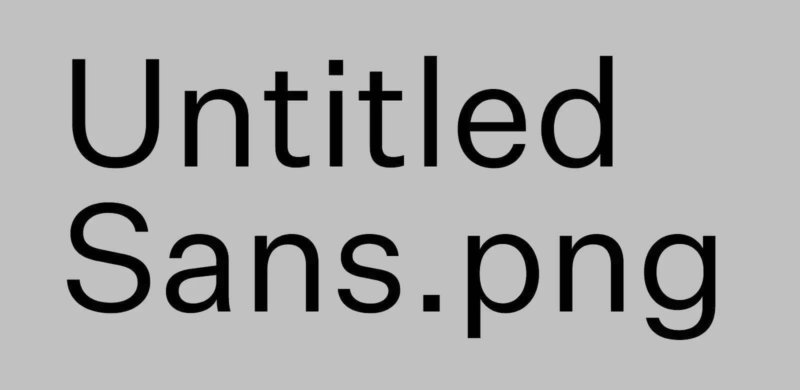
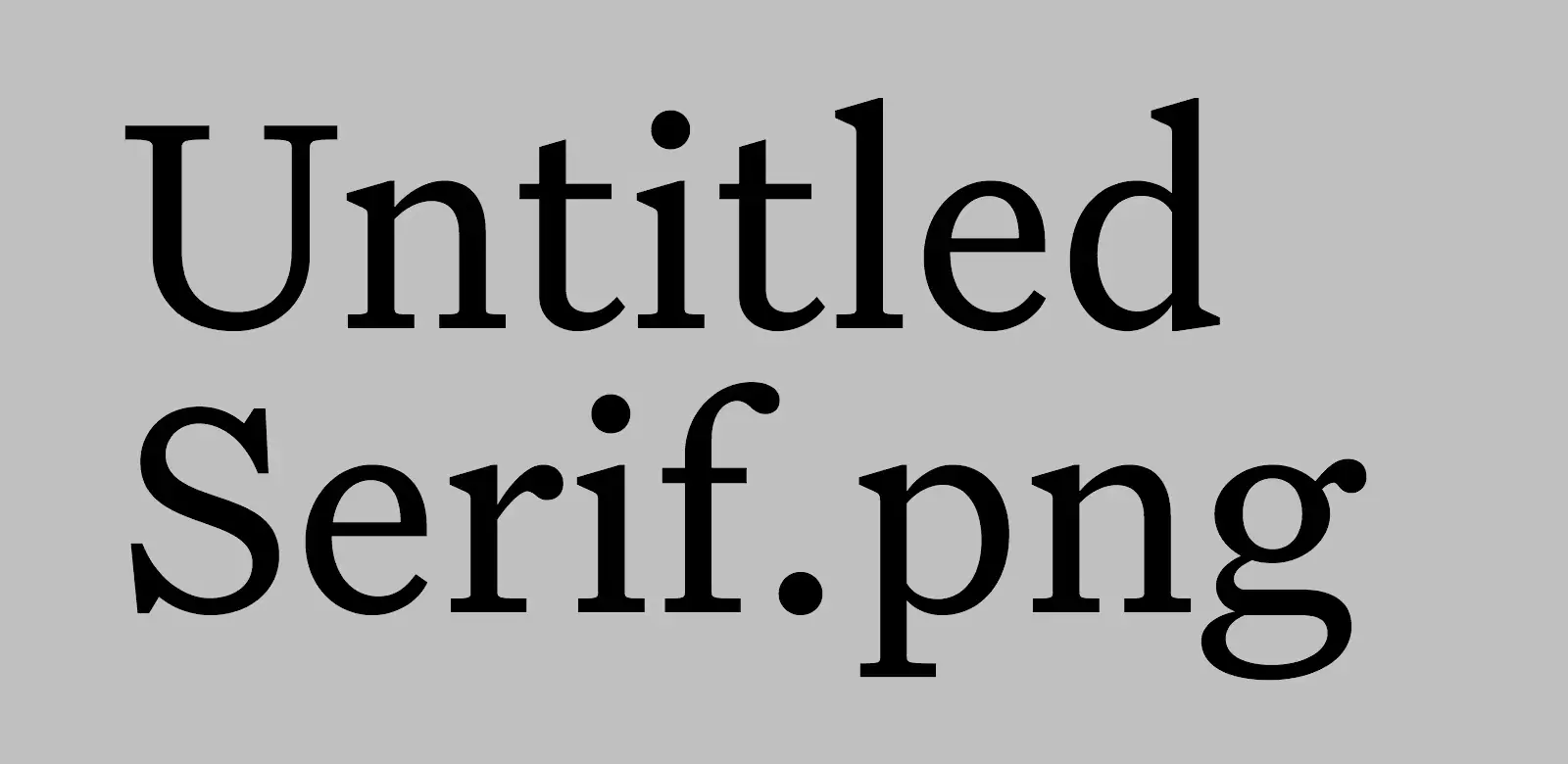
Untitled Sans/Serif
These typefaces are made with the expressed goal of not getting recognised or noticed. The creator, Kris Sowersby, quotes from the book Super Normal, by Jasper Morrison and Naoto Fukasawa:
There are better ways to design than putting a lot of effort into making something look special. Special is generally less useful than normal, and less rewarding in the long term. Special things demand attention for the wrong reasons, interrupting potentially good atmosphere with their awkward presence. — Morrison
Designers generally do not think to design the “ordinary”. If anything, they live in fear of people saying their designs are “nothing special.” Of course, undeniably, people do have an unconscious everyday sense of “normal,” but rather than try to blend in, the tendency for designers is to try to create “statement” or “stimulation.” So “Normal” has come to mean “unstimulating” or “boring” design. — Fukasawa
Some quotes from Sowersby himself:
Most new typefaces are imbued with layers of history, aesthetic associations and cultural signifiers. (…) To lend a new typeface prestige, these blurbs reveal the old specimens that influenced it, and name-drop typographers and foundries long dead. They detail the “engineering challenges” the typeface has heroically overcome — usually small printing sizes, low pixel resolution or limited horizontal/vertical space. Contemporary typefaces are touted as the complete aesthetic and technical package.
But what if you don’t have any special technical requirements, or you want to avoid specific historical connotations? What if you just need to set text with something… utterly normal?
I wanted the details to be exactly normal, without exaggeration. I made a typeface that a designer can use without worrying whether the French Renaissance is an appropriate cultural reference, or if it’s OK to use Bodoni for text. I made all Untitled Serif design decisions while reading. After each round of changes, I embedded the updated fonts into an ePub of Orwell’s 1984 and read several chapters. If a detail stood out, I removed it in the next round of changes. I kept doing this until it was totally comfortable to read.
In general, I absolutely prefer opinionated design – but I do find this approach refreshing. And it fits well with my recent search for a really nice white T-shirt. (I ended up buying this, from Warehouse.)
The missing watch
Most watches fall under some more or less strict categories – like dive, tool, field, dress, or sports watch. And I love, and own, a couple from these categories! But what I feel is missing, both from my collection and the watch world, is a mechanical casual watch. A neutral watch that would fit perfectly with a white T-shirt and a pair of jeans.
Some contenders
If you have a recommendation here, I’d love to hear about it! Here are some that are close to what I’d want.
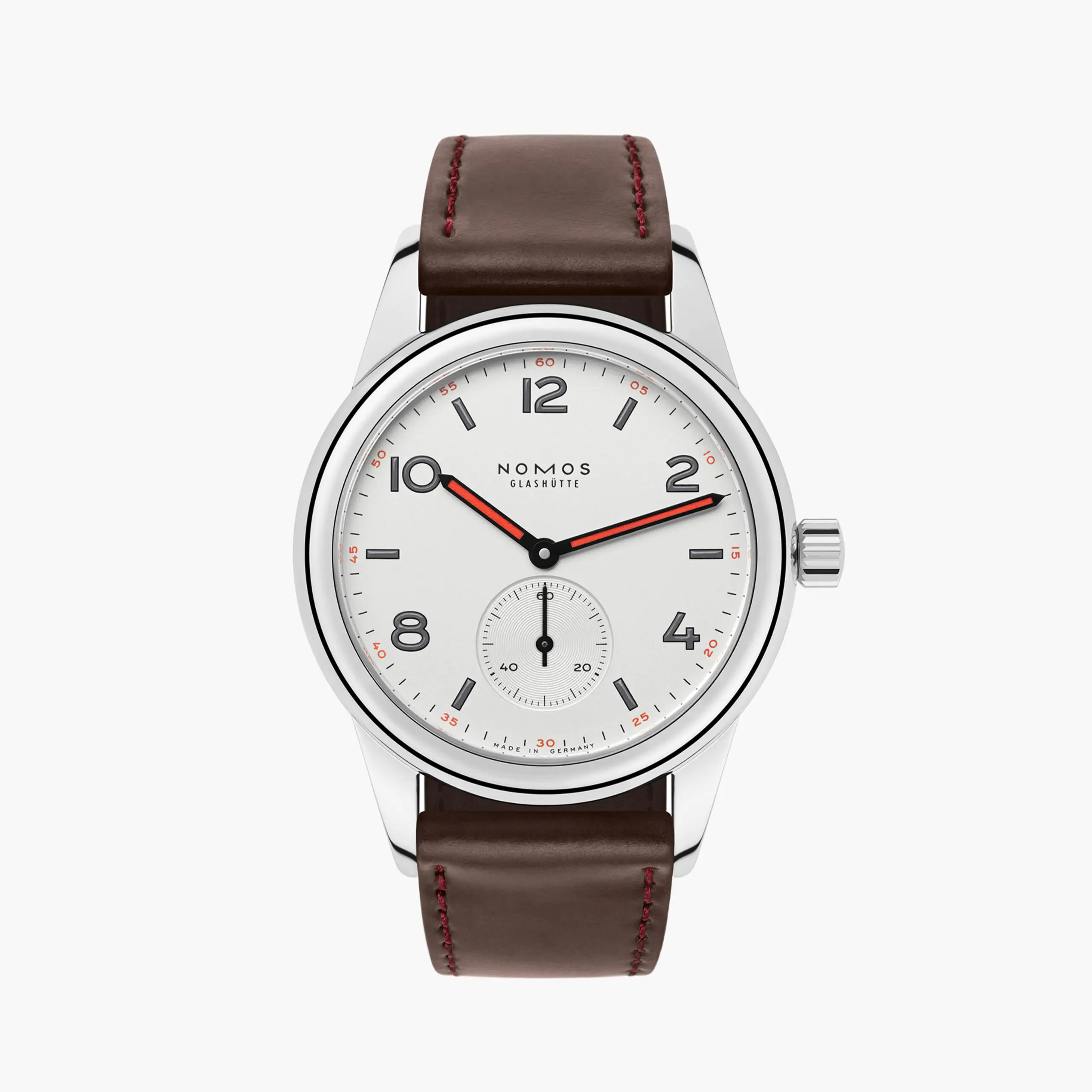
Nomos Club
The round edges and typeface gives it the friendly look that I want – but every variant of it has (at least) one too many things that stick out: Either a blend of roman numerals, or contrasting colours I don’t want. But this one (apart from it being too expensive for me) would be pretty perfect if they just come out with a more basic one.
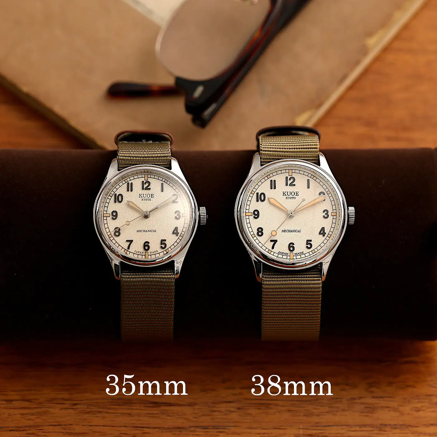
Kuoe Old Smith / 90-002
This one has the sizes I want, and the generally friendly look. My main issue, though, is the beige dial and yellowed, faux patina, lume. I’d rather see it with a white dial and proper lume (and rather use one that ages). The numbers could also be less bold.
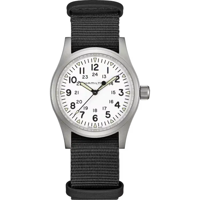
Hamilton Khaki Field
Field watches are pretty close as well – but they often have yellowed lume as well, and are a bit too tool-y.
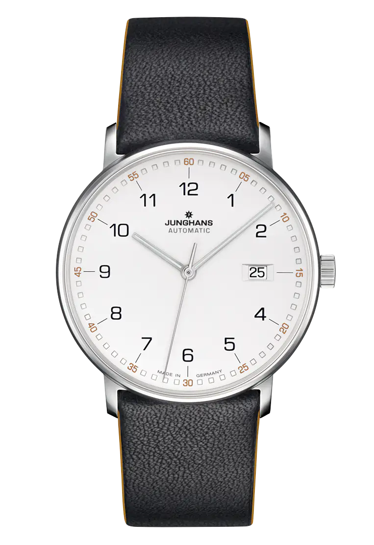
Junghans Form A
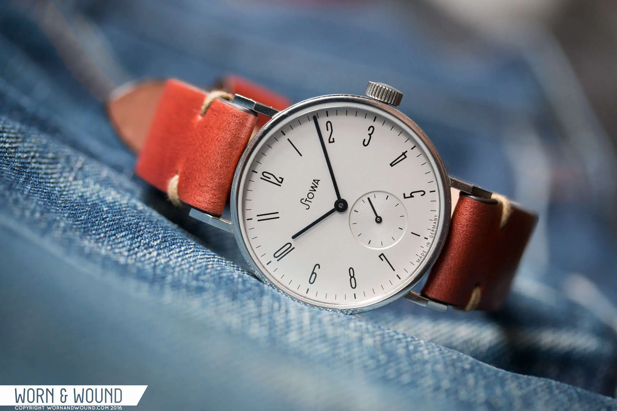
There are plenty of minimalistic Bauhaus watches, like the Form A. Another favourite of mine, is the Stowa Antea KS. (The image below is from this review of it.)
And I’d love to have one someday! But they’re a bit too angular and strict for what I look for. More black turtleneck than white T-shirt.
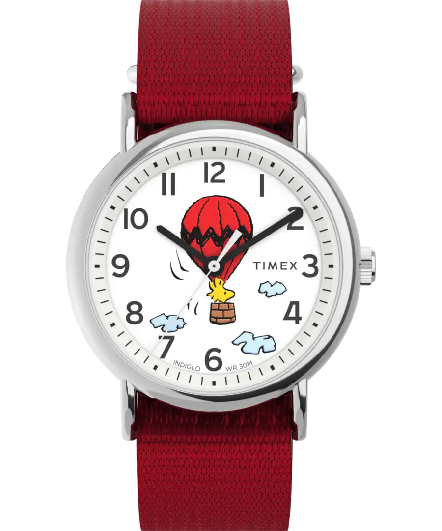
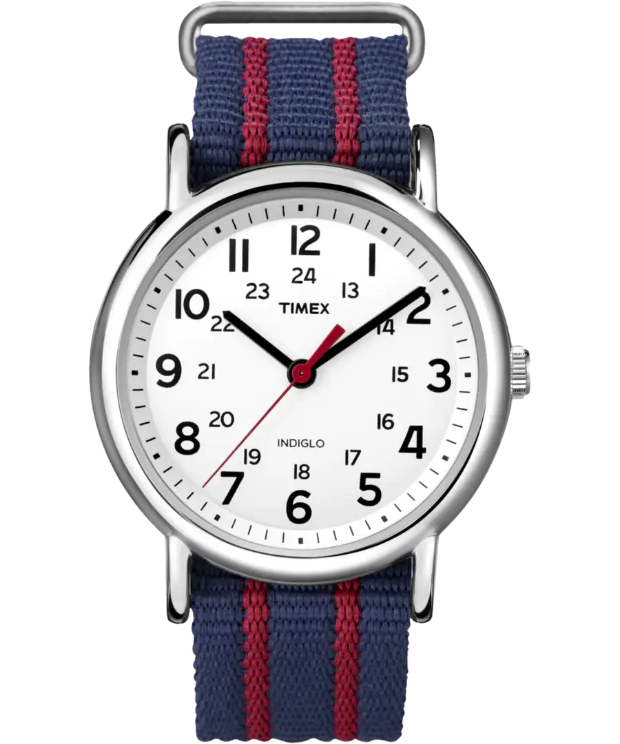
Timex Weekender
This watch is what spurred this whole search. I just love the super casual look of this – but I just wish it was a slightly better watch! (Like £200 for instance.) My dream is that Timex will someday come out with a mechanical version (the current version only comes with a quite noisy quarts movement), no red seconds hand, and with 50 meters water resistance. Add a date complication, and I think you’d have the perfect everyday watch.
An homage
When people make homage watches (a nice word for copies), it’s usually for things like Rolexes. But I dream of making a homage of a €50 watch!
I have of course never designed something like this – and I know it’ll never come of anything. But it was still fun!
And in the honour of the Weekender, I’ve named my design the …
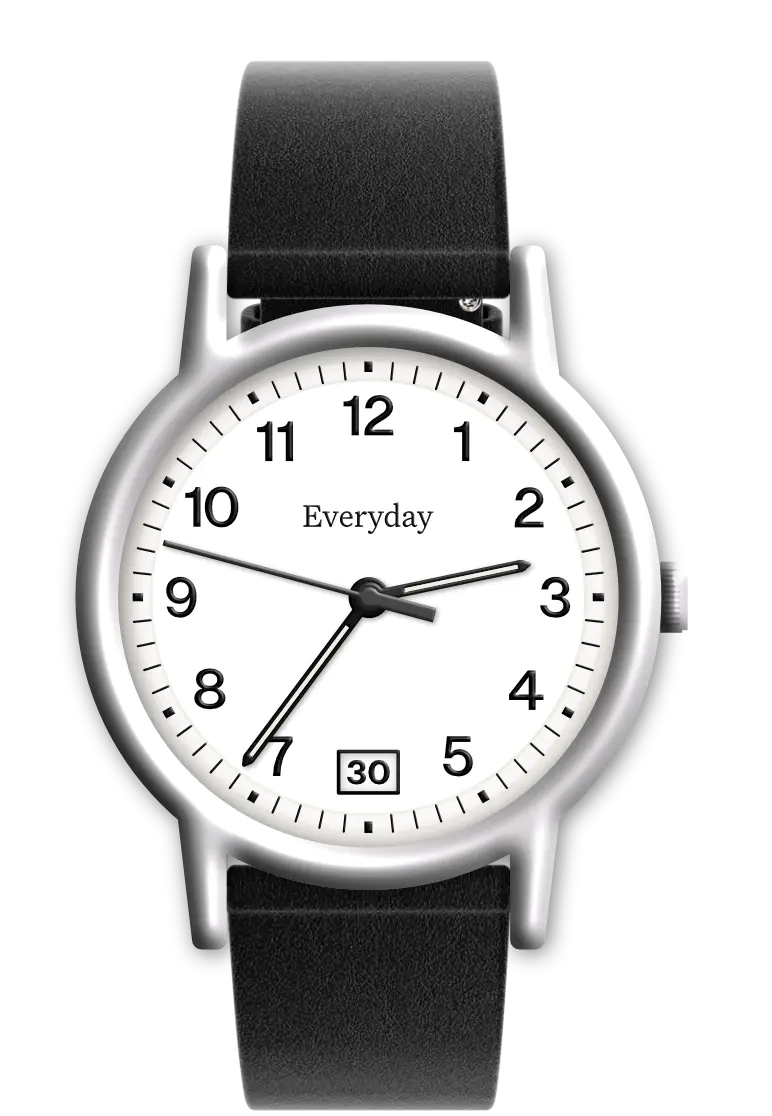
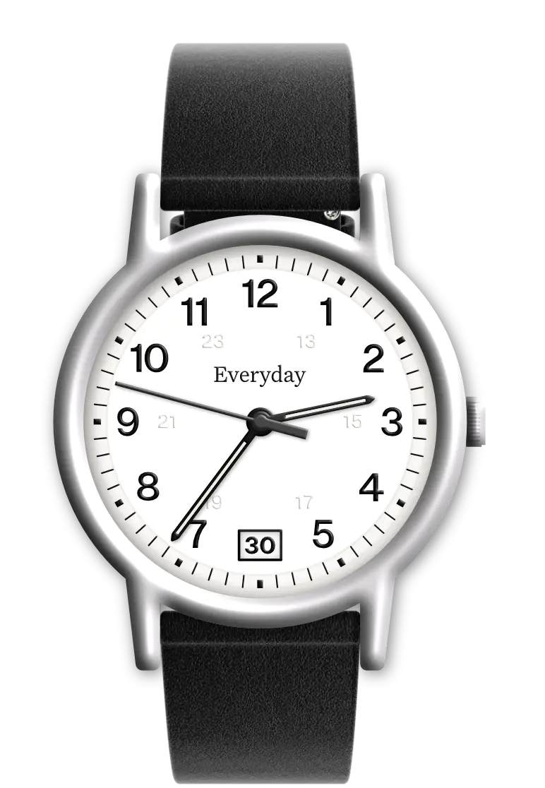
Everyday watch
I want it to be mechanical, and preferably automatic – as you could then wear it every day and never have to wind it. However, the cheaper automatics are typically thicker (and the watch would have to be cheap) – so I fear it would have to be hand-wound as to not be too bulbous.
I’d like it to have a date complication, as that’s the most useful one day-to-day. And I also imagine it having 50 ATM – just enough so you don’t have to worry about water damage, and can even take it for a swim.
I’ve set the numbers with Untitled Sans, and the logo is in Untitled Serif.1
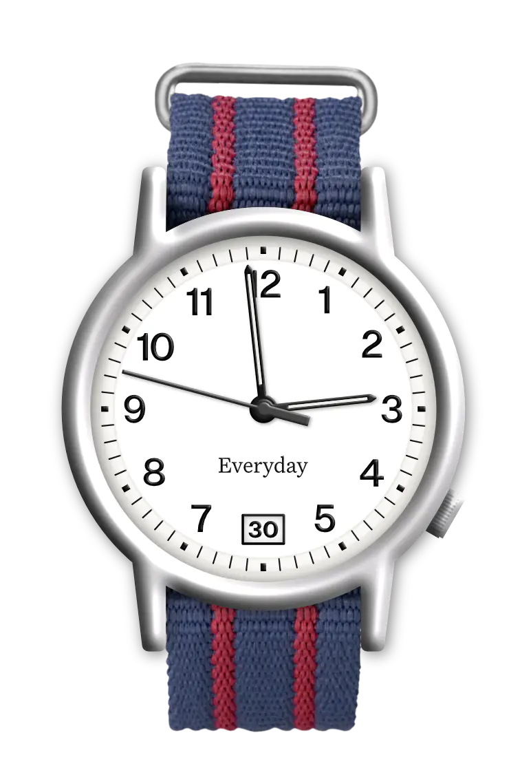
I couldn’t decide, so I made two main versions: One with the logo above the center and crown at three o’clock, and one with the logo below and crown at four o’clock (to balance out the heavier numbers 10-12). I think I prefer the calendar complication at 6 o’clock.
Compared to the Weekender, the lugs are a bit less straight – and I envision it at 38 mm.
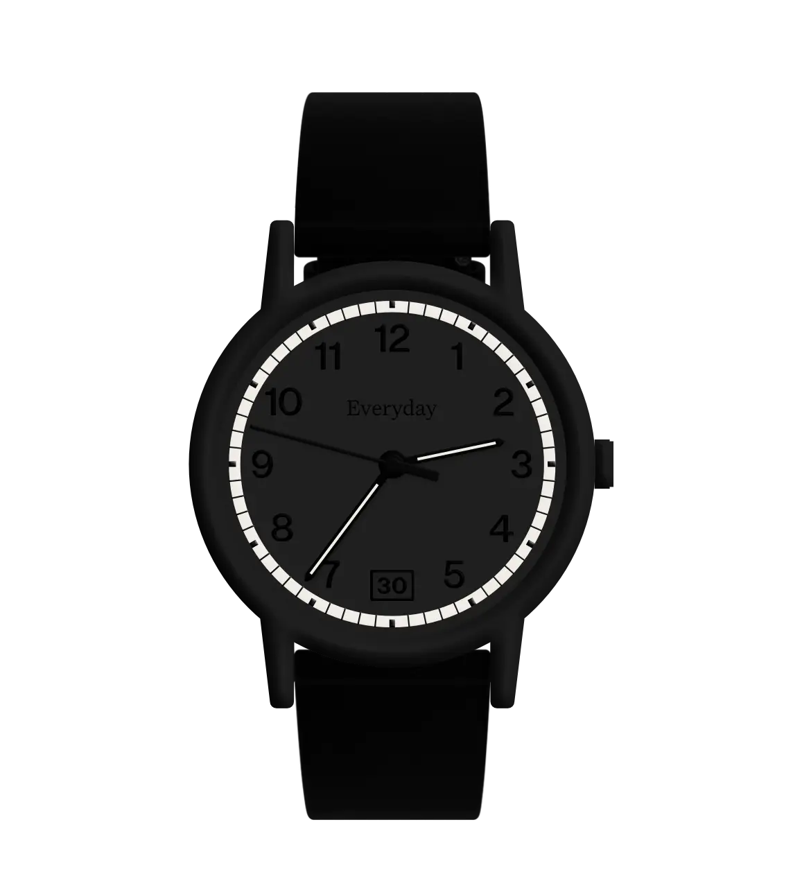
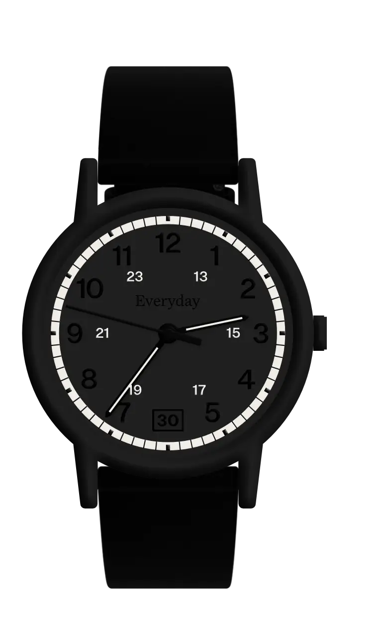
Two of the hands have lume in the middle, and so has part of the rail around the numbers (with the indices applied on top of the lume). So it could look something like this:
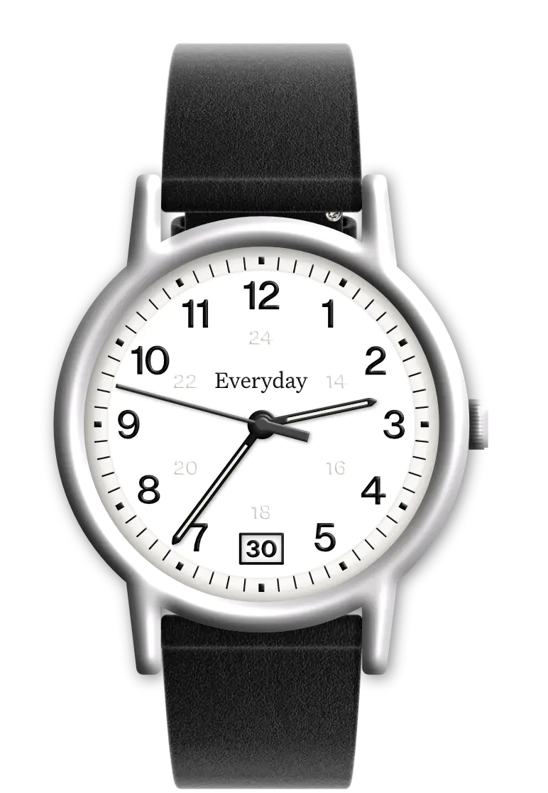
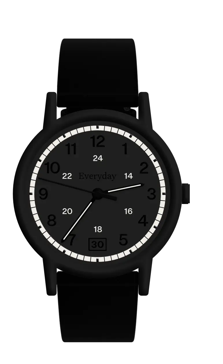
I also toyed with the idea of adding the extra row of numbers from 13-24 that most Weekender models have. What I ended up with, was to try to add every other number with lume:
So, what do you think? Which version do you prefer?
Did I make it normal enough?
Do you have any advice on models that already do what I want?
-
Which I of course would have to license! ↩︎
