Design Thoughts
- … be dirt-cheap
- … support Matter and have a Thread radio1
- … use AAA batteries
- … have a simple, sleek, and light design
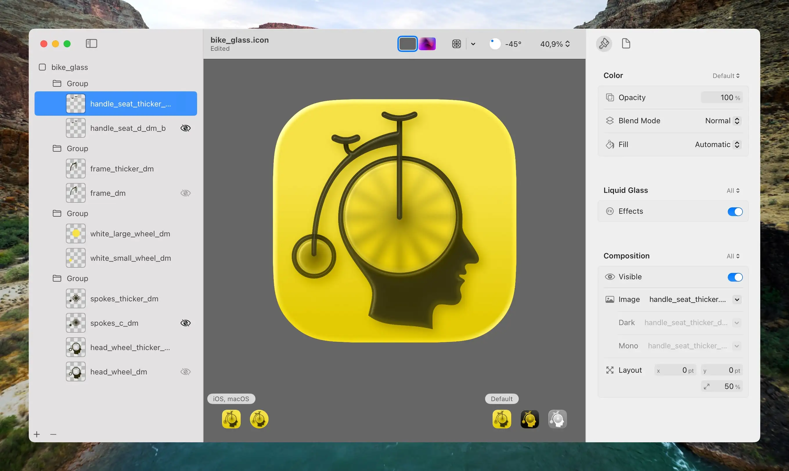
- I redrew all the elements (except the head) to make them thick enough so that the glass effect in Icon Composer would apply.
- Then I separated them into the maximum of four layers Apple allows:
- The spokes and wheels at the bottom,
- then a layer of transparent circles that blur the spokes,
- then the frame,
- and lastly, the seat and handlebar on top.
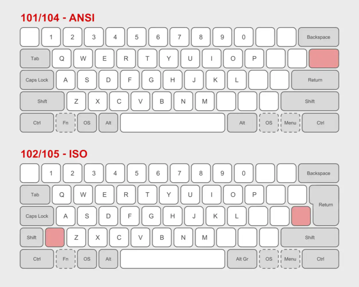
- I wanted a Mac layout, while most keyboards are made for Windows,
- I needed the ISO layout, while most keyboards has the ANSI layout,
- and the Norwegian layout is a subsection of ISO.
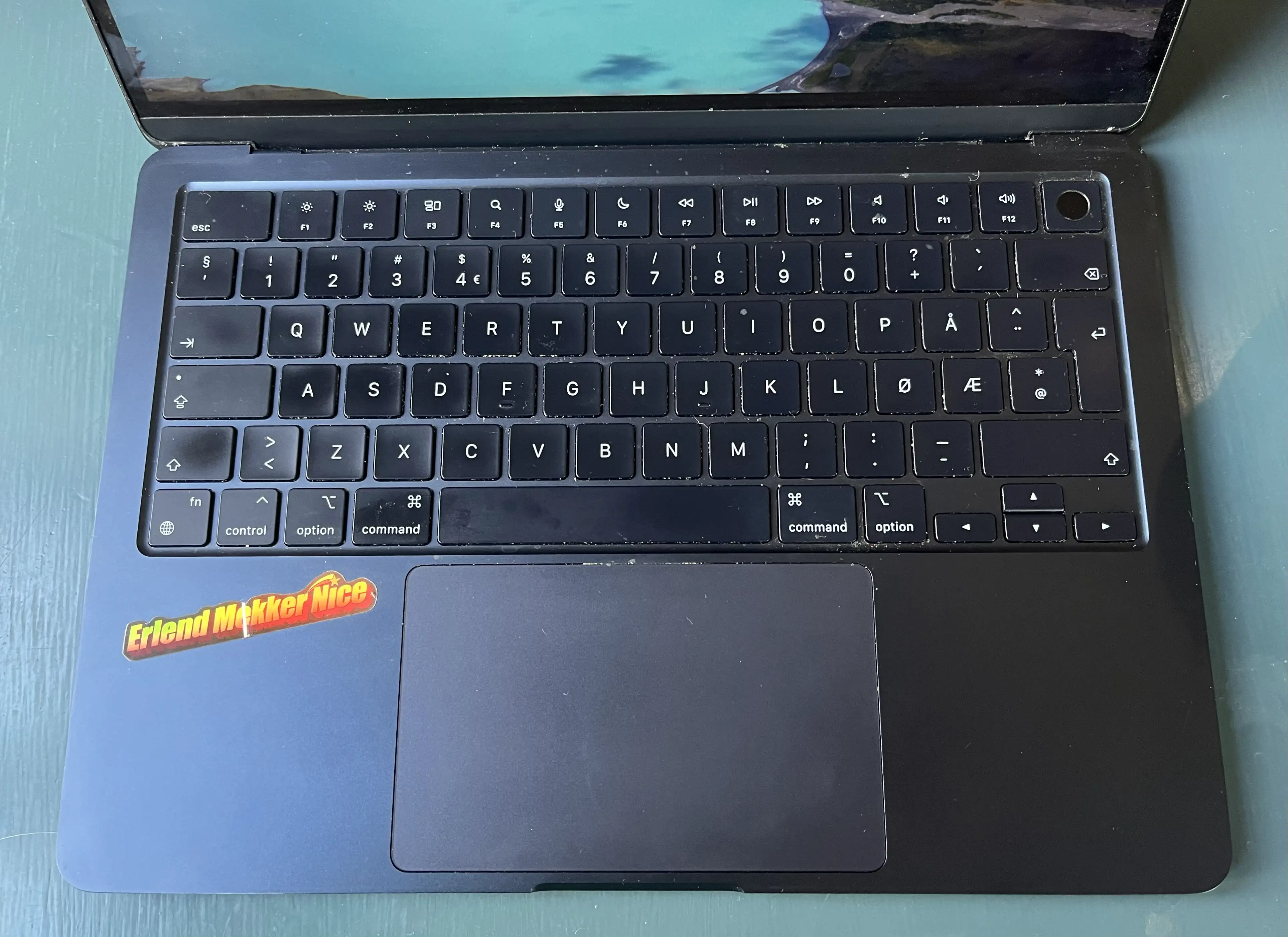
- Have all features (except Touch ID) that she uses on her MacBook Air. This includes:
- All letter, number and symbol buttons,
- arrow keys,
- escape,
- and brightness and sound/music controls.
- Be simple enough that she could just sit down and use it without any prior knowledge.
- I also want to try to not have a function row. So closer to a 65% than a 75%.
- A best-in-class text engine, that can jump between Markdown (plain-text) and Preview (rich text) Modes.
- This is also already great on both Mac, iOS, and iPadOS. (No Apple Watch, though.)
- The UI is made to be minimalistic, mimicking just a piece of paper.
- Paper ships with several beautiful accent colours, and great support for them in the UI.
- It also provides good export features. (Including for copy/paste.)
- In general, I like to rely on third-party services.
- I also like the portability of Markdown, and being able to use several apps on the same files.
- I like that, in NotePlan, I can use the same app for notes and tasks.
- Good apps on both Mac, iPad and iPhone, while also being accessible on the web
- Pretty good collaboration features, with shared notes and folders
- More than enough options for formatting
- Collapsible headings
- Embedding of files, photos, and illustrations (especially good with PDFs)
- Audio recordings
- Links between notes (no backlinks, though)
- Tagging and smart folders
- Quick notes (which Apple, selfishly, reserves for itself)
- Math notes.
- For reasons, I’ll touch on later, this is mostly about desktop browsers.
- In terms of privacy and security, I’m approaching this from a reality where 65% of people use Chrome. So in this context, vastly improving the privacy from that, is more interesting than saying someone is a gullible idiot if they don’t use a Tor browser. 😛 So while I’m not saying those things shouldn’t be part of the discussion at all, I’d like to talk more about user experience and features than hardening if you catch my drift. 1
Another Tiny Tahoe Travesty
Icon buffering
The lack of polish in the latest macOS version is just insane — from cut corners, to text going over other pieces of text, and weird HIG decisions.
But I wanted to point to a piece of terrible piece optimisation I haven’t seen mentioned (even though it probably has been):
When the Design Requirements Are Perfect
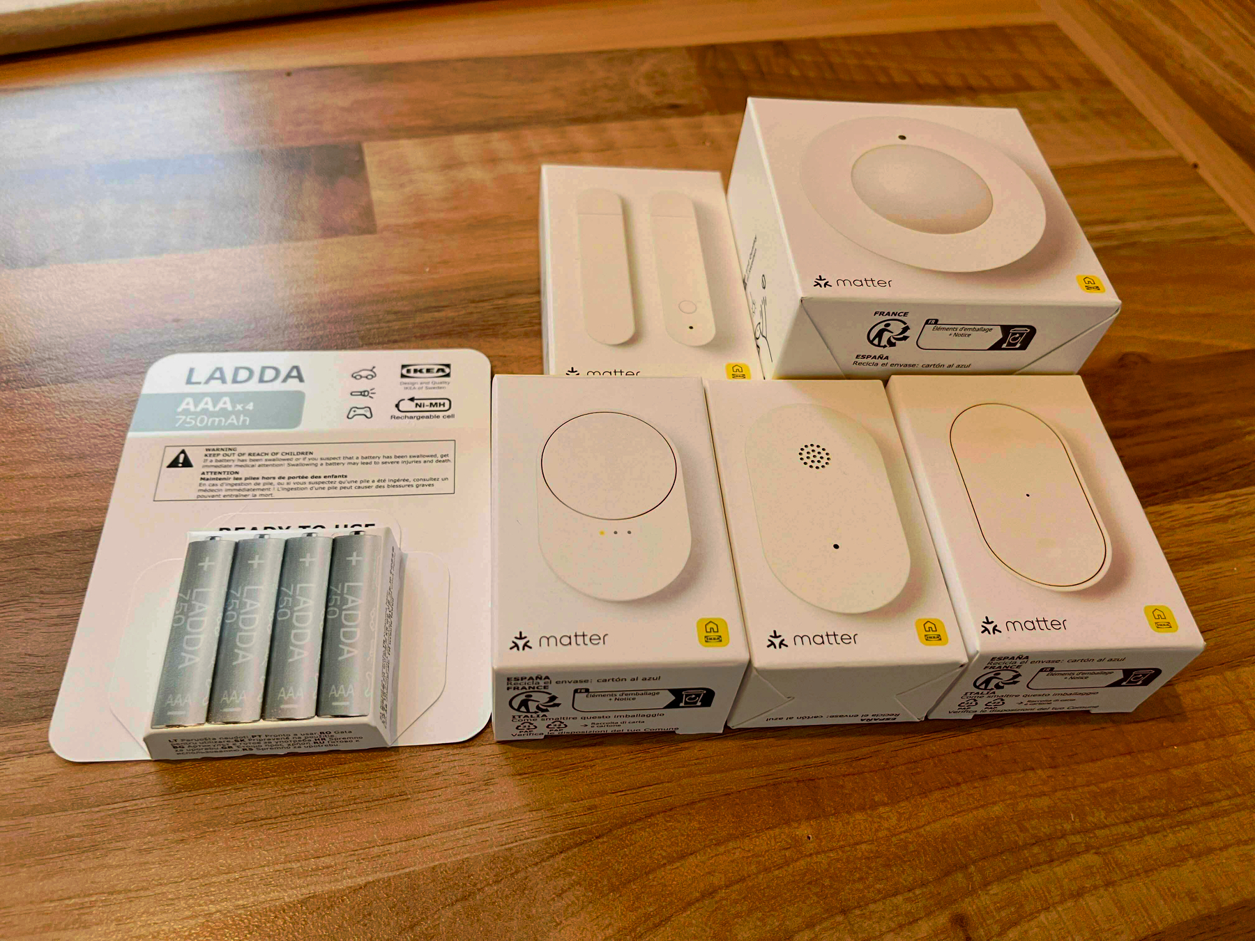
The New Smart Home Line From Ikea
I’ve always quite liked Ikea’s smart home gear, as they’ve felt like good value for the price. However, with their latest batch of products, which are in stores now, it seems like they’re moving up to becoming the first thing I’ll recommend to most people! You know, if they actually work as advertised — which I haven’t got the chance to test yet. But I have a couple of devices in hand, so I’ll get to that!
However, I just wanted to shout out that I looooove the design requirements that they’ve chosen when developing these:
Everything should …
Software Should Have a Customisable UI
Part 1
I’ve recently noticed how most of my favourite pieces of software have one thing in common: I can customise them — not only to be needs, but to my preferences. And I really think this should, and could, be more widespread.
And I know that some iPhone users, when they hear customisable UI, might think: “Pff, why would I want a million ways to make my UI ugly, like an Android phone, instead of having one beautiful way??” But I’m not really talking about looks here! (Even though I also think theming is great.) I’m talking about button placements, how things work, etc.
An example: My favourite mobile browser
But Did They Have to Make the iPhones Ugly?
In general, I have to say that the tech on this year’s iPhones seem pretty good! But I’m a little bummed out by the fact that it seems like they’ve given up on making them look nice.
Are they just thinking, “People will throw these in cases anyway — who cares?"1 ?
Previous iterations of Apple have also missed the balance between design and functionality — but in the other direction. And let me say that I do prefer them not putting design over everything!
But do you remember posts like this?
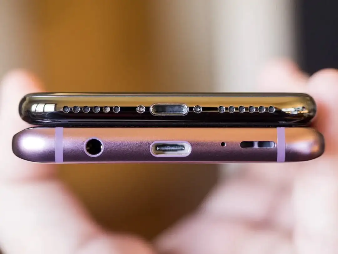
This 11-year-old Reddit post pointed to Apple’s care when it came to the details. It even mattered to them the way the ports were placed beneath the phone.
I really don’t like the new backsides…
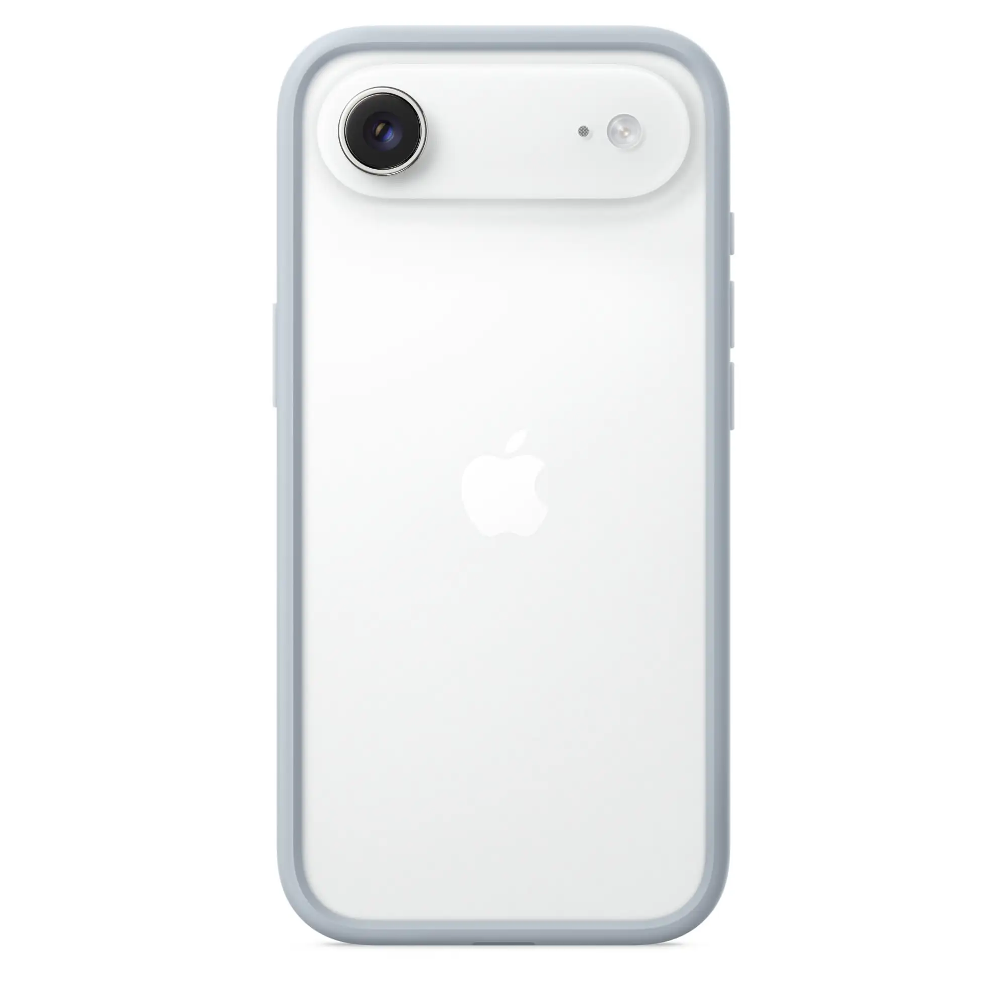
The iPhone’s Camera Plateaux™️ have always been inelegant. So I was glad that the plan this time was to make them larger. (I’m also one of those who dislike table wobble…)
But I think they missed the mark on both the Air and Pro — in slightly different ways.
Air:
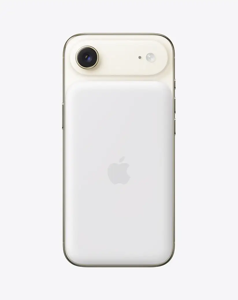
When it comes to the air, I don’t like how the camera bar doesn’t have the same curvature as the phone’s corners. I think this image, with the battery pack, shows this well, as you can see that the battery pack does match the body.
(Yes, it does match the camera’s perfect roundness — but that’s not the choice I’d make.)
With the battery pack, you also get non-matching corners “bumping” up against each other. (Heck, if you insist on having the round corners on the camera bar, I’d consider having the top corners of the battery pack match those instead of the top of the phone.)
Apple used to really care about corners…
Pro:
Playing With Icon Composer and the Bike Icon
One of my favourite apps to use, is Bike Outliner by Jesse Grosjean/Hogbay Software. It’s simply delightful through-and-through.
He’s hard at work on a really promising 2.0, and I wanted to play with Apple’s new Icon Composer. So I wanted to see if I could contribute and adapt Bike’s icon to the new style.
Not optimal
The original Bike icon (which I don’t love as much as the app itself) isn’t optimal for this style. If you look at Apple’s documentation, it’s especially clear to see that it’s easier to get a nice result with few largish objects you can layer.
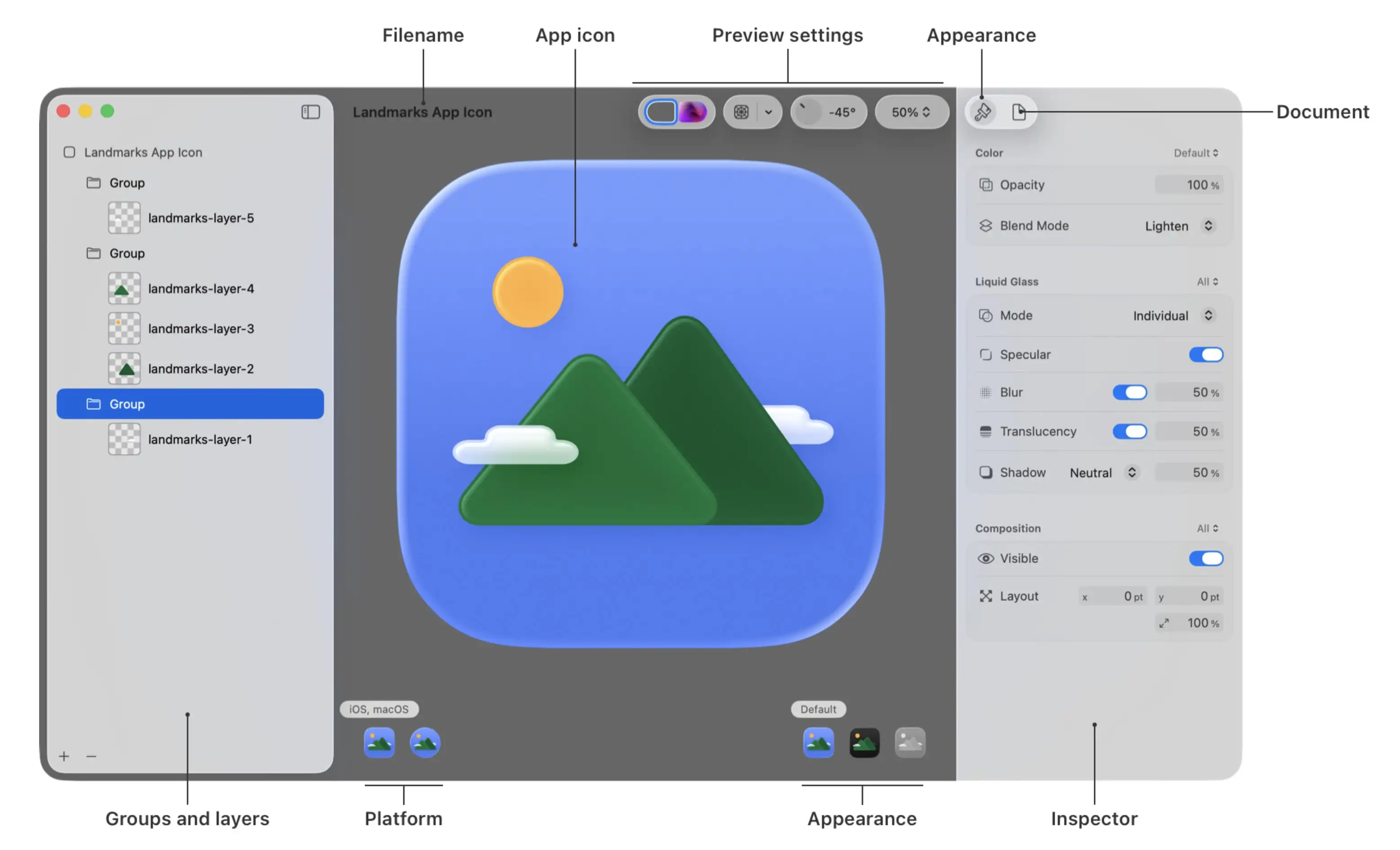
Also, I’m absolutely not a designer. But I did my best to create:
A first draft
One thing I’ve thought about the original icon, is that the spokes on the wheels are many and small. On the sizes where the icon is actually used, this makes them blur into each other. However, this isn’t necessarily something negative. (And I know Jesse likes it.) To me, it gives an impression of the bike being in motion.
Here’s what I did:
Design Challenge: 65% ISO Mac Keyboard, Usable by Everyone
I Want Your Opinion!
I like custom keyboards, and a couple of years ago, I made my own:
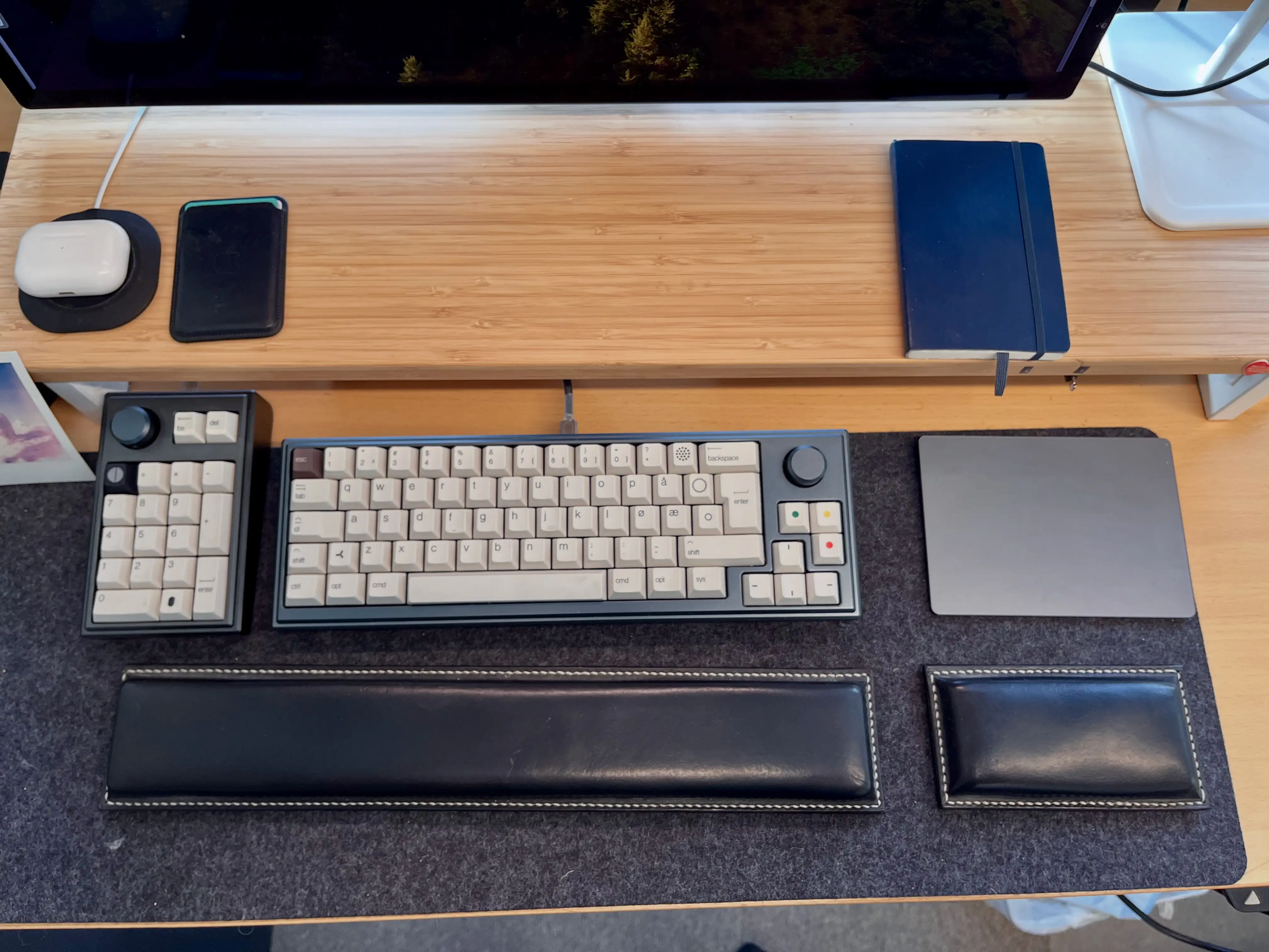
However, three things made this process harder/more expensive (at least at the time):
Enter: 3D printer
This spring, I’m moving from a tiny flat (in the city) into a large house (not in the city). And one of the things I’ll now get room for, is a 3D printer.1 And as someone who likes tinkering and soldering, I want to try to create a keyboard, perhaps hand-wired, in the style of the legendary Joe Scotto.
In time, I would like to make a split keyboard for myself. But before that, I wanted to try to create a more standard keyboard. And I thought a fun challenge would be to design:
A simple keyboard for my wife
This provides the following criteria:
The main issue with having no function row, is the escape key. It needs to be the top-left button, but then the button we use for apostrophes (next to 1) needs to be moved somewhere. I solved it by moving it to the ISO-key between Shift and Z, which usually is < and >. And then I access those with a special modifier. However, this wouldn’t work for a keyboard that’s supposed to be instantly usable by everyone.
3D print everything
✉️ Tapestry Feedback Feedback Feedback
Not too long ago, I wrote some feedback to Iconfactory’s latest app, Tapestry. I just got some great feedback on that, from them, so I wanted to provide a response.
Here’s what they wrote, on Mastodon:
There’s a lot in your post. Thx for such thoughtful feedback, it’s appreciated. Some things like the ability to turn off the service name is coming. The thing to keep in mind is this: just because a particular part of the design doesn’t work for you, doesn’t mean it wasn’t designed that way for a reason that you may have not considered.
The service name is a perfect example. Lots of people are colorblind or even unsighted. To them they cannot tell posts apart simply by color.
So while we are going to add the ability to turn off the service name, that’s why it’s there by default. Avatars are never going to move to the right side. Their placement was carefully considered as was how they appear with their transparency.
Everything you see is the result of over a full year of design, testing by over 1,500 TestFlight backers & then tweaking to adjust things that didn’t work as well as originally planned.
In the end Tapestry may not be for everyone & that’s fine
If Tapestry ends up looking & behaving like Reeder or Surf or… what’s the point? We designed the app the way we wanted it to look & behave using feedback from our testers as a guide. The design will continue to evolve based on feedback like yours (which is thoughtful) but it can never be all things to all people.
Many have told us they love Tapestry so it seems to be doing a lot of stuff right but it can always be better. We’re gratified but will continue to improve going forward. 👍
Here’s my response:
Thanks for reading my feedback, and getting back to me with such an interesting response! And looking back at my own feedback, I see that it was harsher than what was intended… Sorry!
✉️ Micro Social: A New Third-Party iOS App for Micro.blog
And Some Very Early Feedback
Greg Morris is someone whose blog I’ve followed for a while, but I didn’t know was a developer. But now he has released a third-party iOS client for Micro.blog!
As he’s mentioned, it happened “quite accidentally”, and it’s very early days. So this post is just me letting people know it exist, and providing some very early feedback.
To Greg:
Oooh, I love that you’re making this! I’m 100% in the target demographic for Micro Social. (Someone who uses, but doesn’t like, the default Micro.blog app — and is willing to pay for something better.)
I’ll try to provide some more useful feedback later, as I’ve used the app more, that you can use if you’d like. 🙂
Here are some first-impressions:
(In general I like it! So these “negative” comments are meant to be constructive. 🫶🏻)
I’m currently running an iPhone 13 Mini — so the phone is probably both older and smaller than what you use. ☺️
I had several crashes two updates ago, but it’s fine now. But I’ve noticed that avatars load slowly when I scroll (even if I scroll slowly). Maybe you can have the lazy loading start “earlier”?
I really like that you have avatars and names on a separate line, so you can use full-width content. (Instead of having weirdly large left-margins, that far too many apps has. I have strangely strong feelings about this…)
I also really like the “card look”:
However, on my Mini phone, I wish you were a bit more stingy with the padding, as the content gets too narrow. Especially on the timeline, due to the extra arrow on the right side. Is this needed?
The Paper Dev Should Give Their Take on a Tot-Like App
I recently wrote a review of Iconfactory’s great app, Tot.
I like it – but editing text in it does make me miss my favourite places to do this: Paper and Bike.
And this process made me realise that the Paper dev has all* the pieces in place to give their take on an app like this. And it makes sense from a business perspective!
The pieces
Here’s what I would do:
My suggestion for a name (also to make it easier to discuss here) is Slate.
A slate is a thin piece of hard flat material, historically slate stone, which is used as a medium for writing.
The next question is how much it’s OK to copy from others. Let’s pretend it’s fine to take all …
The best parts from Tot:
Fixed number of notes
I really like that Tot only supports 7 notes, that are all “internal” to the app.1 I also love how they’re distinguished from each other by colours.2
Having exactly 7 would a bit on-the-nose… But one of the reasons I liked the “Slate” name, is that you could one-up, rhyme, and go for 8!3
Perhaps the 8 notes could be regular, accessible Markdown files in the app’s iCloud folder, to simplify automation? But that you can’t create other notes with the app, and it can’t “find” other notes if you place them there.
The business model
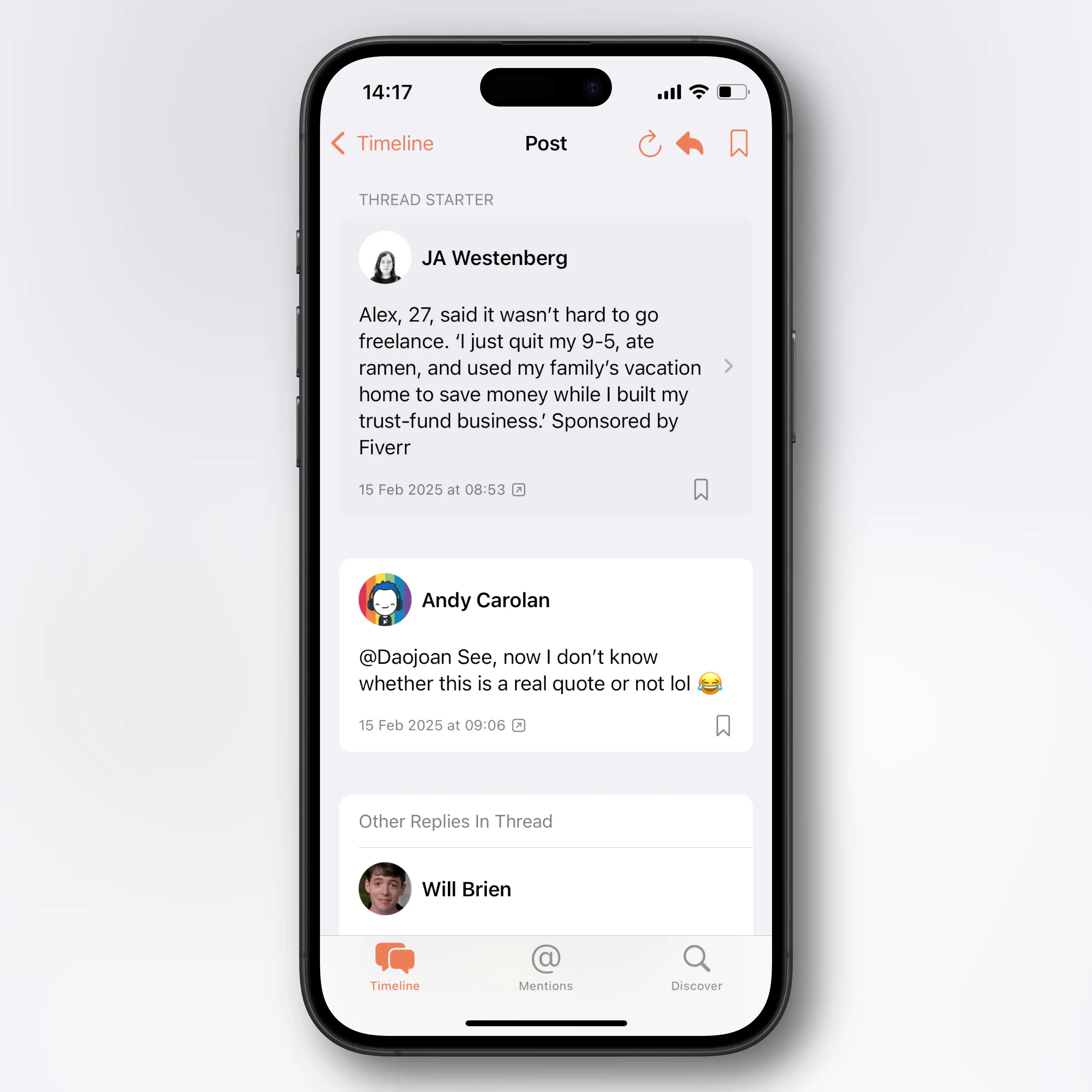
✉️ My Issues With the Tapestry Design
The 1.0 of Iconfactory’s latest app, Tapestry, just landed. Like the new Reeder, it’s a “unified timeline app”, that collects feeds from many different sources, like RSS, Reddit, YouTube, Mastodon, and more.
Some really like this idea (for instance for collecting Bluesky, Mastodon and Micro.blog in one place), while others don’t. I’m not yet sure where I stand.
I backed the Tapestry kickstarter way-back-when, so I’ve been able to beta test it. I like a lot of the ideas – and the way it handles feeds/connectors and default apps seems fascinating and robust. But due to some issues with the visual design, I’ve never been able to get into it… This post is my feedback letter to the devs, which might also be interesting to others.
Edit:
I got some feedback from Iconfactory on this post. That, and my response back, can be read in this blog post.
Great designers
I spent €40 on the Kickstarter – but even if I’ll never get into the app, I won’t call it a complete waste. Because Iconfactory is a cool company, that I don’t mind supporting.
And they are excellent designers! So when I disagree with things about their work, I’m, of course, a bit nervous, heh.
Mini Gang, unite ✊🏻
I’m still rocking my trusty ol' iPhone 13 Mini. And I think part of my issues stem from me using a phone that’s probably smaller than what they’ve optimised for. I also get that it’s a 1.0, and that much of the work has gone into some really cool tech on the backend. So I hope it’s possible to see that this feedback comes from a place of love, and hope for the future!
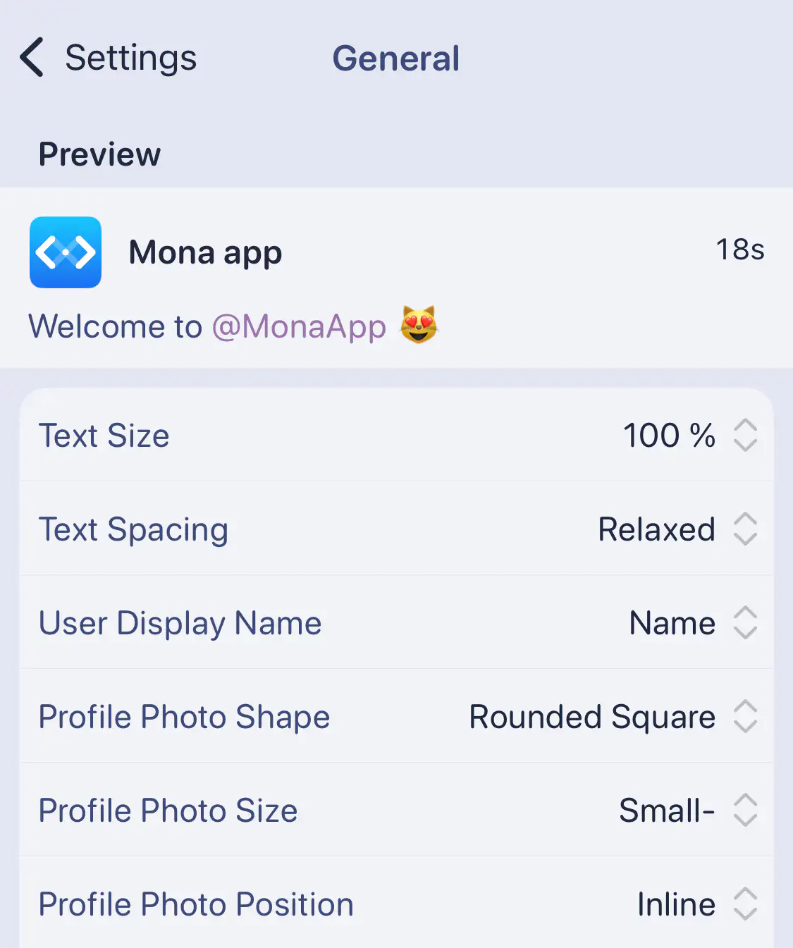
And I get that many might like the things I don’t. So I think the answer is more customisation – like this settings screen from Mona:
Messy and cramped
I like colourful designs. And Tapestry has this neat idea, where it gives timeline entries different colours depending on the type.
It might not come across perfectly in screenshots, but with my Mini phone in hand, I find a combination of things here unpleasant.
I Tried to Design an Icon for Zen – My Favourite Browser
I’m one of those who really likes the Arc browser. But at the same time, I’m quite worried about Google’s web hegemony (and the general trajectory of The Browser Company) – so I want to use and like Firefox/a Gecko browser. Sadly, I just don’t think Firefox is very good…
I get that Mozilla has a lot of things going on, and that creating a browser engine is a lot of work. But I really wish they prioritised having a focused team that's allowed to just working on making Firefox nice.
However, I’ve used Zen as my main browser for the last six months – and I’m pleased with it! (By the way, click here, to go straight to the new icons.)
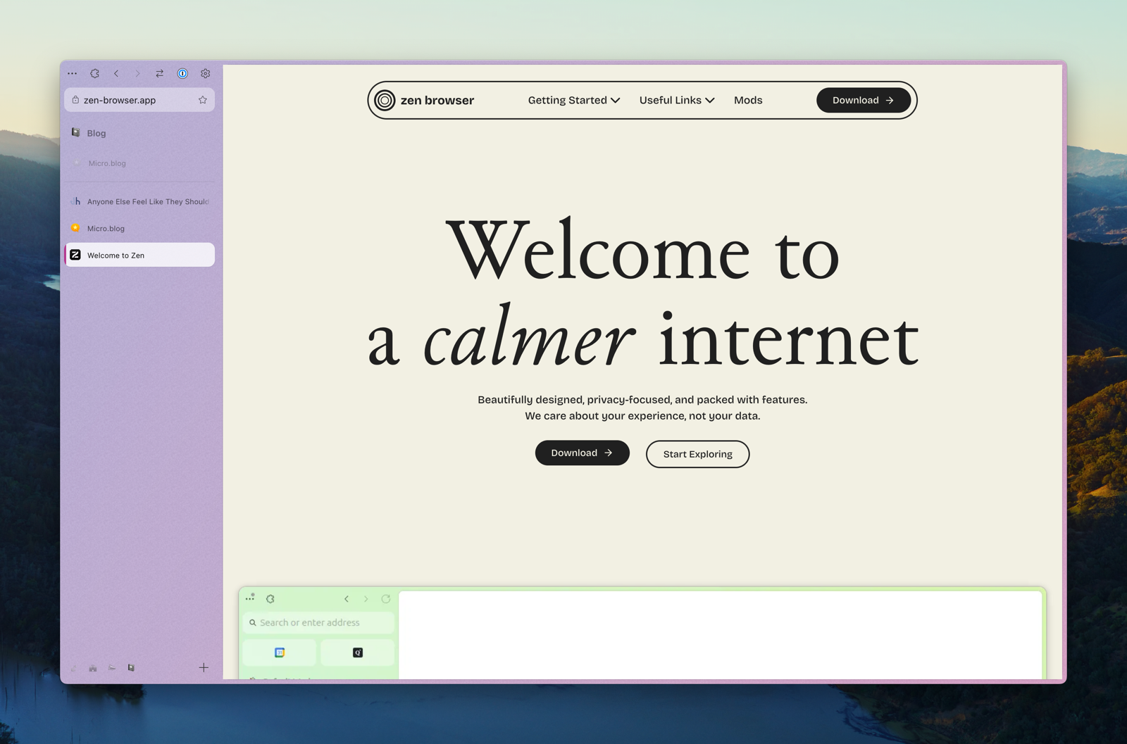
In short, it’s a Firefox fork, that has copied a lot of the things I like about Arc – like vertical tabs, split-views, workspaces, and nice padding 🤤. It also has some original ideas – and my favourite one takes advantage of the great customisability offered in Firefox:
Zen Mods
You can easily install, and adjust the settings of, community created mods. These are mostly little tweaks, like themes, having the close button on the left side (and hidden without hover), cleaner extension menu/right-click menu/navigation bar, etc.
I really like that the browser is enjoyable out-of-the-box, but that I can still customise a lot to my liking.
But be aware: It is alpha software.
This means that not everything is polished, and that things change quite frequently. But, as mentioned, I’ve used it as my primary browser for six months, and I’ve still liked it more than most browsers.
One of the things that has just changed is the graphical profile, logo, and icon.
My Biggest Small Gripe With Apple Notes
And (Obviously) Objectively Correct Principles for Paragraph Spacing
I think Apple Notes might be one of the best pieces of software Apple ships. They’ve nailed creating a simple app, with great ease-of-use, that still has more powerful features hidden, for those who want it. There are a couple of reasons why I don’t use it much, though:
However, Notes has numerous nice features, like:
So I’ll gladly recommend it to most people!
However, as most Apple software, Notes is pretty inflexible. If you don’t like their choices, you’re out of luck. And I really don’t like their choices when it comes to paragraph spacing.
My paragraph spacing commandments
The Everyday Watch
Writing about watches, yesterday, made me think of a type of watch I just can’t seem to find: The watch equivalent of the classic white T-shirt. I also recently read about an interesting pair of typefaces – and put together I got the inspiration to try my best at designing the watch I just can’t seem to find.
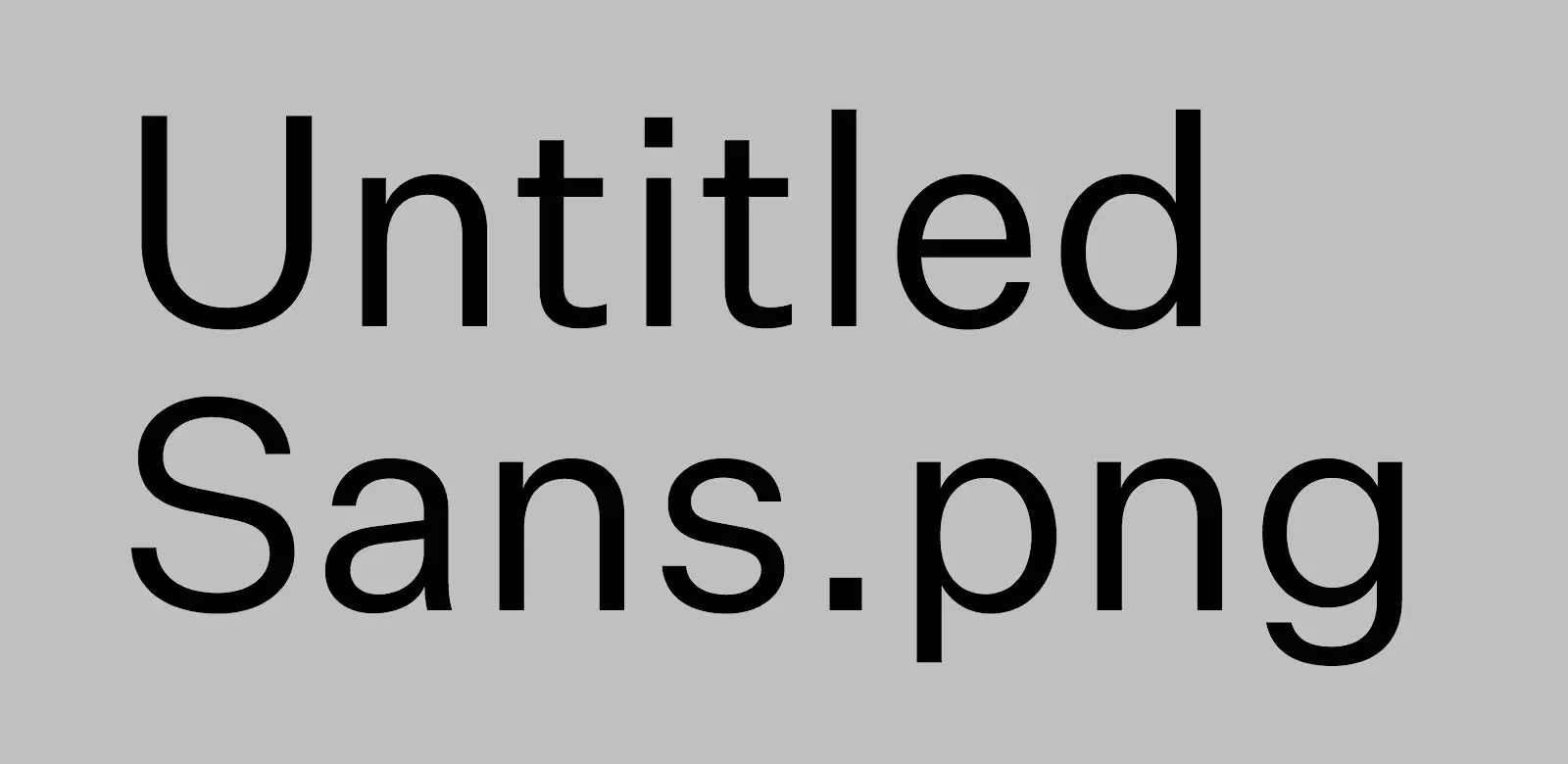
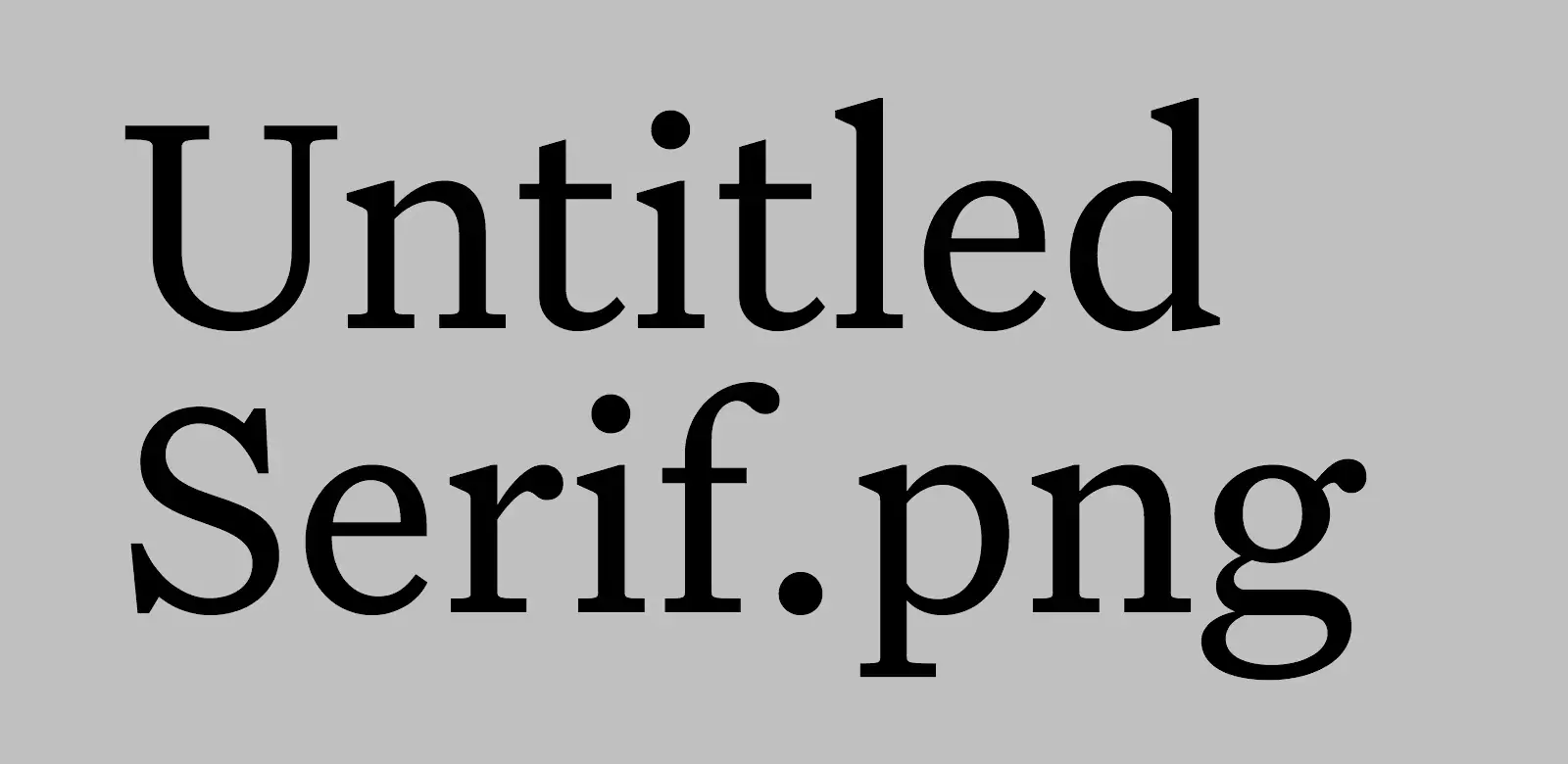
Untitled Sans/Serif
These typefaces are made with the expressed goal of not getting recognised or noticed. The creator, Kris Sowersby, quotes from the book Super Normal, by Jasper Morrison and Naoto Fukasawa:
There are better ways to design than putting a lot of effort into making something look special. Special is generally less useful than normal, and less rewarding in the long term. Special things demand attention for the wrong reasons, interrupting potentially good atmosphere with their awkward presence. — Morrison
Designers generally do not think to design the “ordinary”. If anything, they live in fear of people saying their designs are “nothing special.” Of course, undeniably, people do have an unconscious everyday sense of “normal,” but rather than try to blend in, the tendency for designers is to try to create “statement” or “stimulation.” So “Normal” has come to mean “unstimulating” or “boring” design. — Fukasawa
Some quotes from Sowersby himself:
Most new typefaces are imbued with layers of history, aesthetic associations and cultural signifiers. (…) To lend a new typeface prestige, these blurbs reveal the old specimens that influenced it, and name-drop typographers and foundries long dead. They detail the “engineering challenges” the typeface has heroically overcome — usually small printing sizes, low pixel resolution or limited horizontal/vertical space. Contemporary typefaces are touted as the complete aesthetic and technical package.
But what if you don’t have any special technical requirements, or you want to avoid specific historical connotations? What if you just need to set text with something… utterly normal?
I wanted the details to be exactly normal, without exaggeration. I made a typeface that a designer can use without worrying whether the French Renaissance is an appropriate cultural reference, or if it’s OK to use Bodoni for text. I made all Untitled Serif design decisions while reading. After each round of changes, I embedded the updated fonts into an ePub of Orwell’s 1984 and read several chapters. If a detail stood out, I removed it in the next round of changes. I kept doing this until it was totally comfortable to read.
In general, I absolutely prefer opinionated design – but I do find this approach refreshing. And it fits well with my recent search for a really nice white T-shirt. (I ended up buying this, from Warehouse.)
The missing watch
Most watches fall under some more or less strict categories – like dive, tool, field, dress, or sports watch. And I love, and own, a couple from these categories! But what I feel is missing, both from my collection and the watch world, is a mechanical casual watch. A neutral watch that would fit perfectly with a white T-shirt and a pair of jeans.
Some contenders
Lovely Attention to Detail
I love unnecessary details. I know that, for many people, this has about zero value. But even if it doesn’t serve a function (and there is an argument for the example in the video below having a function), small things like this simply brings joy. For instance, my mom’s car is nicer than mine - and one of the small things, is that the thump you get when you close the door, is so much nicer! And software can give this feeling as well.
Two quick tips for apps (that I’ll write more about later) that has excellent feel: Bike and Paper
I mean, just look at the way the text moves in Bike! 😍
A Simple Embroidery Design
There’s a first time for everything
My wife has received an embroidery book from her grandma, and wanted to give a little gift to her from it. She liked this heart in it - but wanted to make it large enough to be able to write “Mormor” inside of it. 1

She has a lot on her plate, so I wanted to help. So here’s my scaled up adaptation.
I'm working on adding lazy loading to the images on this site - so I thought a little thing like this would be a nice way to test it. Please let me know if you find some image bugs!
The app and process
Game Changing CSS Trick (for Noobs Like Me)
OK, I just learned a brilliant CSS technique I wish I knew about much sooner! This is probably old news for most of you wizards out there - but maybe this little post can be useful for some fellow newbies?
This is one of my "Noob teaching noobs" posts. Some experts are excellent teachers - but not all. Hopefully, these posts can be helpful due to their layman nature, but please contact me if I'm misinforming!
Here are some examples of selectors I could see myself using:
h1 {} -> Styling Header 1 (h1) elements.
h1:hover {} -> Style when hovering h1.
h1::after {} -> A pseudo-element (like a line) related to h1.
h1:hover::after {} -> The pseudo-element when I hover over h1.
h1 a {} -> A link (a) within an h1 element.
h1 a:hover {} -> When I hover over one of those links.
.page-content h1:hover {} -> When I hover an h1 that’s within .page-content.
Put into context, I could do:
Make a Click Wheel Mode for the Apple TV Already!
In this week’s episode of the excellent Hemispheric Views podcast, the hosts discussed features they’d (more or less seriously) like to see make a return in their technology. One of the picks was the Click Wheel, which Apple, in the infamous Apple Watch reveal, mentioned in the same sentence as other great input methods, such as the mouse, multitouch screens and the 💫Digital Crown™️💫.
Still, it’s mostly forgotten since then — but actually almost got some love when they updated the Apple TV remote.

Now, I’m actually one of the dozen of people who didn’t mind the previous Apple TV remote (the one on the left in the image above). Still, I agree that the new one is an improvement. But what’s really bothering me about the new one, is that they’re so close to making it great.
What if the Floorp Icon Actually Looked Like Piano Keys?
Floorp is an interesting Firefox fork, with a questionable name and logo.
Yesterday, someone on Reddit, posted “Floorp’s logo looks like piano keys”. And here’s the thing: I’ve been thinking the same, but at the same time there was something wrong. I’m not a pianist, but I’ve played with them enough to notice the problem. Let’s rotate the Mac icon, and compare with an actual piano:
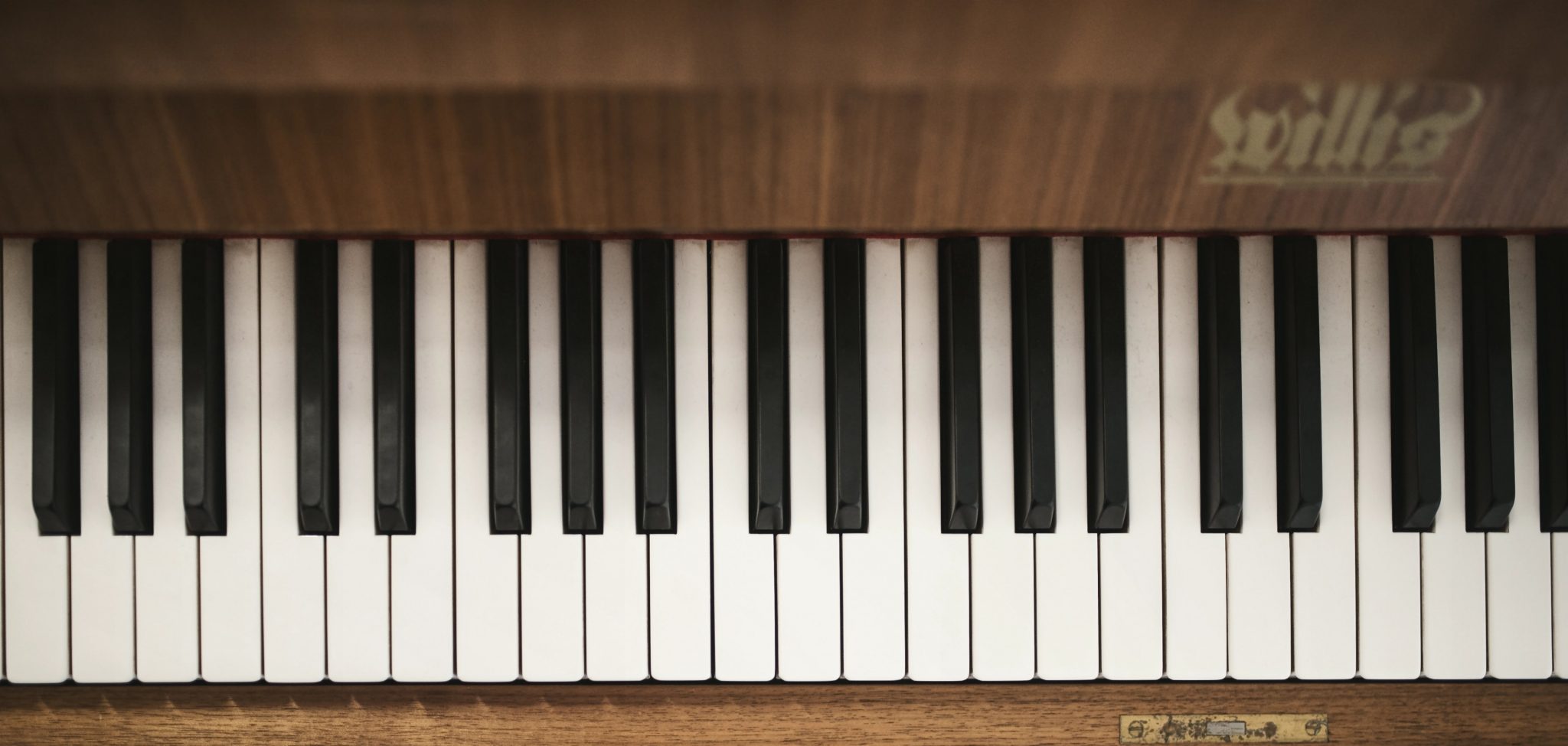
The “double-sized” black key to the right was the culprit! 1 However, notice that there sometimes is two white keys next to each other. (This will be important later.)
But this made me think: What if the logo looked like a piano?
Anyone Else Feel Like They Should Use Firefox
… but Still Struggle With It?
This post was originally (and still is) a forum post on the MPU forums. I have two concrete question blocks I’d love feedback on, which I will present during the post. I would love to hear from you, either over at MPU, as a comment to this post on Micro.blog, via Mastodon, or email. 🙂
I’d like to talk about browsers! And people are of course welcome to comment whatever they want — but some notes on what my intentions for this discussion are:
OK, let’s go!
Ethics are always difficult to discuss. Because while I think everyone should be mindful of the small things we should do to improve things, people have different priorities and possibilities. And where should we draw the line while consumers in a problematic system? Like, I should probably use a Fairphone over an iPhone even though it’s worse, right? How much worse should I accept? How hard should I pull away from things like Facebook or X?

Still, I’m at least trying to try — and as the browser is perhaps the most used app, the choice of it is among the things I’m thinking about.
