UniFi Wi-Fi for Noobs (Like Me)
Ubiquiti’s UniFi series is getting a lot of (deserved) hype these days. However, as the system is meant to scale all the way from a regular home to huge enterprise settings, the purchasing process can be perplexing. Recently, this got mentioned in one of my favourite podcasts, Hemispheric Views, where Andrew Canion said he didn’t even know how to buy it, let alone use it.1
As a noob that actually managed to buy some of this stuff myself recently, I thought I’d do my best to give a layman’s explanation. Because it’s easier than you think! My target audience for this is someone who just wants a “good mesh wi-fi setup for their home."
But first:
Why did I want to get into UniFi?
Last year, I moved from a tiny flat to a large house. And it turned out that the wi-fi that was there didn’t quite cut it.
And the main reason I went for UniFi, is the modularity. It’s a bit like the difference between having an iMac and a Mac mini + display. With the latter, you could keep the screen and upgrade the computer if needed. Or you could get a larger screen while keeping the computer. And UniFi works like this. In general, they’ve separated the parts of a wi-fi setup into separate devices.
In addition to this, the software experience is pretty smooth, the hardware quality is supposed to be good, and it doesn’t hurt that it looks good as well!
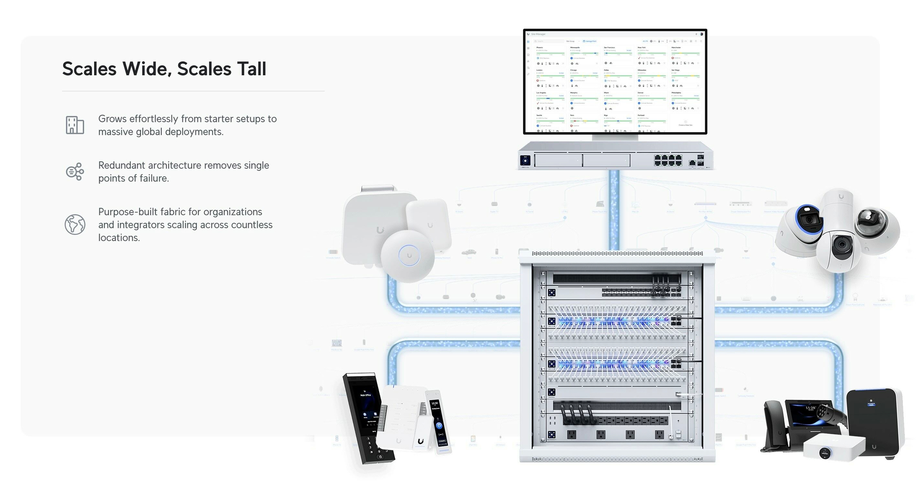
The pieces you need
There are three pieces you require to complete the UniFi puzzle. And these can be had at different levels, supporting different standards. For instance, ethernet ports are usually rated for 1 Gbps, 2.5 Gbps, or 10 Gbps. And Wi-Fi varies between Wi-Fi 5, 6, 6E and 7 — and also between 2.5 GHz, 5 GHz and 6 GHz bands.
1) The brain
Another Tiny Tahoe Travesty
Icon buffering
The lack of polish in the latest macOS version is just insane — from cut corners, to text going over other pieces of text, and weird HIG decisions.
But I wanted to point to a piece of terrible piece optimisation I haven’t seen mentioned (even though it probably has been):

When the Design Requirements Are Perfect
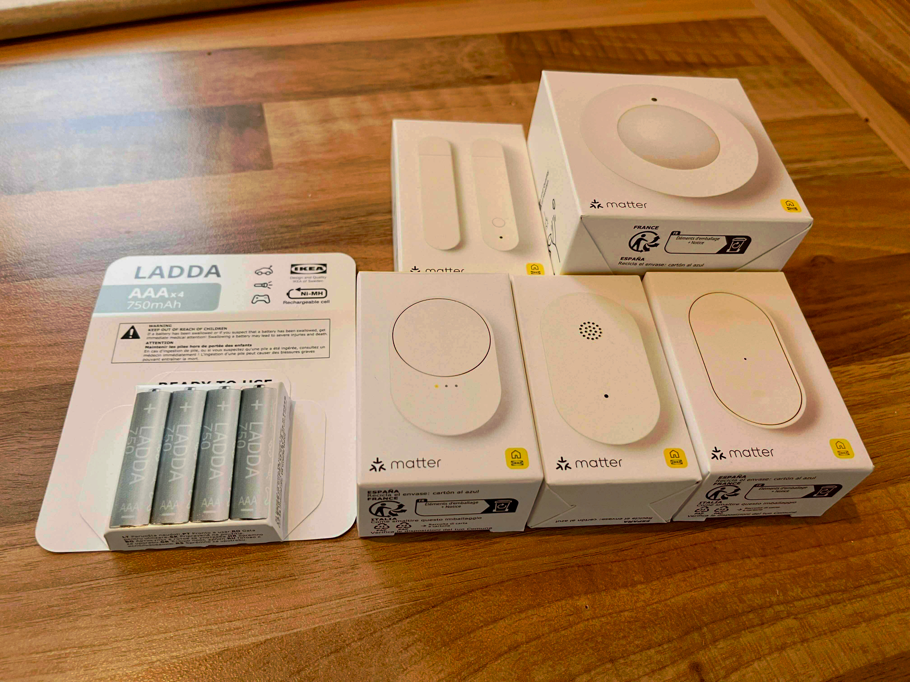
The New Smart Home Line From Ikea
I’ve always quite liked Ikea’s smart home gear, as they’ve felt like good value for the price. However, with their latest batch of products, which are in stores now, it seems like they’re moving up to becoming the first thing I’ll recommend to most people! You know, if they actually work as advertised — which I haven’t got the chance to test yet. But I have a couple of devices in hand, so I’ll get to that!
However, I just wanted to shout out that I looooove the design requirements that they’ve chosen when developing these:
Everything should …
- … be dirt-cheap
- … support Matter and have a Thread radio1
- … use AAA batteries
- … have a simple, sleek, and light design
Software Should Have a Customisable UI
Part 1
I’ve recently noticed how most of my favourite pieces of software have one thing in common: I can customise them — not only to be needs, but to my preferences. And I really think this should, and could, be more widespread.
And I know that some iPhone users, when they hear customisable UI, might think: “Pff, why would I want a million ways to make my UI ugly, like an Android phone, instead of having one beautiful way??” But I’m not really talking about looks here! (Even though I also think theming is great.) I’m talking about button placements, how things work, etc.
An example: My favourite mobile browser
Winter boots "for life"?
Not too long ago, I saw a thread over at r/BuyItForLife about winter boots. And as someone who likes the (even though often unrealistic) ethos behind that subreddit that’s also a Norwegian, I obviously have thoughts.
How cold is cold?
To be clear: Even though I live in Norway, I don’t live in the coldest parts. I also don’t stay outside for days at a time! If you’re working in the arctic, or something, you probably need something even warmer than what I’m about to recommend. But’ve had no problems with my boots, down to like -15 °C (5 °F).
The principles
While I will recommend some specific brands/models — the advice is generalisable:
- Materials: Leather uppers, rubber soles, wool on the inside*.
- The boots should be resoleable.
- They should also be unlined — so you can get wool socks and soles separate from the boots themselves.
- Get them pretty roomy!
- And you should get more than one pair.

Why those materials?
Yes — Please Include Fewer Chargers and Cables in the Box
(Oops, I forgot to hit publish on this one last week..!)
A detail about the new MacBook Pro in the EU (and also here in Norway, the UK, and Switzerland, even though we’re not in the EU) is that the laptop doesn’t come with a charger by default. The reason is a regulation that’s coming that says that companies like Apple need to provide users with the option not to get a charger.
But, still, amazing stuff continues to happen in Europe.
What I find amazing is how cleanly John Gruber is able to put 100% of the blame on the EU, and 0% on Apple, in cases like this… I assume the bad stuff1 he’s talking about here is EU users not getting a charger for free. But absolutely nothing is stopping Apple from doing just that in the EU as well! They only need to include an option of not getting the charger. Apple could even keep all the money from users selecting this option! (Nick Heer also points to a lot of bad coverage of this.)
I might be wrong, but I can’t remember Gruber chastising Apple for removing the chargers from iPhones, or more recently: the cable from AirPods Pro 3… And I agree with this! So, I’d rather focus on why I actually think all of these are good moves!
My optimal future
By default, I don’t think devices like this should come with any cables or chargers. But as part of the check-out process it should be trivial to add what you need — for instance with the MacBook Pro:
- Charging cable?
- None
- MagSafe
- 2 m USB-C
- 3 m USB-C
- Charger?
- None
- 70 W
- 96 W
- Colour?
- White
- Black
These should be sold at “bundle prices”, and be cheaper than if you were to buy them alone. In Apple’s case, this would also increase the amount of competition their chargers and cables face. So maybe they’ll stop being so inferior to third-party options.
Products also need clear markings for the minimum and maximum/optimal number of watts — so people don’t think their 5 W phone charger can charge their Mac.2