Design Challenge: 65% ISO Mac Keyboard, Usable by Everyone
I Want Your Opinion!
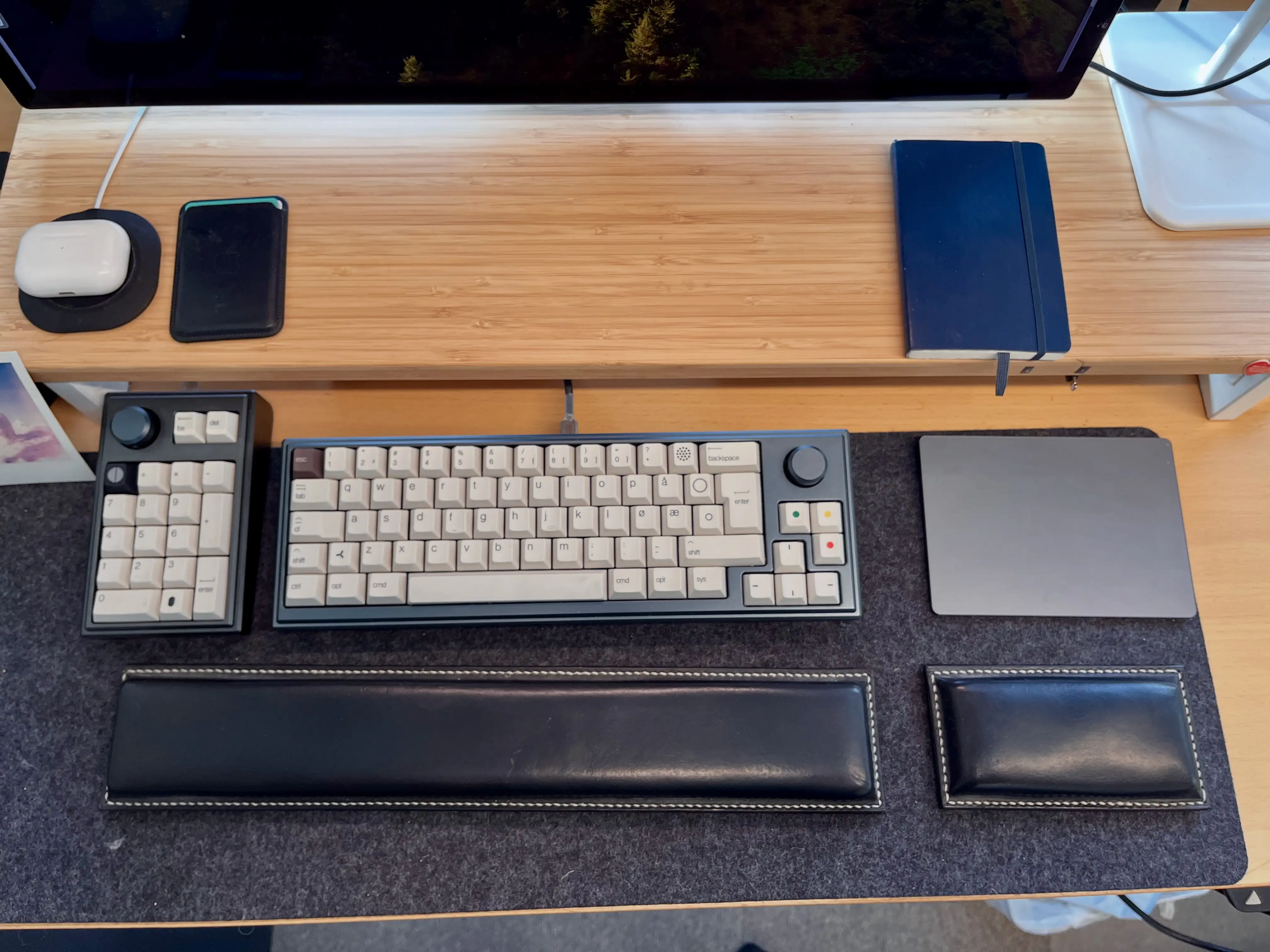
I like custom keyboards, and a couple of years ago, I made my own:
However, three things made this process harder/more expensive (at least at the time):
- I wanted a Mac layout, while most keyboards are made for Windows,
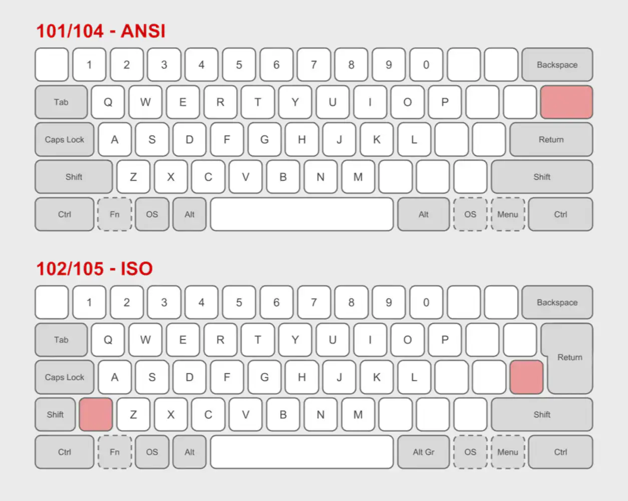
- I needed the ISO layout, while most keyboards has the ANSI layout,
- and the Norwegian layout is a subsection of ISO.
Enter: 3D printer
This spring, I’m moving from a tiny flat (in the city) into a large house (not in the city). And one of the things I’ll now get room for, is a 3D printer.1 And as someone who likes tinkering and soldering, I want to try to create a keyboard, perhaps hand-wired, in the style of the legendary Joe Scotto.
In time, I would like to make a split keyboard for myself. But before that, I wanted to try to create a more standard keyboard. And I thought a fun challenge would be to design:
A simple keyboard for my wife
This provides the following criteria:
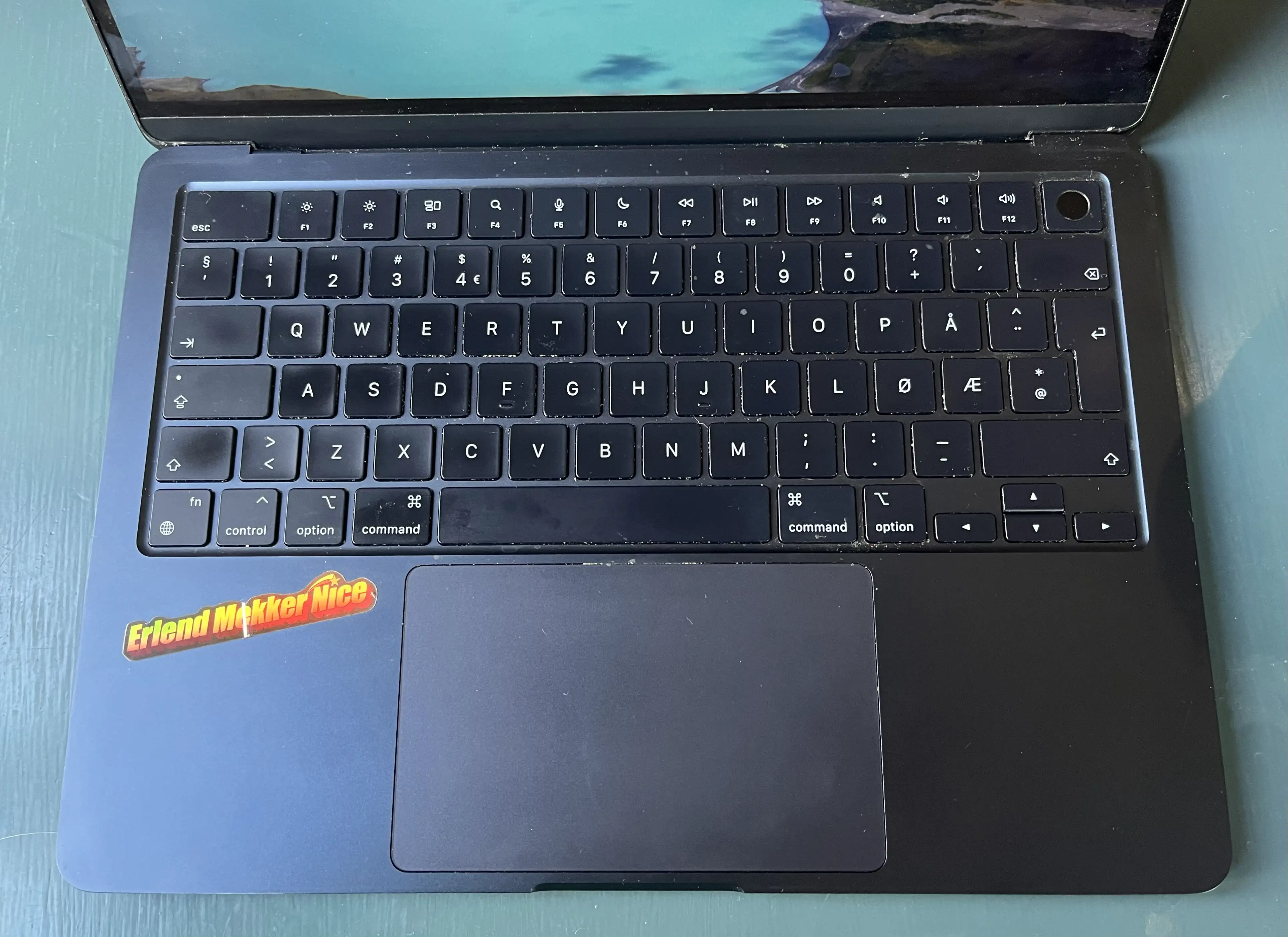
- Have all features (except Touch ID) that she uses on her MacBook Air. This includes:
- All letter, number and symbol buttons,
- arrow keys,
- escape,
- and brightness and sound/music controls.
- Be simple enough that she could just sit down and use it without any prior knowledge.
- I also want to try to not have a function row. So closer to a 65% than a 75%.
The main issue with having no function row, is the escape key. It needs to be the top-left button, but then the button we use for apostrophes (next to 1) needs to be moved somewhere. I solved it by moving it to the ISO-key between Shift and Z, which usually is < and >. And then I access those with a special modifier. However, this wouldn’t work for a keyboard that’s supposed to be instantly usable by everyone.
3D print everything
Luckily, by making it completely custom, including the keycaps, I can get more creative with the solutions. And I’ve landed on three different alternatives, that are all cursed in their own unique way. 🤗
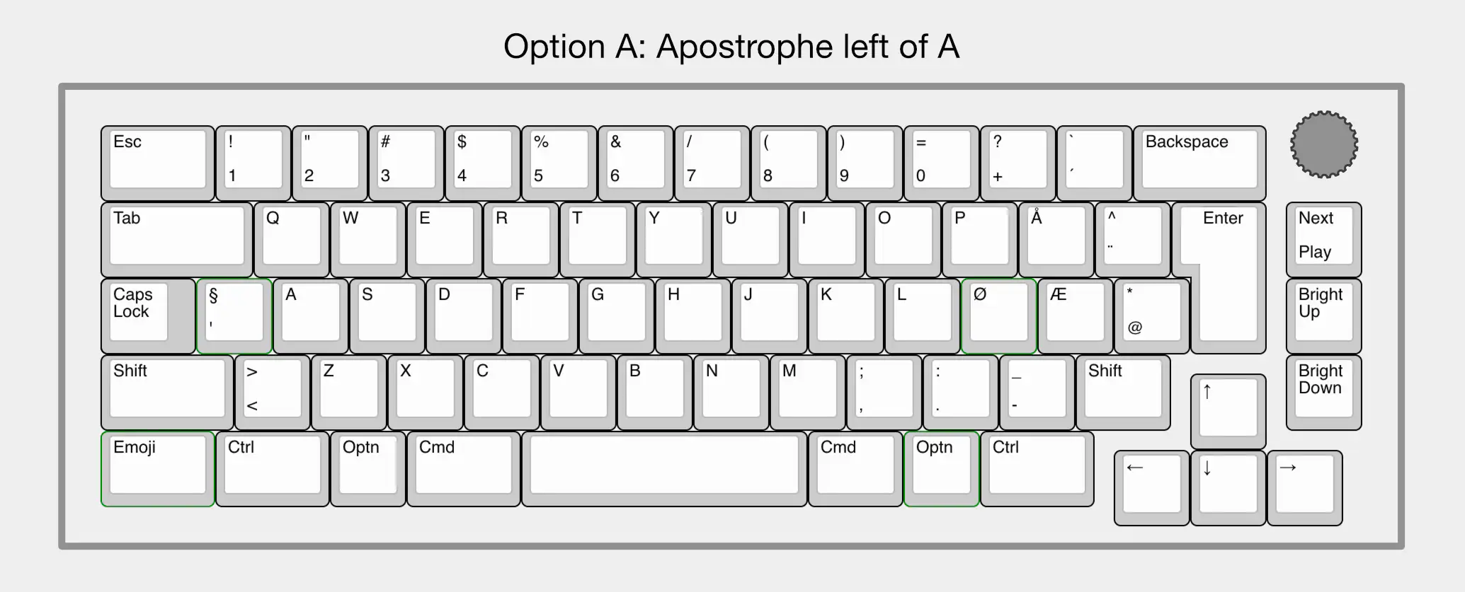
To get the function row functions, I’ve designed it with a rotary encoder top-right, that controls the volume (and mutes on click). Below this, there’s a button for play/pause (+Shift for next track, and +Optn for previous track) and buttons for brightness up and down.
- Option A moves the apostrophe button between Caps Lock and A. This looks the best IMO, but moves the button the furthest. It fits there because A is the button the furthest to the left (compared to Q and <>).
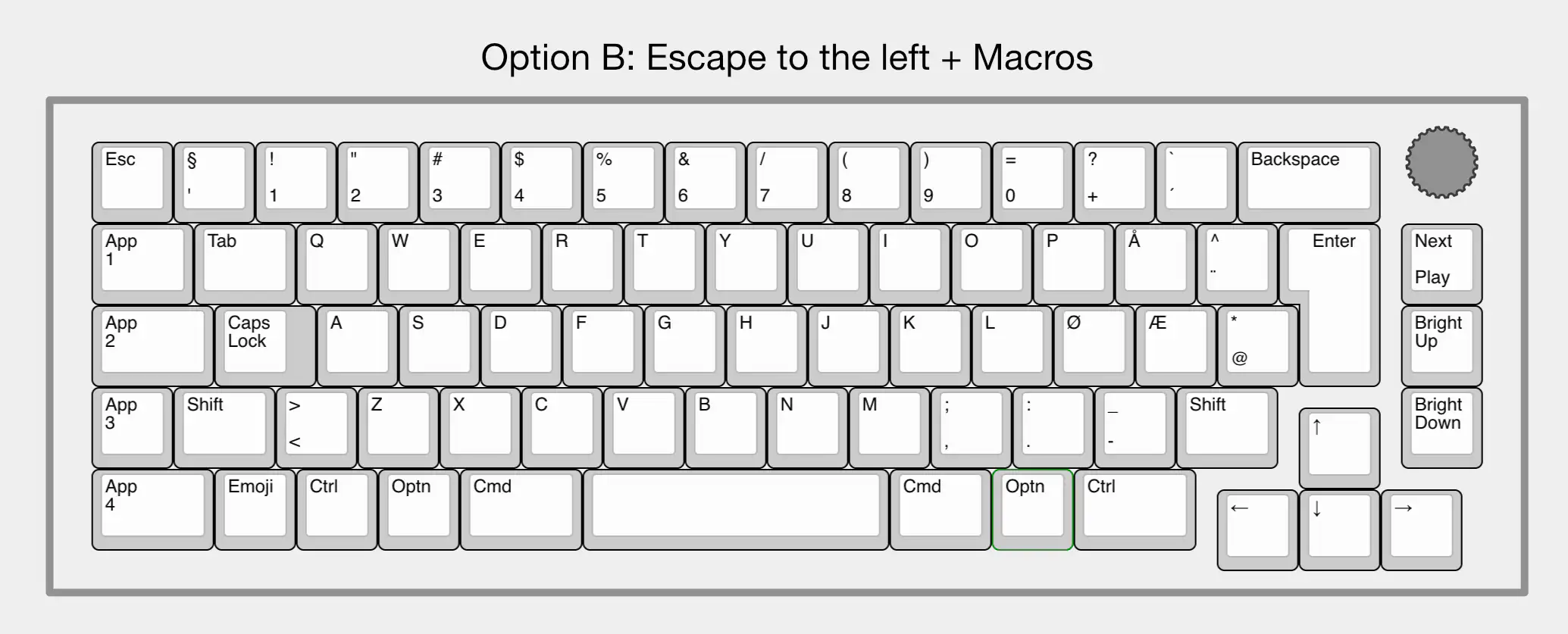
- Option B places escape to the left of the apostrophe button, and then adds some macro keys below this (I want to mark with App 1, App 2, etc.).
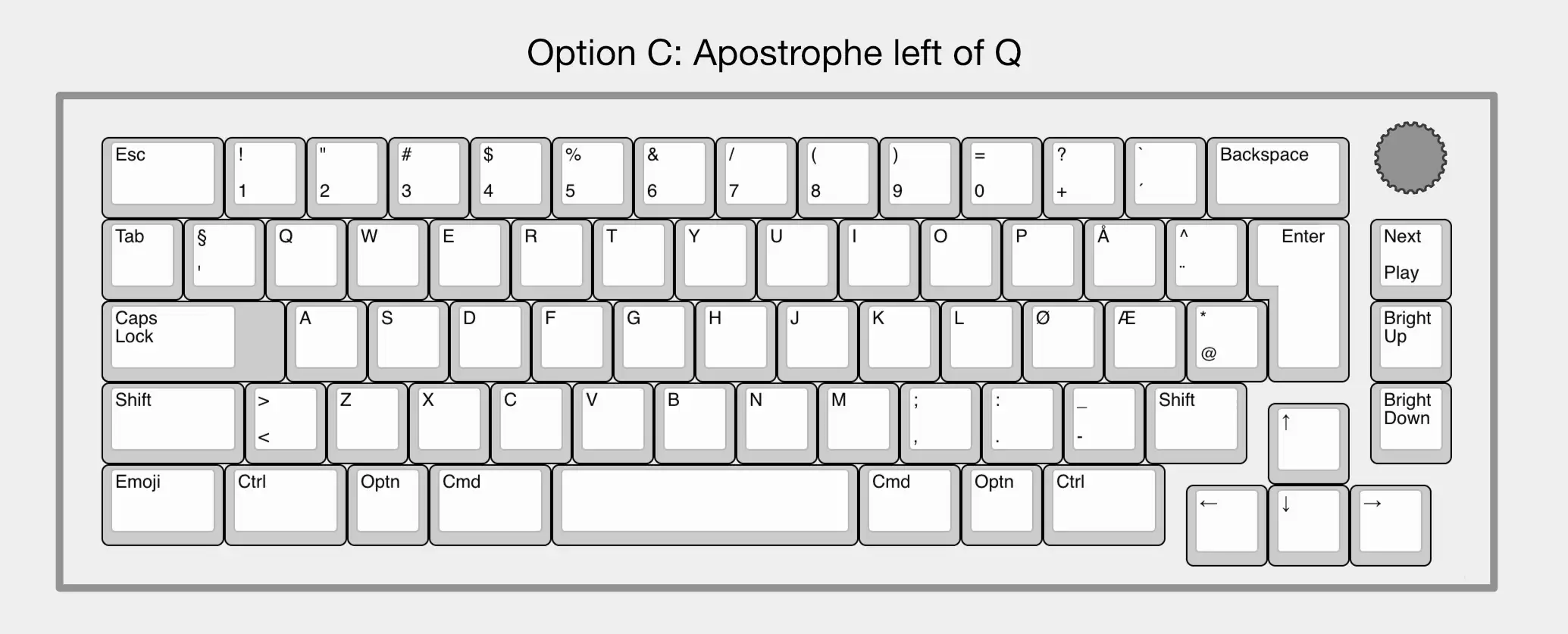
- Option C places the apostrophe button to the left of Q. I don’t mind that placement, but it creates a Tab key for ants and a Caps Lock key for elephants.
So, which one do you prefer?
Do you have any other ideas?
Would you be able to just sit down and use any of them?
-
I’m considering a Prusa CORE One. I like that it’s so open, and that it’s European. Would love to hear opinion on this as well! ↩︎
