Lenke til norsk versjon

There are tons of services, apps and clients for text based social media. But why are almost all of them wrong about timeline margins?

Out of touch Skinner-meme, with the text: «Am I wrong about timeline margins?» «No, it’s most apps who are wrong!»

To show what I’m talking about, here’s Threads as an example:

Screenshot of Threads. Point explained below.

I get that you want to start the text quite close to the username, and that avatars are taller than usernames on some services. But I still think that left-margin is a sin! It wastes space, and makes the entire screen lopsided.

I went through many apps checking - and many of the apps are good and well-designed in general! Many of them are Mastodon clients, because that service has a fantastic 3rd party ecosystem. Also, they’re all iOS apps, because that’s what I have. Would be interested to hear about the situation on Android!

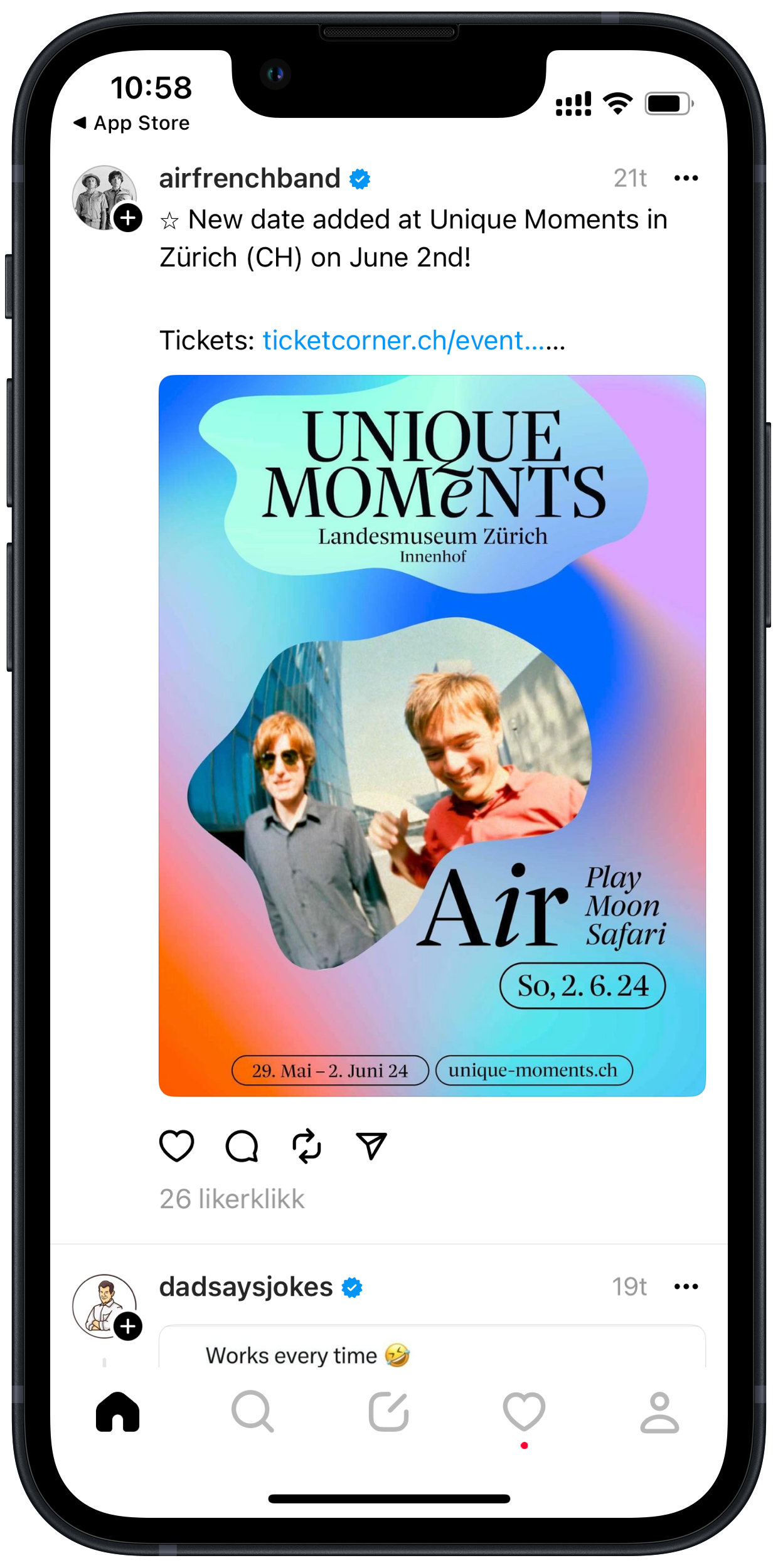
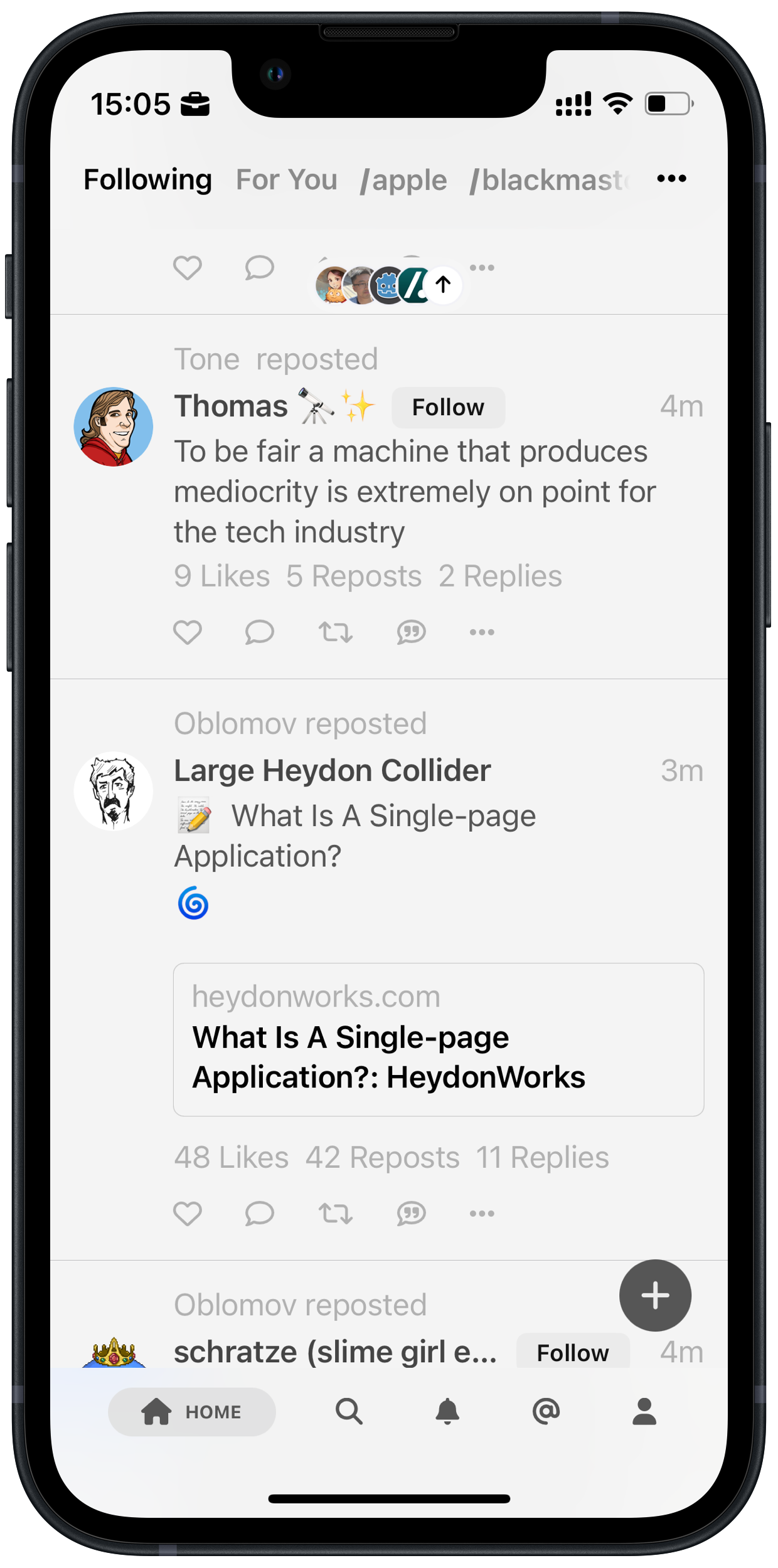
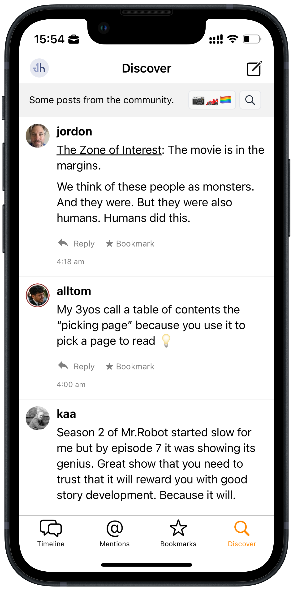
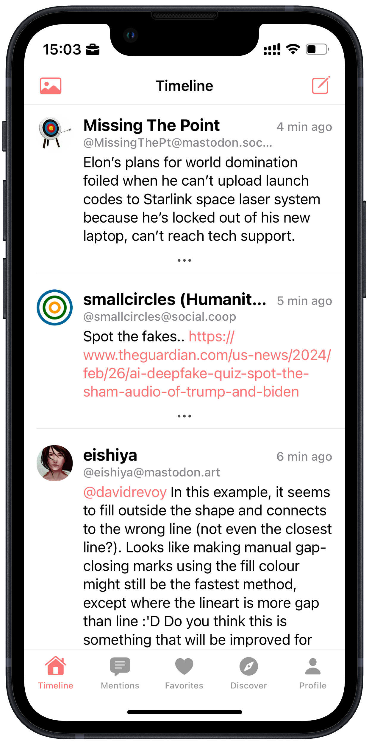
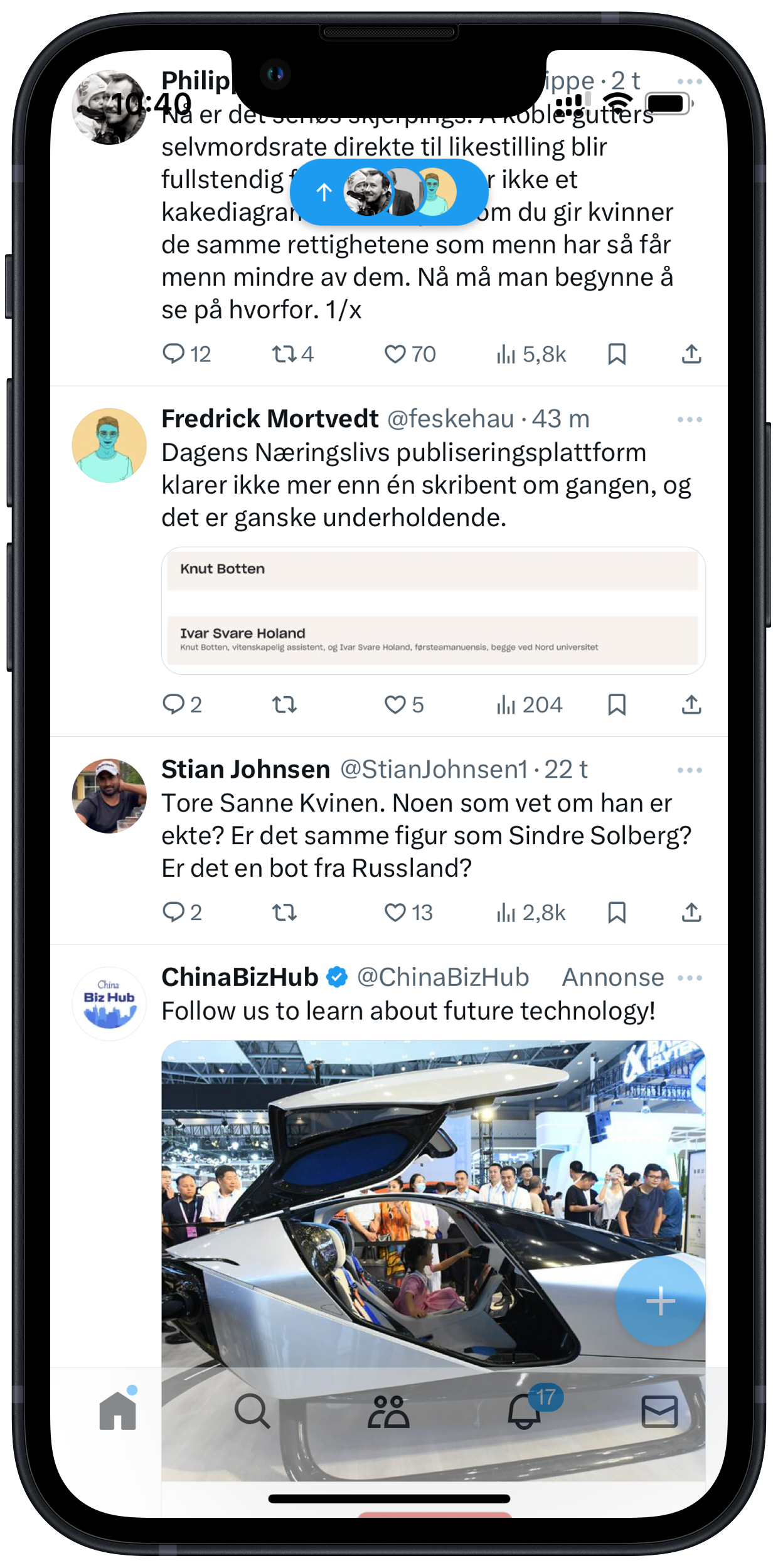
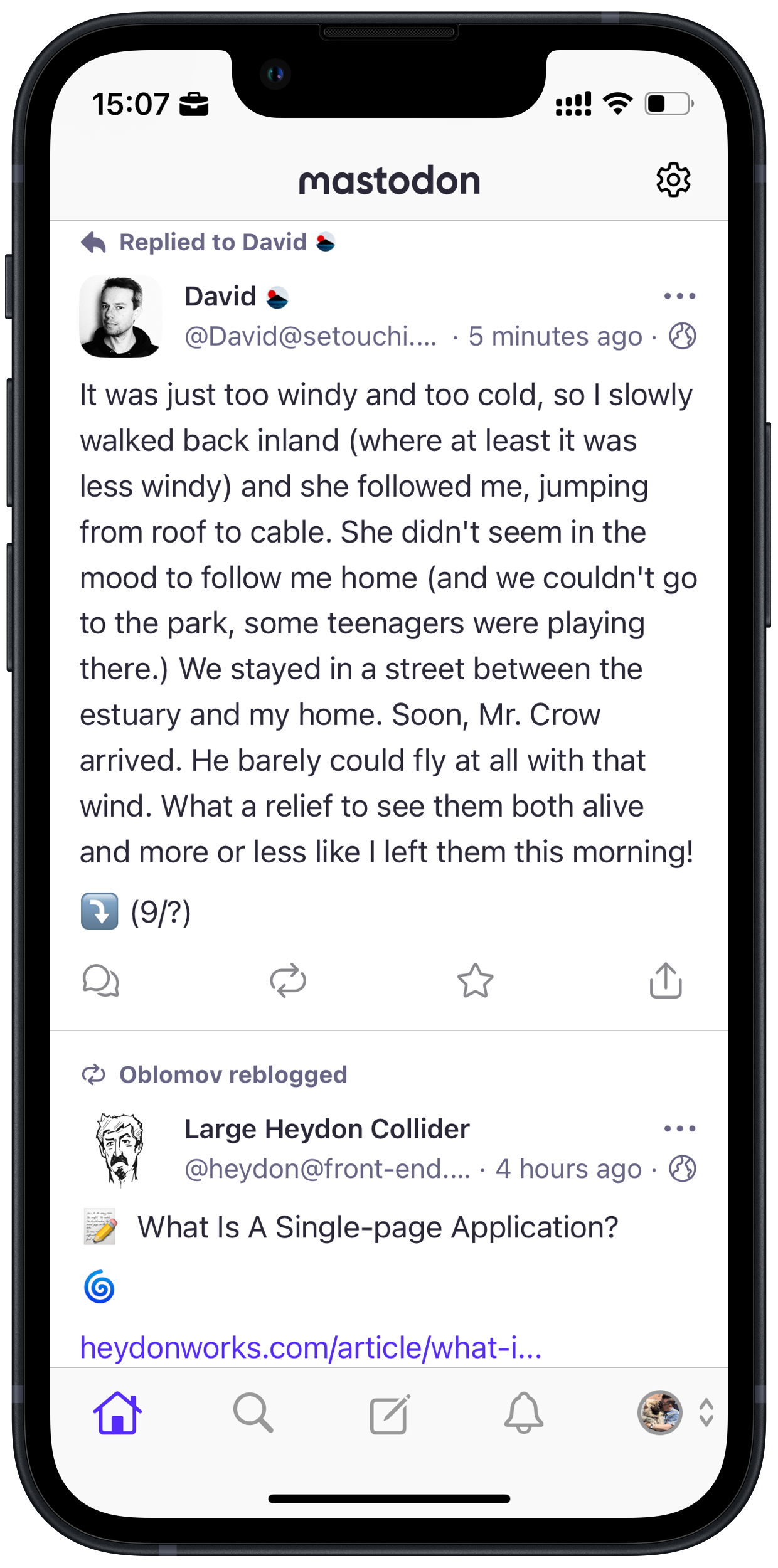
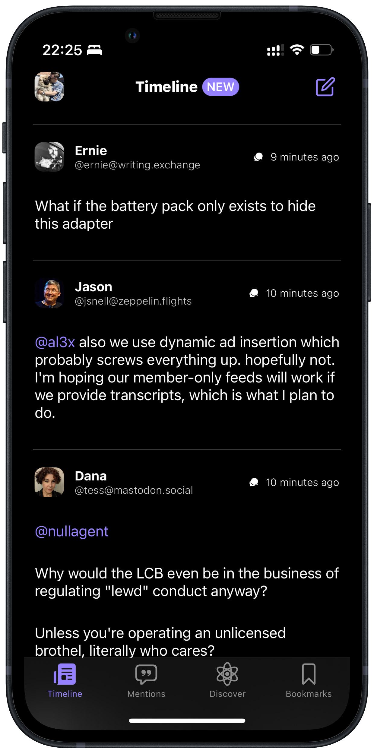
OK, here are some more offenders:

iOS screenshot of Bluesky. This, and all the following apps, have the large left-margin.
Bluesky
iOS screenshot of Mammoth for Mastodon.
Mammoth (for Mastodon)
iOS screenshot of Ivory for Mastodon.
Ivory (for Mastodon)
iOS screenshot of Toot! for Mastodon. This gets a little pass, as it uses the left margins in some clever ways.
Toot! (for Mastodon)
iOS screenshot of Phanpy for Mastodon.
Phanpy.social. Great web client for desktop as well! (for Mastodon)
iOS screenshot of elk.zone for Mastodon.
Elk.zone, another web client. Also great! (for Mastodon)
iOS screenshot of Micro.blog.
Micro.blog
iOS screenshot of Icro.
Icro (for Micro.blog)
iOS screenshot of X.
X is such a mess, compared to the other apps. One thing is the ads, but look at the bottom bar without blur and the messy transparency around the notch. 🤦🏻‍♂️

So, what do I deem the «correct» solution here?

The offical Mastodon app uses the space more effectively, and feels more balanced. Images also gets tons of space.
iOS screenshot of Mona. Same margins as the official, but images also have that margin.
Mona (for Mastodon) is another app with good margins - and I prefer that it has given some margins to link previews and images, as opposed to the official client.
iOS screenshot of Icecubes (for Mastodon)
Icecubes also has nice margins.

You can be flexible

If you look at these Threads screenshot, you can see that it sometimes uses the left-margin for showing that a post is a reply.
Two posts in Mona. One of them is a reply, so has the larger left-margin, while those who aren't keeps the small margins.
But Mona shows that you can do that, while not reserving the space all the time!
iOS screenshot of Gluon, showing it has balanced left and right margins, but has a large margin under the profile names.
Gluon (for Micro.blog) almost gets it right - but has added this weird margin under the avatar and profile names.

Dealing with avatars and usernames

All apps have three different pieces of user information (more or less) on the timeline:

  • Avatar
  • Display name
  • Username

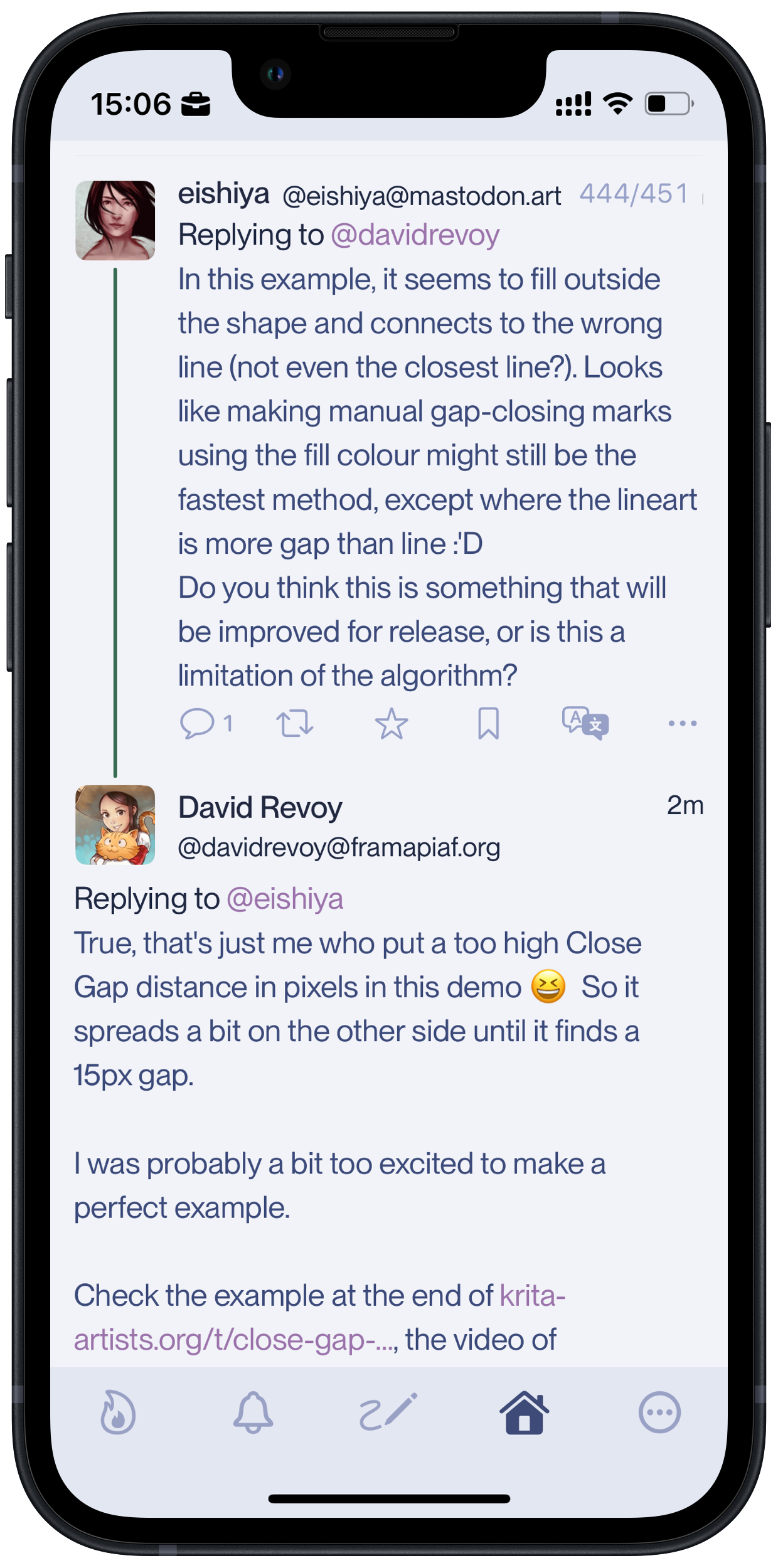
The avatars usually has a height of about two lines. And most of the apps who’s running large left-margins, either only shows one of the names (Threads, Mammoth, Micro.blog) or shows as much of the two names as they can fit on one line (X, Bluesky, Toot!).

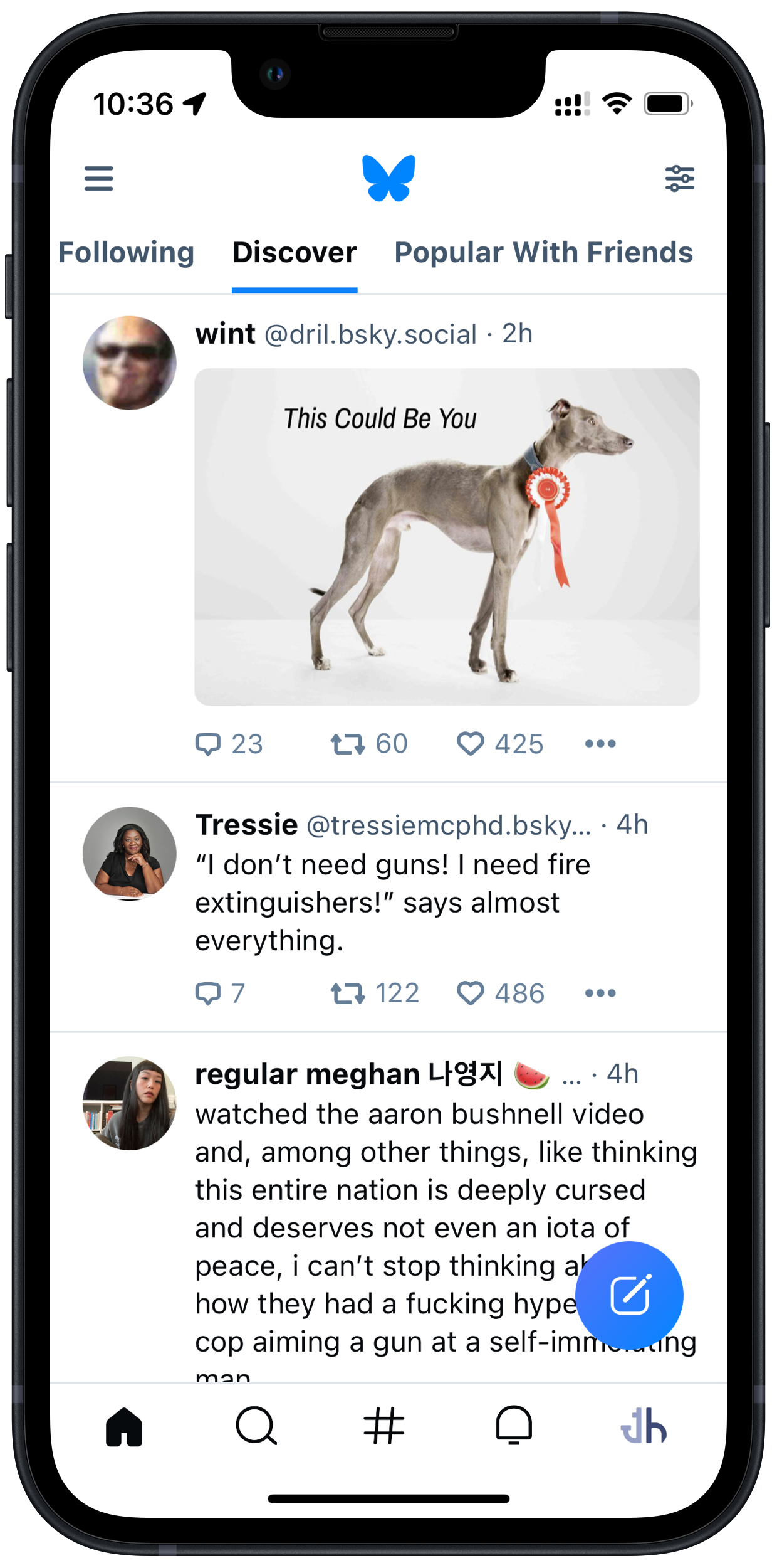
Let’s look at the Bluesky example again:

Same Bluesky screenshot again.

This shows three different outcomes: Both names fit, only some of the username fits, nothing of the username fits. I get that having them on one line allows the text to start higher up - but more than the little space you save, is then wasted in the left margin. So why not just have the names on two lines, like the aforementioned apps?

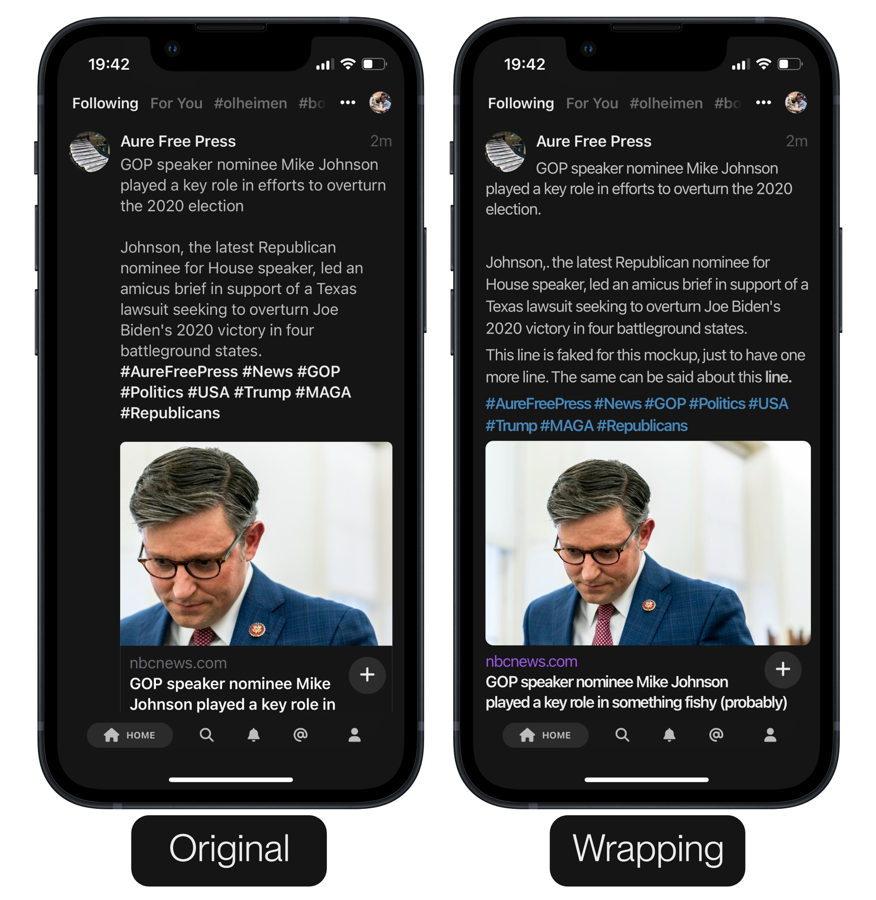
If you really want only one line for the name(s), I made this mockup for a cheeky solution where the text wraps around the Avatar: 1

Two screenshots of Mammoth: The original layout, with the large left-margin, and a mockup I’ve made. The latter has the same margins on both sides, and the first line of text wraps around the avatar.

I can’t be alone in finding the right alternative much more balanced? And I've filled in text to show that there's room for more.

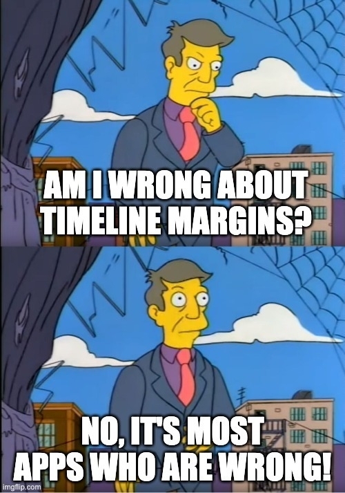
Am I missing something? Why have so many apps landed on having a much larger left-margin than right-margin? Is it just because most people use larger phones, and then the issue isn’t as pronounced?


  1. If a post is just an image, a gap would be made between its top and the name - but I think that’s OK. ↩︎