Technology
- … be dirt-cheap
- … support Matter and have a Thread radio1
- … use AAA batteries
- … have a simple, sleek, and light design
- Charging cable?
- None
- MagSafe
- 2 m USB-C
- 3 m USB-C
- Charger?
- None
- 70 W
- 96 W
- Colour?
- White
- Black
- They collect the revenue, and keep 30% of it.
- They then pay the rights holders 70%. Let’s call this the rights holders' share (RHS).
- They divide the RHS by grouping together all streaming on their platform — and if Taylor Swift had 1% of all streaming on the platform, she would get 1% of the RHS.
- How large is the RHS?
- How does the service balance increasing the revenue per customer and reaching more customers?
- How do they split the RHS among rights holders?
- What effect does the service have on artists, through AI, artist relations, etc.?
- And of course: Is the service owner someone you want to support or not?
- Lights
- Blinds
- Heating
- Main door lock
- Garage door
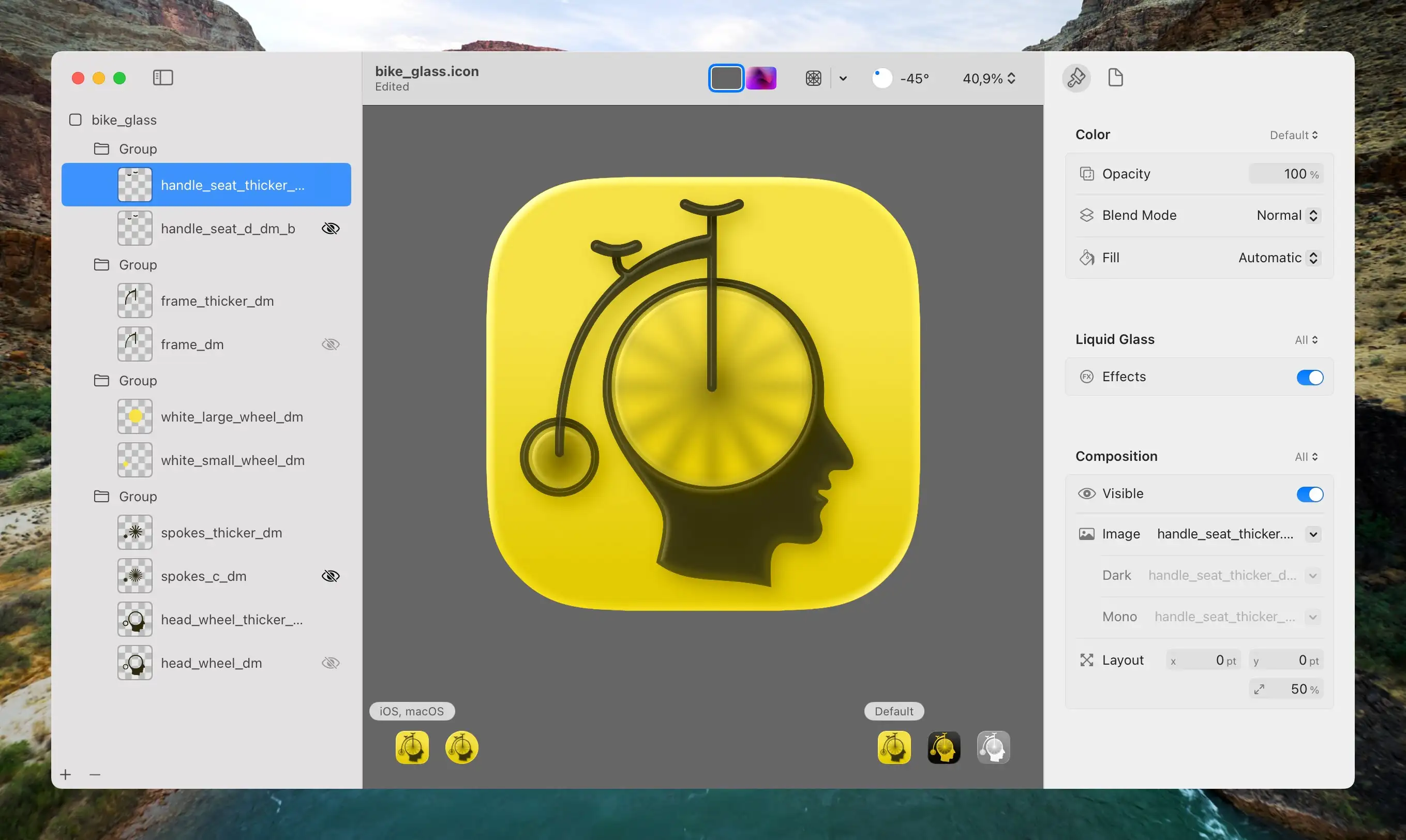
- I redrew all the elements (except the head) to make them thick enough so that the glass effect in Icon Composer would apply.
- Then I separated them into the maximum of four layers Apple allows:
- The spokes and wheels at the bottom,
- then a layer of transparent circles that blur the spokes,
- then the frame,
- and lastly, the seat and handlebar on top.
- Three sympathetic hosts, with great chemistry.
- Some Australian perspective in my life.
- The goal of the episodes being “a tight 45” (minutes).
- Great bits and running jokes. (For instance, their member program is called One Prime Plus. 😁)
- It’s not as useful and amazing as the salesmen claim it is. And overestimating it has its dangers.
- At the same time, it also does have plenty of very useful use-cases — and more to come.
- However, it being useful isn’t the same as it being a net-good, or that there aren’t very problematic consequences that need to be dealt with. (I wrote more about this here.)
The Norwegian Market Has Fixed the iPhone Air Pricing
iPhone prices on Apple.no (including 25% VAT, rounded up), that are not “fixed” are as follows:
| 17 Pro: | 16,000 NOK (€1,430) |
| Air: | 15,000 NOK (€1,340) |
| 17: | 12,000 NOK (€1,072) |
But prices from the “premium partner” (that runs physical “Apple stores” in Norway) has a different tiering:
| 17 Pro: | 16,000 NOK (€1,430) |
| 17: | 12,000 NOK (€1,072) |
| Air: | 10,500 NOK (€938) |
Now the comparison between the excellent 171 and the Air is something like this:
Artisanal Software
Like bread, tools, and clothes
My backpack is really, really nice.
I do like the size, the rooms and pockets it has, etc. But the main thing is the way it looks and, perhaps most importantly, the way it feels. The zip is super satisfying to use, and every piece of material just feels solid. Just interacting with it brings me joy. Every day.

I can’t really recommend it, though! It’s much too expensive for what it is, and it doesn’t carry your stuff any better than most backpacks. It’s a waste of money — but at least it’s money wasted on something that lasts.
So, it doesn’t do the things I need it to do better than the alternatives. However, it’s still worth it for me to love the things I use every day. I don’t write better on my keyboard than on a more standard keyboard. But it still brings me joy.
I think the same is true with software — but I fear we have to fight for the privilege of being able to use truly great software.
I Don't Think It Should Be Easier to Put Rat Poison in Baby Food
Last week, there was a news story about how someone has been putting rat poison in jars of baby food.
On Saturday, HiPP recalled its entire range of jarred purées sold in Spar supermarkets in Austria, saying consuming them may be potentially “life-threatening”.
(…)
The jar had apparently been tampered with, police said. Authorities believe at least one more poisoned jar is in circulation and have issued guidance on how to recognise tampered jars.
— From this BBC article
My hot take is that this is bad. But at least it seems like something that’s pretty hard to do! And that’s why I don’t think it would be great if someone developed and released a way to make putting rat poison in baby food much easier and at a large scale.1 Even if it (apparently) is technically possible today!
Yes, this is about AI
A Master Being Inspired by Another Master
Some people will look you dead in the eye, and say that “this video of a veteran Disney animator, sketching out what the Beast could look like in the style of Studio Ghibli” is exactly the same as “AI companies taking Miyazaki’s work and feeding it to their models”.
The iPad’s Biggest Problem Is That Only Apple Is Allowed to Solve the iPad’s Problems
iPadOS 26 was a popular release, as Apple solved* several of the iPad’s most glaring issues. However, the launch of the MacBook Neo has resurfaced various iPad frustrations — and reminded me of a thought I never got around to write about last summer: The one in the title.
For a long time, people had hoped for better window management on the iPad. And they had to wait because it couldn’t be solved by someone like Many Tricks. Podcasters rejoiced when Apple improved the audio routing options on the iPad because Rogue Amoeba had no way of doing it.
Now people are wishing for a clipboard history (that Spotlight on the Mac got this year) — and only Apple can deliver it. You can’t solve it through Paste or PastePal.
UniFi Wi-Fi for Noobs (Like Me)
Ubiquiti’s UniFi series is getting a lot of (deserved) hype these days. However, as the system is meant to scale all the way from a regular home to huge enterprise settings, the purchasing process can be perplexing. Recently, this got mentioned in one of my favourite podcasts, Hemispheric Views, where Andrew Canion said he didn’t even know how to buy it, let alone use it.1
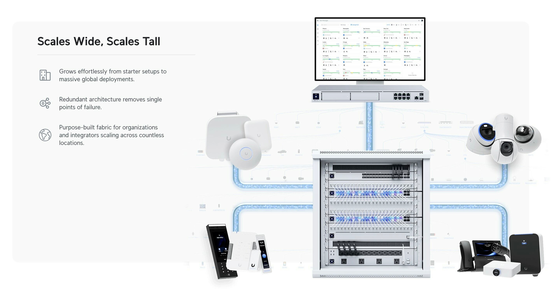
As a noob that actually managed to buy some of this stuff myself recently, I thought I’d do my best to give a layman’s explanation. Because it’s easier than you think! My target audience for this is someone who just wants a “good mesh wi-fi setup for their home."
But first:
Why did I want to get into UniFi?
Last year, I moved from a tiny flat to a large house. And it turned out that the wi-fi that was there didn’t quite cut it.
And the main reason I went for UniFi, is the modularity. It’s a bit like the difference between having an iMac and a Mac mini + display. With the latter, you could keep the screen and upgrade the computer if needed. Or you could get a larger screen while keeping the computer. And UniFi works like this. In general, they’ve separated the parts of a wi-fi setup into separate devices.
In addition to this, the software experience is pretty smooth, the hardware quality is supposed to be good, and it doesn’t hurt that it looks good as well!
The pieces you need
There are three pieces you require to complete the UniFi puzzle. And these can be had at different levels, supporting different standards. For instance, ethernet ports are usually rated for 1 Gbps, 2.5 Gbps, or 10 Gbps. And Wi-Fi varies between Wi-Fi 5, 6, 6E and 7 — and also between 2.5 GHz, 5 GHz and 6 GHz bands.
1) The brain
Another Tiny Tahoe Travesty
Icon buffering
The lack of polish in the latest macOS version is just insane — from cut corners, to text going over other pieces of text, and weird HIG decisions.
But I wanted to point to a piece of terrible piece optimisation I haven’t seen mentioned (even though it probably has been):

When the Design Requirements Are Perfect
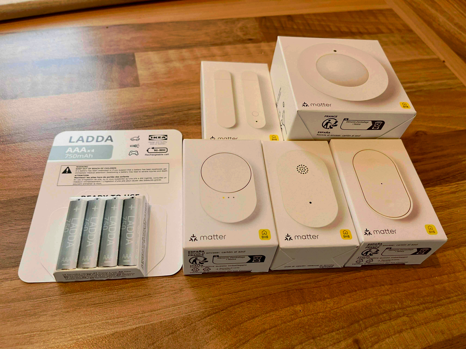
The New Smart Home Line From Ikea
I’ve always quite liked Ikea’s smart home gear, as they’ve felt like good value for the price. However, with their latest batch of products, which are in stores now, it seems like they’re moving up to becoming the first thing I’ll recommend to most people! You know, if they actually work as advertised — which I haven’t got the chance to test yet. But I have a couple of devices in hand, so I’ll get to that!
However, I just wanted to shout out that I looooove the design requirements that they’ve chosen when developing these:
Everything should …
Software Should Have a Customisable UI
Part 1
I’ve recently noticed how most of my favourite pieces of software have one thing in common: I can customise them — not only to be needs, but to my preferences. And I really think this should, and could, be more widespread.
And I know that some iPhone users, when they hear customisable UI, might think: “Pff, why would I want a million ways to make my UI ugly, like an Android phone, instead of having one beautiful way??” But I’m not really talking about looks here! (Even though I also think theming is great.) I’m talking about button placements, how things work, etc.
An example: My favourite mobile browser
Yes — Please Include Fewer Chargers and Cables in the Box
(Oops, I forgot to hit publish on this one last week..!)
A detail about the new MacBook Pro in the EU (and also here in Norway, the UK, and Switzerland, even though we’re not in the EU) is that the laptop doesn’t come with a charger by default. The reason is a regulation that’s coming that says that companies like Apple need to provide users with the option not to get a charger.
But, still, amazing stuff continues to happen in Europe.
What I find amazing is how cleanly John Gruber is able to put 100% of the blame on the EU, and 0% on Apple, in cases like this… I assume the bad stuff1 he’s talking about here is EU users not getting a charger for free. But absolutely nothing is stopping Apple from doing just that in the EU as well! They only need to include an option of not getting the charger. Apple could even keep all the money from users selecting this option! (Nick Heer also points to a lot of bad coverage of this.)
I might be wrong, but I can’t remember Gruber chastising Apple for removing the chargers from iPhones, or more recently: the cable from AirPods Pro 3… And I agree with this! So, I’d rather focus on why I actually think all of these are good moves!
My optimal future
By default, I don’t think devices like this should come with any cables or chargers. But as part of the check-out process it should be trivial to add what you need — for instance with the MacBook Pro:
These should be sold at “bundle prices”, and be cheaper than if you were to buy them alone. In Apple’s case, this would also increase the amount of competition their chargers and cables face. So maybe they’ll stop being so inferior to third-party options.
Products also need clear markings for the minimum and maximum/optimal number of watts — so people don’t think their 5 W phone charger can charge their Mac.2
Why?
But Did They Have to Make the iPhones Ugly?
In general, I have to say that the tech on this year’s iPhones seem pretty good! But I’m a little bummed out by the fact that it seems like they’ve given up on making them look nice.
Are they just thinking, “People will throw these in cases anyway — who cares?"1 ?
Previous iterations of Apple have also missed the balance between design and functionality — but in the other direction. And let me say that I do prefer them not putting design over everything!
But do you remember posts like this?
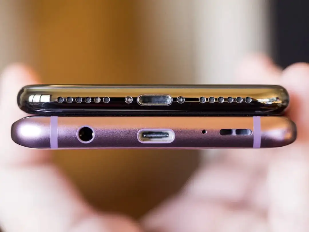
This 11-year-old Reddit post pointed to Apple’s care when it came to the details. It even mattered to them the way the ports were placed beneath the phone.
I really don’t like the new backsides…
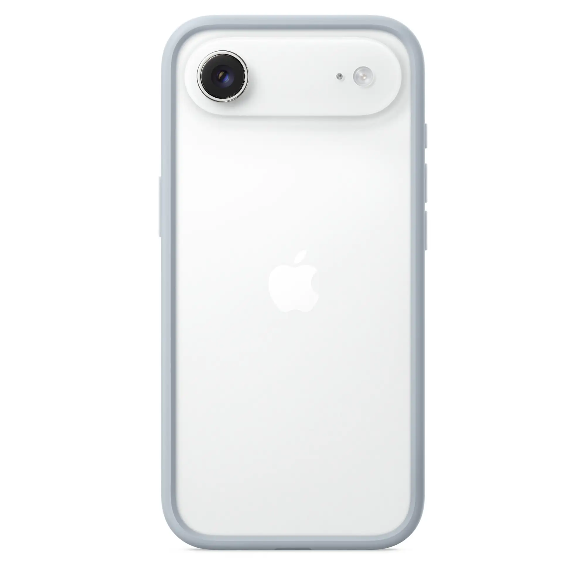
The iPhone’s Camera Plateaux™️ have always been inelegant. So I was glad that the plan this time was to make them larger. (I’m also one of those who dislike table wobble…)
But I think they missed the mark on both the Air and Pro — in slightly different ways.
Air:
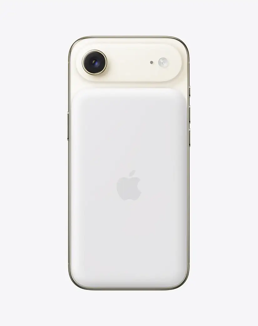
When it comes to the air, I don’t like how the camera bar doesn’t have the same curvature as the phone’s corners. I think this image, with the battery pack, shows this well, as you can see that the battery pack does match the body.
(Yes, it does match the camera’s perfect roundness — but that’s not the choice I’d make.)
With the battery pack, you also get non-matching corners “bumping” up against each other. (Heck, if you insist on having the round corners on the camera bar, I’d consider having the top corners of the battery pack match those instead of the top of the phone.)
Apple used to really care about corners…

Pro:
PLEASE Stop Evaluating Streaming Services Over How Much They Pay Per Stream
*Taps the Sign (Again)
Today I saw this video, that has a premise I really like: A tier list of different music streaming services, mostly based on ethics.
However, this reinvigorated my annoyance with the over-reliance on the payment per stream metric.
Check out my grand idea for music streaming here.
And also check out what I've written about streaming payment previously here.
The most straightforward reason for why this metric is useless is that that’s simply not how the deals with the music streaming companies work. At all. It’s not like there’s a set payment per stream (that’s lower on Spotify than Tidal), and if my band got streamed twice as much next month we’d earn twice as much.
Every streaming service I know of does just about what Spotify does:
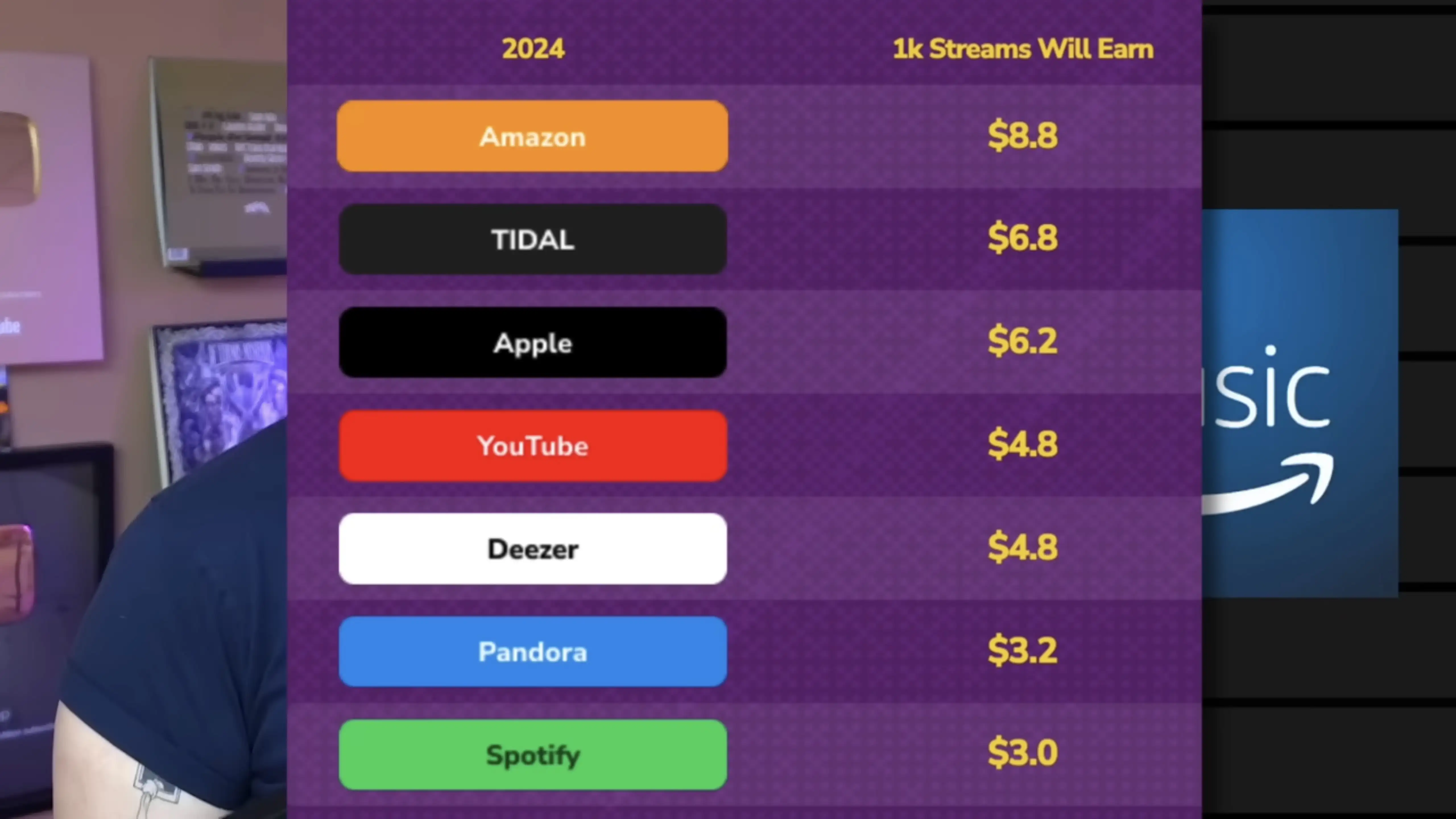
I get that it’s a metric that makes sense to people. But that doesn’t beat out the fact that it doesn’t reflect the reality.
Here’s what I, both as a user and artist, want to know when evaluating services:
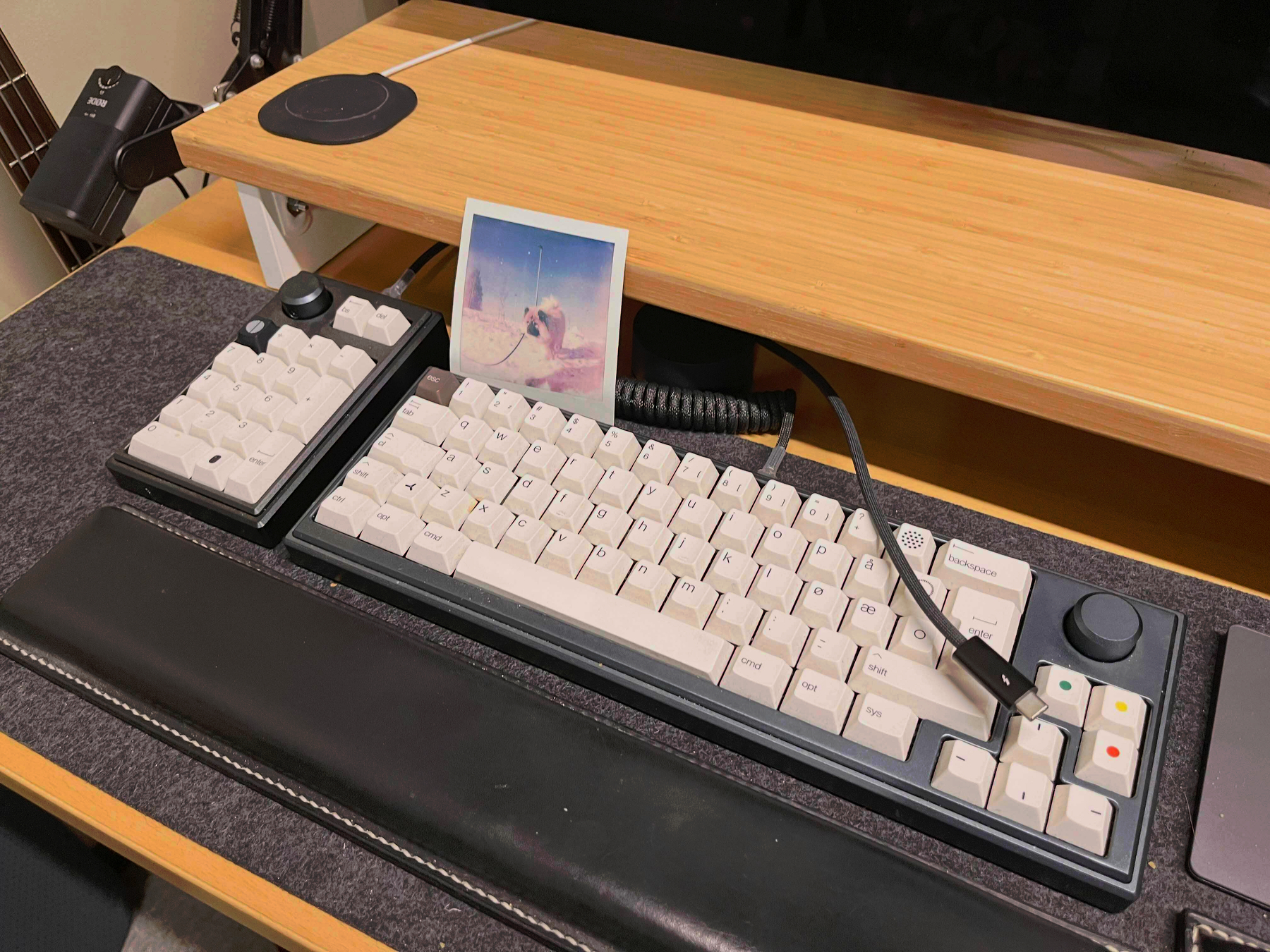
Oh No, I Think I Might Have to Move to Home Assistant
And Other Major Life Changes
The last few months have been pretty wild… In April, my wife and I moved out of our tiny Oslo flat (41 m²) into her childhood home. This is a large (for us) 290 m² house in a smaller town. On the first night in the new house, with things pretty up in the air, our first baby decided he wanted to be born 3.5 weeks ahead of schedule. He’s a lovely guy! But it’s fair to say moving, renovating, selling a flat, and taking care of a bundle like that, is pretty intense — hence why I haven’t written the last few months.
I do want to refrain from posting a lot of our son online — but hopefully saying that his name is Alfred, and posting the pretty anonymised photo below is OK ☺️:

I got to make the house smart 🫶🏻
As part of the deal of us moving to «my wife’s» house and hometown, we agreed that I was allowed to make the house smart. Not that she was that difficult to convince, as she doesn’t find a smart home annoying. Especially if I manage to follow my own principle: Smartness should always be in addition to regular functions. There should always be a button to toggle a light — and then you can add smarts on top.
The current plan is to have the following be smart:
Playing With Icon Composer and the Bike Icon
One of my favourite apps to use, is Bike Outliner by Jesse Grosjean/Hogbay Software. It’s simply delightful through-and-through.
He’s hard at work on a really promising 2.0, and I wanted to play with Apple’s new Icon Composer. So I wanted to see if I could contribute and adapt Bike’s icon to the new style.
Not optimal
The original Bike icon (which I don’t love as much as the app itself) isn’t optimal for this style. If you look at Apple’s documentation, it’s especially clear to see that it’s easier to get a nice result with few largish objects you can layer.
Also, I’m absolutely not a designer. But I did my best to create:
A first draft
One thing I’ve thought about the original icon, is that the spokes on the wheels are many and small. On the sizes where the icon is actually used, this makes them blur into each other. However, this isn’t necessarily something negative. (And I know Jesse likes it.) To me, it gives an impression of the bike being in motion.
Here’s what I did:
Quick Recommendation #10: Hemispheric Views (Podcast)
Episode 137 Is the Perfect Place to Get Into the Most Charming Tech Podcast
Some reasons why Hemispheric Views is one of my favourite tech podcasts:
I can recommend last week’s episode, 137: I Had a Pi in the Drawer, as a good place to start! It’s both accessible and gives a good impression of the show. And as I’m a bit late to posting this, you’ll then also have this week’s episode ready if you want another one immediately.
I also recommend following the hosts:
Don't Chop Up Your Apple Trees to Make Barrels for Your Apples
The CEO of The Browser Company, the company behind the Arc browser, recently posted a lengthy Reddit post. He explained why they’ve abandoned Arc, and discussed a bit about their plans going forward.
They’ve made a huge pivot to an upcoming AI browser they’re calling Dia. But I just wanted to comment on this, very stupid, approach, from the portion about what makes an “AI browser” different:
1. Webpages won’t be the primary interface anymore. Traditional browsers were built to load webpages. But increasingly, webpages — apps, articles, and files — will become tool calls with AI chat interfaces.
They really don’t see the major flaw in this approach?
The AI models are completely worthless without training data,1 which they scrape from webpages. If people don’t visit webpages, the incentives to create the content disappears. What do they think this will do to the quality of the “tool calls” over time?
“Hmm, we need some barrels for all of these apples we just picked from our orchard… I got a great idea! The trees are worthless now, without apples – so let’s just chop them down and use the wood to make the barrels. I’m sure this won’t have any ramifications for the future.”
The Single Piece of AI Legislation I'd Start With
One Simple Rule
I know that creating laws is very hard — especially at a global scale.1 And figuring out what to do about the rise of AI is the same. But I have an idea about where I’d start, that I would love to spitball.
My opinion regarding generative AI is currently something like this:
My suggestion…
… for the first rule is quite simple (in concept):
It must be easy to find out if a piece of content is part of a model’s training data or not.
Locked-In-O-Meter: iPhone Edition
I use several Apple devices. This is partly because I like them, and partly because I think they’re more worthy of my support than (for instance) Microsoft and Google.
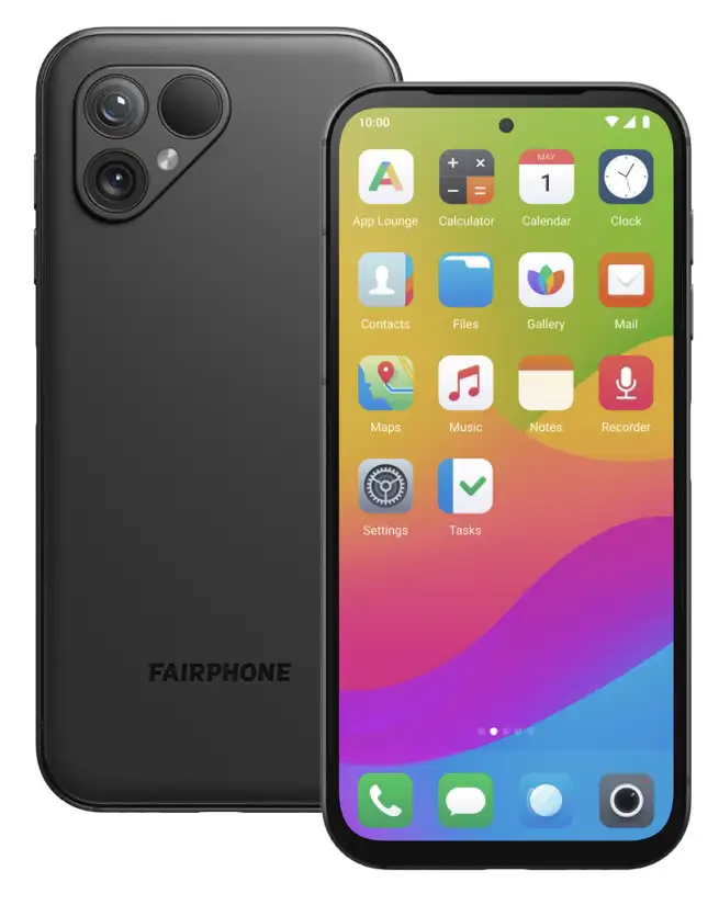
However, Apple is doing their best to invalidate that second point. I’d also love to be able to support cool companies, like Framework and Fairphone.
So, I want to examine: How locked-in would I rate myself? Starting with the iPhone.
And I’m not just talking about being locked-in for nefarious reasons. I’m also talking about things I simply prefer about having an iPhone.
Hardware
I do like my current iPhone 13 Mini – and also my wife’s iPhone 15 Pro. However, from a hardware perspective, I would have zero issues moving to something else instead.
I’d either buy a Fairphone (the 5 has been out for a while, so interested in seeing what they do with the 6th version), or maybe a flip phone of some kind 🖇️. I think that’s the logical next step for a Mini Phone Person like myself.
Especially as long as my wife has access to a good camera, I’m not very picky about my phone hardware.
Accessories
Raycast for iOS Is Out
A Companion to My Favourite Mac Launcher
Raycast 🖇️ is one of my favourite parts about using a Mac. It’s a great launcher, that I also use for snippets, window management, searching, setting a bunch of hotkeys (like for shortcuts), and more. It’s also my main window to AI tools, and the only AI subscription I have.
I’m working on a full post on how I use Raycast – but now I just wanted to share that the iOS version is out.
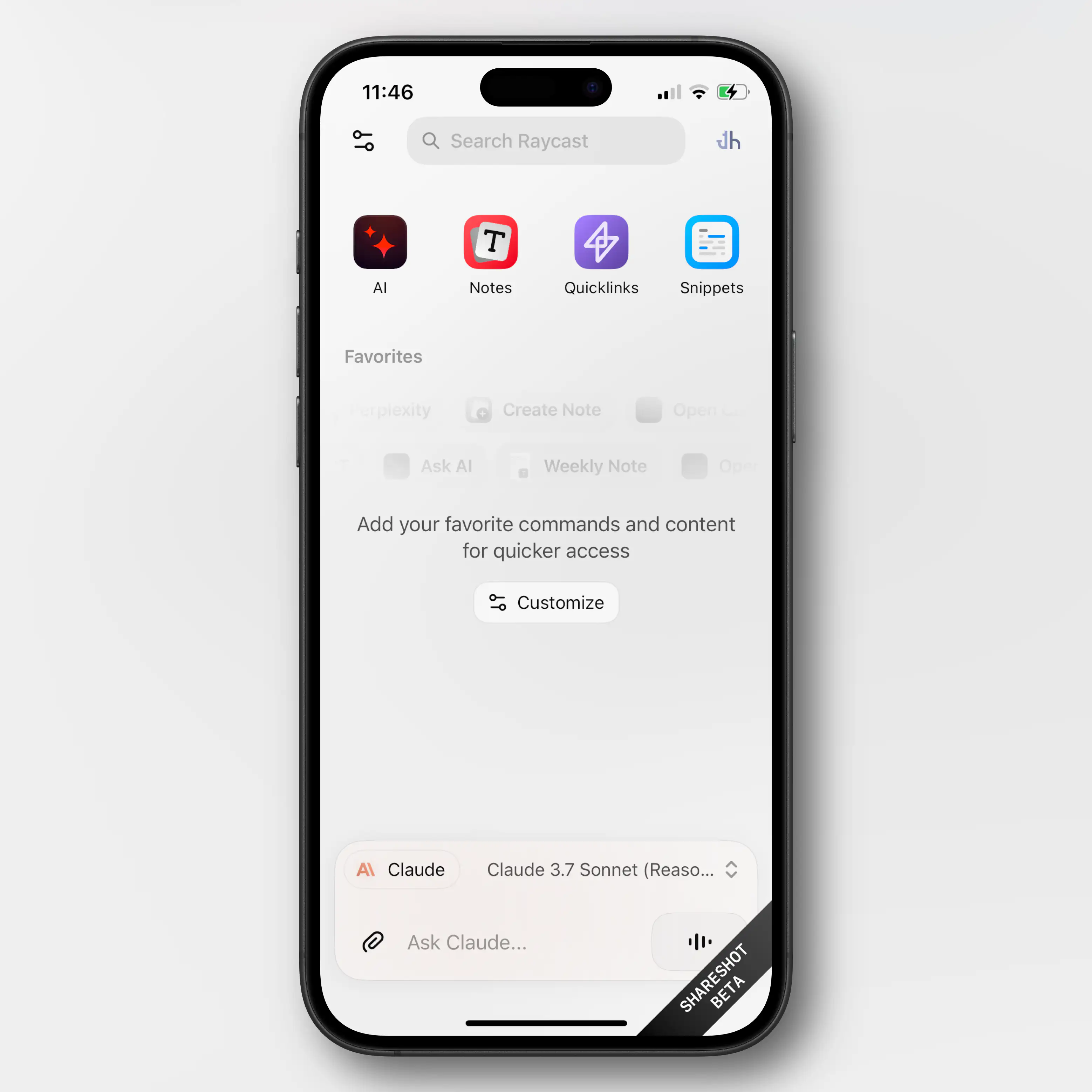
Obviously, very limited (thanks Apple)
Most of what Raycast does on the Mac is, obviously, not even close to allowed on iOS. So this new app is mostly just a companion for the Mac app.
Raycast did a large overhaul of their notes feature in november – and if you’re a user of this (which I’m not) having access to them on mobile is nice.
You also get access to your snippets and “quick links” (which I don’t use either).
But the thing I’ll use the iOS app for, is access to my AI chats. Not only does it sync the conversations from the Mac, I’ll also be able to use all the premium models I’m paying for. This greatly increases the value of my Raycast subscription.
As I don’t pay directly to any AI vendor, I’ve been using only free options on mobile. I don’t use AI chat that much, and even less on mobile, so I’ve been content enough with Mistral’s Le Chat.1 But having access to all of Raycast is a large upgrade here.
An (Imperfect) Solution for USB-C Devices Without PD
You Know, Those Who Need USB-A on the Other End
I just listened to the latest episode of the Upgrade podcast. It was Myke Hurley’s first episode after his parental leave – and as someone who got my first child less than a week ago, the episode obviously resonated with me.
I intend to write a bit about some baby tech – but here I just wanted to throw out a quick recommendation for an annoyance Myke brought up.
(Click here to jump straight to the solution!)
USB-C is great – but also a lie
The good thing about “everything” being USB-C, is that every cable fits into every socket. However, the problem is that you suddenly don’t always know if things will work. For instance, what’s the maximum amount of charging a cable can give? And when do you need a Thunderbolt cable? And how can you tell what a cable is?
In the Upgrade episode, Myke mentioned another issue: If the USB-C device doesn’t include everything that’s needed for USB-C Power Delivery, the USB-C cable might need to be USB-A on the other end.
For instance, this is the case with the, otherwise great, Anbernic RG35XX_ 🖇️ retro hand-held. If I connect it to my 140W charger, with a powerful USB-C to USB-C cable, it gets “scared” (because it doesn’t have the smarts to ask for less power), and doesn’t want to charge. However, if it senses a USB-A on the other end, it knows that it can’t draw too much power, so it “dares” to charge.1
This is nothing but poor design from the device maker, as giving it the necessary smarts is both cheap and easy – but it’s still something one encounters from time to time.
The most obvious solution …
… is to simply buy a USB-A charger that you then use for those specific devices. And this is what Myke said he had done, for the multiple baby tech devices needing special treatment. But then you need to both have a custom cable for these devices and a custom charger. (By “charger” I mean the actual charging brick, not including the cable.)