I Tried to Design an Icon for Zen – My Favourite Browser
I’m one of those who really likes the Arc browser. But at the same time, I’m quite worried about Google’s web hegemony (and the general trajectory of The Browser Company) – so I want to use and like Firefox/a Gecko browser. Sadly, I just don’t think Firefox is very good…
I get that Mozilla has a lot of things going on, and that creating a browser engine is a lot of work. But I really wish they prioritised having a focused team that's allowed to just working on making Firefox nice.
However, I’ve used Zen as my main browser for the last six months – and I’m pleased with it! (By the way, click here, to go straight to the new icons.)
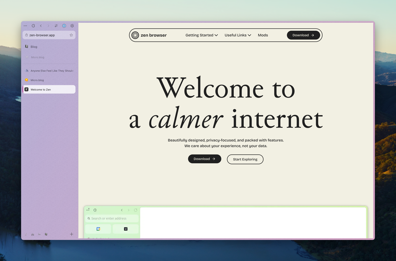
In short, it’s a Firefox fork, that has copied a lot of the things I like about Arc – like vertical tabs, split-views, workspaces, and nice padding 🤤. It also has some original ideas – and my favourite one takes advantage of the great customisability offered in Firefox:
Zen Mods
You can easily install, and adjust the settings of, community created mods. These are mostly little tweaks, like themes, having the close button on the left side (and hidden without hover), cleaner extension menu/right-click menu/navigation bar, etc.
I really like that the browser is enjoyable out-of-the-box, but that I can still customise a lot to my liking.
But be aware: It is alpha software.
This means that not everything is polished, and that things change quite frequently. But, as mentioned, I’ve used it as my primary browser for six months, and I’ve still liked it more than most browsers.
One of the things that has just changed is the graphical profile, logo, and icon.
I like the direction and idea – but I don’t love the execution
The profile used to be harsher and more based on black and white – and with a Z logo. Now everything is a bit more chill, which fits the name better.

I assume the circles are meant to represent zen garden patterns – that sometimes come in circles:

Even though I’m not a designer, I tried my best to create a logo/icon, based on the same idea.
And these are the goals that I had:
- Have the circles be of consistent thickness, as this appears to be more common when it comes to the zen patterns.
- Add some more depth, to give a more sand-y vibe.
- (But as I know that Zen has to only ship one version of the icon, it can’t be too detailed – as it must also work in small sizes.)
- Have versions for the 10 accent colours you can choose in Zen. (And light and dark versions of each.)
- Try to make it a bit less generic.
The last one is especially difficult, as “a bunch of circles in a quite minimalistic style” isn’t the easiest to differentiate…
Here’s my best try:


Desktop icons
As this is just an early proof-of-concept, I just made it for my two favourite accent colours: A light blue, and a dusty pink. (Oh, and remember that you’ll probably watch the images much larger than they’ll be in use.)


All icons, for Mac, PC, and Linux, can be found through this Dropbox link, if you want to try them out.
Would love to hear feedback if anyone has any!
And, have you tried Zen for yourself? I greatly recommend it, or (the terribly named) Floorp, if you want something nicer than Firefox, but still see the value in bumping up Gecko market share.