Playing With Icon Composer and the Bike Icon
One of my favourite apps to use, is Bike Outliner by Jesse Grosjean/Hogbay Software. It’s simply delightful through-and-through.
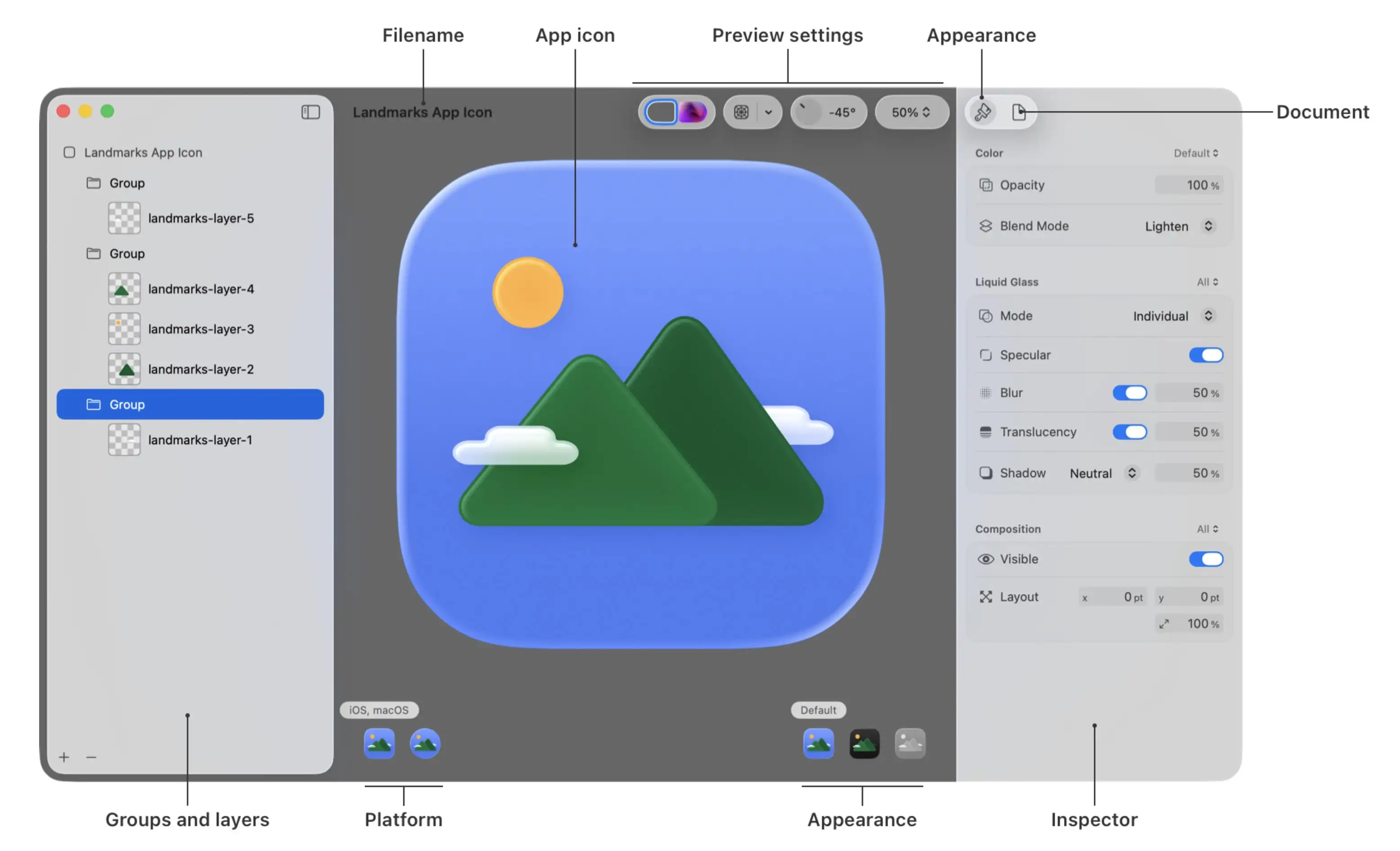
He’s hard at work on a really promising 2.0, and I wanted to play with Apple’s new Icon Composer. So I wanted to see if I could contribute and adapt Bike’s icon to the new style.
Not optimal
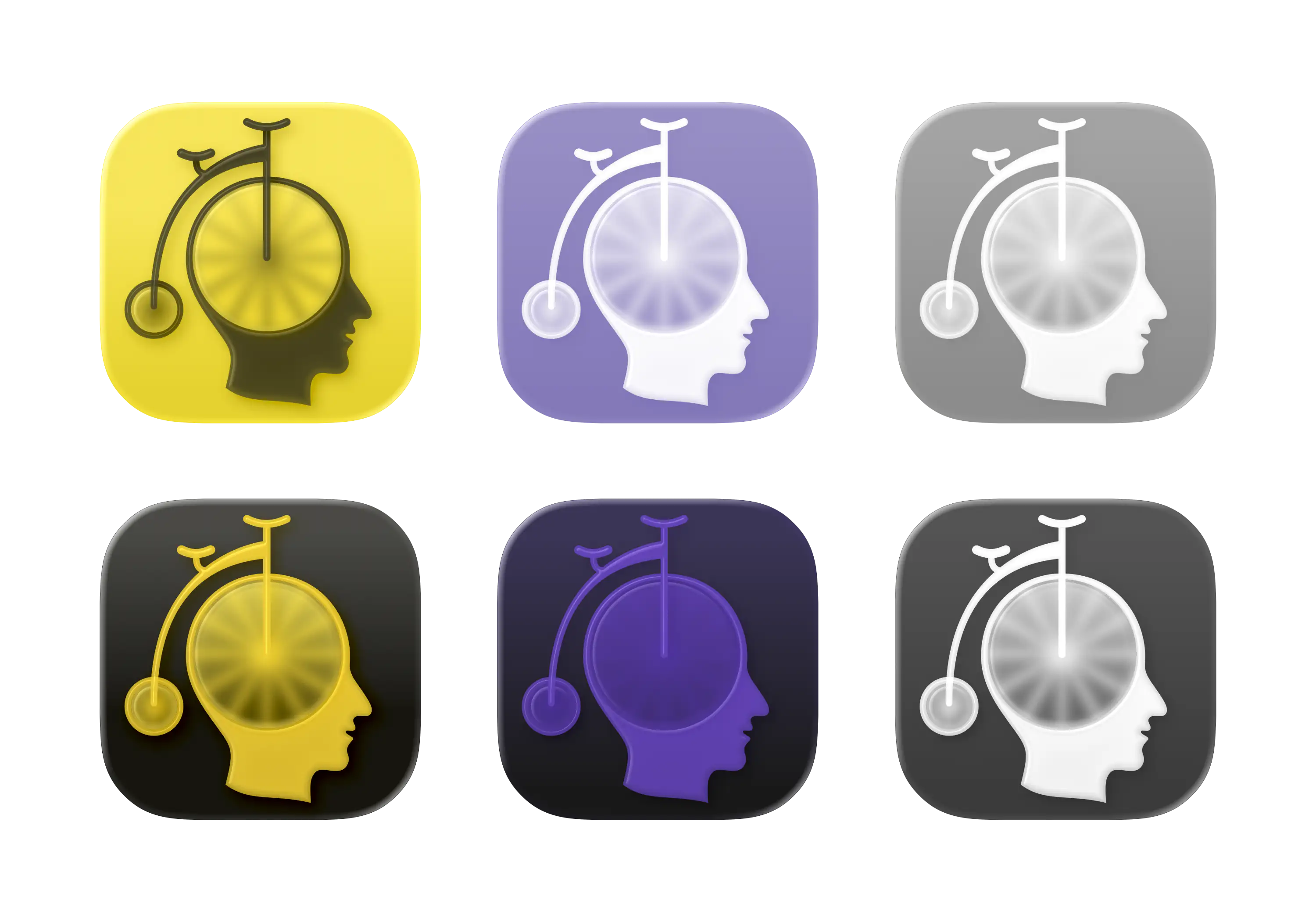
The original Bike icon (which I don’t love as much as the app itself) isn’t optimal for this style. If you look at Apple’s documentation, it’s especially clear to see that it’s easier to get a nice result with few largish objects you can layer.
Also, I’m absolutely not a designer. But I did my best to create:
A first draft
One thing I’ve thought about the original icon, is that the spokes on the wheels are many and small. On the sizes where the icon is actually used, this makes them blur into each other. However, this isn’t necessarily something negative. (And I know Jesse likes it.) To me, it gives an impression of the bike being in motion.
Here’s what I did:
- I redrew all the elements (except the head) to make them thick enough so that the glass effect in Icon Composer would apply.
- Then I separated them into the maximum of four layers Apple allows:
- The spokes and wheels at the bottom,
- then a layer of transparent circles that blur the spokes,
- then the frame,
- and lastly, the seat and handlebar on top.
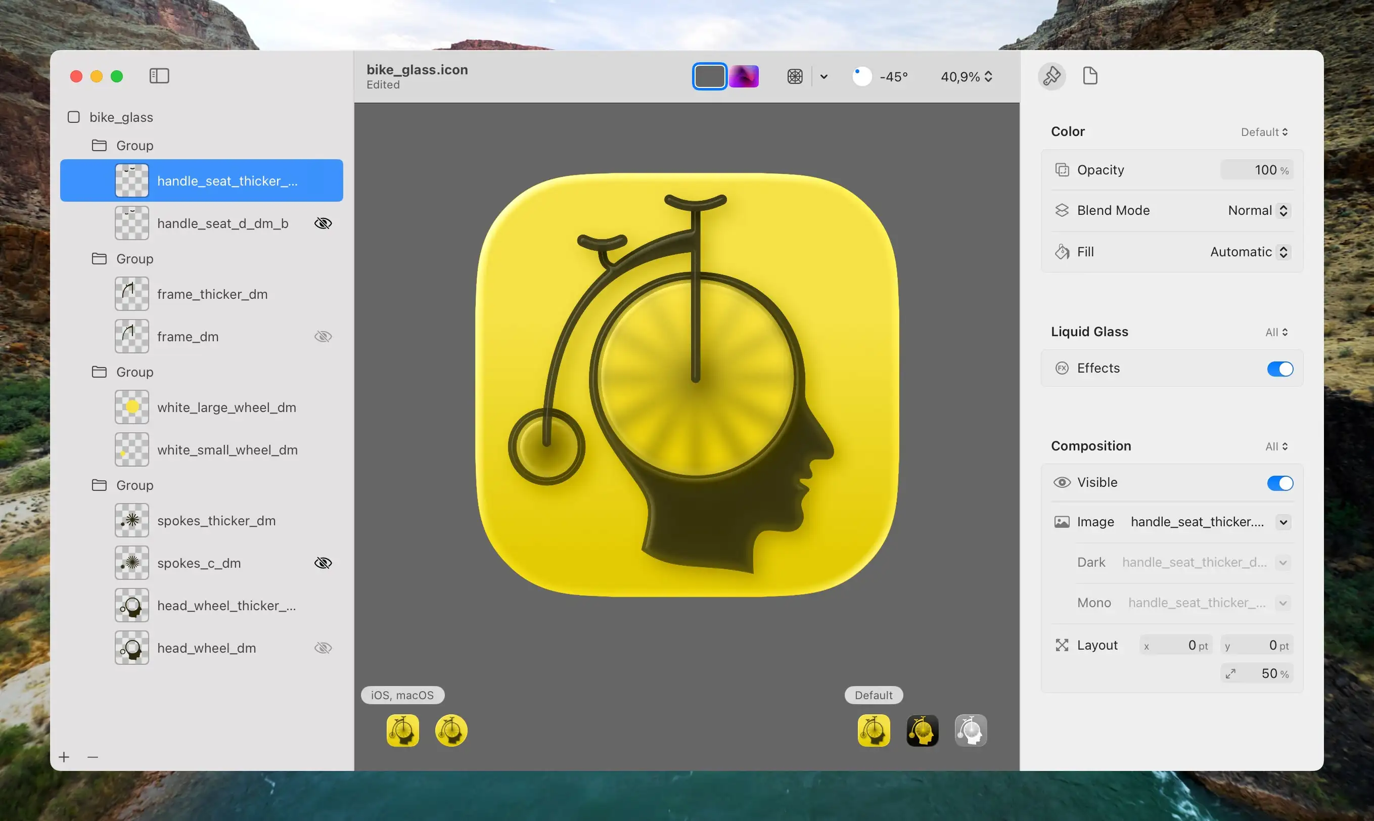
For some reason, the large wheel looks less blurred than the small one — even though they are on the same layer with the same amount of effect. I wish I could separate them (the small wheel looks better with slightly less blur) — but only four layers are allowed…
The same issue was annoying with an earlier version (that I also quite like), where I had some circles behind the spokes instead:
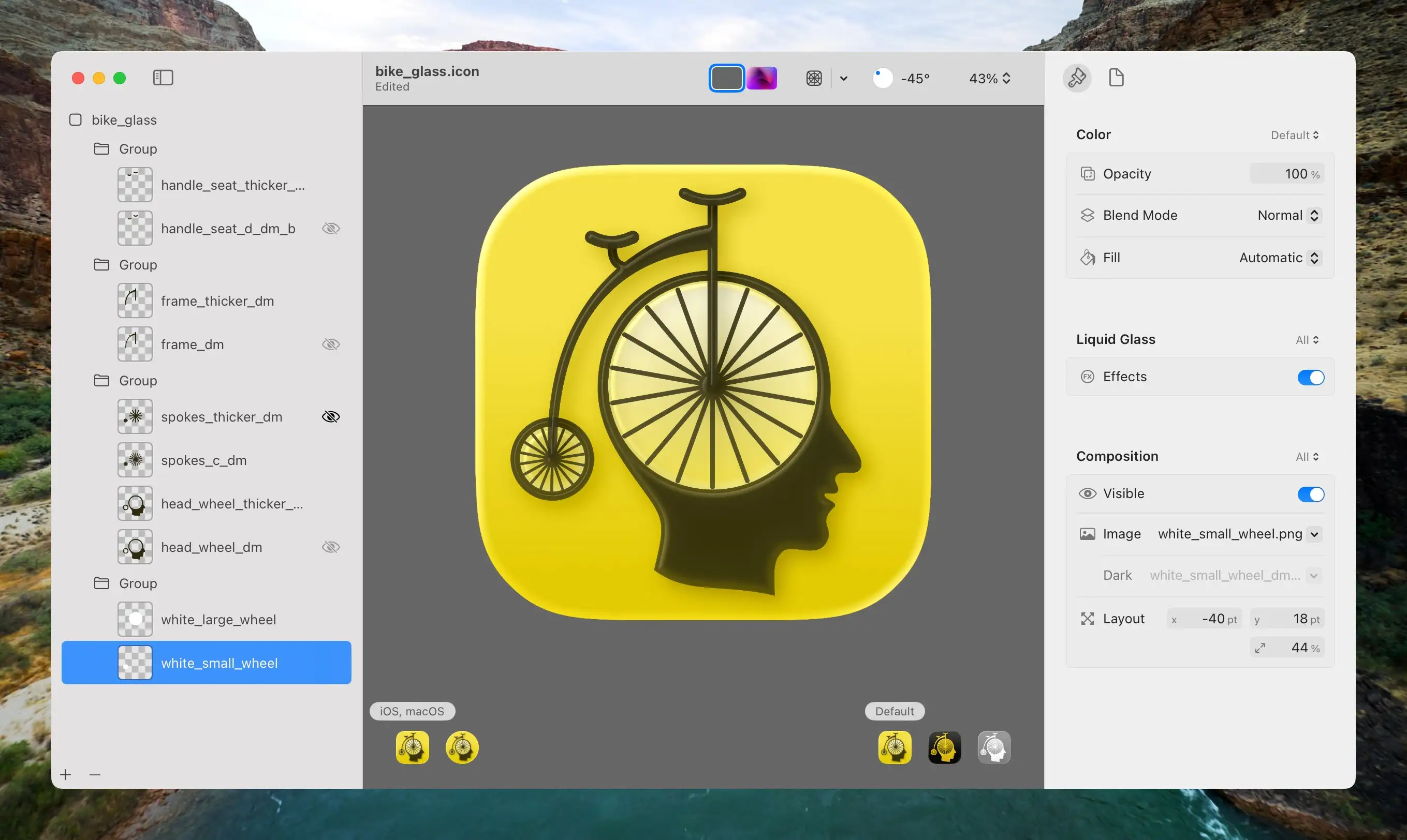
Here I added a white circle behind the spokes, to make the wheels pop a bit more. But I wish I could have the small wheel match the large one… Also, here I have more, and thinner, spokes, to create the blur at smaller sizes.
One way to fix it, would be to sacrifice having the seat and handlebar on a separate layer. But they look nice on top! It could also, perhaps, be fixed by not having the circles have the same colour in the first place.
To be honest, I think the version with the circle behind the spokes looks the best — especially on larges sizes like in the context above. However, that’s not the context where it will be used. And I think the first one I showed might fit the macOS 26 aesthetics the most.

Thoughts?
I’d love to hear feedback on these! And, if you want to look at them, and perhaps try it out, they can be downloaded via this Dropbox link. The export from Icon Composer doesn’t fit the mould for Sequoia, though. But I’ve made manual export for that in light and dark mode.