But Did They Have to Make the iPhones Ugly?
In general, I have to say that the tech on this year’s iPhones seem pretty good! But I’m a little bummed out by the fact that it seems like they’ve given up on making them look nice.
Are they just thinking, “People will throw these in cases anyway — who cares?"1 ?
Previous iterations of Apple have also missed the balance between design and functionality — but in the other direction. And let me say that I do prefer them not putting design over everything!
But do you remember posts like this?
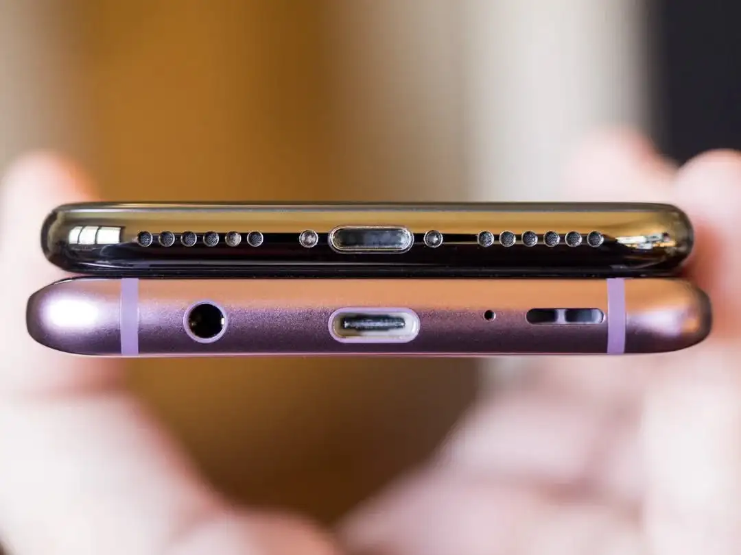
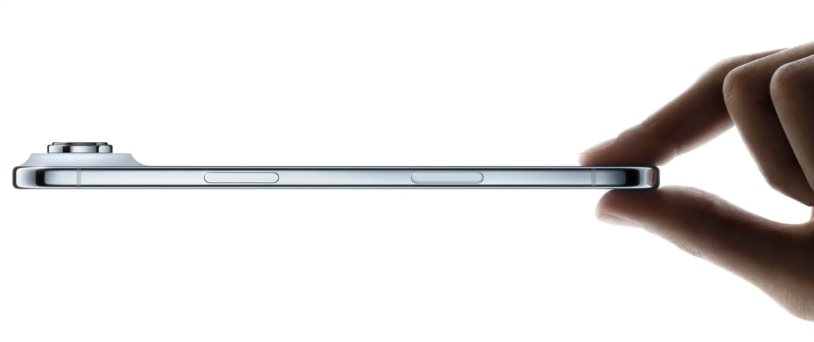
This 11-year-old Reddit post pointed to Apple’s care when it came to the details. It even mattered to them the way the ports were placed beneath the phone.
I really don’t like the new backsides…
The iPhone’s Camera Plateaux™️ have always been inelegant. So I was glad that the plan this time was to make them larger. (I’m also one of those who dislike table wobble…)
But I think they missed the mark on both the Air and Pro — in slightly different ways.
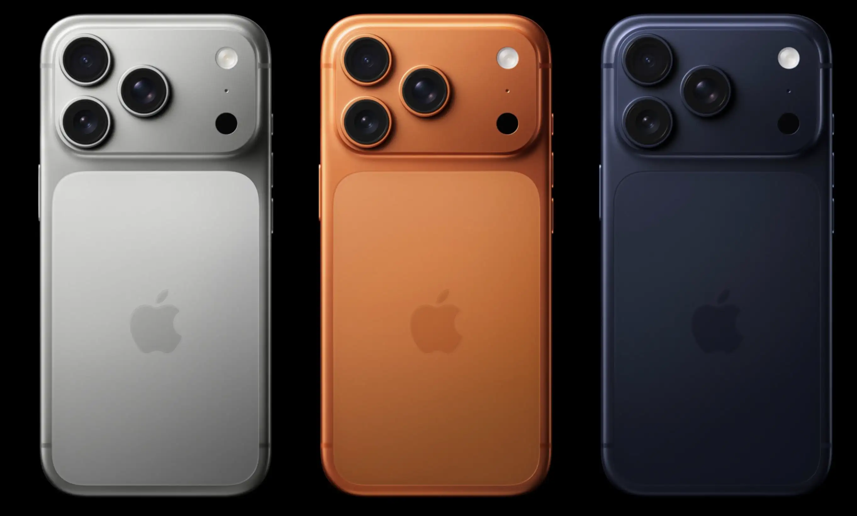
Air:
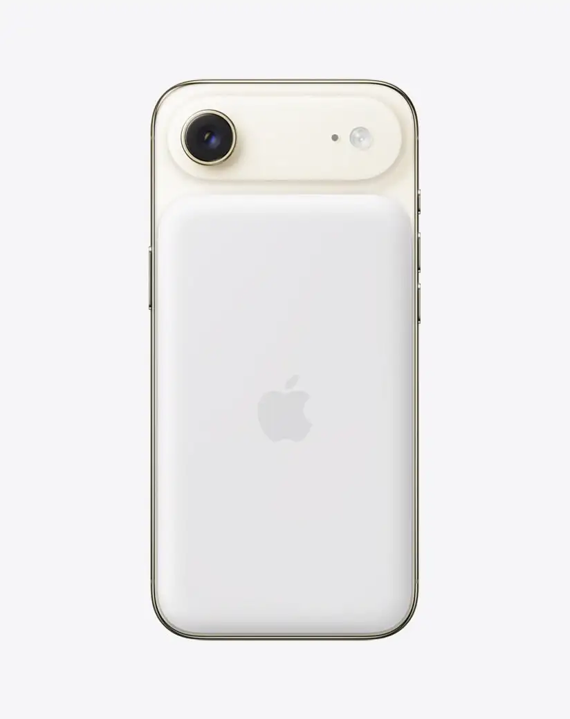
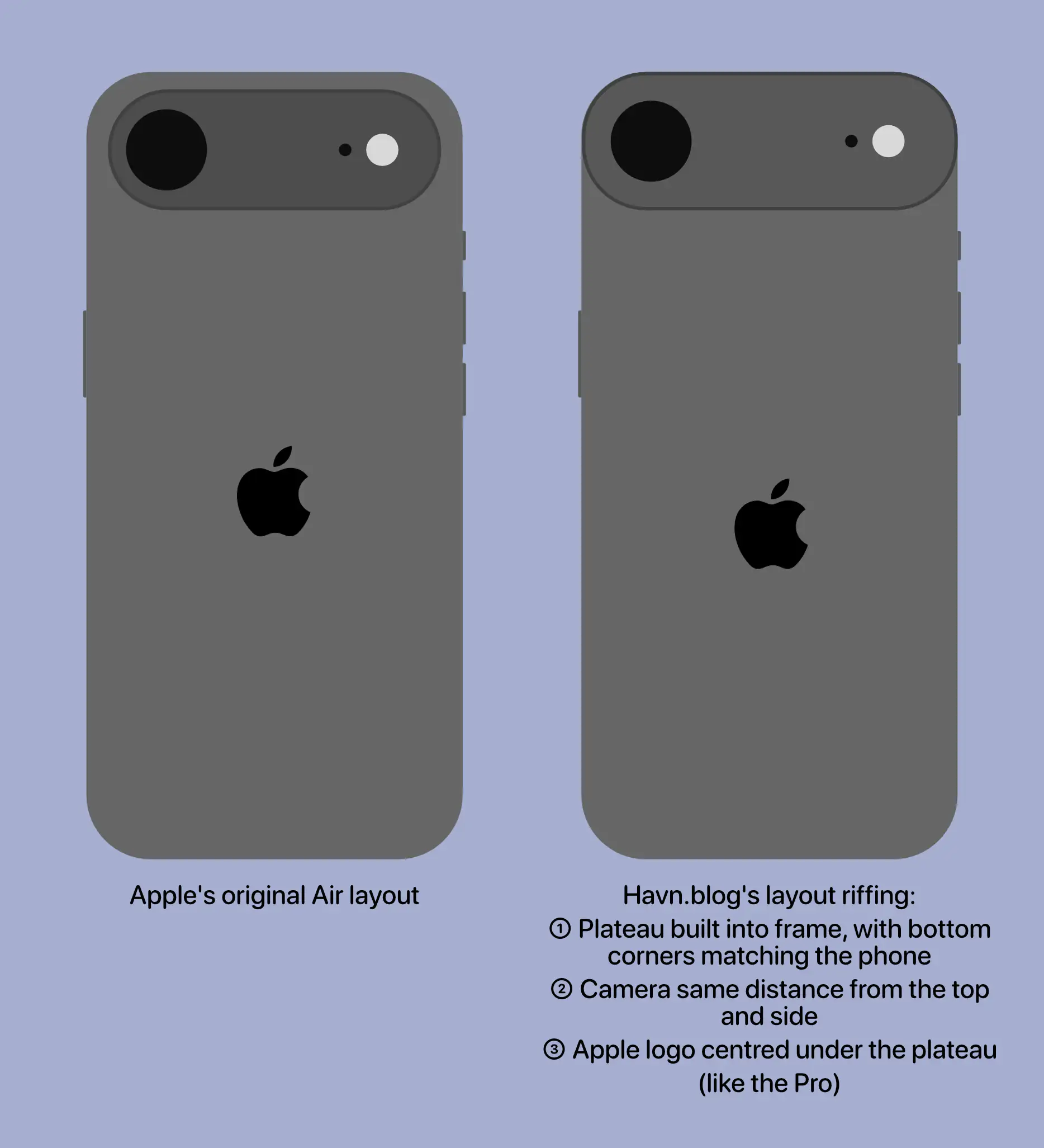
When it comes to the air, I don’t like how the camera bar doesn’t have the same curvature as the phone’s corners. I think this image, with the battery pack, shows this well, as you can see that the battery pack does match the body.
(Yes, it does match the camera’s perfect roundness — but that’s not the choice I’d make.)
With the battery pack, you also get non-matching corners “bumping” up against each other. (Heck, if you insist on having the round corners on the camera bar, I’d consider having the top corners of the battery pack match those instead of the top of the phone.)
Apple used to really care about corners…
Pro:
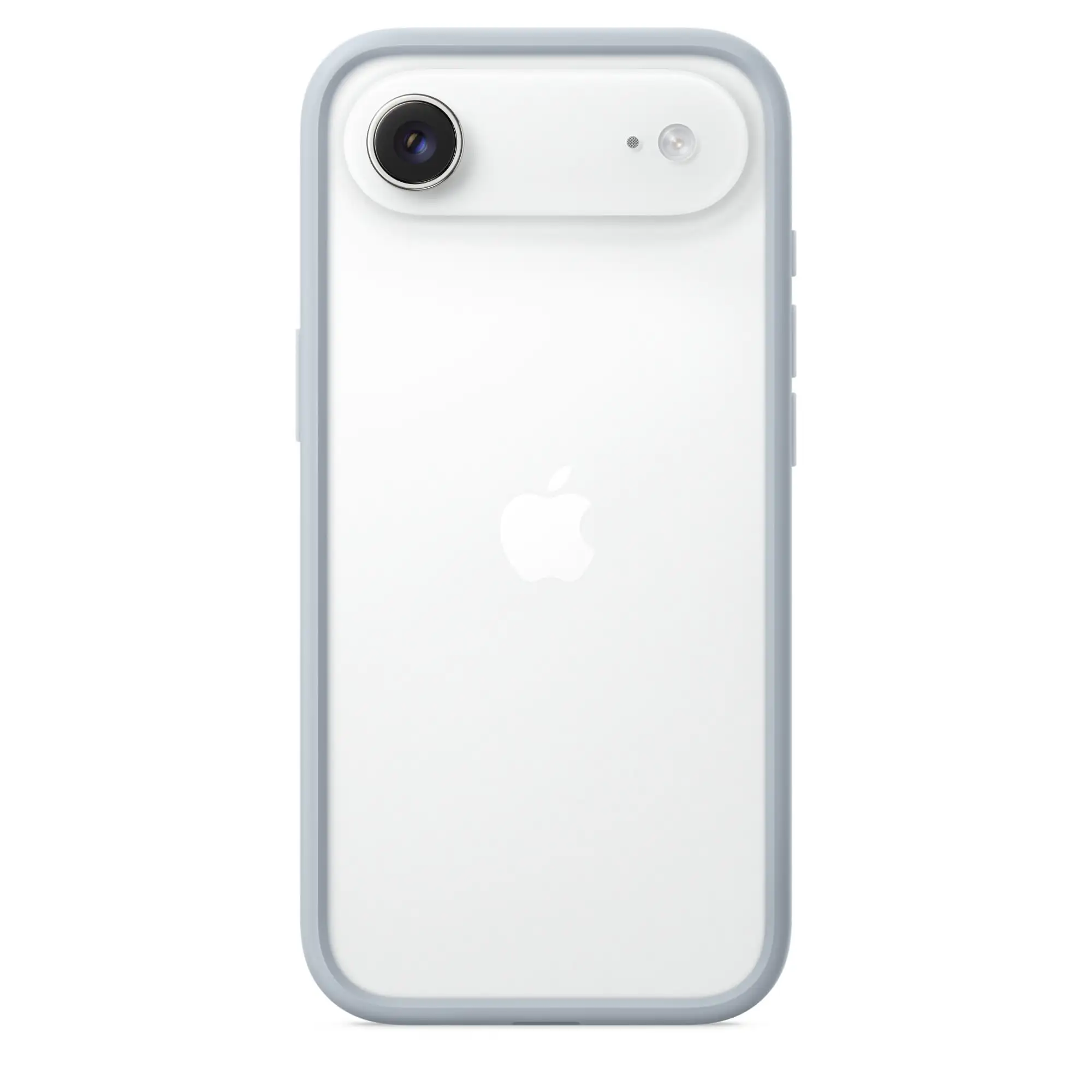
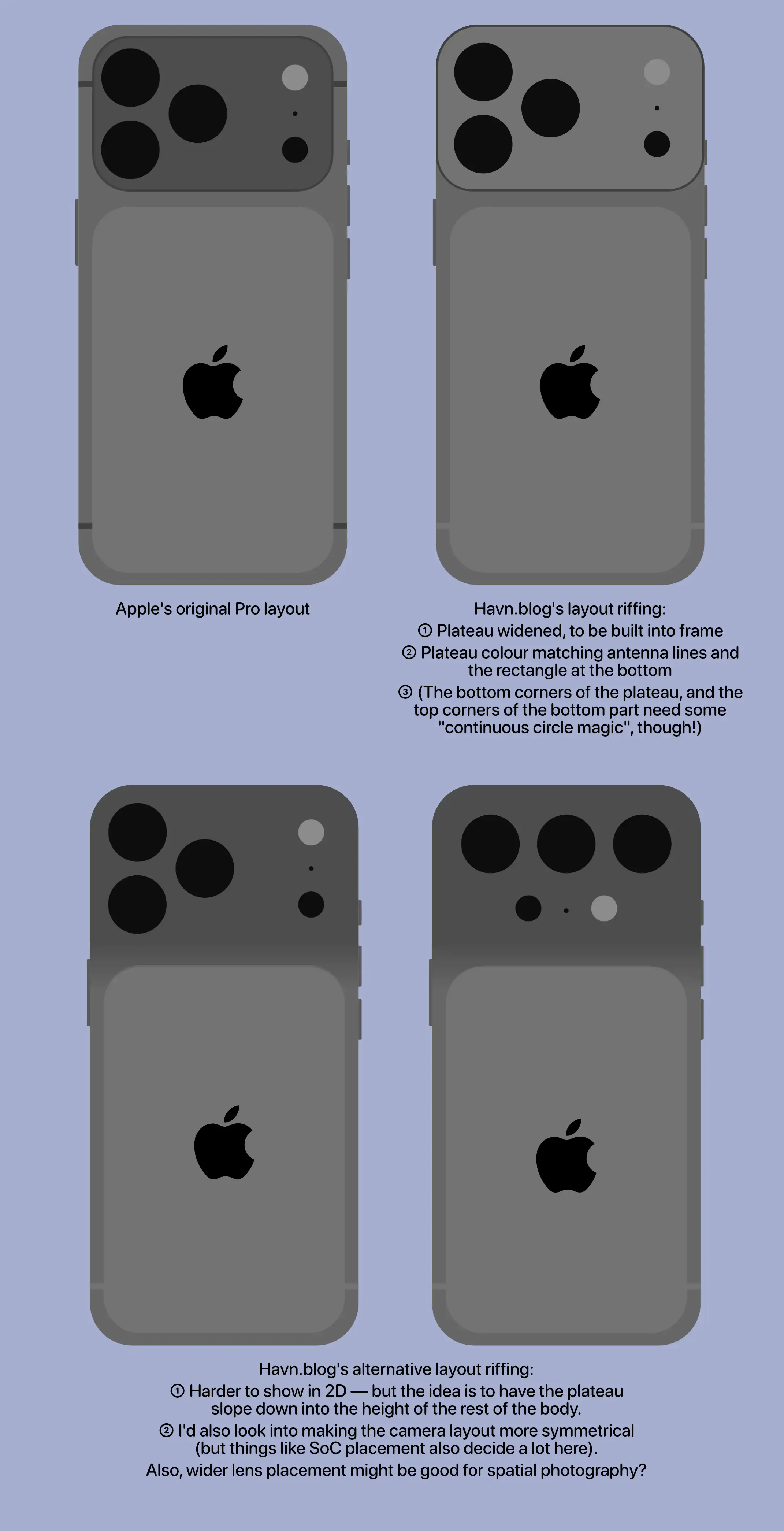
Apple does know how to do it — ‘cause just look at the Pro:
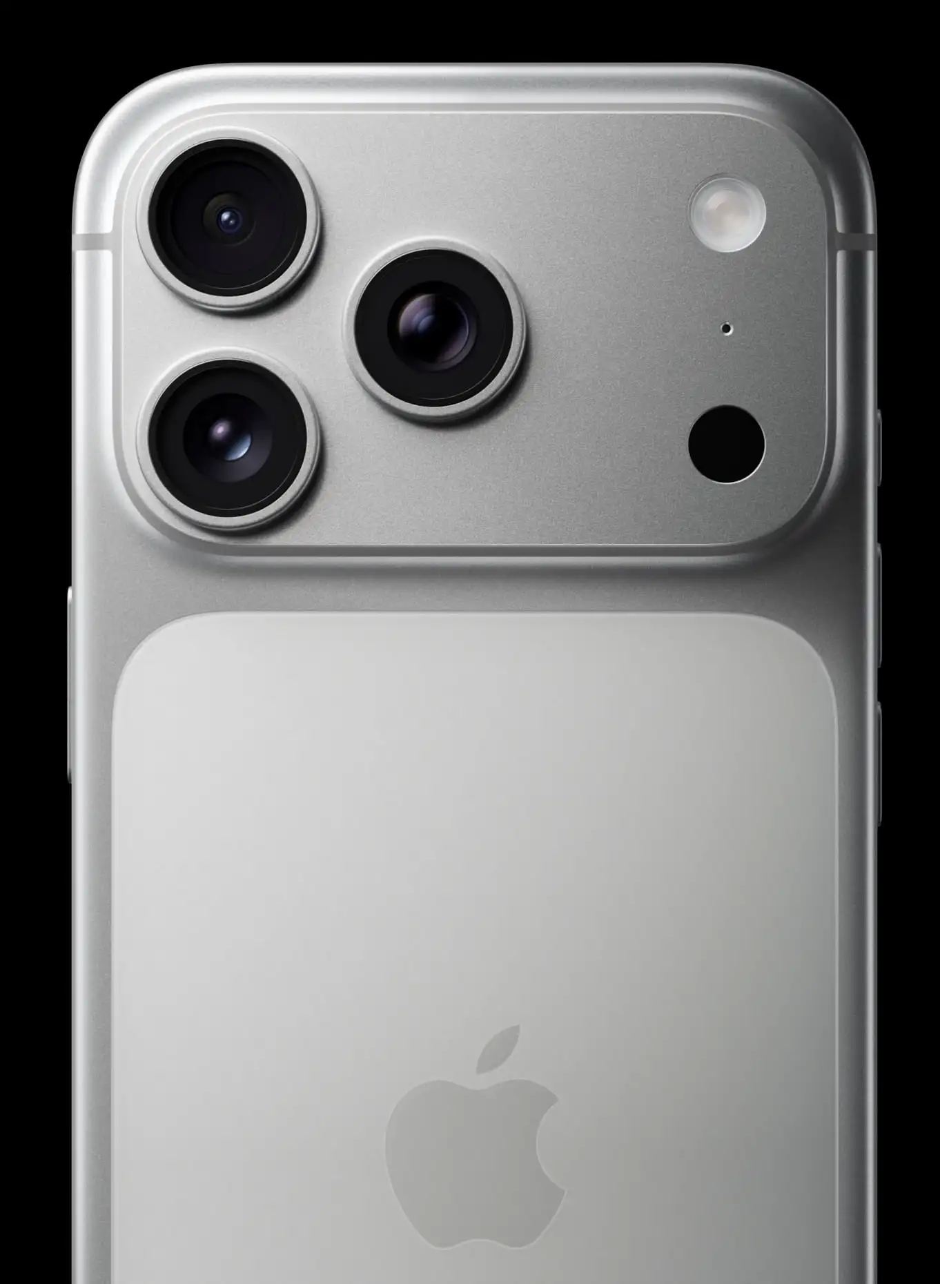
If I’m not mistaken, it looks like the corners match here. (And it still looks good up against the circular lens.)
And, as opposed to with the battery pack and the Air’s camera bar, the two-tone back’s top corners match the bottom corners of the bar.
My main issue with the Pro phones is that I just find the backs really messy. I mean, not as messy as the Nothing Phone 3 — but still.
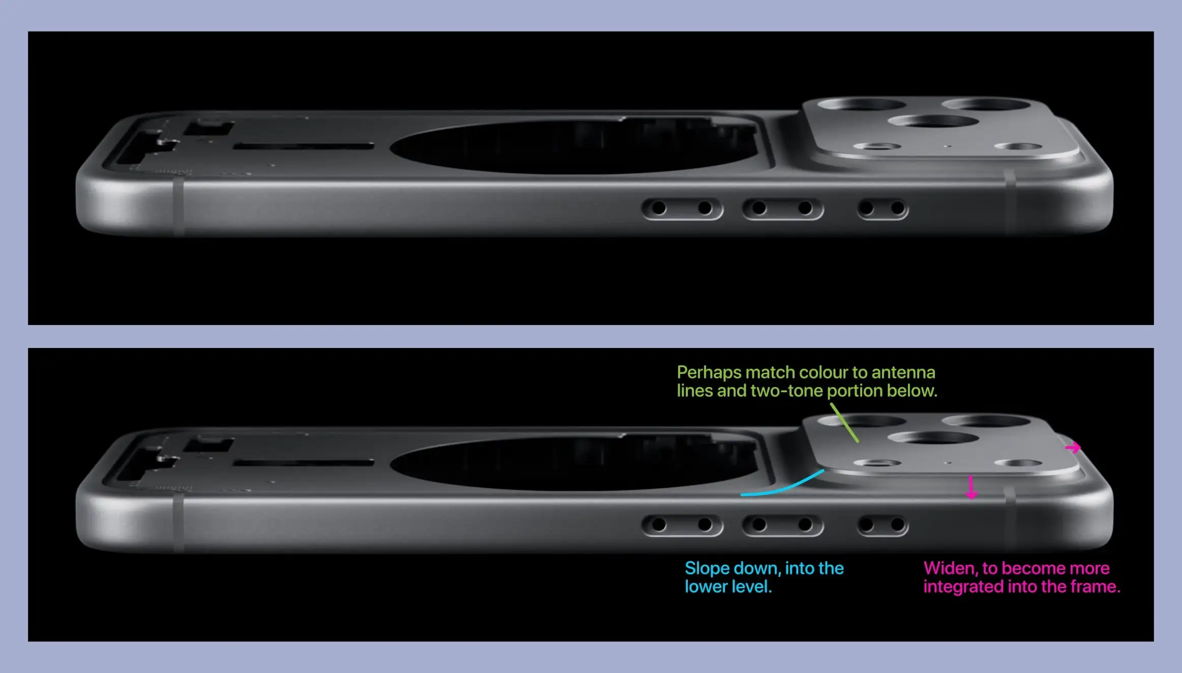
I think I would’ve liked the “two-tone” design better if the camera bar had the same tone as the part at the bottom. Furthermore, the antenna lines make it so it’s more of a three-tone design… So I also would’ve tried to match those with the contrast colour.
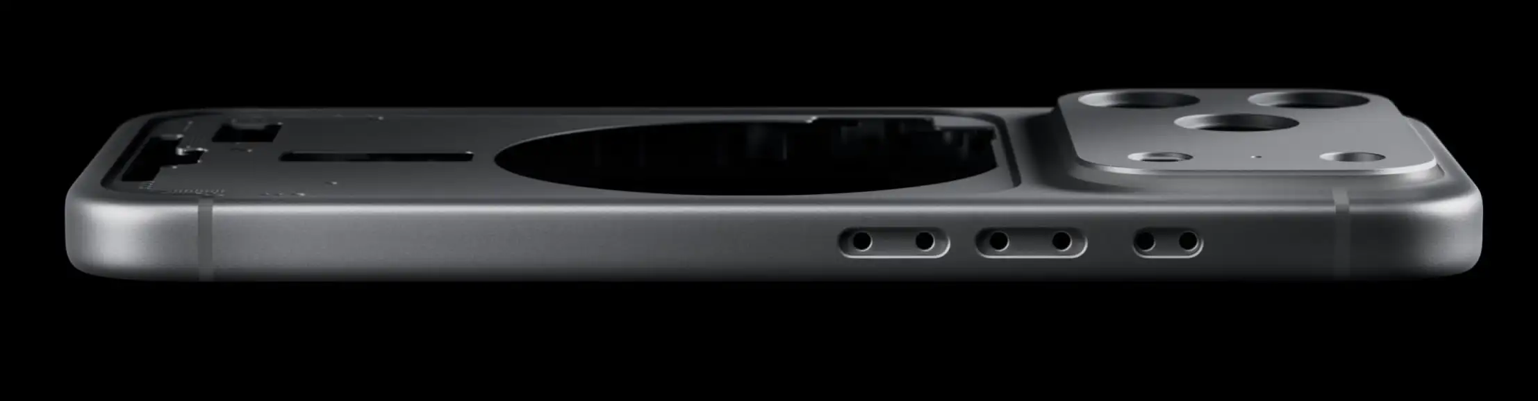
The bar itself is really challenging to lay out, as it has to fit a lot of stuff. But maybe Google is onto something (as seen on the Pixel 10 image above) by blacking out more, to not have the lenses stick out as much?
But my main issue is something that bothers me with …
Both:
Why not have the bar go all the way out??
I think Google had the right idea with the Pixel 8:
For some reason, they moved away from this with the 9 and 10 — but I liked that they integrated the bar with the frame.
Now the design is one large bar of soap with a smaller bar of soap placed on top. Why not just have one part of the first bar of soap be thicker than the rest?
Shouldn’t they still be able to do the neat trick where they place the antenna lines around the camera bar?
This would also provide more room — which is especially important in the Air!
Amateur thoughts on solutions
In general, I think sloping does well to make protrusions less… protruding.
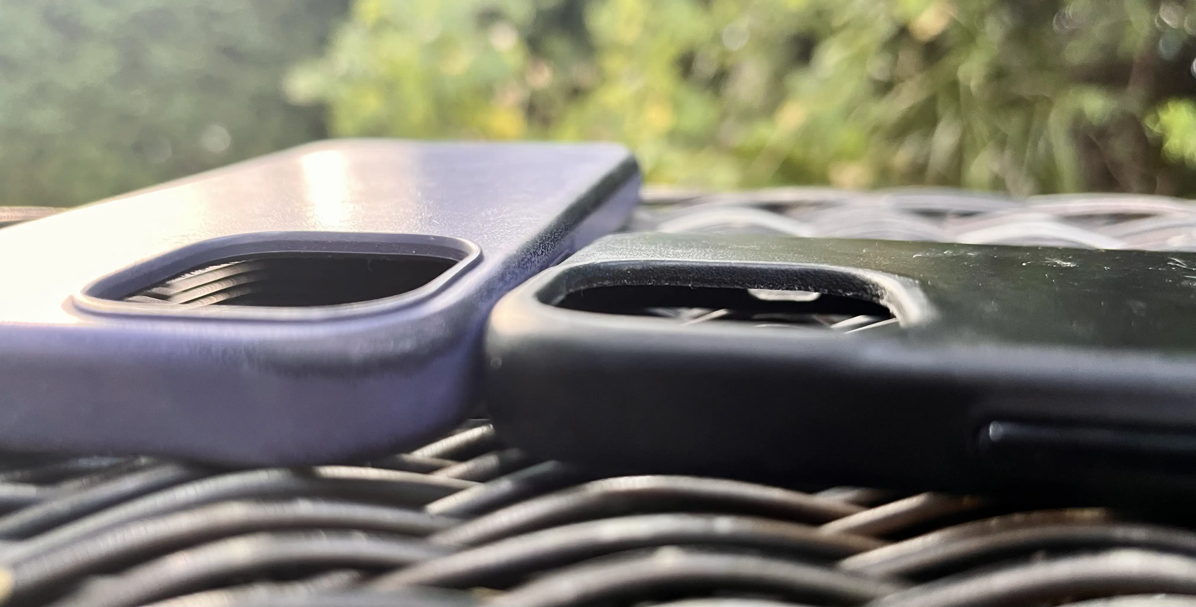
I think this image, comparing Apple’s leather case for my 13 Mini with Bullstrap’s leather case 🖇️ shows this well:
And personally, I think it would look nicer if Apple tried to mill the plateau out of the same part, and have it slope gently into the rest of the frame.
Some crude mock-ups
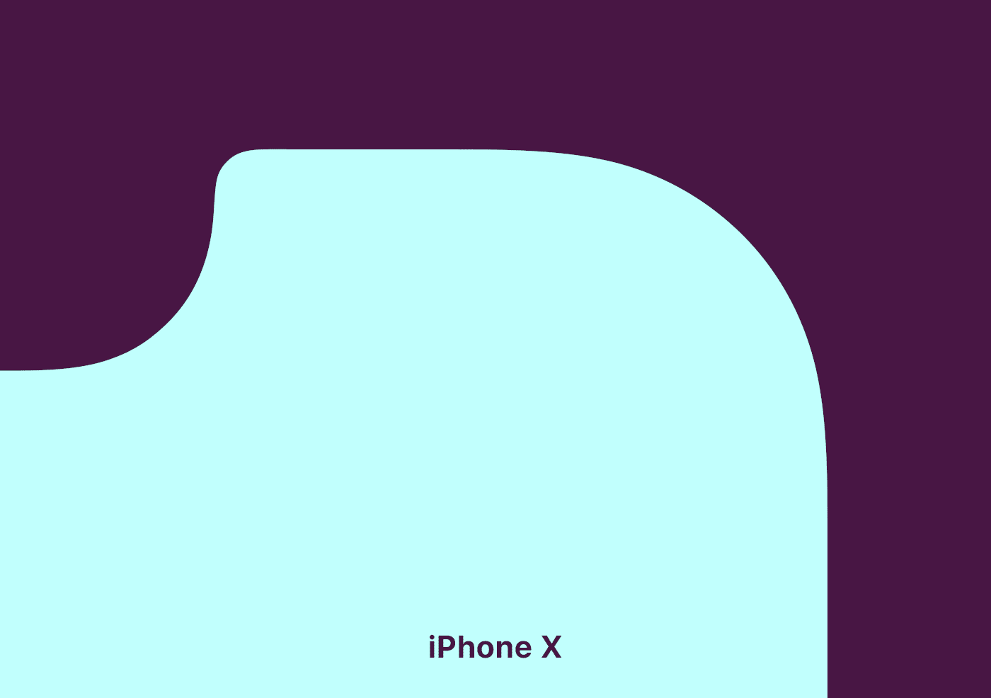
Now, I’m absolutely no designer… But if given the time, I’m sure the same people who sweated over the iPhone X’s continuous corners could make something better than what Apple delivered.
However, I still wanted to make some simple 2D mockups, to show my thinking:
Also, to remove the table wobble, I honestly think I’d make the plateau sloped all the way.
With the Pro, I really wish I had the opportunity to 3D print something… But hopefully these mock-ups provide some ideas.
Of course, there are a million things to consider when it comes to the inside of the phones.2 But making the plateau larger (which is my main suggestion) should only make this easier.
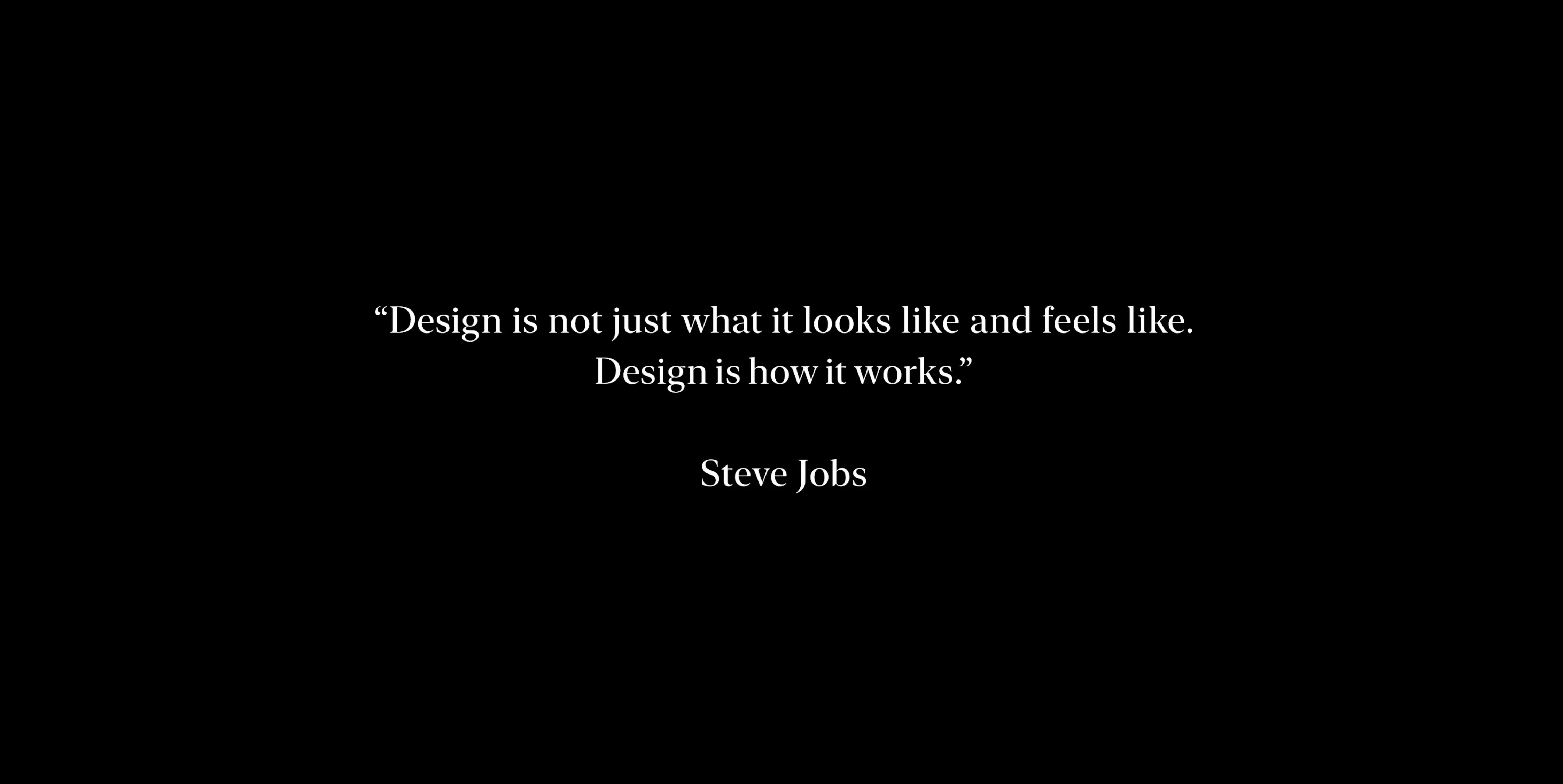
Design is also what it looks like and feels like
The keynote started with this quote:
My issue here is that Apple makes quite few designs for the iPhones, compared to how many they sell. And then I think, in a larger sense than now, it should feel like someone really pored over the details. Even though so many, including myself, stuff them in cases…
As mentioned up top, “how it works” does look good. But I think it should be possible to make something look nicer than this, while not working any less.
And maybe the software team, in charge of Liquid Glass, should focus a bit more on the «how it works» part…