Another Tiny Tahoe Travesty
Icon buffering
The lack of polish in the latest macOS version is just insane — from cut corners, to text going over other pieces of text, and weird HIG decisions.
But I wanted to point to a piece of terrible piece optimisation I haven’t seen mentioned (even though it probably has been):
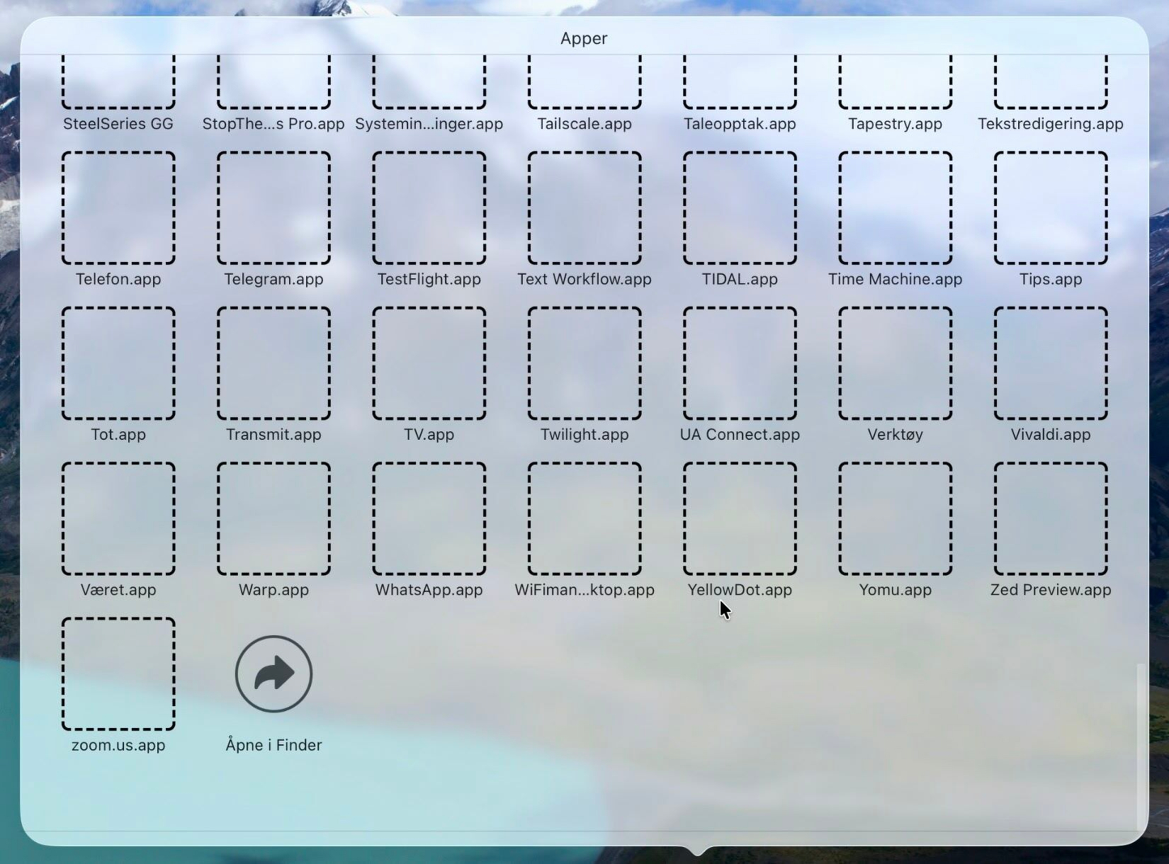
This is on an M1 Pro — but it’s the same on my M4 Mac mini.
Is it a big deal? Of course not. But when you add all these paper-cuts together, the experience is much worse. And the software experience is so far from excellent, which, I assume, is what Apple’s goal is.
I’ve always bought Apple gear because of the software — but never Apple’s software. It’s been because of the exceptional third-party software only available on these platforms. You could say Apple should be paying these developers 30% of the hardware prices I’m paying…
However, I’ve always liked (just not loved) what Apple has been doing. But now it’s only “at least better than Windows”.