The Norwegian Market Has Fixed the iPhone Air Pricing
iPhone prices on Apple.no (including 25% VAT, rounded up), that are not “fixed” are as follows:
| 17 Pro: | 16,000 NOK (€1,430) |
| Air: | 15,000 NOK (€1,340) |
| 17: | 12,000 NOK (€1,072) |
But prices from the “premium partner” (that runs physical “Apple stores” in Norway) has a different tiering:
| 17 Pro: | 16,000 NOK (€1,430) |
| 17: | 12,000 NOK (€1,072) |
| Air: | 10,500 NOK (€938) |
Now the comparison between the excellent 171 and the Air is something like this:
Artisanal Software
Like bread, tools, and clothes
My backpack is really, really nice.
I do like the size, the rooms and pockets it has, etc. But the main thing is the way it looks and, perhaps most importantly, the way it feels. The zip is super satisfying to use, and every piece of material just feels solid. Just interacting with it brings me joy. Every day.

I can’t really recommend it, though! It’s much too expensive for what it is, and it doesn’t carry your stuff any better than most backpacks. It’s a waste of money — but at least it’s money wasted on something that lasts.
So, it doesn’t do the things I need it to do better than the alternatives. However, it’s still worth it for me to love the things I use every day. I don’t write better on my keyboard than on a more standard keyboard. But it still brings me joy.
I think the same is true with software — but I fear we have to fight for the privilege of being able to use truly great software.
I Don't Think It Should Be Easier to Put Rat Poison in Baby Food
Last week, there was a news story about how someone has been putting rat poison in jars of baby food.
On Saturday, HiPP recalled its entire range of jarred purées sold in Spar supermarkets in Austria, saying consuming them may be potentially “life-threatening”.
(…)
The jar had apparently been tampered with, police said. Authorities believe at least one more poisoned jar is in circulation and have issued guidance on how to recognise tampered jars.
— From this BBC article
My hot take is that this is bad. But at least it seems like something that’s pretty hard to do! And that’s why I don’t think it would be great if someone developed and released a way to make putting rat poison in baby food much easier and at a large scale.1 Even if it (apparently) is technically possible today!
Yes, this is about AI
A Master Being Inspired by Another Master
Some people will look you dead in the eye, and say that “this video of a veteran Disney animator, sketching out what the Beast could look like in the style of Studio Ghibli” is exactly the same as “AI companies taking Miyazaki’s work and feeding it to their models”.
The iPad’s Biggest Problem Is That Only Apple Is Allowed to Solve the iPad’s Problems
iPadOS 26 was a popular release, as Apple solved* several of the iPad’s most glaring issues. However, the launch of the MacBook Neo has resurfaced various iPad frustrations — and reminded me of a thought I never got around to write about last summer: The one in the title.
For a long time, people had hoped for better window management on the iPad. And they had to wait because it couldn’t be solved by someone like Many Tricks. Podcasters rejoiced when Apple improved the audio routing options on the iPad because Rogue Amoeba had no way of doing it.
Now people are wishing for a clipboard history (that Spotlight on the Mac got this year) — and only Apple can deliver it. You can’t solve it through Paste or PastePal.
UniFi Wi-Fi for Noobs (Like Me)
Ubiquiti’s UniFi series is getting a lot of (deserved) hype these days. However, as the system is meant to scale all the way from a regular home to huge enterprise settings, the purchasing process can be perplexing. Recently, this got mentioned in one of my favourite podcasts, Hemispheric Views, where Andrew Canion said he didn’t even know how to buy it, let alone use it.1
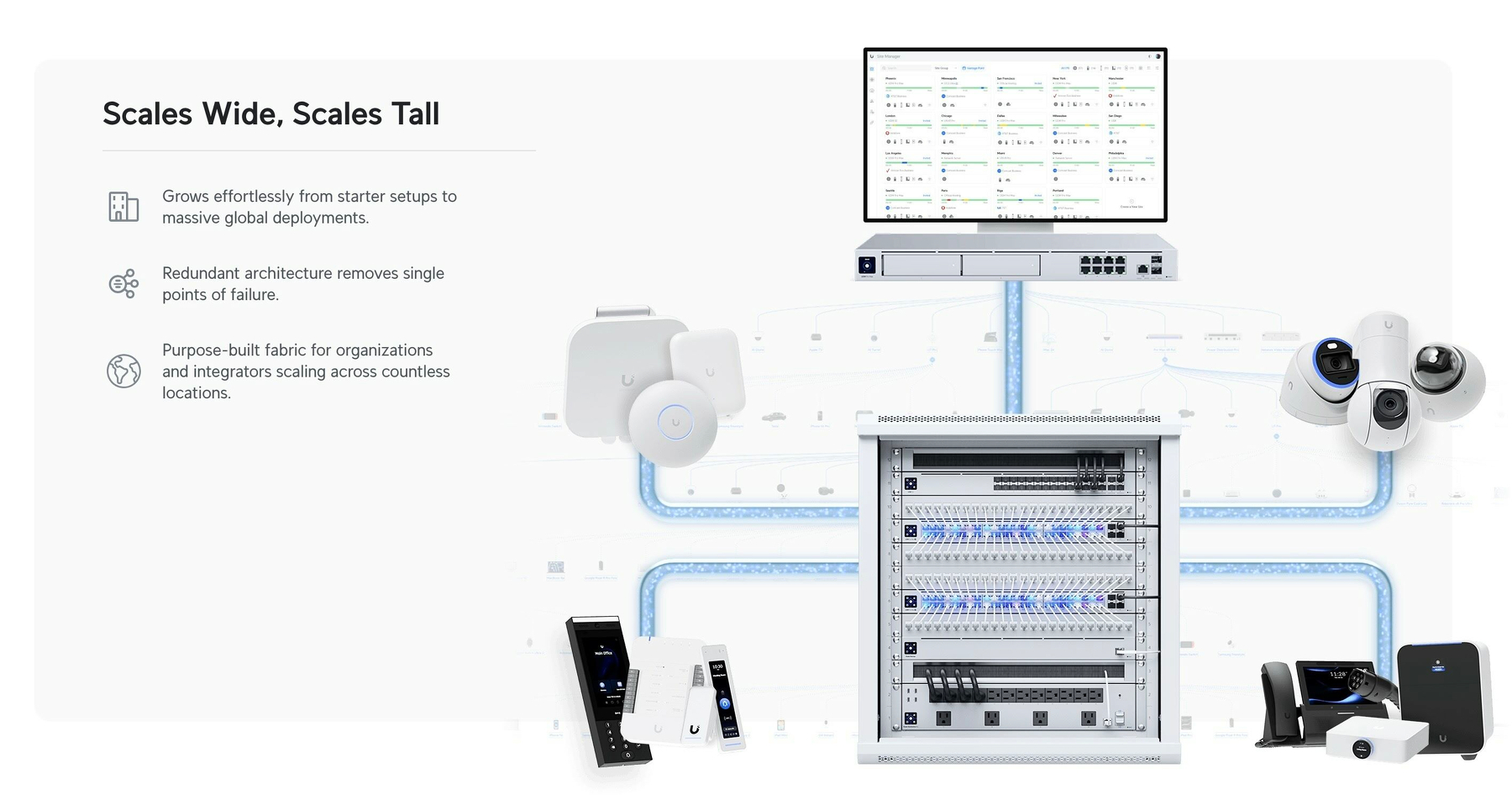
As a noob that actually managed to buy some of this stuff myself recently, I thought I’d do my best to give a layman’s explanation. Because it’s easier than you think! My target audience for this is someone who just wants a “good mesh wi-fi setup for their home."
But first:
Why did I want to get into UniFi?
Last year, I moved from a tiny flat to a large house. And it turned out that the wi-fi that was there didn’t quite cut it.
And the main reason I went for UniFi, is the modularity. It’s a bit like the difference between having an iMac and a Mac mini + display. With the latter, you could keep the screen and upgrade the computer if needed. Or you could get a larger screen while keeping the computer. And UniFi works like this. In general, they’ve separated the parts of a wi-fi setup into separate devices.
In addition to this, the software experience is pretty smooth, the hardware quality is supposed to be good, and it doesn’t hurt that it looks good as well!
The pieces you need
There are three pieces you require to complete the UniFi puzzle. And these can be had at different levels, supporting different standards. For instance, ethernet ports are usually rated for 1 Gbps, 2.5 Gbps, or 10 Gbps. And Wi-Fi varies between Wi-Fi 5, 6, 6E and 7 — and also between 2.5 GHz, 5 GHz and 6 GHz bands.