🌱 Why 4k ≠ 5k
And what Apple means when they say «Retina»
I’m pretty sure the Apple Studio Display is overpriced. Still, the discourse after its announcement has been plagued by people not quite understanding the difference between 4k and 5k on a 27-inch display. It’s just one kay difference — why can’t you just buy a 4k screen that’s cheaper, brighter and/or has a higher refresh rate? Why do some Apple fans crave this extra kay so much??
Marc Edwards, of Bjango, wrote an excellent piece on this, and I especially like the visual examples of 4k vs. 5k on macOS. ** As a maths teacher, I find this problem interesting, and here I will bring some light to this issue the way I would to a high school class.** Perhaps this makes it easier to understand why the issues Edwards highlight appear.
What’s in a kay?
To narrow things down, I’m mostly going to look at 27-inch screens with a 16:9 aspect ratio (so no super-wides here!). Let’s compare the three most normal resolutions at this size: 1440p, 4k and 5k.
Humans are notoriously bad at comparing large numbers. Every day, there’s a new tweet trying to help us understand the difference between a million and a billion, by reminding us that:
- One million seconds ≈ 12 days
- One billion seconds ≈ 31 years
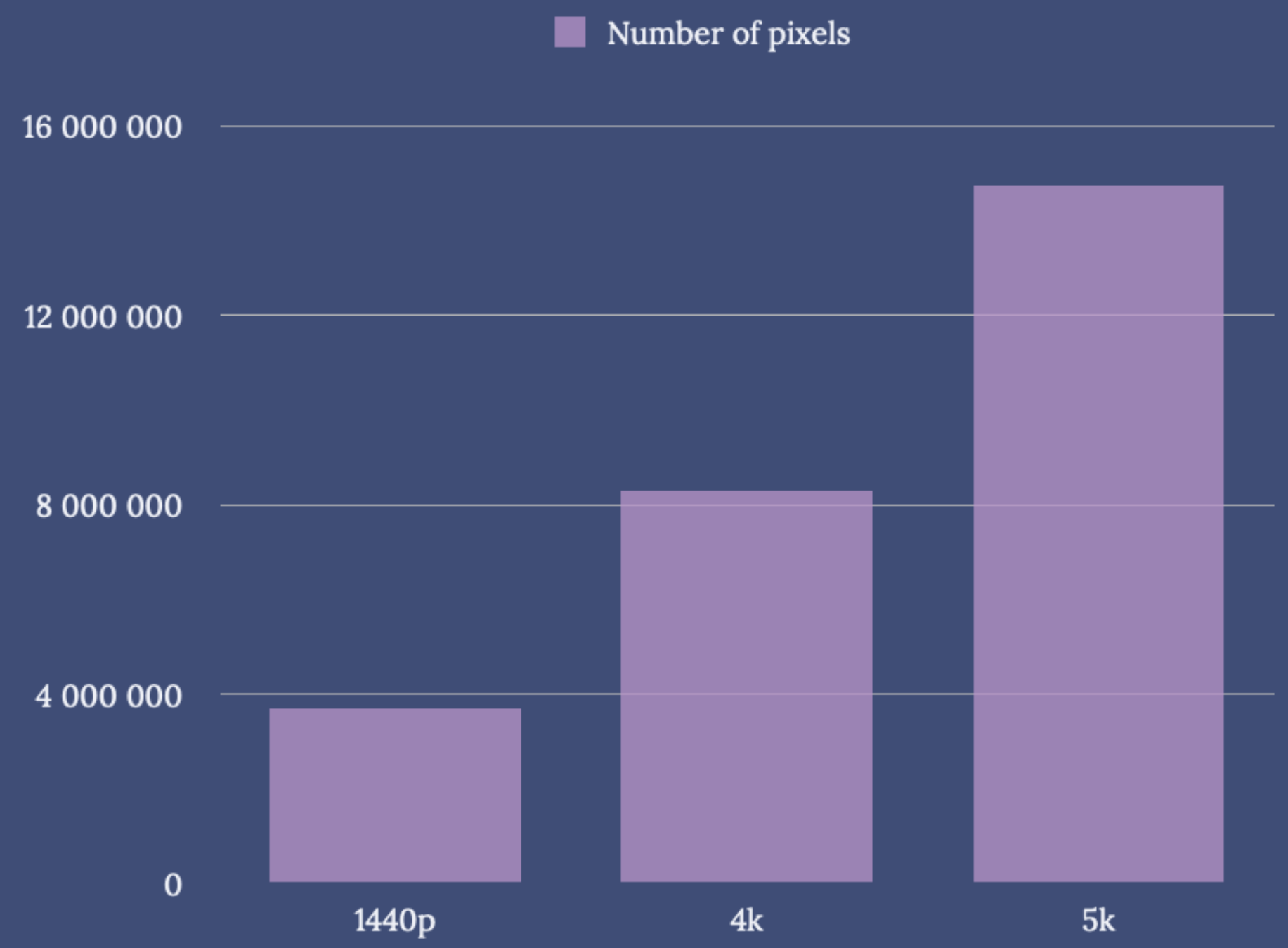
So, it’s forgiven that people think 4k and 5k are pretty close. However, 5k resolution has _a lot _more pixels:
1440p = 2 560 ⋅ 1 440 ≈ 3.7 million pixels
4k = 3 840 ⋅ 2160 ≈ 8.3 million pixels
5k = 5 120 ⋅ 2 880 ≈ 14.7 million pixels
So, as 5k screens has almost twice the amount of pixels as 4k, I find it weird that people say «pff, just buy a 4k screen - it’s just as good».
This also helps to explain why Apple couldn’t just add high refresh rate (Thunderbolt 4 can’t drive that, I think) or mini-LED (no one produces that panel). Now, everyone is free to wish for, and dream about, a 5k mini-LED screen with ProMotion (Apple definitely wants to make it)! But criticising this year’s $1 600 screen for not being this, is a bit off.
… but let’s move on with the maths lesson!
Scaling
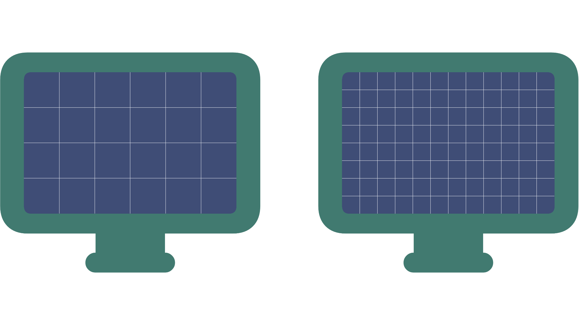
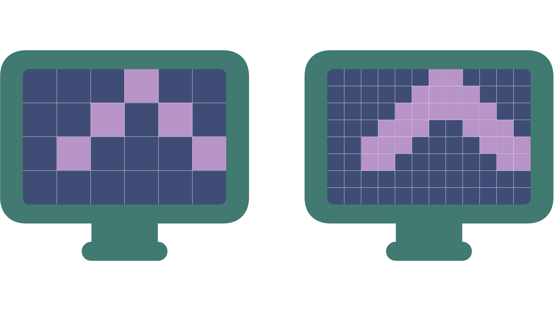
Take a look at these two screens. They have the remarkable resolutions of 6 × 4 pixels (24 pixels in total) and 12 × 8 pixels (96 pixels in total) ✨.
Now, the 8p has double the number of pixels in height and width, making the total number of pixels four times higher – that’s the same ratio as 1440p and 5k. Since the screens have the same size, the pixels on the 8p are smaller – in fact, exactly one fourth the size.
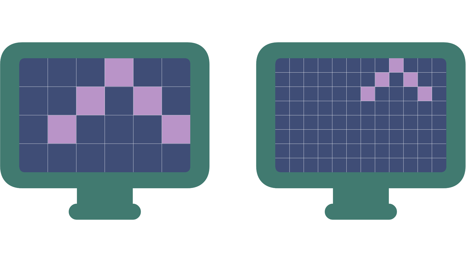
Now let’s say we have the following element on the 4p screen:
How should it be drawn on the 8p? One option is to just transfer the same pixel pattern:
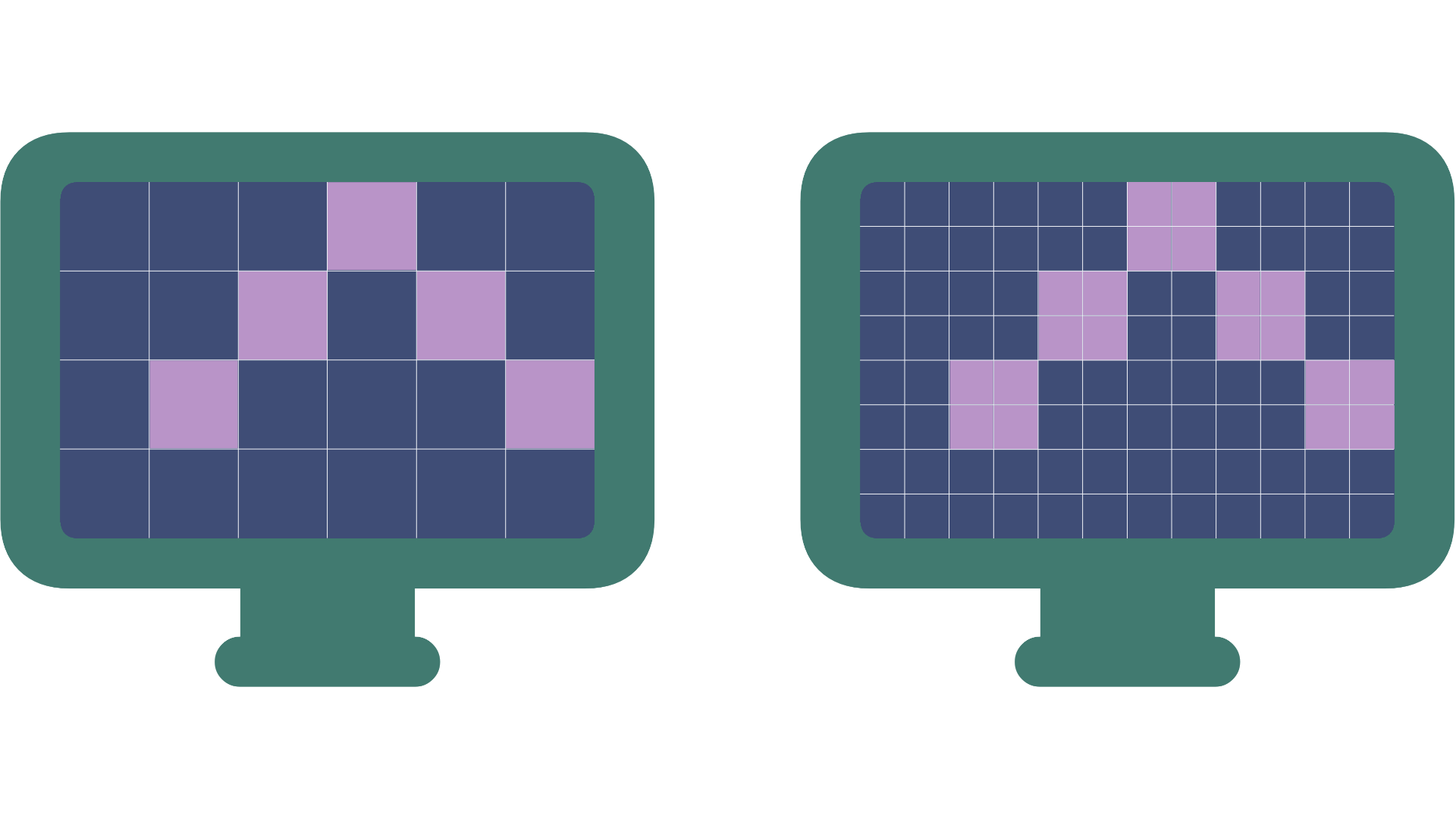
However, this makes the element tiny. This is where scaling comes in: Instead, we can say we want the element to be the same size, and make the 8p «pretend» it’s 4p. We scale it to 4p:
Here you can see that they look identical, since every pixel on the 4p is four pixels on the 8p. But we can do even better! Since we have more pixels on the 8p, we can fill in some pixels, and make the element smoother/sharper looking:
So, now the 8p screen is scaled to 4p. This is what Apple means by «retina screens»: Instead of making the elements tiny, they «pretend» to be a resolution one fourth the size, but make everything looks sharper and smoother. And this is why 5k is so important to them for 27-inch screens (more on this later).
It’s often called 2x, because it’s twice the height and twice the width (but it’s four times as many pixels, as it’s times 2 two times).
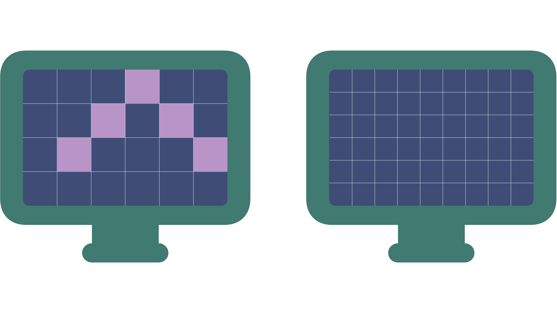
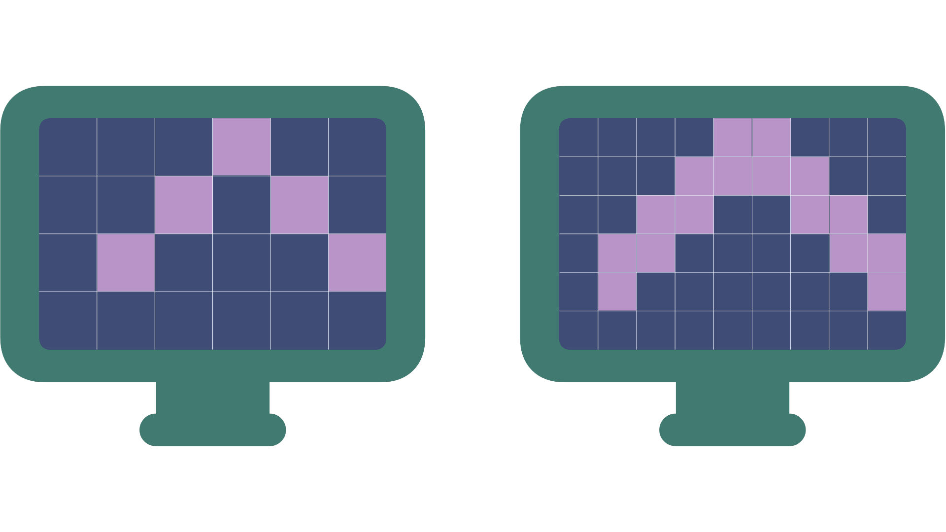
Now, let’s instead compare the 4p screen to one with 9×6 pixels. The 6p screen has 1,5 times the height and width, instead of two times. Why did I pick this example? Because this is the same ratio as 1440p and 4k screens.
Now, how do we draw the same element on the 6p screen? It goes to the top and right edge, while there’s a margin on the left and bottom.
Again, we could make it tiny — but if we don’t want that, we get into some trouble. If this were a high school class, I would give out hand-outs and let my students try for themselves! But since it’s a blog post, I’ll just show my best try:
Notice that while it’s pretty smooth and sharp, it’s not accurate. The margins are smaller, and the bottom edges are smaller than the top point. While it’s much more pronounced with so few pixels, a 4k screen gets the same problem when trying to scale to 1440p. And these inaccuracies create the issues showed by Edwards.
This is why Mac people have been craving a good 5k screen for years — and why a 4k screen isn’t a great option for many – even though it has enough pixels. Actually, this is also why a lower resolution 1440p screen might be preferable to a 4k screen. I went to my current 4k screen from a 1440p iMac, and now I know why I’ve always been underwhelmed.
A quick note on Mac vs Windows
David Heinemeier Hansson made this post recently:
Here's a good example of the difference between Windows and macOS font rendering. If you can't tell the difference, or it doesn't bother you, I envy you greatly. You should probably buy a PC instead of a Mac next, if you work with web development. pic.twitter.com/r672aEb2ew
— DHH (@dhh) February 25, 2024
And later he followed up with:
Oh boy. Shit just got real. I hooked the Framework laptop up to my 6K Pro Display, set scaling to an even 200%, and would you look at this. SO. MUCH. BETTER. The severe ugliness was all down to using integer scaling?? Problem, though: 100% too small on laptop, 200% too big? pic.twitter.com/JH4zUHdvRp
— DHH (@dhh) February 26, 2024
Previously I’ve read that Windows scales differently than macOS, so that not running 1x or 2x was as important (but that it never got as good as 2x on macOS). But maybe it’s just that most users just don’t care (re: the first post)?
There’s also a utility called BetterDisplay, that’s supposed to make scaling to sub-optimal resolutions better on MacOS. I haven’t tried it myself, but give it a shot if, for instance, you work on a 4k screen that’s 27 inches or larger!
Pixels per inch
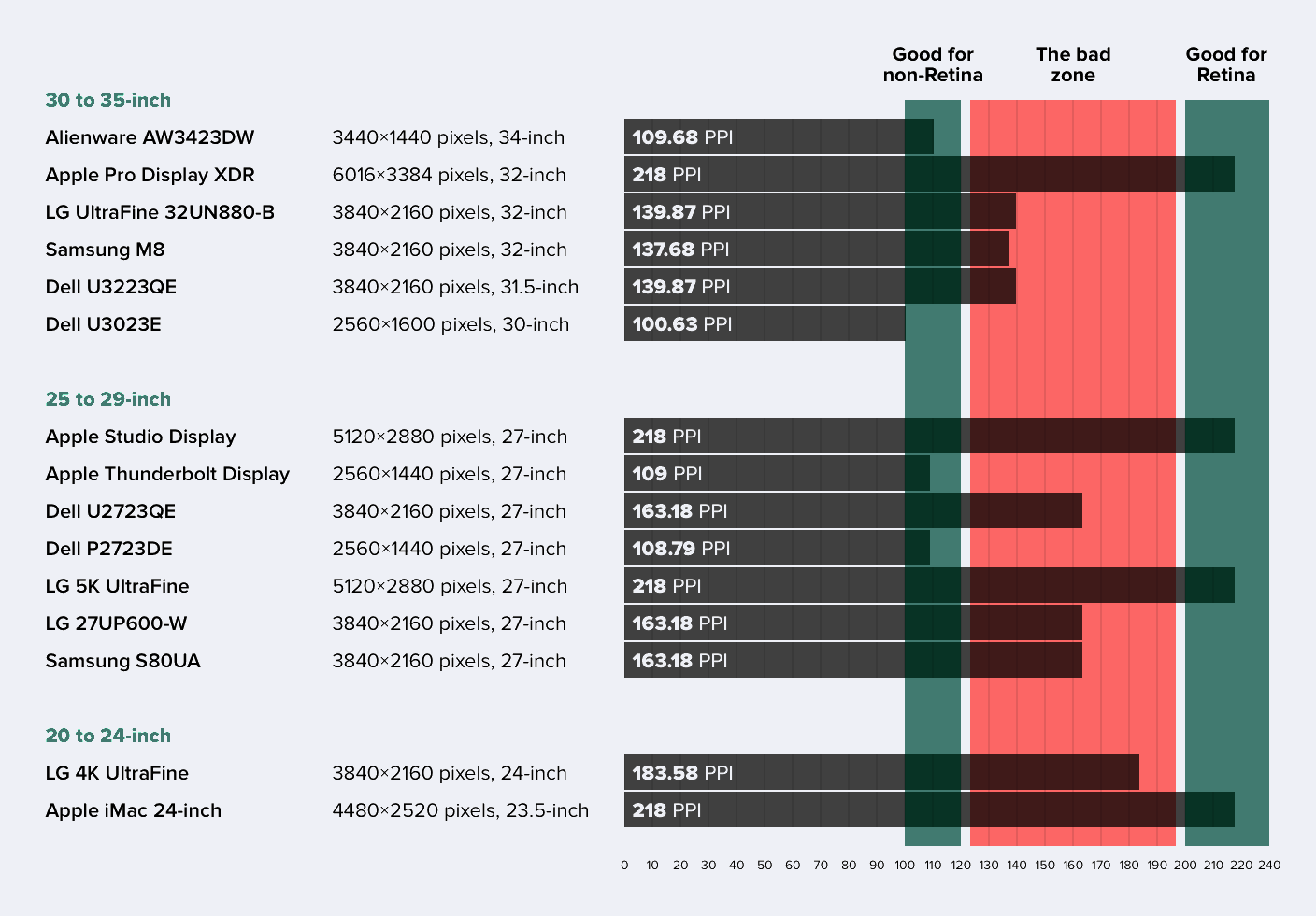
Now, let’s tackle the problem DHH mentioned about too small or too big. Since this post was inspired by the existence of the Studio Display, I’ve been talking about 27-inch screens here. Since scaling to 1440p is a good look on these, you want 2x that, so 5k. What’s important is the number of pixels per inch (PPI). You want either 100-120 PPI (good for non-retina) or twice that, 200-240 PPI (good for retina).
Here’s a simple way of figuring out what you need for «good retina»:
- Figure out what screen size you want.
- Find the non-retina resolution that gives a UI size you want — like 1080p for 21 inches and 1440p for 27 inches.
- Then, to get to the needed resolution, you double the amount of pixels in the width and height (so four times the pixels in total).
4k also scales nicely — but to 1080p. So, if you have a screen size that fits 1080p, like a laptop or a 21-inch desktop screen, 4k is great. Just not on a 27-inch screen — unless you want the zoomed in look of 1080p.
Now, did I make this post only because it’s an interesting math problem, or as a part of an elaborate plan to justify shelling out for a Studio Display? Impossible to tell — we’ll never know…
