Guides
- I purchased a (cheaper and slower) Satechi USB-C enclosure 🖇️, and a 4 TB SSD 🖇️.
- Then I moved the old 2 TB SSD over to the slower USB-C enclosure,
- and slipped the new 4 TB drive into the faster Thunderbolt enclosure.
- One “full-sized” WebP version,1
- and a lazy placeholder PNG version (that has only 24 pixels as its max height/width).
- The first one was about basic concepts,
- the second about why you might want to use and become familiar with the terminal,
- and this is how you can make your terminal more noob-friendly (regardless of what you’ll end up using it for).
- run through all folders in a parent,
- add a hidden folder in each, named .Originals,
- and place a copy of each file in that hidden folder.
- Part Two: The Why and What
- Part Three: A More Noob-Friendly Terminal
- Be effortless to use (and relatively easy to adjust)
- Both provide a good experience with simple switches, and with dimmers.
- Working with different brands of switches and bulbs.
- Keep everything in HomeKit.2
- Glow (warmest)
- Cream
- Glass (coldest)
- From the night before 🌙: Glow
- 1 hour after sunrise ⛅: Cream
- 3 hours after sunrise ☀️: Glass
- 3 hours before sunset 🌥️: Cream
- 1 hour after sunset 🌙: Glow
- While in laptop mode, I want it at the bottom, with automatic hiding.
- But while on my 27" external display, I want it to be on the left, smaller, and always showing.
- I always resize with just my left hand
- I’ve made a “grid” that uses Hyperkey (Caps Lock) + a letter:
WandEis Top Left Quarter and Top Right QuarterAis Left Half,Sis Maximise/Fill, andDis Right HalfZandXis Bottom Left Quarter and Bottom Right Quarter
- Pretty fiddly – you can’t even paste text, as it will think you’re trying to set
Command + Vas the hotkey - Doesn’t get backed up – you have to do it again if you reinstall macOS (Pro tip: Take a screenshot to “back up”!)
- Only works on menu bar items
- Works without third-party software
- Will change the displayed hotkey in the menu bar – making it easier to remember
- Many of the apps are one-time purchases (but often not with unlimited updates), so it’s difficult to compare with a single subscription.
- Many of the apps I use, I wouldn’t pay for if it weren’t included in Setapp. I’d either use a free/cheaper alternative, or just not use something like that at all.
- The left one is a specific one for working with subtitles. It splits the selected line into two, down the middle.
- This wraps text in
<figcaption>, and is used for blog posts. - This wraps the text in a “callout div”, that I use to create callouts like the one about the affiliate link up top.
- If I want to format text in image captions or callouts, I have to use HTML. This creates an HTML hyperlink,
- this is italics,
<em> - and this is bold.
<strong> - The pen is some custom stuff for my band’s website.
- The Last One Will Title Case the Selected Text.
- ProMotion display (high/variable refresh-rate)
- Always-On display
- Added Telephoto camera
- Night mode portraits
- Support for Apple ProRAW
- Faster USB-C speeds
- Aluminium → Titanium (With increase weight as well, though.)
- LiDAR Scanner
UniFi Wi-Fi for Noobs (Like Me)
Ubiquiti’s UniFi series is getting a lot of (deserved) hype these days. However, as the system is meant to scale all the way from a regular home to huge enterprise settings, the purchasing process can be perplexing. Recently, this got mentioned in one of my favourite podcasts, Hemispheric Views, where Andrew Canion said he didn’t even know how to buy it, let alone use it.1
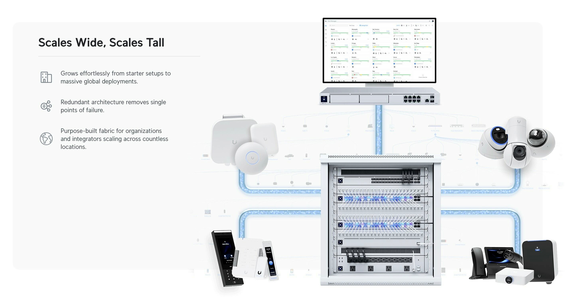
As a noob that actually managed to buy some of this stuff myself recently, I thought I’d do my best to give a layman’s explanation. Because it’s easier than you think! My target audience for this is someone who just wants a “good mesh wi-fi setup for their home."
But first:
Why did I want to get into UniFi?
Last year, I moved from a tiny flat to a large house. And it turned out that the wi-fi that was there didn’t quite cut it.
And the main reason I went for UniFi, is the modularity. It’s a bit like the difference between having an iMac and a Mac mini + display. With the latter, you could keep the screen and upgrade the computer if needed. Or you could get a larger screen while keeping the computer. And UniFi works like this. In general, they’ve separated the parts of a wi-fi setup into separate devices.
In addition to this, the software experience is pretty smooth, the hardware quality is supposed to be good, and it doesn’t hurt that it looks good as well!
The pieces you need
There are three pieces you require to complete the UniFi puzzle. And these can be had at different levels, supporting different standards. For instance, ethernet ports are usually rated for 1 Gbps, 2.5 Gbps, or 10 Gbps. And Wi-Fi varies between Wi-Fi 5, 6, 6E and 7 — and also between 2.5 GHz, 5 GHz and 6 GHz bands.
1) The brain
An (Imperfect) Solution for USB-C Devices Without PD
You Know, Those Who Need USB-A on the Other End
I just listened to the latest episode of the Upgrade podcast. It was Myke Hurley’s first episode after his parental leave – and as someone who got my first child less than a week ago, the episode obviously resonated with me.
I intend to write a bit about some baby tech – but here I just wanted to throw out a quick recommendation for an annoyance Myke brought up.
(Click here to jump straight to the solution!)
USB-C is great – but also a lie
The good thing about “everything” being USB-C, is that every cable fits into every socket. However, the problem is that you suddenly don’t always know if things will work. For instance, what’s the maximum amount of charging a cable can give? And when do you need a Thunderbolt cable? And how can you tell what a cable is?
In the Upgrade episode, Myke mentioned another issue: If the USB-C device doesn’t include everything that’s needed for USB-C Power Delivery, the USB-C cable might need to be USB-A on the other end.
For instance, this is the case with the, otherwise great, Anbernic RG35XX_ 🖇️ retro hand-held. If I connect it to my 140W charger, with a powerful USB-C to USB-C cable, it gets “scared” (because it doesn’t have the smarts to ask for less power), and doesn’t want to charge. However, if it senses a USB-A on the other end, it knows that it can’t draw too much power, so it “dares” to charge.1
This is nothing but poor design from the device maker, as giving it the necessary smarts is both cheap and easy – but it’s still something one encounters from time to time.
The most obvious solution …
… is to simply buy a USB-A charger that you then use for those specific devices. And this is what Myke said he had done, for the multiple baby tech devices needing special treatment. But then you need to both have a custom cable for these devices and a custom charger. (By “charger” I mean the actual charging brick, not including the cable.)
There’s a (slightly) better way!
Making My Phone More Boring
Not More Dumb
There are numerous reviews of the new Light Phone III going around – and this has invigorated discussions about having a dumber phone. There are also Android e-ink devices going around, with 🖇️ or without 🖇️ a SIM slot, which are cool. A friend of mine is considering how far he can get with the combination of an Apple Watch with a SIM and a Boox Palma. 👌🏻
I’m 100% in the category of too dependent on my phone. However, I don’t think having a dumber phone is the solution for me. I want one that’s more boring.
The problem with out phones isn’t that they’re too useful. It’s that they’re “too fun”. And by that I mean “too fun” like how junk food is “too good” for our own good.
Because, things like being able to buy transit tickets, pre-heat my car, and control my lights are not issues for me. And neither is easy access to a camera, calculator, music, weather forecasts, etc.
I do have some issues with my phone, though…
I have ADHD – and also a history (and not only a history) of anxiety and depression. So I really struggle with being uncomfortable with my mind wandering and being left to its own devices. This has led to me “needing” to fill every void with … something.
I want to try to work on this – especially as we’re expecting a baby next month.
Before mentioning what I have done to my phone: One thing I’m choosing not to tackle at the moment, is my over-usage of podcasts. Not listening to anything makes me uneasy. And often music isn’t even enough, and I require something like a podcast. That’s because the latter demands more of my mind. To put it a bit exaggerated: I want to listen to a podcast while going out with the rubbish. I intend to think more about this – but at the moment, I haven’t deleted Overcast or anything.
I do want to try to have it be more quiet around me, though – or at least “only” have music. (However, I know that will make things less quiet on the inside…) So, I’ve deleted the YouTube app from my phone. I don’t want to never use my phone for video, though – but maybe more intentional TV shows, etc. instead.
I also have an issue where I want to fill every little sliver of free time (like waiting a minute for something to load) with reading something quick – often in Mona (Mastodon) or Narwhal (Reddit). So, I’ve deleted all social media apps like this. I’ve kept Lire, my RSS reader, for now. I’ve also loaded up my phone with some ebooks.
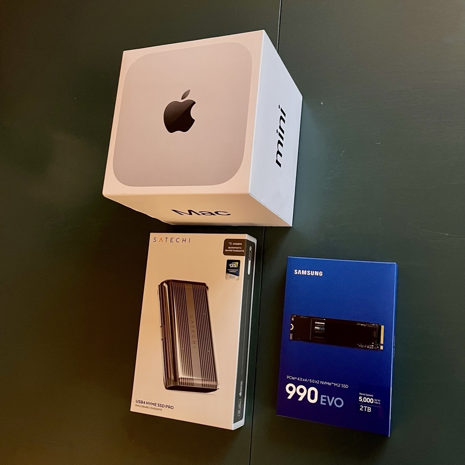
I Had to Expand the External Storage on My Secondary Mac Mini
I first wrote about this Mac and its setup here — and then I have an update here. However, quite quickly, I learned that the 2 TB of storage I had purchased wasn’t enough.
The main culprit is Time Machine — and while I could probably do something to minimise the usage, backing up my wife’s MacBook Air (512 GB) and my MacBook Pro (512 GB) currently takes up about 1.1 TB.
I was considering upgrading the internal storage on the Mac, as more and more options for this gets released. However, none of my use-cases for storage benefits from being internal — so I did something else.
New hardware
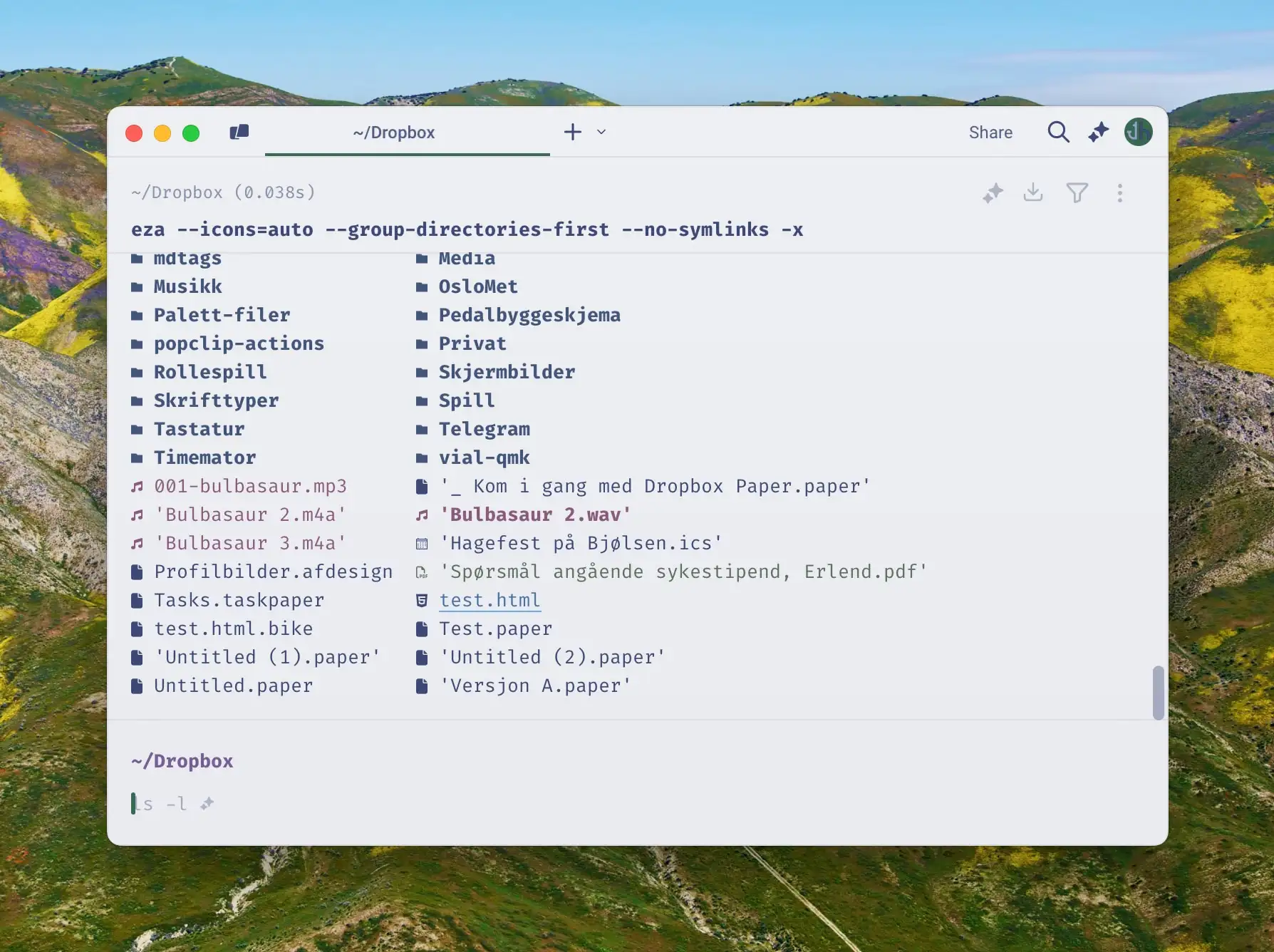
So, I previously only had a 2 TB SSD 🖇️ in a Satechi Thunderbolt enclosure 🖇️. And here’s what I did:
✉️ How, and Why, I Use Micro.blog
A friend of mine, Simen (who has a nice, Norwegian blog), asked me about Micro.blog. That’s where this blog is hosted, and is also a social medium of sorts.
His questions
First, I want to give quick answers to the questions he had – and then go into more detail on how I’ve set things up.
1) “Which tier do you use, and why?"
Micro.blog has several tiers:
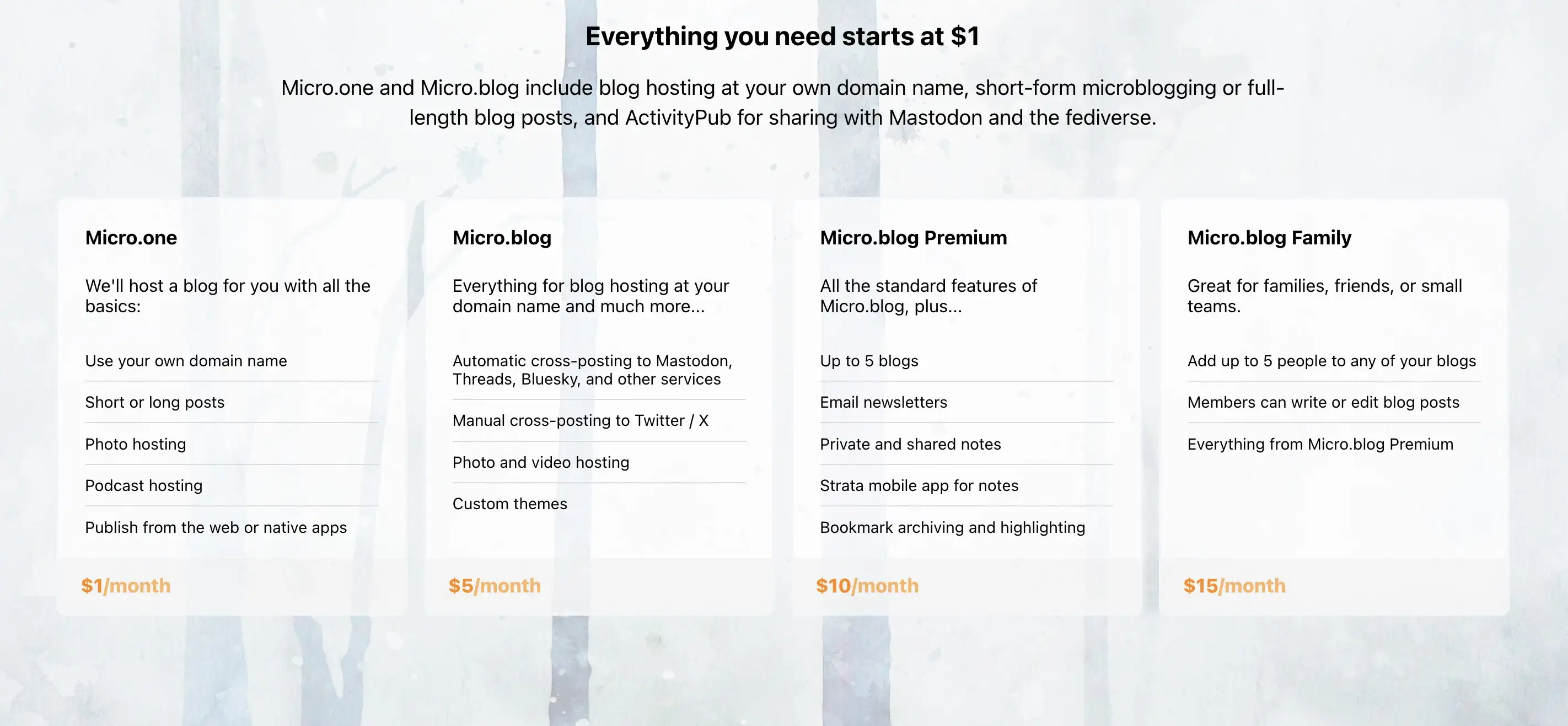
When I signed up, they only had the $5/month and $10/month plans. And I don’t quite remember what made me require the Premium plan – but things has been restructured now, so I could probably make do with one plan lower. If my friend wants to move to Micro.blog, we could go for a Family plan. 🫶🏻
I don’t find any value in things like notes and bookmarking, as I’d much rather use dedicated tools for this. I also don’t really use the newsletter feature – so I can’t really comment on that.
2) “Which features do you appreciate the most?"
I like the cross-posting features and robust ActivityPub support. For instance, the comment feature here is neat:

I also like that there are great option for third-party apps for publishing, like Ulysses, Drafts, and MarsEdit.
And I find that the platform has a good balance between being easy enough to use, while also being powerful and flexible enough to form into what I need. An example of the contrary was how I couldn’t find a way to have WordPress have a front-page with the start of my blog posts like I have now. (I’ll go into how I’m doing that later.)
3) “How is it different from the alternatives?"
Before I tried WordPress, my blog was on Write.as. However, that was too simple, and not expandable enough. With Micro.blog I can freely add features via Javascript, for instance. (Examples below.) And it also has a plug-in system (even though it’s far from as powerful as WordPress in that regard).
I know that Simen uses Quartz, which I also use for my band’s website. This is a nice static site generator where you, for instance, can simply “push” an Obsidian vault. However, this doesn’t have integrated newsletter support, doesn’t support ActivityPub, and doesn’t have cross-posting (among other things).
4) What’s missing? Or is too clunky?
One thing Quartz is better suited for, though, is digital gardens. Micro.blog is absolutely built around traditional, chronological blogging.
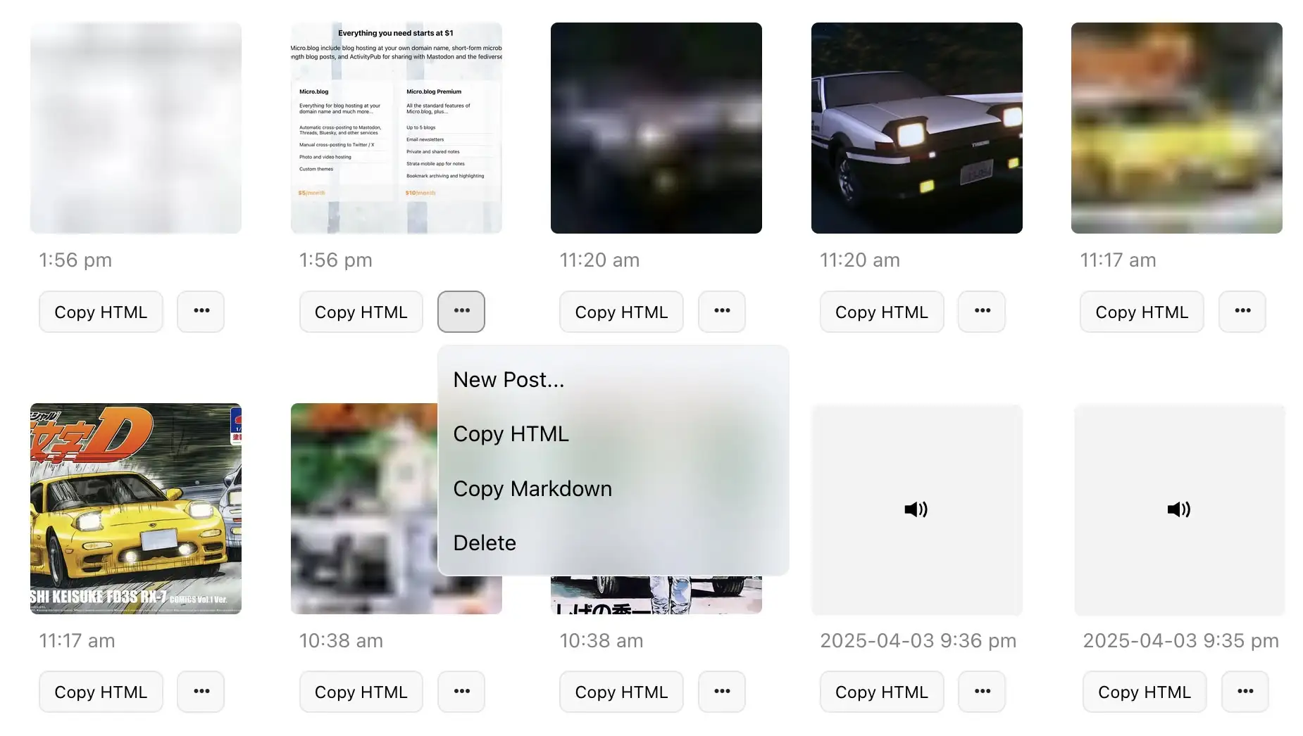
I also find uploads to be very clunky, when I don’t do it through Shortcuts. I can only upload one file at the time – and there’s no way, even in the … menu, to copy just the URL to the file. (I have to carve it out from the HTML or Markdown.) 👇🏻
The ActivityPub posts that Micro.blog push, for the long-form posts, are also very lacklustre, IMO. Just the title, and link to the post:

And I don’t like the social media part of the service – which I’ll get into next.
However, I’m generally delighted with the place I’ve gotten this blog!
My use, and how I got there
My Blog's Photo Workflow, Powered by Shortcuts
And Thoughts on Alt Text
I use many images on my blog. But that’s not because I’m a photo blogger, or use a lot of decorative illustration images – it’s usually because I want to show and/or explain something.
I’m pleased with where my flow for uploading these, and adding them to my blog posts. So I would like to show what it looks like, and give thanks to Jarrod Blundy over at Hey Dingus, as I’ve built it around a shortcut of his.

The shortcut starting point
Jarrod has shared plenty of cool shortcuts, over at his Shortcuts Library. And the one I started with, was the one called Bulk MB Image Uploader. The point of this was to be able to upload several images at once to Micro.blog – which is the hosting provider we both use. However, uploading in bulk like this isn’t necessary to me. I just used the framework surrounding access to the Micro.blog API/app token, so I don’t have to use the website, and can do it all from shortcut actions.
More features
After being yelled at, by various web efficiency tests because my website used too many resources, I wanted to optimise the way I use images. And this involves two steps: Compress the main images, and add lazy loading (with a temporary lazy image, that keeps the layout while the image loads).
So, my version of the shortcut (which only works with one image at the time), actually uploads two images to Micro.blog:
I’m using Jason’s GLightbox plugin for Micro.blog to get a lightbox for the images, and I combined that with this guide for lazy loading.2
So the code my image uploader shortcut spits out, looks like this:
The Terminal – For Noobs (Like Me), Part Three
A More Noob-Friendly Terminal
This is the third, and final, part of my terminal guide.
I’m not saying these things are stuff everyone should do – but they are things that have helped me like the terminal much more. And feel free to just pick-and-choose the things you want to try out.
Also, as I’m a Mac user, this might be a bit Mac-centric. But I think all of the programs I’m mentioning also exist for Linux – and many of them for Windows as well. (And installation is probably similar.)
Choice of app
One thing that has tripped me up quite a bit, is that terminals adhere to different text manipulation conventions than the rest of the OS. For instance, Shift+Command+Left will usually select text from the caret and all the way to the left – but it doesn’t in terminals. To be fair, the hotkeys in the terminal are probably better, if you know them. But to me, it’s just impractical that they’re different when I spend so much more time with “regular” bindings. (Here’s a video showing some of the default bindings in most terminals!)
The only terminal I’ve found that behaves like regular apps, when it comes to text, is Warp 🖇️. It also has several helpful AI tools integrated. However, this is a controversial recommendation. Among other things, it has gotten a lot of flack for the fact that you used to have to log in to use it, and that it’s quite bloated compared to other terminals. But I still think it’s a good choice for beginners!
If you want something leaner, either to start with or if you’ve graduated from Warp, I recommend Ghostty.1 I’m currently using Ghostty – and the screenshots in these posts are from it. I don’t miss the AI features, as I prefer to keep a chat going in Raycast 🖇️ anyway. And I’m getting by with the, in my opinion, poorer text manipulation.
Customising
The Terminal – For Noobs (Like Me), Part Two
The Why and What
In part one, I tried to establish the basic concepts, like terminal emulator, shell, prompt, and CLI. In this part, I want to go into why people use the terminal – and in the next part, how to make it more noob-friendly.
“But why do people use this archaic thing?”
As mentioned in part one, I’m absolutely not one of those who live in the terminal. But if I were to guess (and this applies to my basic usage as well), I’d say two things are the most important: It’s fast, and it’s powerful.
One way it can be fast, is that CLI programs are computational efficient, as there’s a lot of stuff (like graphics) they don’t need to render.
Another way is that you can do quite complicated tasks in a single* command. For instance, I’ll sometimes run this:
for dir in */; do
(cd "$dir" && mkdir -p .Originals && cp * .Originals/)
done
This will
I use this to create backups of files before editing them (in a specific workflow), and it happens instantly. 👌🏻
CLI tools are both powerful in terms of what they can do, and also in that they’re usually highly customisable. They’re also generally easy to combine with each other, because they often do one thing.
And the combination of being fast and powerful, if you know what you’re doing, makes it a valuable tool in which to invest.
“But what can you use it for?”
The Terminal – For Noobs (Like Me), Part One
The Basic Concepts
If you’re like me, from time-to-time you’ll come across tasks that should be done in the terminal. But as you’re not very familiar with it, you wince a bit, and then just paste whatever they say, and hope for the best. The guide might also assume you know a bunch of concepts, that you don’t really understand. Like, why do some commands start with $?
Hopefully, this guide can answer some of the questions you’re too afraid to ask, and make you less afraid of the terminal. I’ll never be a person who lives in the terminal (especially as I’m not a programmer) – but I’ve managed to get to where I like it, and will be happy if a task can be done there.
Sorry that this will be a bit Mac-focused. But hopefully, it can be useful for more than Mac users!
Basic concepts
To me, things get much less daunting if I understand some basic concepts. And here are some of the basic things you won’t necessarily see explained on guides that include some terminal stuff.
CLI vs. GUI
More on Using a Mac Mini as a Secondary Computer
Remote Access, RSS, and Storage and Backups
Last November, I started using an M4 Mac Mini as a secondary computer. I’m still pleased with it! And I wanted to provide a little update with some more things I’ve learned.
Remote access
Using the Mini, has been pretty simple. I’ll usually use Continuity, via my MacBook or iPad, if the TV the Mini is connected to is on. And I’ll use Screen Sharing if not.1 (I can recommend keeping something like an integrated keyboard and trackpad nearby, if you have the space – which I don’t.)
But I’ve also figured out something else! And I get that this is very basic for many of you, but probably not for all.
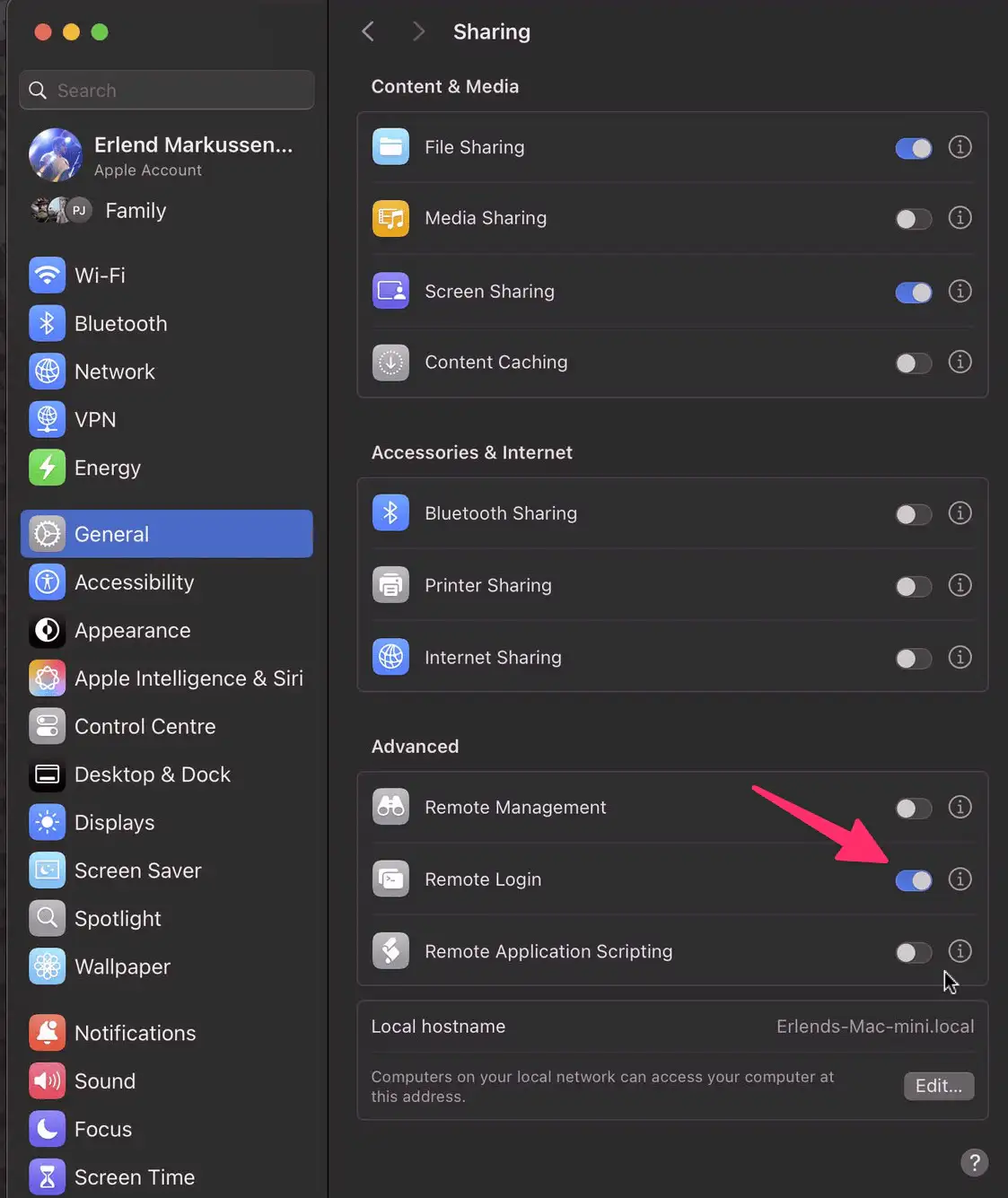
On the Mini, I’ve gone into System Settings → General → Sharing → Advanced → Remote Login, and turnet it on. Now I can paste in something like this, in my Macbook’s terminal: ssh erlend@192.168.12.34
The terminal instance, on the MacBook, will now be like if I was running it locally on the Mini. This allows me to reduce the number of times I have to control the Mini directly – as it’s nicer to just use the MacBook.
I also think this is an important setting – even though it’s not as secure:
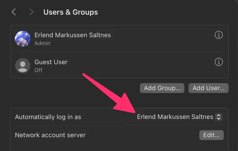
This means you can’t have FileVault turned on – but it makes it so the Mac will log in (and start all login items) on a restart. This is important to keep services running – but if there’s another (more secure) way of doing this, I’m interested in hearing about it.
RSS
My Adaptive Smart Light Setup
A Guide, and a Glimpse Into the Mind of a Madman (Me)
I’ve previously written about why I think Smart Bulbs > Smart Switches.1 And one of the reasons I think that, is that I (for some reason) really love having the colour temperature of my lights change throughout the day.
Sadly, I’ve found the automatic systems for this really lacking. But here I wanted to show how I’ve created a system I like.
The goals:
I want a smart home. But, in use, I want it to be as simple as a dumb one. I want guests to be able to operate things at, at least, the same level as they would in another unfamiliar home.3 And then I want to add smart benefits on top of this, like colour temperature, automations, some hidden button features, and being able to override stuff with things like a phone.
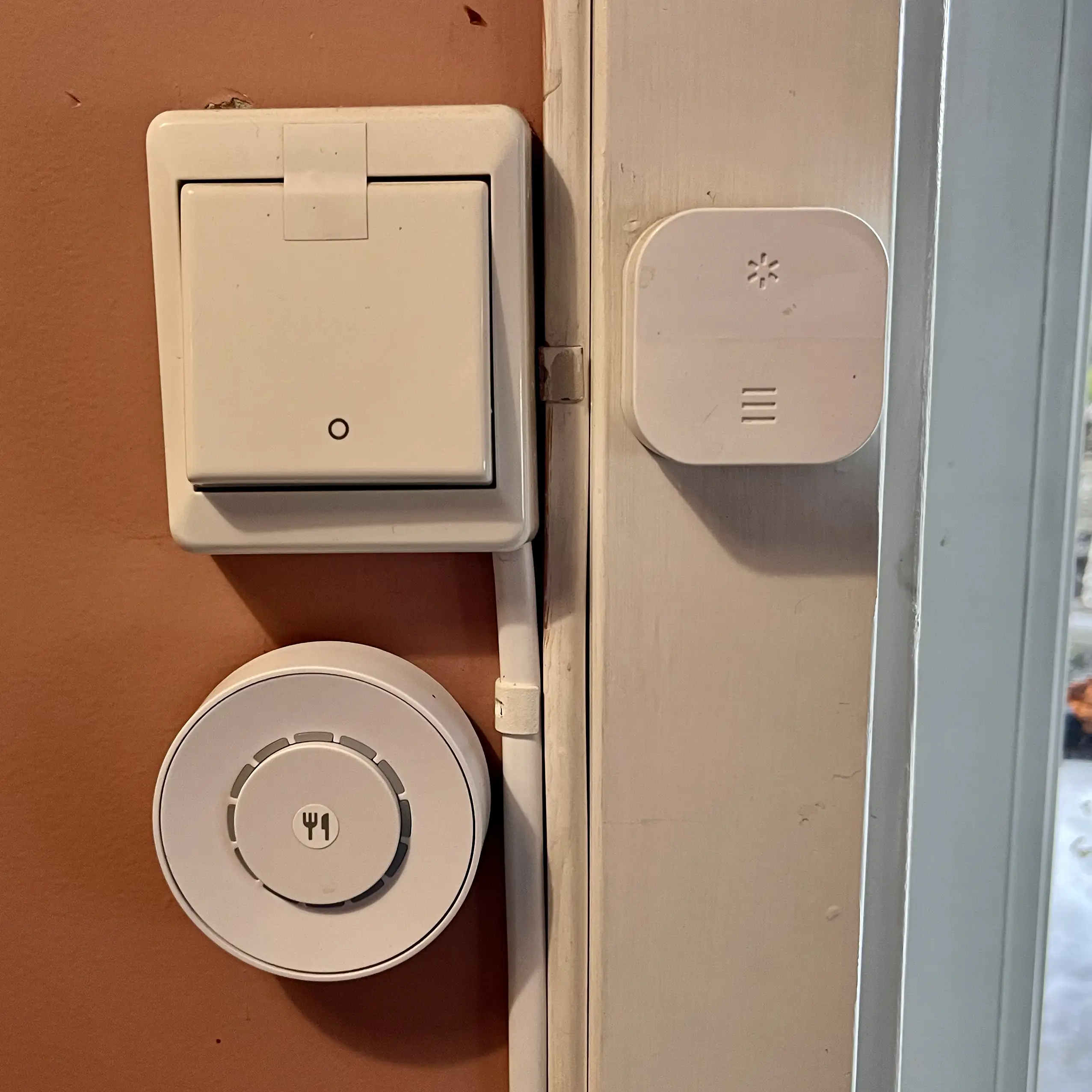
My most used switch is the Flic 2. And when the light is off, I want one click to turn on to a setting that’s almost always the right one. But as the “right setting” changes throughout the day, I have to do some adjustments in the background…
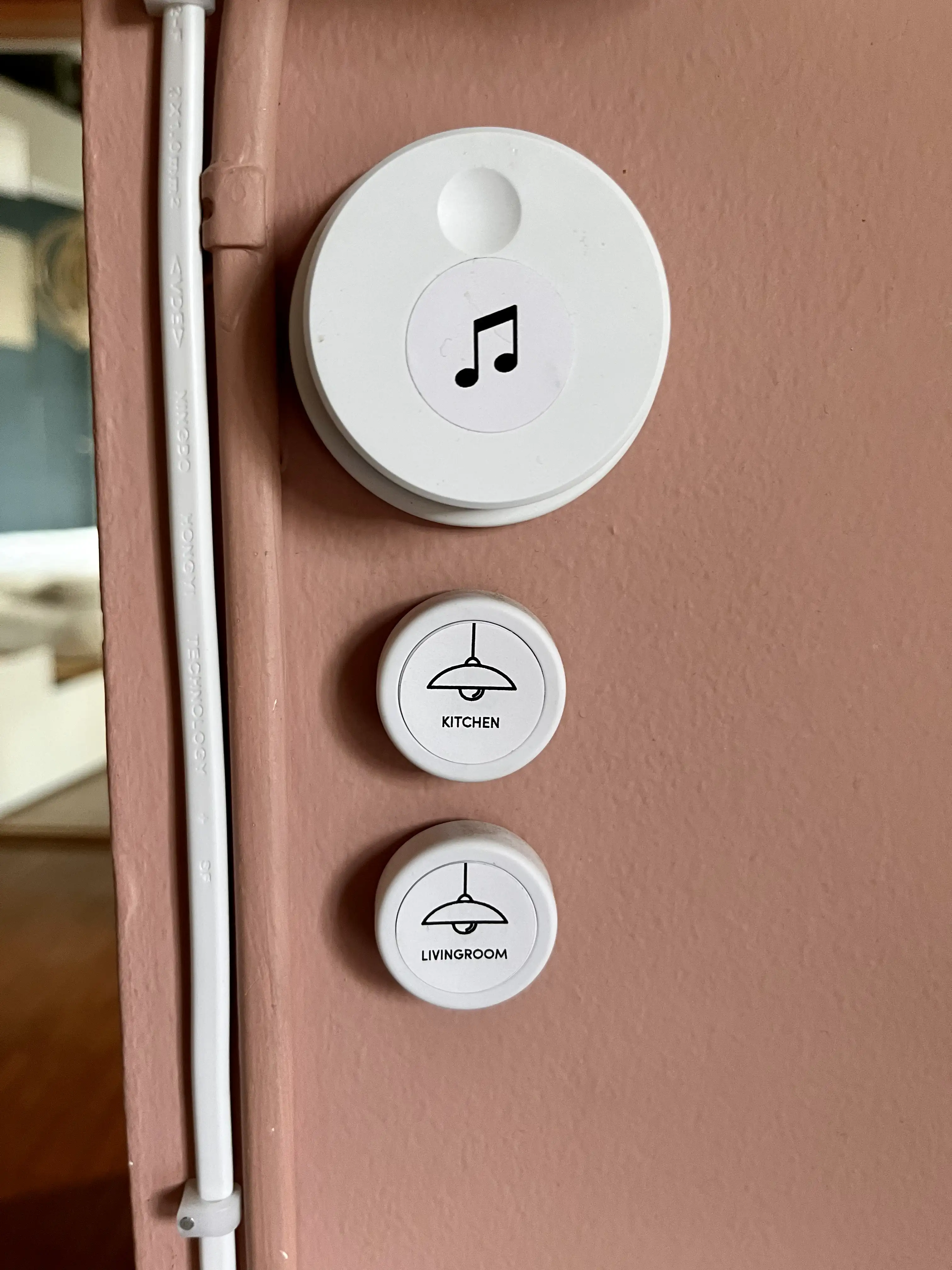
While you can adjust the brightness in Home.app, I also wanted to be able to do it with a dimmer switch at some places. So I’ve bought a couple of Flic Twists 🖇️ as well.4 HomeKit/Matter, sadly, hasn’t delivered support for dimmers, though – so I had to be a bit creative to get these to work as I wanted.
The principle
I’ve created three “moods” (which correlates to brightness and colour temperature):
And, currently, my home moves through these moods at these times:
If you turn on a light during “Cream time” it will turn on to that setting, and so on. And when the mood changes (during the day), it will go through the lights that are turned on, and adapt them to the current mood.
The how
Why I Value Doing Stuff on My Mac With One Hand
And How I Do It
I get that it sounds shady1 or like a great accessibility story, when I talk about being able to use my Mac one-handed. But it’s neither. Allow me to explain!
My default mode for using my Mac …
… is with my right hand on the trackpad, and my left in the home row position – for instance like this:
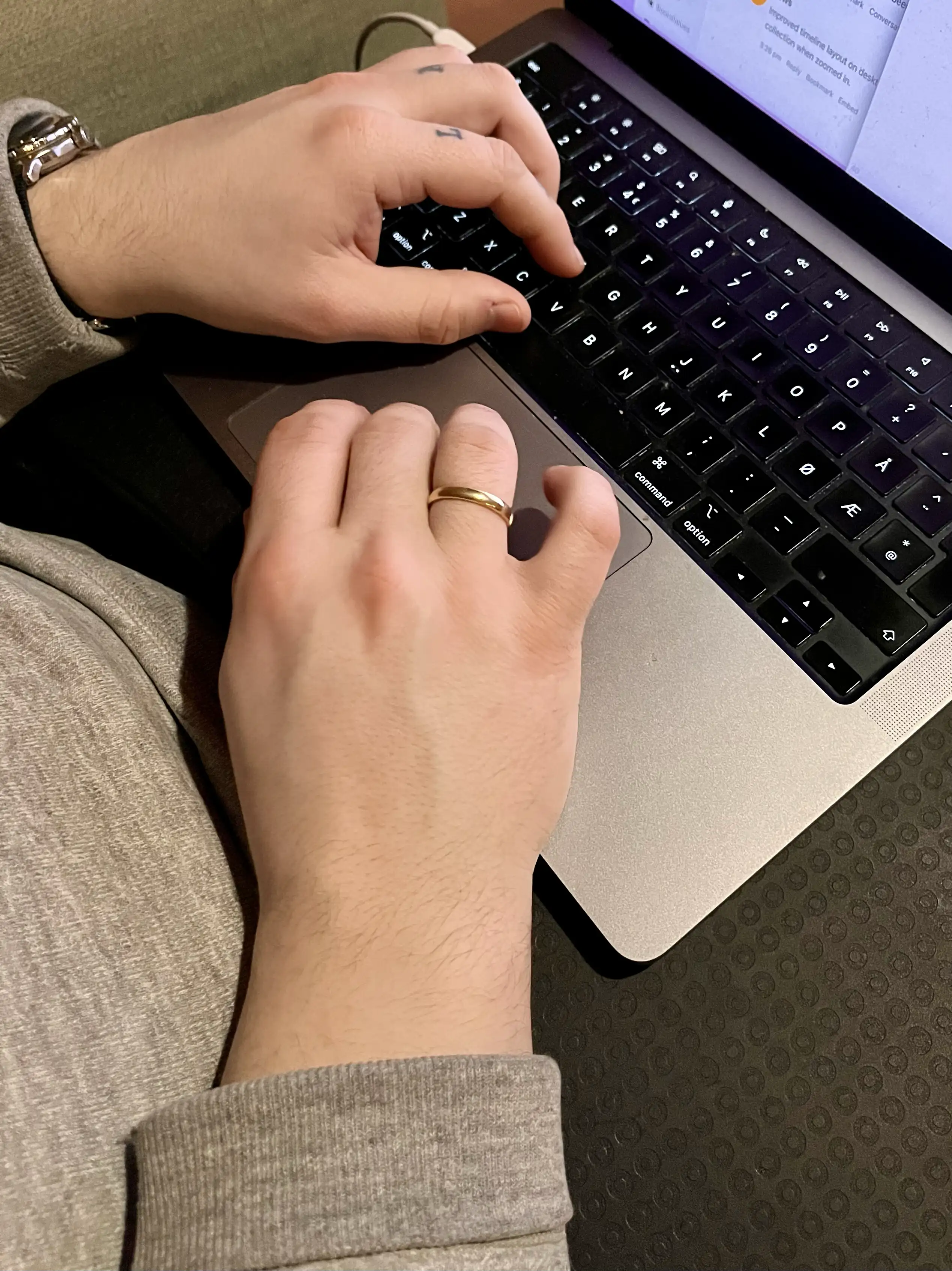
I totally get that both hands on the keyboard is the default for many. And I’m there quite a lot as well, and love keyboard-driven software.2 But, for some reason, the tasks I’m doing call for the above even more.
So I’ve optimised my Mac to be able to do a lot with only that left hand on the keyboard, and only that right hand on the trackpad.
I really like the Magic Trackpad, as I can have the “desktop” setup be really similar to the laptop one. I do have a gaming mouse at the ready – but if I had to use a mouse, I guess I would try to recreate as much as possible on the Magic Mouse.3
The right hand and trackpad
I’ve used BetterTouchTool (and some default options) to have the trackpad be extra useful. (I can also recommend Swish, even though it doesn’t fit what I want to do with the trackpad.)
Here are the main gestures I’ve set up, and that work in “every” program:
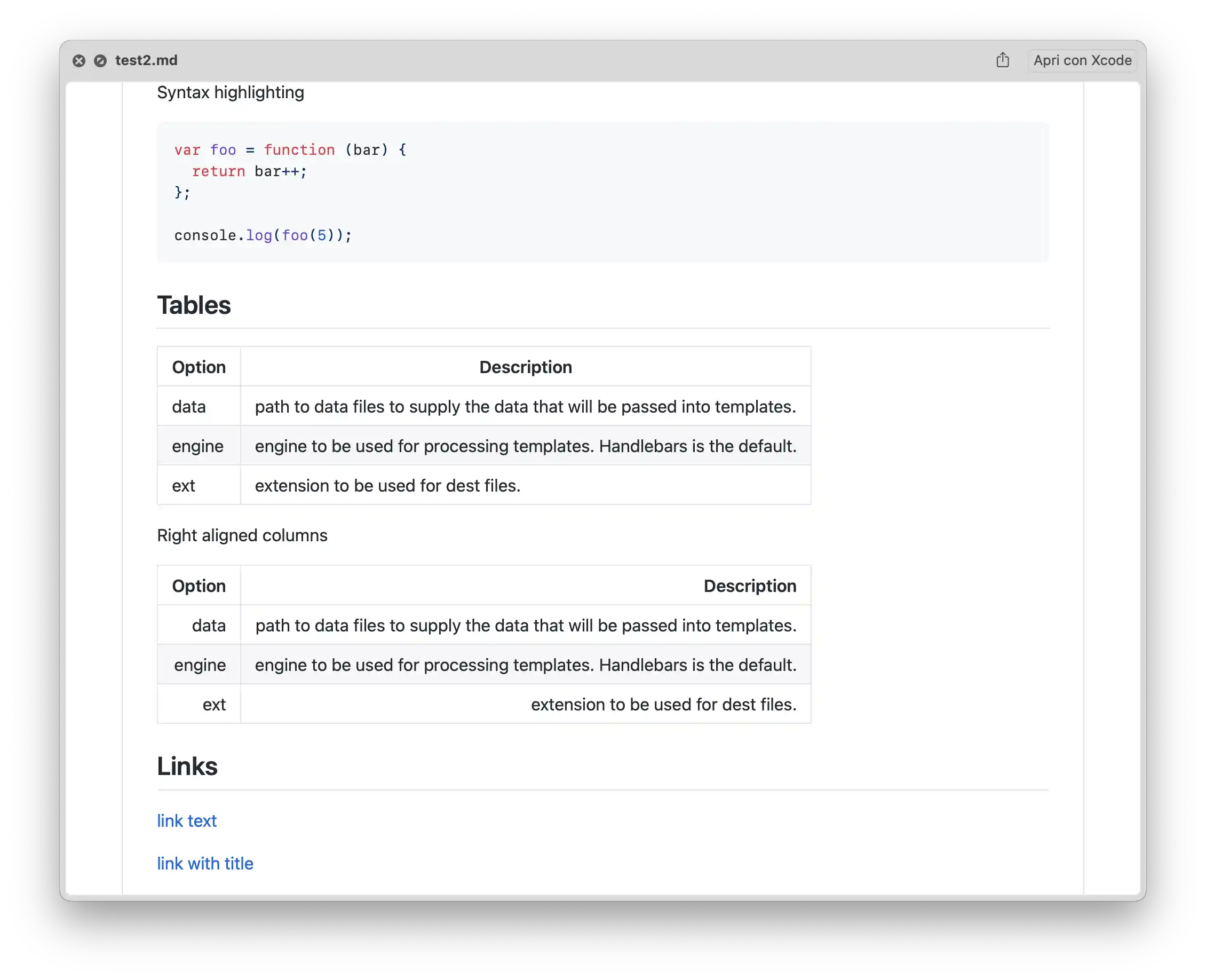
Quick Recommendation #2: Better Markdown Preview in Finder
Hitting space to preview files (Quick Look) is one of my favourite Finder features. However, it does a pretty mediocre job with Markdown files. QLMarkdown is a little utility that makes these previews richer.
You can install it from this link, or by using this Homebrew command:
brew install --cask qlmarkdown
The app isn’t signed – so you need to do the little dance to convince macOS that you want to run the app. (This is detailed in the original link share up top.)
You need to open the app once for the utility to work. And that’s also where you change settings.
I get that many Markdown contexts are outside of Finder – but if you do use them there, I hope this little tool can be useful!
Monitor Resolution Guide for macOS
Seeing as Apple just released a great monitor-less Mac, in the new M4 Mac Mini1, it makes sense that there’s more external display discussions surrounding Macs. After answering a couple of questions on Reddit here, I thought I’d try to write a guide. Because, if you don’t use a screen made by Apple, things get a bit complicated…

To make this as timeless as possible, I won’t discuss specific monitor models. Instead, I’ll do my best to foster understanding, that will help in your research.
Two uses of the term “resolution”
One way of using it, is when discussing the actual number of pixels a screen has. For instance, a regular 4K screen has 3840 ✕ 2160 pixels. This can be called the physical resolution.
However, look at this image, where I went into settings to set my 4K TV to display as 540p:
Changing the setting, luckily, doesn’t delete a bunch of pixels on my TV. So in this context, it can be useful to think of the resolution more like the size of the rendering. This can be called the logical resolution.
The relationship between the physical and logical resolutions matters
The physical and logical resolution can be the same. But for high-resolution screens, this will usually make things too small. And in this context, the resolutions 4K (3840 ✕ 2160) and _1080p_ (1920 ✕ 1080) have a special relationship: The former is exactly 2x the width and 2x the height of the latter. This is why you’ll see people mention 4K being “2x” that of 1080p. But keep in mind: it technically has 4x the number of pixels (since it’s 2x two times).
Let me try to explain why that’s important
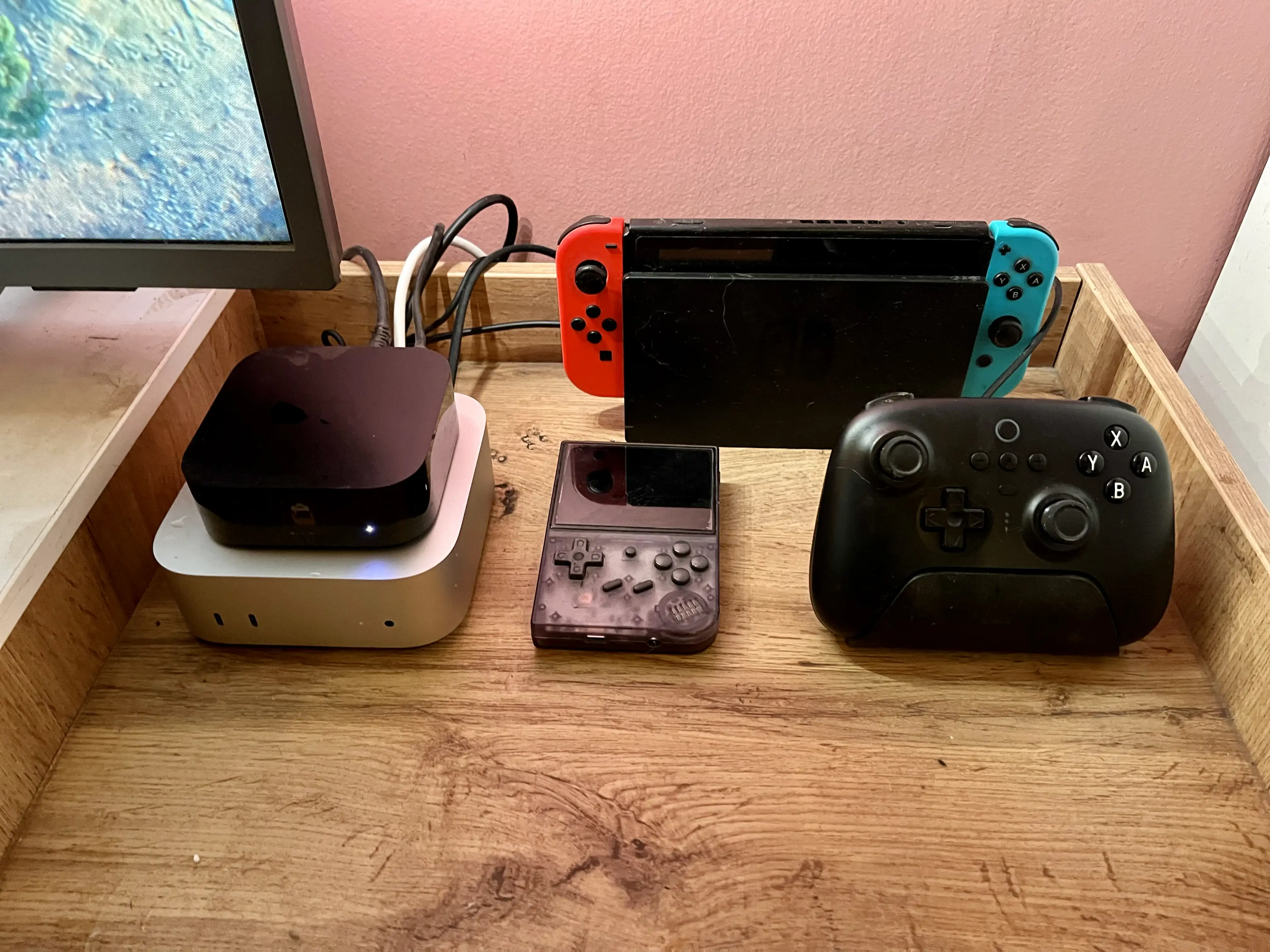
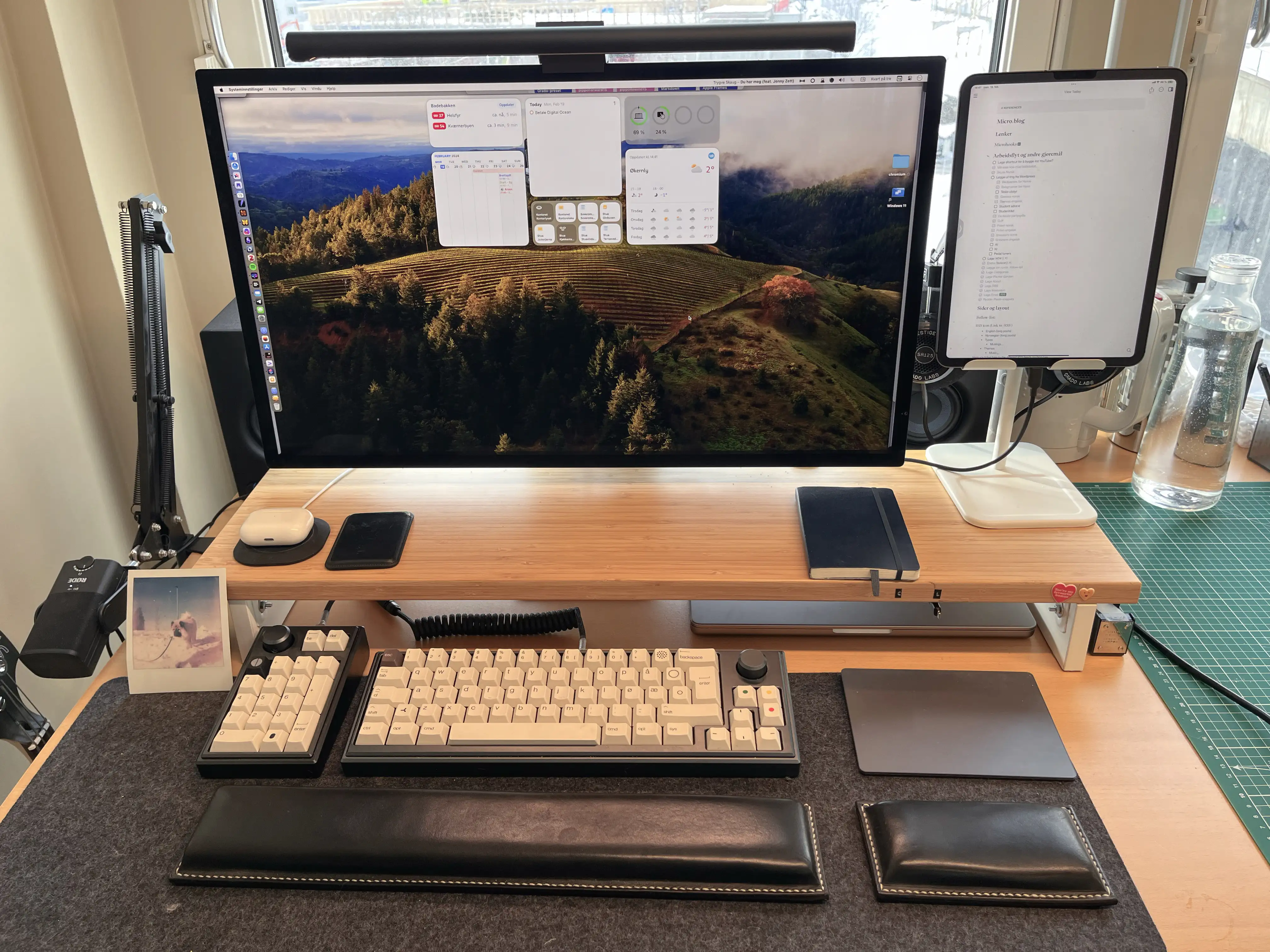
My Setup for the M4 Mini as a Secondary Mac
NAS, Media Server, and Light Gaming
I spent the weekend setting up my little new Mac – and I have to say: it went pretty smoothly! Here’s what I did, and how you can do it yourself if you like.
The hardware
As Apple’s upgrade prices are certified insane, I went for the absolute base model. I did briefly consider getting 10 gig Ethernet – but I had to change too much about my setup to get any benefits from it. And I don’t really need that fast a connection for my use case.
16 GB of ram is enough for me, but the built-in 256 GB of storage is obviously too little. But as it’s a stationary machine, getting external storage works great.
Some drives will use regular USB speeds (for instance USB 3.2 Gen 2). These are cheaper – but if you go for USB 4 or Thunderbolt 3+ you will get about three times the speed. If you, like me, want to run programs (like games) straight from the disk, you’ll probably want the latter.
Homebrew – For Noobs (Like Me)
I do not know what I’m doing when it comes to the terminal on my Mac. But one use-case, I really like, is Homebrew. So I wanted to explain what it is, and how to use it, to other newbies!

How to install it
I get that I haven’t told you why yet, but to install it, you just copy this into your terminal: $1
/bin/bash -c "$(curl -fsSL https://raw.githubusercontent.com/Homebrew/install/HEAD/install.sh)"
Then you just follow the quick guide. (I think you only have to copy and paste one set of commands.) For Mac, you can also go here to download the latest .pkg file.
It’s a “package manager”
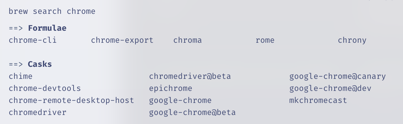
And this just means that you use it to install, uninstall, and update other apps. These can both be command-line software (called formulae in Homebrew parlance) or what most would recognise as regular apps (called casks).
And here’s how you use it:
Installing something is as easy as typing brew install firefox. That’s it! No going to a website, no downloading of installers, no dragging and dropping, no nothin'! And you uninstall by typing brew uninstall google-chrome. Even though you’d be surprised by how many apps support installation through Homebrew, not every app does. Furthermore, every “app name” has to be only one word – so brew search chrome will help you find out if the app you want is there, and how you should address it.
A Shortcut for Automatic Mac Dock Changes
For When You Switch Between Screen Sizes
I switch a lot between using my MacBook as a laptop, and in clamshell mode in my office. And in general, I keep every setting the same between the setups. However, I have different dock preferences:
The great Rafael Conde has made a solution, with his app HiDock. But sadly, in my experience, it’s simply not stable enough (probably due to some esoteric macOS restrictions) – so I’ve made a crude shortcut to replace it. But before the guide to try it out for yourself, a little thing I recommend you paste into your terminal:
defaults write com.apple.dock autohide-delay -float 0;
defaults write com.apple.dock autohide-time-modifier -int 1 ;
killall Dock
First, create shortcuts for setting the different preferences
How to Change macOS Keyboard Shortcuts for Window Management
Or Any Other Keyboard Shortcut, for That Matter (With Extra Added Fun for Multilingual Users)
This year, Apple decided to upgrade the default window management on macOS, from terrible to OK. However, I’ve heard some complaints about the keyboard shortcuts, as they use the Globe key, which can cause some problems if you want to automate the hotkeys somehow.
But I have good news: You can change these, and any* other, keyboard shortcuts!
16/10-24: Now updated to work with weird apps, like Discord!
Here’s (one way) how:
If you go into the System Settings app, hit Keyboard and then the button Keyboard Shortcuts…, you’ll open up a screen. In this, you can then hit App Shortcuts to come here:
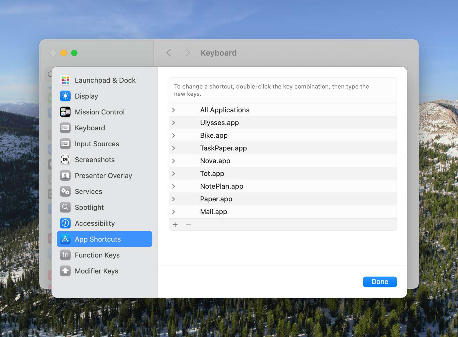
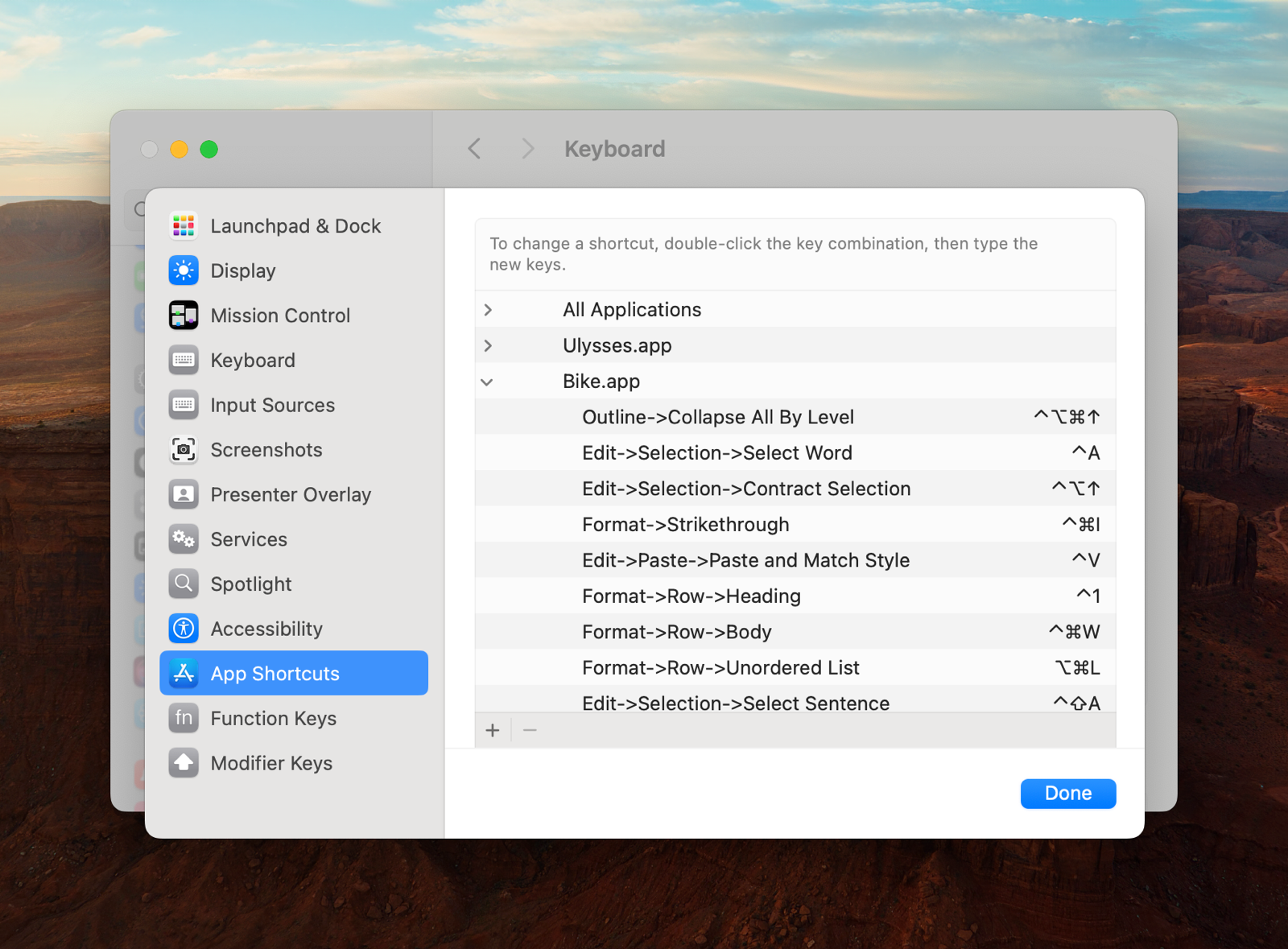
This screen is for changing the keyboard shortcuts to the items in your menu bar (or adding to those who don’t have one already), like those shown in this image:
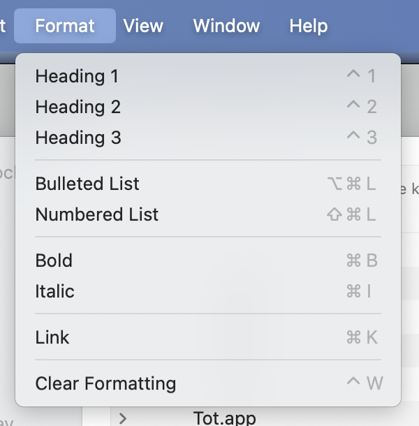
You can either add them only to specific apps (like you can see I’ve done), or to All Applications – and when we’re dealing with this window management, we need to do the latter.
Hitting + gives us this screen:
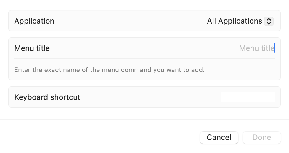
When writing the menu title, you have to be very specific. Here’s what it could look like: Format->Bulleted List
The spelling and capitalisation has to be exact – and you need to separate levels with a - and > and no spaces.
Here’s what it looks like if I want to set a hotkey for tiling a window top left:
Window->Move & Resize->Top Left
As the option sits two levels deep, I have to add a bit more – but it works!
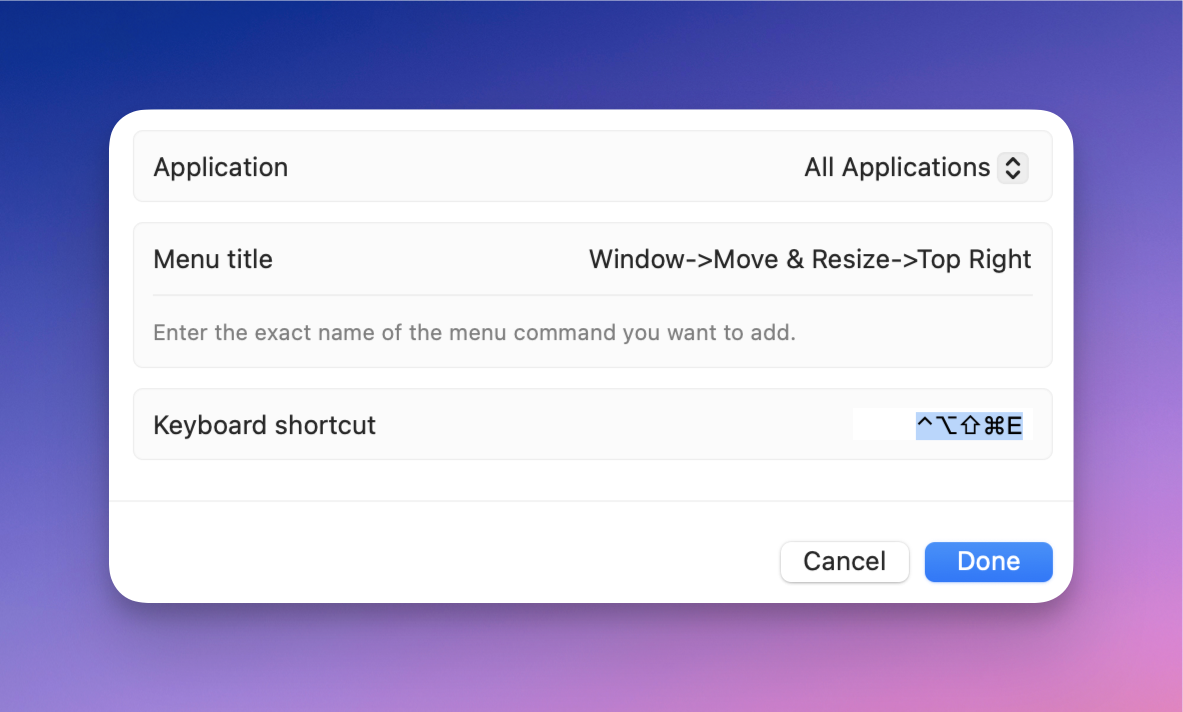
Yes, the hotkey is Shift + Ctrl + Optn + Cmd + E, heh. But I use Karabiner-Elements to set up Caps Lock as all of those keys at once.1 Doing that creates a separate modifier, not used by any apps. A word for this, is Hyperkey, and it’s sometimes denoted by this symbol: ✦
The easiest way to set it up is probably with this little utility by Ryan Hanson, and I greatly recommend doing it.
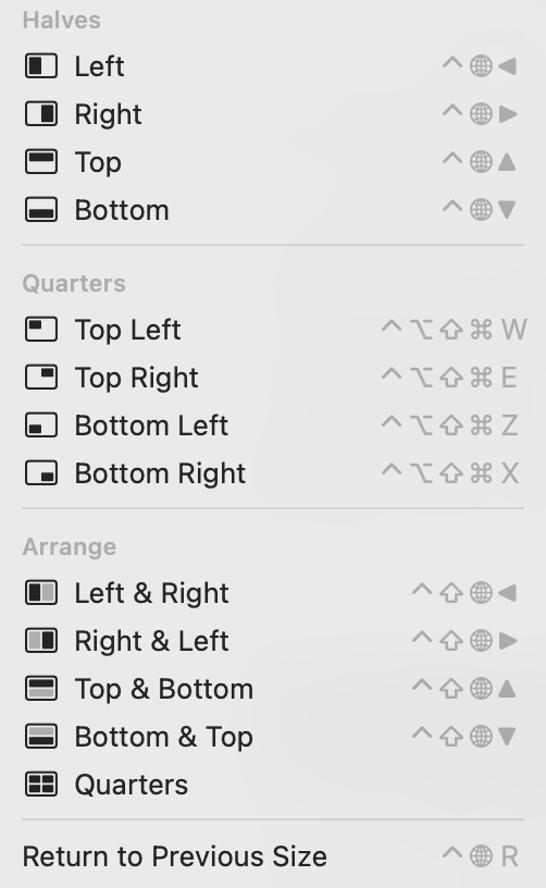
I go more into how I manage windows here – but this is the short version:
The grid isn’t perfect, as I couldn’t set Hyper + Q as a hotkey, and I like to keep Hyper + C as OCR Copy. But I still really recommend this setup! For the rare cases I need something else, I use Lasso (launced with Hyper + Space).
Cons of the System Settings method:
Pros of the System Settings method:
An alternative: Keyboard Maestro
The Apps I Use From Setapp
And Why I Think It’s Great Value
Setapp — which apps do you use? Many, us pay for SetApp yet don’t get all the value because we don’t know the full extent of all the shiny toys. This was last asked 4 yrs ago, so it feels relevant againWhat the hidden gems have I missed?
A while ago, someone, on the MPU Forums, asked the question above. And here’s my answer to this question.
I also got around to writing this, as many of My App Defaults are from Setapp, and because I recently read about the Setapp iOS store in the EU (which Norway, sadly, isn’t a part of).
I hope this post can be useful if you’re considering the service, and wonder if it’s worth it, or if you’re new to the service and would like some tips to get started. If you want to give it a try, I’d appreciate you doing so through my affiliate link to Setapp 🖇️. 🫶🏻
I’ve sorted them into the following categories:
I also have a couple of honorable mentions, that are (or seem like) good apps, but that I, personally, don’t use that much.
I’ve added the price outside Setapp as well.1 Setapp is €10-15/month, or €100-150/year. However, some things to keep in mind:
I still find it to be great value – and I like that I can use nice, paid apps like explained in the second point.
Always-running utilities
These are apps I have running in the background all the time.
Bartender (€21)
The grandad of menu bar organisation. Ice is an interesting free alternative, but I’m still pleased with Bartender – especially as I can have it automatically change layout when I connect my Studio Display.
BetterTouchTool (€22)
I mostly use this to set up trackpad shortcuts – which it does amazingly. But it can do much more as well.
Cleanshot X (€26)
Terrific tool for screenshots, annotations, and screen recordings. An alternative for the latter, called IShowU (€80 or €22/year) also just dropped on Setapp.
Default Folder X (€47)
This app powers up the open and save dialogues on your Mac – with things like recent folders and the ability to click on folders you have open in the background to save there.
Hookmark (€63)
This is an app for creating deep links between different documents and parts of apps (like specific emails).
iStat Menus (€13)
Recently updated, with a beautiful coat of paint, this highly customisable app lets you place what you want in the menu bar. I have RAM and CPU usage, and a weather widget.
Mission Control Plus (€10)
I only use this to allow me to close windows from Exposé. Worth it!
Paste (€27/year)
My favourite clipboard manager. Both pretty and powerful.
PixelSnap (€35)
Used for measuring things or your screen. I think xScope might be a more powerful version of this.
PopClip (€23)
App that mimics the menu you get when you select text on iOS – but you fill it with what you want. I’ve turned off mine coming up automatically, but I get this with a hotkey:

From the left:
New defaults
These are tools that do the same thing as built-in tools, but a bit nicer/and more in a more powerful way.
Archiver (€20)
Just a nice zip/unzip tool. The Unarchiver (free) is more or less just as nice!
Elmedia Player (€25)
And this is just a nice video player. But here Iina (free) is also just as nice.
BusyCal (€45)
It lacks some of the most powerful Fantastical features – but I also prefer some things about BusyCal. And seeing as it’s so much cheaper, this is a great alternative if you want something more powerful than Calendar.app, but don’t want to pay €60/year. It also has a nice menu bar widget (as seen in the screenshot above).
Nitro PDF Pro (€200 or €17/month)
I’ve no idea why this is so expensive! I guess it offers features some businesses just got to have. 🤷🏻♂️ But for me, it’s just a nice PDF reader/editor.
Useful tools
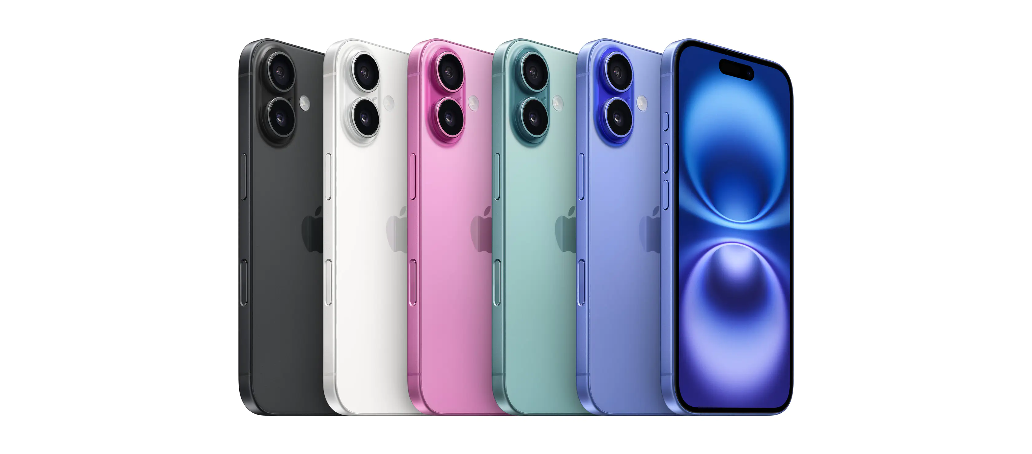
My Take-Away From the iPhone Event: This isn't a "Pro year"
A friend of mine had to buy a new iPhone a couple of months ago – and I liked his phrasing while asking me for advice: Is this a “Pro year”? Now, to some, the things you always get with a Pro phone are so important that every year is a Pro year. But I’m discussing how much you get for your money with the upgrade – because this will vary from year to year.
To be clear: I don't think most people should buy new phones more often than every 3-5 years. But as that interval will hit many people every year, it's still always valuable to analyse this year's phones.
However, I'll be holding on to my precious 13 Mini for at least another year! 💪🏻
So, while we haven’t seen any reviews of this year’s models, to me, it seems like last year was a “Pro year”, while this year isn’t. Let’s find out why.
These are things that are the same – things you’d get for the upgrade last year, and still get this one:
Both from 15 to 15 Pro and from 16 to 16 Pro:
Going from 16 to 16 Pro
In addition, the aforementioned stuff, this year you also get: