Chromium and Nested Backdrop-Filters
If you’re like me, you sometimes get these small (often technical) problems, that you work on for so long — and you refuse to surrender.
I had this with CSS a couple of months ago:
I had a menu, that had transparency and blur, and then I also had a submenu that I wanted to have the same. But the submenu just. wouldn’t. blur!
It works perfectly in Gecko and WebKit — but after countless hours, I found the problem: If an element has a backdrop-filter, Chromium won’t let its children have it as well. 1
I had to design around it, and moved on with my life.
A few moments later…
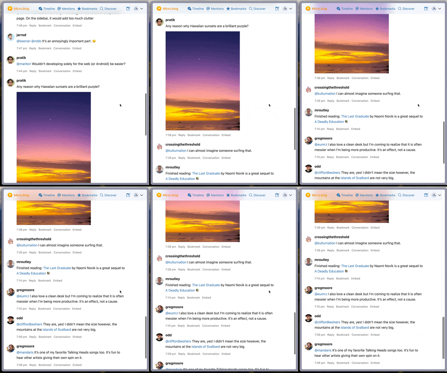
I recently moved to Micro.blog. And one day I was scrolling down my timeline…

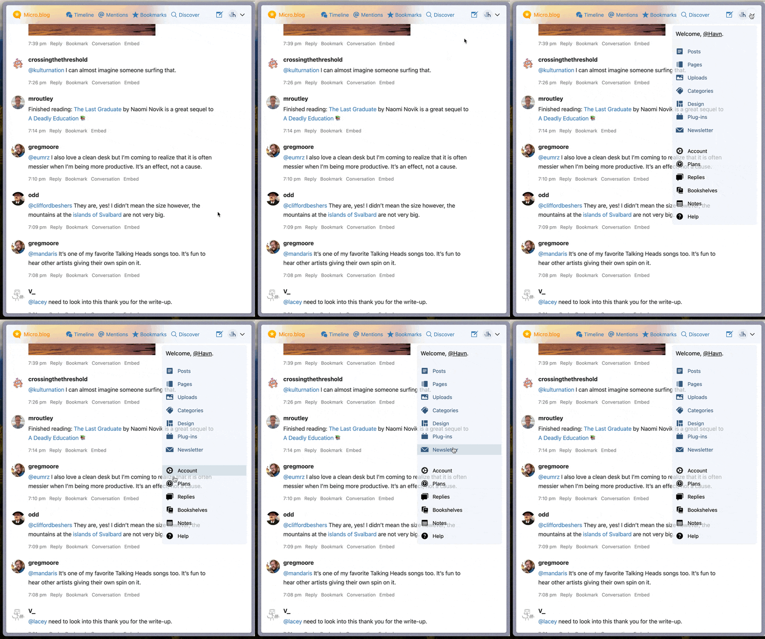
Then I opened the submenu:

There it was — the same bug! I’m not alone!
The fix
Now, Manton, I don’t know if you guys have battered your heads at this as much as me. Perhaps you don’t use Chromium and didn’t notice? Or maybe you’re just better than me at letting go of insignificant (unsolved) problems?
Well, anyway — as I really struggled to find a solution online, I wanted to share a solution for Micro.blog — and perhaps someone else who stumbles upon this.
It’s not perfect, but:
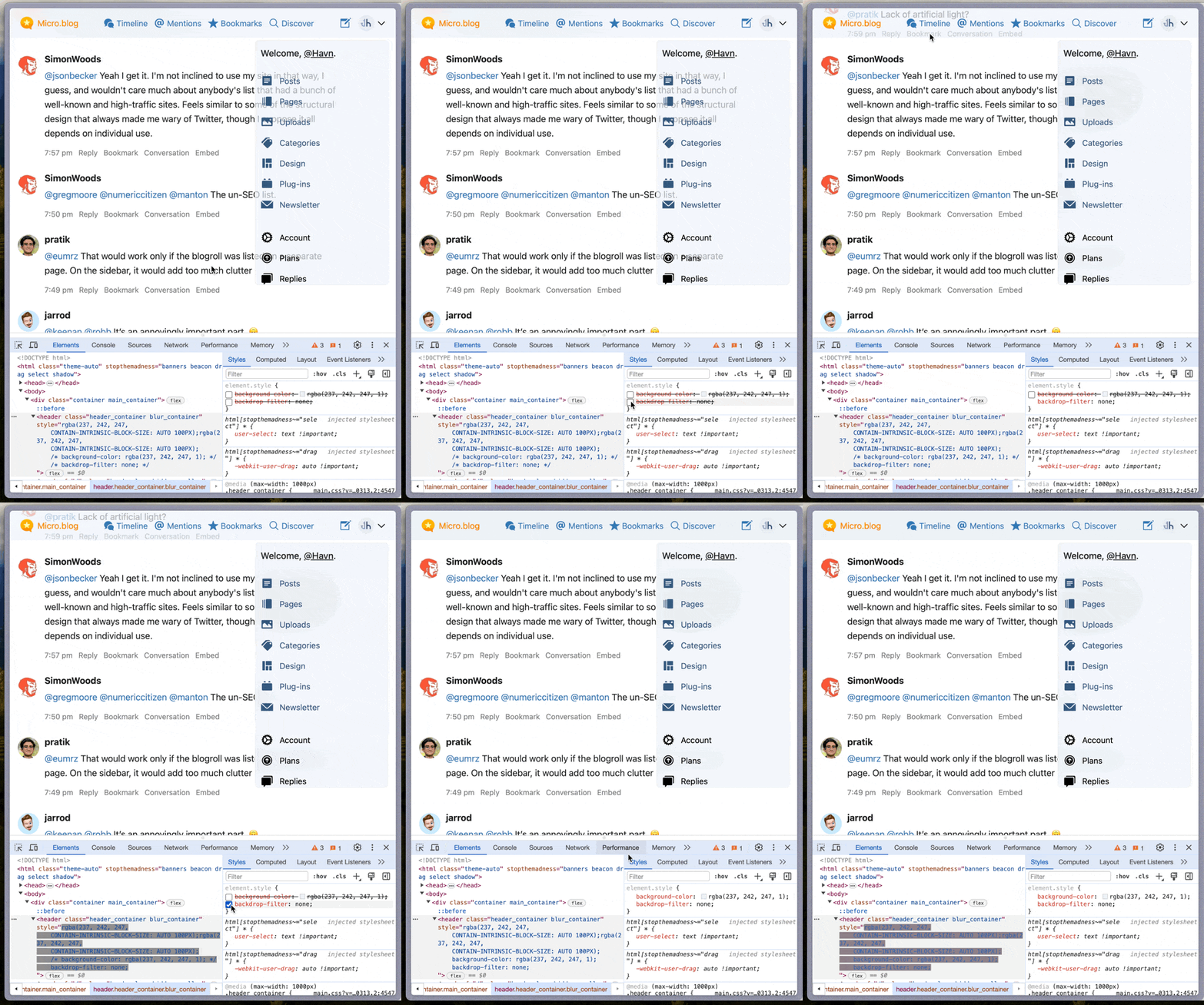
You have to temporarily remove the blur from the parent
I think the best thing would be to have some javascript change the class of the parent when you click to open the submenu.
And then you turn off the backdrop-filter and change the background-color to something suitable.
Here you can see the fix in action:

Now, you do lose the nice blur while the submenu is open — but people will be looking at the submenu at that point!
If you don’t want the user to have to what I did there manually:
I think the best way to fix it, is by using the pseudo-element :focus-within. That could look something like:
header {
background: rgba (237, 242, 247, .7);
backdrop-filter: blur(20px)
}

header:focus-within {
background: rgb (237, 242, 247);
backdrop-filter: none;
}
If anyone tries this, let me know if it works! I hope my pain can lessen someone elses…
-
Now, I think I read somewhere that the Chromium people are claiming they’re the ones who interptrets the spec correctly — and that Gecko and WebKit are wrong in having it work. ↩︎