Erlend's Overdelivery Service
- Materials: Leather uppers, rubber soles, wool on the inside*.
- The boots should be resoleable.
- They should also be unlined — so you can get wool socks and soles separate from the boots themselves.
- Get them pretty roomy!
- And you should get more than one pair.
- In my apartment, I have some light switches that are in idiotically placed. I also have several lights I wish had more than one switch. So the fact that I can easily place switches wherever I want, by just sticking a little button to the wall (or whatever), is very nice. And so is the fact that it’s trivial to have one switch control several lights, or have several switches controlling one light.
- I want nothing to only be controllable by my phone. But I do think it’s nice that I can use it to control my lights — even when I’m not home. I also like that I can create automations, like turning off the lights when I leave.
- I really, really like to vary the colour temperature of my lights throughout the day. However, I don’t need colours like in the image above.
- Very simple → In your head
- Simple → A calculator (app)
- Medium to complex → A spreadsheet app
- Why do you use the one you use now?
- What are your favourite (large or small) features? Please be very specific!
- I don’t love that Arc is built on Chromium — as I think Google has more than enough power over the web as it is.
- I’m not against supporting any VC funded company — but in combination with an unclear business model, I become more skeptical and worried if our incentives align. 2
- I’m 1.75 m tall, and my legs and arms aren’t especially long - so clothes are usually too long.
- Related, I like watches, bracelets, shoes and socks - and cuffing shows them off.
- I often think it makes the clothes themselves look better.
Winter boots "for life"?
Not too long ago, I saw a thread over at r/BuyItForLife about winter boots. And as someone who likes the (even though often unrealistic) ethos behind that subreddit that’s also a Norwegian, I obviously have thoughts.
How cold is cold?
To be clear: Even though I live in Norway, I don’t live in the coldest parts. I also don’t stay outside for days at a time! If you’re working in the arctic, or something, you probably need something even warmer than what I’m about to recommend. But’ve had no problems with my boots, down to like -15 °C (5 °F).
The principles
While I will recommend some specific brands/models — the advice is generalisable:

Why those materials?
✉️ How, and Why, I Use Micro.blog
A friend of mine, Simen (who has a nice, Norwegian blog), asked me about Micro.blog. That’s where this blog is hosted, and is also a social medium of sorts.
His questions
First, I want to give quick answers to the questions he had – and then go into more detail on how I’ve set things up.
1) “Which tier do you use, and why?"
Micro.blog has several tiers:
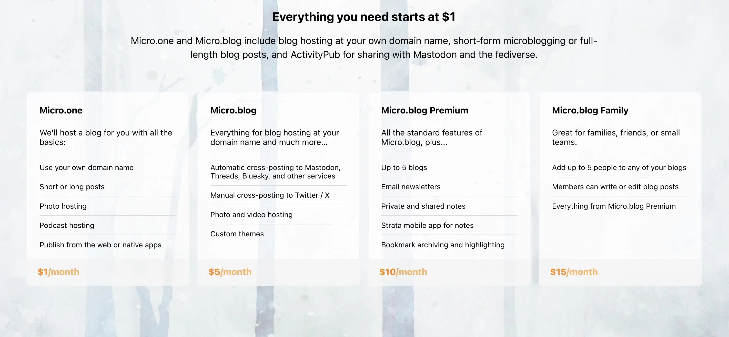
When I signed up, they only had the $5/month and $10/month plans. And I don’t quite remember what made me require the Premium plan – but things has been restructured now, so I could probably make do with one plan lower. If my friend wants to move to Micro.blog, we could go for a Family plan. 🫶🏻
I don’t find any value in things like notes and bookmarking, as I’d much rather use dedicated tools for this. I also don’t really use the newsletter feature – so I can’t really comment on that.
2) “Which features do you appreciate the most?"
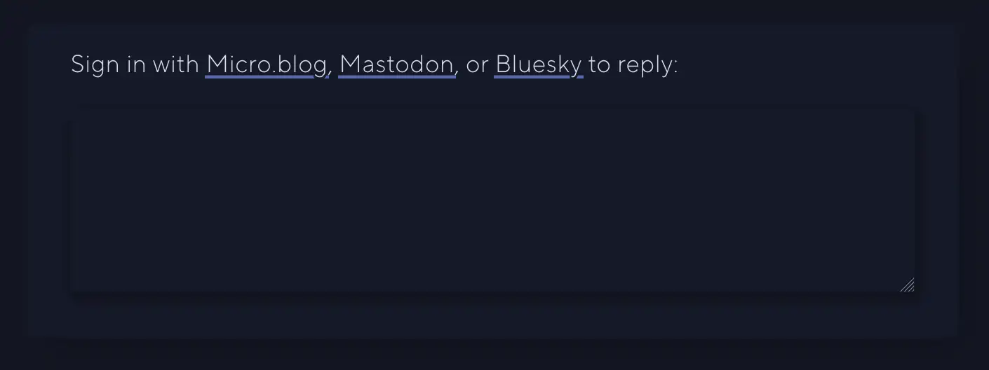
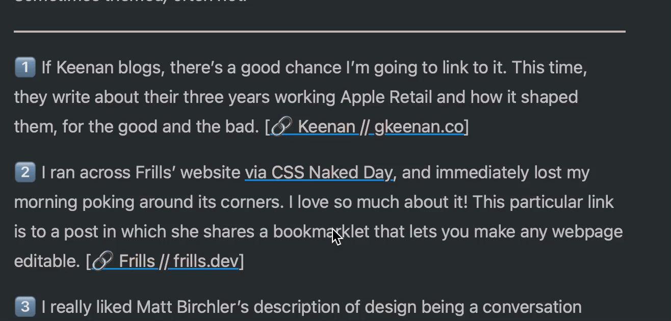
I like the cross-posting features and robust ActivityPub support. For instance, the comment feature here is neat:
I also like that there are great option for third-party apps for publishing, like Ulysses, Drafts, and MarsEdit.
And I find that the platform has a good balance between being easy enough to use, while also being powerful and flexible enough to form into what I need. An example of the contrary was how I couldn’t find a way to have WordPress have a front-page with the start of my blog posts like I have now. (I’ll go into how I’m doing that later.)
3) “How is it different from the alternatives?"
Before I tried WordPress, my blog was on Write.as. However, that was too simple, and not expandable enough. With Micro.blog I can freely add features via Javascript, for instance. (Examples below.) And it also has a plug-in system (even though it’s far from as powerful as WordPress in that regard).
I know that Simen uses Quartz, which I also use for my band’s website. This is a nice static site generator where you, for instance, can simply “push” an Obsidian vault. However, this doesn’t have integrated newsletter support, doesn’t support ActivityPub, and doesn’t have cross-posting (among other things).
4) What’s missing? Or is too clunky?
One thing Quartz is better suited for, though, is digital gardens. Micro.blog is absolutely built around traditional, chronological blogging.
I also find uploads to be very clunky, when I don’t do it through Shortcuts. I can only upload one file at the time – and there’s no way, even in the … menu, to copy just the URL to the file. (I have to carve it out from the HTML or Markdown.) 👇🏻
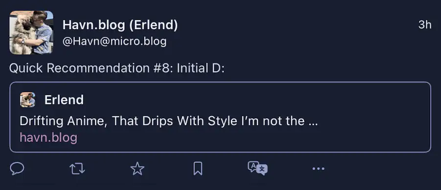
The ActivityPub posts that Micro.blog push, for the long-form posts, are also very lacklustre, IMO. Just the title, and link to the post:
And I don’t like the social media part of the service – which I’ll get into next.
However, I’m generally delighted with the place I’ve gotten this blog!
My use, and how I got there
An Introduction to Mad Max
I recently saw a film poster to Furiosa: A Mad Max Saga - so I thought I’d might watch Mad Max: Fury Road again. I think I remembered it being pretty good - but after rewatching it, I thought: “Uhm, I think this is the best film I’ve ever seen??"
So I’ve spent some time the last two weeks getting into the Mad Max Franchise. I’ve always known about it, but never really had a relationship to it. But now I’m a fan!
I’m not going into why Fury Road is so amazing here. Instead I’m going to give some pointers on how to get into the series.
Worth your time
There are many famous franchises out there - but most of them take a little lifetime to get into. There’s so much Star Wars/Trek, Game of Thrones or Marvel stuff out there. But Mad Max is much more manageable, and the high notes are so great, that it’s absolutely worth your time.
You can absolutely just watch Fury Road, without doing anything else before it. If you’re going that route, you can read this little footnote for a tiny bit of background. 👉🏻 1
I watched Fury Road blind, and then went back to the three old ones - but it could also be fun to simply watch them in chronological order!

Mini reviews of the first three
What if the Floorp Icon Actually Looked Like Piano Keys?
Floorp is an interesting Firefox fork, with a questionable name and logo.
Yesterday, someone on Reddit, posted “Floorp’s logo looks like piano keys”. And here’s the thing: I’ve been thinking the same, but at the same time there was something wrong. I’m not a pianist, but I’ve played with them enough to notice the problem. Let’s rotate the Mac icon, and compare with an actual piano:

The “double-sized” black key to the right was the culprit! 1 However, notice that there sometimes is two white keys next to each other. (This will be important later.)
But this made me think: What if the logo looked like a piano?
🌱 Why Smart Bulbs > Smart Switches
I really like my smart light setup — and later I will write a guide on how I set it up. (I promise!) But in this post, I want to explain why I think smart light sources are a better option than smart switches (with regular light sources).
(Click here to go to the TL;DR!)
Some notes on costs
Smart lights ain’t cheap. And while I will argue that I don’t think going for smart switches is that much cheaper than smart light sources — my main focus is on what gives the best smart light experience. And then it’s up to each person to evaluate what feels “worth it”, or even possible, to them and their budgets.
I also think the experience is way better if you get the consistency of having (more or less) every light in your home be smart — so keep that in mind as well. I’m not arguing against those who say “Yeah, I only wanted these four lights to be smart, and then it was cheaper to go for a couple of smart switches”. What I am arguing against is those who say going for smart switches is better than smart light sources — and hopefully giving some valuable insights to those who haven’t decided yet.
Why smart lights at all, though?

To me, there are three main reasons (in no particular order):
The two approaches to smart lights
🌱 Some Quick Mastodon Client Reviews
One of my favourite things about Mastodon, is that, as opposed to most other social networks, the service is completely open for other developers to make their own clients. And this has lead to a remarkable ecosystem of third-party options.
Now the official ones, are pretty mediocre (especially the web app, IMO) — but I like this prioritisation. They could’ve sacrificed precious dev time to make their own clients great — but this would have to come at the expense of improving the core service. And the only thing we would gain, is “another great way to use Mastodon”.
“How good are the default apps?” is a far less important question than “How good are the best apps for Mastodon?”. Also, what’s a good app isn’t the same for everyone — so why on earth should there only be one client (like Instagram, Facebook and, now, X)?
If you’re new (or old) to Mastodon — don’t be afraid to test different clients! They can be used in complete parallel — so you could just download a bunch on your phone, and log into each of them with your username. And then you could just “main” one of them for a couple of days (turning on notifications on that one, for instance), and then move to another one.
But let’s get to the main point: Some quick reviews of some of my favourite clients!
The Case for Soulver, and an App Between a Calculator and a Spreadsheet
The iOS counterpart of Soulver 3 just released — and is being discussed a bit over at the (excellent) Mac Power Users forum.
This post is (mostly) an answer to the following post there:
Soulver is a fun app to do simple math, but it is no substitute for a spreadsheet. Can it do any of this Numbers - Function list - Apple (AU)?
Can it graph data?
So I would buy it again if it was cheaper, but $35 for the Mac app plus another $34 for the iOS apps is definitely not worth it to me. I’ll keep using my free, constantly improving Numbers app.
Plus it took 5 years to finally recreate the iOS apps? Seriously? Why would I trust this developer after borking a perfectly good iOS app and taking so long to finally add it back to the App Store.
I think you’re misunderstanding
… what Soulver is trying to be,
even though you mention “a fun app to do simple math”.
When discussing solving math problems, different complexity levels make us turn to different tools. I’d say it usually looks something like this:
Input wanted!
In principle, I think I should use Firefox… So I’m digging deep to see if I can make it not-bad! 🙊
So, my question to those of you who use a (desktop) browser:

A Way To Get a Fancy Link Hover Effect
Jarrod, of (the great blog) HeyDingus.net, wanted to do something about the way his links appear on his website. He asked:
Since the first design of my site, I’ve stuck with blue text for my hyperlinks because that always seemed canonical with the web. Links = blue text, blue underline. But I’ve grown less certain with its readability with all that blue text interspersed. I’m considering a change. What do y’all think?
One thing he didn’t mention there, is that he also has a nice hover effect, that changes the underline to a gradient (that matches his logo and more) on hover.
My first idea for how to solve it sacrificed the gradient — but that just wouldn’t do. But I think I found a pretty good solution in the end!
The solution and how to implement it
Chromium and Nested Backdrop-Filters
If you’re like me, you sometimes get these small (often technical) problems, that you work on for so long — and you refuse to surrender.
I had this with CSS a couple of months ago:
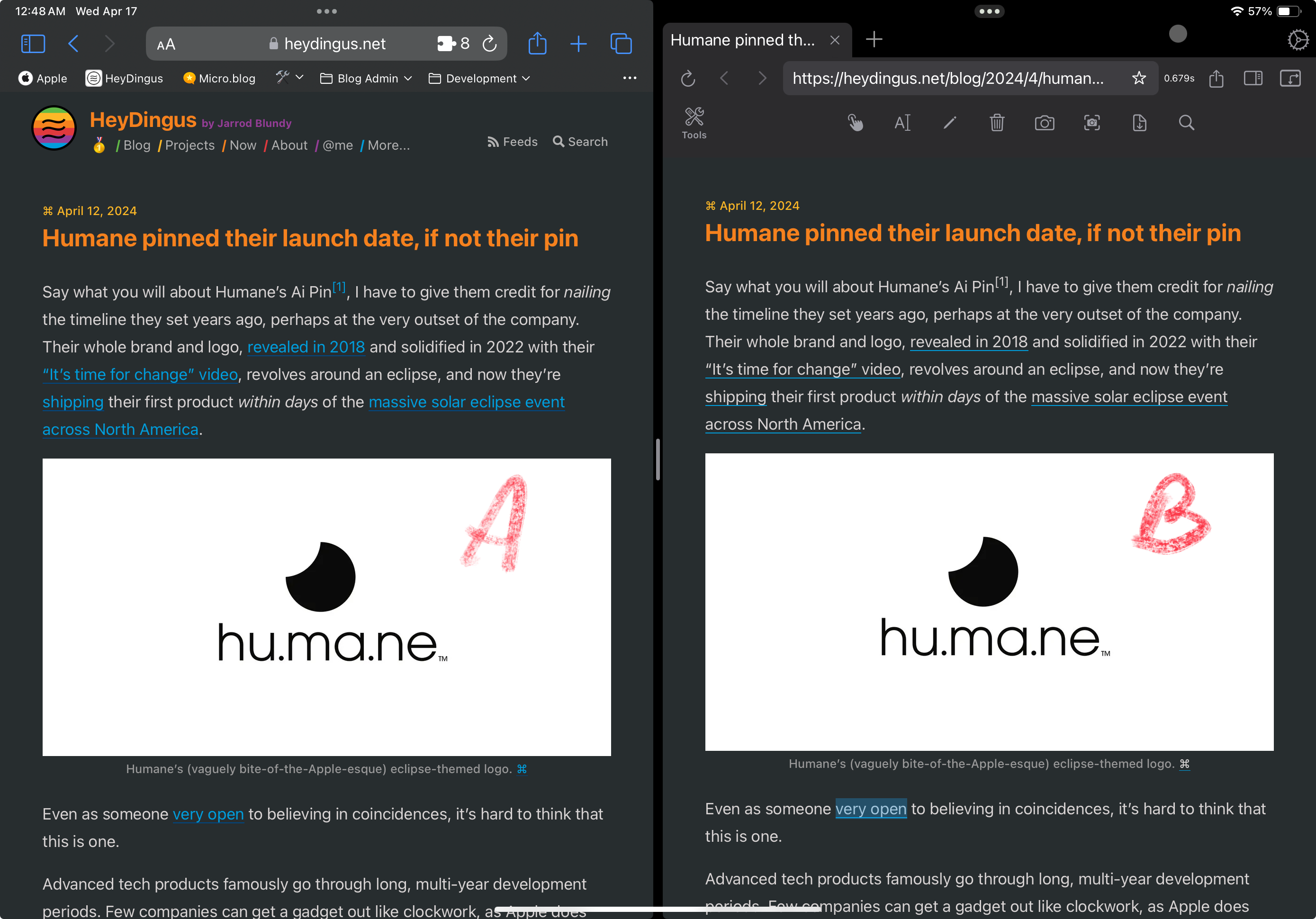
I had a menu, that had transparency and blur, and then I also had a submenu that I wanted to have the same. But the submenu just. wouldn’t. blur!
It works perfectly in Gecko and WebKit — but after countless hours, I found the problem: If an element has a backdrop-filter, Chromium won’t let its children have it as well. 1
I had to design around it, and moved on with my life.
A few moments later…
I recently moved to Micro.blog. And one day I was scrolling down my timeline…
Then I opened the submenu:
There it was — the same bug! I’m not alone!
The fix
✉️ 🌱 To SigmaOS’ CEO: This Is What I Don’t Like About Arc’s Direction
I really, really like the Arc browser. But as I alluded to in this post, I have some reservations regarding it, and don’t feel like it’s going in a direction that I like. In the post, I said that I might try SigmaOS again — and I am. 1
I mentioned this in their community Slack, and their CEO, Mahyad, asked me what about Arc’s direction I don’t like. I must say, the dev team seems very active, nice, and open to input! So this post is my reply to his question.
(And here’s a link straight to the TL;DR at the bottom.)
Hi, Mahyad — and thanks for asking! I wrote a blog post called «I Just Want A Nice Browser!», which might give you a hint, heh.
And let me also say that I’m a bit worried about your direction as well — but I’ll come back to that. 😉
Two fundamentals I don’t love, but that I don’t need to go too much into
My main issue, though, is regarding AI
🌱 Apple Is Not the Reason I’m Buying Apple Products - These People Are
In the court cases against Epic, this round of regulatory scrutiny from the EU, and other more, Apple has made their sense of entitlement abundantly clear. Every piece of business that happens on their platforms, is to their credit. And developers are lucky to be able to pay them almost a third of their revenue for the privilege of being on their platforms. If Apple understands that their relationship with developers is reciprocal, they’re hiding it well.
I like all my Apple hardware. Heck, I even love some of it! I also like the operating systems, the general focus on privacy, and the way the different parts of the ecosystem work together. But I think I could enjoy a Framework laptop, Asus phone and some Sony earbuds as well! The things Apple makes and does isn’t the main reason I keep buying Apple products. It’s all the fantastic third-party developers, mostly indie, who make great software for the Apple platforms.
🌱 A Good Way to Get Home Row Mods on a Mac
As part of my ergonomics voyage, I’ve been working on getting home row mods on my keyboard. This excellent guide provides tons of info on this, but the short version is this:
To contort your hands less when using modifiers (like shift and control), the letter keys on your home row serves double duty: They’re the letters if you tap them, but modifiers if you hold them.
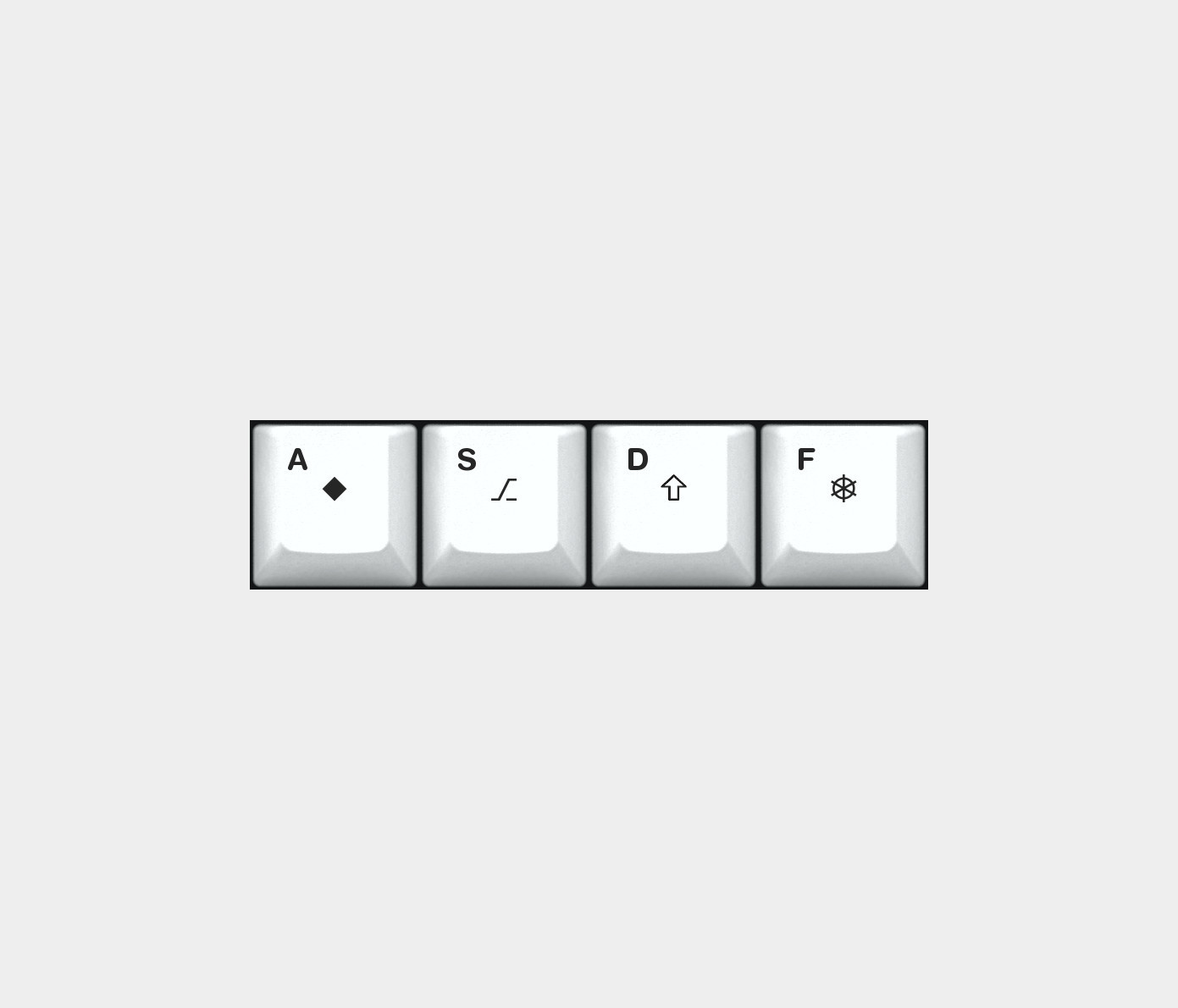

Tapping vs holding
But what’s constitutes a tap and what constitutes a hold? That’s the central question here…
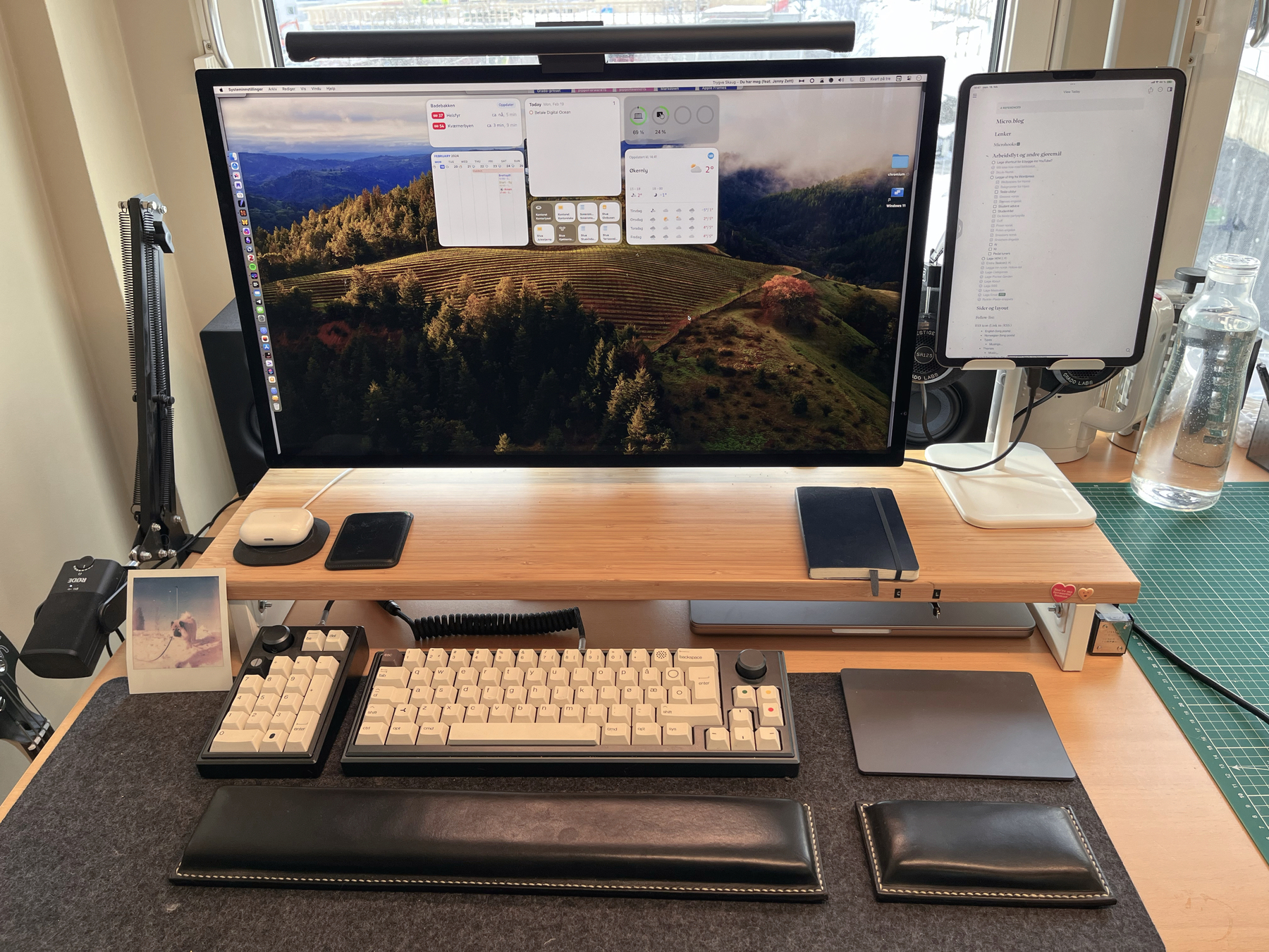
🌱 My Tech Setup
I’ll make separate posts for my software and bass guitar setups, but here’s my current tech hardware setup.
Pedal tuners and product design
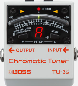
Firstly, sorry about caring a bit too much about guitar tuners. You see, as a side gig, I help people with their pedalboards (especially people using multiple guitars on stage), and I often recommend that they get a new tuner. But no tuners are exactly like I want!
While this post is mostly hard core nerd out on pedal tuners, there are also some comments on product design in general. Let’s go!
A new product series gives (false) hope
I prefer always-on tuners that you mute elsewhere (volume pedal or otherwise), and this makes foot-switches redundant. That’s why I like the idea behind Boss TU3-S.
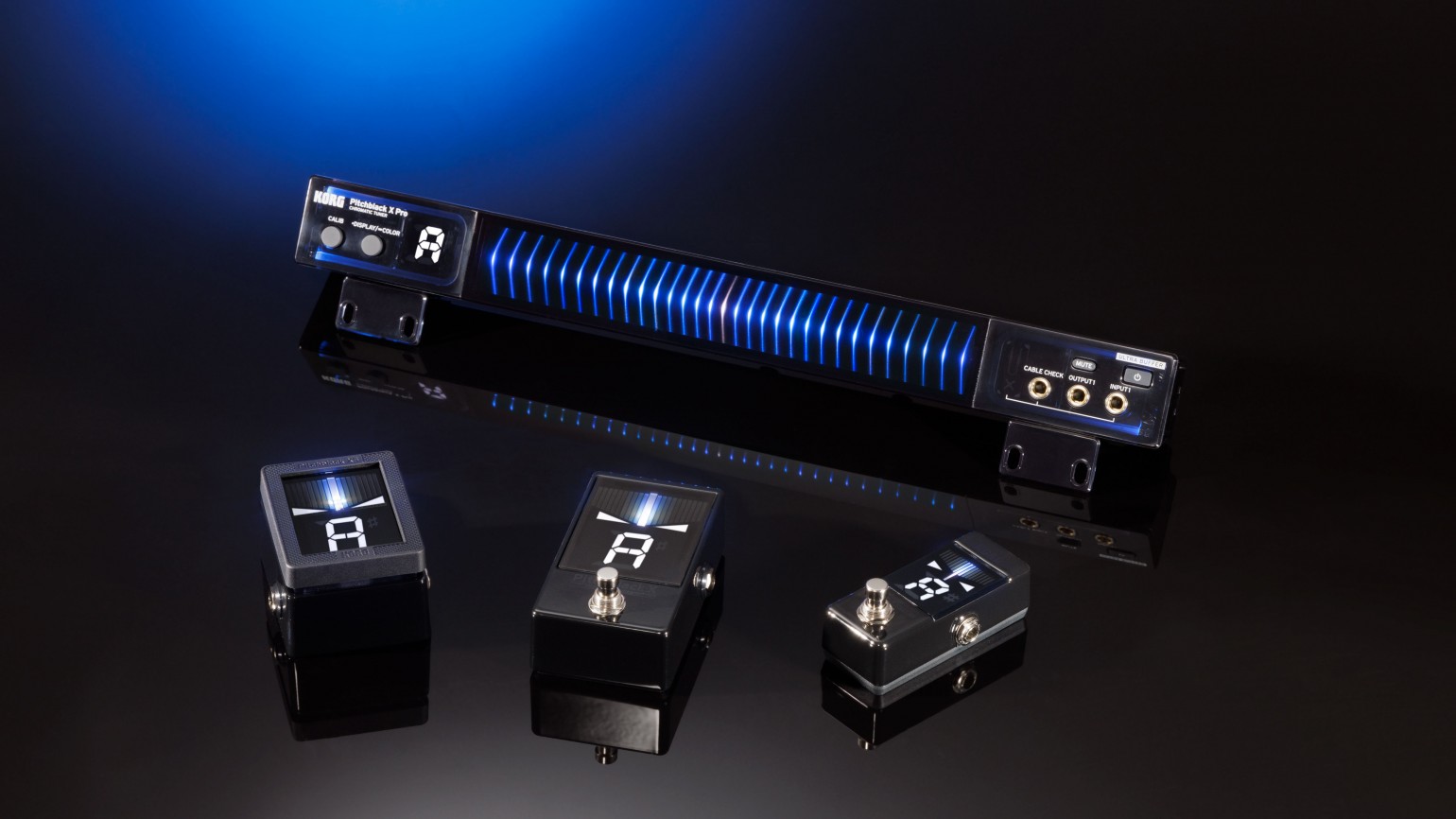
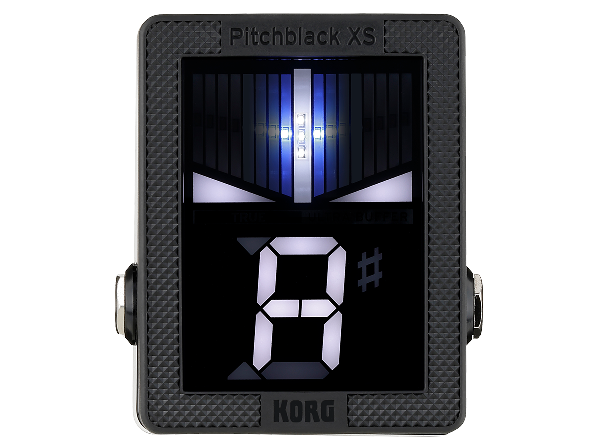
So, when I saw the new(ish) Korg X tuners, I was stoked – especially for the XS. The pedal to display size ratio is great, the switch design is cool, and I like that it’s more squared off than your typical mini pedal. This allows it to fit into odd slots on pedalboards.
What makes a good cuff?
Ok, so this is by far the most niche thing I’ve ever written. But after getting a great jacket (that I’ll write about some other time!) that only had one problem, I wanted to gather my thoughts on this tiny subject. The “problem” was: It doesn’t cuff perfectly.
What’s the deal with cuffing anyway??
Cuffing is when you fold the sleeves of a shirt, jacket, sweater etc. It’s also commonly used when you do the same to leg opening of pants or shorts. And I’m an avid cuffer! The three reasons are:
Here’s some examples of what I mean by nr. 2 and 3:
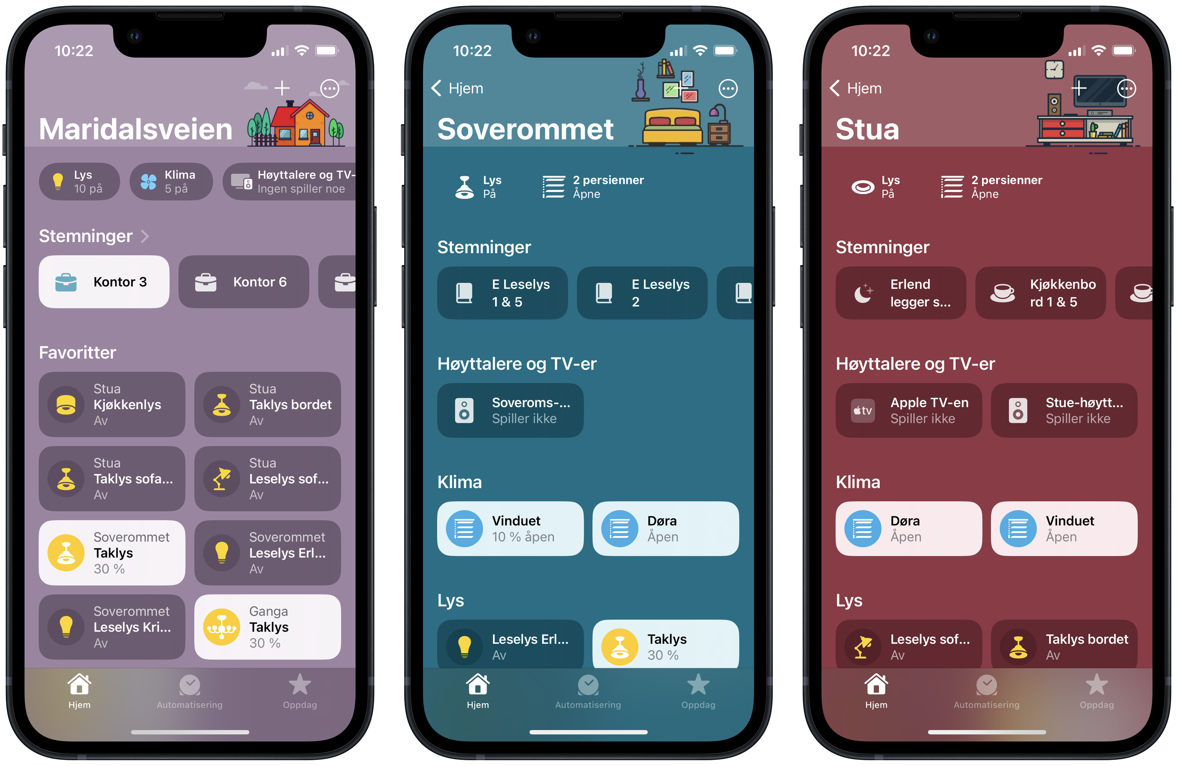
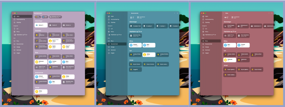
🌱 Wallpapers for Home.app

Here’s a remake of backgrounds from this thread that I made since the links were dead. These were inspired by u/rzalexander and made with free illustrations from illustrations.co. I’ve tried to adapt the illustrations to iOS 16’s new home app, so that the text and icons are visible.
I’ve also made companion backgrounds for use with iPad and Mac. Since those windows resize all the time, using two tone and illustrations was a no-go. So they are just one colour backgrounds (I have one using the dark colour and one using the light one. I’ve used the latter).