A Way To Get a Fancy Link Hover Effect
Jarrod, of (the great blog) HeyDingus.net, wanted to do something about the way his links appear on his website. He asked:
Since the first design of my site, I’ve stuck with blue text for my hyperlinks because that always seemed canonical with the web. Links = blue text, blue underline. But I’ve grown less certain with its readability with all that blue text interspersed. I’m considering a change. What do y’all think?
One thing he didn’t mention there, is that he also has a nice hover effect, that changes the underline to a gradient (that matches his logo and more) on hover.
My first idea for how to solve it sacrificed the gradient — but that just wouldn’t do. But I think I found a pretty good solution in the end!
The solution and how to implement it
Here’s the logic behind it:
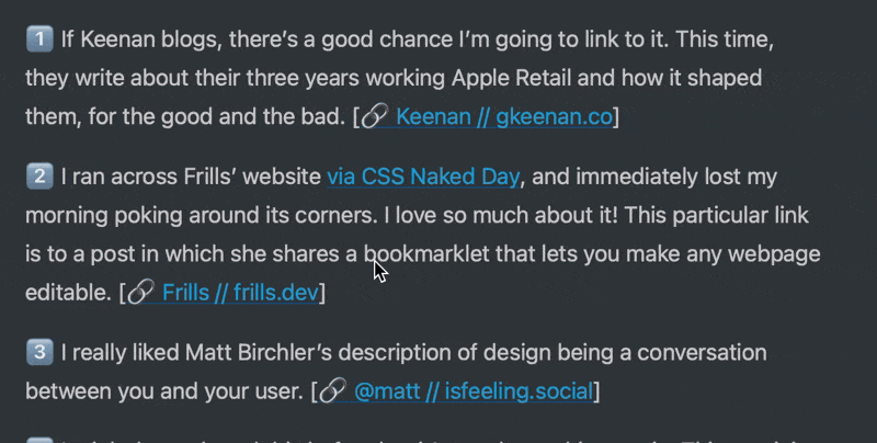
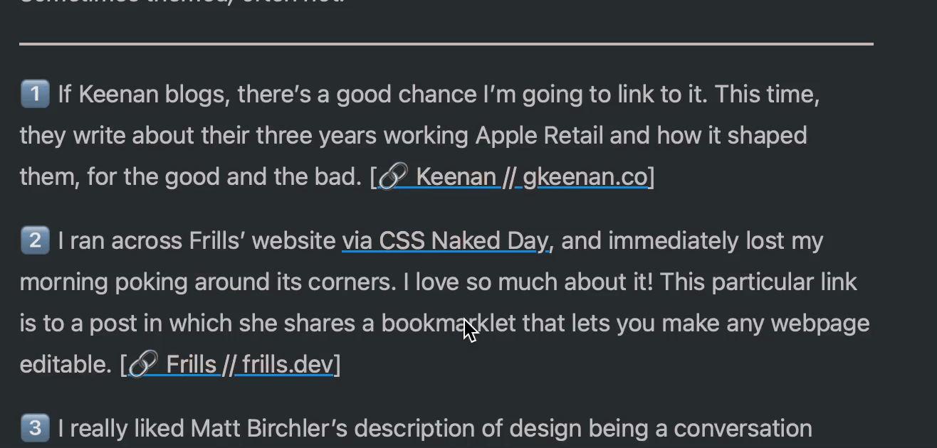
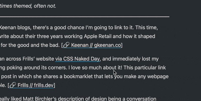
- We set the gradient as the background image always.
- But then we use
-webkit-background-clip: text;to make it so that the shape of the background is exactly like the text. - However, as we don’t want the gradient to be visible at all times, we add
-webkit-text-fill-color: var(-—offWhite);. This fills normal text colour above our gradient — so now the entire background-image covered and appears invisible. - But then, on :hover, we change the text-fill to
-webkit-text-fill-color: transparent;, as that will make it so the gradient shines through! - …and we do something similar with the underline — from colour to transparent.
So then we get the following CSS:
a {
  background-image: linear-gradient(
    to right,
    var(--green),
    var(--yellow),
    var(--orange),
    var(--red),
    var(--purple),
    var(--blue)
  );

  text-decoration: underline;
  text-decoration-thickness: 1.5px;
  text-decoration-color: var(--blue);

  transition: all ease-in-out 0.3s;
}

a:hover {
  -webkit-text-fill-color: transparent;

  text-decoration-color: transparent;
}
Alternative to text-decoration: underline;
An alternative way to create underlines, is by using box-shadow: inset. 1 Then you can make it shrink down to nothing on hover:
And here’s the CSS:
a {
  background-image: linear-gradient(
    to right,
    var(--green),
    var(--yellow),
    var(--orange),
    var(--red),
    var(--purple),
    var(--blue)
  );

  text-decoration: none;
  box-shadow: inset 0 -1.5px 0 var(--blue);

  transition: all ease-in-out 0.3s;
}

a:hover {
  -webkit-text-fill-color: transparent;

  box-shadow: inset 0 0 0 var(--blue);
}
Without moving it down, it clips the emoji a bit — so that’s a negative here. Also, the shrinking effect would be cooler if the line were thicker (but I think 1.5px looks nice here!). By the way, I’m using box-shadow on my links here, but on :hover I make the inset shadow cover the entire link and change colour, Instead of disappearing.
-
And you could move them further down by making some pseudo-elements, but I won’t go Into that here. ↩︎