What if the Floorp Icon Actually Looked Like Piano Keys?
Floorp is an interesting Firefox fork, with a questionable name and logo.
Yesterday, someone on Reddit, posted “Floorp’s logo looks like piano keys”. And here’s the thing: I’ve been thinking the same, but at the same time there was something wrong. I’m not a pianist, but I’ve played with them enough to notice the problem. Let’s rotate the Mac icon, and compare with an actual piano:
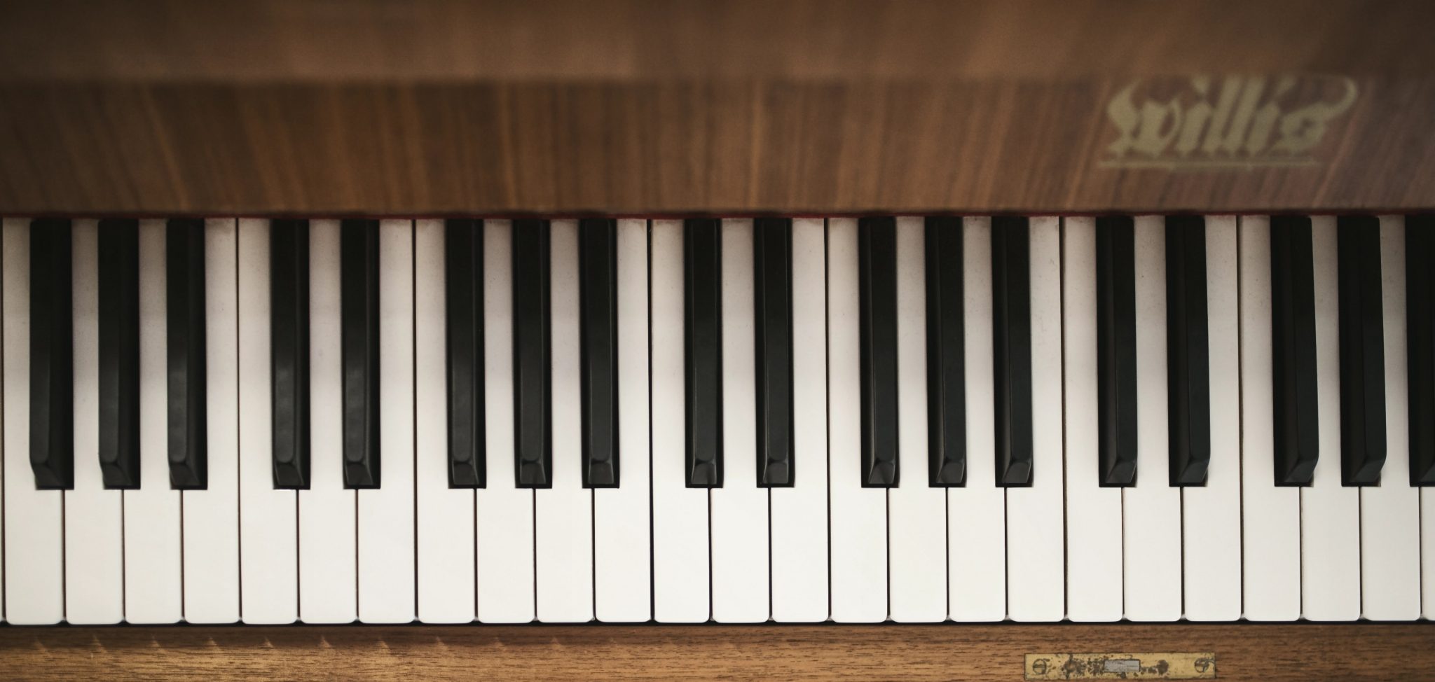
The “double-sized” black key to the right was the culprit! 1 However, notice that there sometimes is two white keys next to each other. (This will be important later.)
But this made me think: What if the logo looked like a piano?
My best attempt
In addition to pianist, “designer” is also a thing I’m not. But I think icon design is very fun, so I tried my best to make a variant!
This was my design spec:
- Keep the main ingredients of the logo: A white, rotated bestagon on a blue and purple gradient - with an “F” of sorts.
- Have the dark, protruding rectangles actually look like piano keys.
I’m not saying these are good ideas!
Mac icons (at least) are square - so why use a rotated hexagon, which are wider than they are tall? And why on earth base a browser logo on a piano at all??
I didn’t have time for any of these questions - as I was busy figuring out:
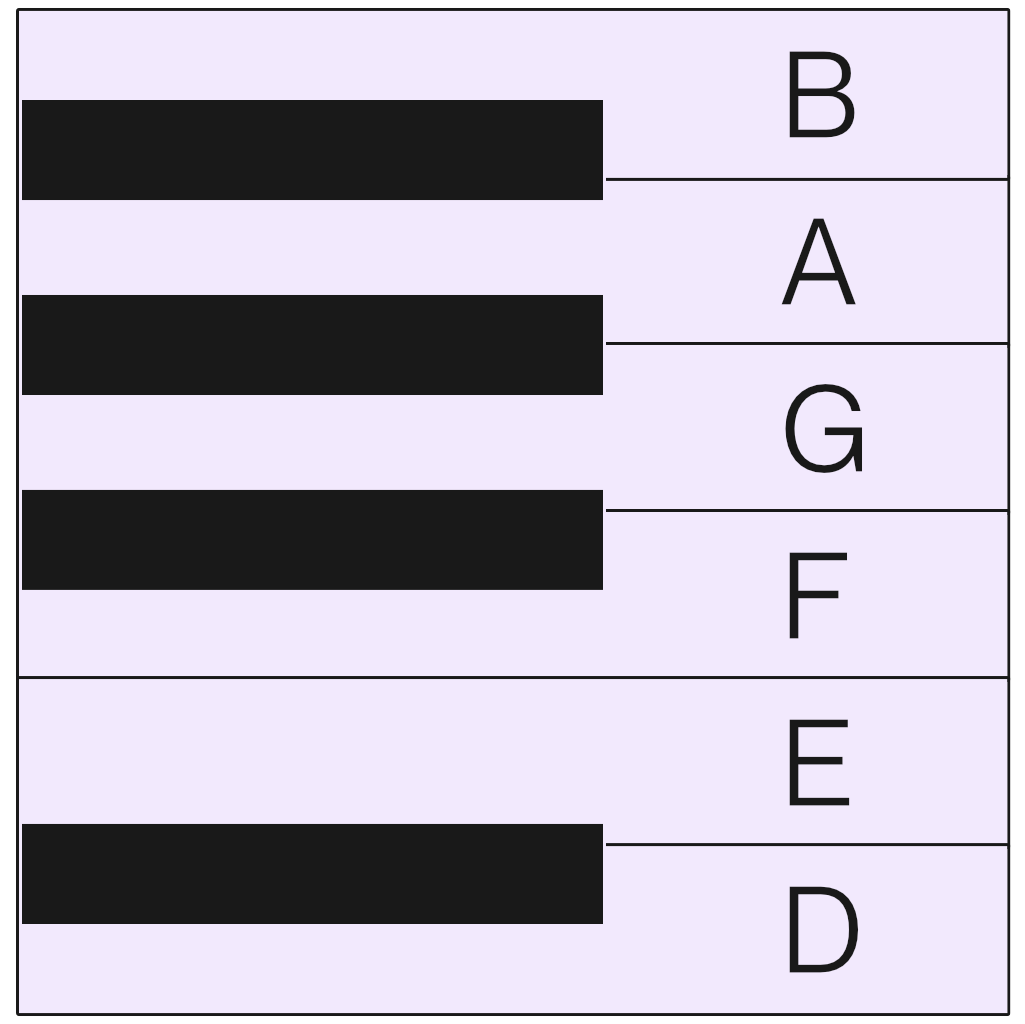
What’s the ratio of the white and black piano keys?
And how are they placed?
It turns out, there’s no definite ratio. But I gave my black keys 60% of the width of the white ones, and that was within the norm. What was more interesting, is that the black keys don’t sit directly in the middle of the white keys. They’re shifted a bit towards where there’s two white keys in a row.
So, first I made this, as a template for the keys:
Had the app been called something starting with E, I could’ve made the letter with the white keys. But as it’s called Floorp (for some reason), I had to change flip it, compared to the original logo, and use the black keys instead.
Then I remade the parts of the logo on top of the piano template:
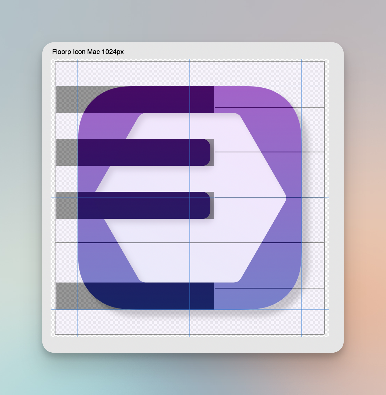
So then I ended up with this logo and icon pairing:


Now, I’m absolutely not sure if it’s better! I especially don’t love that the side margins, on the Mac icon, are smaller than the top and bottom ones (and squeezing the hexagon looks terrible), and the the F itself is sort of off-screen. But at least I had fun!
What do you think? Anything I should do to improve it? Or how would you solve the stupid problem I gave myself?
-
Now, Floorp themselves has never claimed that it looks like a piano! ↩︎