My Biggest Small Gripe With Apple Notes
And (Obviously) Objectively Correct Principles for Paragraph Spacing
I think Apple Notes might be one of the best pieces of software Apple ships. They’ve nailed creating a simple app, with great ease-of-use, that still has more powerful features hidden, for those who want it. There are a couple of reasons why I don’t use it much, though:
- In general, I like to rely on third-party services.
- I also like the portability of Markdown, and being able to use several apps on the same files.
- I like that, in NotePlan, I can use the same app for notes and tasks.
However, Notes has numerous nice features, like:
- Good apps on both Mac, iPad and iPhone, while also being accessible on the web
- Pretty good collaboration features, with shared notes and folders
- More than enough options for formatting
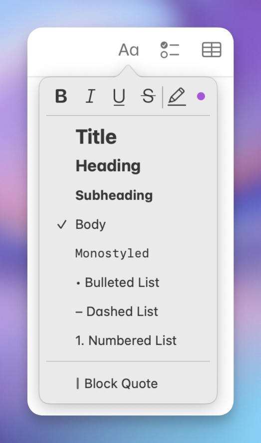
- Collapsible headings
- Embedding of files, photos, and illustrations (especially good with PDFs)
- Audio recordings
- Links between notes (no backlinks, though)
- Tagging and smart folders
- Quick notes (which Apple, selfishly, reserves for itself)
- Math notes.
So I’ll gladly recommend it to most people!
However, as most Apple software, Notes is pretty inflexible. If you don’t like their choices, you’re out of luck. And I really don’t like their choices when it comes to paragraph spacing.
My paragraph spacing commandments
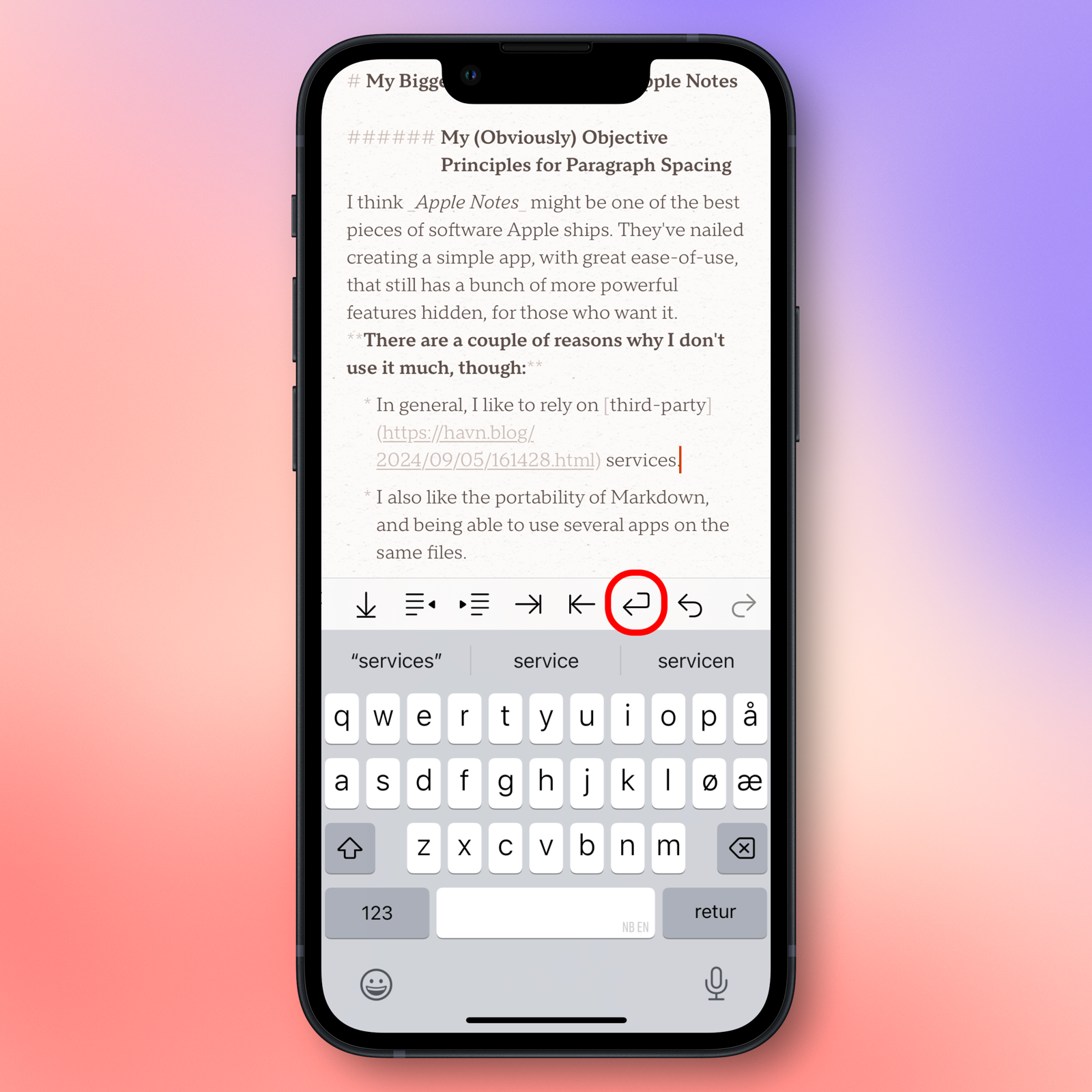
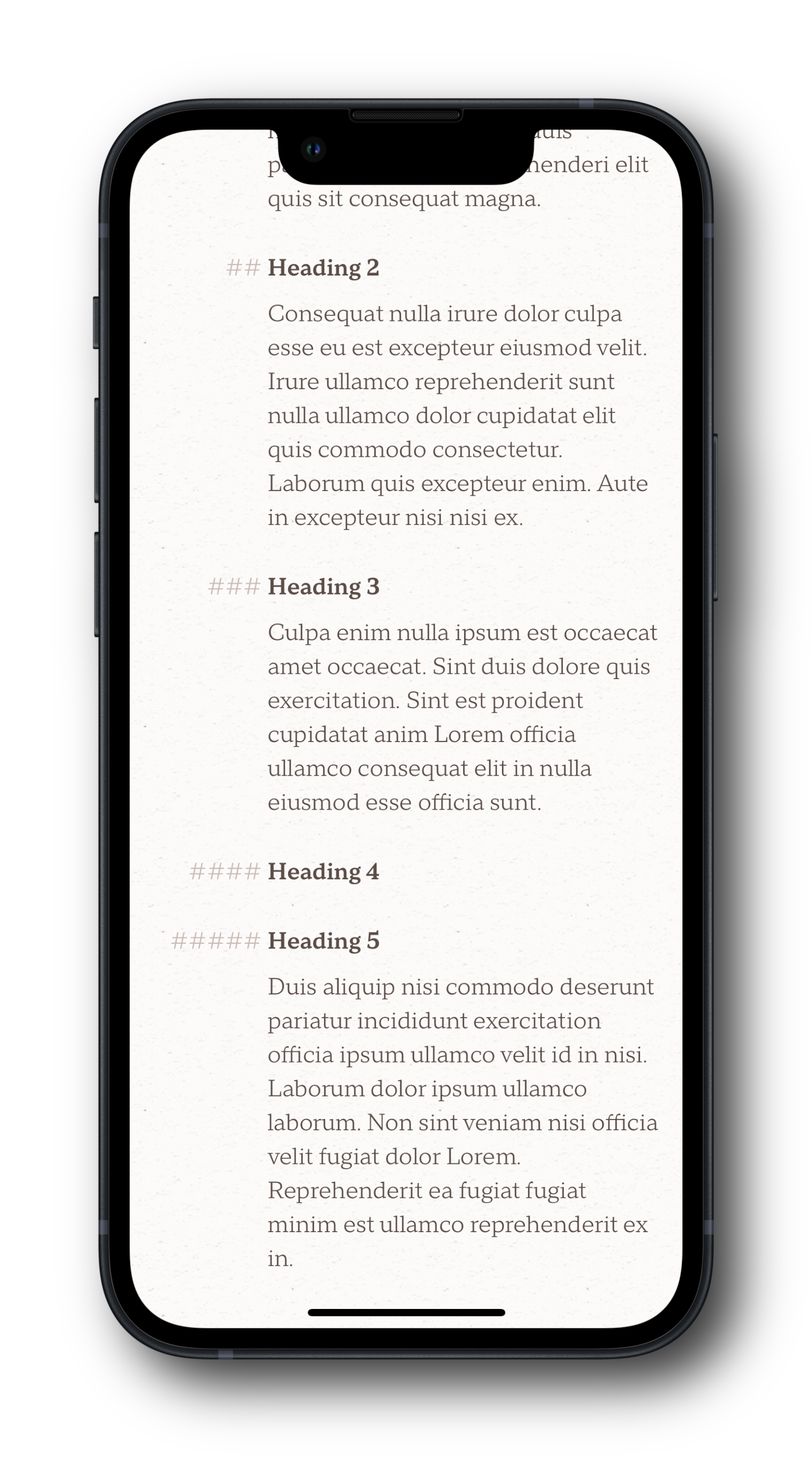
Have a look at this screenshot from Notes:
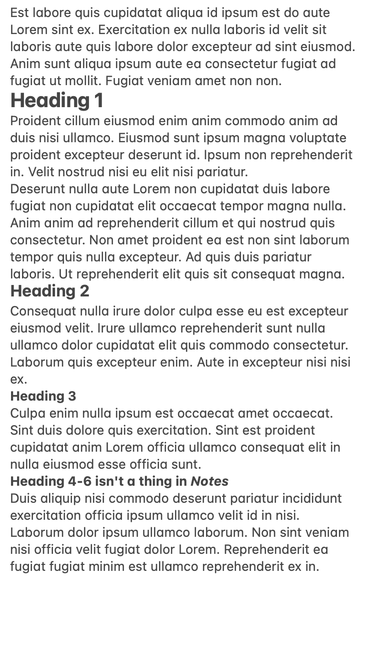
I really don’t like the lack of spacing around the headings, and that it’s difficult to tell that there are two separate paragraphs below Heading 1.
A way to fix this, is by adding newlines before headings and between paragraphs. But I think this both looks a bit inelegant, and is annoying to have to do.
So, I’ve made four commandments, that I think every text editor should adhere to. (And one extra, for Markdown editors.) Apple absolutely isn’t the only sinner. But most(?) other apps can at least customise these things!
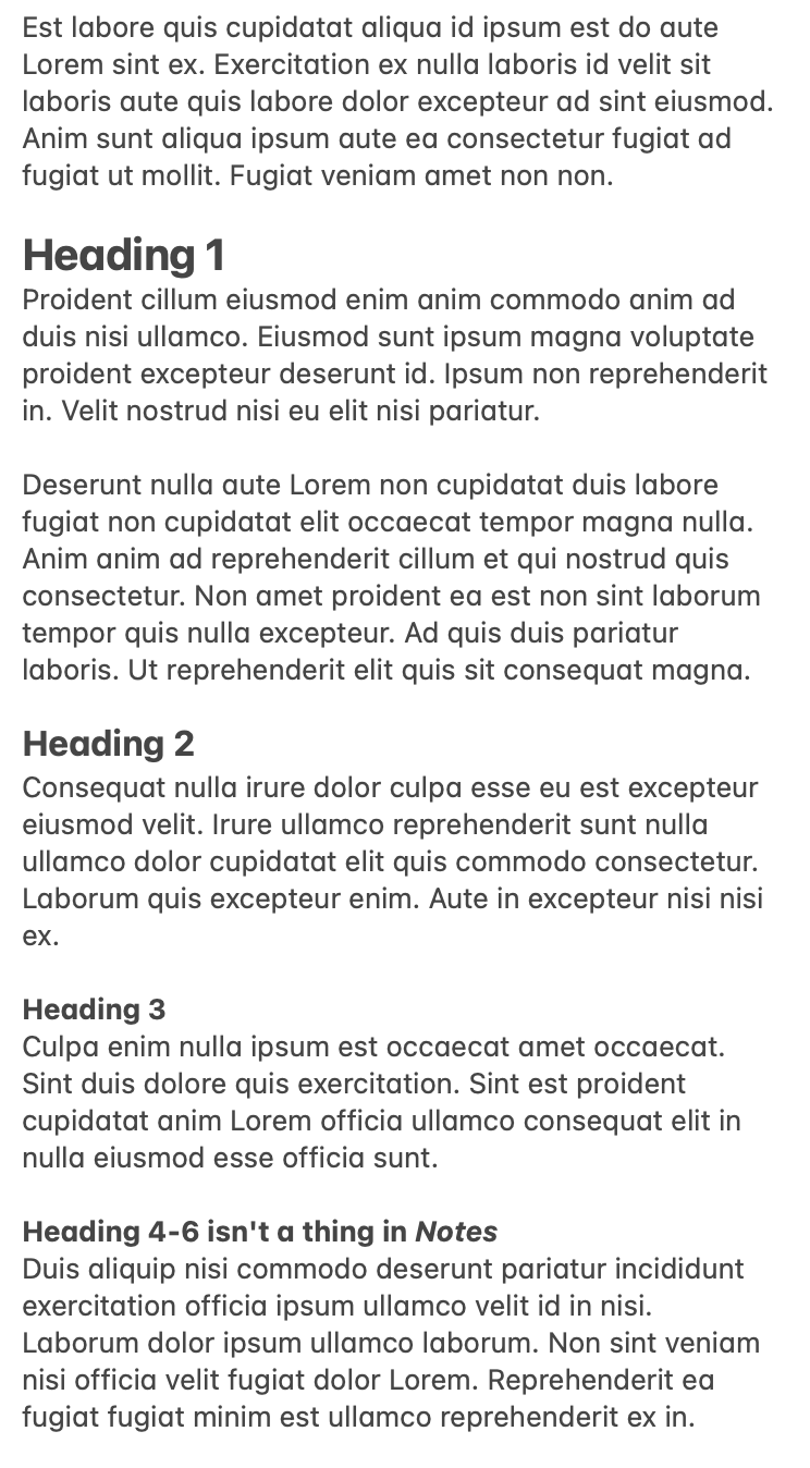
The image above, is an example of what I want to see in terms of spacing1 – and none of it is created with newlines.
1) Paragraph spacing must be larger than the line height
This makes it easy to see that there are two separate paragraphs below Heading 1. To avoid complexity, if the app has an option for adjusting line height, you could have the paragraph spacing be a multiple of the line height.
2) There must be a separation between hard and soft returns
Many text contexts on our computers distinguishes between hitting Shift+Return or just Return. For instance, in some chat apps, Return will send the message, while Shift+Returns creates newlines.
In most text editors, Return creates a new paragraph – and usually a new regular body paragraph. (So if you were writing a heading, the next one would not be a heading.) However, if you are writing a list, it creates a new list element. This is a hard return.
However, if you hit Shift+Return (or Ctrl+Return in some contexts), you will create a new line within the same paragraph. This is a soft return. It can be used like this:
- This is the first list element.
- This is the second,
which goes over two lines.
If I had made a hard return after “second”, I would have created a new list element (3.) instead of just a new line. This also works in headings, etc.
Adhering to the first commandment can be annoying if your app doesn’t support soft returns. Because occasionally, you want a new line without the extra paragraph spacing. For instance, while writing things like this great pop song by the Norwegian artist Astrid S:
From everything to nothing at all.
From every day to never at all.
And everyone says that I should be sad.
Is it normal thatI don’t feel sorry for myself,
care if your hands touch somebody else.
Wouldn’t get jealous if you’re happy.
It’s okay if you forget me.
I don’t feel empty now that you’re gone.
Does that mean it did mean nothing at all?
But I’ll tell you what the worst is:
It’s the way it doesn’t hurt,
when I wish it did.
You need soft returns to be able to separate between line changes and new parts. Supporting these on mobile apps is a bit more complicated – but as not everyone needs it, I like the approach by the excellent app Paper:
Apple Notes does have this distinction. But you require a keyboard to type soft returns – and it’s less useful when they don’t have paragraph spacing.
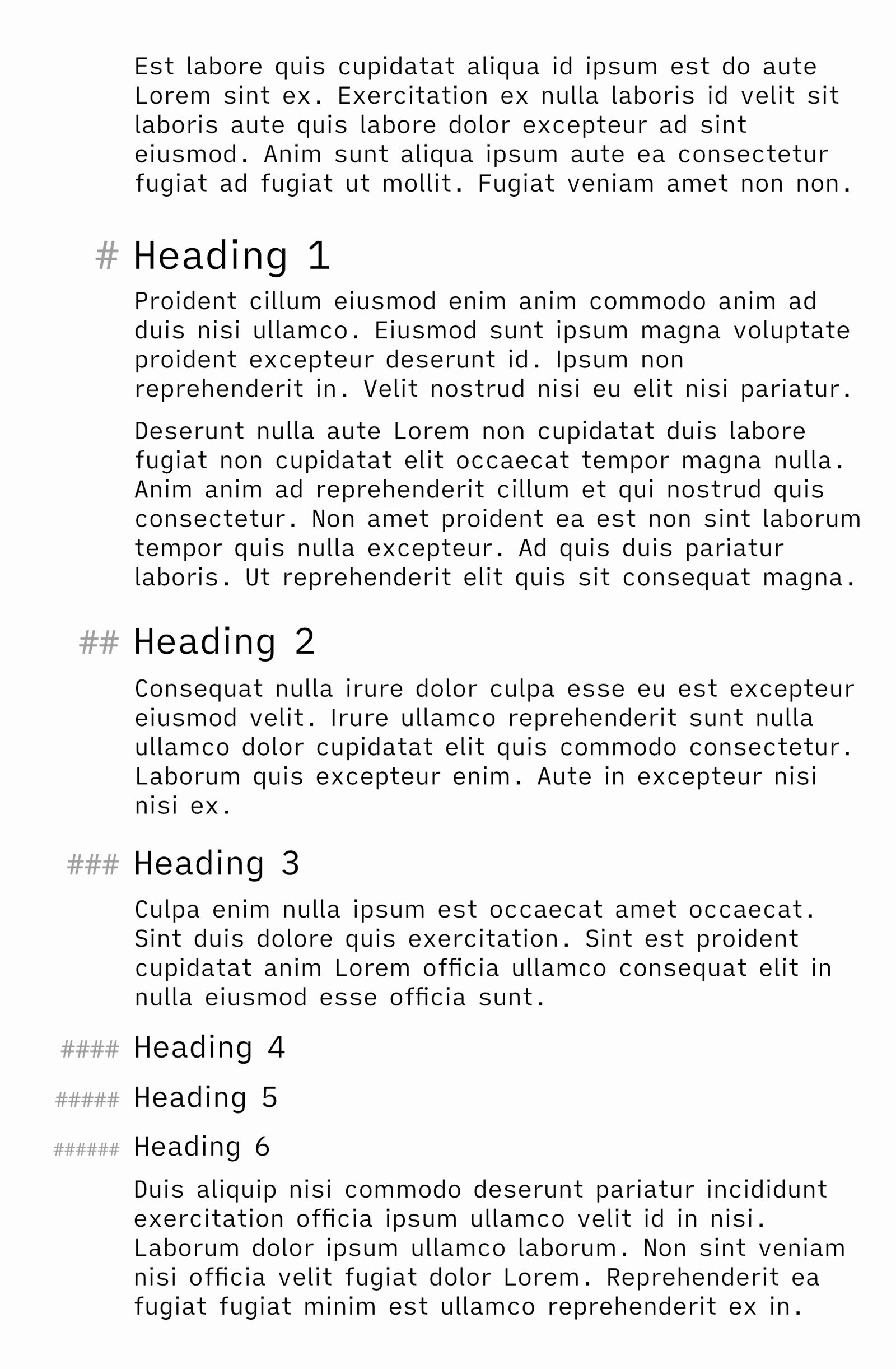
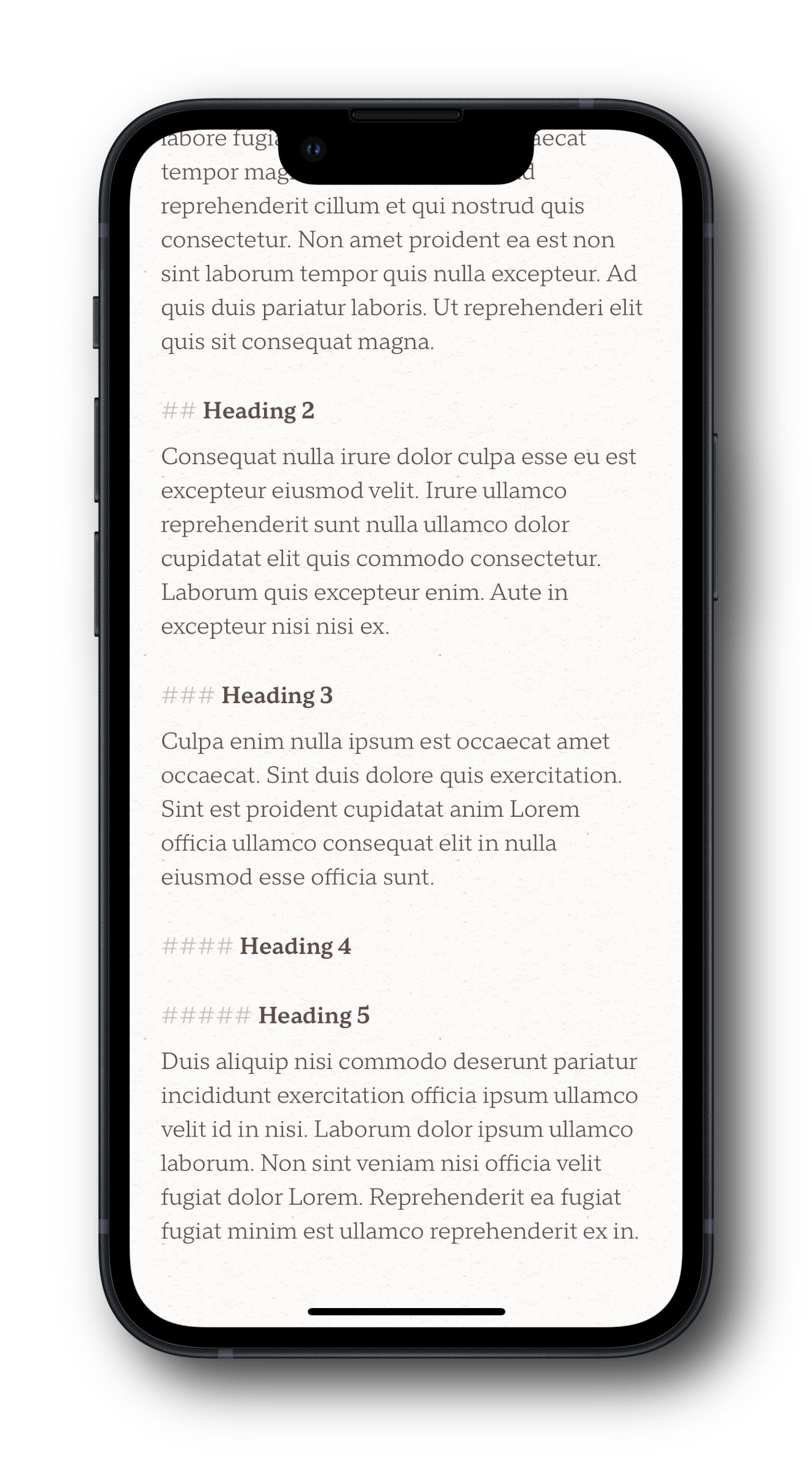
3) Scale paragraph spacing to heading level
To help with distinguishing heading levels, it’s a good idea to give more paragraph spacing to level 1 than level 2, etc. Here’s my example from earlier, but with added pixel values:
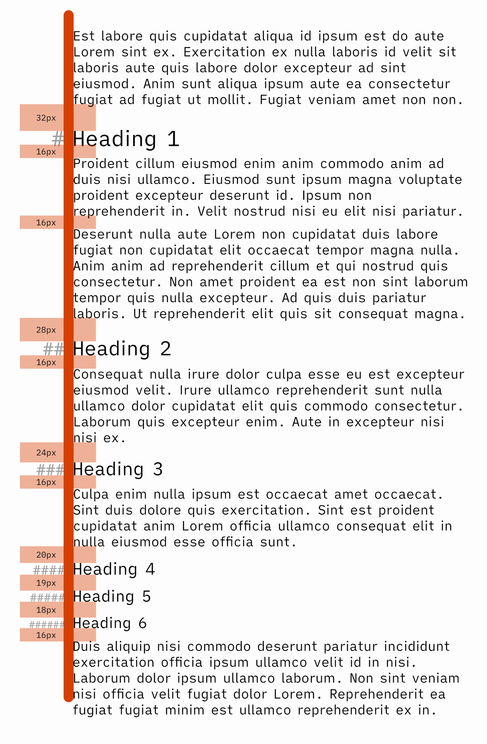
In this example, I’ve used 16px between regular paragraphs, and also below headings.2 And this leads me to the next commandment:
4) Make sure headings are closest to the content it applies to
Notice that I’ve added the scaled spacing above the headings, while keeping the spacing below them the same.
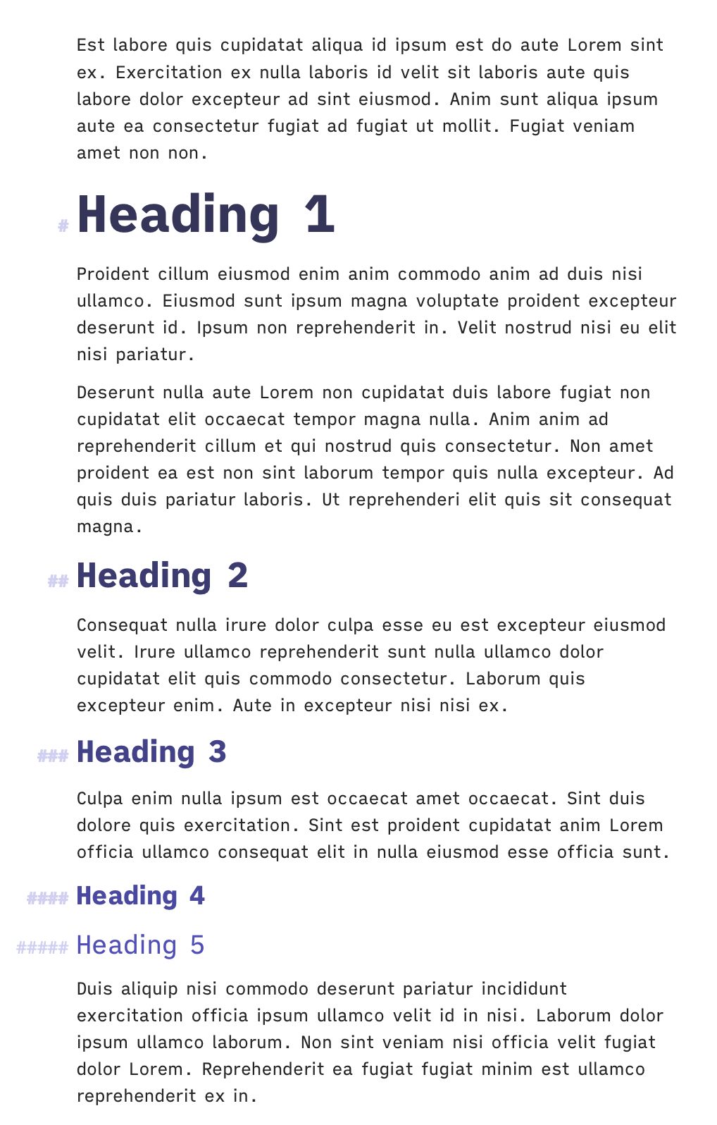
This screenshot is from Ulysses. As you can see, they do allow for spacing scaled to headings, but they make a different mistake: They apply the same spacing above and below. This doesn’t make sense, as headings explicitly apply to content below it. So standard information hierarchy theory dictates that it should be closer to that paragraph than the one above.
However, Ulysses does adhere to a bonus commandment, only relevant to Markdown editors:
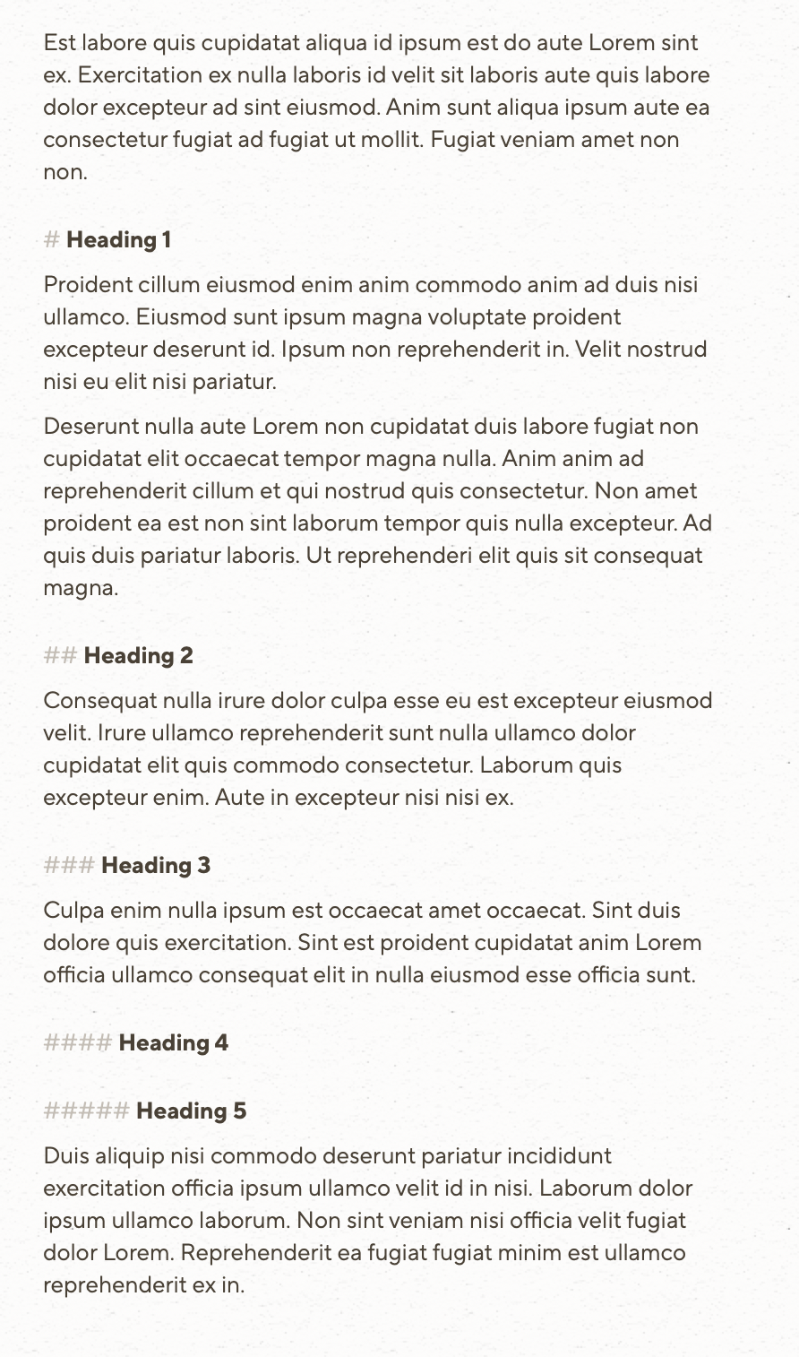
5) Align Markdown headings, by putting the syntax in the margin
I prefer having the Markdown syntax being shown, but muted, as I don’t like it when the text jumps around (when showing/hiding automatically). But if you don’t put the # symbols in the margin, the headings won’t be aligned with the rest of the text:
However, as this takes up extra horizontal space, I like that I, in Paper, can align the headers on Mac and iPad, while not doing it on mobile.
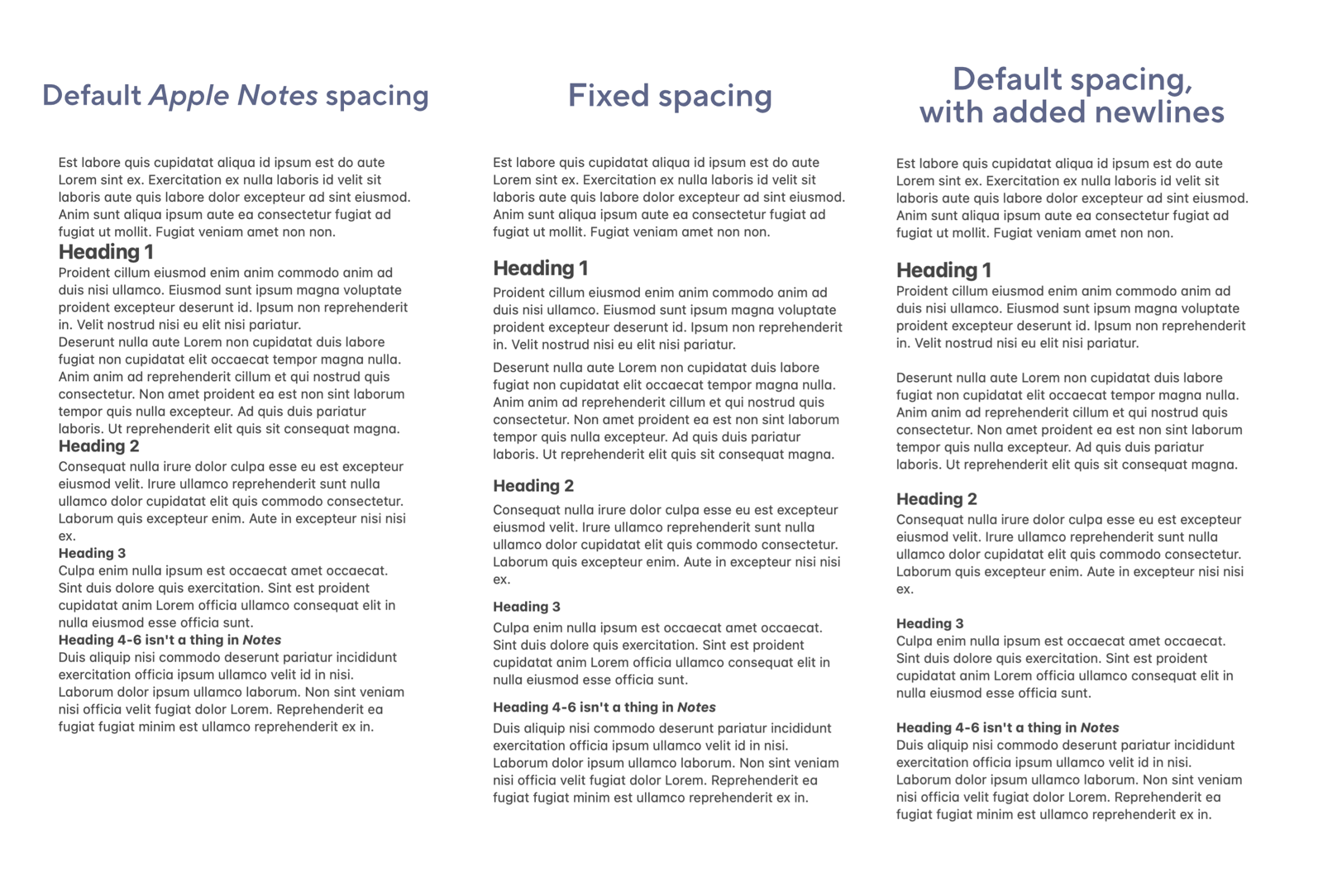
Fixing Apple Note’s spacing
I’ve made a mockup, where I’ve adjusted the spacing in Apple Notes. I’ll show the default spacing, my adjustments, and default spacing with added newlines.
In general, think the default line height in Notes is too tight, and this also makes the visual difference between the latter two smaller. So keep in mind that the middle option would also be functionally easier to use, as you don’t need to add space yourself.
Defaults and customisability
Now, I’m not saying everyone has to have the same preferences as me – so lots of customisability, like in Paper, of course has its value. And I also genuinely understand if many just don’t care! But I really think adhering to these commandments makes for the best default.
What do you think? Could it be that the world-renowned design company is correct, and I (a nobody, who’s not even a designer) am wrong? 😲
The commandments again:
- Paragraph spacing must be larger than the line height
- There must be a separation between hard and soft returns
- Scale paragraph spacing to heading level
- Make sure headings are closest to the content it applies to
- Align Markdown headings, by putting the syntax in the margin