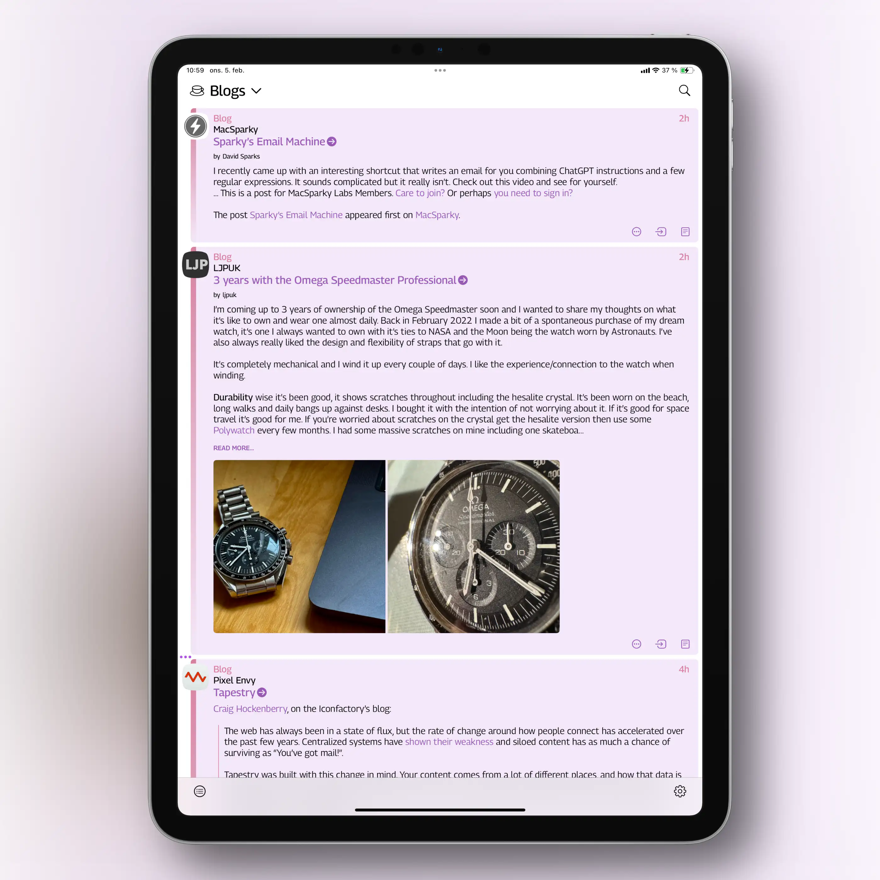
✉️ My Issues With the Tapestry Design
The 1.0 of Iconfactory’s latest app, Tapestry, just landed. Like the new Reeder, it’s a “unified timeline app”, that collects feeds from many different sources, like RSS, Reddit, YouTube, Mastodon, and more.
Some really like this idea (for instance for collecting Bluesky, Mastodon and Micro.blog in one place), while others don’t. I’m not yet sure where I stand.
I backed the Tapestry kickstarter way-back-when, so I’ve been able to beta test it. I like a lot of the ideas – and the way it handles feeds/connectors and default apps seems fascinating and robust. But due to some issues with the visual design, I’ve never been able to get into it… This post is my feedback letter to the devs, which might also be interesting to others.
Edit:
I got some feedback from Iconfactory on this post. That, and my response back, can be read in this blog post.
Great designers
I spent €40 on the Kickstarter – but even if I’ll never get into the app, I won’t call it a complete waste. Because Iconfactory is a cool company, that I don’t mind supporting.
And they are excellent designers! So when I disagree with things about their work, I’m, of course, a bit nervous, heh.
Mini Gang, unite ✊🏻
I’m still rocking my trusty ol' iPhone 13 Mini. And I think part of my issues stem from me using a phone that’s probably smaller than what they’ve optimised for. I also get that it’s a 1.0, and that much of the work has gone into some really cool tech on the backend. So I hope it’s possible to see that this feedback comes from a place of love, and hope for the future!
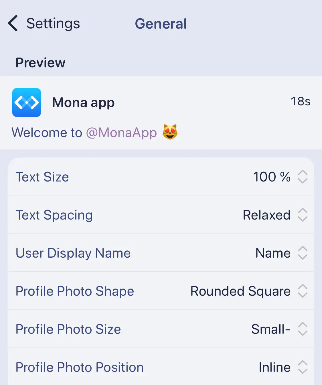
And I get that many might like the things I don’t. So I think the answer is more customisation – like this settings screen from Mona:
Messy and cramped
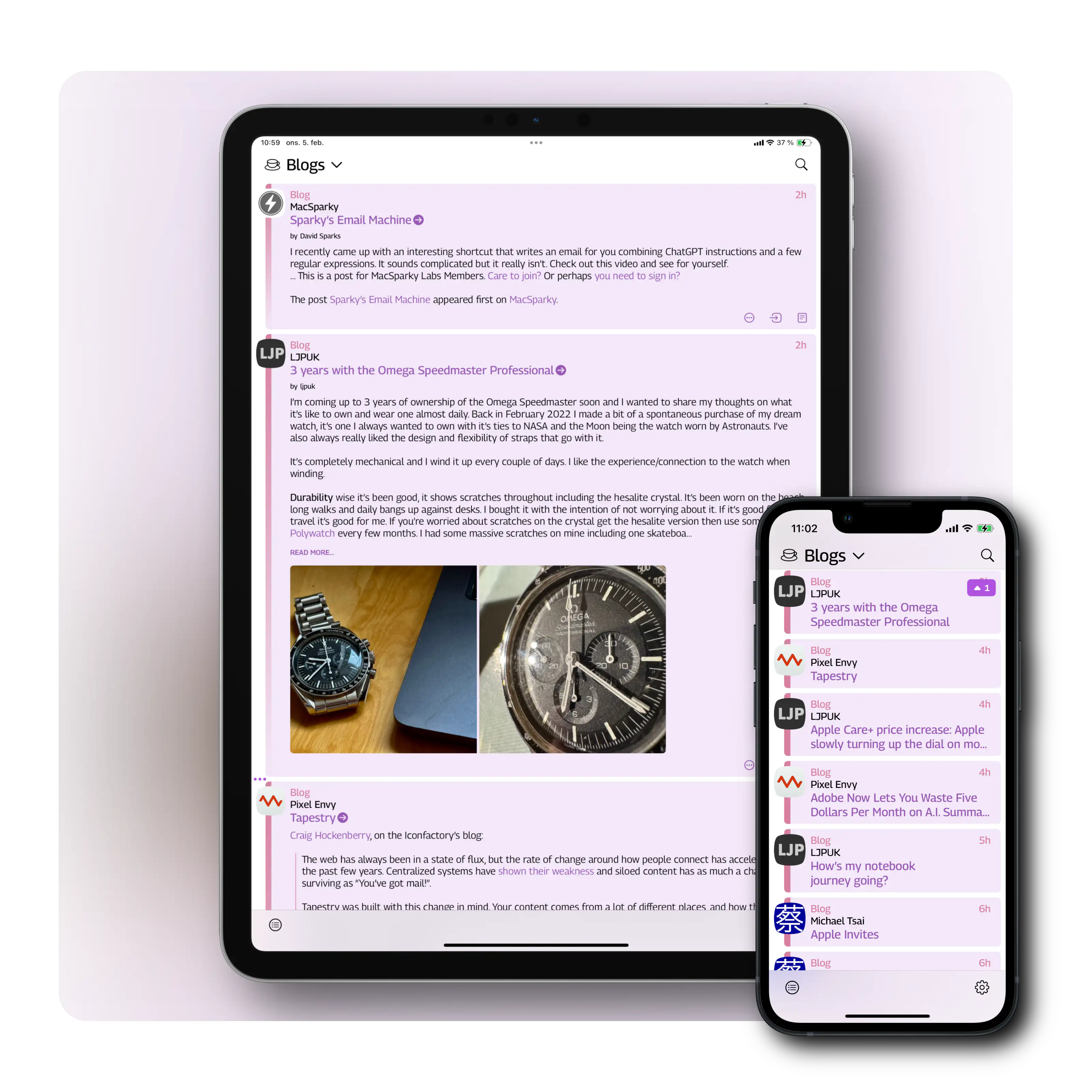
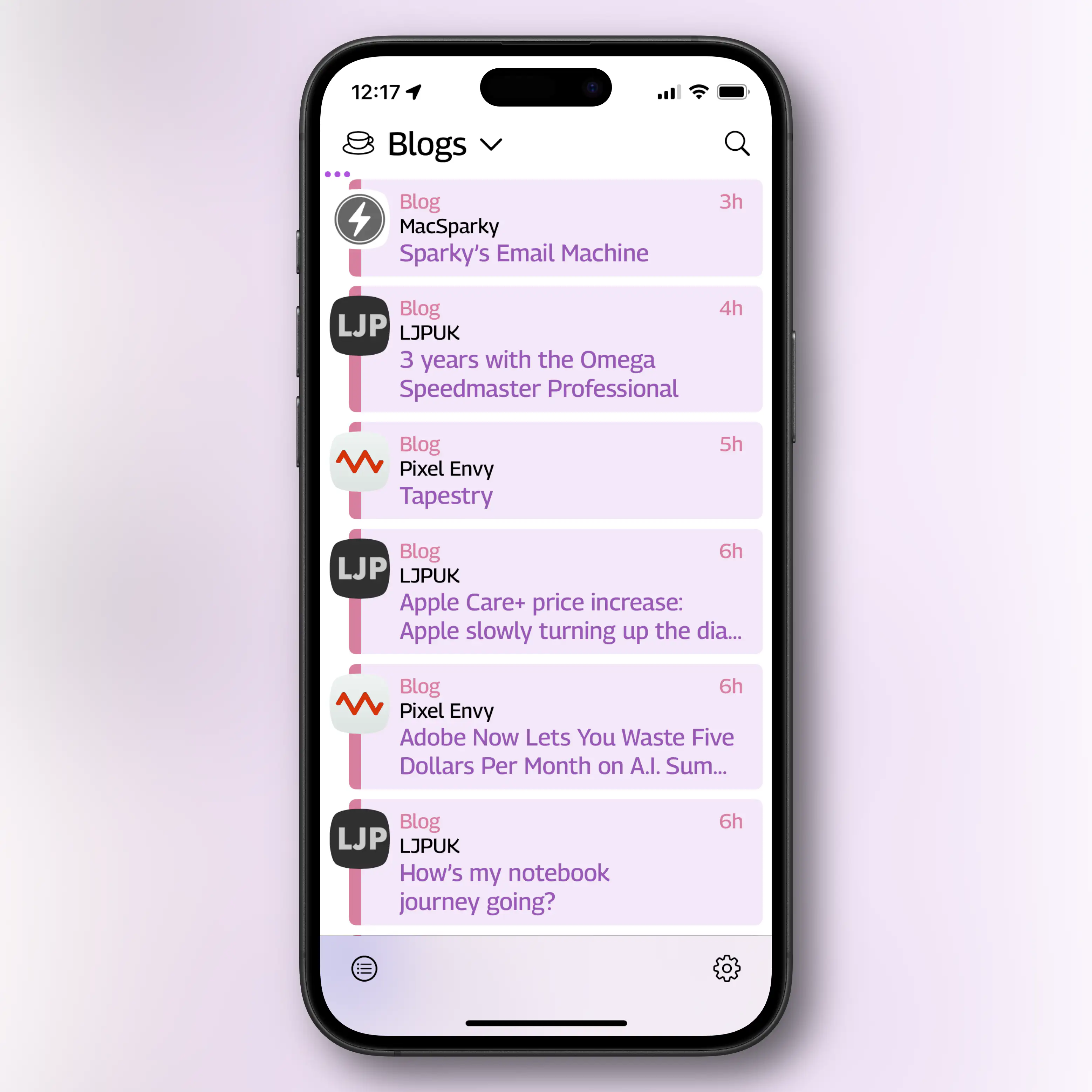
I like colourful designs. And Tapestry has this neat idea, where it gives timeline entries different colours depending on the type.
It might not come across perfectly in screenshots, but with my Mini phone in hand, I find a combination of things here unpleasant.
Large fonts, lack of space
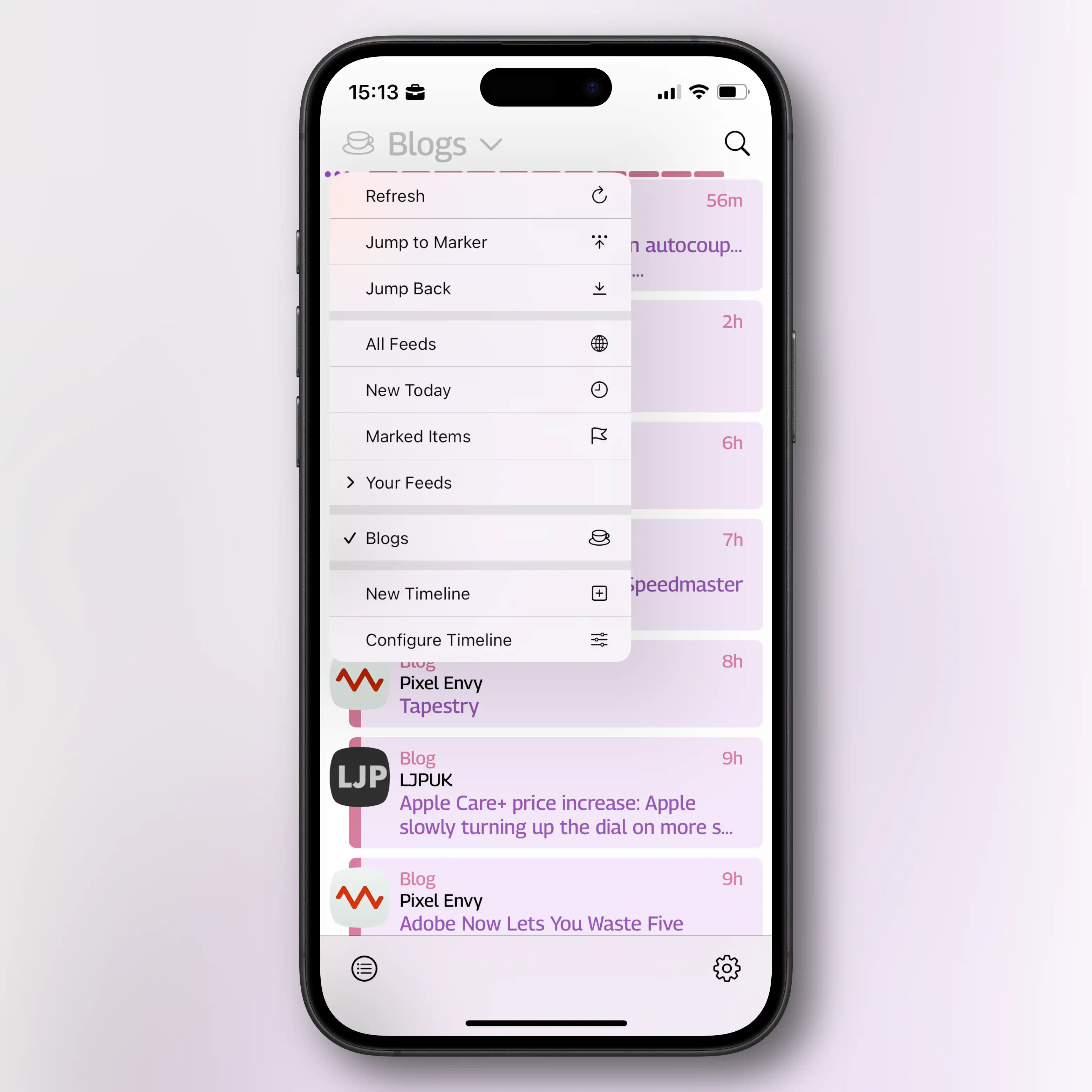
In general, the app has very little white space – and this becomes worse by the fact that some fonts are larger than necessary. And to save more space, I wish I could turn off the part where it says the type of feed. The colours already communicate this, and it’s especially useless in the feeds of just one type. (So this should probably be a per-timeline toggle.)
In most screenshots, I’ve used Dynamic Type to turn down the font size 1 notch. I like Tapestry the most if I can turn it all the way down – but then all my other apps get too small. Here you can see Tapestry with the default font size, and then the smallest possible:

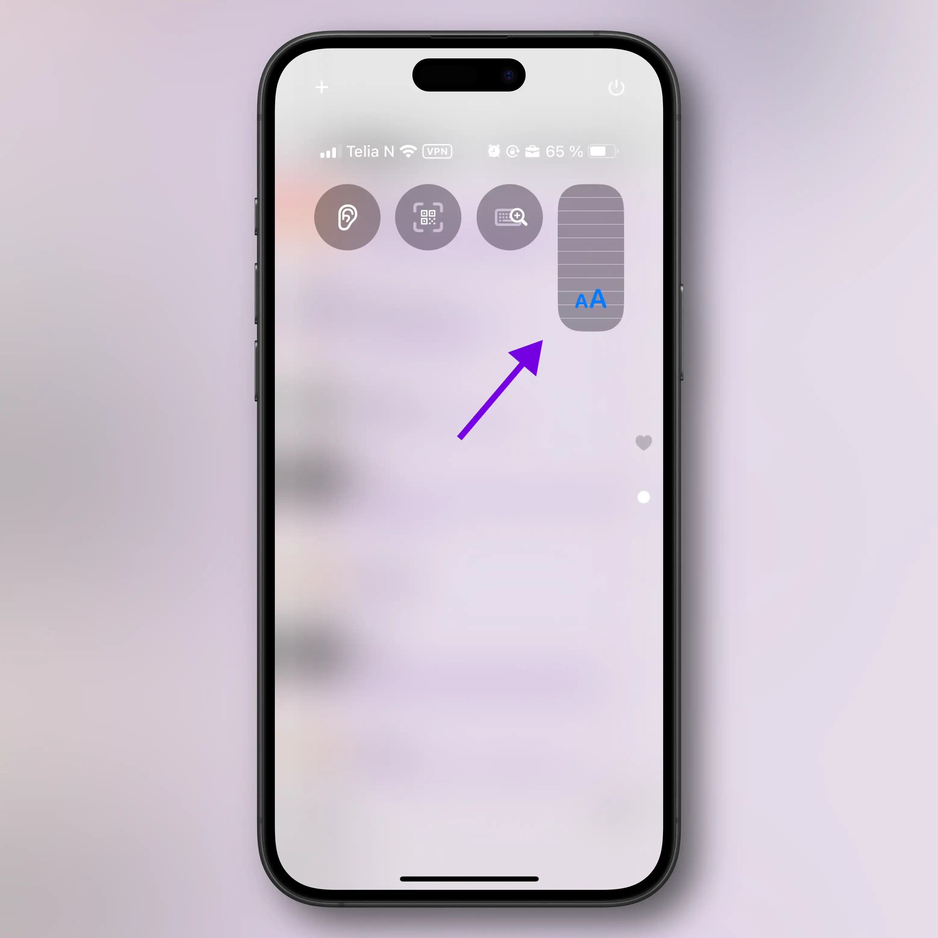
Edit: You can adjust text size per app!
You have to
- add a Text Size control to Control Center,
- go into the app,
- tap the widget in Control Center,
- click Tapestry Only, and adjust.
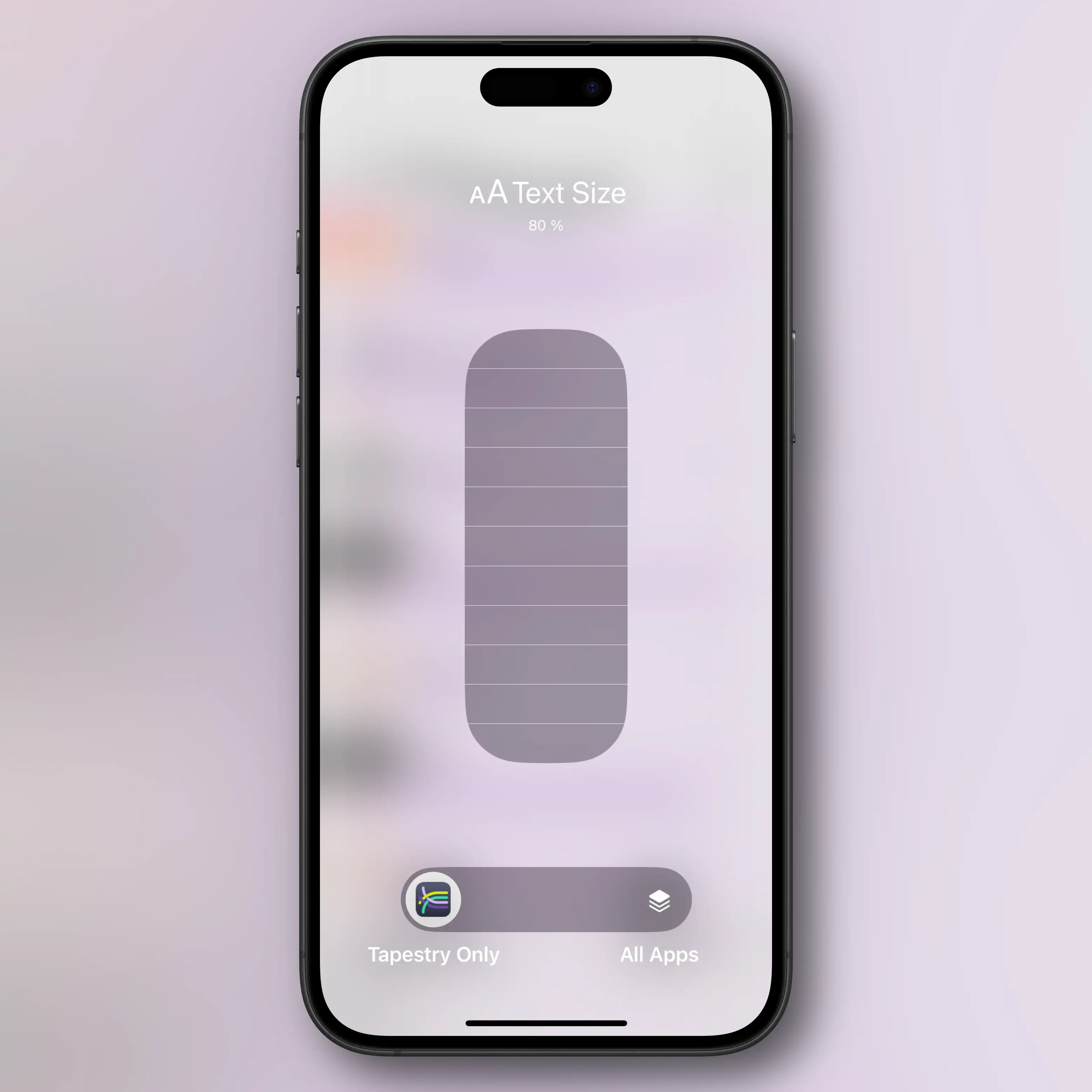
This helps – but it’s not perfect, IMO. And now my menus are comically small…
Borders and avatars competing
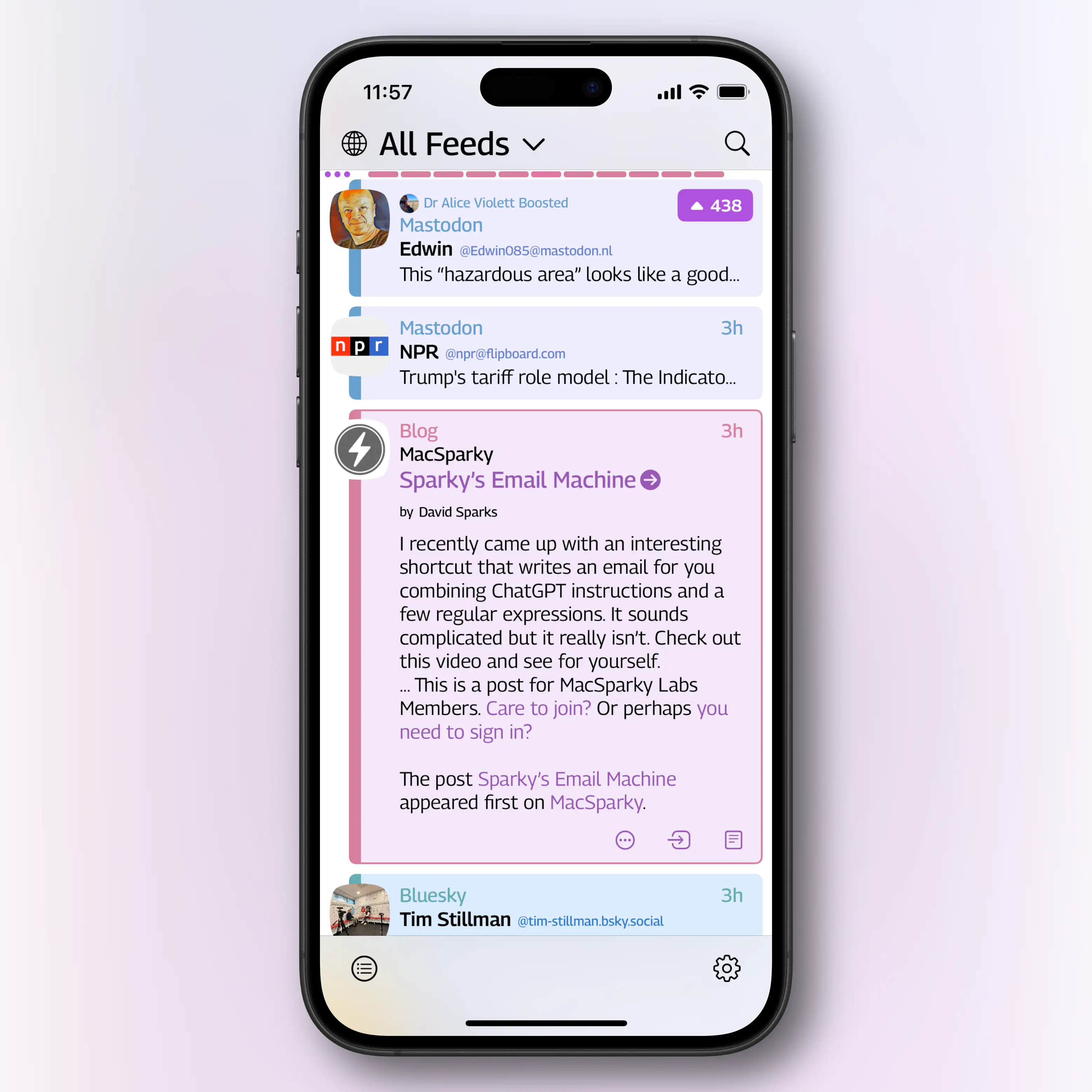
I like the darker coloured border on the left side, and how it goes all around when you expand the entry. But the lines going through the avatars, that sometimes have plenty of different colours and varying degrees of transparency, makes it very messy, IMO.
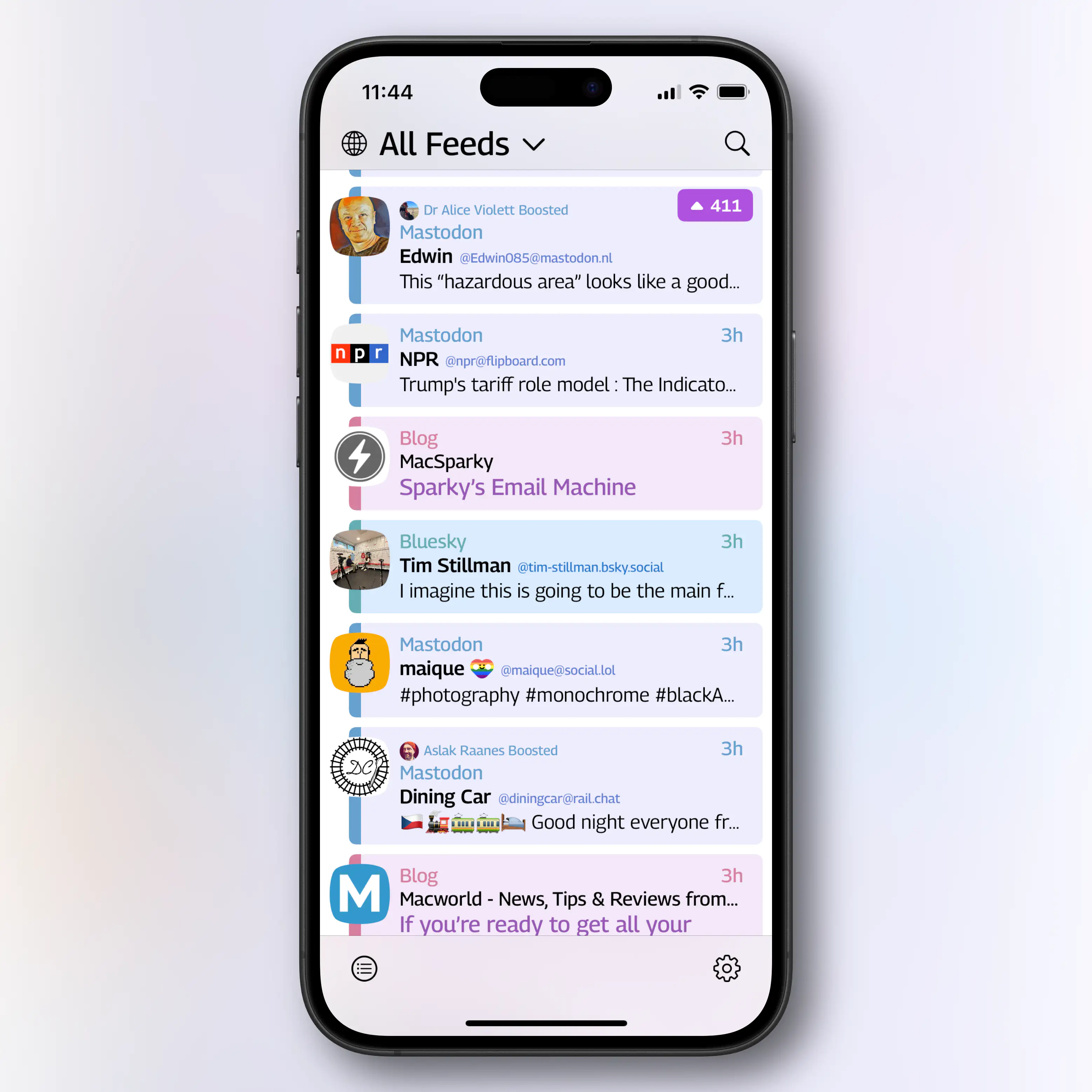
I wish I could move either the avatar or the border to the right side – like you can in Reeder:
Having the option to turn off avatars (like in Unread below here), would also be nice. The names are already communicated. (I do see how having the avatars makes scanning more quickly easier, though.)
Some things are better on my 11" iPad.
At least things are less cramped! But I would still like to be able to move the avatar to the right…
It also feels more unfinished than the iPhone version: Expanding and collapsing on the timeline doesn’t seem to work, and it really needs a multi-column view, like the one in Reeder below.
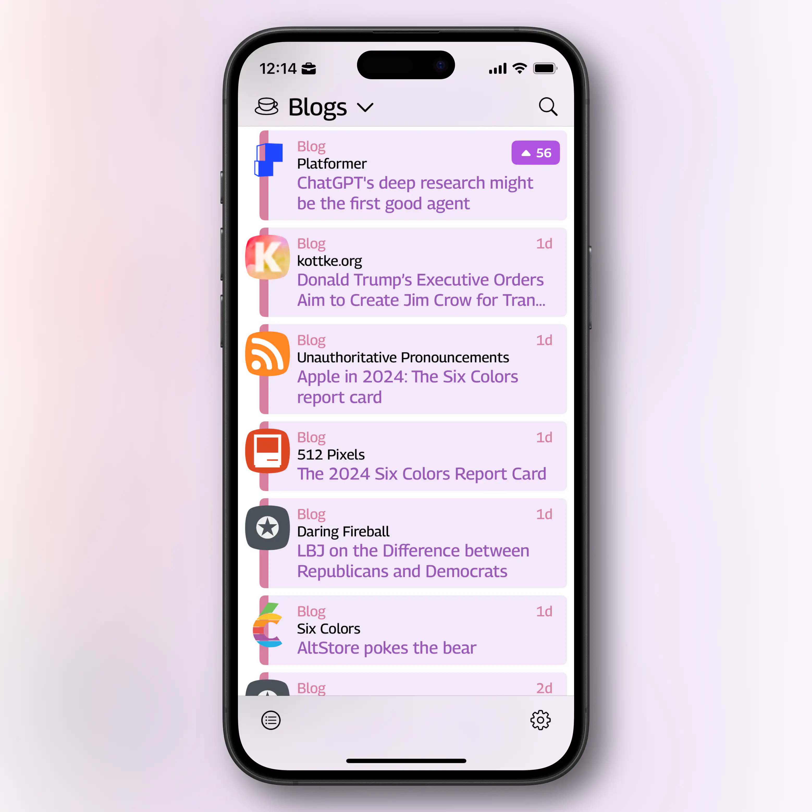
Comparison shots with my RSS reader
Here you can see the title font sizes of Tapestry (purple) and Lire – on the same Dynamic Type size:
Here’s how they display entries:
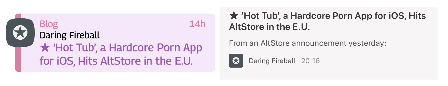
It’s OK that Tapestry uses less space for an entry – but I don’t think it should then also use a larger font size. (Also, props to Tapestry for having to display one more piece of info: The type of feed (“Blog”).)
And the entire feed screen:
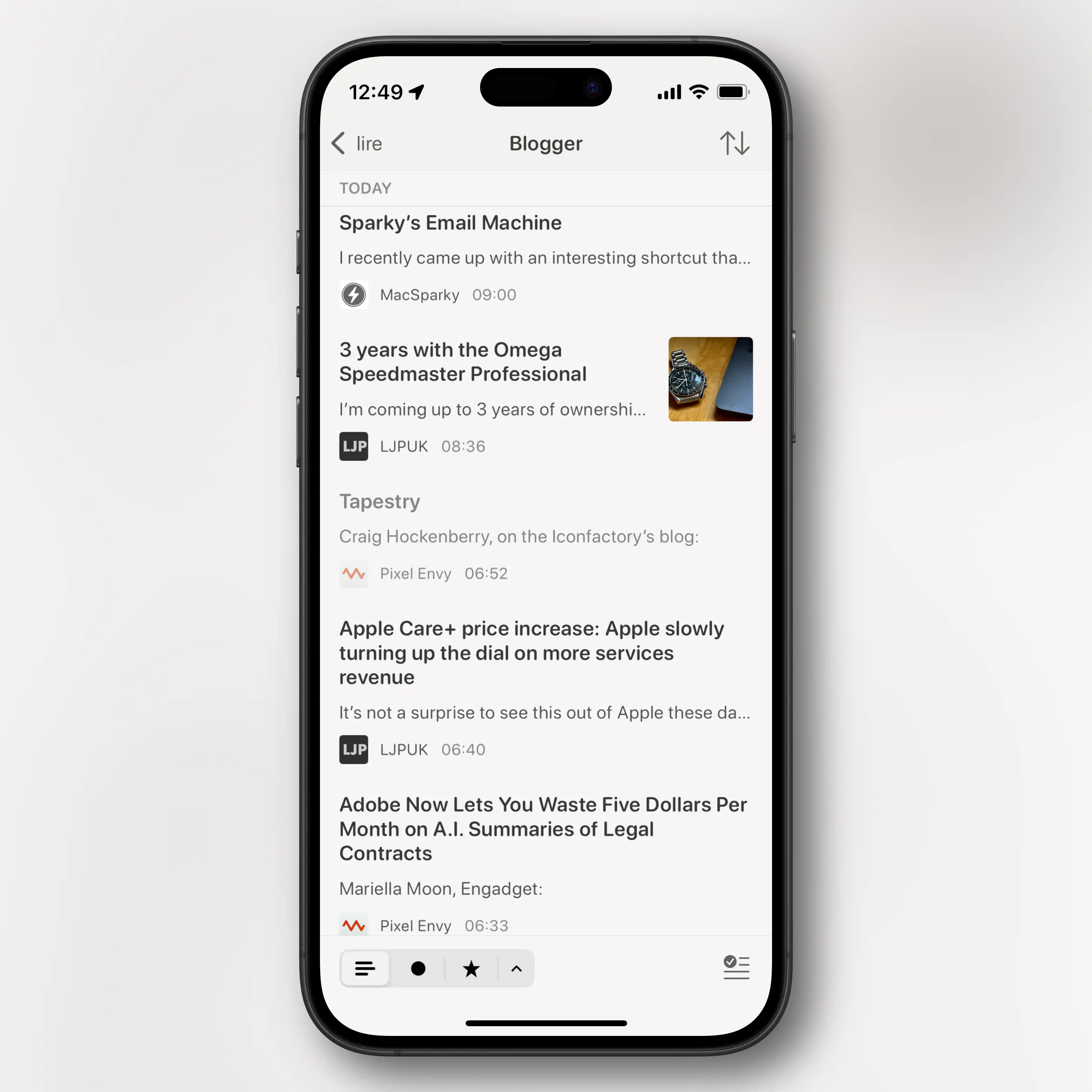
I’m not saying Tapestry has to become as minimalistic as Lire, or that the latter is a perfect example of design. But I wish I could tweak Tapestry, as it currently feels a bit claustrophobic to me.
Summing it up, and looking ahead
Iconfactory told me on Mastodon, that they’ve optimised for being able to quickly scroll through the timeline “and instantly be able to spot a post from a particular service”. And I guess I don’t do that all that much. But even though, I don’t agree with them that “[y]ou can’t do that in those other apps”.
Nevertheless, my wishes, for now, are these:
- Allow me to tweak the general font size of the app. (And as titles are coloured, I don’t think the difference in font size, compared to the body size, needs to be as large as it is now.) A spacing setting might also be a good idea, as some might want the tighter look.
- Have an option to toggle the feed type text on/off (per timeline).
- I also want to be able to display all content in posts on my Mastosky timeline – so settings like this should also be possible to do per timeline.
- You could have default values in the main settings, and then in the timeline settings, have a toggle for “Custom setting X” and then select what you want.
- Be able to set avatars to be either left, right or off.
- On the iPad, it would be nice to be able to browse the timeline with some of the entry visible, and then being able to click to expand for a bit more, and then also be able to open the entire thing. Something closer to what you can already do on the phone, but perhaps with different break points.
- There also needs to be some sort of multi-column view.
And two, more technical things, I’ve thought about while testing:
- Using Apple to sign in to Micro.blog doesn’t work for me. Doing that just allows me to browse Micro.blog within Tapestry – I don’t get sent back to the app to finish the connector.
- My RSS backend is currently Miniflux, which also uses the Fever API. I get that Tapestry isn’t a regular RSS reader, so I don’t expect the feeds themselves to be synced through something like that. But it would be cool if I could sync just which feeds I subscribe through!
I will continue trying out the app, as I like both the company and several of the ideas. But for now, for me, it needs more work before it’ll become a staple in my daily surfing. Which might be expected for a 1.0 product.
I recommend checking out the app for yourself!