✉️ Tapestry Feedback Feedback Feedback
Not too long ago, I wrote some feedback to Iconfactory’s latest app, Tapestry. I just got some great feedback on that, from them, so I wanted to provide a response.
Here’s what they wrote, on Mastodon:
There’s a lot in your post. Thx for such thoughtful feedback, it’s appreciated. Some things like the ability to turn off the service name is coming. The thing to keep in mind is this: just because a particular part of the design doesn’t work for you, doesn’t mean it wasn’t designed that way for a reason that you may have not considered.
The service name is a perfect example. Lots of people are colorblind or even unsighted. To them they cannot tell posts apart simply by color.
So while we are going to add the ability to turn off the service name, that’s why it’s there by default. Avatars are never going to move to the right side. Their placement was carefully considered as was how they appear with their transparency.
Everything you see is the result of over a full year of design, testing by over 1,500 TestFlight backers & then tweaking to adjust things that didn’t work as well as originally planned.
In the end Tapestry may not be for everyone & that’s fine
If Tapestry ends up looking & behaving like Reeder or Surf or… what’s the point? We designed the app the way we wanted it to look & behave using feedback from our testers as a guide. The design will continue to evolve based on feedback like yours (which is thoughtful) but it can never be all things to all people.
Many have told us they love Tapestry so it seems to be doing a lot of stuff right but it can always be better. We’re gratified but will continue to improve going forward. 👍
Here’s my response:
Thanks for reading my feedback, and getting back to me with such an interesting response! And looking back at my own feedback, I see that it was harsher than what was intended… Sorry!
The thing to keep in mind is this: just because a particular part of the design doesn’t work for you, doesn’t mean it wasn’t designed that way for a reason that you may have not considered.
Yeah, I totally get this! And as I said in the original post, I know that you are great designers (better than me), so I assume you don’t just do things at random, hehe. This isn’t necessarily a 1.0 feature, but that’s why I love being able to do little tweaks and customisations in the settings of apps: Because what’s right for some, isn’t right for others.
And I didn’t mean that I expected every piece of customisation to be there in 1.0. I just meant that, as the app evolves, it’s possible to allow users to tweak things to their liking. (Like how I, in the Markdown app I’m writing this in, can choose if Cmd+I give me underscores or asterisks for italics.) It was absolutely the right move to first launch with both colours and service name. 👍🏻
Avatars are never going to move to the right side. Their placement was carefully considered as was how they appear with their transparency.
(…)
If Tapestry ends up looking & behaving like Reeder or Surf or… what’s the point? We designed the app the way we wanted it to look & behave using feedback from our testers as a guide.
I’d love to hear about your considerations for the avatars. (I assume you’re right, and that there’s just something I don’t see.) I especially don’t understand why you wouldn’t even consider being able to move them as an option, heh…
I did a quick mockup of what it could look like: 👇🏻

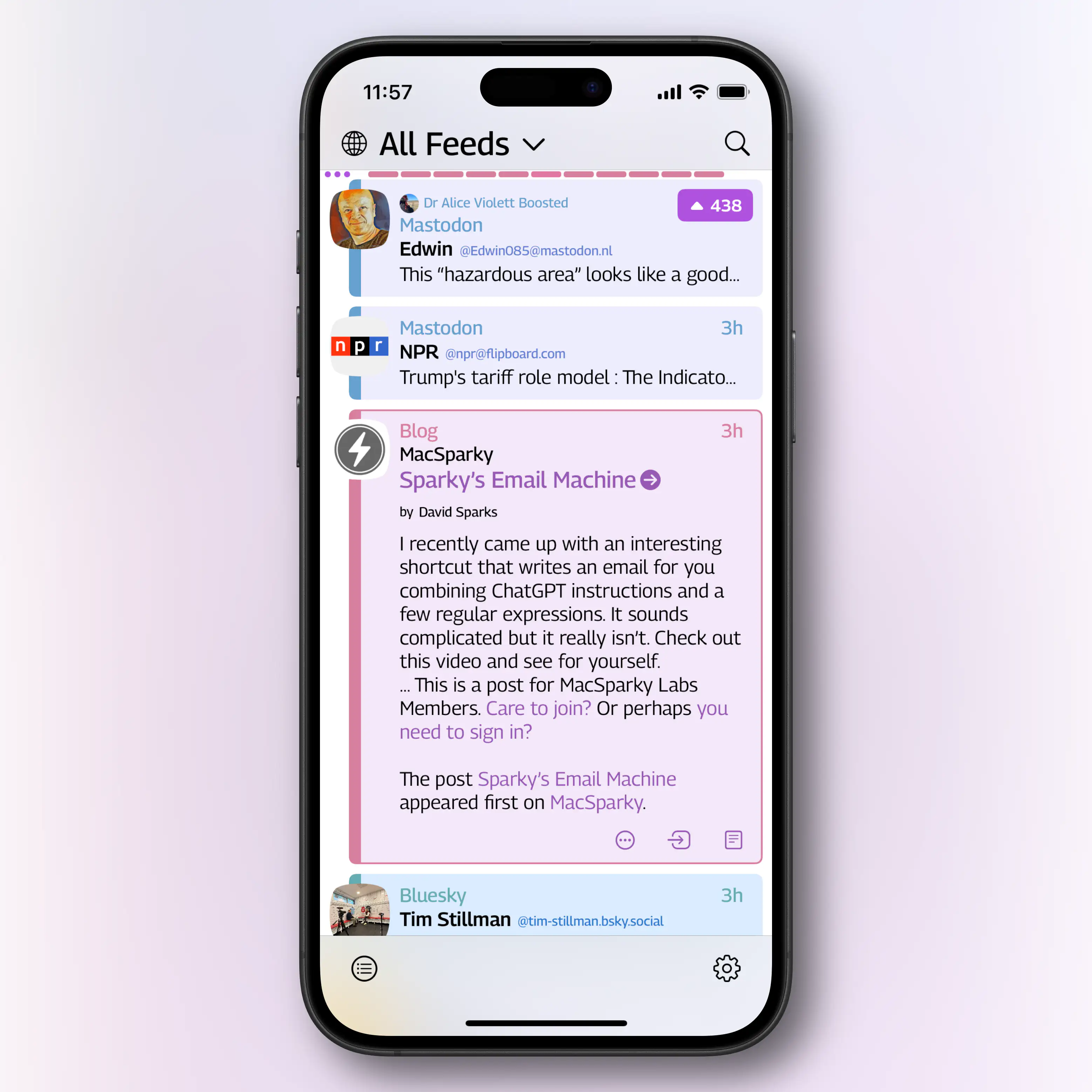
And the original, the way it is currently: 👇🏻
And here’s another version, where I’ve taken back some left-margin, and made the avatars small enough to fit the timestamp below (even on short posts, like the second Mastodon post): 👇🏻
And while it’s perfectly fair to prefer them on the left, I don’t think it’s fair to say that it doesn’t still look and feel like Tapestry. I’m “just” advocating for the user to be able to do some tweaks (specifically being able to, as options, turn off service name, adjust font sizes, and move the avatars) – not demanding that it looks just like Reeder. (Even though the specific thing with the avatars on the right is available there.)
There are plenty of things I like about both the app and the design! (I’ve been using it full-time since the last post. I especially like the colourful design, and the way I can quickly move between compact, expanded, and full view of posts.) I guess that’s why the things that bother me matters more, if you know what I mean.
And sorry for not coming with the feedback sooner. I’m also a Kickstarter backer, has had the TestFlight since it launched, and has had these opinions since then, heh. (Not that it necessarily would have mattered, if I’m alone in having those opinions: Loving the colours and vibe, but wishing for tweaks to clean it up a bit.)
You, of course, don’t have to listen to, and spend time on, a noisy customer like me! But I’m genuinely interested in hearing about the considerations – as I both find it interesting to discuss, and something to learn from.
Have a nice weekend!
-Erlend