The Paper Dev Should Give Their Take on a Tot-Like App
I recently wrote a review of Iconfactory’s great app, Tot.
I like it – but editing text in it does make me miss my favourite places to do this: Paper and Bike.
And this process made me realise that the Paper dev has all* the pieces in place to give their take on an app like this. And it makes sense from a business perspective!
The pieces
- A best-in-class text engine, that can jump between Markdown (plain-text) and Preview (rich text) Modes.
- This is also already great on both Mac, iOS, and iPadOS. (No Apple Watch, though.)
- The UI is made to be minimalistic, mimicking just a piece of paper.
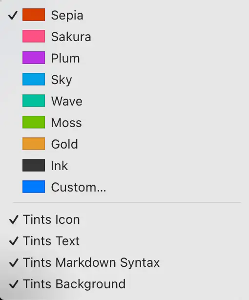
- Paper ships with several beautiful accent colours, and great support for them in the UI.
- It also provides good export features. (Including for copy/paste.)
Here’s what I would do:
My suggestion for a name (also to make it easier to discuss here) is Slate.
A slate is a thin piece of hard flat material, historically slate stone, which is used as a medium for writing.
The next question is how much it’s OK to copy from others. Let’s pretend it’s fine to take all …
The best parts from Tot:
Fixed number of notes
I really like that Tot only supports 7 notes, that are all “internal” to the app.1 I also love how they’re distinguished from each other by colours.2
Having exactly 7 would a bit on-the-nose… But one of the reasons I liked the “Slate” name, is that you could one-up, rhyme, and go for 8!3
Perhaps the 8 notes could be regular, accessible Markdown files in the app’s iCloud folder, to simplify automation? But that you can’t create other notes with the app, and it can’t “find” other notes if you place them there.
The business model
Tot is free for the Mac, and a one-time purchase for each extra platform (iOS and Apple Watch). I think something like this could be a good idea for Slate as well.
You could also consider just having it be free, and the business model being to funnel people into Paper. Once people get the taste for the great writing feeling, they might want a more powerful app, that can also edit files.
What to take from Paper
See my full review for why the general text engine is terrific. I’d, of course, bring this over.
Accents
I really like how the accents in Paper colour the icon, scroll bar, caret, and iOS UI. It can also subtly colour the background, text colour, and Markdown syntax. Like in Tot, this can be used to distinguish between the different notes.
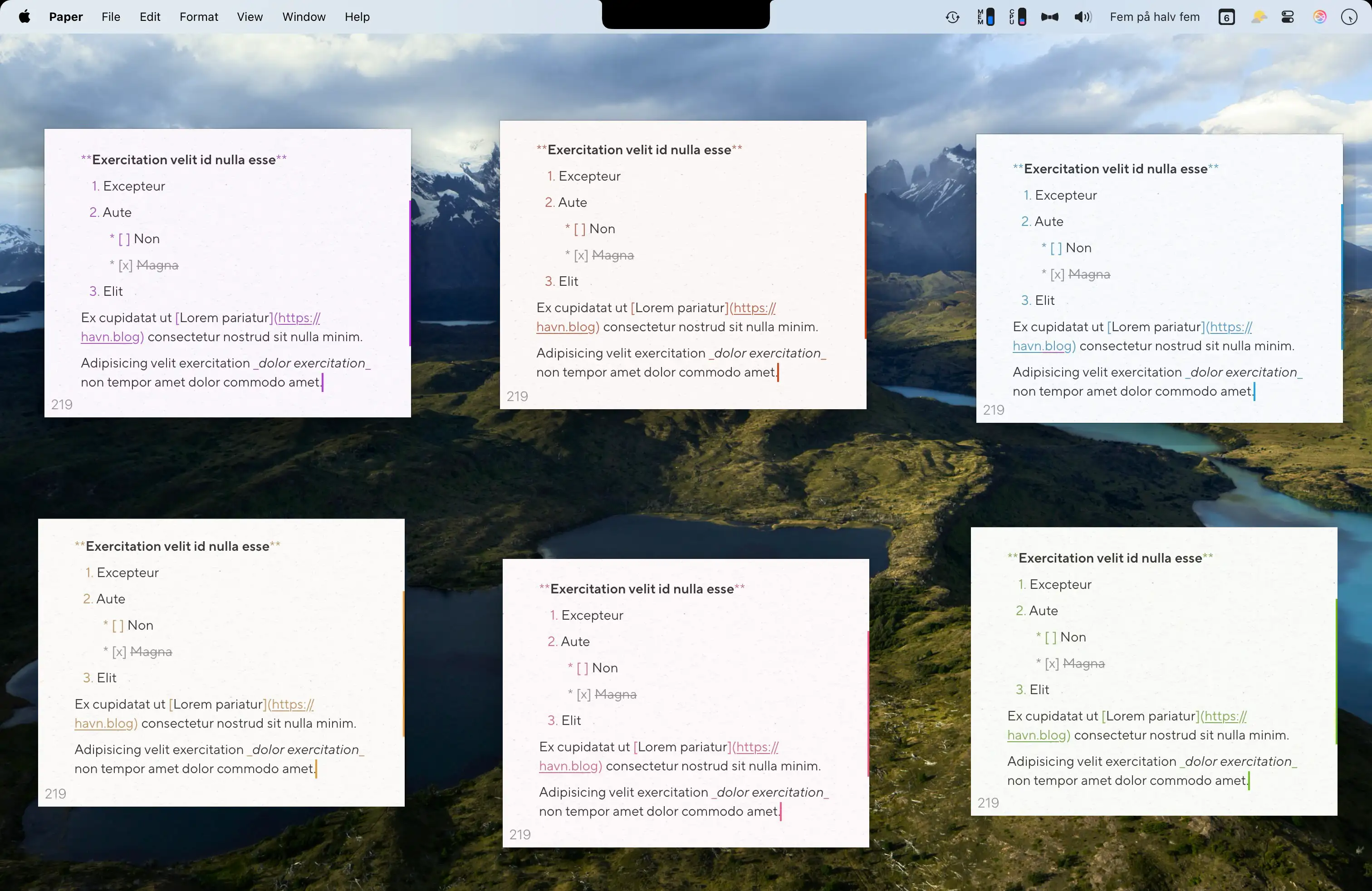
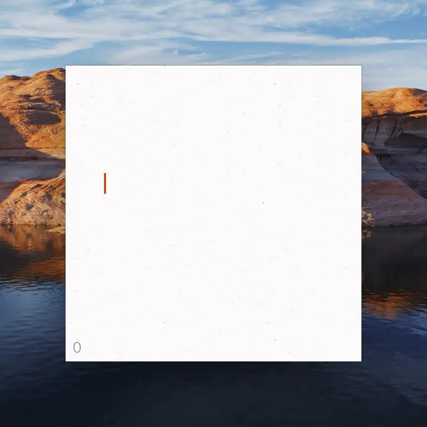
The minimal UI, and visuals in general
Opening a new note in Paper, just gives you this:
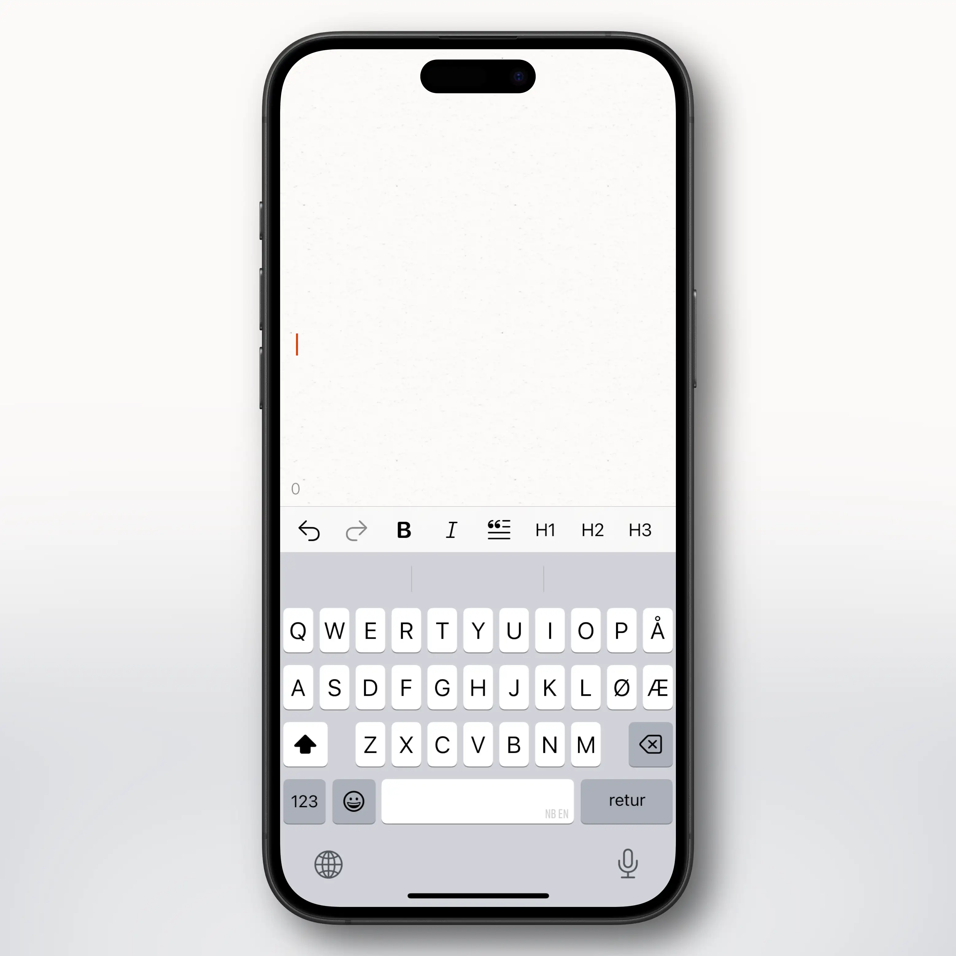
On Mac, you’re supposed to rely on keyboard shortcuts and Markdown, and on iOS you have the great, customisable toolbar above the keyboard.
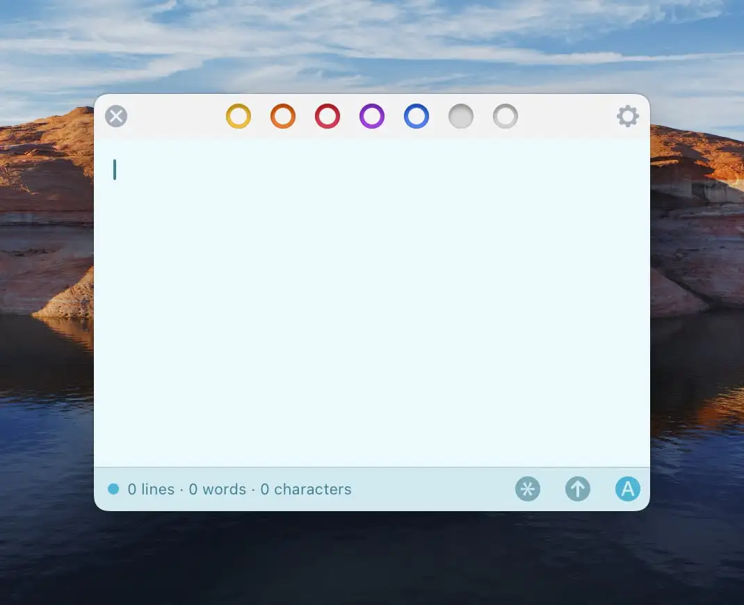
You would probably have to add something to show that there are different notes somewhere, though, like Tot has:
But in general, I really like the way Paper looks, with square corners, paper texture on the background, sleek caret and scrollbar, and more. You could toy with going for a more stone-like thing, though – if going for the slate metaphor… Skeuomorphism is back, baby!
Formatting
I would have the amount of formatting options somewhere between Paper and Tot. You can also compare with Raycast 🖇️ Notes:
I think not having headers is a good idea. Both to focus the app, and because the Markdown syntax would be messy.4
For instance, you could bring over:
- Bold
- Italics
- Ordered lists
- Unordered lists
- Task lists
- Links
- Quotes
- Horizontal Rule
(I wouldn’t mind support for code as well – but support for that is one of Paper’s weak points. I also think quotes and horizontal rule needs some visual work.)
I’d also keep the options to set your own preferred syntax.
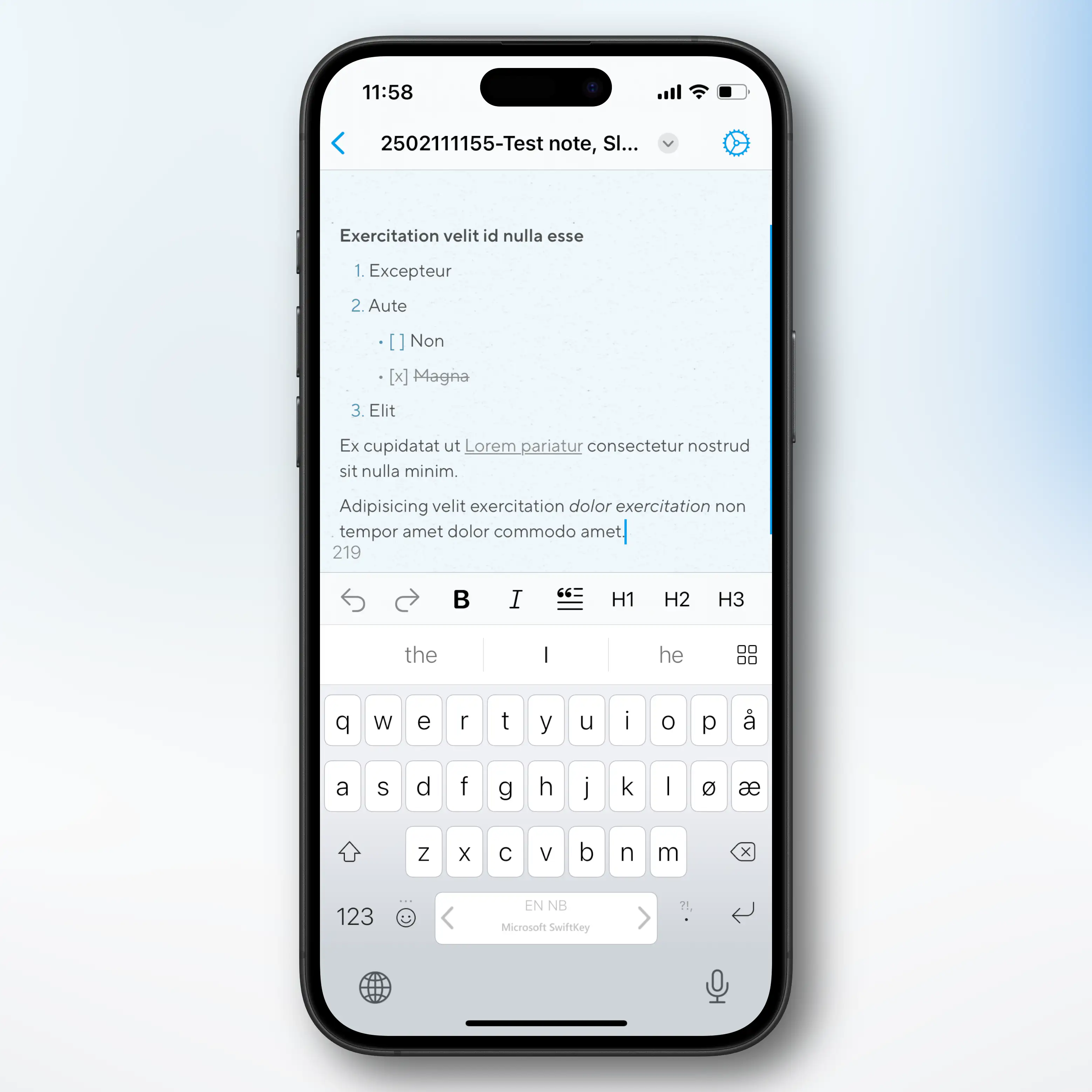
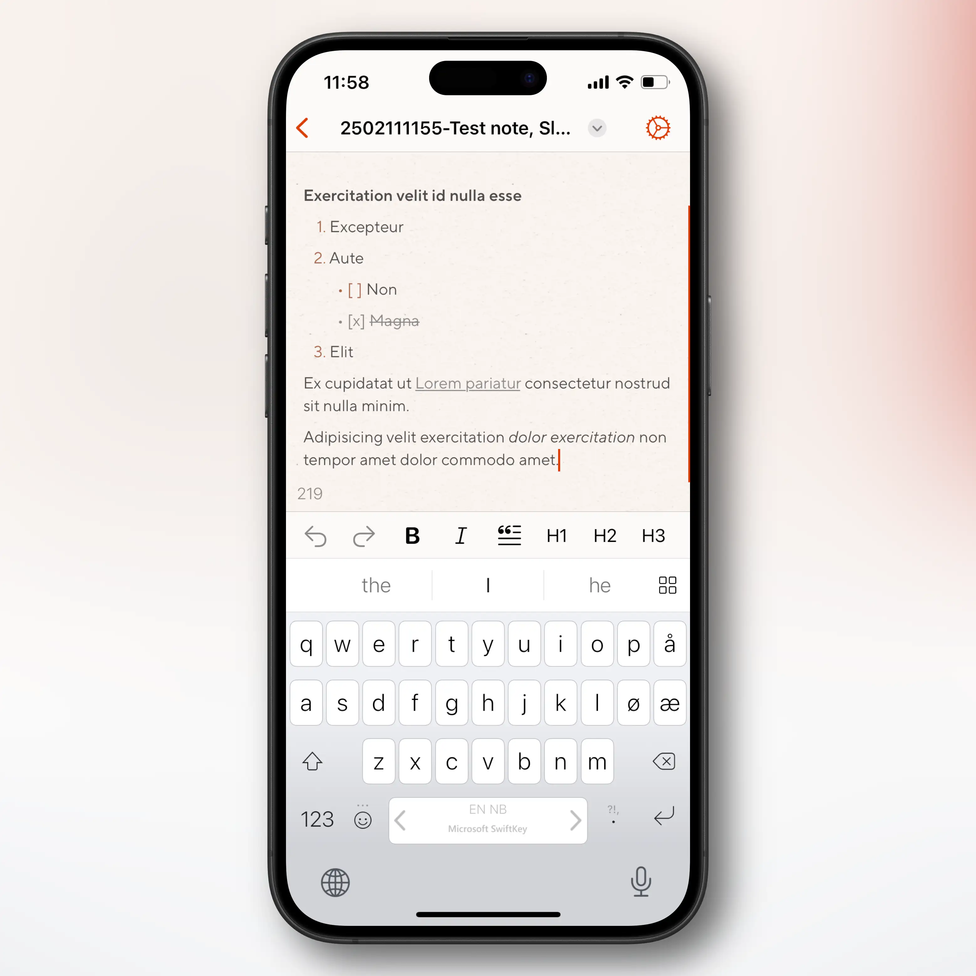
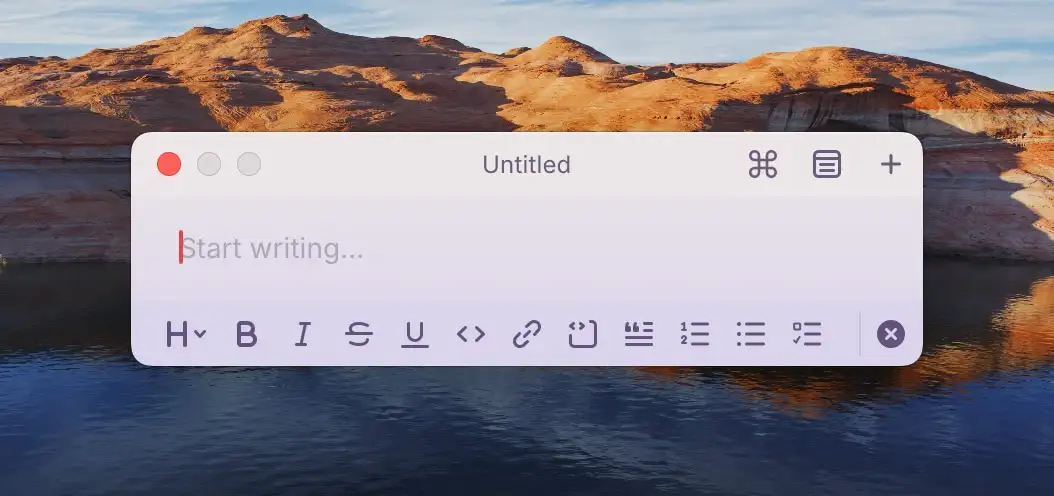
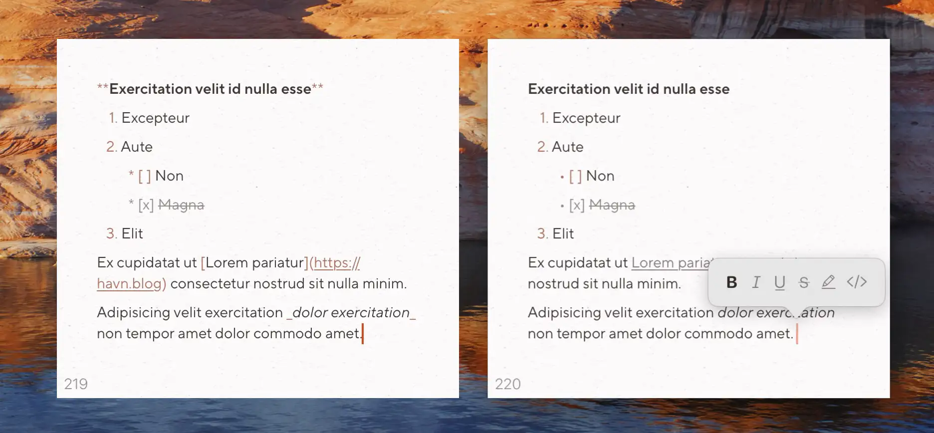
Markdown Mode and Preview Mode
I don’t like auto-hiding Markdown syntax (as the text jumps around), and I don’t like separate preview windows, like NvUltra/Marked. So I love how Paper handles its two different modes.
The Markdown Mode is an honest mode, that shows all the syntax. But this is muted and applied (bold text is bold, etc.), for better readability. (You can also place the header symbols in the margin, like God intended.)
In Preview Mode, the app acts and looks more like a rich-text editor. This also has a little UI element helping you know if you’re about to type some bold text (etc.). Here’s an image of the two modes:
What about the rest?
I really like Typewriter Mode and Focus Mode – but I don’t think they’re needed here.
Perhaps keep the Export features, but not the Publish ones?
I’m unsure about the general level of customisability, for things like animations, fonts, spacing, accents, etc. As the options are already made, perhaps just give it?
Or just pick my defaults, which are objectively the correct ones:
- 1.1 Line Height
- 0 indentation
- 0.5 Paragraph Spacing
- 1 Chapter Spacing
- Soft blinking caret, with slow smooth movement (except when typing)
However, I think giving all the customisation options could be good advertisement for the proper Paper app.
I get that it’s harder than it seems…
I’m not claiming that moving forward with my idea would be a negligible amount of work for the dev! Just maintaining two apps would be a hassle – like how, if you made a new feature, you’d want to add it to both apps.
But I really think an app like Slate, could both be a great app on its own and be a good way to funnel people towards Paper. Adding it to Setapp 🖇️, like Paper already is, could also generate some extra income and exposure.
And apart from the UI and logic behind the limited number of notes, it would mostly be about taking features away from an app that’s already built.
-
It doesn’t open files, or anything like that. ↩︎
-
It also has a colour-blind mode, though. 👍🏻 ↩︎
-
I toyed with calling it “Sleight” – but I was sad to learn that it doesn’t rhyme with eight. 😔 ↩︎
-
I really like that I, in Paper, can have the # symbols in the margin. But that takes up a lot of horizontal space. ↩︎