App Review: Paper
The Expensive, but Best, Place to Write Markdown
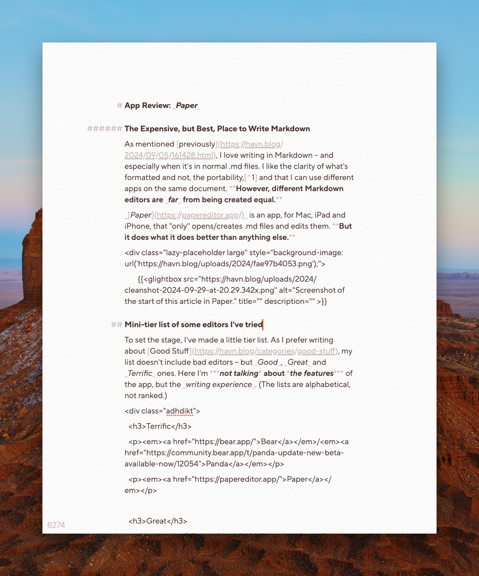
As mentioned previously, I love writing in Markdown – and especially when it’s in normal .md files. I like the clarity of what’s formatted and not, the portability,1 and that I can use different apps on the same document. However, different Markdown editors are far from being created equal.
Paper is an app, for Mac, iPad and iPhone, that “only” opens/creates .md files and edits them. But it does what it does better than anything else.
Paper could be an app for you, if:
- … you write a lot in Markdown – especially in short to medium lengths,
- … you don't mind (or even prefer) working with files instead of libraries,
- … you value the quality and feel of software, like $1.000 Japanese garden shears.
Mini-tier list of some editors I’ve tried
To set the stage, I’ve made a little tier list. As I prefer writing about Good Stuff, my list doesn’t include bad editors – but Good, Great and Terrific ones. Here I’m not talking about the features of the app, but the writing experience. (The lists are alphabetical, not ranked.)
There’s been plenty of memes about how long the team over at Shiny Frog spent on Bear 2.0. But holy croak, it shows – the editor is extremely polished. The app does have good export features, so your notes aren’t held hostage.2 But the main reason I, personally, don’t use it, is that the note files aren’t easily accessible to other apps. It also doesn’t have as robust publish features as Ulysses, or task/calendar system as NotePlan. However, as a general note-taker for Apple devices, I highly recommend Bear.3
Panda is the Bear editor as a stand-alone app, to simply open .md files – so it’s closer to Paper in terms of functionality. However, it’s not readily available for mobile, and isn’t technically a proper product at the moment.4

I don’t recommend my favourite pair of boots
I love my pair of Alden Indy Boots. I haven’t found a single boot I like the look of as much, and the last (being rather narrow at the back and wide in the front) fits my weird feet perfectly. However, I don’t generally recommend them – as they’re not technically “worth it”. They’re simply too expensive for what they are, as you can get better made shoes for the same price, or shoes of similar quality for less. But that doesn’t change the fact that I love them, and am happy I bought them!
I could say the same thing about my Filson Journeyman backpack: Is it too expensive? Yes. Do I still love it? Also yes.
Paper is in the same category: I won’t claim that it’s worth it – because it’s very expensive. But if you end up splurging for the app, you’ll get something terrific. Let me try to explain why.
The price for Paper varies from region to region, and the dev keeps experimenting. But it can be as much as €200! Personally I bought it after getting paid extra for a job I did – and at least the money went to a small indie dev. How much money people have to "waste" on nice stuff like this varies. So I'll focus on the good, and the bad, of the app – and then it's up to you to figure out if it could be worth it to you. It also has a 50% educational discount.
How I use Paper
As mentioned when talking about my default apps, I currently store my notes, blog posts, tasks, etc. in NotePlan. The app’s database is stored with CloudKit, but is still accessible by other apps. As I prefer writing in Paper, I will do that as much as possible, while jumping into NotePlan and Ulysses for stuff that those apps do better.5
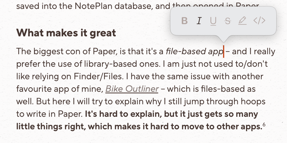
For instance, I’ve made different shortcuts for creating a new general note or a new blog post. This creates a .md file that gets saved into the NotePlan database, and then opened in Paper.
What makes it great
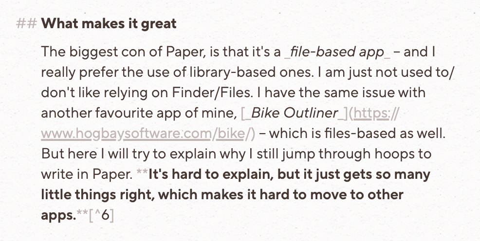
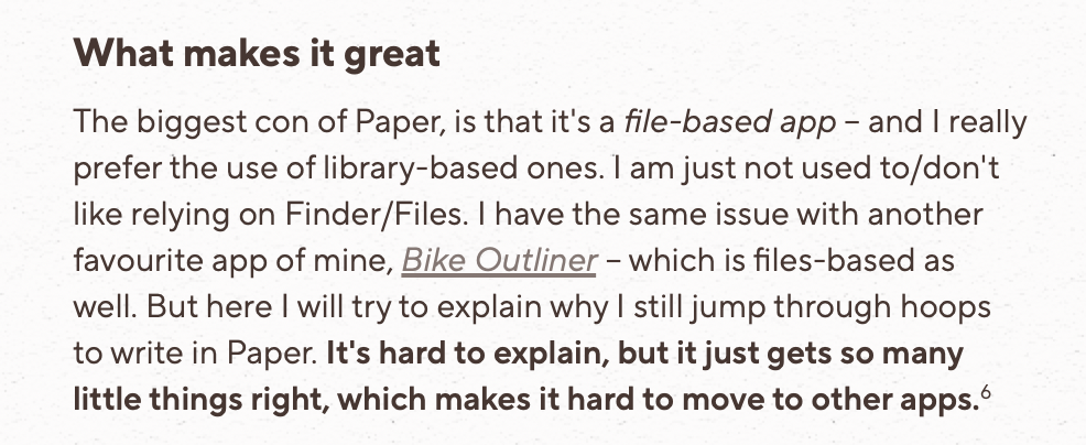
The biggest con of Paper, is that it’s a file-based app – and I really prefer the use of library-based ones. I am just not used to/don’t like relying on Finder/Files. I have the same issue with another favourite app of mine, Bike Outliner – which is files-based as well. But here I’ll try to explain why I still jump through hoops to write in Paper. It’s difficult to explain, but it just gets so many little things right, which makes it hard to move to other apps.6
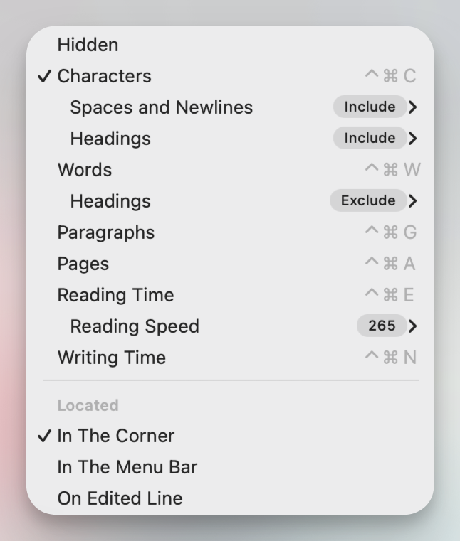
Markdown syntax
The first thing it does right, is allowing you to choose your preferred syntax. This dictates which symbols will be used when using hotkeys – but it still “accepts” all variants when typed.
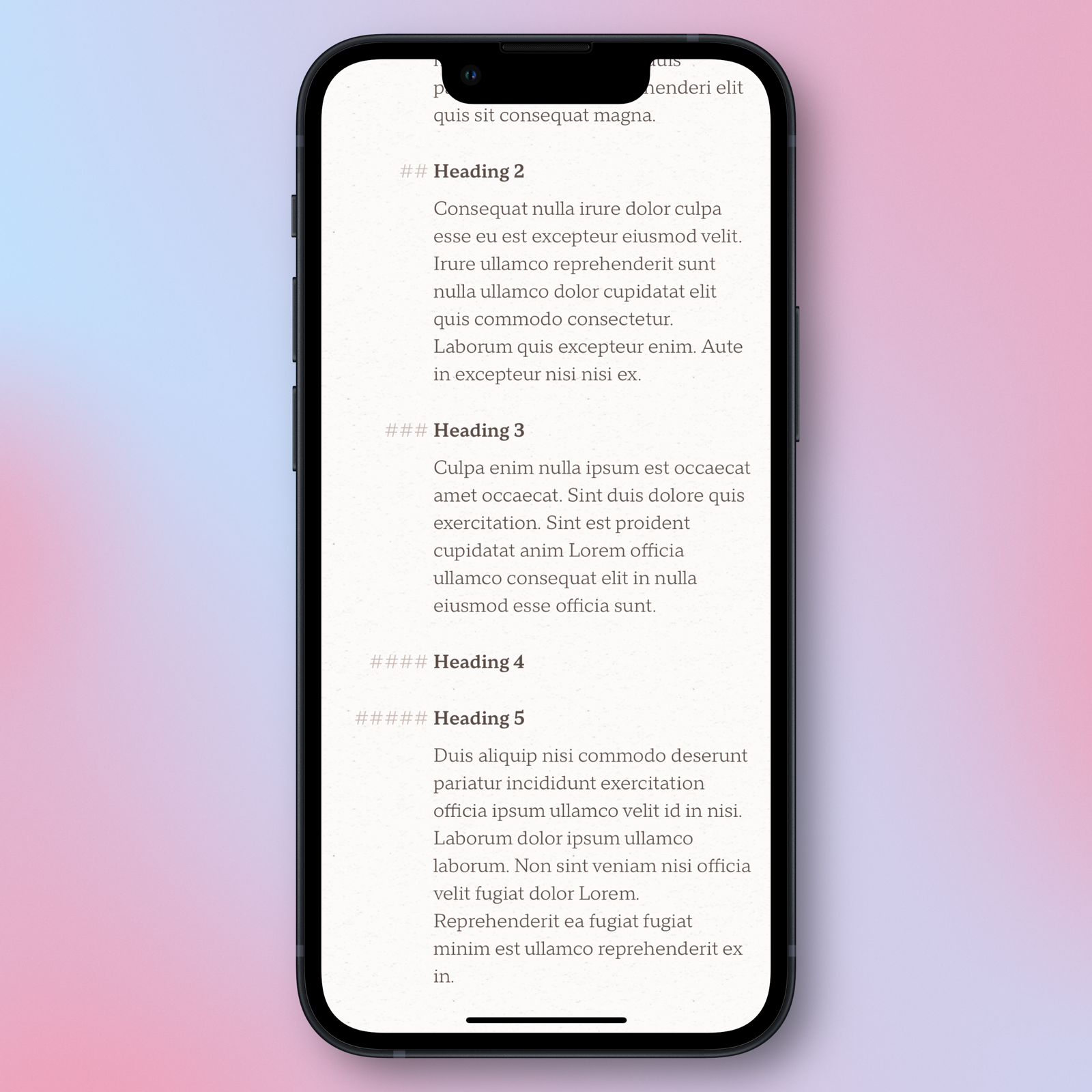
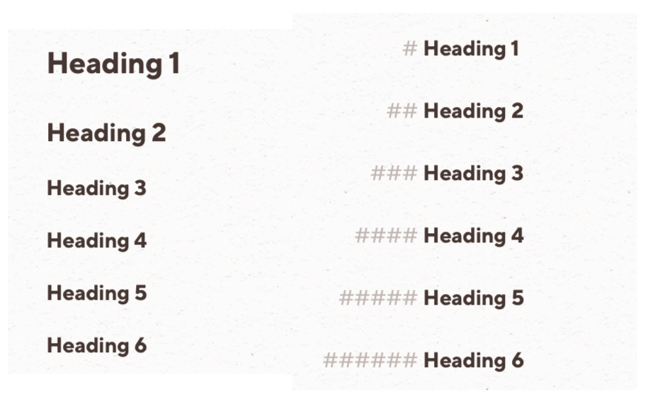
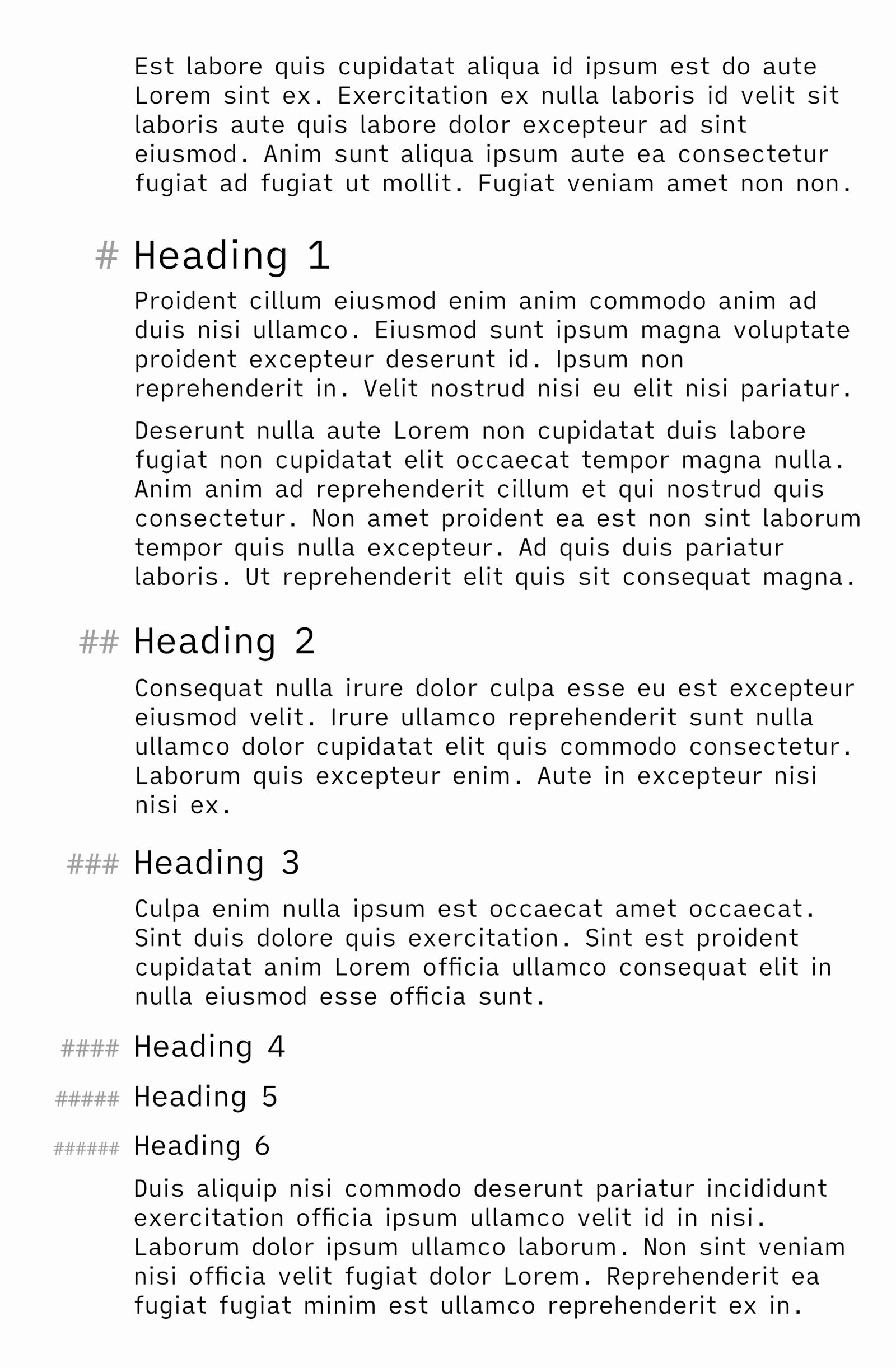
# symbol is needed to create headings.By default, Paper shows the Markdown syntax – but in a muted colour. This is my preferred mode, as I don’t like it when text jumps around with automatic hiding, while finding it distracting if it’s as visible as the text. It also applies the formatting:
# symbols are in the margin, to align the header with the paragraphs. 👌🏻However, at the hit of a button, you can enter Preview Mode. This turns Paper into a rich text editor of sorts – while the file beneath remains Markdown. I find this especially useful on iPhone, where space is at a premium.
While in Preview Mode, hitting a formatting hotkey while no text is selected, will bring up this little window, showing which formatting you’re currently typing with:
It also handles selection and combinations of bold and italics perfectly. Have a look at this example:
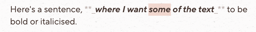
The middle part of the sentence has both bold and italics applied – but what should happen if I select a word in the middle and hit Cmd + I?
Paper nails it, by turning off italics, but only for the selected word. If my caret had been in the middle, but without having selected the word, it would turn off italics for the entire section. This last option is nice for when you quickly want to turn off the formatting of an entire section, without having to exactly select the whole thing. Ulysses lacks this, for instance.
Obsidian, on the other hand, turns off italics for the entire section even if the word is selected:

While NotePlan just completely messes up:

Paper also rocks at edge-cases when it comes to selection and formatting. Here’s an example, from this article by the developer. (Sorry that you probably have to zoom in to see the text!)
It will also, unlike Ulysses (for instance), always remove spaces before and after syntax. 👌🏻
It also handles links well: If you select text and paste a link, it will create a Markdown link with the selection as the text. However, if you paste without any selection, you can choose whether it should create an empty Markdown link or just paste the URL. Personally, I prefer the latter.
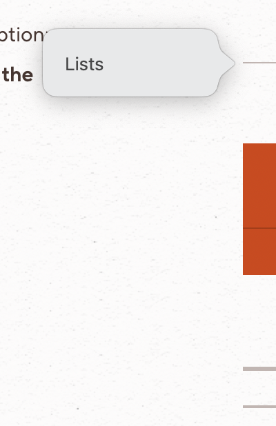
Lists
OK, let’s say I’ve written a numbered list, with three items – but then I want to add something between 2 and 3. However, maybe I regret it, and want to delete it again! Let’s see how three different apps handles it:
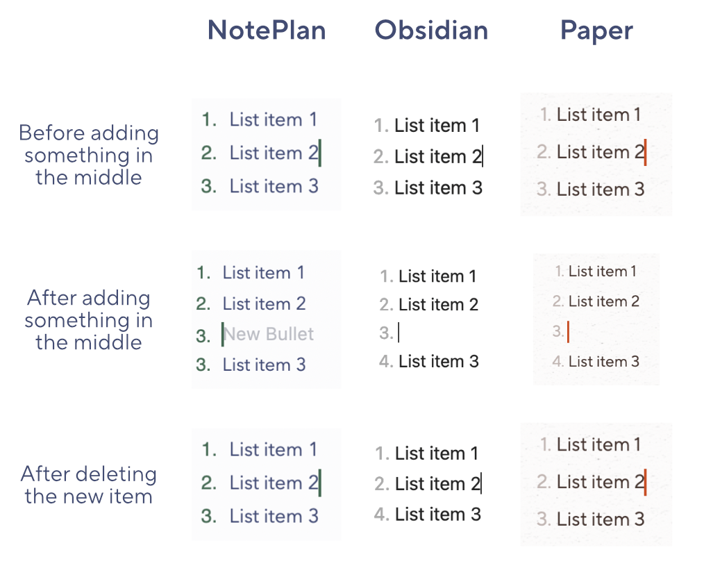
As you can see, Obsidian and Paper both handles adding a new item in the middle. However, if I delete an item in the middle, things break in Obsidian.7 Neither NotePlan nor Obsidian handles deletion in the middle of a numbered list.
I couldn’t find this hotkey in Obsidian (don’t know if it exists – it’s a big omission if not), but both NotePlan and Paper has a hotkey for moving the paragraph with the caret/the selected paragraphs up or down. (I have it mapped to Ctrl+Cmd+Up/Down.) Let’s compare what happens if I move List item 3 up:
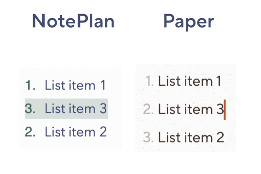
This, and the things regarding formatting, are examples of how Paper just works.
Another thing is how it always seems to copy and paste like I want. And if you like, it has options for copying and pasting between Markdown and HTML.
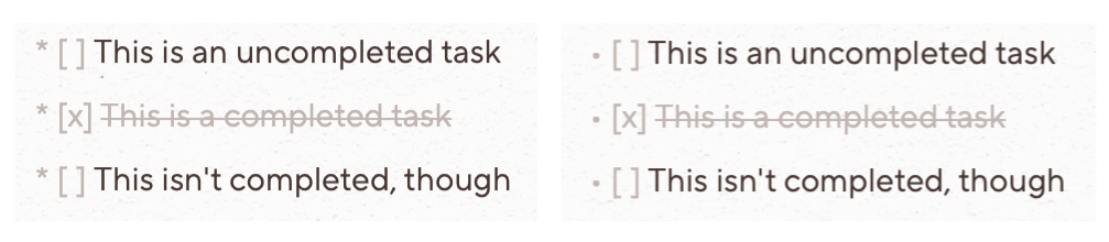
The app also has rudimentary support for task lists.
Looks and feel
In addition to working well, the app also looks and feels great.
There’s no UI – the app is just a white square (which can even be without rounded corners) with your text. However, notice the paper texture on the background, and the sleek and matching caret and scroll bar. The caret can also be set to blink softly, and move smoothly as it moves from line to line (at a customisable speed).
These are in an accent colour I’ve chosen:
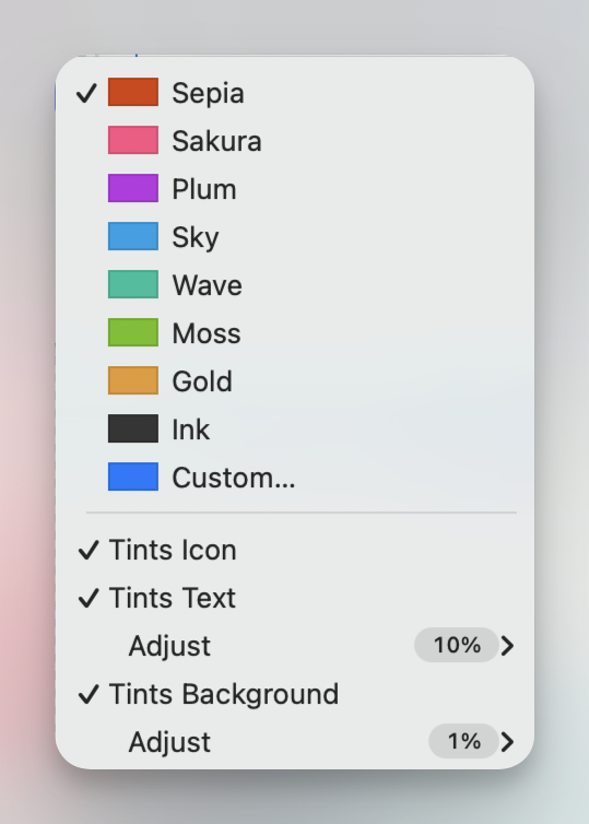
All the accent options look great – but you can set your own colour as well. You can also have it give a slight tint to the text and background – and it also changes the selection colour and even the app icon (which also has a dark mode variant, of course).
It can also be set up to have proper paragraph spacing. (But I do have some notes on this, which I’ll come back to.)
Of all the apps I’ve used, there’s only one app which I like the feel more of than Paper – and that’s Bike Outliner.
Navigation
The scroll bar doesn’t just look good – it has a hidden trick: If you hover over it, it expands, and shows you “chapters” (which are your headings).
Some more neat navigation features, can be seen here:
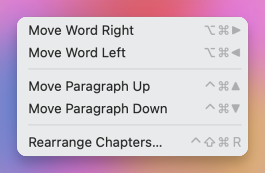
Moving words within sentences, and paragraphs within the document (also list items in a list), works on where the caret is currently, or on what you have selected (even partially).
Rearrange Chapters opens a screen, where you can drag your headings (with its content) around, in a list. You can also change the heading level of them.
However, my favourite navigation feature is the excellent Typewriter Mode. All other typewriter modes I’ve tried, work something like Ulysses here:
So, as you type, and create new lines, the vertical position of the caret stays constant. This can be nice – but I don’t like that it moves every line. That’s a bit too disturbing for me.
I’ll show it in action afterwards – but have a look at the options for Typewriter Mode in Paper:
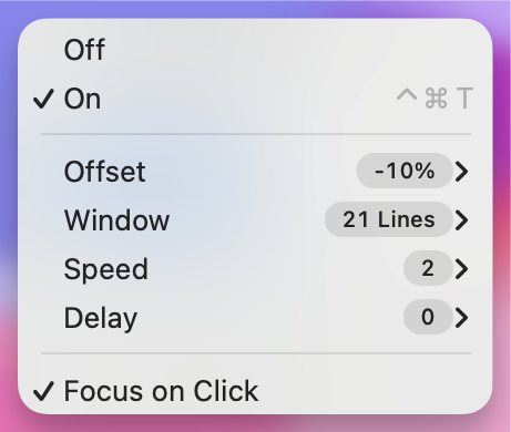
- That I’ve set Offset at -10% means that I’ve set my sweat spot to be a bit over the middle of the screen.
- However, you can set it to not move every line! As I’ve set the Window to be 21 lines, it only moves when I’m more than 10 lines away from the sweet spot.
- Speed is how fast the scrolling is. I like to keep it slow.
- Delay is how quickly it reacts when I go outside the window. I think I prefer 0.
- Focus on Click is whether it should only move while typing.
The results is a Typewriter Mode that just feels like a human is scrolling up and down for you, in a natural way, to always keep the caret at a nice vertical position.
It also has a cute Move to Center and Hide Others feature, shown here:
Great iOS and iPadOS counterpart
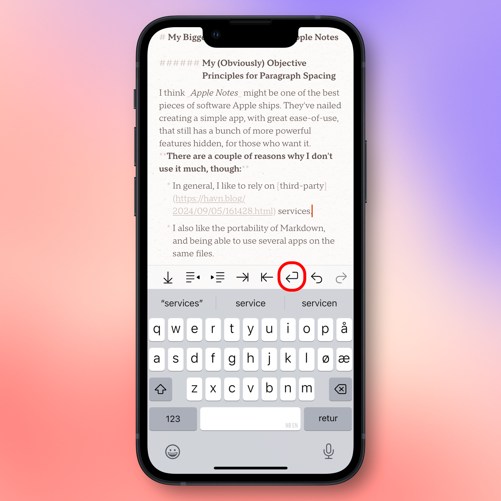
Until now, I’ve mostly shown examples from the Mac app. But the mobile counterparts are also great. And here’s an important point: Most of the things I’ve mentioned are customisable. So it’s great that you can set different options on different platforms.
Both apps also has a completely customisable toolbar, with numerous clever buttons – like this one, for Soft Returns:
I like the third-party keyboard SwiftKey – even though Microsoft hasn’t done an impressive job with it since they bought it. But for some reason, it doesn’t play nice with some Markdown apps, like Drafts. However, it does play nice with Paper!
Other, and things I don’t use much myself
Another little thing Paper just nails, is undo/redo. The developer touches on it in this article – but yeah, it just works. He’s also made a nifty touchpad gesture, where you can rotate to undo/redo! That looks like this:
You can also pinch to change the size of the window – and holding Command, while scrolling, changes the text size.
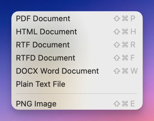
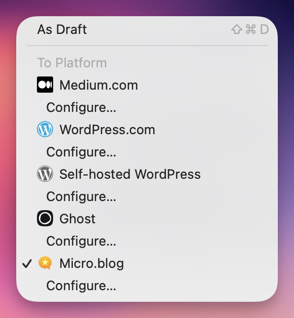
Paper also has some rudimentary exporting and publishing features.8 It’s not as robust as Ulysses', but I like that they’re there.
Some will be happy to know that the app is far from trying to be an “AI app”. But it does have an AI hotkey! If you don’t have any text selected, you’ll get this:
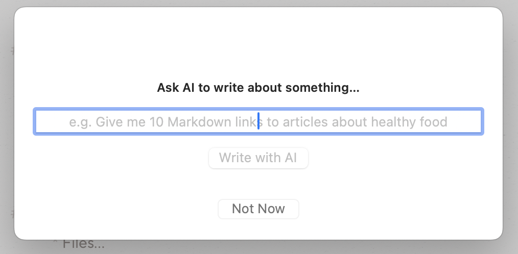
And if you have selected some text, you get this instead:
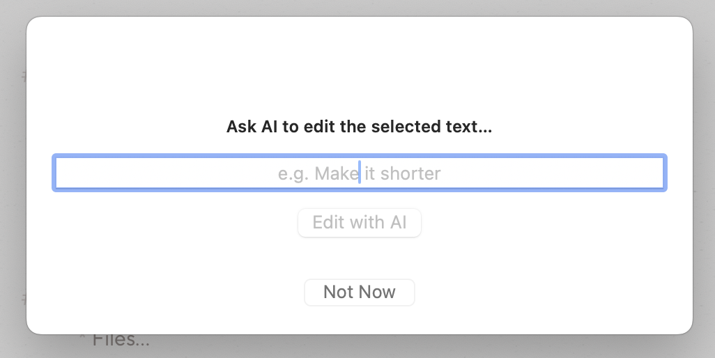
When using the latter, it will edit the text, while also providing an explanation. Both right in your document. Yeah, and as it uses native text tools, the Apple Intelligence features can work out-of-the-box as well (when they eventually ship).9
Two other features I don’t use much, but that some might, are a Focus Mode and Counter. The first allows you to mute the parts of the document your caret isn’t in – and you can choose if it should focus on the current line, sentence, or paragraph. You can also decide if you should exit the mode on click.
Some other niche features are the option to not be able to edit or delete text (only write), typing sounds, and showing hidden characters. It’s also supposed to smartly handle switching between non-alphabetic languages (like Chinese or Hebrew) and alphabetical ones (like Norwegian) – but I can’t really test that.
Lastly, it also has a Callback URL Scheme, which also makes it work nicely with Hookmark. I also recommend checking out the overview of the keyboard shortcuts, which gives an impression of how much can be done with those.
But there are also things that could be better!
I’ve focused heavily on the positives until now – both to show why I really do love this app, and as I hope it can serve as inspiration for other apps. But that doesn’t mean the app is perfect. Some of the things I’m mentioning here, I know are hard/impossible to implement due to how the app is built. Nonetheless, I still think it’s a good idea to point them out here, as they are things I miss with the app, and that others might miss as well.
Price
I get that it might be easier to capture fewer customers at a price of €200 than 10 times as many with a €20 price… Nonetheless, I still think the price is wild – and it makes me a bit sad, as it keeps the app niche.10 Another thing that bums me out, is that the dev told me he had pitched the app to Setapp, but that it got rejected because they already had enough writing apps. I really think Setapp made a mistake here, as they might not have realised how high quality the app is. If you agree with me, or are curious and have Setapp, join me in sending them a friendly email to ask them to reconsider.
Personally, I view Paper as a luxury writing instrument – like a nice fountain pen. And if you write a lot, and have the funds, it’s not that crazy to spend a bit to provide more joy to that experience!
Surrounding features (and name)
I don’t like how generic the name is – as Paper is hard to both talk about and search for, heh. However, it does suit the app well: Not only does it look like a piece of paper (with its paper texture and square corners) – it also simulates single pieces of paper, as opposed to something like a notebook. This brings me back to a con I’ve already mentioned, that it’s a simple files-based app, with little to no surrounding features. I would’ve loved it if I could get the writing experience of Paper, with the extra chrome of apps like NotePlan or nvUltra!11
A quick thing I would love, would be if I could point it at a folder and say “Hey, please know about things in this folder”. (It would have to create a hidden .paper folder in it.) This could be a way to make links [[like this]] work. I’ve pointed both NotePlan and nvUltra at the same folder – so both of them follow those links, regardless of which of the apps I made it in!
It also doesn’t have any dedicated shortcut actions, for automation. But as we’re dealing with plain-text files here – it’s far from impossible to work around that!
Lastly, in this section – the dev has made a choice, for the Mac app, that I don’t agree with: To keep with the minimalist approach, the app doesn’t have a settings screen at all. And every option is accesses via the menu bar. The basic ones are visible all the time, while the more advanced ones require you to hold Option. I love a good settings screen, so I think having one of those would be better – at least in addition to the current menu. When I’ve evaluated this app, I’ve often found myself thinking, “That would be a good option to have in a settings screen – but it would be overcomplicated if it were just in the menu bar”.
Looks, and formatting features
The app’s simplicity can also be sensed in some formatting options, or lack thereof. And while I do love how the app looks, it could be even better, in my opinion.
Headings
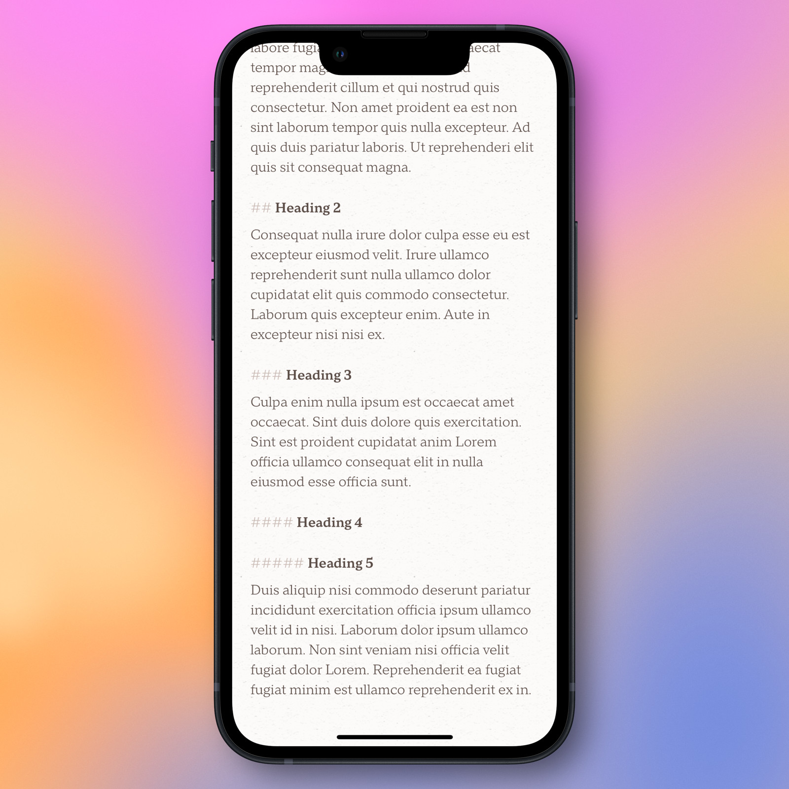
Here are some headings – in Preview Mode on the left and Markdown Mode on the right:
So, the app does acknowledge h1-h6, which is good. But I have two problems with it:
- In Markdown Mode, all headings have the same size and paragraph spacing. (However, at least the spacing is larger above than below, as it should be!)
- And Preview Mode has the same size for h3-h6.
I know that several markdown editors, like iA Writer and MarkEdit, do the first thing as well – but I still don’t like it. I get the principle of wanting to stay true to the original plaintext file – but I don’t see any philosophical differences between “showing bold text as bolder than regular text”, and “having heading 1 be larger than heading 2”. It should at least be an option.
Here’s a mockup of how I would like it to be:
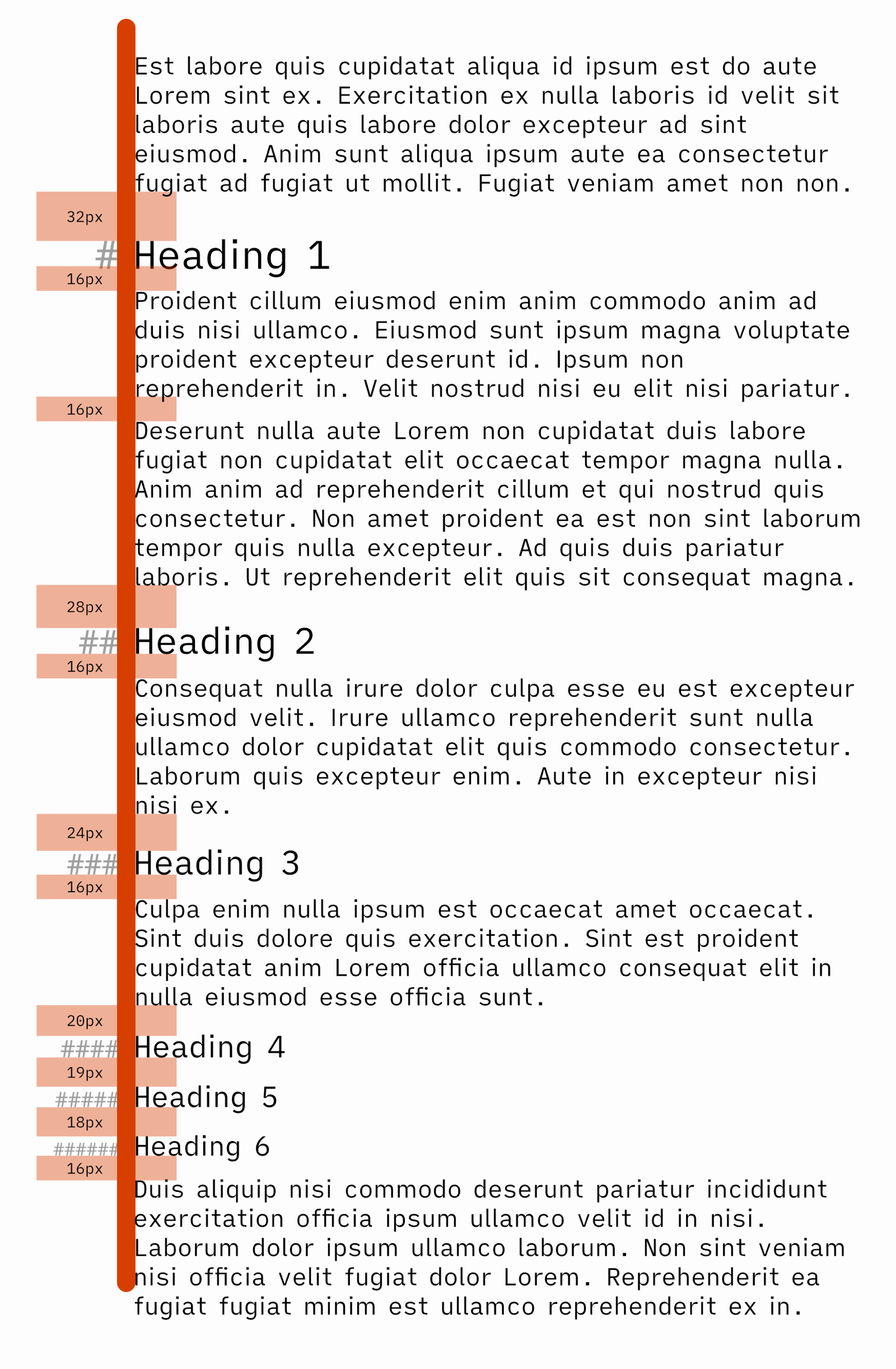
\\# symbols slightly smaller font size, but that's not necessary.I’d also love it if the headings could be collapsible, like in NotePlan (and many others). Collapsible list items would also be great!
Some niche things that haven’t got much love
Paper’s main focus has been on doing the basic Markdown things extremely well – and do them well it does! But that means that some more niche features haven’t got the needed attention. But I hope they can get it eventually!
The app has little support for tables and images. It will show images, but only ones that are hosted online, and only in Preview Mode. It will also show Markdown tables in Preview Mode – but I don’t think it really has a way to make them.
I know it’s not trivial to add support for images in .md files when you’re not a library app. One improvement could be to show the images in Markdown Mode as well. And maybe the app could offer to convert the file to TextBundle if you want to add a local image? Or perhaps the “Hey, please know about this folder” suggestion from earlier would make it possible to add attachment folders, like NotePlan does?
I also wish footnotes were improved. Hitting the hotkey only creates this: [^] While I wish the app used its terrific logic from numbered lists, and did the following:
- Add the correct number in the footnote syntax
[^3] - Then moved to the bottom of the document, and write
[^3]:
Then you could quickly add the footnote content at the bottom – and if the number was clickable, to quickly go up and down between them, it would be even better.
When writing blog posts, I’ll mix in some HTML here and there – like when adding images, callouts, etc. And I prefer the way Ulysses displays this, as Paper doesn’t really recognise it. Here’s an example:
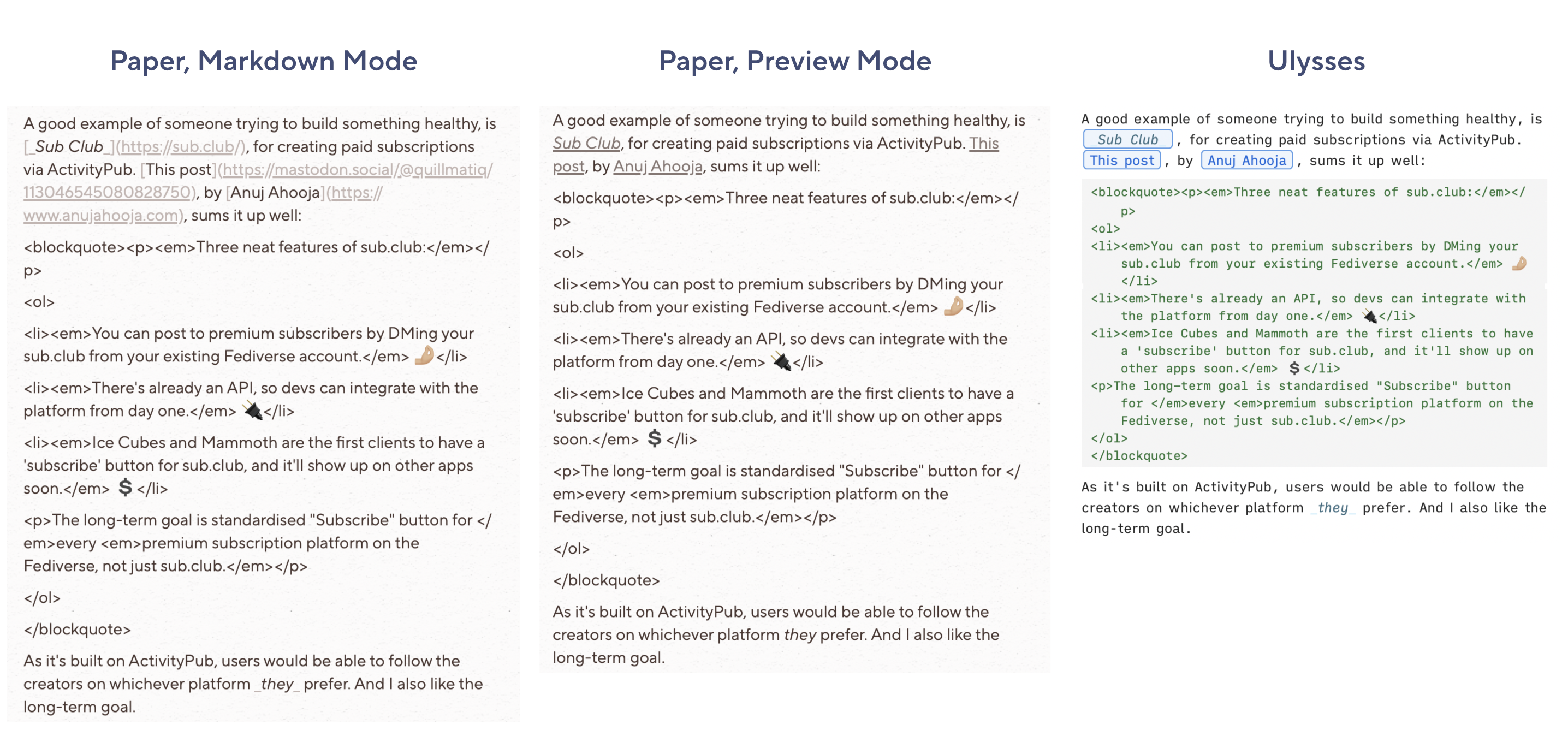
In Paper, the HTML is just there, while in Ulysses, it’s recognised as what it calls “Raw Source”. The latter makes it easier for me, at a glance, to see what’s text and what’s code. This, together with the “Built-In Proofreader and Editing Assistant” and publish features, is why I finish up my blog post in Ulysses.
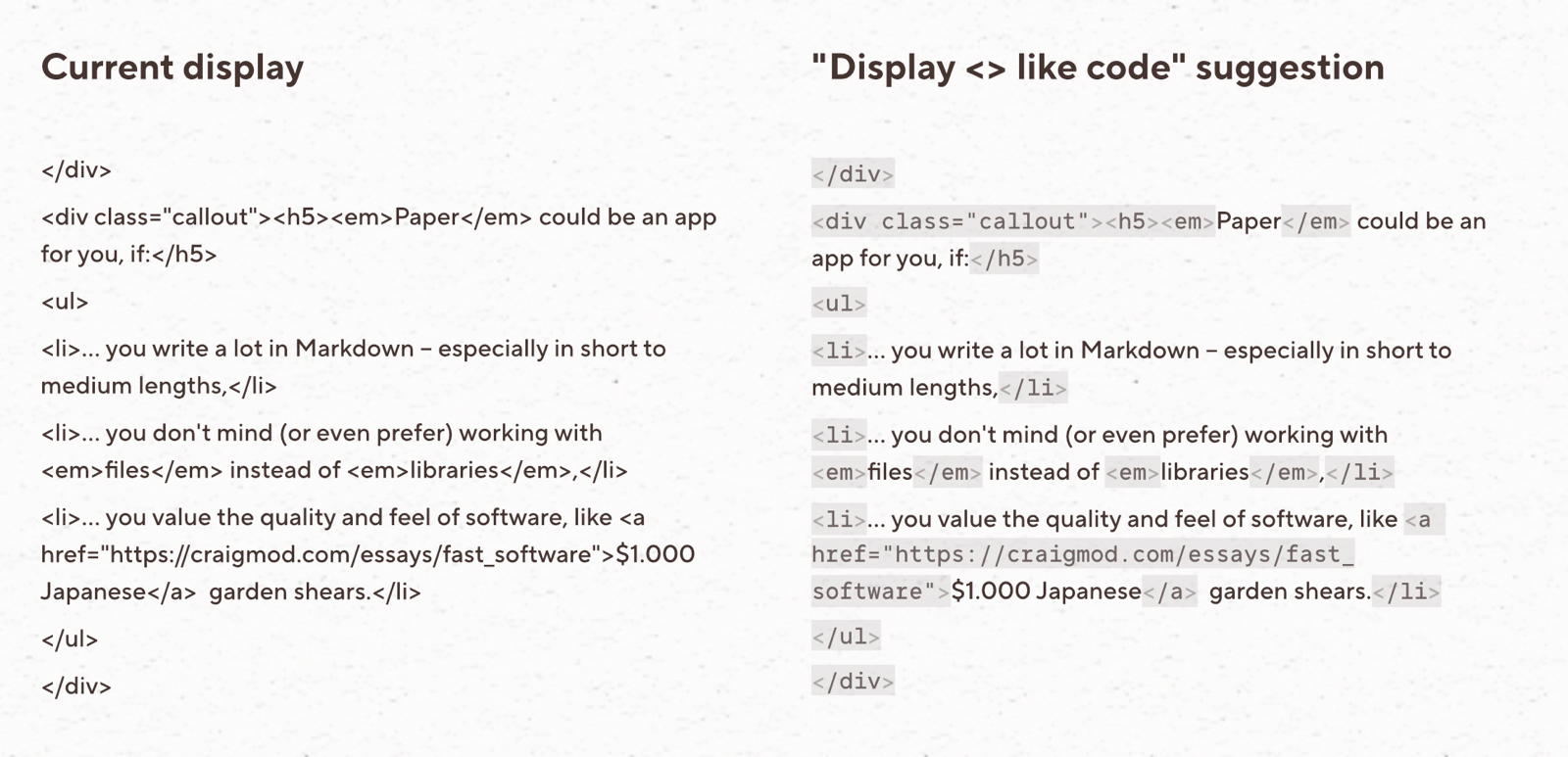
Some apps, like Obsidian, will try to render the HTML inline. This can be a cool option to have, but it can also be a bit messy.
A possible implementation could be to recognise, and render, things that start with < and end with > as code:
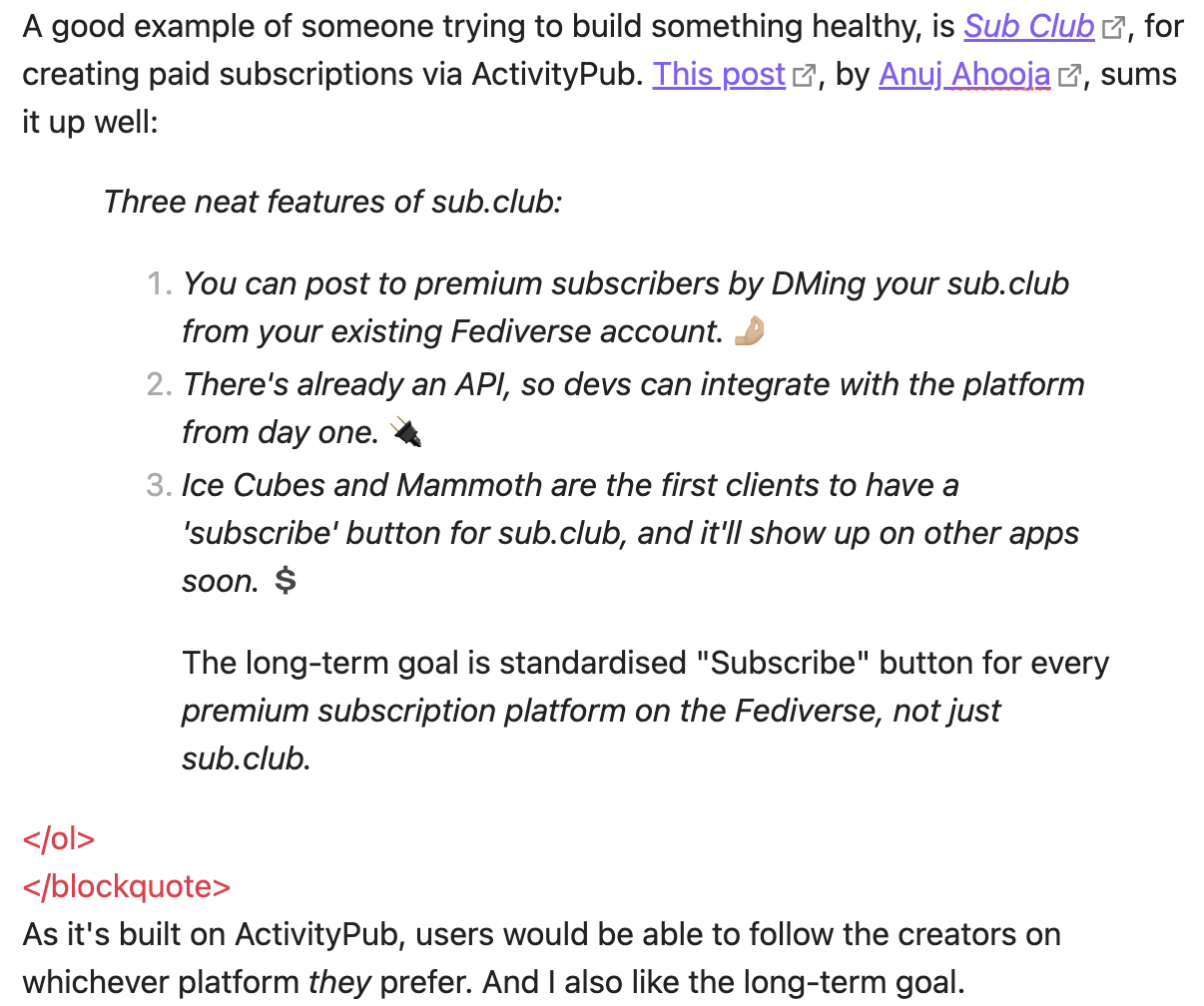
Paper’s doesn’t love code blocks either. Let’s compare it to Ulysses and NotePlan:
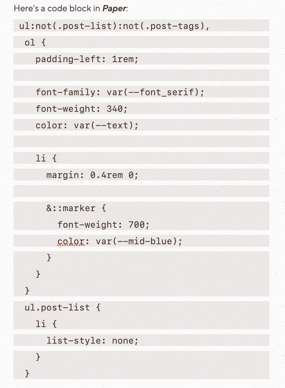
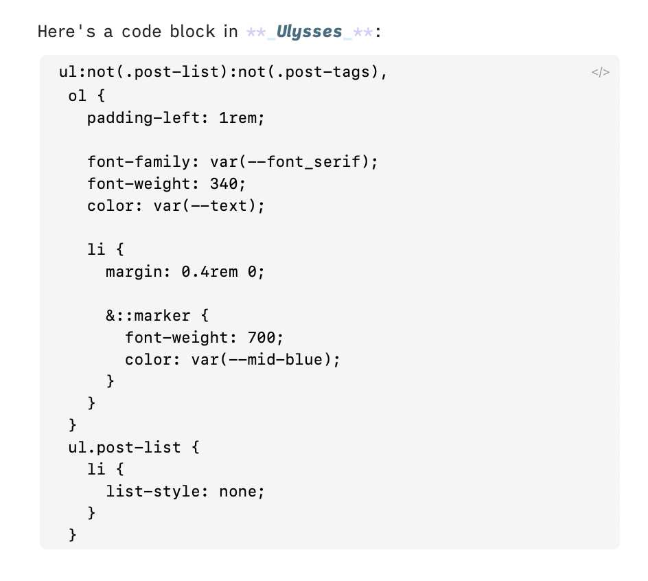
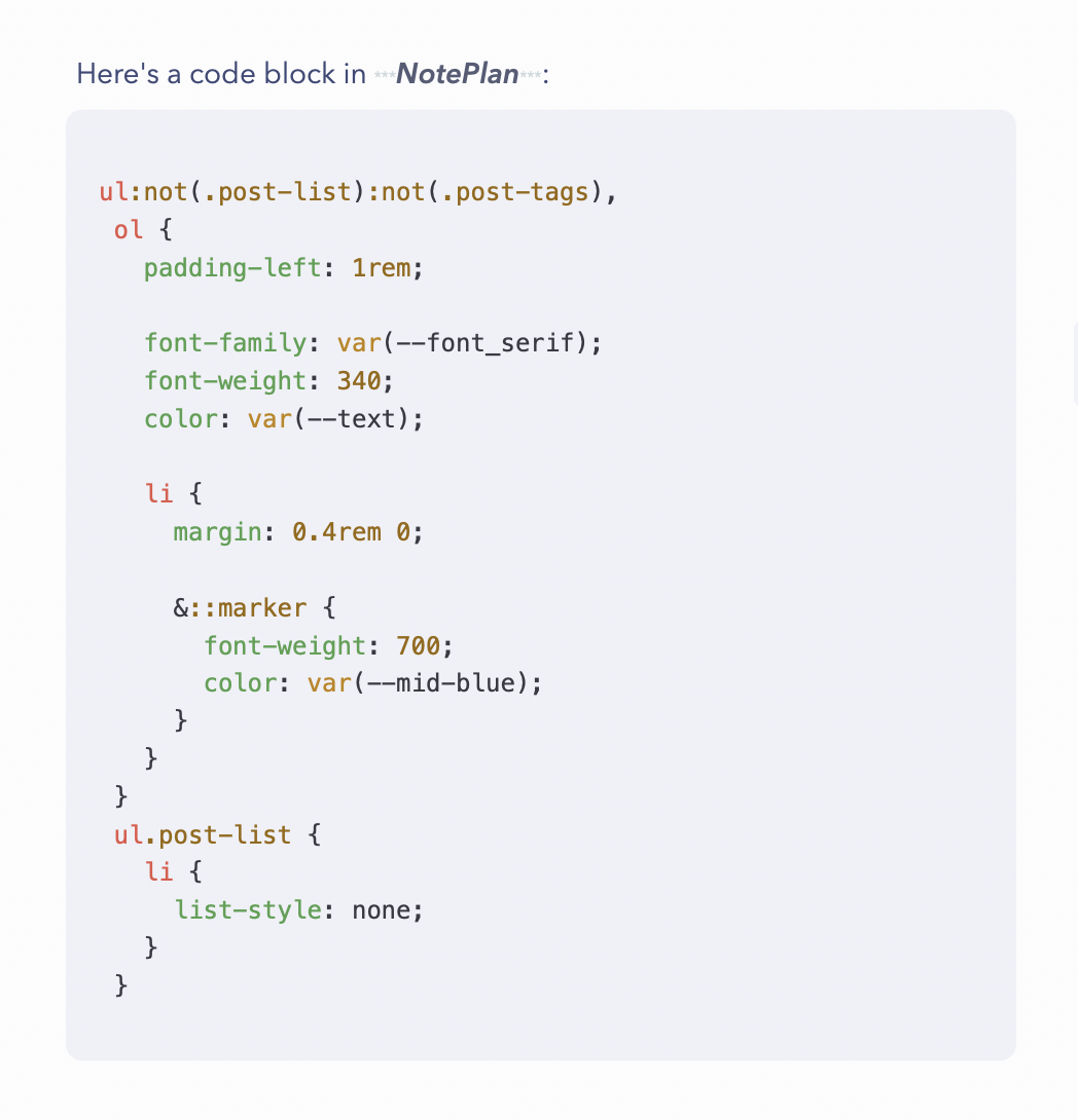
I don’t think Paper has to be as good as NotePlan here – but it should be better. This also brings me to an example where a settings screen would be nice.
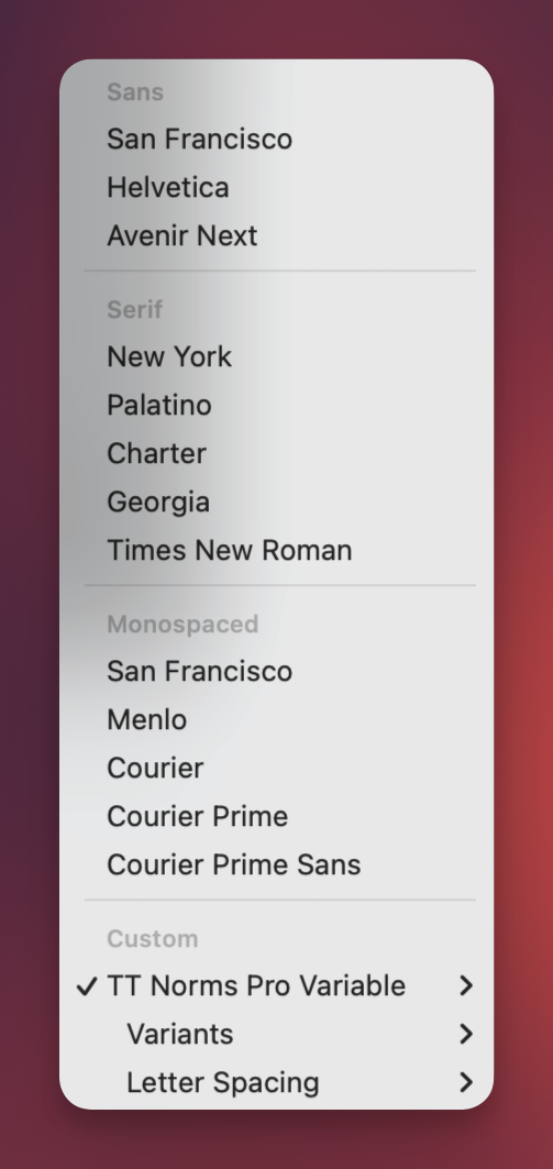
Variants lets you set weight for Heading, Body and Bold – but that’s it. You can’t set the font for code and have a different font for headings. And the letter spacing is the same for everything. Having this be more robust would be much easier if not everything had to fit within the menu bar…
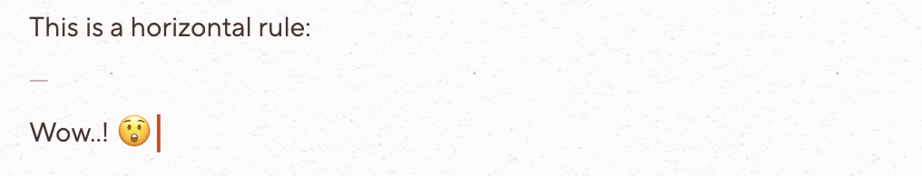
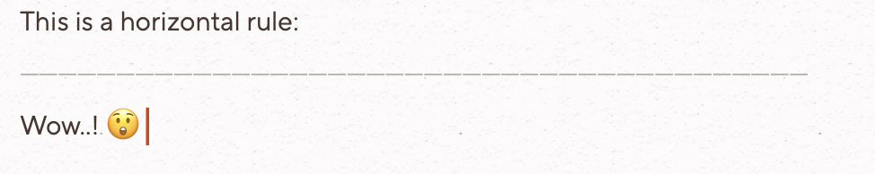
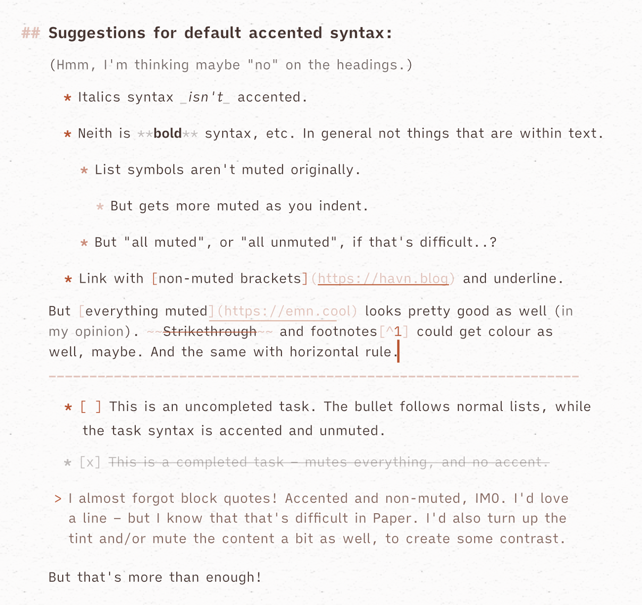
Block quotes, horizontal rules, and more accents
The Markdown Mode has a very strict paradigm, where it won’t hide or show any elements that aren’t there in the plain-text file. But an effect of this, is that horizontal rules look very rudimentary:
They do look a bit better in Preview Mode – but I would want them to be in the accent colour and match the caret and scroll bar.
Block quotes are also too simple:
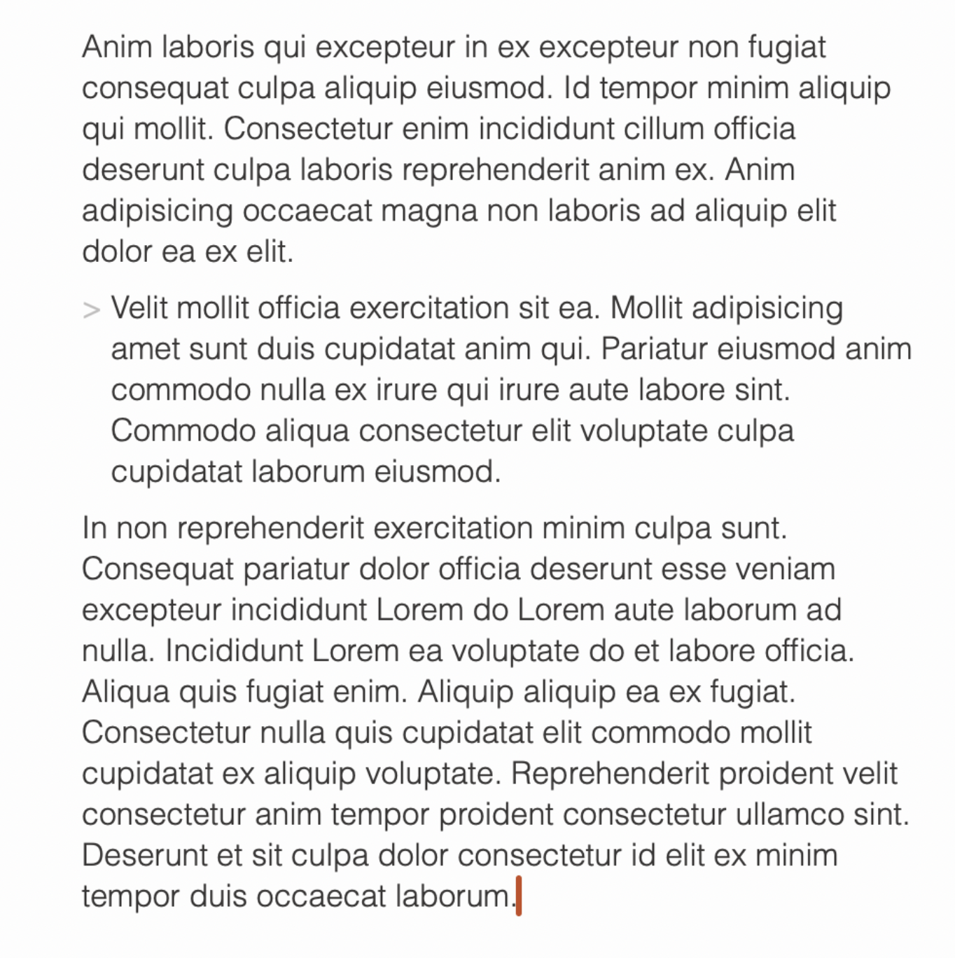
Here’s one idea for how it could be improved (in my opinion), without adding anything:
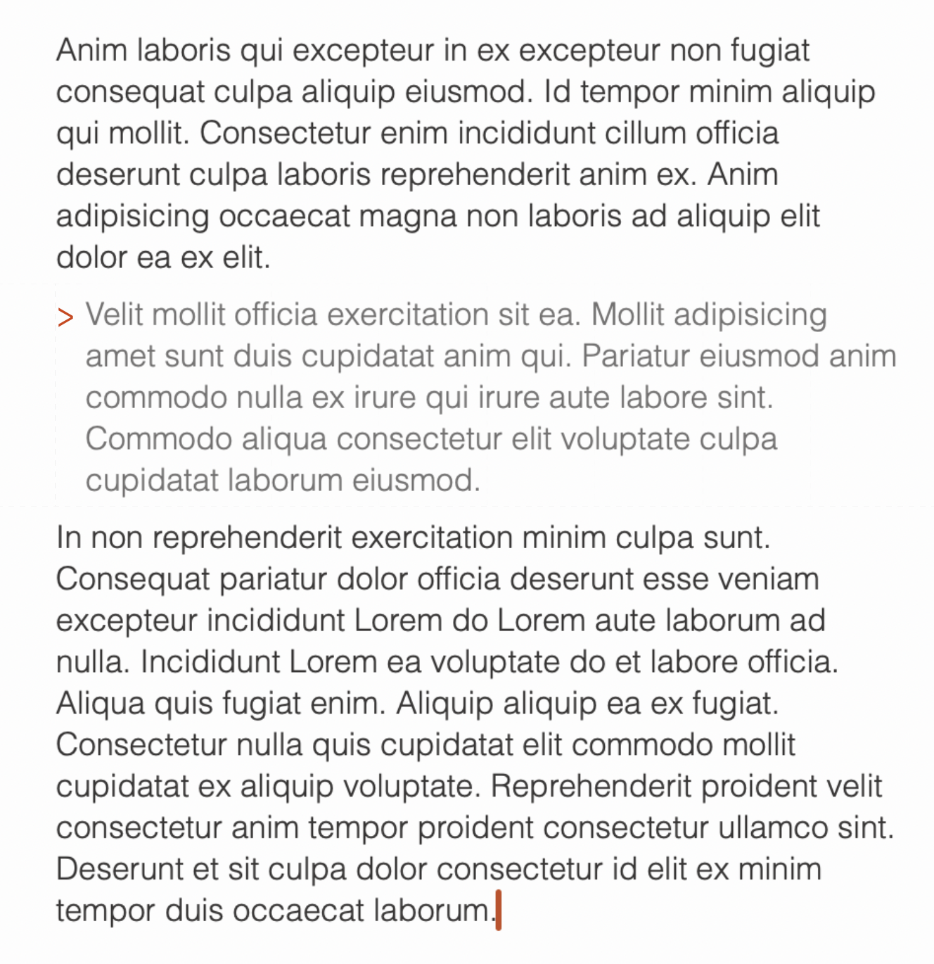
But I would also like a line, that matches the thickness of the caret and scroll bar:
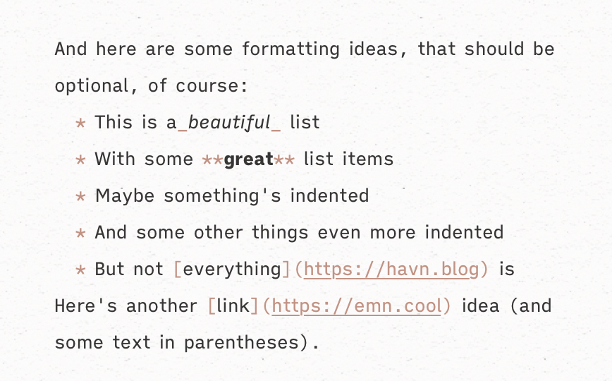
The accent colours are so beautiful, that I would like to see more of them! I also think having sharp lines in those colours, like the caret and scroll bar has now, as part of the branding is a cool idea I think could be developed further. But I get that not everyone wants the accent colour everywhere – so, again, a settings screen would be nice. For instance, here are some accent ideas I’d like:
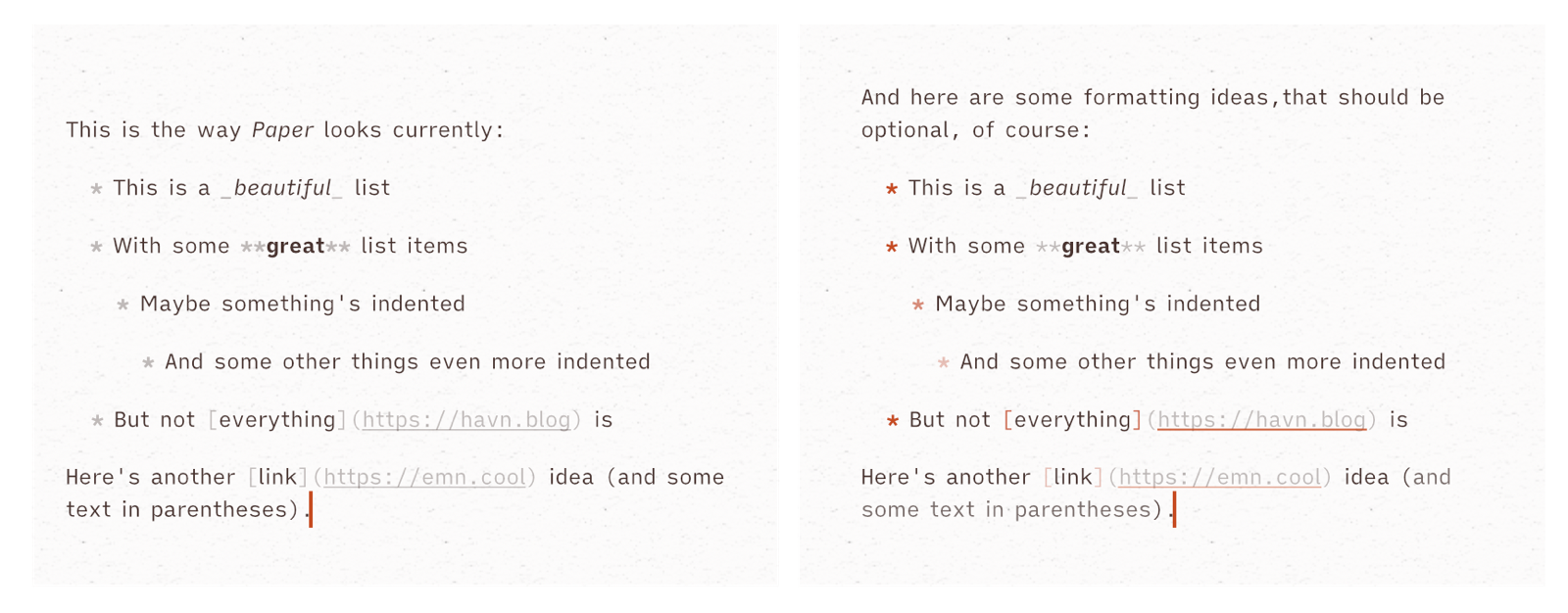
Here are the changes I made:
- The list bullets are bold, like originally, but I gave them the accent colour. I’ve also given them more transparency as you move up indent levels.
- The asterisks around the bold word isn’t bold. (Just to make them a bit less prominent.)
- With links, I’ve given the square brackets and underline colour the accent colour, to “link them together”.12 One idea is more transparent and another is less.
- I’ve also muted text in parentheses a bit, which is just a thing I think is a bit fun.
A way to present the options, could be to have a list of the different Markdown syntax (maybe the same place as you choose your preferred syntax), and the option to pick between regular, muted, accent, and muted accent.
Another option could be to just have a toggle that says “Tint syntax”, and choose a pleasant default. For instance something like this:
I also had fun playing with an icon idea that took a bit more from the app itself. Being literally the only app on my Mac who has square corners, I think the icon should be the only one with the same. I also tried to incorporate the caret in the P. I think my favourite is the one with it being slightly thicker than the letter – but in general, I’m not claiming that the icon is better than the original, hehe. And now we’re firmly into spitballing territory, and out of the review.
Conclusion
Paper is simultaneously one of my favourite pieces of software, and also pretty hard to recommend. It has a rather narrow use case and a very steep price. But if you write a lot in Markdown, and value excellent tools, there are worse ways to waste your money! Personally, I think it’s worthwhile to spend money to make things we do every day more enjoyable. Both if it’s work-related, as it could make you more productive, and if it’s (like it is for me) connected to something that’s just a creative endeavour – as it makes me pursue it more. The app has also got meaningfully better in the six months I’ve used it, so I’m excited about the future as well – including any other projects the developer might build.
-
You can easily copy+paste from one Markdown source to another. ↩︎
-
I think it uses TextBundle files in an SQLite database. ↩︎
-
They’re also working on a web editor – but who knows how long that’ll take. It’ll probably be great when it arrives, though! ↩︎
-
But if you want a great, and free, app to have as your default way to open odd .md files, Panda is a great place to start. ↩︎
-
Tasks+Calendar and Publishing, respectively. ↩︎
-
NotePlan feels more native than something like Obsidian – and is an OK place to write. But doesn’t get close to Paper, sadly. ↩︎
-
NotePlan looks correct after deletion – but that’s only due to the fact that it didn’t update in the first place. ↩︎
-
You tap the title to access these things on mobile. ↩︎
-
However, as the developer is located in the EU, he mentioned that he had to disable Writings Tools in Paper for now, as there’s no way for him to validate how well they work. ↩︎
-
However, the dev has said that the price is way lower in parts of the world with less purchasing power, which is good. ↩︎
-
I want to write an articles on those ideas someday! ↩︎
-
Pun intended, obviously. ↩︎