✉️ Micro Social: A New Third-Party iOS App for Micro.blog
And Some Very Early Feedback
Greg Morris is someone whose blog I’ve followed for a while, but I didn’t know was a developer. But now he has released a third-party iOS client for Micro.blog!
As he’s mentioned, it happened “quite accidentally”, and it’s very early days. So this post is just me letting people know it exist, and providing some very early feedback.
To Greg:
Oooh, I love that you’re making this! I’m 100% in the target demographic for Micro Social. (Someone who uses, but doesn’t like, the default Micro.blog app — and is willing to pay for something better.)
I’ll try to provide some more useful feedback later, as I’ve used the app more, that you can use if you’d like. 🙂
Here are some first-impressions:
(In general I like it! So these “negative” comments are meant to be constructive. 🫶🏻)
I’m currently running an iPhone 13 Mini — so the phone is probably both older and smaller than what you use. ☺️
I had several crashes two updates ago, but it’s fine now. But I’ve noticed that avatars load slowly when I scroll (even if I scroll slowly). Maybe you can have the lazy loading start “earlier”?
I really like that you have avatars and names on a separate line, so you can use full-width content. (Instead of having weirdly large left-margins, that far too many apps has. I have strangely strong feelings about this…)
I also really like the “card look”:
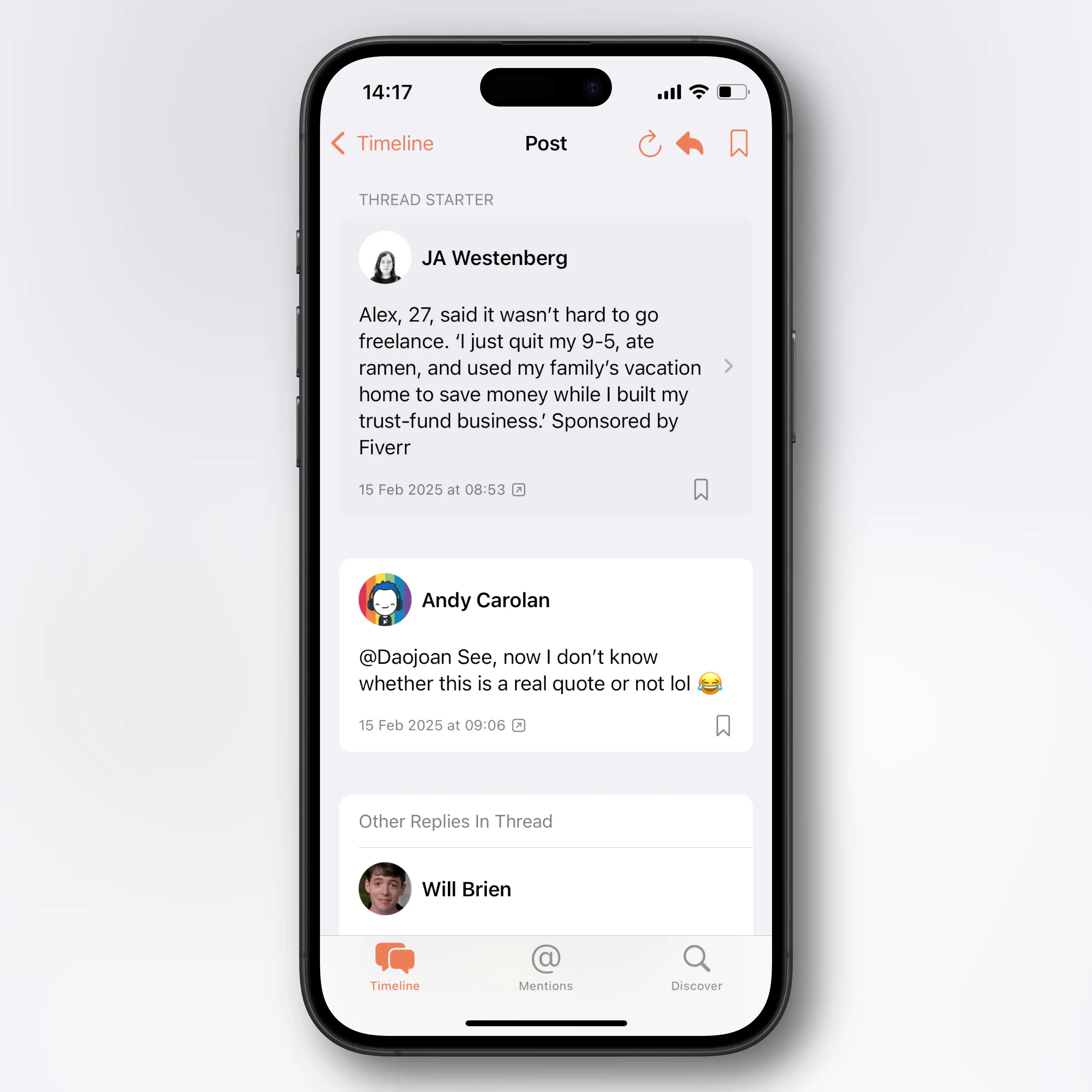
However, on my Mini phone, I wish you were a bit more stingy with the padding, as the content gets too narrow. Especially on the timeline, due to the extra arrow on the right side. Is this needed?
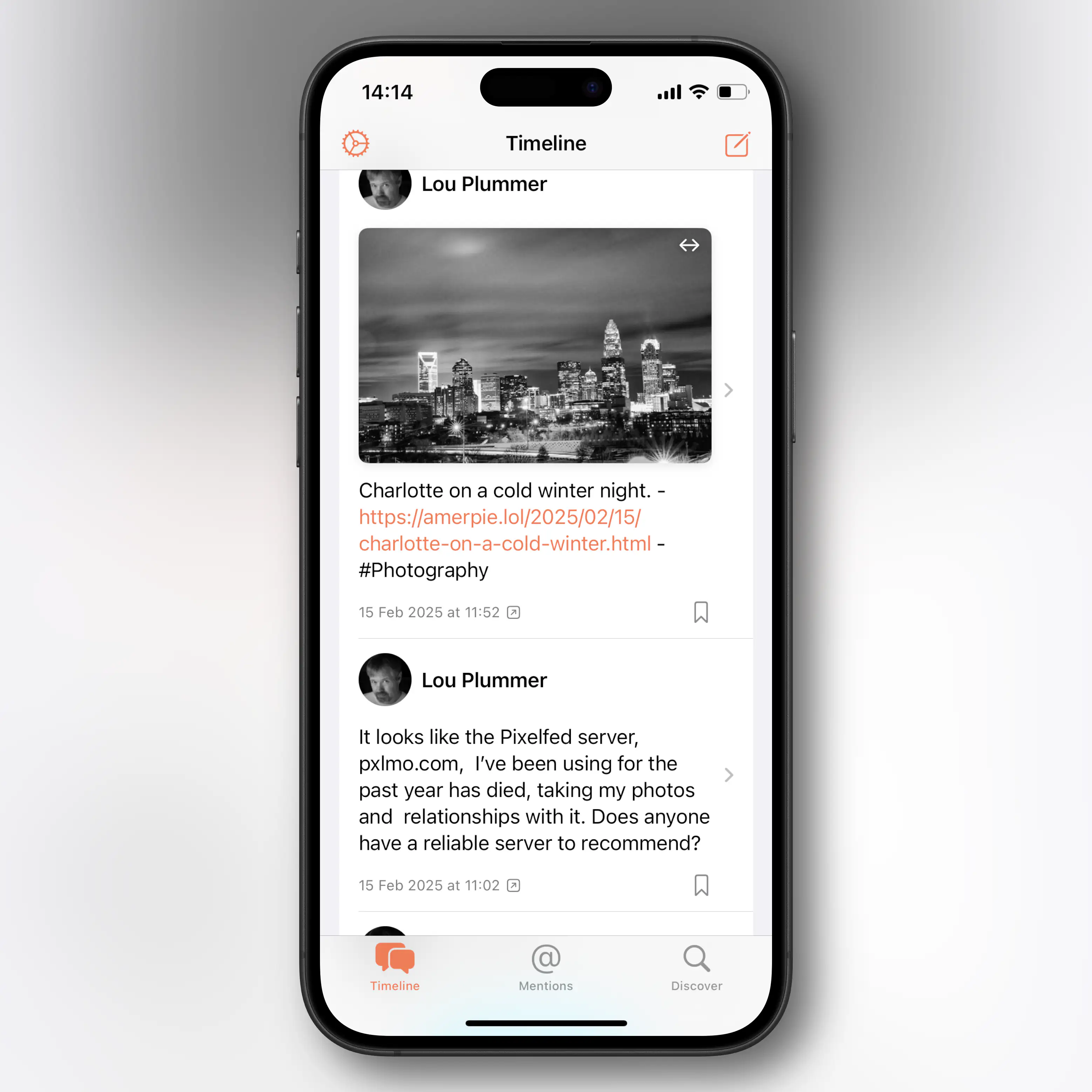
I don’t know if it’s possible, but perhaps consider moving the arrow to the block with the avatar and username, to allow (full) full width for the content? Not as pleasing – but the little arrows take up a lot of space now, as it’s the full height of the entire content (including images).
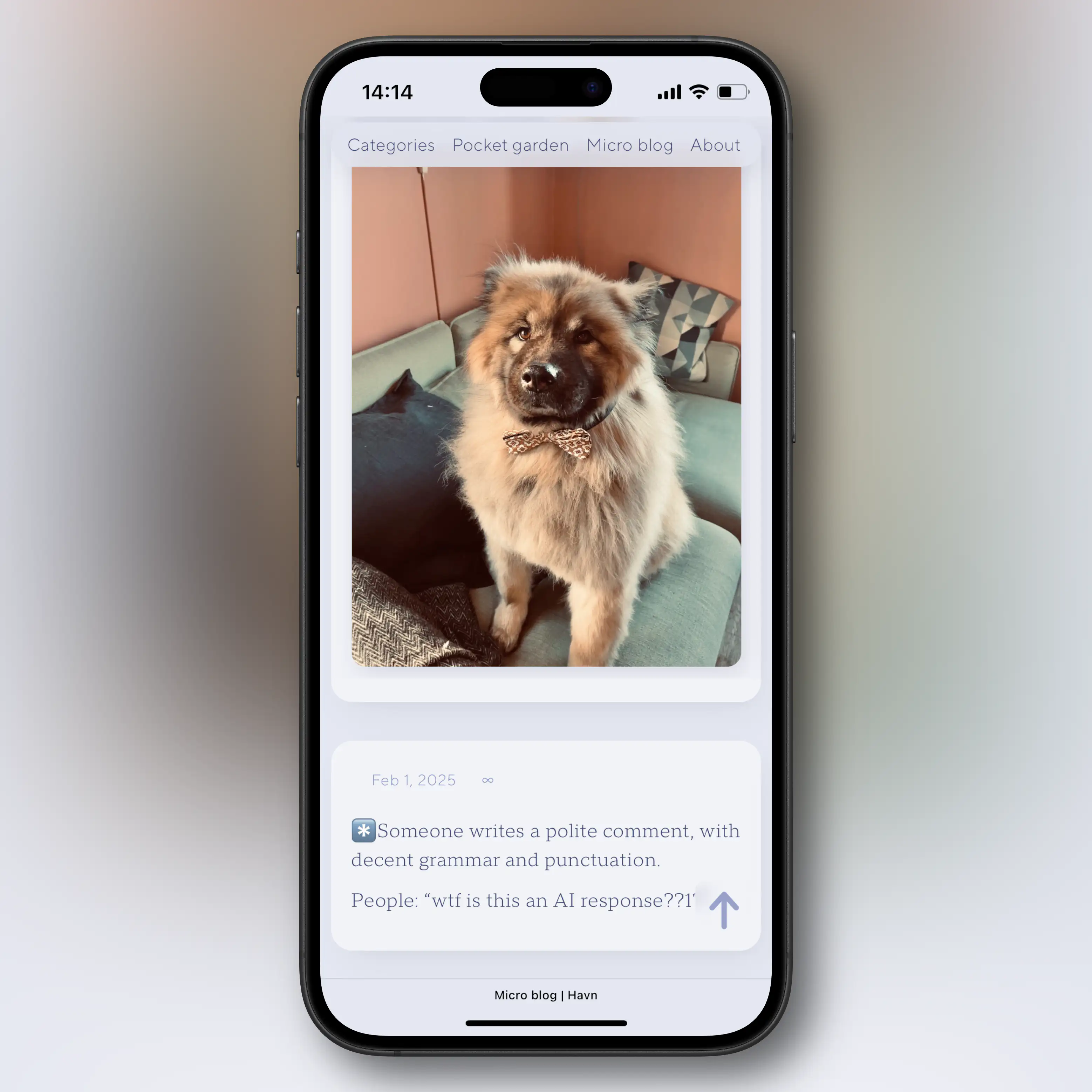
My blog is proof …
… that I like the look, hehe. And I don’t know if you have as much control over spacing as I have with CSS and clamp. But as I’ve already worked on optimising very similar spacing for my little phone, I wanted to show my work. And then you can steal it if you would like to, or ignore it if not.
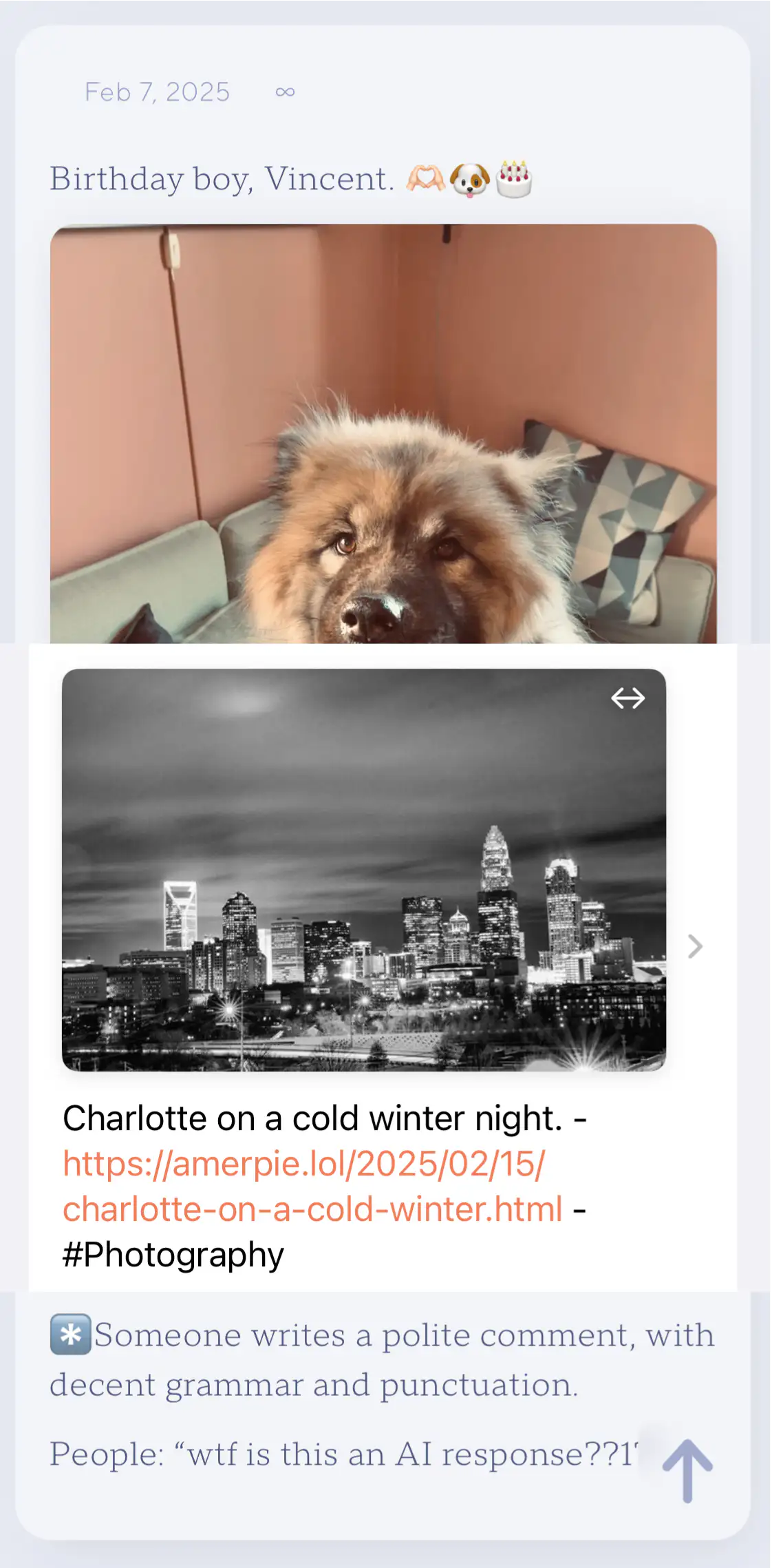
We have very similar padding on “the card” – but I went for half that amount on the outside/gutter. I mashed up the screenshots here, to show the effect (but the largest effect is on the right margin, due to the arrow):
That’s it, for now!
I’ll keep using it, and might provide additional feedback later. It’s already better than the official app, IMO. 👏🏻
I’ll also be the first to buy it when you launch that part of the app. Best of luck!