Why I Value Doing Stuff on My Mac With One Hand
And How I Do It
I get that it sounds shady1 or like a great accessibility story, when I talk about being able to use my Mac one-handed. But it’s neither. Allow me to explain!
My default mode for using my Mac …
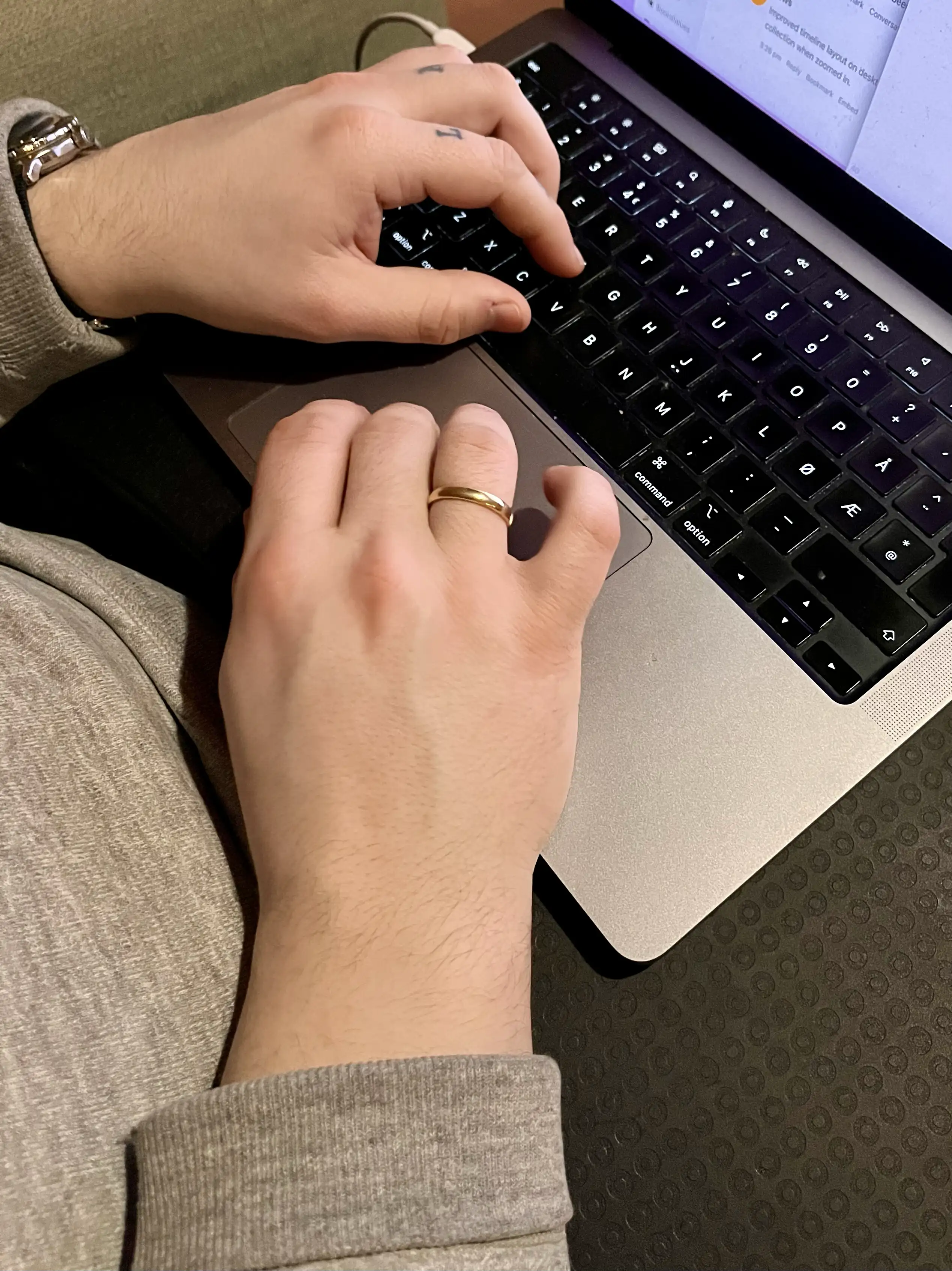
… is with my right hand on the trackpad, and my left in the home row position – for instance like this:
I totally get that both hands on the keyboard is the default for many. And I’m there quite a lot as well, and love keyboard-driven software.2 But, for some reason, the tasks I’m doing call for the above even more.
So I’ve optimised my Mac to be able to do a lot with only that left hand on the keyboard, and only that right hand on the trackpad.
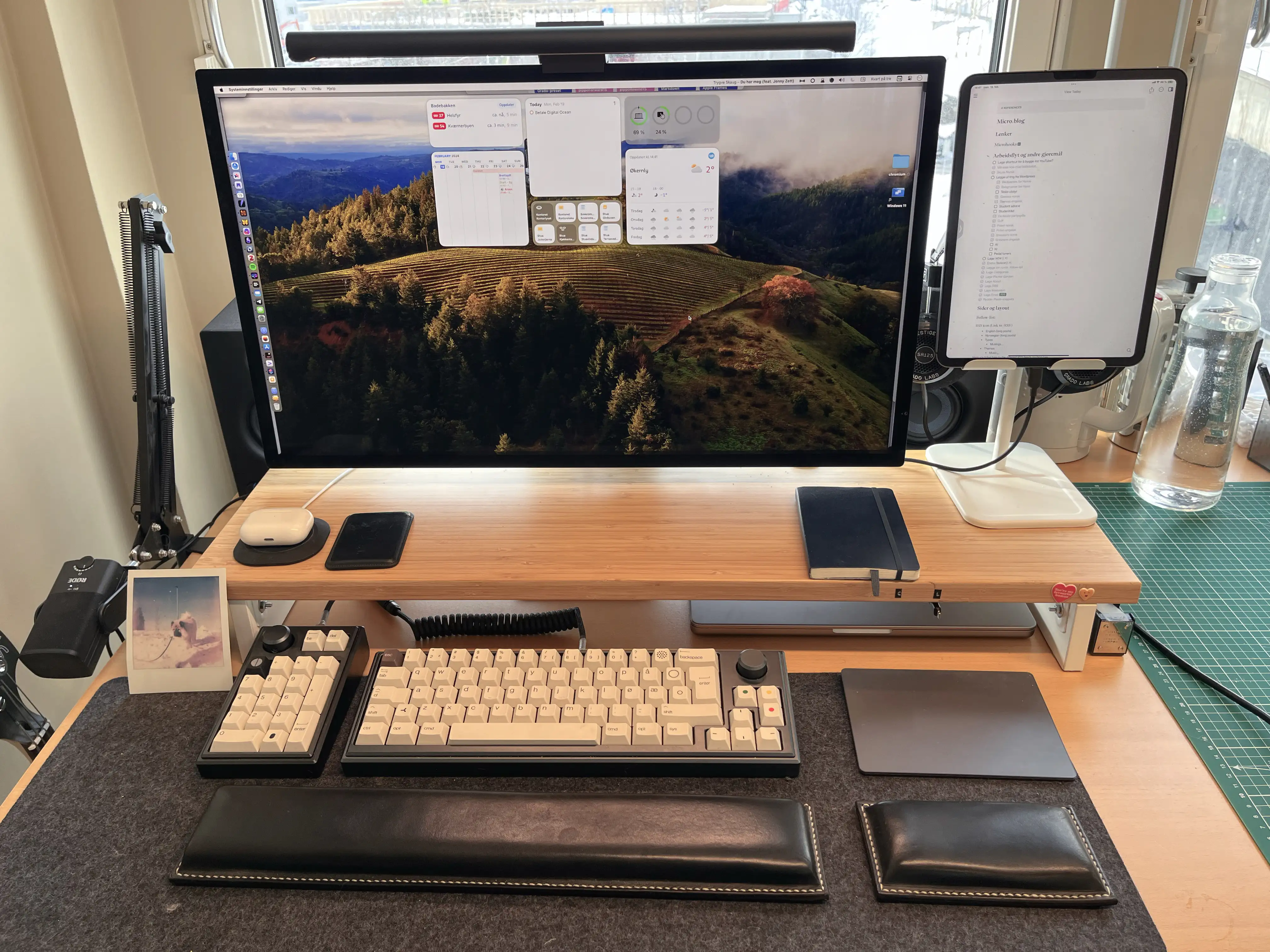
I really like the Magic Trackpad, as I can have the “desktop” setup be really similar to the laptop one. I do have a gaming mouse at the ready – but if I had to use a mouse, I guess I would try to recreate as much as possible on the Magic Mouse.3
The right hand and trackpad
I’ve used BetterTouchTool (and some default options) to have the trackpad be extra useful. (I can also recommend Swish, even though it doesn’t fit what I want to do with the trackpad.)
Here are the main gestures I’ve set up, and that work in “every” program:
Rumble Nation – a Terrific, Minimalistic, Japanese Strategy Board Game
Comparison Between the Old, Regular Version and the New, Deluxe Version
A couple of years ago, I got a great recommendation from the Board Game Barrage podcast: The minimalistic area majority board game, Rumble Nation. It only takes about 30 minutes to play, is easy to learn, and is cheap and compact. And all of this while still offering a lot of player interaction and interesting choices.
A rundown of the game:
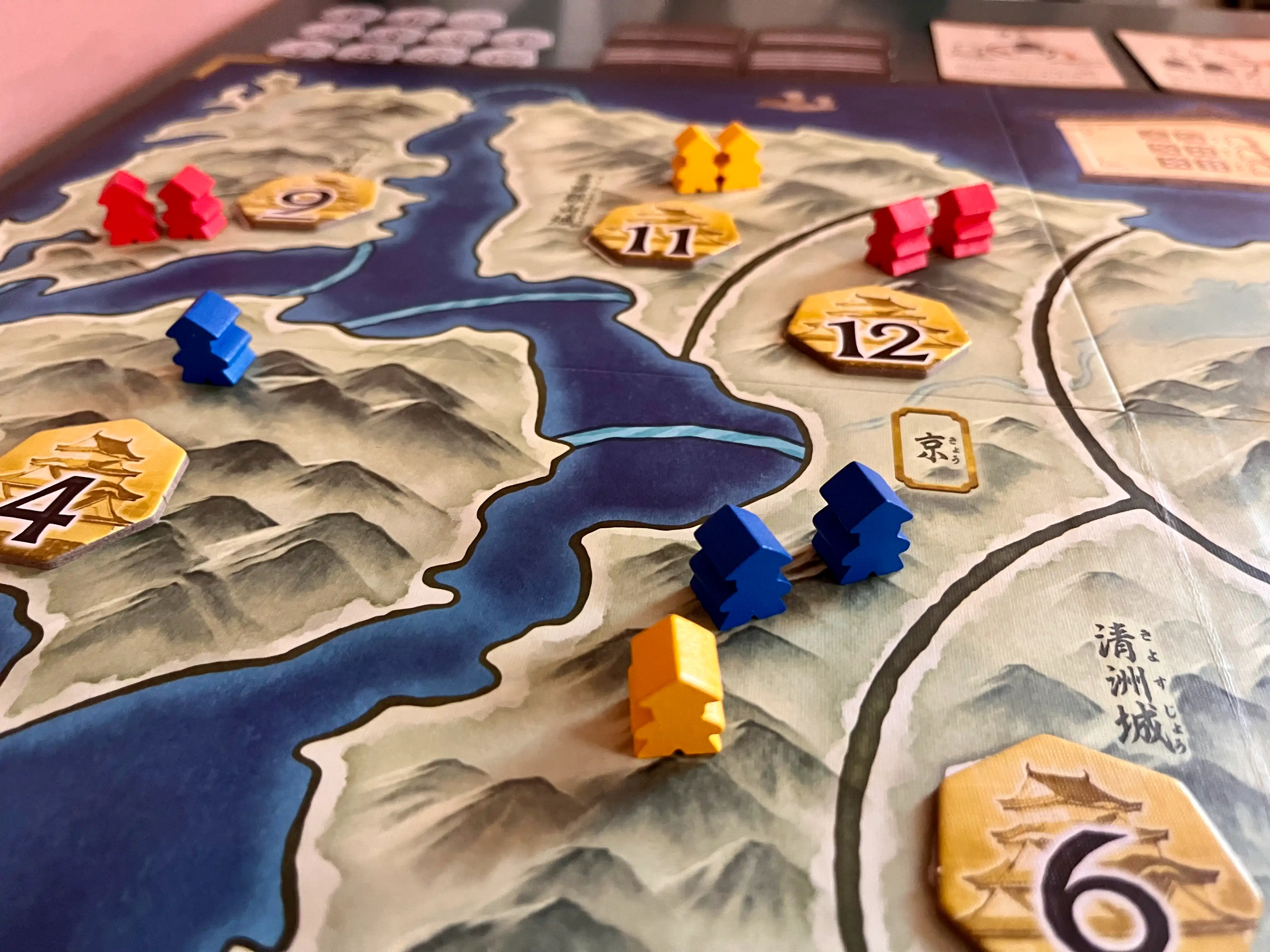
You're competing for control over 11 areas in feudal Japan numbered from 2 to 12. These will give 2-12 points to the winner (and half points for second place). The winner is the person with the most points.
The game has two phases: One where players will take turns, and there are both chance and choices – and one where you'll see who wins the fights. (But with no chance or choices.)
In phase 2, the person who has the most armies in an area will win it. But here's the most interesting part: You'll determine the winner in order, from 2 to 12. And if you win area 2, you'll be able to add reinforcements, 2 armies, to every adjacent area you have at least 1 army in (and that hasn't been determined yet). So, prioritising high numbers is great, as you'll get a lot of points. But low numbers will give you a lot of extra armies in other higher value fights!
When placing armies, in phase 1, you'll throw 3 dice. You then combine two of them to determine where you place them (if you select 3 and 6, you'll place them in the 9), and the last die determines how many you'll place (half its value, rounded down). You can also, once per game, use a special card ability.
This means you'll place between 1 and 3 armies every round – so everyone won't be done in the same number of rounds. You can't (without using special abilities) move armies you've placed. So, in general, it's best to be the last to commit your armies – but the game has handled this in an interesting way, by having the tiebreaker in the phase 2 fights be whomever finished their phase 1 first.
And as mentioned, phase 2 is 100% deterministic, so the game wraps up really fast and smoothly.
I ordered the original version from Japan, and it’s been a treasured possession. But recently, I was looking at some other games from Japan, and saw that they had made a deluxe version 🖇️ of it – so I ordered it.
I got it in the mail today, and wanted to show how it compares to the original, as I haven’t seen this done anywhere.
The rules
The only gameplay changes compared to the base game is that one tactic card is nerfed a bit,1 and that the deluxe version includes a Daimyo variant/mini-expansion.
Quick Recommendation #3: What Makes This Song Stink (YouTube)
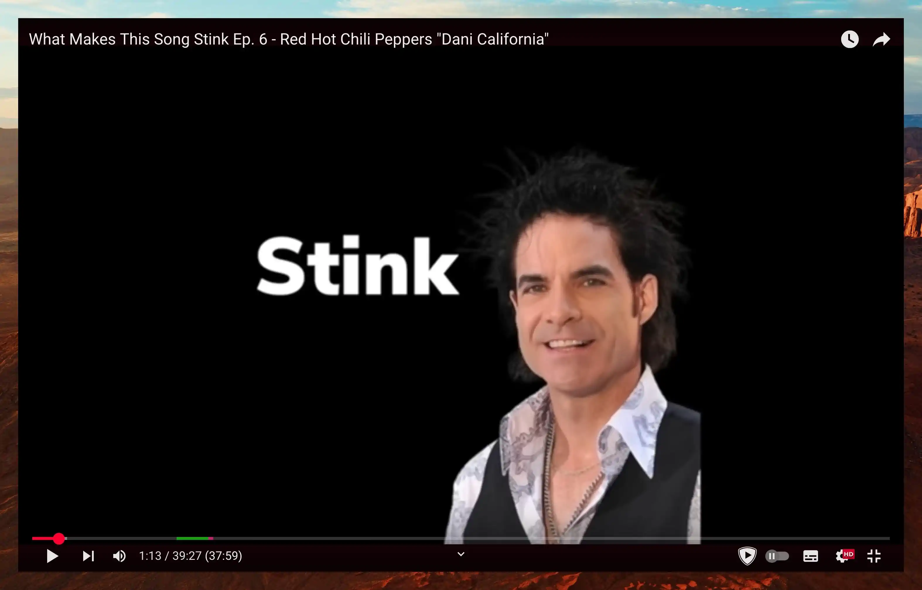
In general, I prefer positive content. So I prefer the vibe of CinemaWins over CinemaSins. But the series called What Makes This Song Stink, by Pat Finnerty, is an absolute treasure of YouTube content.
I think it can work for anyone – but it’s especially funny if you’ve spent any time on “Music YouTube”. (The series is packed with Rick Beato beats.)
I recommend starting at the beginning (of the playlist linked above), with Kryptonite by 3 Doors Down, and watch them in order. Then you’ll see the evolution of the form, and be in on all the terrific in-jokes. And already the third video, on Weezer - Beverly Hills, is a highlight.
It’s hard to explain, but the series just has so much heart, and Pat is just delightful. I highly recommend giving this series a try! (Also, he releases like a couple of videos a year – so its easy to stay on top of.)
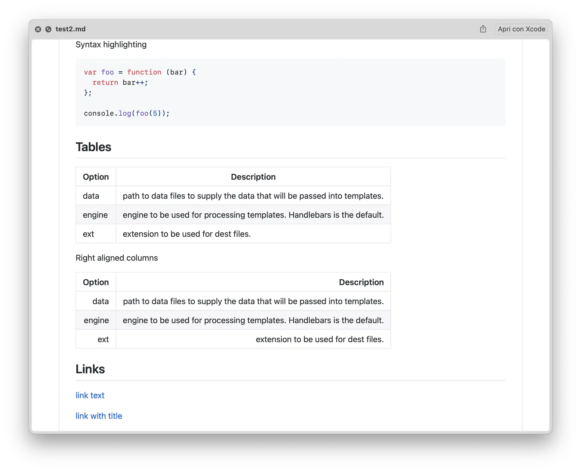
Quick Recommendation #2: Better Markdown Preview in Finder
Hitting space to preview files (Quick Look) is one of my favourite Finder features. However, it does a pretty mediocre job with Markdown files. QLMarkdown is a little utility that makes these previews richer.
You can install it from this link, or by using this Homebrew command:
brew install --cask qlmarkdown
The app isn’t signed – so you need to do the little dance to convince macOS that you want to run the app. (This is detailed in the original link share up top.)
You need to open the app once for the utility to work. And that’s also where you change settings.
I get that many Markdown contexts are outside of Finder – but if you do use them there, I hope this little tool can be useful!
Is Apple Forcing Me to Pay Them for Much More Cloud Storage Than I Need?
It’s pretty well-known that the 5 GB of cloud storage Apple includes for free (when you buy a €1,000 phone) is quite pathetic. However, I’ve actually found the 200 GB plan for 39 NOK (€3.33) a month to be decent value. But as I’m close to reaching the limits of that plan – I think it’s highlighting some anti-competitive issues.
My use
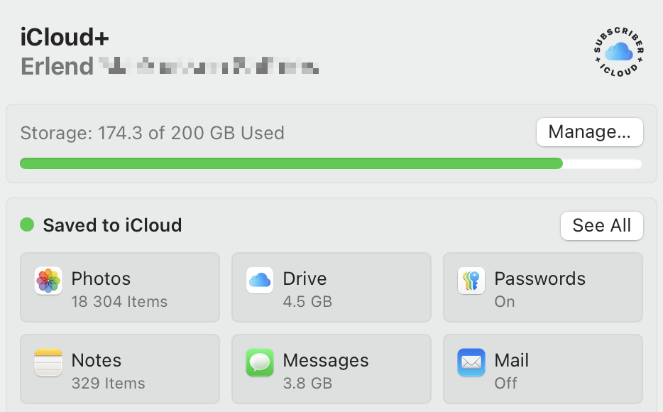
I’m currently using 86.7% of my storage.
- Photos.app is the largest culprit, using 128.7 GB.
- Backups use 27.3 GB – but I intend to set this up to back up locally to my Mac Mini.
- iCloud Drive only uses 4.5 GB, as I’m babying it quite a bit.
- Messages uses 3.8 GB – but this could probably be removed as I don’t use iMessage as my default chat app.
- My wife is currently on her own 50 GB plan – but we do have an iCloud family. (So I wouldn’t mind combining these.)
My default cloud storage provider is Dropbox
In my opinion, the largest tech companies have far too much power already. So I like to use services from other companies if I can.1 I also like how, in general, using third-party alternatives can give you flexibility. So, since we’re using Dropbox in my band, and I think it does the job, using this is my default cloud storage provider makes sense to me.
However, some pros of using third-party alternatives can be thwarted by first-parties, like Apple:
Problem #1: Backups
Quick Recommendation #1: Cheap Strap Locks for Guitars
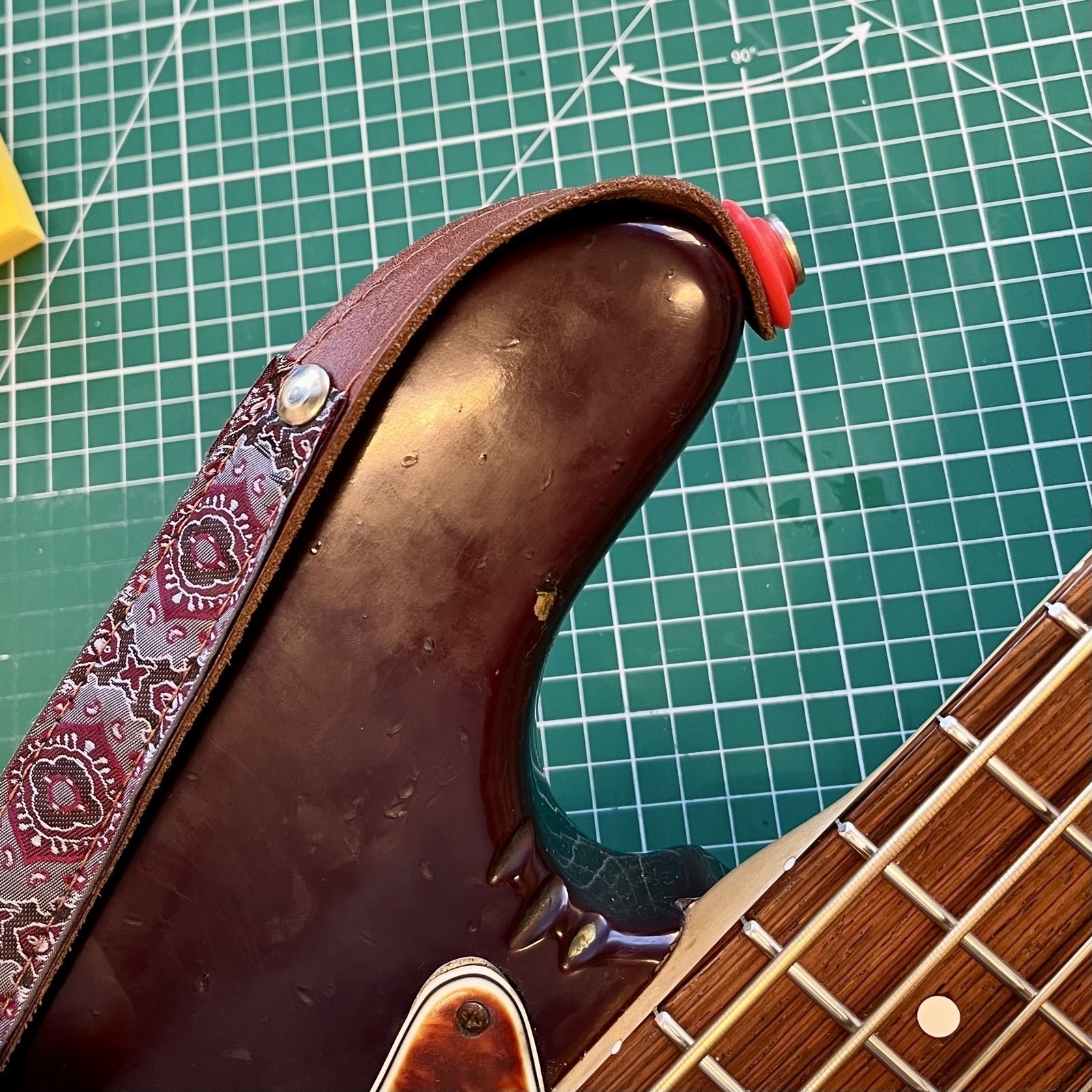
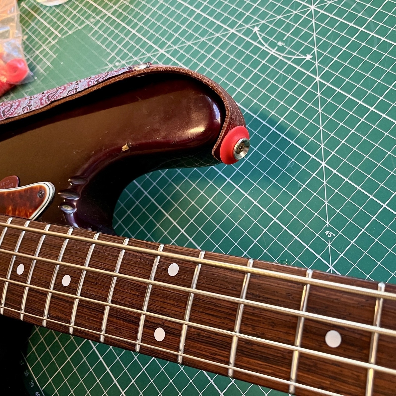
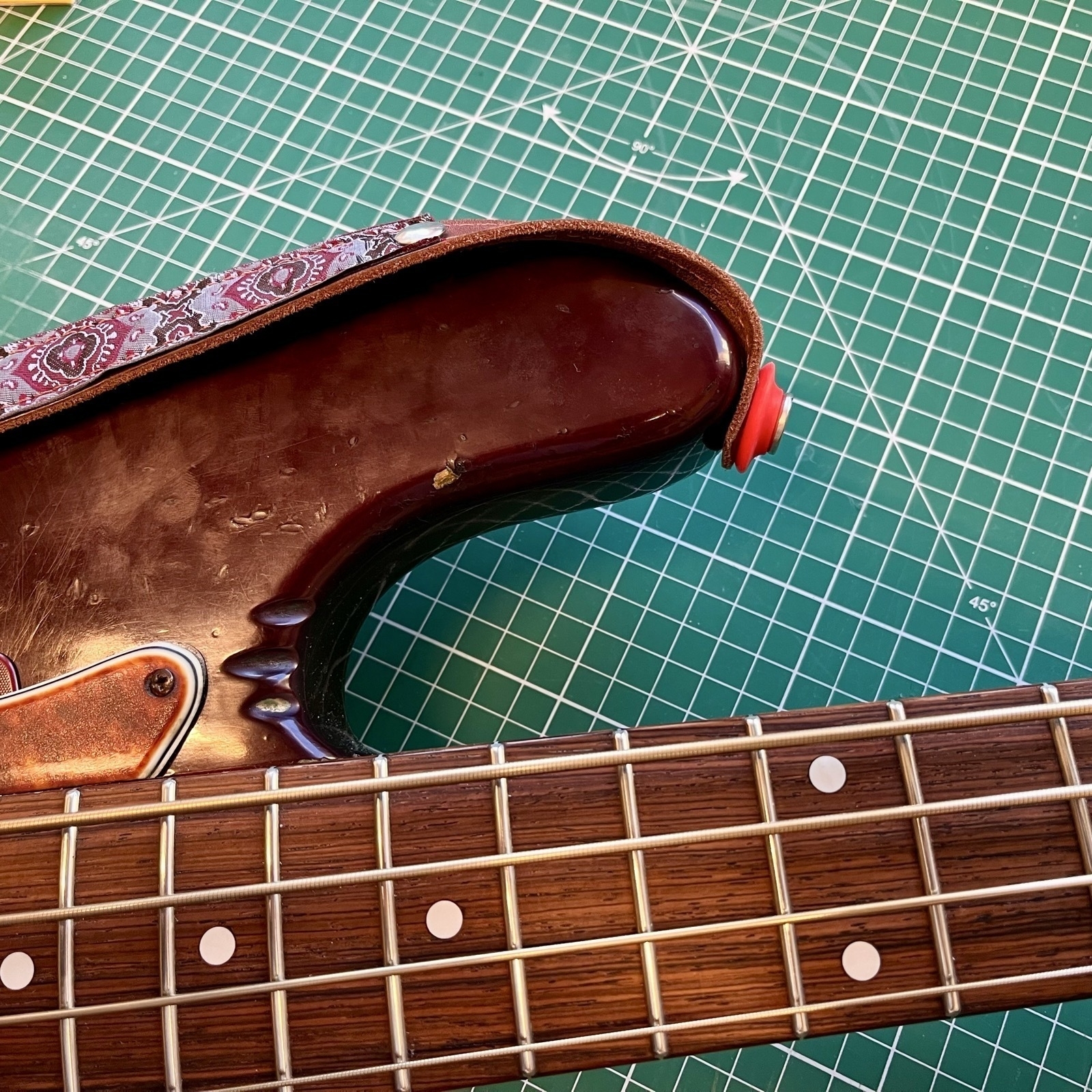
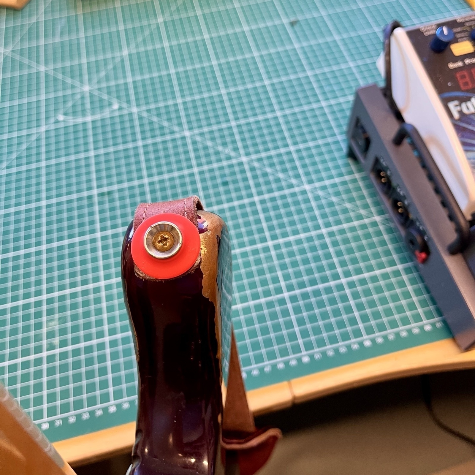
Why buy expensive (or just kind of cheap strap locks, when you can go old school and just order a bunch of rubber gaskets for bottles??
Here’s a link 🖇️ to the listing I used on AliExpress – but there are probably plenty of others that are just as fine. 👍🏻
I know it’s silly – but for some reason I think it’s a bit more rock ‘n’ roll to use something not meant for the purpose. 😎
