Software Should Have a Customisable UI
Part 1
I’ve recently noticed how most of my favourite pieces of software have one thing in common: I can customise them — not only to be needs, but to my preferences. And I really think this should, and could, be more widespread.
And I know that some iPhone users, when they hear customisable UI, might think: “Pff, why would I want a million ways to make my UI ugly, like an Android phone, instead of having one beautiful way??” But I’m not really talking about looks here! (Even though I also think theming is great.) I’m talking about button placements, how things work, etc.
An example: My favourite mobile browser
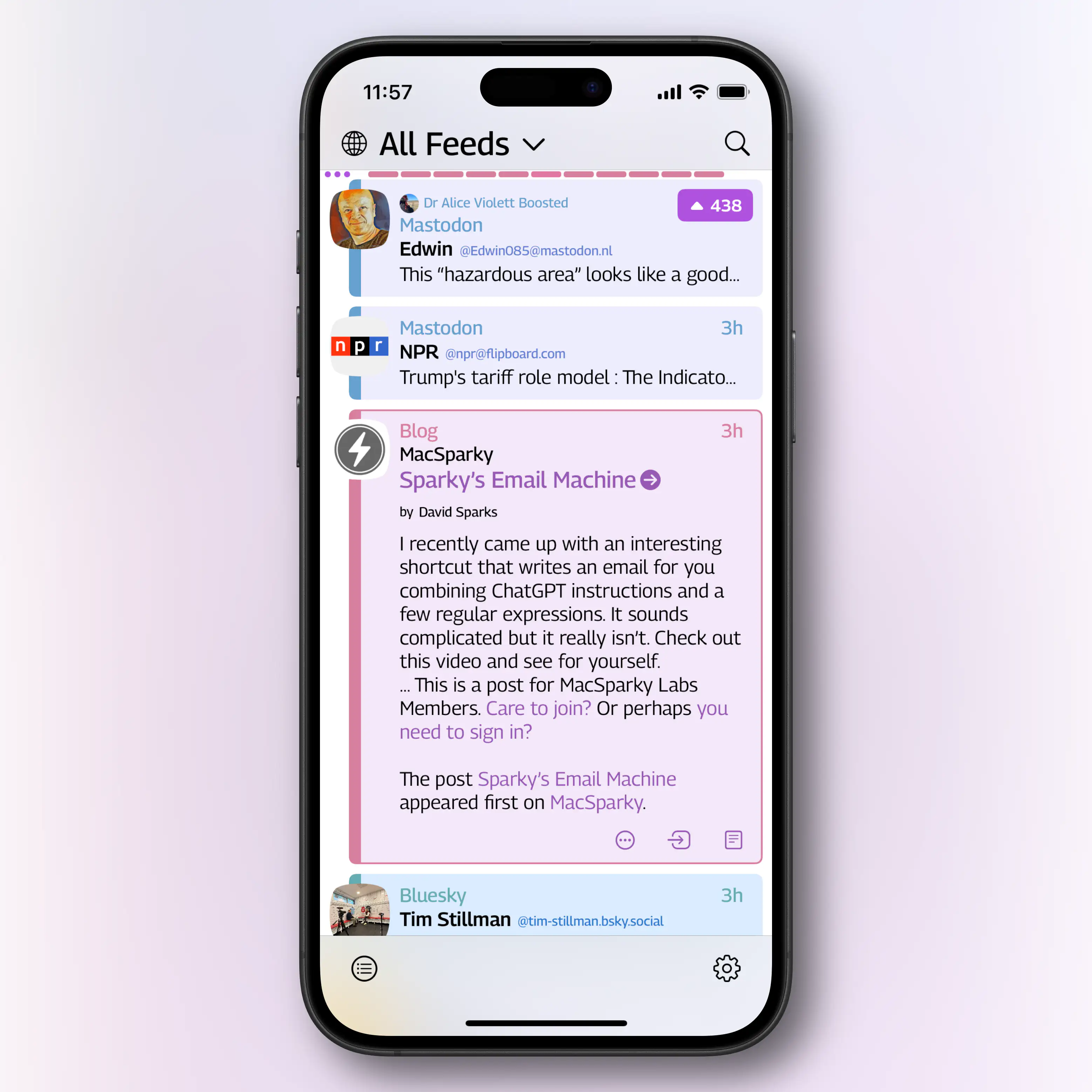
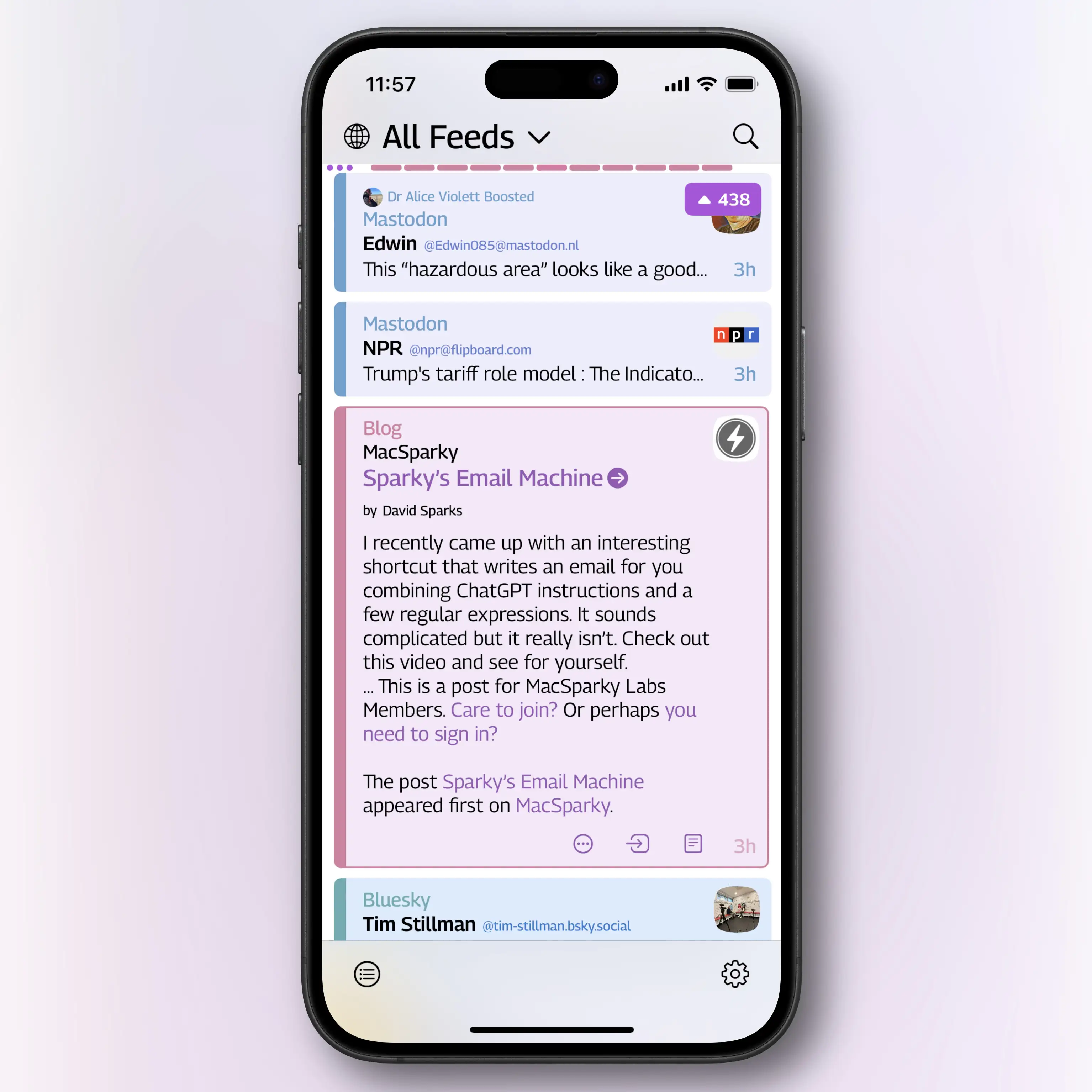
The screenshots below are of Safari on iOS (not my favourite browser) — and take note of the toolbar:

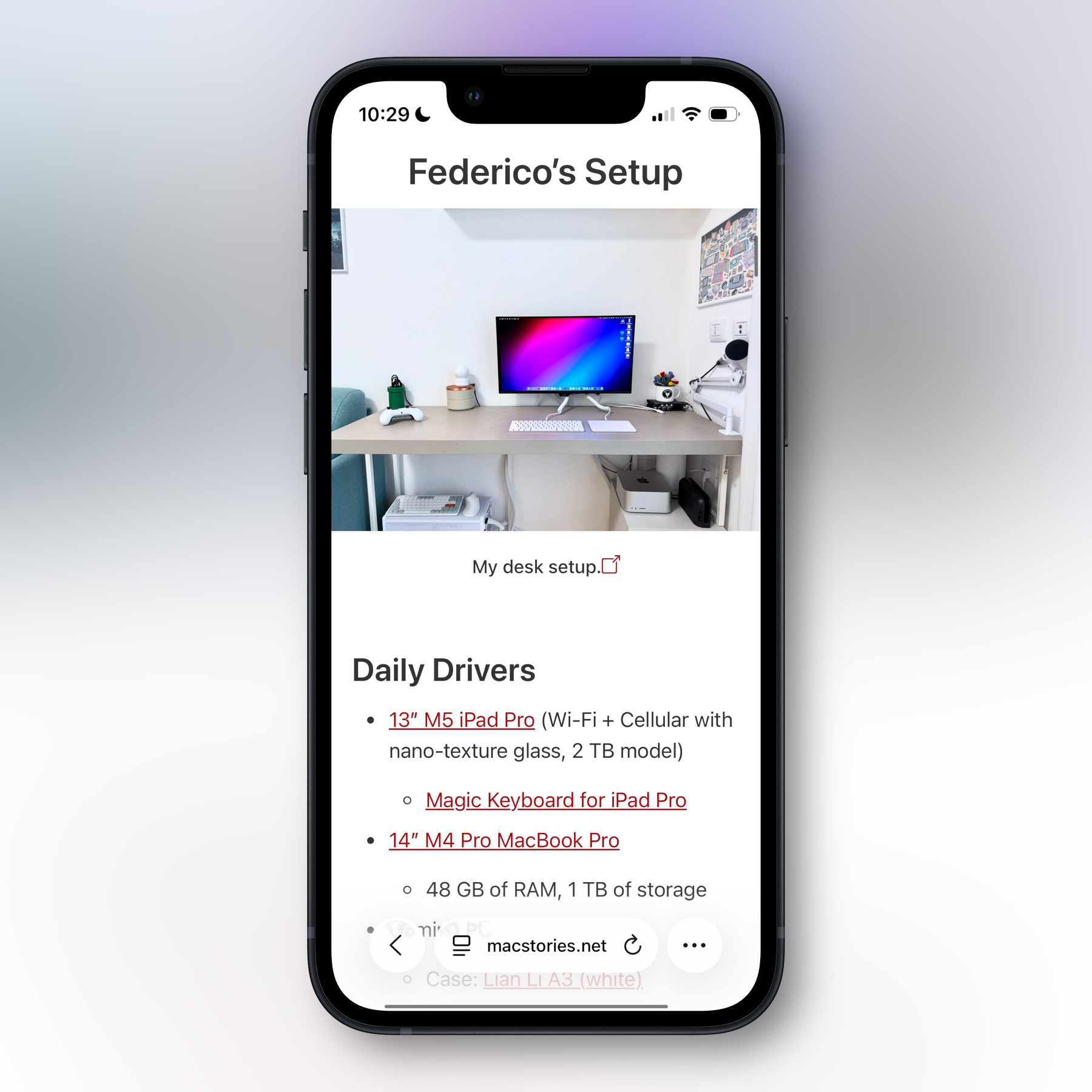
So, in the compact view, you get up to five buttons + the address. While in the regular view, you get 7 buttons. (In both cases, two of them are in the address field.) What I want to highlight is that when there are this few, exactly which buttons are chosen is crucial. For instance, I never ever use the bookmarks button. And should the refresh button take up space all the time when I almost always pull to refresh?
Apple should absolutely pick sensible defaults. But why do they think 1 billion iPhone users all want the same buttons?
This leads me to the main reason why I love the Quiche Browser: I’ve been able to create my perfect toolbar.

- The address bar is clean, but I’ve added forward and back buttons next to it, on the same line.
- On the next line, I have the following:
- A copy link button, that instantly puts the current URL on the clipboard
- The regular share button
- New tab button
- Paste and go, to instantly go to whatever’s on my clipboard (URL or web search)
- Tabs overview
- Close current tab
The beauty here is that you’ll might hate this toolbar! But to me, it’s just what I need.
In this app, you can also customise the items in the menu you get when long pressing the address bar — so that’s where I’ve put the refresh button. (You can also customise what you get when long pressing links.)
Does it add complexity?
Here’s the thing: A system like this doesn’t make it any harder, or less important, for the developer to ship good defaults. You can ship exactly what Safari has, and most users might not even find out it can be changed.
What Quiche does, is that they set a default, and also have a Toolbar Gallery:
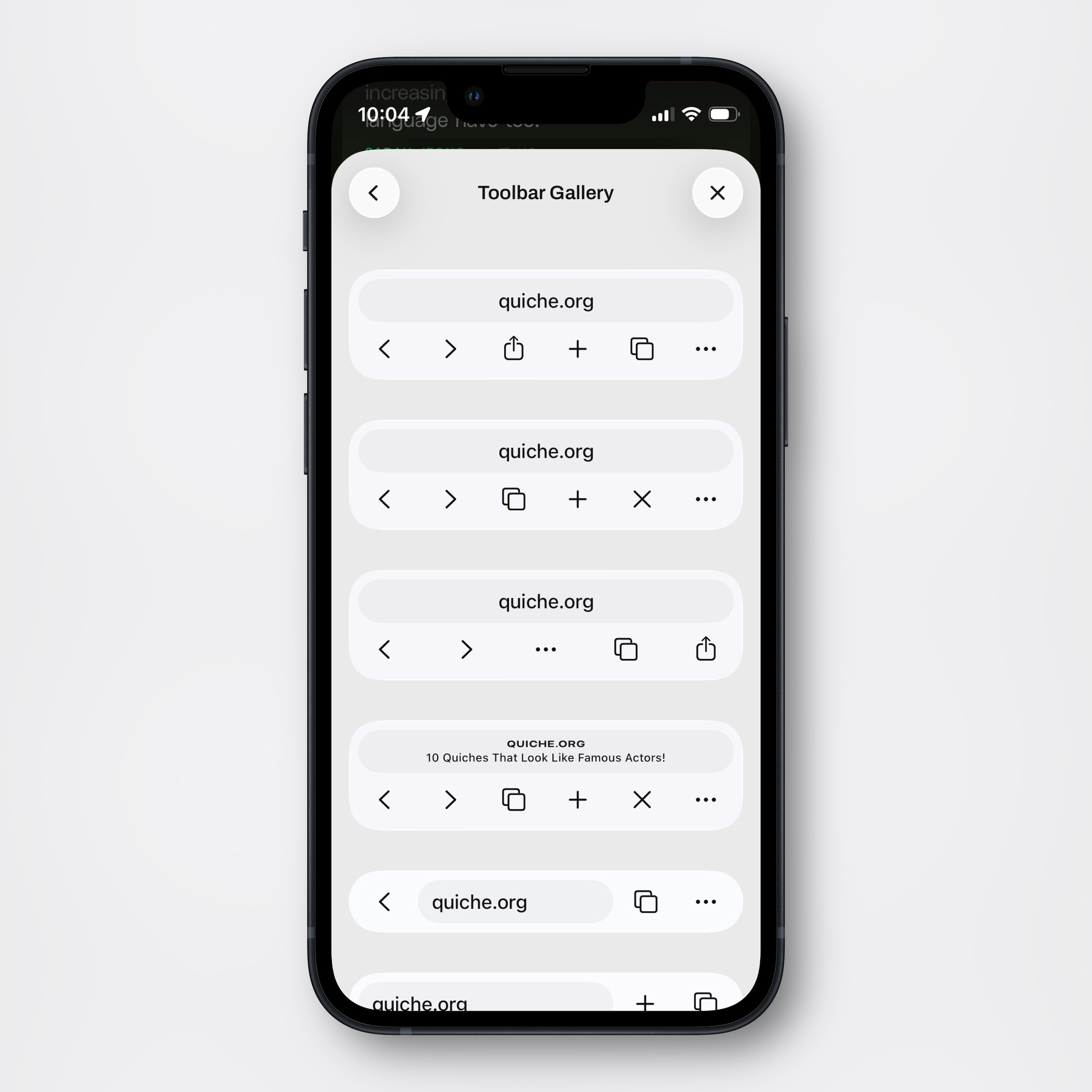
But then, if you’d like to, you can go and create your own:
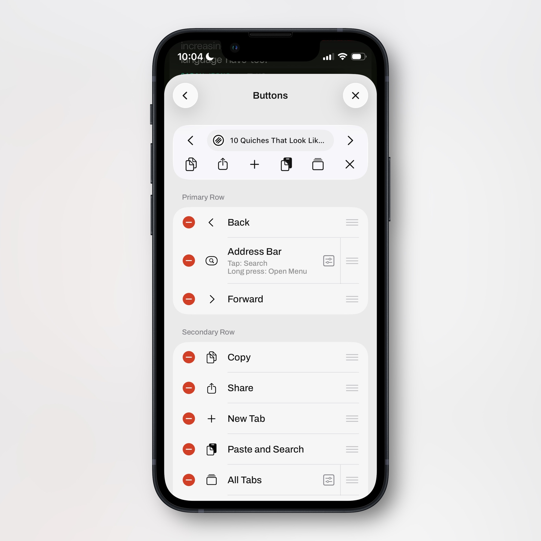
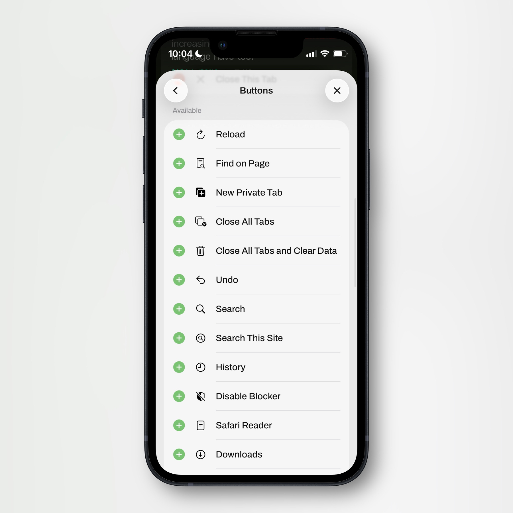
There are also more options — some of which you can see here (the screenshots above were from the Buttons section):
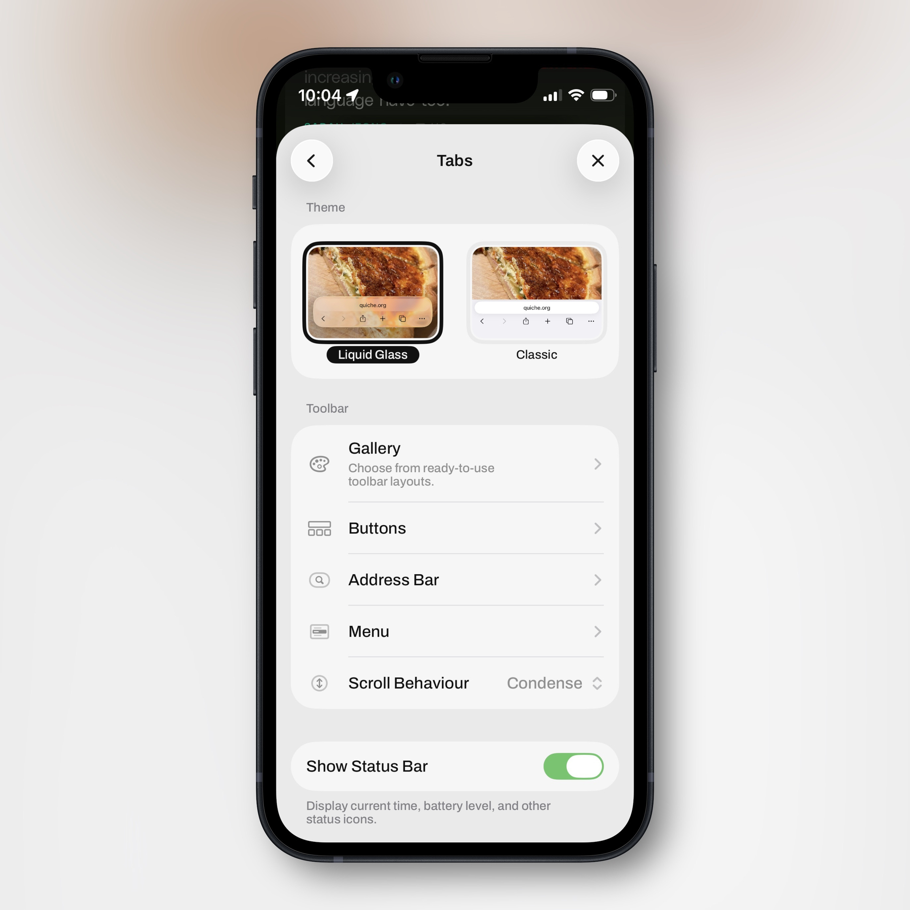
I sincerely believe none of this power makes the app harder to use — as the system is perfectly ignorable.
Easier for developers
While developing the system itself takes a toll on the developer,1 I also think it can relieve some pressure. While you still need to sweat creating good defaults, you don’t have to be like the Safari team and think “OMG, we need to figure out exactly which 5 buttons, on average, would be the most useful to our billion users! Also, is 5 the correct number? What about 6? Or 4??”
There simply isn’t one correct choice for all of your users. So it’s OK to just let us (be able to) choose for ourselves. And especially as part of the Liquid Glass design language is to remove options and add more to sub-menus, users being able to decide what goes where becomes even more important.
I’m not talking about extensions here
I also love apps having extensive extension support — like Obsidian and the upcoming version of Bike. But that does add quite a lot of complexity. So what I’m specifically advocating here is that developers give users more control over small choices in apps.
It can still be opinionated
I know that many users, myself included, like opinionated apps. But I don’t think giving more options hinders opinionated design. For instance, I’ve previously written about Tapestry — an app I’d absolutely call the good kind of opinionated. However, I really wish I could move the avatars to the right side in this app! Last year, pre-Liquid Glass, I made two mockups to show what I mean: (The first image is the original, the second simply moves them to the right, and the last one also reduces the size of the avatar to fit the timestamp below, and I’ve moved the text a bit to the left.)

My point here, though, isn’t to harp on this detail. It’s to show that the design is still opinionated (and cool, IMO), even if I had the choice of moving the avatar!2
And Tapestry is a good app… If you want a properly bad counter-example of what I want, we can check out Windows 11, and this forum post showing something that’s still a problem:
When I updated my machine to Windows 11, the quick access items were moved beneath OneDrive in the File Explorer navigation pane. This is a big inconvenience since I always have my OneDrive folder expanded and can no longer scroll to the top to access my pinned folders. How do I get the pinned Quick Access items back to the top of the navigation pane where I can – ironically – access them quickly?
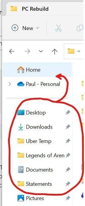
Now Microsoft has also added a Gallery button there as well, that you can’t remove even if you never use it! And that post is from 2022…
I have tons of more examples I want to show! Both of where I wish I could make small choices, and of apps where I love being able to do so. (Expect mentions of apps like Mona, MrKeyboard, Affinity, and Paper.) But as I’m trying to post more and smaller posts, that will come in later parts.