Alternatives to Forcing Apple to Provide Solutions to Their Competitors
On Anti-Trust, APIs, and Market Participation
This week’s episode of the Upgrade podcast, was a good one as usual. I especially liked the discussions surrounding a potential pair of Apple smart glasses, and the way this connects to the regulatory scrutiny Apple is under currently.
Jason refers to the fact that Federico Viticci loves the Meta Ray Bans, but still really wants Apple to create a pair. And he then asked what I deem to be a crucial question:1
Do we want smart glasses from Apple because of what they do better than the competition, or because of what they are allowed to do, but that they bar their competitors from doing?
Let me use earbuds as an example, as they are more common. I’m delighted with my AirPods Pro – and they’re a better fit for me, and my Apple hardware, than a pair of Sony buds (for example). But when looking at the reasons why I pick one over the other, here’s something I think it’s crucial to distinguish between: Which of them are due to things Apple does better, in fair competition (maybe I prefer the sound, or noice cancelling), and which of them are due to things Apple blocks Sony from doing (like pairing fairy dust)?
A side point: Why I think Apple's main markets require more regulatory scrutiny than something like the gaming market:
- Their main markets, especially the smart phone one, is extremely large in absolute terms.
- As opposed to things like the gaming market, it's one everyone* has to participate in.
- Many people game on a PS5, but also on PC and mobile, etc. Very few daily more than one phone OS.
- A complete monopoly isn't the only way to have anti-trust issues. For instance, a duopoly doesn't necessarily mean healthy competition.
This brings me to a clip I wanted to share from the podcast, where I agree with a lot, but wanted to add something:
More solutions
What I wanted to add, was that there are more solutions than Apple being forced to make stuff for its competitors. And I think the European Commission holds this opinion as well.
Solution 1: Don’t block
Monitor Resolution Guide for macOS
Seeing as Apple just released a great monitor-less Mac, in the new M4 Mac Mini1, it makes sense that there’s more external display discussions surrounding Macs. After answering a couple of questions on Reddit here, I thought I’d try to write a guide. Because, if you don’t use a screen made by Apple, things get a bit complicated…
To make this as timeless as possible, I won’t discuss specific monitor models. Instead, I’ll do my best to foster understanding, that will help in your research.
Two uses of the term “resolution”
One way of using it, is when discussing the actual number of pixels a screen has. For instance, a regular 4K screen has 3840 ✕ 2160 pixels. This can be called the physical resolution.
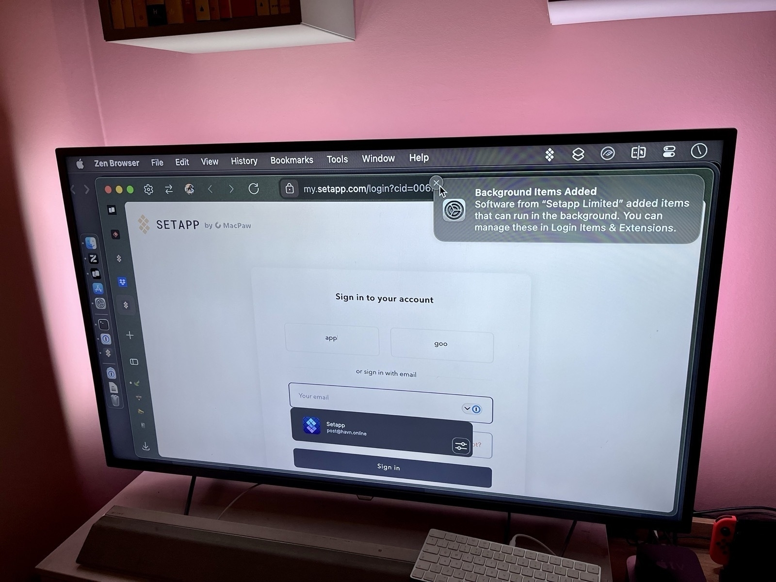
However, look at this image, where I went into settings to set my 4K TV to display as 540p:
Changing the setting, luckily, doesn’t delete a bunch of pixels on my TV. So in this context, it can be useful to think of the resolution more like the size of the rendering. This can be called the logical resolution.
The relationship between the physical and logical resolutions matters
The physical and logical resolution can be the same. But for high-resolution screens, this will usually make things too small. And in this context, the resolutions 4K (3840 ✕ 2160) and _1080p_ (1920 ✕ 1080) have a special relationship: The former is exactly 2x the width and 2x the height of the latter. This is why you’ll see people mention 4K being “2x” that of 1080p. But keep in mind: it technically has 4x the number of pixels (since it’s 2x two times).
Let me try to explain why that’s important
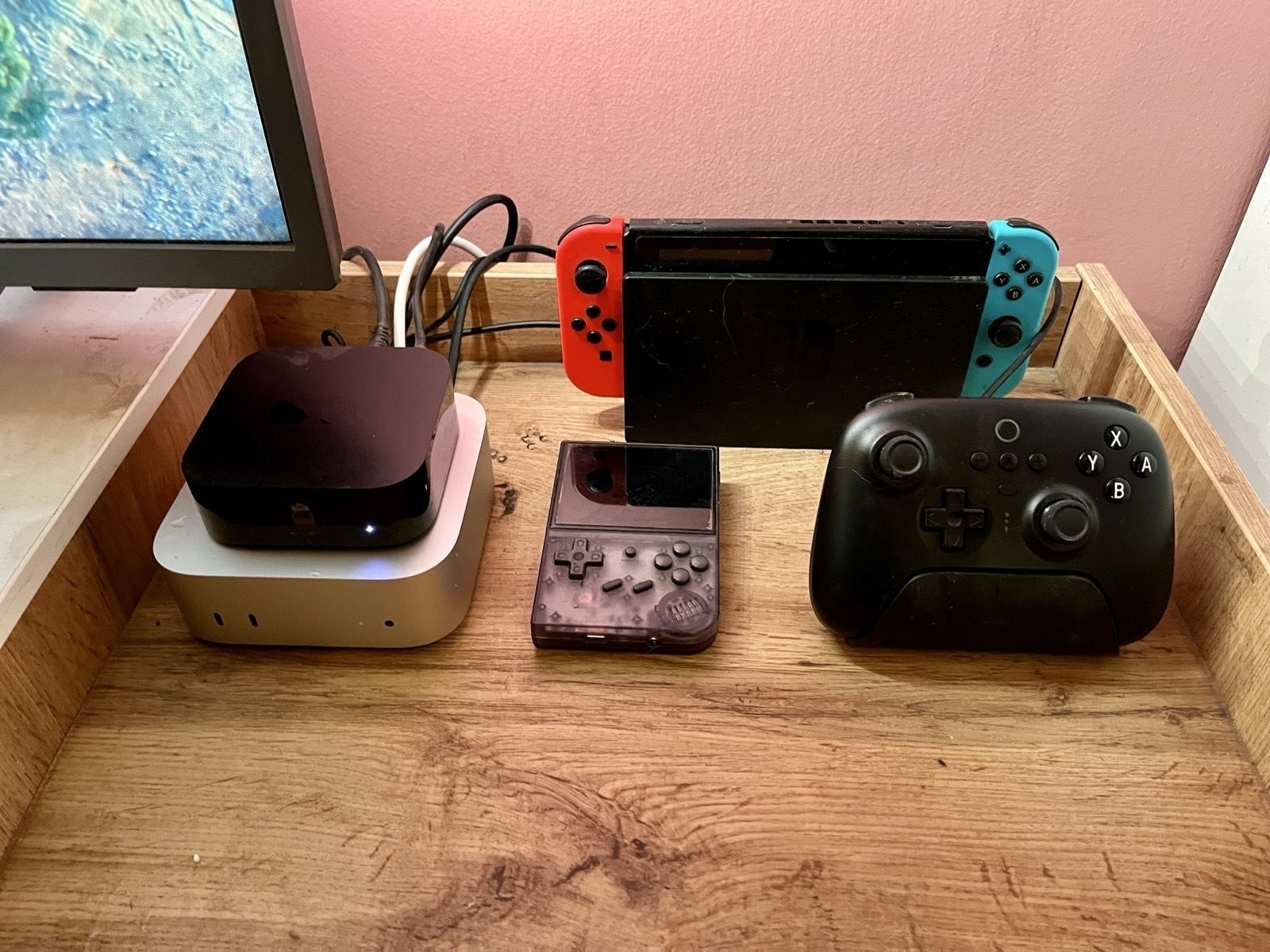
My Setup for the M4 Mini as a Secondary Mac
NAS, Media Server, and Light Gaming
I spent the weekend setting up my little new Mac – and I have to say: it went pretty smoothly! Here’s what I did, and how you can do it yourself if you like.
The hardware
As Apple’s upgrade prices are certified insane, I went for the absolute base model. I did briefly consider getting 10 gig Ethernet – but I had to change too much about my setup to get any benefits from it. And I don’t really need that fast a connection for my use case.
16 GB of ram is enough for me, but the built-in 256 GB of storage is obviously too little. But as it’s a stationary machine, getting external storage works great.
Some drives will use regular USB speeds (for instance USB 3.2 Gen 2). These are cheaper – but if you go for USB 4 or Thunderbolt 3+ you will get about three times the speed. If you, like me, want to run programs (like games) straight from the disk, you’ll probably want the latter.
Today's Plan: Setting Up My Mac Mini NAS
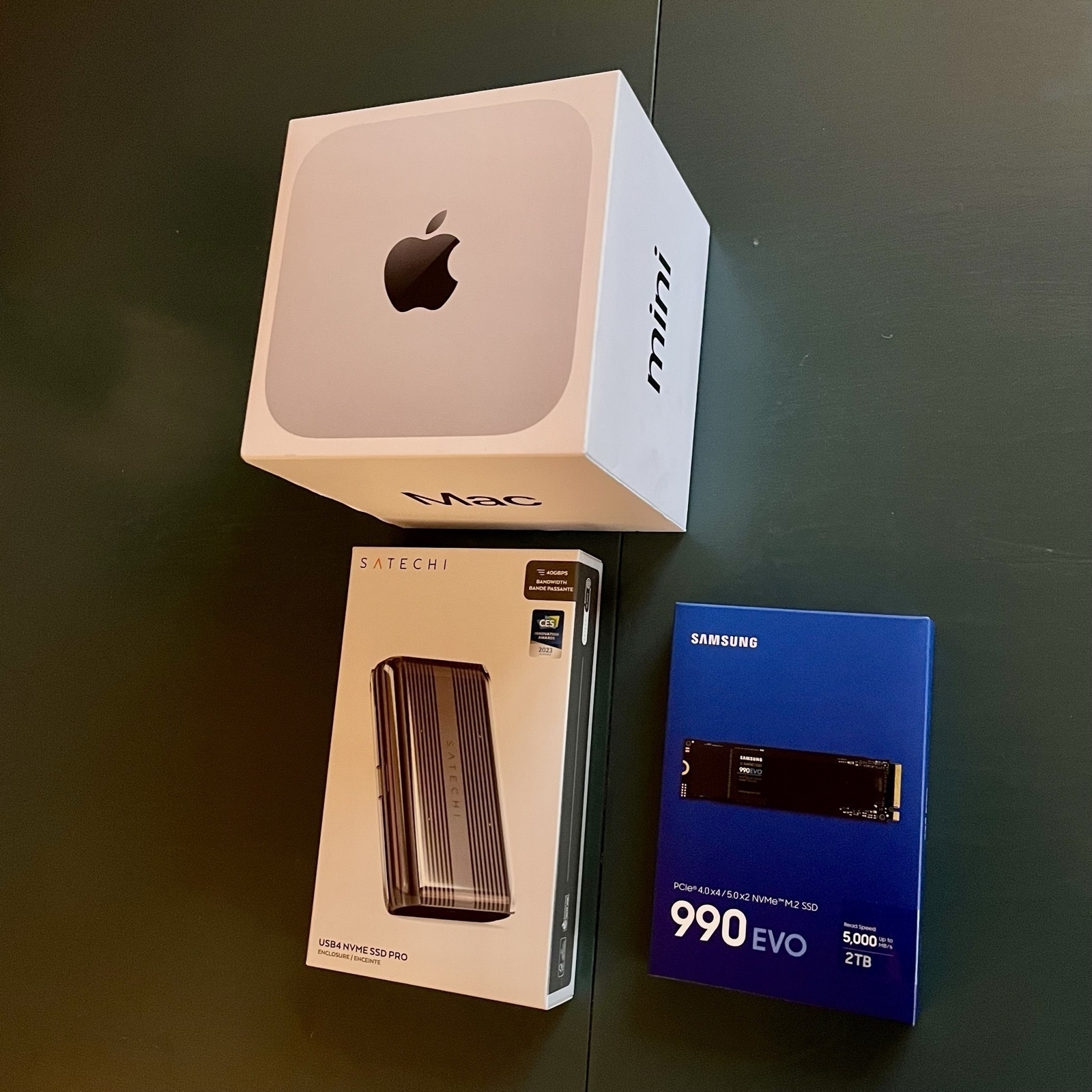
I just picket up my new Mac Mini, which I intend to use as a server (backups and media) and light gaming machine, connected to my TV.
Upgrade prices are a joke – so I went for the base model + a Thunderbolt enclosure, and a Samsung 990 EVO 2 TB SSD (which speeds might be an overkill – but it was on sale). Wish me luck! (Will report back later.)
Something is off about the performance on my blog… Especially on Chromium! While part of me would enjoy saying “Works best on Firefox”, I still have to do something about it.
Well, I have been looking for an excuse to rewrite and optimise my CSS! I’ll start tomorrow. 💪🏻 (Wouldn’t mind advice!)
Early Mac Mini Takes From Someone Who’ll Probably Get One
For a while now, I’ve thought that I’ll most likely get a Mac mini when it gets refreshed. My intended use case is pretty specific — and not as my main computer:
- Connecting some external storage, and using it for
- backups,
- and as a media server. (Jellyfin, perhaps?)
- Maybe use it for some smart home stuff.
- And I’ll also connect it to my TV, via HDMI, for some light big-screen gaming. (Like UFO 50! But also things that I want to play with a controller that’ll run at least as well as on my M1 Pro 16 GB laptop.).
Thoughts regarding my use case
I got to say, the update is pretty perfect for me. The new form-factor is great for my TV furniture, and I can probably get by with the absolute cheapest one. The only upgrades I’m considering, are 24 GB RAM and 10 Gigabit Ethernet. Would love input on this!
General thoughts
In general, I think this is a great update at a good price. And at last we’re finally out of the 8 GB hole! 256 GB is pretty rough, though… But it’s OK for me! So, in principle, if Apple had non-criminal upgrade pricing, I wouldn’t mind it starting that low. But they don’t.
They made the right choices regarding the ports
The new Mini has the following ports on the back:
- 3x Thunderbolt 4/5
- HDMI
- Ethernet
- Power
And the following in the front:
- 2x USB-C
- Mini-jack
There are two questions we need to look at:
- How many ports should the enclosure size account for?
- And then, which ports should those be, and where?
Partially I think, in a world where the Mac Studio exists, they went for a sensible size and port number (9 — one more than the M2 Mini, and one less than the M2 Pro). It’s OK to disagree with that — but I think we have to keep that separate from the port types and placement.
I’ve seen some disappointment voiced about the jack being on the front. And while I have zero issues with someone preferring that for their specific setup, I still think it’s wrong to say that Apple made the wrong choice for the majority of people. For those with speakers connected permanently, there are _so _many options for connection. And which port on the back should’ve been moved to the front instead, then?
I also think it would’ve been a travesty if they sacrificed USB-C ports for USB-A ones. Just get over it…
The power button placement is fine
I mean, it uses very little power while in sleeping, so how often do you need to turn it off? And it’ll probably be OK to reach anyway. (Remember that the back of the Mac will be closer to you than with the last one, as the footprint is smaller.)
I’ll have to think about it some more, but I think this will be my next purchase. And I think this will be a great Mac for many people for many years.


