English
- … you write a lot in Markdown – especially in short to medium lengths,
- … you don't mind (or even prefer) working with files instead of libraries,
- … you value the quality and feel of software, like $1.000 Japanese garden shears.
- If we agree that open social media, free from ad-tech monopolies, is a good thing, everyone deserves the chance to take part in it.
- This includes those who use online platforms to make a living, and those who want to follow them.
- And resources flowing through the ecosystem, makes it more realistic to achieve this goal.
- The name
- The price
- The split
- The privacy
- In general, I like to rely on third-party services.
- I also like the portability of Markdown, and being able to use several apps on the same files.
- I like that, in NotePlan, I can use the same app for notes and tasks.
- Good apps on both Mac, iPad and iPhone, while also being accessible on the web
- Pretty good collaboration features, with shared notes and folders
- More than enough options for formatting
- Collapsible headings
- Embedding of files, photos, and illustrations (especially good with PDFs)
- Audio recordings
- Links between notes (no backlinks, though)
- Tagging and smart folders
- Quick notes (which Apple, selfishly, reserves for itself)
- Math notes.
- Many of the apps are one-time purchases (but often not with unlimited updates), so it’s difficult to compare with a single subscription.
- Many of the apps I use, I wouldn’t pay for if it weren’t included in Setapp. I’d either use a free/cheaper alternative, or just not use something like that at all.
- The left one is a specific one for working with subtitles. It splits the selected line into two, down the middle.
- This wraps text in
<figcaption>, and is used for blog posts. - This wraps the text in a “callout div”, that I use to create callouts like the one about the affiliate link up top.
- If I want to format text in image captions or callouts, I have to use HTML. This creates an HTML hyperlink,
- this is italics,
<em> - and this is bold.
<strong> - The pen is some custom stuff for my band’s website.
- The Last One Will Title Case the Selected Text.
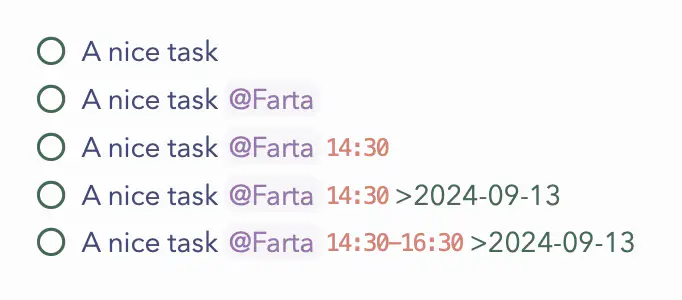
- Farta means “out-and-about” in Norwegian, and is a tag list I use for things I can do if I’m driving around.
- If I add a time, and the task is in a daily note, I’ll get a reminder notification at that time.
- I can add a date at the end, to move it to a daily note (to give me the notification if I’m not in a daily note, or to schedule it for another day).
- You can also create time blocks, by adding an end-time.
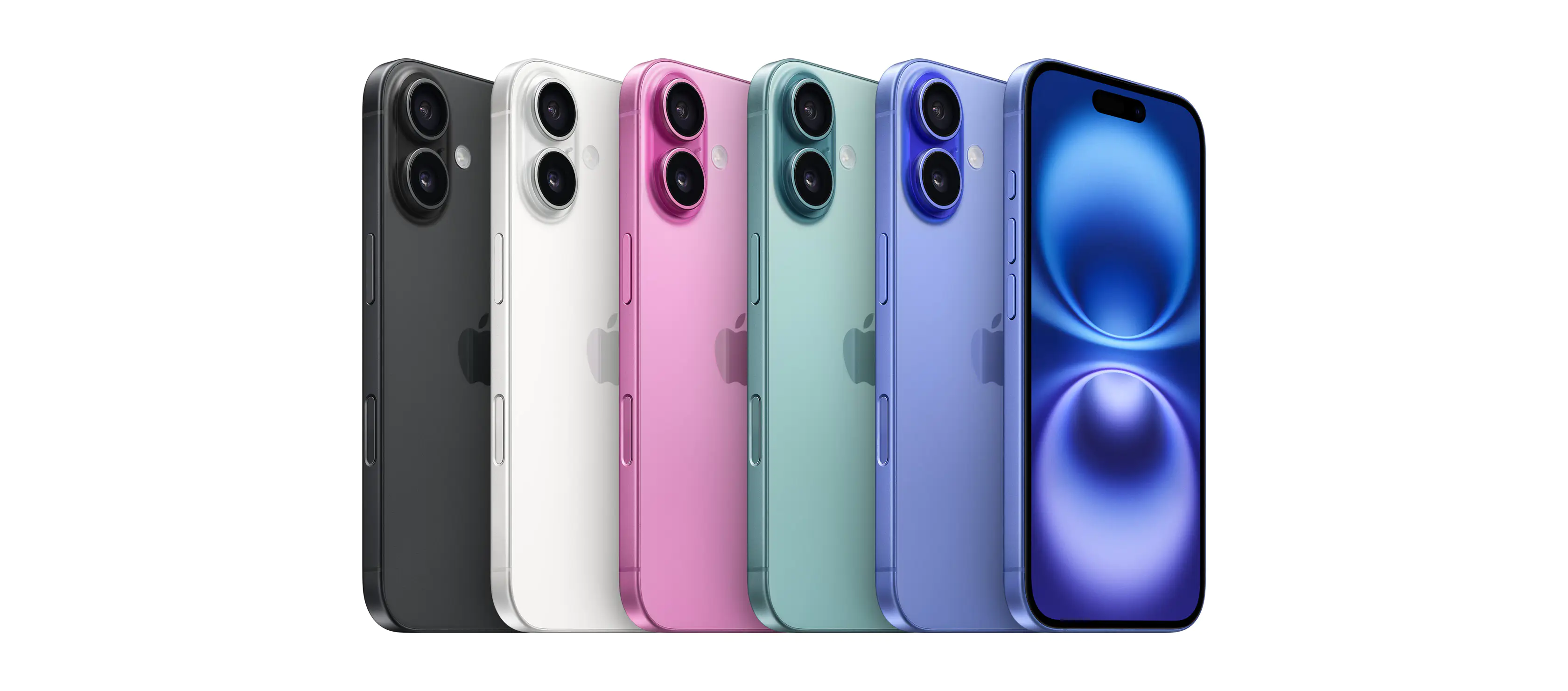
- ProMotion display (high/variable refresh-rate)
- Always-On display
- Added Telephoto camera
- Night mode portraits
- Support for Apple ProRAW
- Faster USB-C speeds
- Aluminium → Titanium (With increase weight as well, though.)
- LiDAR Scanner
- Camera Control button added
- Support for Dolby Vision video
- Latest generation Photographic Styles
- Anti-reflective lens coating
- Improved glass
- Faster MagSafe charging
- Lower minimum brightness
- A bit longer battery life
- Larger screen size, from 6.1" to 6.3" / /6.7" to 6.9" (A negative in my book, but not in most’s, I assume.)
- Upgraded chip, from A17 Pro to 18 Pro (Doesn’t seem like the largest bump.)
- Improved thermals
- New ultra-wide camera (Seems substantial!)
- The non-Max also gets last year’s 5x tele lens
- Improved microphones
- Upgraded chip, from A16 to A18 (All-new architecture – more substantial upgrade.)
- More RAM, from 6 GB to 8 GB.
- Support for Apple Intelligence (Due to the last two things mentioned.)
- Added Action button
- New ultra-wide camera (With support for Macro photography – but not as large an upgrade as on the Pro.)
- Support for spatial video
- Thread radio
- 1 whole gram lower weight (🤓)
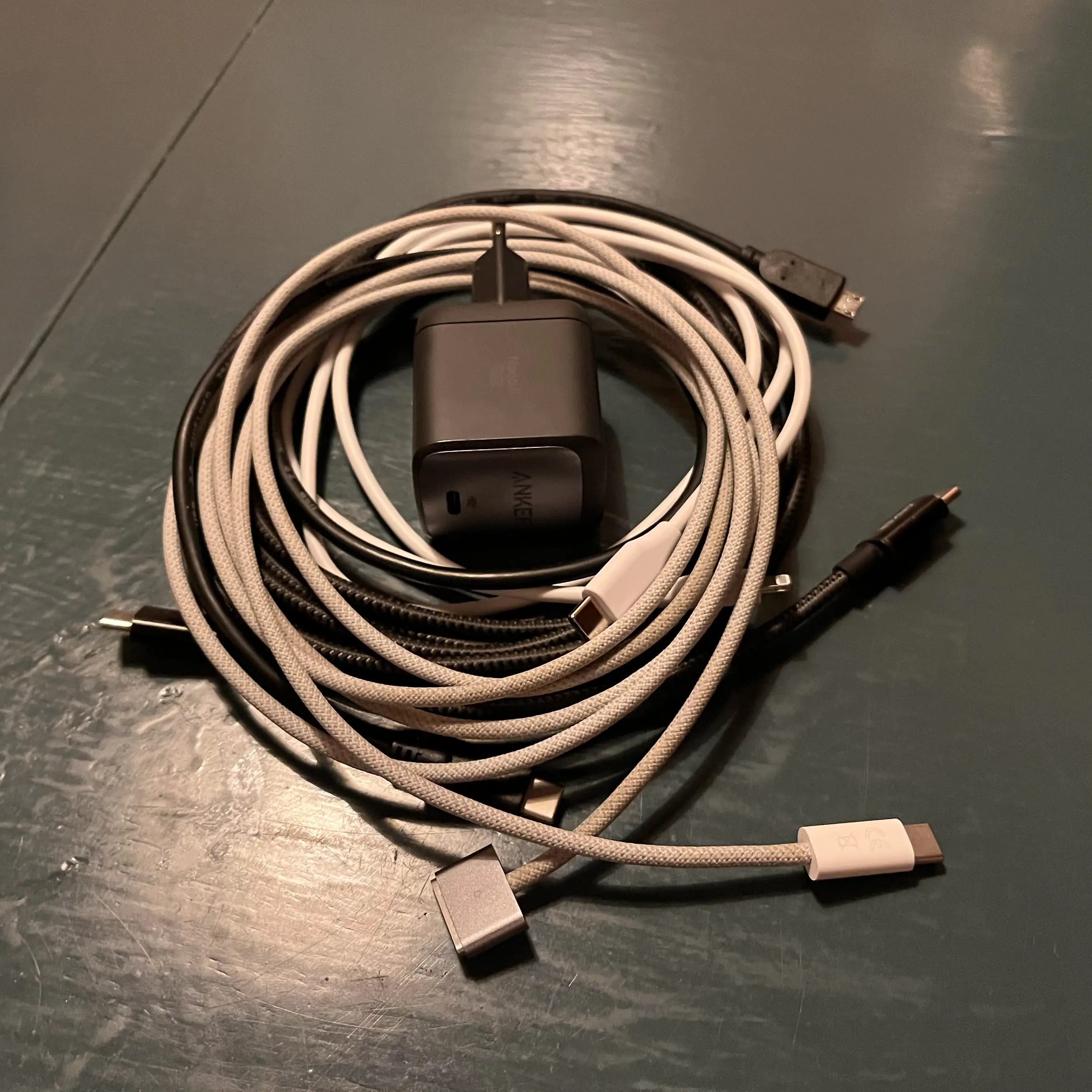
- USB-C, 3 meters (black, braided)
- MagSafe for Mac (light gray, braided)
- Lightning, 1 meter (white)
- Micro-USB (black)
- USB-C Power brick (in the wall)
- USB-C to USB-C cable
- iPad Pro’s Magic Keyboard (which charges the iPad)
- USB-C to Micro-USB cable (in the iPad itself)
- Satechi remote
Big Milestone for Me: First One-a-Month Member
My little blog is added to the One-a-Month Club’s website. It’s “[a] collection of blogs and other web projects that make supporting them both simple and inexpensive by offering access to everything for as little as $1 per month.” The site is run by the excellent Jarrod over at Hey Dingus, and inspired by Manuel Moreale:
But I recently realised that tiers are the wrong approach. At least for me. I believe in kindness. I believe that if you decide to support something I do, you should get all the benefits, no matter how much you pay.
I also realised that 1$+/month is the best price possible when it comes to supporting online creators. The 1 part means you can set it up and forget about it because it’s a low enough amount that won’t make too much of a difference for the majority of people who are considering supporting online creators. The + part allows you to contribute more if you want to do so. And that’s just perfect.
And recently, I achieved two milestones is one, thanks to Numeric Citizen: Get a mention on a blog I follow, and my first donation.1
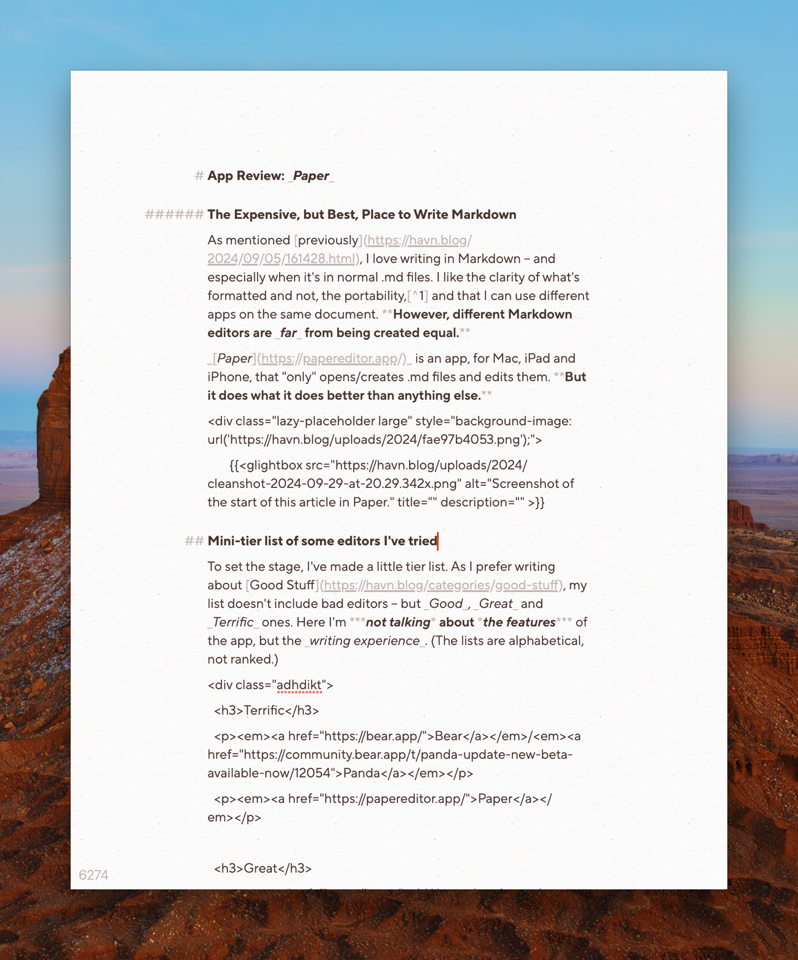
App Review: Paper
The Expensive, but Best, Place to Write Markdown
As mentioned previously, I love writing in Markdown – and especially when it’s in normal .md files. I like the clarity of what’s formatted and not, the portability,1 and that I can use different apps on the same document. However, different Markdown editors are far from being created equal.
Paper is an app, for Mac, iPad and iPhone, that “only” opens/creates .md files and edits them. But it does what it does better than anything else.
Paper could be an app for you, if:
Mini-tier list of some editors I’ve tried
To set the stage, I’ve made a little tier list. As I prefer writing about Good Stuff, my list doesn’t include bad editors – but Good, Great and Terrific ones. Here I’m not talking about the features of the app, but the writing experience. (The lists are alphabetical, not ranked.)
There’s been plenty of memes about how long the team over at Shiny Frog spent on Bear 2.0. But holy croak, it shows – the editor is extremely polished. The app does have good export features, so your notes aren’t held hostage.2 But the main reason I, personally, don’t use it, is that the note files aren’t easily accessible to other apps. It also doesn’t have as robust publish features as Ulysses, or task/calendar system as NotePlan. However, as a general note-taker for Apple devices, I highly recommend Bear.3
Panda is the Bear editor as a stand-alone app, to simply open .md files – so it’s closer to Paper in terms of functionality. However, it’s not readily available for mobile, and isn’t technically a proper product at the moment.4
I don’t recommend my favourite pair of boots
I love my pair of Alden Indy Boots. I haven’t found a single boot I like the look of as much, and the last (being rather narrow at the back and wide in the front) fits my weird feet perfectly. However, I don’t generally recommend them – as they’re not technically “worth it”. They’re simply too expensive for what they are, as you can get better made shoes for the same price, or shoes of similar quality for less. But that doesn’t change the fact that I love them, and am happy I bought them!
I could say the same thing about my Filson Journeyman backpack: Is it too expensive? Yes. Do I still love it? Also yes.
Paper is in the same category: I won’t claim that it’s worth it – because it’s very expensive. But if you end up splurging for the app, you’ll get something terrific. Let me try to explain why.
The price for Paper varies from region to region, and the dev keeps experimenting. But it can be as much as €200! Personally I bought it after getting paid extra for a job I did – and at least the money went to a small indie dev. How much money people have to "waste" on nice stuff like this varies. So I'll focus on the good, and the bad, of the app – and then it's up to you to figure out if it could be worth it to you. It also has a 50% educational discount.
How I use Paper
As mentioned when talking about my default apps, I currently store my notes, blog posts, tasks, etc. in NotePlan. The app’s database is stored with CloudKit, but is still accessible by other apps. As I prefer writing in Paper, I will do that as much as possible, while jumping into NotePlan and Ulysses for stuff that those apps do better.5
For instance, I’ve made different shortcuts for creating a new general note or a new blog post. This creates a .md file that gets saved into the NotePlan database, and then opened in Paper.
What makes it great
I'm Anti Anti-Growth and Anti-Commerce on Open Social Media
I don’t like it when people say “People on this platform are like this” – because all platforms contain multitudes. However, one quite prevalent multitude on Mastodon, and other open social media platforms,1 is the idea of being against growth and commercial activity on these platforms. And while I agree with some parts of these notions, in general, I really don’t agree with them.
The reason can be summed up in three points:
Let’s name this abstract “good thing” after something else most people agree is good: Cake
I think everyone deserves cake! But we might have to bake more of it to have enough to go around. And being able to do that, and delivering it in a safe and timely manner, is a big challenge.
Nuances on growth
So, the main reason I think there should be some focus on growth, is that everyone deserves things like good privacy.2 And to achieve this, we need to focus on accessibility, usability, communication, actually being enjoyable, and more. Now, some of those who argue against growth, are really talking about being against “growth at all cost”, “growing past the security measures”3, etc. And with that, I’m 100% aligned.
Nuances on commercialisation
The Idea of Marques Brownlee's App Panels is OK
But I Have Several Problems With It
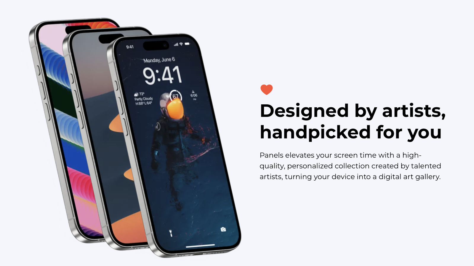
With the review of the latest iPhones, Marques Brownlee/MKBHD also revealed his latest project: The app Panels.
And I don’t mind the idea:
He’s hinted at expanding it in the future, but currently the app is an app to get wallpapers. You can get some of them for free (and by watching ads), but you can also buy packs of them, or subscribe to the app to get access to everything. The money is split between the app and the artists.
Wallaroo, by Iconfactory, is already a paid app for wallpapers, and Walli is an example of an app with a model where artists can upload their work.
In general, I feel like people’s expectations of stuff being free online is too high, so I don’t mind a new paid option in the market.
But these are my problems:
1) The name
My Biggest Small Gripe With Apple Notes
And (Obviously) Objectively Correct Principles for Paragraph Spacing
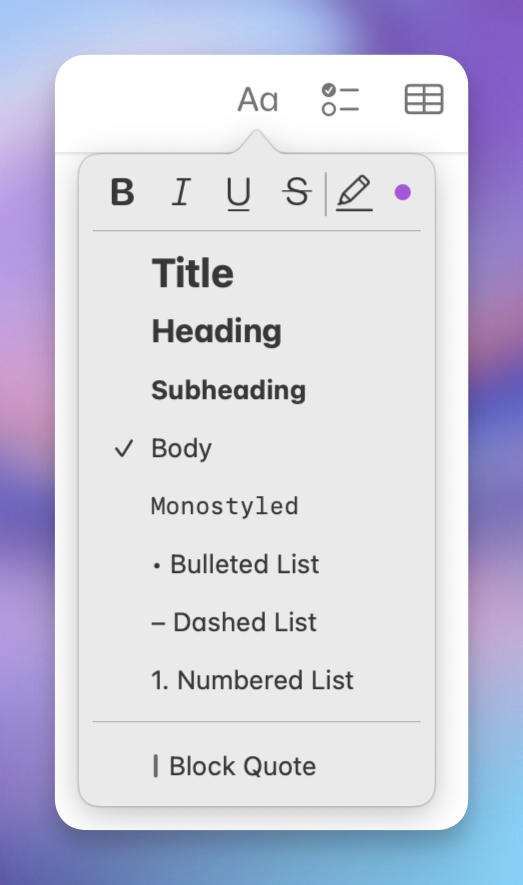
I think Apple Notes might be one of the best pieces of software Apple ships. They’ve nailed creating a simple app, with great ease-of-use, that still has more powerful features hidden, for those who want it. There are a couple of reasons why I don’t use it much, though:
However, Notes has numerous nice features, like:
So I’ll gladly recommend it to most people!
However, as most Apple software, Notes is pretty inflexible. If you don’t like their choices, you’re out of luck. And I really don’t like their choices when it comes to paragraph spacing.
My paragraph spacing commandments
The Apps I Use From Setapp
And Why I Think It’s Great Value
Setapp — which apps do you use? Many, us pay for SetApp yet don’t get all the value because we don’t know the full extent of all the shiny toys. This was last asked 4 yrs ago, so it feels relevant againWhat the hidden gems have I missed?
A while ago, someone, on the MPU Forums, asked the question above. And here’s my answer to this question.
I also got around to writing this, as many of My App Defaults are from Setapp, and because I recently read about the Setapp iOS store in the EU (which Norway, sadly, isn’t a part of).
I hope this post can be useful if you’re considering the service, and wonder if it’s worth it, or if you’re new to the service and would like some tips to get started. If you want to give it a try, I’d appreciate you doing so through my affiliate link to Setapp 🖇️. 🫶🏻
I’ve sorted them into the following categories:
I also have a couple of honorable mentions, that are (or seem like) good apps, but that I, personally, don’t use that much.
I’ve added the price outside Setapp as well.1 Setapp is €10-15/month, or €100-150/year. However, some things to keep in mind:
I still find it to be great value – and I like that I can use nice, paid apps like explained in the second point.
Always-running utilities
These are apps I have running in the background all the time.
Bartender (€21)
The grandad of menu bar organisation. Ice is an interesting free alternative, but I’m still pleased with Bartender – especially as I can have it automatically change layout when I connect my Studio Display.
BetterTouchTool (€22)
I mostly use this to set up trackpad shortcuts – which it does amazingly. But it can do much more as well.
Cleanshot X (€26)
Terrific tool for screenshots, annotations, and screen recordings. An alternative for the latter, called IShowU (€80 or €22/year) also just dropped on Setapp.
Default Folder X (€47)
This app powers up the open and save dialogues on your Mac – with things like recent folders and the ability to click on folders you have open in the background to save there.
Hookmark (€63)
This is an app for creating deep links between different documents and parts of apps (like specific emails).
iStat Menus (€13)
Recently updated, with a beautiful coat of paint, this highly customisable app lets you place what you want in the menu bar. I have RAM and CPU usage, and a weather widget.
Mission Control Plus (€10)
I only use this to allow me to close windows from Exposé. Worth it!
Paste (€27/year)
My favourite clipboard manager. Both pretty and powerful.
PixelSnap (€35)
Used for measuring things or your screen. I think xScope might be a more powerful version of this.
PopClip (€23)
App that mimics the menu you get when you select text on iOS – but you fill it with what you want. I’ve turned off mine coming up automatically, but I get this with a hotkey:
From the left:
New defaults
These are tools that do the same thing as built-in tools, but a bit nicer/and more in a more powerful way.
Archiver (€20)
Just a nice zip/unzip tool. The Unarchiver (free) is more or less just as nice!
Elmedia Player (€25)
And this is just a nice video player. But here Iina (free) is also just as nice.
BusyCal (€45)
It lacks some of the most powerful Fantastical features – but I also prefer some things about BusyCal. And seeing as it’s so much cheaper, this is a great alternative if you want something more powerful than Calendar.app, but don’t want to pay €60/year. It also has a nice menu bar widget (as seen in the screenshot above).
Nitro PDF Pro (€200 or €17/month)
I’ve no idea why this is so expensive! I guess it offers features some businesses just got to have. 🤷🏻♂️ But for me, it’s just a nice PDF reader/editor.
Useful tools
The Story of My 1962 Bass Guitar
My Most Treasured Possession
In 2010, I went on a school trip from Norway to Los Angeles. I wanted a new bass, so I took a chance, and sold both basses I had at the time, to have funds to spend in L.A.
I was looking for a P-bass
But after not finding anything interesting in Guitar Center and other “regular” music stores, I searched online. There I found a store called Norman’s Rare Guitars. I didn’t know it at the time, but it’s one of the world’s most highly rated vintage shops – and they had a real bargain. You see, Fender instruments from the early 60s are expensive – especially the “Pre-CBS” ones.1 To put things into perspective: Norman’s have one currently, in great condition, which they want $10,900 for!
The one I ended up buying was even older, from 1962, but “only” $3,000. Not only that, the currency rate was much more favourable, from Norwegian Kroner, at the time. I paid what today would be $1,700.
Why it was so much cheaper
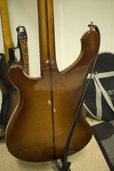
The guys as Norman’s said that the bass spent most of its life in the possession of a man they know who was. However, he wasn’t a stranger to experimenting with chemistry and his own blood – and the bass bears witness to this.
Here’s what I know about originality
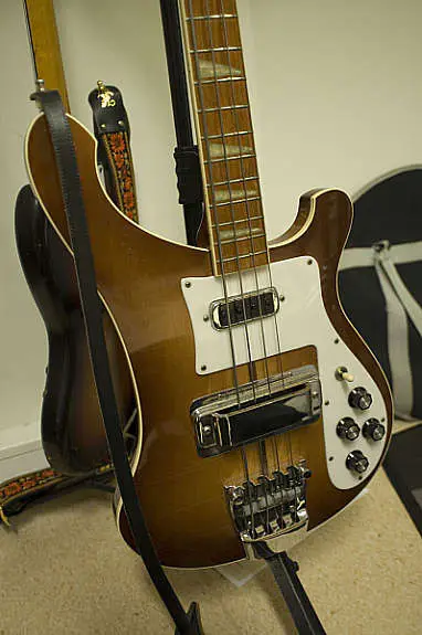
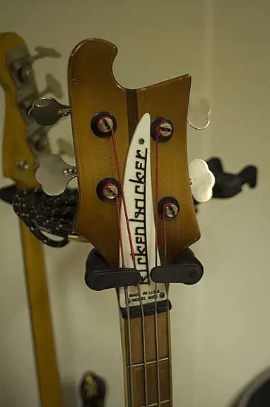
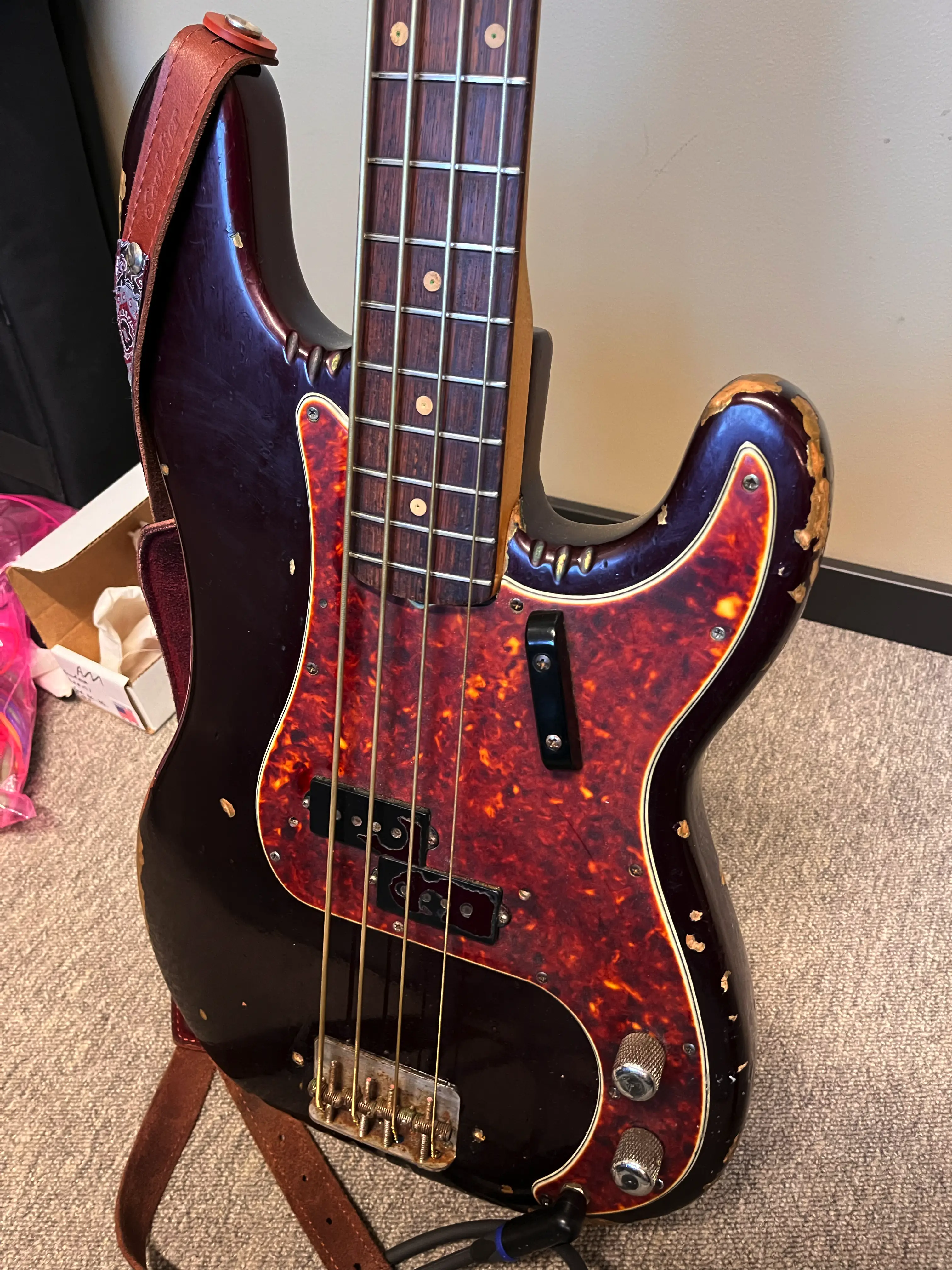
I know that the volume pot is new (as I’ve swapped it myself) – and I don’t think the knobs are original.2 The rear strap button has been moved (to accommodate the heavy tuners). The headstock strap button is missing, alongside the pickup and bridge covers. However, as far as I know, the rest is original: Neck (more on this later), thumb rest, bridge tuners, pickup, and electronics.
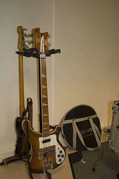
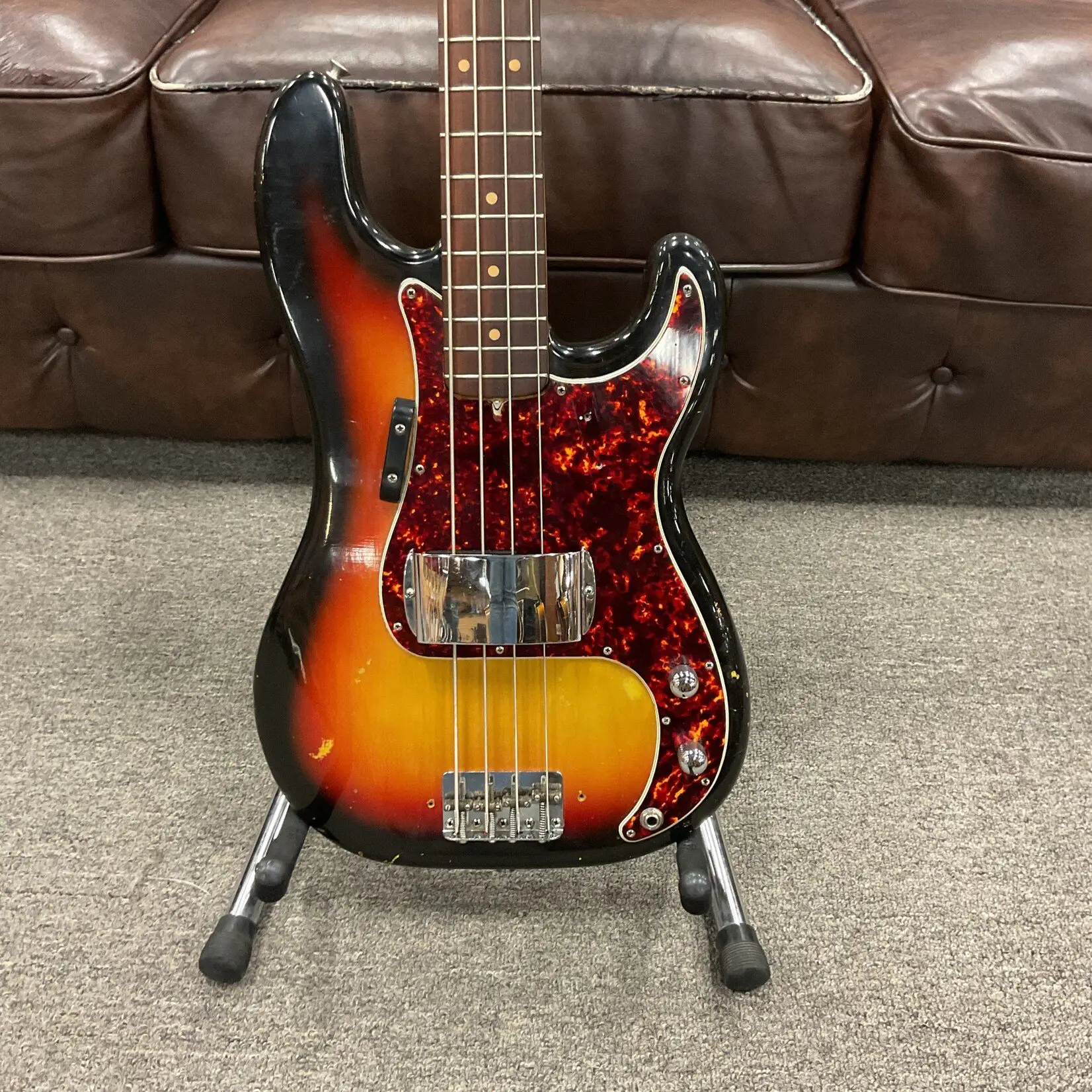
As mentioned, my bass used to look like the one in the image above here – same finish and all.3 But now, and when I bought it, it looks like this:
🌱 My App Defaults
Extremely late to the party, I finally got around to write about my app defaults. A bunch of these are paid apps I probably wouldn’t prioritise if I didn’t already subscribe to Setapp 🖇️ – so keep that in mind. I’ll also give alternatives places where I remember some.
Click here to see the hardware I use this software on!
Lastly, I know that these posts are “supposed” to be simple lists – but I thought I’d add a bit more info.
Systems and productivity
📓 Notes, tasks, and writing
I want to get this one out-of-the-way first, as it’s the most complicated one. (The other entries are much shorter!)
All my notes, tasks, and writing is in a bunch of Markdown files held within NotePlan. But these are also local files I can access with other apps, write to with automation, etc.1
I prefer to do as much as possible with Paper, which is a super slick Markdown editor. So I use this for writing of blog posts, note-taking, sticky notes, as the default app for random .md files, etc.
I use Ulysses to edit and publish blog posts to Micro.blog.
And occasionally, I’ll use TaskPaper to manage more complicated projects – but as mentioned, all of these apps points at the same NotePlan files!
This is from NotePlan, and I’ve added one extra feature to every task down the list – and as everything is plain-text, I can add it from wherever.
I also really, really like Bike Outliner – but I struggle getting it to fit into my workflow. I also dabble in Tot, when I need stickies that stay on-top.
📖 Journaling
I absolutely fall into this cliché: I wish I journal more than I do. But when I do, I do it in Everlog. I like that it’s Markdown and linkable.
📅 Calendar
I use BusyCal. It’s way cheaper than Fantastical (and included in Setapp), while being almost as good. (There are some things I prefer in BusyCal, as well, actually.) I think this is a nice sweet point if you want something a bit more powerful than Calendar.app, but don’t want to pay Fantastical money.
🌦️ Weather app
Here’s a great tip (that probably mostly Norwegians know about): Here in Norway, we have a publicly funded weather service, called Yr (which means drizzle). It’s good, completely free (and without ads), and has good apps for both Android and iOS. And guess what: It’s available in English as well!
Pronunciation guide: The y is a monophthong, that sounds like the ui sound in “build”.
🛒 Shopping list
My wife and I use Bring, which is a great little uni-tasker!
📮 Mail server
I host through Fastmail 🖇️. I go into why here.
📨 Mail client
My Take-Away From the iPhone Event: This isn't a "Pro year"
A friend of mine had to buy a new iPhone a couple of months ago – and I liked his phrasing while asking me for advice: Is this a “Pro year”? Now, to some, the things you always get with a Pro phone are so important that every year is a Pro year. But I’m discussing how much you get for your money with the upgrade – because this will vary from year to year.
To be clear: I don't think most people should buy new phones more often than every 3-5 years. But as that interval will hit many people every year, it's still always valuable to analyse this year's phones.
However, I'll be holding on to my precious 13 Mini for at least another year! 💪🏻
So, while we haven’t seen any reviews of this year’s models, to me, it seems like last year was a “Pro year”, while this year isn’t. Let’s find out why.
These are things that are the same – things you’d get for the upgrade last year, and still get this one:
Both from 15 to 15 Pro and from 16 to 16 Pro:
Going from 16 to 16 Pro
In addition, the aforementioned stuff, this year you also get:
Summarised – This Year's iPhone Changes
While working on a different blog post, I made a list of changes to the different iPhone models. Instead of just scrapping it, I thought I’d post it here.
Improvements across the line(s)
iPhone 15 Pro → 16 Pro
iPhone 15 → Iphone 16
Anything I missed? Feel free to let me know!
My recommendation is that it seems like the iPhone 16 (regular model) is the best buy at the moment. And that the €100 higher price compared to buying last year’s iPhone 15 is well worth it. (Where a used 15 Pro fits in the calculation, is a more complicated question!)
I Love My Little Charging Bundle
I recently wrote about not needing USB-A, and mentioned the USB-C Lifestyle™️. That reminded me of a little bundle of cables I always keep in my backpack. So here are some …
Advice for frustration-free charging
1) Buy extra
Here’s my bundle:
The trick is that I don’t need any of these elsewhere – they are extra. I have other chargers in my office, next to my bed, etc. I get that this is a bit more wasteful than just having one charger that you move around everywhere. But I think this is resource spending that’s worth it – and hopefully the devices you buy don’t come with (sub-par) chargers you don’t need. Furthermore, try to keep chargers for a long time.
2) Think about colour and texture of the cables
These are the cables in the bundle:
As you can see, all of them have a different combination of colour and texture. This makes it easier to pick out the correct one!
3) Don’t buy “original” chargers
In general, buying “original” accessories will give you something that might be pricier, but at least is among the best. But when it comes to chargers, and especially compared to Apple, the third-party chargers are objectively better. The reason being that Apple doesn’t use GaN, a relatively new technology that allows for significantly smaller size to power ratio.
Mine’s a 65 watt Anker charger 🖇️, that I really like. Because while I don’t necessarily recommend getting chargers from Apple/Samsung/etc., I do recommend getting a “name-brand” one. Anker is a brand I’ve always been pleased with, so I haven’t tried many others. But I think Ugreen and Belkin might be decent as well. Would love to hear about it if you have other recommendations I can add here!
4) Get enough wattage, but not more
No, You Don’t Need USB-A on Your Desktop Computer
The first redesign in a decade for the Mac Mini is near. And the rumours point towards Apple removing the USB-A ports on the current models, in favour of USB-C ports. And to the surprise of no one, people are moaning about losing their precious ports, as if they were buying a laptop in 2016.
But, just like Freedom …
USB-A isn’t free
First, let me be clear: I’m not discussing the number of USB ports – I’m discussing the types. So, for instance, I’m evaluating 5 USB-C ports vs 3 USB-C ports and 2 USB-A ports.1 So “just keep the USB-A ports” wouldn’t come for free, it would come at a cost of more of the future-proof2 port type.
Another “cost”, is that the longer computer makers ship products with the port, the less pressure Logitech et al. feels to update their peripherals to USB-C.
I know this might sound a bit harsh, my clear advice is …
Get over it
“But I don’t want dongles”, I hear you say. Well, I think there are satisfactory ways to adopt the USB-C Lifestyle without becoming a permanent resident of Dongle Town – which doesn’t include buying numerous new devices.3 Yes, I know this comes at the cost of maybe €10-30 (depending on your setup) – but just factor it into the cost of the €500-1000 computer, and it will be fine. And your life will be better for it!
Here are my two main tips, as someone who’s deep into the lifestyle.
1) Buy some new cables
I have an older Satechi presenter, which charges with Micro-USB (boo) and came with a USB-A to Micro-USB cable.
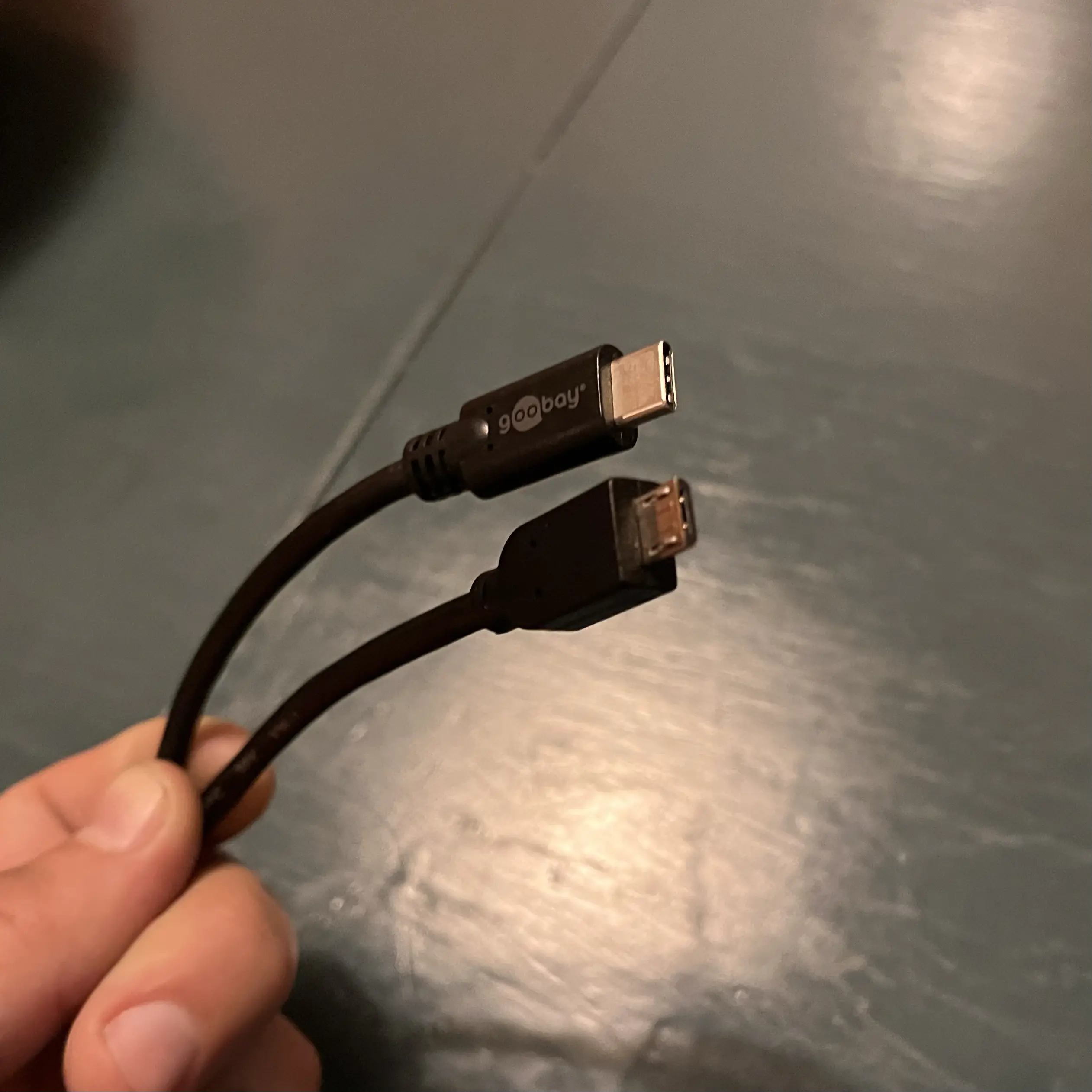
However, I’ve bought this cursed contraption:
I don’t love having to lug around that stupid cable4 – but it sure works to pull an older device into the USB-C age. All my power bricks 🖇️ are USB-C, so I can charge it directly there. It can also charge from my tablet, laptop or the theoretical USB-A-less Mac Mini.
I’ve most often used it with an iPad Pro (with a Magic Keyboard) – and an advantage of bringing things into USB-C, is that it also makes things work better with more “port constrained” devices, like the iPad. So I would, for instance, run things like this:
That cable would (probably?) also allow the remote to be charged from a newer iPhone!
So, my first recommendation is to see if any of your “USB-A devices” could become “USB-C devices” by just buying a new cable.
2) Buy some adapters
The Beauty of Third-Party Services
and Open Protocols and Standards
I’m very much what you’d might call a software snob. Not only do I care about unnecessary things like how an app looks – I also care about how it feels. I’d also say that apps are an interest/hobby of mine, and I love testing new things. So I love open and portable stuff, so that I’m always able to use the software I prefer. Allow me to explain, with four examples: RSS, Email, Browsers, and Markdown.
RSS
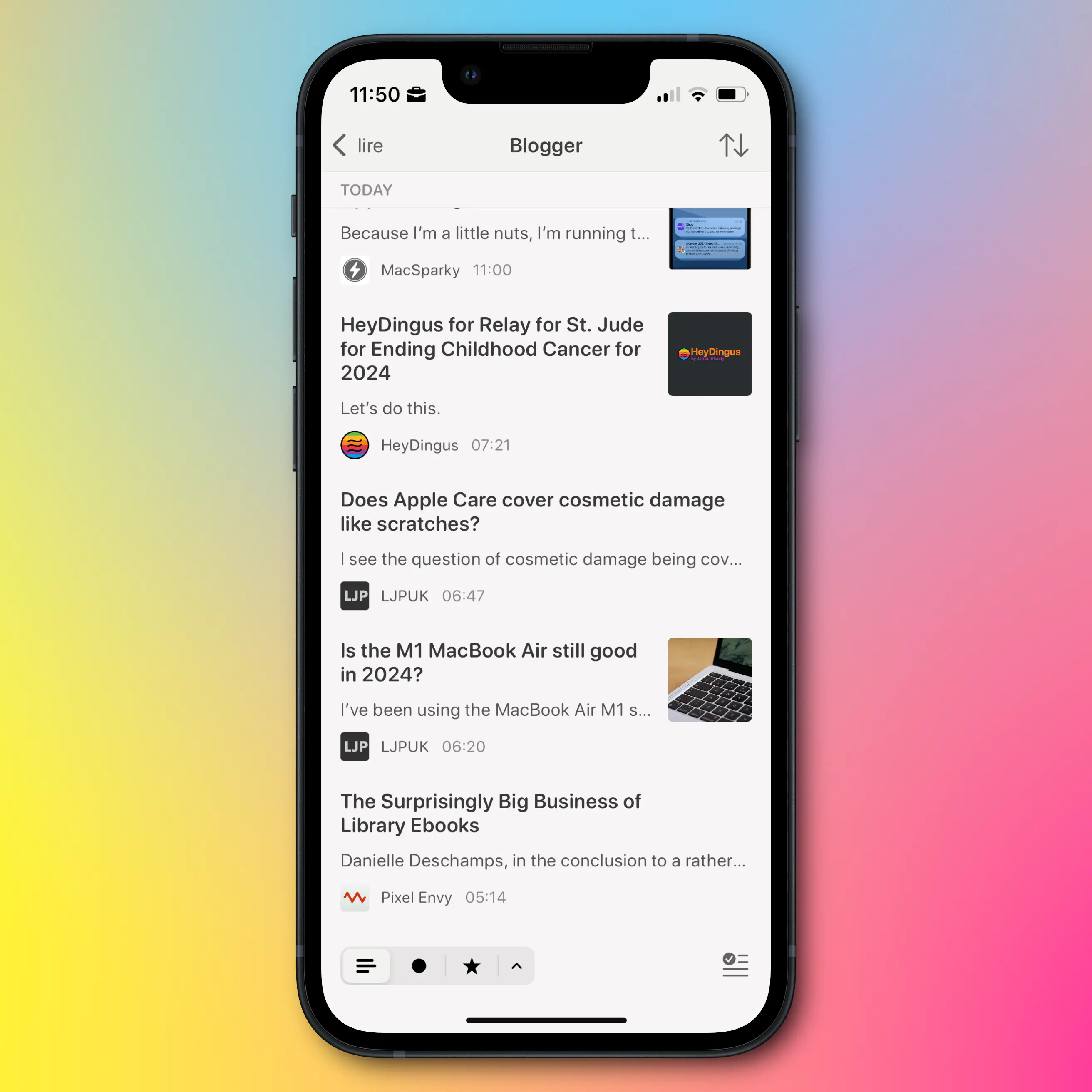
My current RSS reader of choice, is Lire. It doesn’t look and feel quite as nice as Reeder and Unread, but it is still good in this regard. However, I love that I can customise the look, that it caches truncated RSS feeds, and that I can (on a feed-by-feed basis) load an inline web browser. This makes it possible to read blogs with their original design, which I think is neat.
However, my feeds don’t live in one client. They’re synced with Feedbin. This makes it trivial to move between clients, and I can even use several in parallell, as things like sorting and read status instantly sync between them. Maybe I prefer Lire on mobile and Unread on Mac, for instance?
Portability is an important principle here. And if I want to move from Feedbin to Inoreader, for instance, I can easily export my feed subscriptions as an OPML file, which I can then import into Inoreader.
So I’m not locked in anywhere, and I can use the client I prefer everywhere. This reality is what I wish I could have for music streaming as well, as I’ve touched on here. It also shows why I want less bundling and integration.
Notes on cross-platform-ness
My best friend, and fellow nerd, has always been adamant in using cross-platform tools – the reason being that he can be flexible in terms of which hardware he uses. He can easily switch between Windows, Mac, iPhone, Android, etc. However, this doesn't gel well with my software snobbery, as most of the best apps (in my opinion) simply aren't cross-platform. I have the same issue with web apps – I love their flexibility and portability, but I don't love using them. So the approach laid out in this post, is my approach to the same idea. But yes, it would be even more robust if I only used web based and cross-platform tools.Now, as opposed to with RSS, there’s not many good email clients… But the same principles apply!
I host my email with Fastmail 🖇️, and I’m very pleased with it.1 But if I still want to switch later, I don’t use an @fastmail.com address. Instead, I use my own domain, hosted on Hover 🖇️ – so I don’t have to change address if I change hosting. I can also change where I have my domain without having to change anything regarding my email.
Now, I don’t like the default Fastmail client – but email being email, I can use a client I dislike less instead!
Browser
Please Stop Saying "Telegram Isn't Encrypted"
You’re not helping - draft 2
Telegram is back in focus these days – and, as usual, not for good reasons. I will write more on this later, as I will have to figure out how to deal with the very real concerns I have with the chat app I use the most. But now I wanted to focus on one thing that’s annoying me a lot, for instance in the latest Vergecast episode.
Why it’s a bad idea to say things that aren’t true
I think it’s crucial to get the word out, that Telegram isn’t as safe as Signal1 – and I applaud those who want to shine a light on that fact. The problem is, that many of them (like Nilay Patel) do it by saying that “Telegram isn’t encrypted”. But what happens if someone has heard that phrase, and then later learns the fact: That Telegram is encrypted.2 They will then perhaps disregard the entire notion, and maybe assume that Telegram is as secure as Signal after all.
My issue with that phrase is that it erases the essential distinction between just “encryption” (or “server encryption”) and “end-to-end-encryption”.
Here’s the difference:
A Good Conversation About Apple and APIs
When comments helps you grow
A couple of days ago, I hastily wrote a quite spicy blog post, about the removal of a good Spotify feature on iPhone. I got some pushback from Jason, and it led to a conversation I liked.
Me and Jason often disagree on stuff – but I always find his comments fair, interesting, and leading to me adjusting my opinions. One important takeaway in this for me, was whether or not this was just a case of someone whining, and putting a spin on, an API getting deprecated. Which is something that sometimes has to happen, but will still often lead to complaints which I often disagree with.
His first comment
I mean, it also could be there was an old way of accessing volume controls, Apple built a new way to work with HomePods, AppleTV, and likely Matter devices. They then deprecated the old API in favor of the new one to maintain one pathway, that yes, means access to its products comes along, but also means one, more modern, more standards compliant API to control devices.
I don’t trust Spotify comms for shit, and don’t know that’s what Apple did, but that story is equally like Apple– get rid of an old API for a new one that does more stuff, misses some functions but adds a lot more, etc. It would also line up with Matter and the addition of these devices that didn’t exist when the original implementation was done.
And for what it’s worth, the bugs that Spotify mention are present with the volume rocker over AirPlay. So, I’m not sure it’s not just Apple’s shit not being as good as it should be, period, versus disadvantaging someone.
My first reply:
The thing is, you can point to a million small examples where Apple makes (decently rational) choices that just so happens benefit themselves at the expense of others. Many of them are of the type “We made this choice, because privacy. That it hampers our competitors, is just a coincidence. So is the fact that we didn’t do this other thing which also would’ve been good for user-privacy, but would hurt us.” If you only look at each thing individually, Apple’s behaviour can often be defended – but you have to look at the larger patterns. Hehe, I agree that it’s a good idea to be skeptical of comms – but I don’t trust “Spotify + Sonos combined” less than Apple, I think. And Apple could’ve decided to comment, but has chosen not to.
And for what it’s worth, the bugs that Spotify mention are present with the volume rocker over AirPlay. So, I’m not sure it’s not just Apple’s shit not being as good as it should be, period, versus disadvantaging someone.
This is a good point! 👆🏻 But I still stand by my stance that these things would be better if the behemoths didn’t insist on competing in more and more markets. (I wrote more about this here.) We would have much cleaner incentive structures, if Apple’s “only” focus was on making their platforms (and hardware) as good as they could make them. (And “competition” would be an important ingredient here.)
His second comment:
How to use your market dominance
What do you do if you’re dominant in some markets, but wished you were more dominant in others?
If this isn’t one of the clearest examples of the problems with too much bundling and integration, I don’t know what is.
So, Apple (the phone maker) is artificially nerfing the competition of Apple (the music streaming service), unless they agree to build stronger integration with Apple (the smart speaker maker).
At imaginary HomePod meeting:
Some guy: “Our speaker would benefit from Spotify integration, but they would rather not build it for free. Should we pay them, like how we demand payment for integration with our stuff?”
Another guy: “No, I have a better Idea: What if we called Federighi, and threatened them instead? We could remove a useful feature that Apple Music (their main competitor) has, unless they agree to our demands.”
Some guy: “Oh, yeah – that’s way better!”
Now, I’m not saying it went down just like that. But it is awfully “convenient”, isn’t it?
So, to be clear, this is the situation:
As I’ve mentioned previously, I moved from Spotify to Tidal this year, due to artist payments. (Now, I’m not sure whether I got that right – but that’s another case.) And the main thing I’m missing from Spotify, is the excellent Spotify Connect. This is both a way of streaming music to different speakers and devices, and a way to control the Spotify playback from any device. For instance, let’s say I start the playback on my iPad, connected to a speaker via a mini-jack. If I then open Spotify on my phone, the playback controls are “live”, like if I streamed from my phone. I can also say “Nah, move the playback to my Sonos speaker instead”.
What Apple has done, is removing the ability to use the phone’s physical volume buttons to control the Spotify Connect volume. So if you listen to Spotify on your phone, with AirPods, clicking the buttons adjusts the volume. But if you then move it to your Sonos speakers, it suddenly doesn’t – it only adjusts the phone’s notification volume. I really don’t like this disconnect.1
Apple is saying that Spotify users can get the feature back if Spotify agrees to integrate with the HomePod – and that’s very problematic.
Imagine me, happy as a clam: I had bought a phone that I liked, and was using a streaming service I liked – party due to how well it worked with my smart speakers, which I also like. And now Apple is jumping in, and making the latter two worse, just because Spotify won’t support a speaker I don’t have.
The Everyday Watch
Writing about watches, yesterday, made me think of a type of watch I just can’t seem to find: The watch equivalent of the classic white T-shirt. I also recently read about an interesting pair of typefaces – and put together I got the inspiration to try my best at designing the watch I just can’t seem to find.
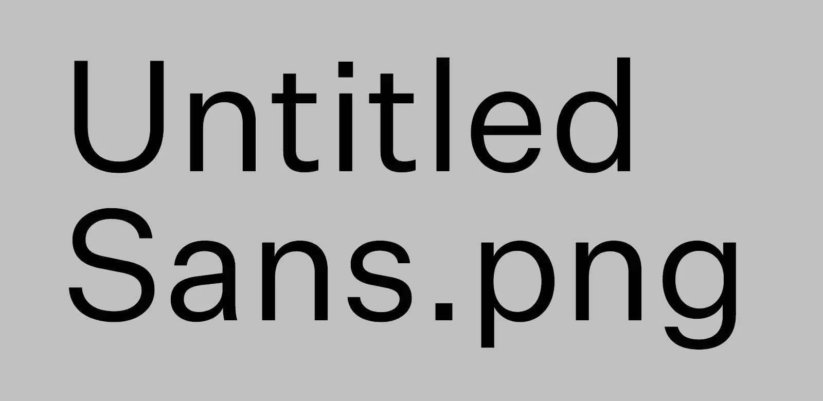
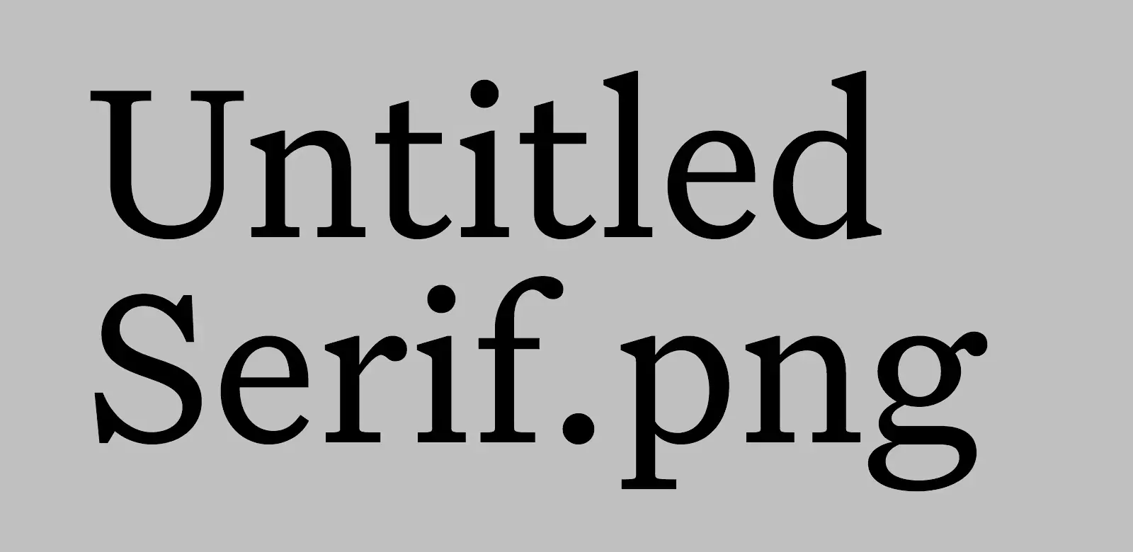
Untitled Sans/Serif
These typefaces are made with the expressed goal of not getting recognised or noticed. The creator, Kris Sowersby, quotes from the book Super Normal, by Jasper Morrison and Naoto Fukasawa:
There are better ways to design than putting a lot of effort into making something look special. Special is generally less useful than normal, and less rewarding in the long term. Special things demand attention for the wrong reasons, interrupting potentially good atmosphere with their awkward presence. — Morrison
Designers generally do not think to design the “ordinary”. If anything, they live in fear of people saying their designs are “nothing special.” Of course, undeniably, people do have an unconscious everyday sense of “normal,” but rather than try to blend in, the tendency for designers is to try to create “statement” or “stimulation.” So “Normal” has come to mean “unstimulating” or “boring” design. — Fukasawa
Some quotes from Sowersby himself:
Most new typefaces are imbued with layers of history, aesthetic associations and cultural signifiers. (…) To lend a new typeface prestige, these blurbs reveal the old specimens that influenced it, and name-drop typographers and foundries long dead. They detail the “engineering challenges” the typeface has heroically overcome — usually small printing sizes, low pixel resolution or limited horizontal/vertical space. Contemporary typefaces are touted as the complete aesthetic and technical package.
But what if you don’t have any special technical requirements, or you want to avoid specific historical connotations? What if you just need to set text with something… utterly normal?
I wanted the details to be exactly normal, without exaggeration. I made a typeface that a designer can use without worrying whether the French Renaissance is an appropriate cultural reference, or if it’s OK to use Bodoni for text. I made all Untitled Serif design decisions while reading. After each round of changes, I embedded the updated fonts into an ePub of Orwell’s 1984 and read several chapters. If a detail stood out, I removed it in the next round of changes. I kept doing this until it was totally comfortable to read.
In general, I absolutely prefer opinionated design – but I do find this approach refreshing. And it fits well with my recent search for a really nice white T-shirt. (I ended up buying this, from Warehouse.)
The missing watch
Most watches fall under some more or less strict categories – like dive, tool, field, dress, or sports watch. And I love, and own, a couple from these categories! But what I feel is missing, both from my collection and the watch world, is a mechanical casual watch. A neutral watch that would fit perfectly with a white T-shirt and a pair of jeans.
Some contenders
✉️ Advice for Cheap Watches
This post is an answer to a part of the latest Comfort Zone podcast episode, where they talked about considering a non-smart watch. In the episode, Matt Birchler said he had considered going back to using a non-smart watch – but that when he asked for advice, people usually said he had to spend around €1.000 to get something good. He ended up saying why he probably didn’t want one anyway, but I wanted to give some advice “just in case”! And also to others who might come by this.
I do love more expensive watches1 – but I also have a soft spot for cheap ones. And my watch collection consists of only sub-€100 watches! So here are my tips: (Click here for the TL;DR.)
1) Look past the strap
Making Something Bad Easier to Do, Isn’t Good
Should Be Obvious…
Speaking of bad arguments… This, from The Verge and this from Dan More (good posts!) got me thinking of another terrible take I see way too often:
«People have always done Bad Thing (at great expense of some kind), so Company X making it super-accessible isn’t critique worthy at all, actually.»
Edit 27/8-24:
The Verge posted a good, and very linkable, article called Hello, you’re here because you said AI image editing was just like Photoshop. And the comment section is full of the argument above, and also its sibling:
«We’ve always has to contend with Bad Thing – so drastically increasing the amount of it, is of no consequence, actually.»
"It's a Company" Isn't an Excuse
You’ll often hear people say (as excuses to negative conduct) something like: “It’s a company, of course they’re only worried about profits." Or something like: “It’s publicly traded – they have an obligation to work towards growth."
And I simply don’t accept that. I don’t mind companies trying to be profitable – but how you do it matters. The consequences matters. And if a company is already immensely profitable (and already provides lots of value to its shareholders) it’s toxic, on so many levels, to squeeze at all cost.
