Quick Recommendation #10: Hemispheric Views (Podcast)
Episode 137 Is the Perfect Place to Get Into the Most Charming Tech Podcast
Some reasons why Hemispheric Views is one of my favourite tech podcasts:
- Three sympathetic hosts, with great chemistry.
- Some Australian perspective in my life.
- The goal of the episodes being “a tight 45” (minutes).
- Great bits and running jokes. (For instance, their member program is called One Prime Plus. 😁)
I can recommend last week’s episode, 137: I Had a Pi in the Drawer, as a good place to start! It’s both accessible and gives a good impression of the show. And as I’m a bit late to posting this, you’ll then also have this week’s episode ready if you want another one immediately.
I also recommend following the hosts:
Don't Chop Up Your Apple Trees to Make Barrels for Your Apples
The CEO of The Browser Company, the company behind the Arc browser, recently posted a lengthy Reddit post. He explained why they’ve abandoned Arc, and discussed a bit about their plans going forward.
They’ve made a huge pivot to an upcoming AI browser they’re calling Dia. But I just wanted to comment on this, very stupid, approach, from the portion about what makes an “AI browser” different:
1. Webpages won’t be the primary interface anymore. Traditional browsers were built to load webpages. But increasingly, webpages — apps, articles, and files — will become tool calls with AI chat interfaces.
They really don’t see the major flaw in this approach?
The AI models are completely worthless without training data,1 which they scrape from webpages. If people don’t visit webpages, the incentives to create the content disappears. What do they think this will do to the quality of the “tool calls” over time?
“Hmm, we need some barrels for all of these apples we just picked from our orchard… I got a great idea! The trees are worthless now, without apples – so let’s just chop them down and use the wood to make the barrels. I’m sure this won’t have any ramifications for the future.”
The Single Piece of AI Legislation I'd Start With
One Simple Rule
I know that creating laws is very hard — especially at a global scale.1 And figuring out what to do about the rise of AI is the same. But I have an idea about where I’d start, that I would love to spitball.
My opinion regarding generative AI is currently something like this:
- It’s not as useful and amazing as the salesmen claim it is. And overestimating it has its dangers.
- At the same time, it also does have plenty of very useful use-cases — and more to come.
- However, it being useful isn’t the same as it being a net-good, or that there aren’t very problematic consequences that need to be dealt with. (I wrote more about this here.)
My suggestion…
… for the first rule is quite simple (in concept):
It must be easy to find out if a piece of content is part of a model’s training data or not.
Locked-In-O-Meter: iPhone Edition
I use several Apple devices. This is partly because I like them, and partly because I think they’re more worthy of my support than (for instance) Microsoft and Google.
However, Apple is doing their best to invalidate that second point. I’d also love to be able to support cool companies, like Framework and Fairphone.
So, I want to examine: How locked-in would I rate myself? Starting with the iPhone.
And I’m not just talking about being locked-in for nefarious reasons. I’m also talking about things I simply prefer about having an iPhone.

Hardware
I do like my current iPhone 13 Mini – and also my wife’s iPhone 15 Pro. However, from a hardware perspective, I would have zero issues moving to something else instead.
I’d either buy a Fairphone (the 5 has been out for a while, so interested in seeing what they do with the 6th version), or maybe a flip phone of some kind 🖇️. I think that’s the logical next step for a Mini Phone Person like myself.
Especially as long as my wife has access to a good camera, I’m not very picky about my phone hardware.

Accessories
Quick Recommendation #9: Niléane
Just a Really Cool Woman
In this instalment of Quick Remmondations, I’m going to recommend a person in general!
While listening to the last few episodes of one of my favourite tech podcasts, Comfort Zone, a thought has been growing in me: “I think Niléane might be one of my favourite people online!” (I do like both Matt and Chris as well, to be clear. 🫶🏻)
She’s French-Réunionnese – and in addition to the podcast, she, among other things, writes for MacStories, creates a great theme for Mastodon called TangerineUI, and is the president of Toutes des Femmes.
Recently, she wrote a great post, called Are Pride Wallpapers and a Watch Band Enough in 2025?, and that pushed me over the edge to write this recommendation. (I also really liked this follow-up post by Matt. 👌🏻)

Why I think she’s a treasure for the community:
Raycast for iOS Is Out
A Companion to My Favourite Mac Launcher
Raycast 🖇️ is one of my favourite parts about using a Mac. It’s a great launcher, that I also use for snippets, window management, searching, setting a bunch of hotkeys (like for shortcuts), and more. It’s also my main window to AI tools, and the only AI subscription I have.
I’m working on a full post on how I use Raycast – but now I just wanted to share that the iOS version is out.
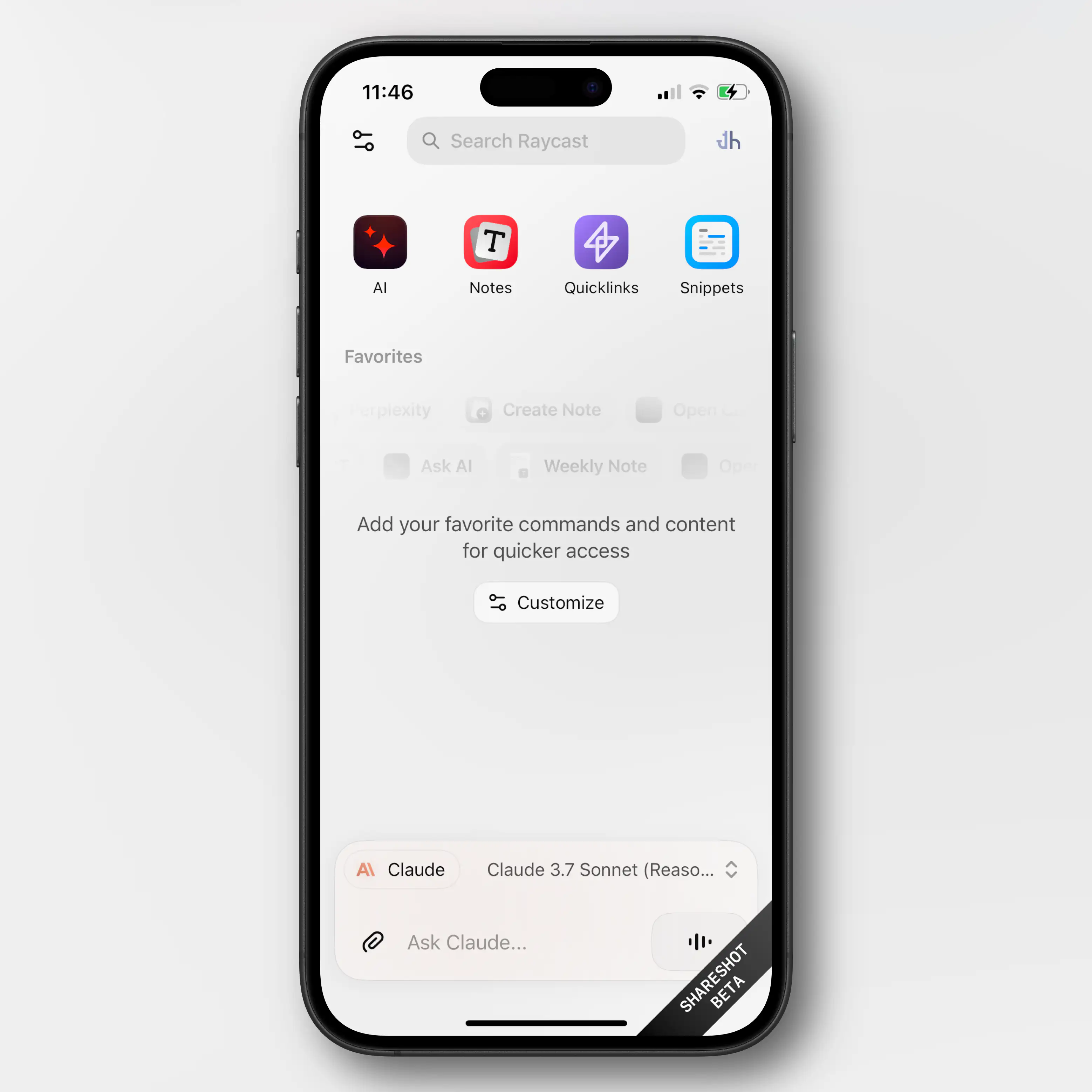
Obviously, very limited (thanks Apple)
Most of what Raycast does on the Mac is, obviously, not even close to allowed on iOS. So this new app is mostly just a companion for the Mac app.
Raycast did a large overhaul of their notes feature in november – and if you’re a user of this (which I’m not) having access to them on mobile is nice.
You also get access to your snippets and “quick links” (which I don’t use either).
But the thing I’ll use the iOS app for, is access to my AI chats. Not only does it sync the conversations from the Mac, I’ll also be able to use all the premium models I’m paying for. This greatly increases the value of my Raycast subscription.
As I don’t pay directly to any AI vendor, I’ve been using only free options on mobile. I don’t use AI chat that much, and even less on mobile, so I’ve been content enough with Mistral’s Le Chat.1 But having access to all of Raycast is a large upgrade here.