English
- templates (with Javascript support!),
- backlinks,
- embedded images,
- code syntax highlighting,
- foldable headers and list items,
- synced lines,
- (light) front-matter support,
- voice notes,
- sketching and hand-writing transcripts,
- sharing live links to notes with others, and more.
- How would you feel about buying the factory’s products?
- And would it matter if you lived upstream or downstream from it?
- Their main markets, especially the smart phone one, is extremely large in absolute terms.
- As opposed to things like the gaming market, it's one everyone* has to participate in.
- Many people game on a PS5, but also on PC and mobile, etc. Very few daily more than one phone OS.
- A complete monopoly isn't the only way to have anti-trust issues. For instance, a duopoly doesn't necessarily mean healthy competition.
- Connecting some external storage, and using it for
- backups,
- and as a media server. (Jellyfin, perhaps?)
- Maybe use it for some smart home stuff.
- And I’ll also connect it to my TV, via HDMI, for some light big-screen gaming. (Like UFO 50! But also things that I want to play with a controller that’ll run at least as well as on my M1 Pro 16 GB laptop.).
- 3x Thunderbolt 4/5
- HDMI
- Ethernet
- Power
- 2x USB-C
- Mini-jack
- How many ports should the enclosure size account for?
- And then, which ports should those be, and where?
- Guitar in
- Dry signal out
- Wet out L
- Wet out R
- … That Great October Sound (2001)
- Stray Dogs (2003)
- One Day You’ll Dance for Me, New York City (2004)
- While in laptop mode, I want it at the bottom, with automatic hiding.
- But while on my 27" external display, I want it to be on the left, smaller, and always showing.
Quick Recommendation #1: Cheap Strap Locks for Guitars
Why buy expensive (or just kind of cheap strap locks, when you can go old school and just order a bunch of rubber gaskets for bottles??
Here’s a link 🖇️ to the listing I used on AliExpress – but there are probably plenty of others that are just as fine. 👍🏻
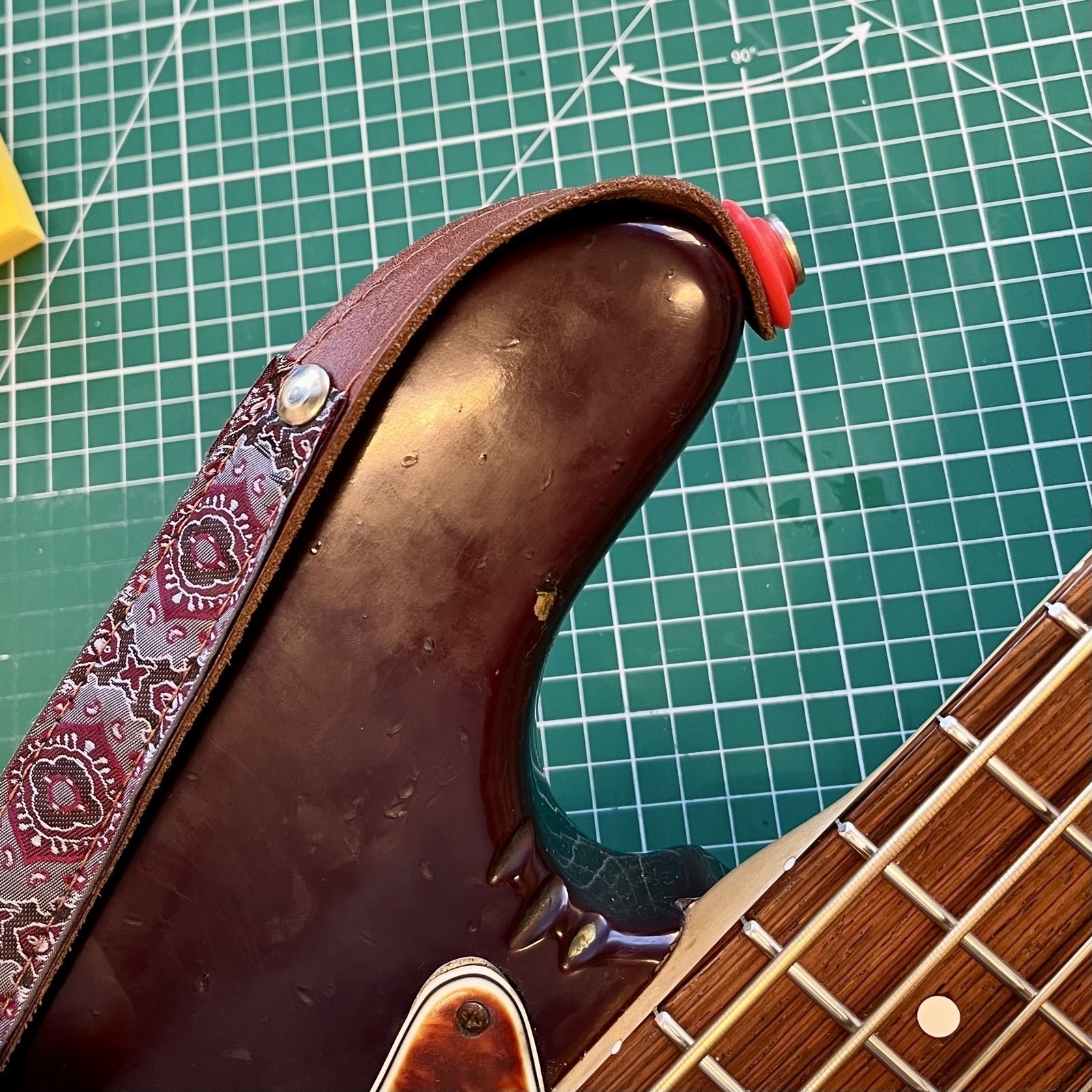
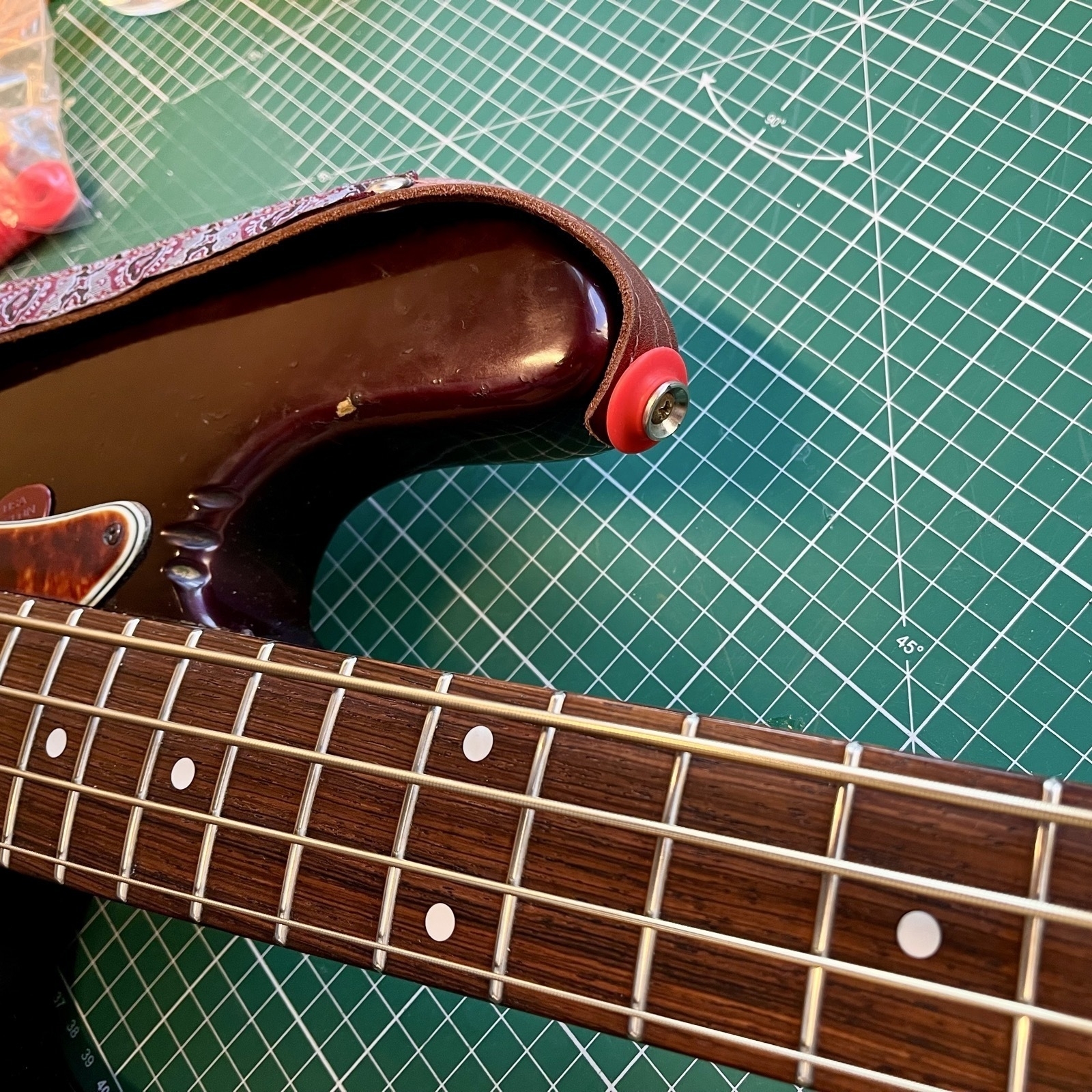
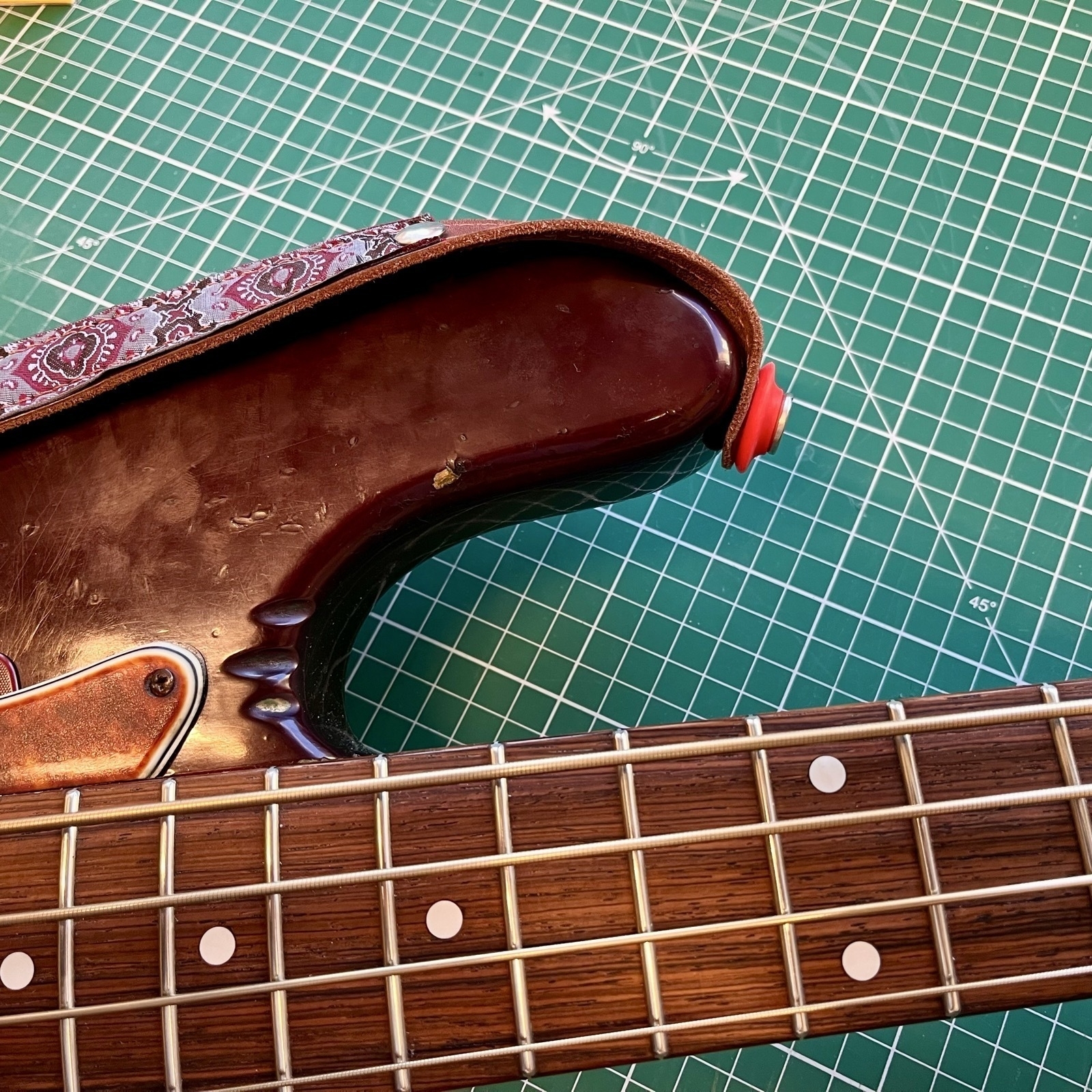
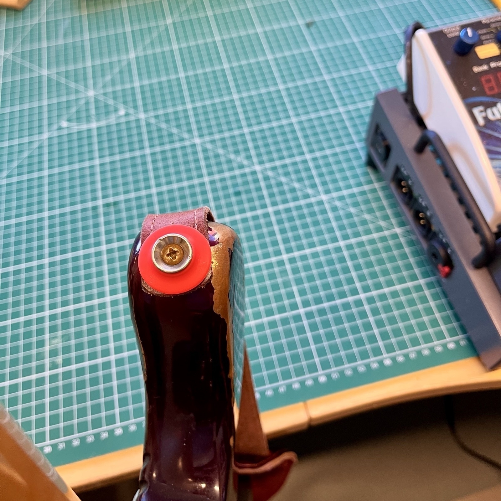
I know it’s silly – but for some reason I think it’s a bit more rock ‘n’ roll to use something not meant for the purpose. 😎
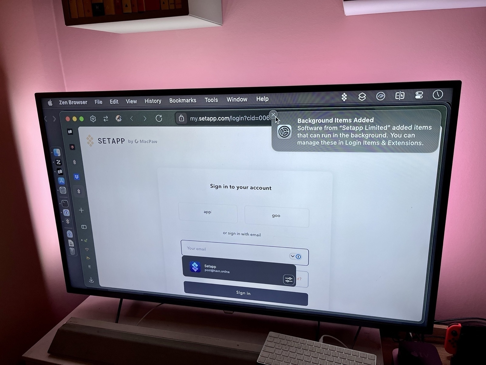
App Defaults and Home Screen Update – January 2025
I wrote a bit more in-depth about it in my original post here – but here’s my update at the beginning of 2025! A bunch of these are paid apps I probably wouldn’t prioritise if I didn’t already subscribe to Setapp 🖇️ – so keep that in mind.
Headers with * have some changes.
Mac dock
I use an automatic shortcut, activated with Shortery, to switch between the dock being “hidden at the bottom” (on the laptop screen) and “shown to the left” (on my 27" monitor).
Here’s what it looks like by default:

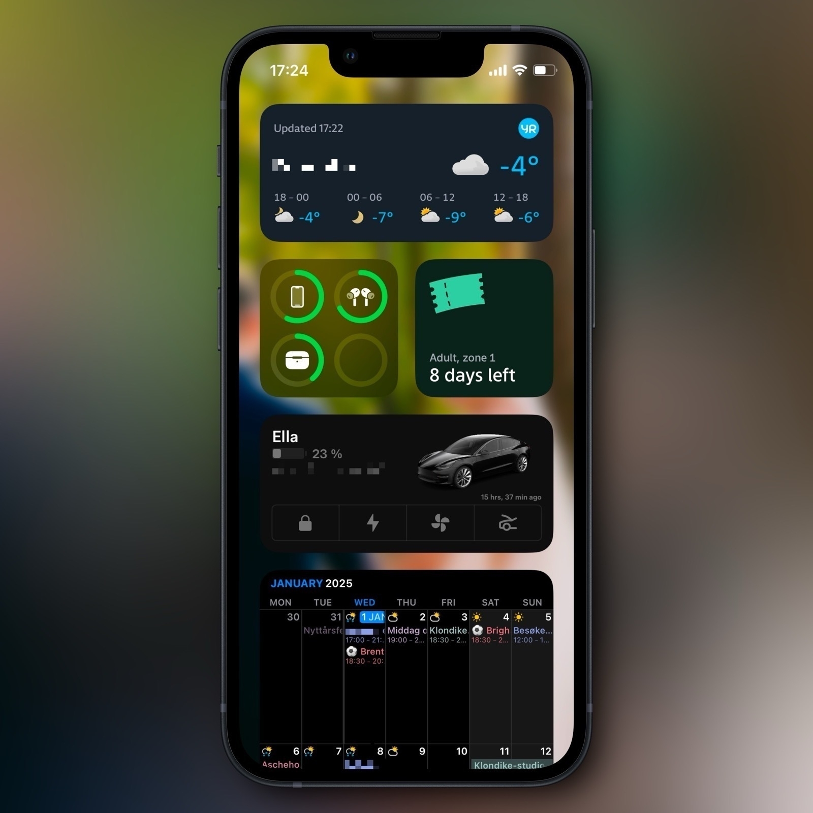
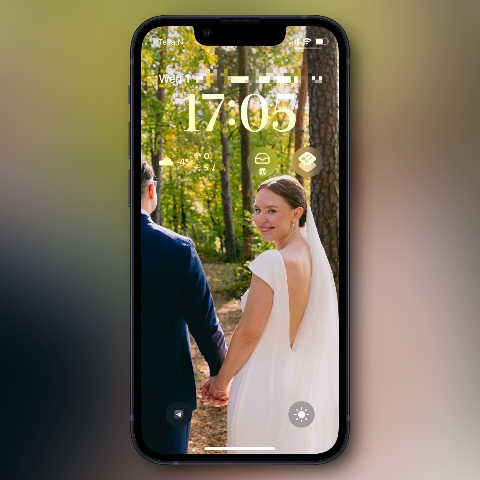
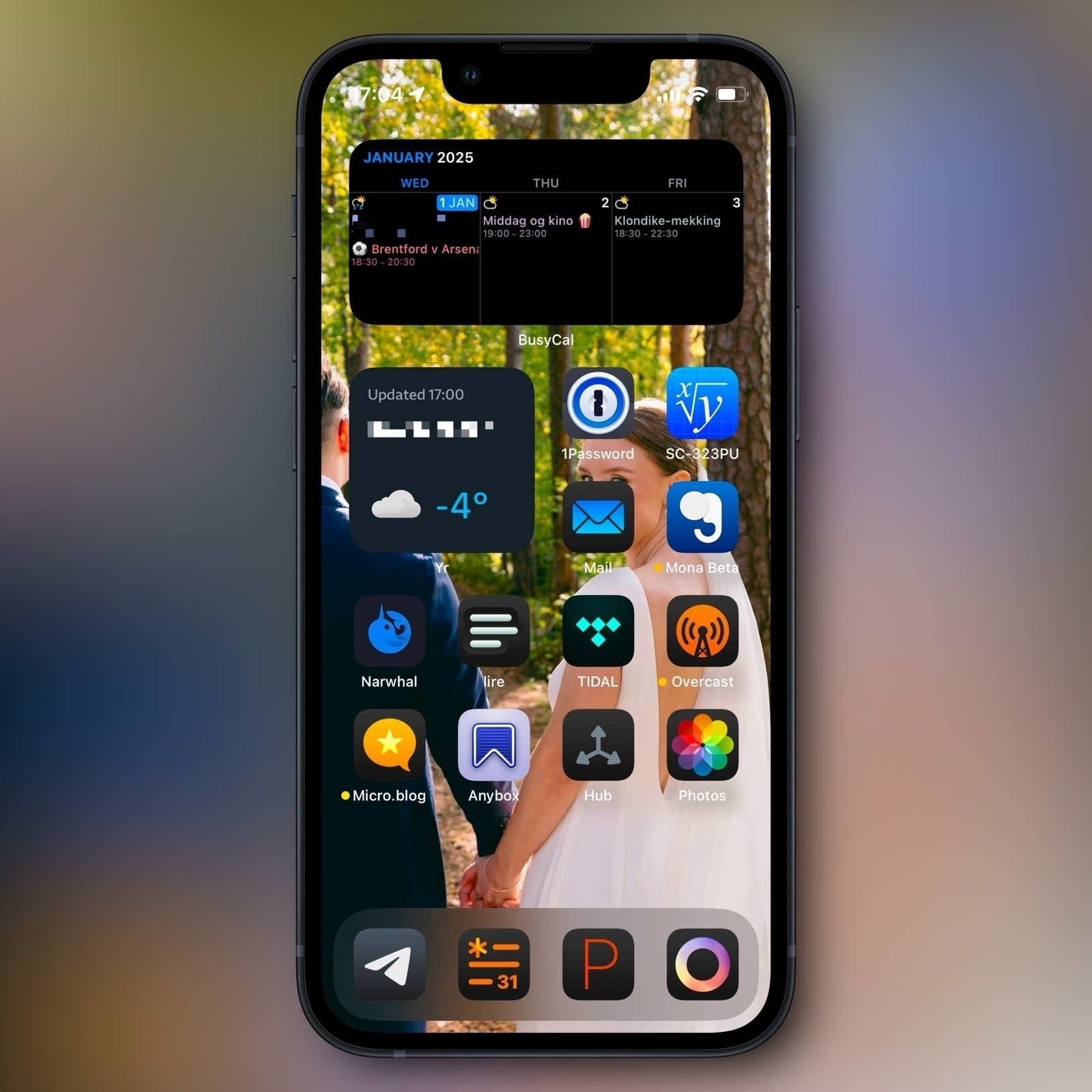
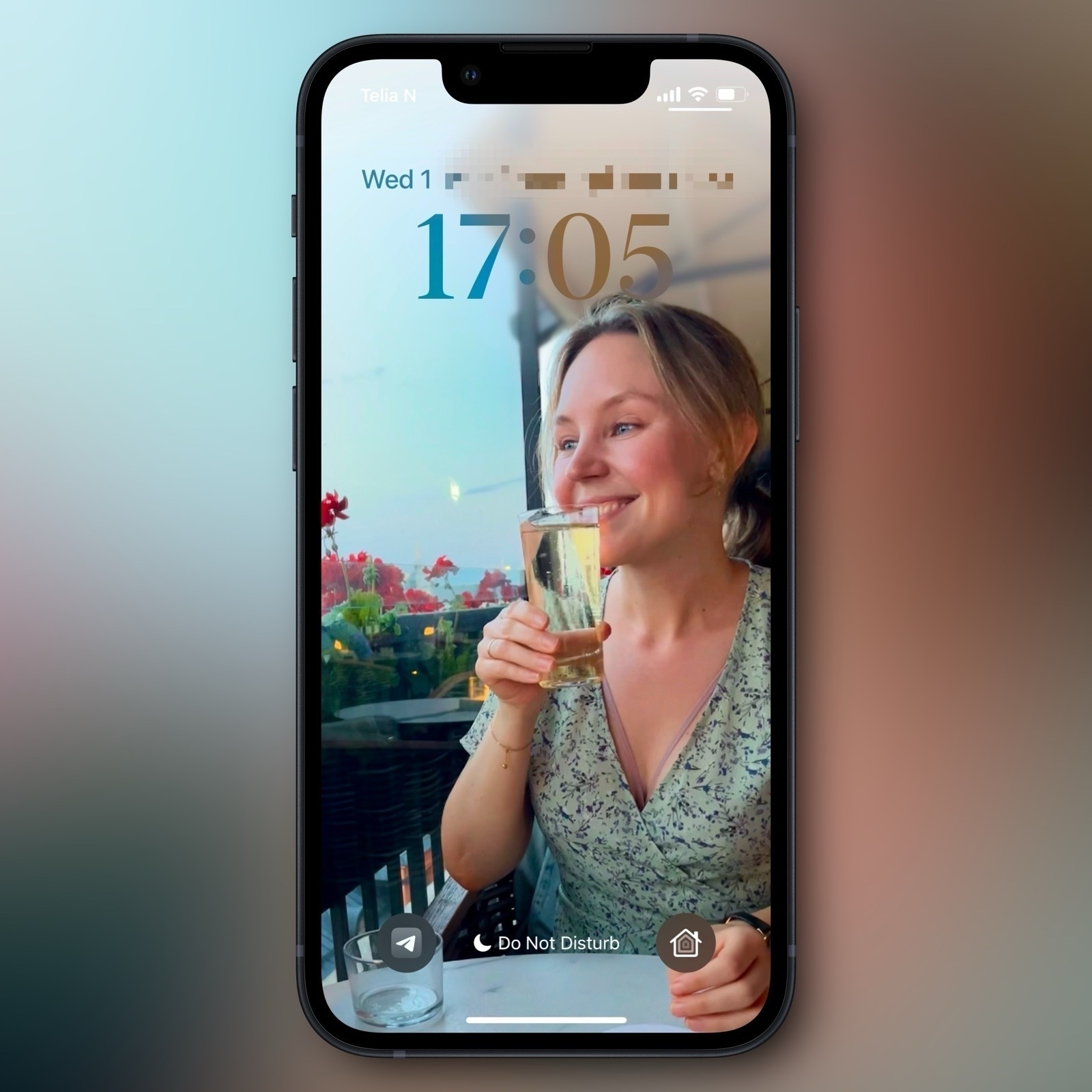
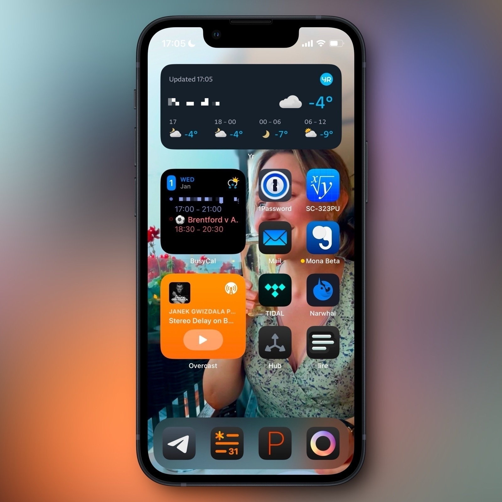
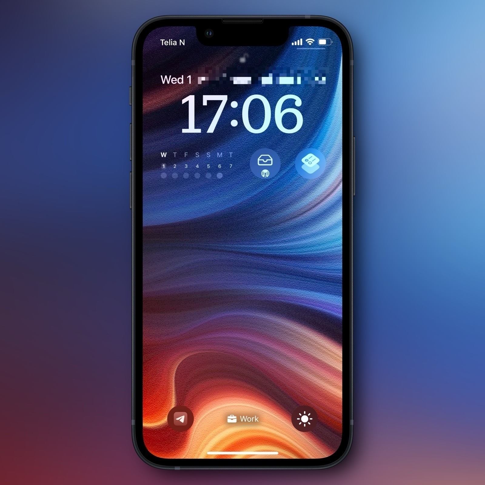
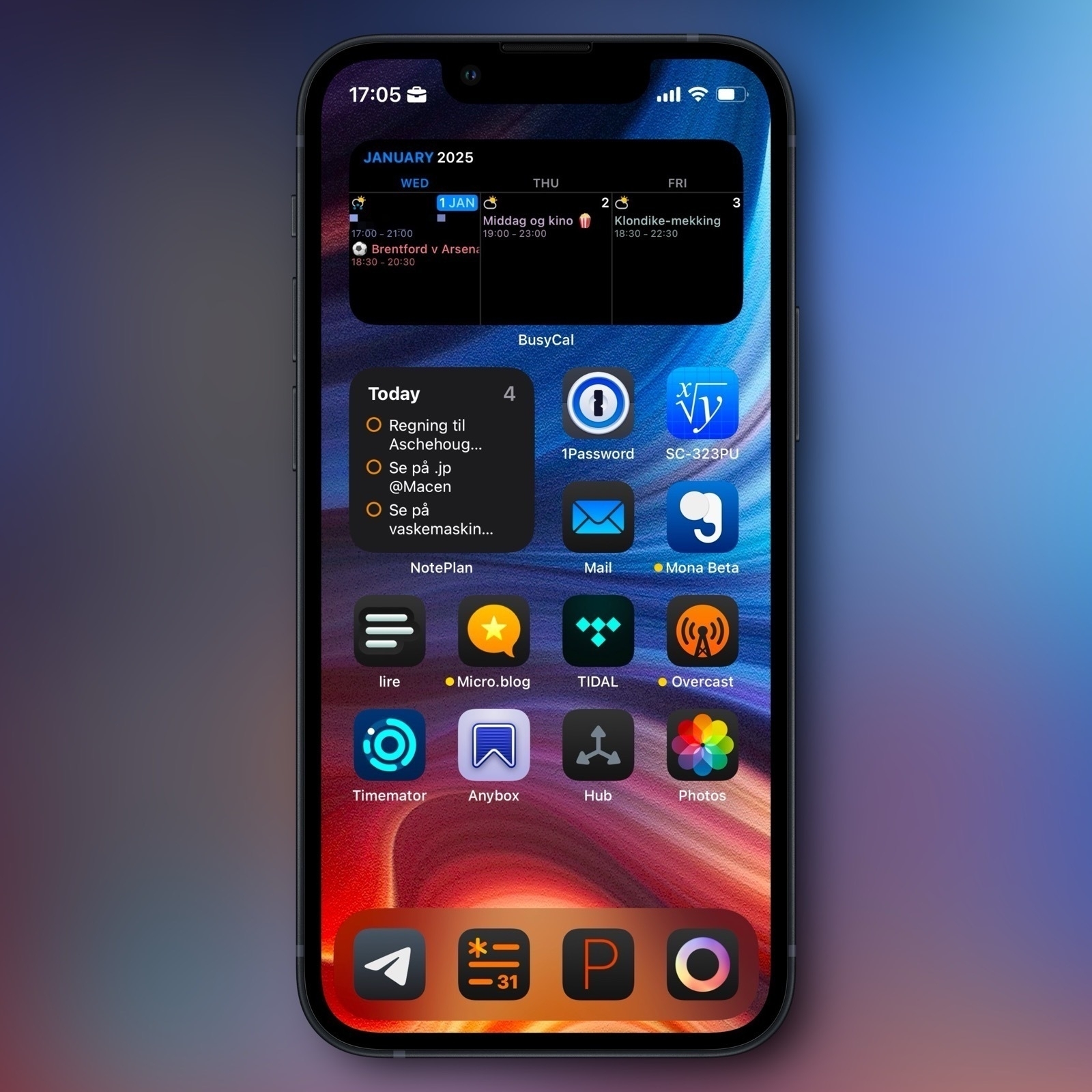
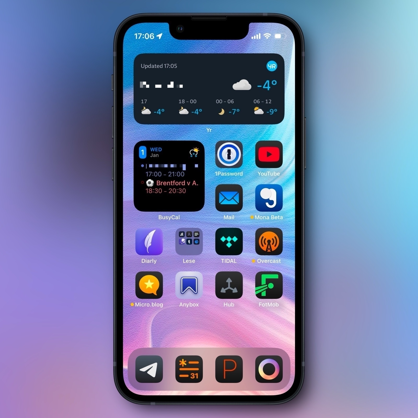
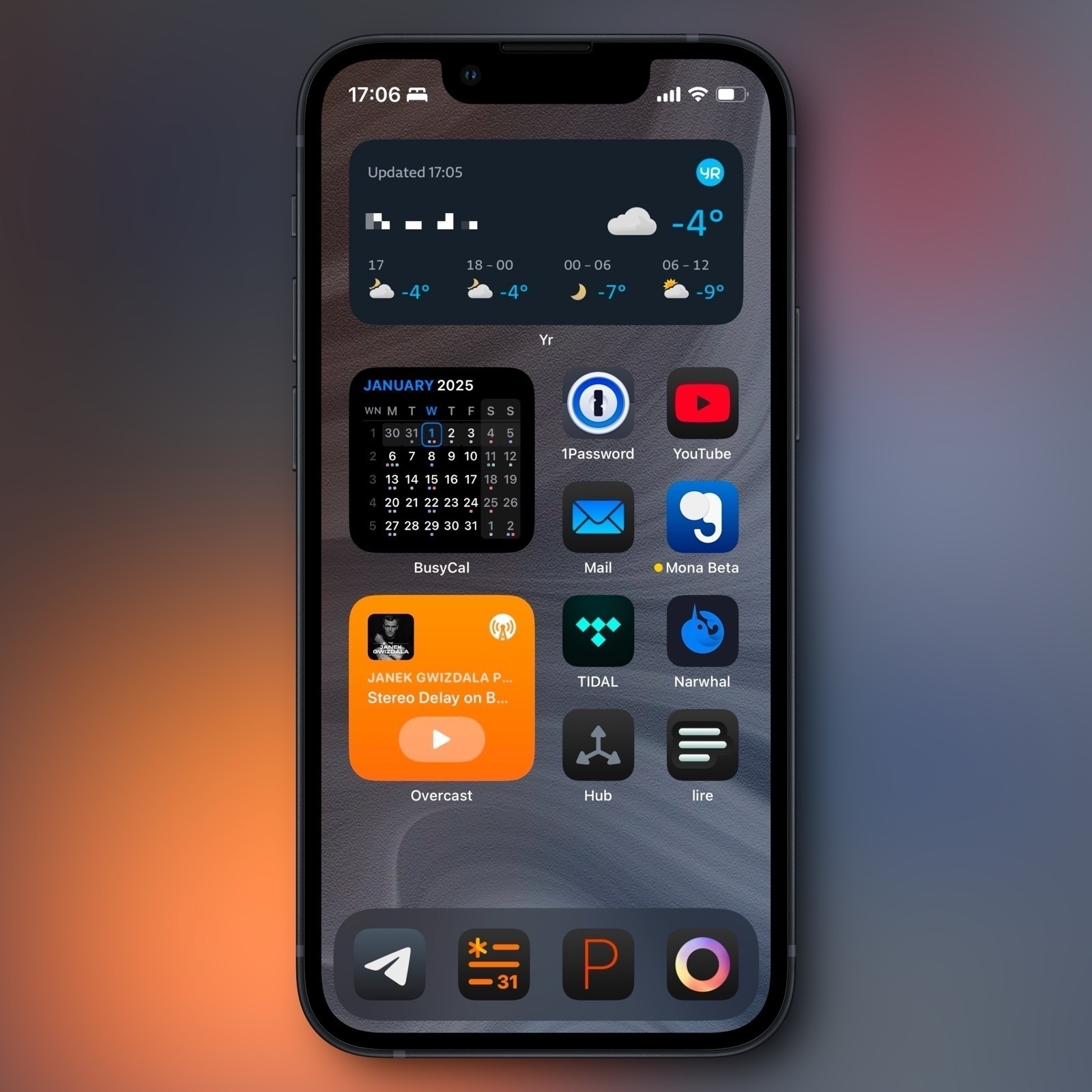
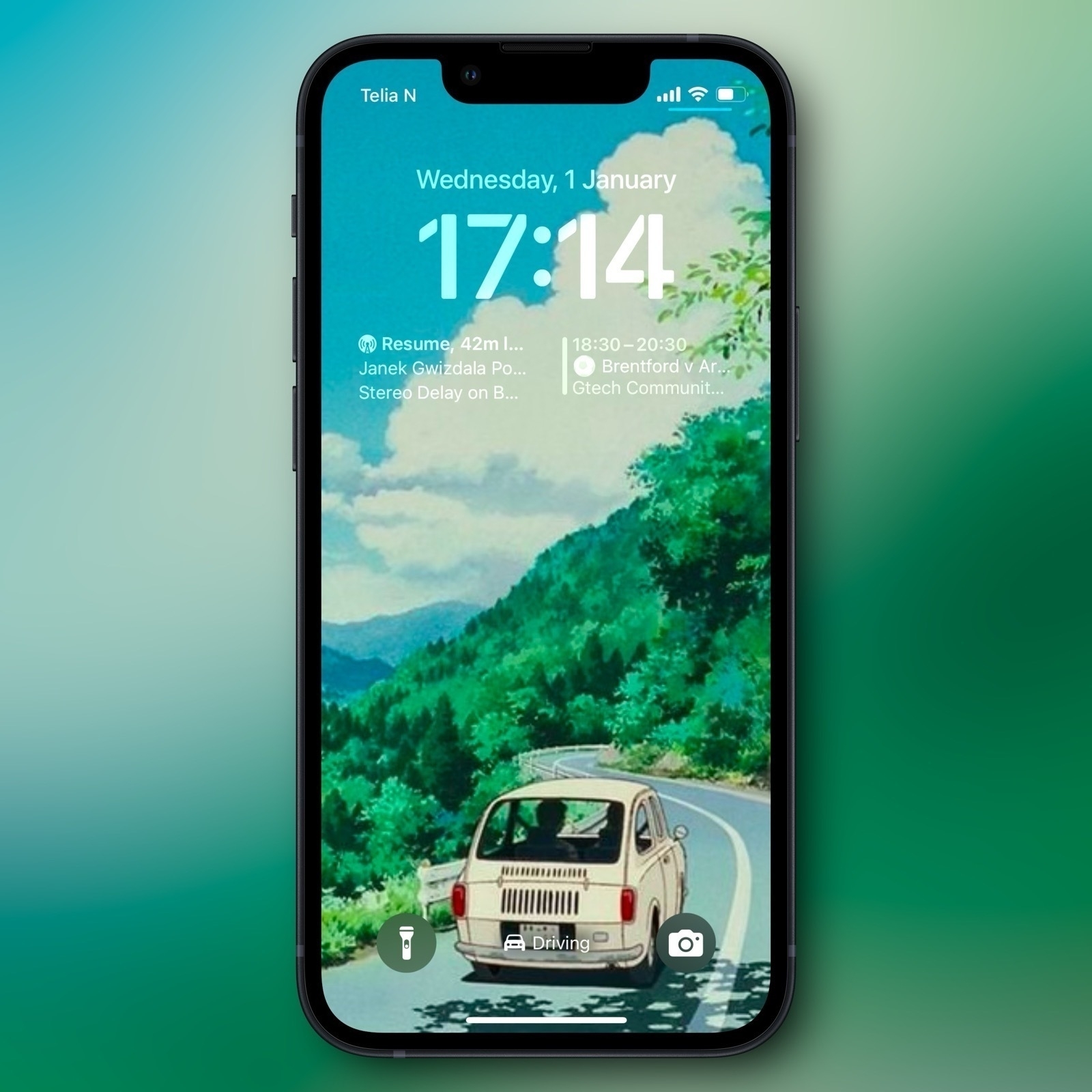
iPhone home (and lock) screens
My home screens, and backgrounds, change with my Focus modes – but I wouldn’t say I’m great at maintaining these modes. I’ll often use different variants of the same background, for instance from Wallaroo. Some of my modes have traces of this – but I’ll also mix it up, like I have now, with things like photos of my wife.
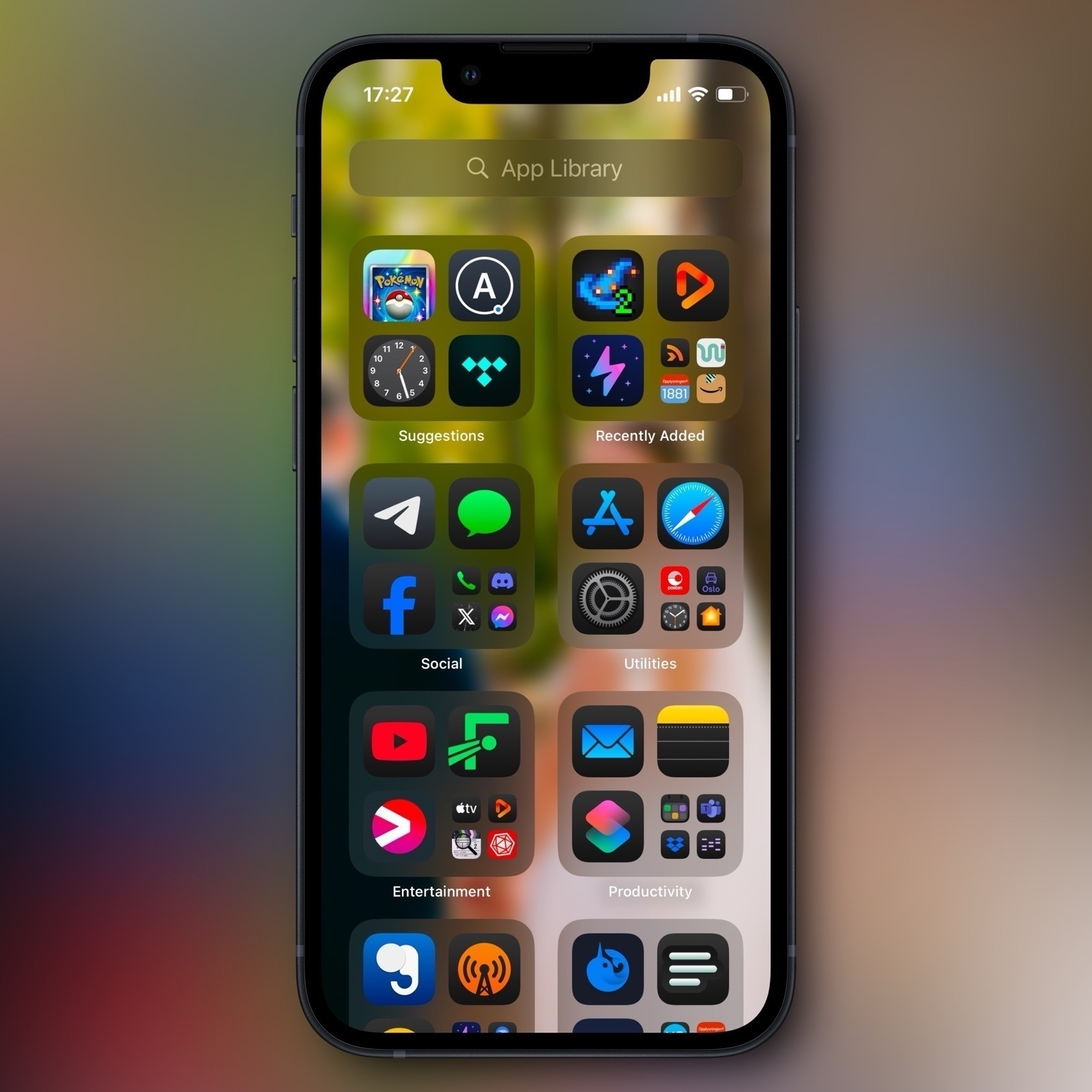
I always use just one home screen – so I always have one swipe to the Today View and the App Library.
Today View and App Library
No mode
Do Not Disturb
Work
Chill
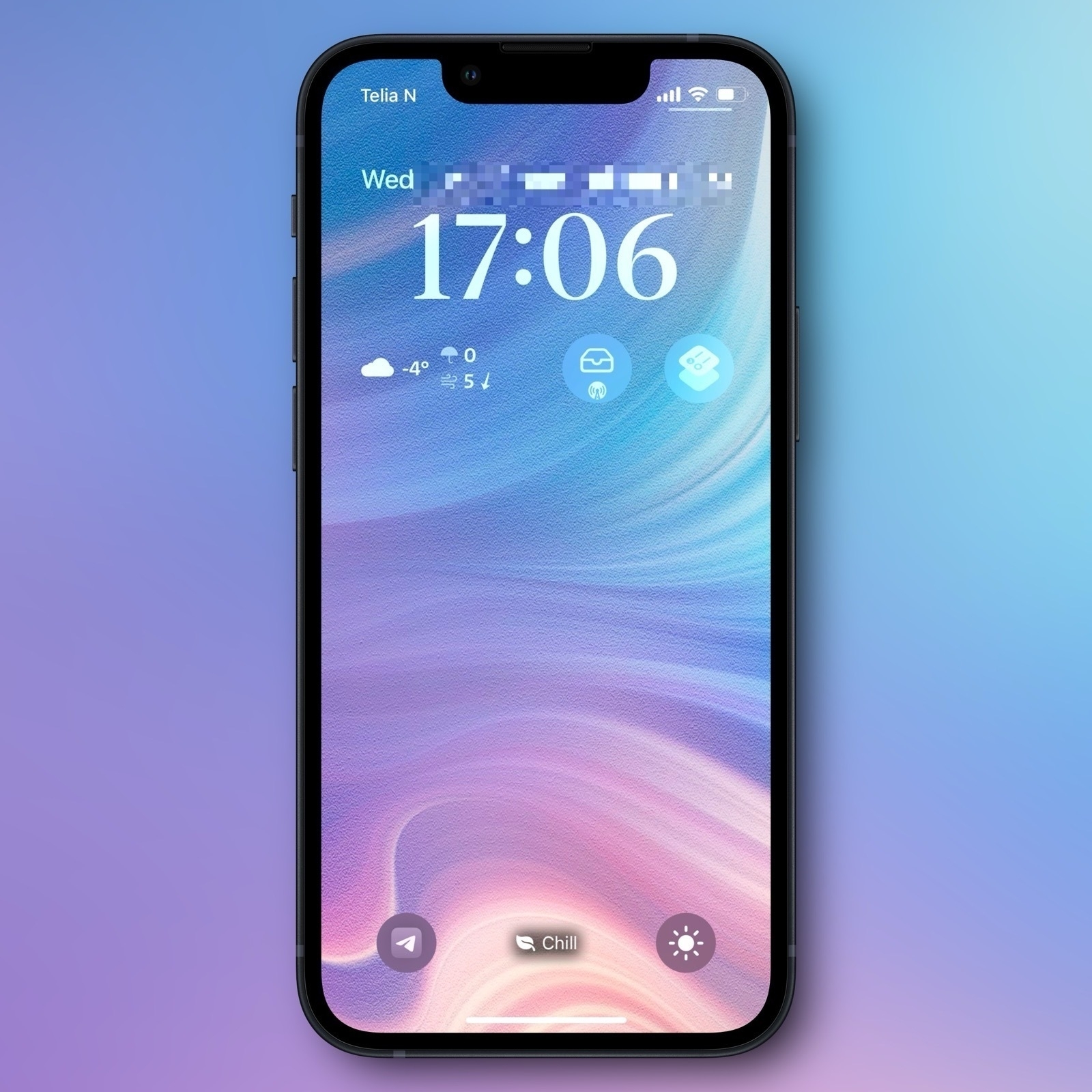
Sleep (lock screen not relevant)
Driving (home screen not relevant)
Systems and productivity
📓 Notes, tasks, and writing*
Most of this happens in a folder of Markdown files, which I access both through Paper, NotePlan, and Ulysses. At the same time, I just love using Bike (and always think in outlines), so I use that a bit as well. But it’s a big con that I can only access those files on the Mac for now…
I’ve been dabbling with Godspeed 🖇️ for tasks – and I can recommend it, even though I just don’t need a separate task manager.
I’m also using Obsidian for my band, and Notes.app for stuff I share with my wife. And I use Tot as a sticky note and when I need to keep some text floating on top on my Mac.
📖 Journaling*
I Tried to Design an Icon for Zen – My Favourite Browser
I’m one of those who really likes the Arc browser. But at the same time, I’m quite worried about Google’s web hegemony (and the general trajectory of The Browser Company) – so I want to use and like Firefox/a Gecko browser. Sadly, I just don’t think Firefox is very good…
I get that Mozilla has a lot of things going on, and that creating a browser engine is a lot of work. But I really wish they prioritised having a focused team that's allowed to just working on making Firefox nice.
However, I’ve used Zen as my main browser for the last six months – and I’m pleased with it! (By the way, click here, to go straight to the new icons.)
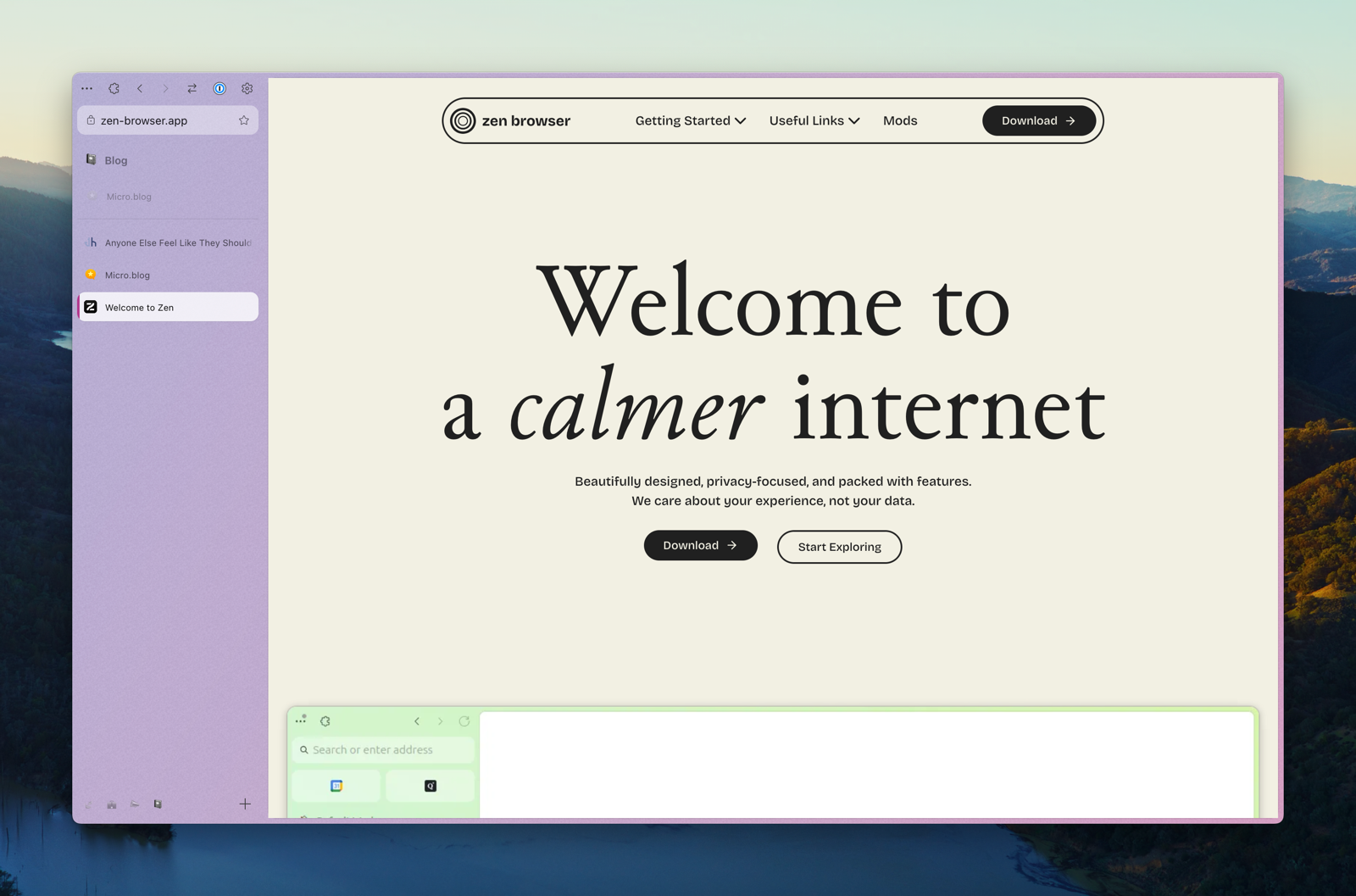
In short, it’s a Firefox fork, that has copied a lot of the things I like about Arc – like vertical tabs, split-views, workspaces, and nice padding 🤤. It also has some original ideas – and my favourite one takes advantage of the great customisability offered in Firefox:
Zen Mods
You can easily install, and adjust the settings of, community created mods. These are mostly little tweaks, like themes, having the close button on the left side (and hidden without hover), cleaner extension menu/right-click menu/navigation bar, etc.
I really like that the browser is enjoyable out-of-the-box, but that I can still customise a lot to my liking.
But be aware: It is alpha software.
This means that not everything is polished, and that things change quite frequently. But, as mentioned, I’ve used it as my primary browser for six months, and I’ve still liked it more than most browsers.
One of the things that has just changed is the graphical profile, logo, and icon.
Guess What Apple Paid to "Buy" the Firefox Extension for iCloud Keychain
Good news! As of today, there’s an official Firefox extension for Passwords.app / iCloud Keychain.
“What? There wasn’t one already?" you might say.
Fair question! Maybe it was a bit much to ask of the famously cash-strapped company to take care of those of their users who want to use the only* independent* browser. (To me, this reveals one of the reasons why I think you should rather store your passwords with a third party you trust.)
Luckily, the lonely lad (or lady) Aurélien has been maintaining an unofficial add-on for years! 🫡
“But now Apple has managed to scrape together the cash to build one themselves??"
Not quite… Apple reached out to Aurélien, through Mozilla, to ask if Apple could simply get the code of the unofficial plugin. (Source)
“Ah, so instead of starting from scratch, they instead bought a good starting-point. Smart."
Well, not quite… From the GitHub thread linked above:
✉️ Feedback on the The Verge Subscription
The excellent tech website, The Verge, just launched a subscription – which I know they’ve worked on for a while.
Generally, I think the way they’ve approached it seems pretty sensible – but I still have some feedback. And hopefully, the fact that I’ve subscribed for a year will increase the odds of it getting better, and not decrease it.
Some quotes from the launch, to get you up to speed
All the emphasises are mine – meant to guide you towards the most important parts.
Today we’re launching a Verge subscription that lets you get rid of a bunch of ads, gets you unlimited access to our top-notch reporting and analysis across the site and our killer premium newsletters, and generally lets you support independent tech journalism in a world of sponsored influencer content. It’ll cost $7 / month or $50 / year — and for a limited time, if you sign up for the annual plan, we’ll send you an absolutely stunning print edition of our CONTENT GOBLINS series, with very fun new photography and design.
At the same time, we didn’t want to simply paywall the entire site — it’s a tragedy that traditional journalism is retreating behind paywalls while nonsense spreads across platforms for free. We also think our big, popular homepage is a resource worth investing in. So we’re rethinking The Verge in a freemium model: our homepage, core news posts, Decoder interview transcripts, Quick Posts, Storystreams, and live blogs will remain free.
Our original reporting, reviews, and features will be behind a dynamic metered paywall — many of you will never hit the paywall, but if you read us a lot, we’ll ask you to pay. Subscribers will also get full access to both Command Line and Notepad, our two premium newsletters from Alex Heath and Tom Warren, which are packed full of scoops every week.
Our vision has always been to build The Verge like a software product, and we have a big roadmap of features to come, like a true dark mode toggle, the ability to personalize the homepage feed, and a lot of wacky ideas about what it might mean to follow authors, topics, and streams across the site and — eventually — decentralized social platforms like Bluesky, Mastodon, and Threads.
In general, it seems OK
I'm Getting a New Car, and I Don't Care About CarPlay
Am I insane?
Time and time again, I’m hearing people say that they wouldn’t buy a new care without Apple CarPlay/Android Auto.1 (The after-show on the latest episode of Mac Power Users was the last example.) I also hear how stupid some companies are for not including these systems in their cars. And I just don’t get it. Or, to be honest: I think I know some reasons why my opinion seems to differ from most people’s.
I live in the land of EVs
Norway has been subsidising EVs heavily for many years. And I think this statistic shows the effect well:
| Year | EV market share |
|---|---|
| 2020: | 54.3% |
| 2021: | 64.5% |
| 2022: | 79.3% |
| 2023: | 82.4% |
| 2024: | 88.2% |
To put things into perspective: The EV market share in the US is currently at 8.9%, which is well below the 13% we had all the way back in 2014 – ten years ago.2
A welcome effect of this, is that we also have a healthy used-market for EVs – so I literally can’t remember the last time I talked to someone who weren’t buying an EV.3 I’ll come back to why this is important!
My experience
The car I’ve had for the last 3 years, is a 2019 Tesla Model 3, which I bought used. My wife and I are expecting our first kid in May, and we have a large dog – so we need something larger in the next 6 months. That’s why I’ve been looking at new cars again.
I’m pleased with my Model 3! And the Model Y would probably be the best purchase for us. But I simply don’t want to buy one, due to *gestures in the general direction of Elon Musk*. Luckily, we have tons of options over here. But when I started doing my research, I found myself not caring about whether the cars had CarPlay – even though I’m heavily entrenched in the Apple ecosystem.4

The reasons I haven’t missed CarPlay
✉️ A Recommendation for the Great Note-Taking and Task Management App, NotePlan
In the latest episode of AppStories, Brendon Bigley filled in for Federico Viticci. Among other things, they discussed the apps he used, and he said he had research (and some writing) in Obsidian, while using the neat little post-it app Tot for “task management”. By task management, he meant that he kept his daily tasks in a note, and just deleted it at the end of the day.
This workflow made me want to recommend an app I like: NotePlan. And this post is a letter to him, about why I recommend that he takes a look.
Hi, Brendan! I’ve been listening to NPC on and off – but as I’m slightly more interested in the stuff AppStories focuses on, I’m glad you got the chance to bring your voice there as well. I enjoyed the episode!
When listening to your workflows and tastes in apps, I felt the need to throw a recommendation your way (which might also fit someone else who stumbles upon this letter): NotePlan. I think this app would be a nice upgrade over the way you use Tot, while, at the same time, also having the potential of replacing Obsidian. The writing experience is nicer than Obsidian’s – so it might even creep up on iA Writer! However, the writing experience isn’t absolutely top-tier, so I have to admit that I write my blog posts in a different app – while the files are in the NotePlan folder. (My favourite writing Markdown experience is Paper, which I wrote a review of here.)
Furthermore, it’s a bit expensive on its own, so if you don’t already already subscribe to Setapp 🖇️ (where the app is included), it might not be worth it, depending on which apps (if any) it manages to replace.
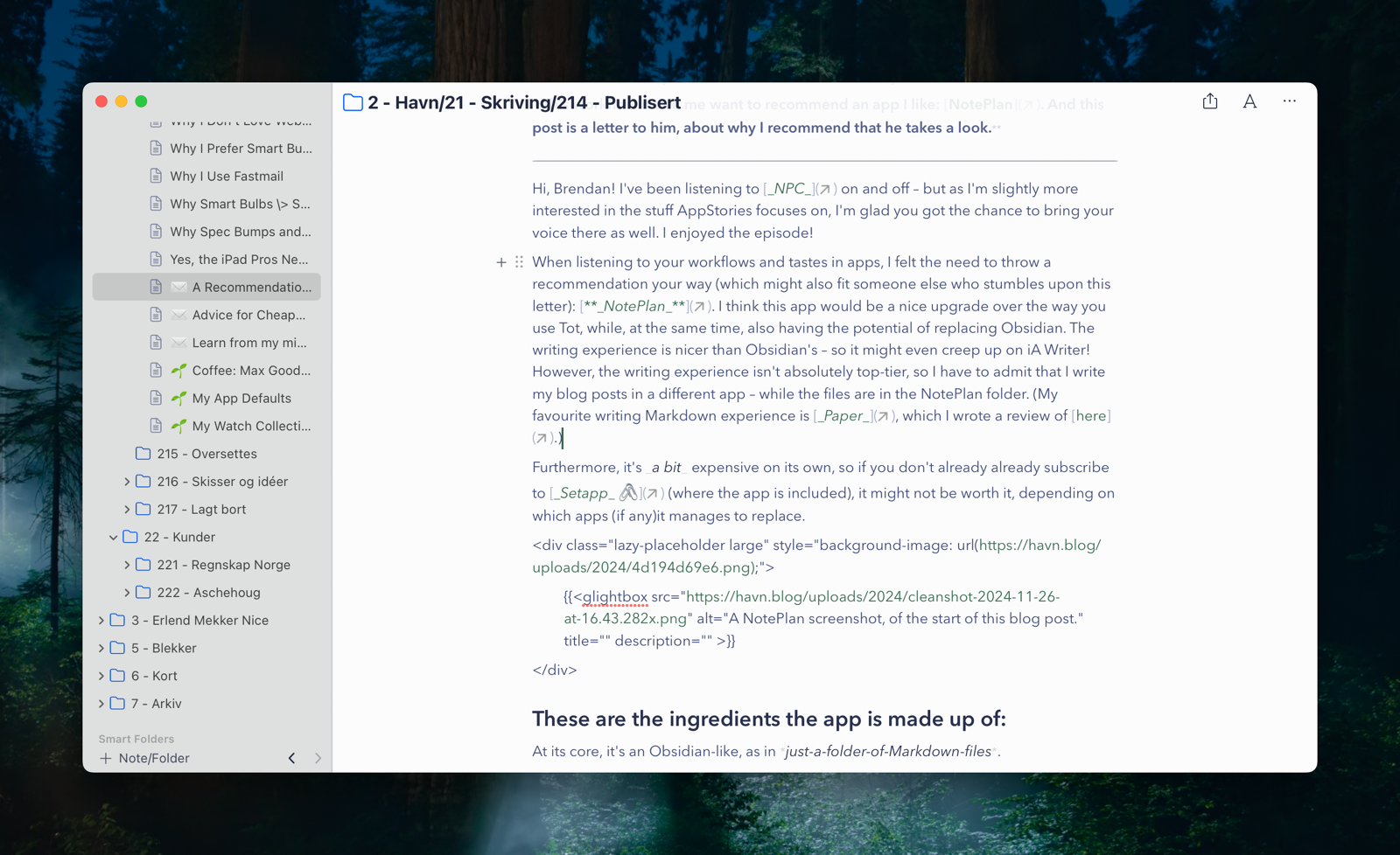
These are the ingredients the app is made up of:
At its core, it’s an Obsidian-like, as in just-a-folder-of-Markdown-files.
It does have plugin support, but it’s still far from as customisable as Obsidian.
However, if you’re mostly on Apple devices, it’s much more native-feeling than most Electron apps.1
As I heard you use Windows at work, it could be valuable that NotePlan has a web app as well – even though it’s not as good as the native experience.
It offers powerful note-taking features, like
I also like that it has a command-bar interface (with a fast search), and powerful custom themes.
But the Secret Sauce is the way it handles tasks and calendar notes! But before I go into that, I wanted to touch on …
How you can use it in conjecture with other apps, like Obsidian:
As mentioned, the NotePlan library is just a folder, that looks like this:
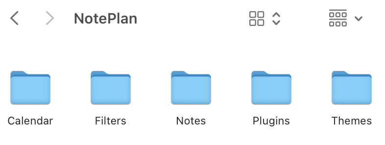
The Notes folder holds your regular notes, while the Calendar folder holds the calendar notes. If you wanted to dip your toes into the app, while using Obsidian in parallell, you could just add your Obsidian vault to the Notes folder. Then you just point Obsidian to either just folder, or the whole NotePlan folder (so you’ll get access to the Calendar folder as well). I think note links are cross-compatible between Obsidian and NotePlan.
"Julie", a New Single From My Band
I play bass in a band – and today we released a new single.
It’s called Julie, and I would love it if you gave it a whirl! 🫶🏻 It includes a modulation, an outrageous guitar solo, a fade-out, and good vibes.
Please Care About the Factory's Effect on the River
No Matter Where You Live
Let’s imagine a town, where the river is the main source of fresh water for everyone. Then, one day, someone builds a factory, near the middle of the river. A side effect of what the factory produces, is that it releases toxic waste into the river. The owners are aware of this – but they won’t do what’s needed to clean it up, as it would cut into their profits.
Blog posts about Substack
Today I read John Gruber’s blog post Regarding – and, Well, Against – Substack, which also linked to Anil Dash’s post “Don’t Call It a Substack”.
We constrain our imaginations when we subordinate our creations to names owned by fascist tycoons. Imagine the author of a book telling people to “read my Amazon”. A great director trying to promote their film by saying “click on my Max”. That’s how much they’ve pickled your brain when you refer to your own work and your own voice within the context of their walled garden. There is no such thing as “my Substack”, there is only your writing, and a forever fight against the world of pure enshittification.
Anil Dash
This is a great point – and all three of us are in agreement here!
A slight disagreement
However, while I have a slight (and perhaps unimportant) disagreement with the next quote from Dash, I strongly dislike Gruber’s comments on it.
Substack is, just as a reminder, a political project made by extremists with a goal of normalizing a radical, hateful agenda by co-opting well-intentioned creators’ work in service of cross-promoting attacks on the vulnerable. You don’t have to take my word for it; Substack’s CEO explicitly said they won’t ban someone who is explicitly spouting hate, and when confronted with the rampant white supremacist propaganda that they are profiting from on their site, they took down… four of the Nazis. Four. There are countless more now, and they want to use your email newsletter to cross-promote that content and legitimize it. Nobody can ban the hateful content site if your nice little newsletter is on there, too, and your musings for your subscribers are all the cover they need.
Anil Dash
Substack is the factory in my simple analogy at the top. And “normalizing a radical, hateful agenda” is the toxic waste in the river. My small disagreement, is that I don’t think the factory was made with the purpose of polluting the river.
Some might say that’s an unimportant distinction, and that what matters is that they don’t care that they’re doing it. And I get that! My point is that I don’t want to give people the opportunity to think, “Of course they didn’t create an entire factory just to pollute 🙄 – so let me disregard all the points about the factory’s effect on the river."1
Gruber’s post also shows another way this type of hyperbole can be unhelpful:
I think Substack sees itself as a publishing tool and platform. They’re not here to promote any particular side. It makes no more sense for them to refuse to publish someone for being too right-wing than it would for WordPress or Medium or, say, GitHub or YouTube. Substack, I think, sees itself like that.
John Gruber
Technically, I think he’s right here.2 But Dash’s (I believe, exaggerated comment) allowed the discussion to be dragged into Substack’s intent rather than effect – which is not unimportant, but way less important.3
A large disagreement
However, I really don’t like where Gruber goes next:
What I can say, personally, is that I read and pay for several publications on Substack, and for the last few weeks I’ve tried using their iOS app (more on this in a moment), and I’ve never once seen a whiff of anything even vaguely right-wing, let alone hateful. Not a whiff. If it’s there, I never see it. If I never see it, I don’t care.
John Gruber
Gruber doesn’t even try to dispute that the factory is poisoning the river. The only thing he’s saying is that, as someone who lives upstream from it, he doesn’t care whether it pollutes. His water tastes good, so why should he care?4
Alternatives to Forcing Apple to Provide Solutions to Their Competitors
On Anti-Trust, APIs, and Market Participation
This week’s episode of the Upgrade podcast, was a good one as usual. I especially liked the discussions surrounding a potential pair of Apple smart glasses, and the way this connects to the regulatory scrutiny Apple is under currently.
Jason refers to the fact that Federico Viticci loves the Meta Ray Bans, but still really wants Apple to create a pair. And he then asked what I deem to be a crucial question:1
Do we want smart glasses from Apple because of what they do better than the competition, or because of what they are allowed to do, but that they bar their competitors from doing?
Let me use earbuds as an example, as they are more common. I’m delighted with my AirPods Pro – and they’re a better fit for me, and my Apple hardware, than a pair of Sony buds (for example). But when looking at the reasons why I pick one over the other, here’s something I think it’s crucial to distinguish between: Which of them are due to things Apple does better, in fair competition (maybe I prefer the sound, or noice cancelling), and which of them are due to things Apple blocks Sony from doing (like pairing fairy dust)?
A side point: Why I think Apple's main markets require more regulatory scrutiny than something like the gaming market:
This brings me to a clip I wanted to share from the podcast, where I agree with a lot, but wanted to add something:
More solutions
What I wanted to add, was that there are more solutions than Apple being forced to make stuff for its competitors. And I think the European Commission holds this opinion as well.
Solution 1: Don’t block
Monitor Resolution Guide for macOS
Seeing as Apple just released a great monitor-less Mac, in the new M4 Mac Mini1, it makes sense that there’s more external display discussions surrounding Macs. After answering a couple of questions on Reddit here, I thought I’d try to write a guide. Because, if you don’t use a screen made by Apple, things get a bit complicated…
To make this as timeless as possible, I won’t discuss specific monitor models. Instead, I’ll do my best to foster understanding, that will help in your research.
Two uses of the term “resolution”
One way of using it, is when discussing the actual number of pixels a screen has. For instance, a regular 4K screen has 3840 ✕ 2160 pixels. This can be called the physical resolution.
However, look at this image, where I went into settings to set my 4K TV to display as 540p:
Changing the setting, luckily, doesn’t delete a bunch of pixels on my TV. So in this context, it can be useful to think of the resolution more like the size of the rendering. This can be called the logical resolution.
The relationship between the physical and logical resolutions matters
The physical and logical resolution can be the same. But for high-resolution screens, this will usually make things too small. And in this context, the resolutions 4K (3840 ✕ 2160) and _1080p_ (1920 ✕ 1080) have a special relationship: The former is exactly 2x the width and 2x the height of the latter. This is why you’ll see people mention 4K being “2x” that of 1080p. But keep in mind: it technically has 4x the number of pixels (since it’s 2x two times).
Let me try to explain why that’s important
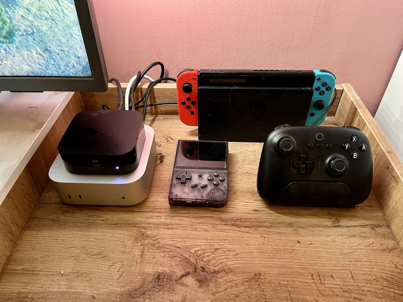
My Setup for the M4 Mini as a Secondary Mac
NAS, Media Server, and Light Gaming
I spent the weekend setting up my little new Mac – and I have to say: it went pretty smoothly! Here’s what I did, and how you can do it yourself if you like.
The hardware
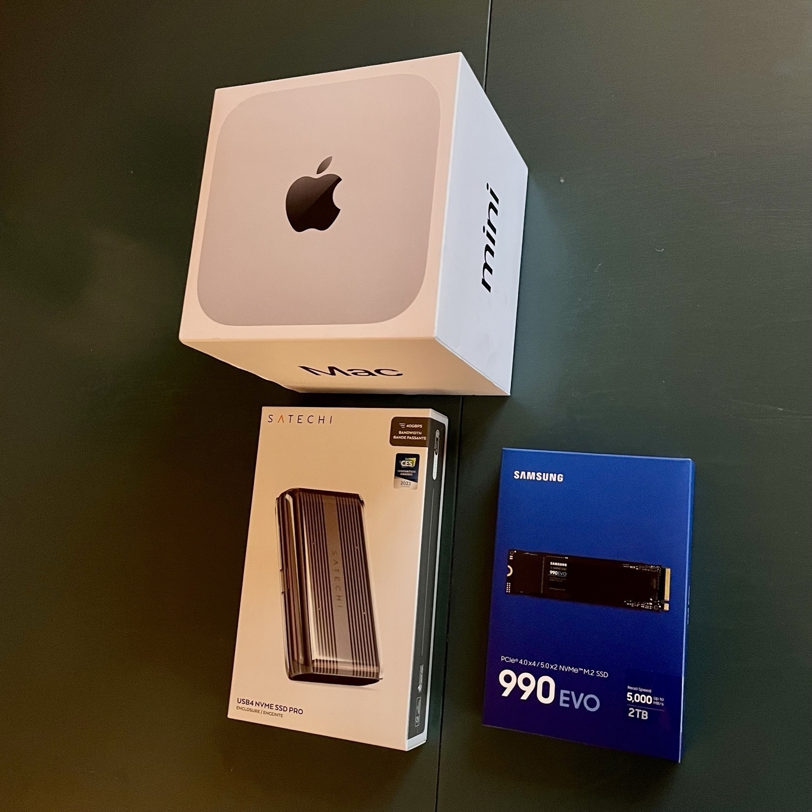
As Apple’s upgrade prices are certified insane, I went for the absolute base model. I did briefly consider getting 10 gig Ethernet – but I had to change too much about my setup to get any benefits from it. And I don’t really need that fast a connection for my use case.
16 GB of ram is enough for me, but the built-in 256 GB of storage is obviously too little. But as it’s a stationary machine, getting external storage works great.
Some drives will use regular USB speeds (for instance USB 3.2 Gen 2). These are cheaper – but if you go for USB 4 or Thunderbolt 3+ you will get about three times the speed. If you, like me, want to run programs (like games) straight from the disk, you’ll probably want the latter.
Today's Plan: Setting Up My Mac Mini NAS
I just picket up my new Mac Mini, which I intend to use as a server (backups and media) and light gaming machine, connected to my TV.
Upgrade prices are a joke – so I went for the base model + a Thunderbolt enclosure, and a Samsung 990 EVO 2 TB SSD (which speeds might be an overkill – but it was on sale). Wish me luck! (Will report back later.)
Something is off about the performance on my blog… Especially on Chromium! While part of me would enjoy saying “Works best on Firefox”, I still have to do something about it.
Well, I have been looking for an excuse to rewrite and optimise my CSS! I’ll start tomorrow. 💪🏻 (Wouldn’t mind advice!)
Early Mac Mini Takes From Someone Who’ll Probably Get One
For a while now, I’ve thought that I’ll most likely get a Mac mini when it gets refreshed. My intended use case is pretty specific — and not as my main computer:
Thoughts regarding my use case
I got to say, the update is pretty perfect for me. The new form-factor is great for my TV furniture, and I can probably get by with the absolute cheapest one. The only upgrades I’m considering, are 24 GB RAM and 10 Gigabit Ethernet. Would love input on this!
General thoughts
In general, I think this is a great update at a good price. And at last we’re finally out of the 8 GB hole! 256 GB is pretty rough, though… But it’s OK for me! So, in principle, if Apple had non-criminal upgrade pricing, I wouldn’t mind it starting that low. But they don’t.
They made the right choices regarding the ports
The new Mini has the following ports on the back:
And the following in the front:
There are two questions we need to look at:
Partially I think, in a world where the Mac Studio exists, they went for a sensible size and port number (9 — one more than the M2 Mini, and one less than the M2 Pro). It’s OK to disagree with that — but I think we have to keep that separate from the port types and placement.
I’ve seen some disappointment voiced about the jack being on the front. And while I have zero issues with someone preferring that for their specific setup, I still think it’s wrong to say that Apple made the wrong choice for the majority of people. For those with speakers connected permanently, there are _so _many options for connection. And which port on the back should’ve been moved to the front instead, then?
I also think it would’ve been a travesty if they sacrificed USB-C ports for USB-A ones. Just get over it…
The power button placement is fine
I mean, it uses very little power while in sleeping, so how often do you need to turn it off? And it’ll probably be OK to reach anyway. (Remember that the back of the Mac will be closer to you than with the last one, as the footprint is smaller.)
I’ll have to think about it some more, but I think this will be my next purchase. And I think this will be a great Mac for many people for many years.
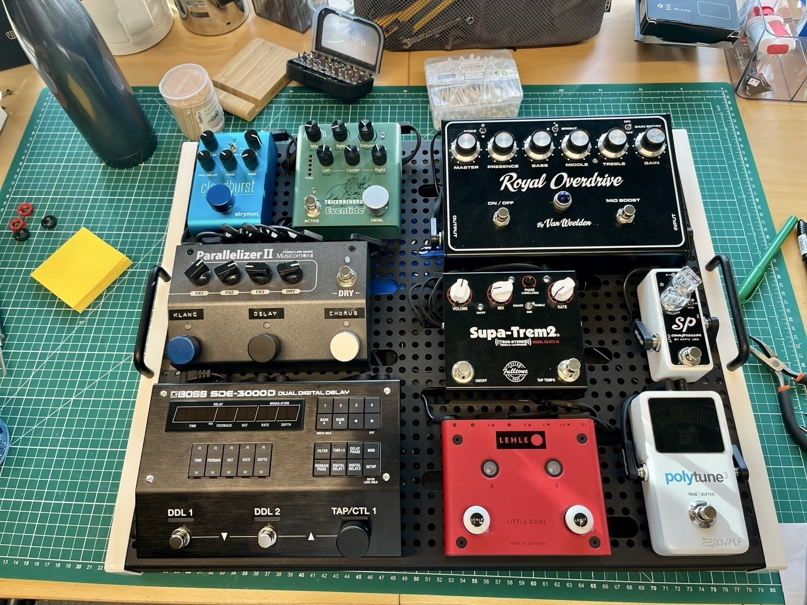
I Got the Opportunity to Build My First Wet/Dry/Wet Guitar Pedalboard
I was lucky enough to be allowed to make this cool rig this week! It’s made to work well with one amp, but great with two. And if you’re a certified mad lad, you can even run it with three amps!
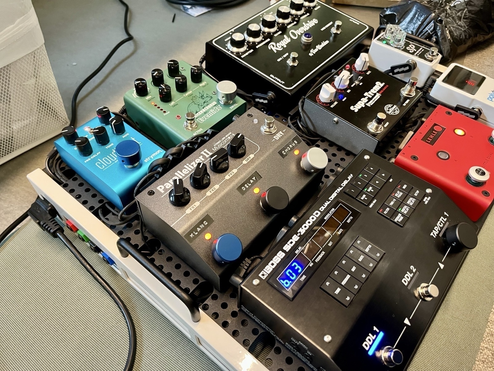
Allow me to explain:
When a signal has effects on it, it’s called “wet” – and when it doesn’t, it’s called “dry”. However, sometimes (like here), only some effects, like chorus, delay and reverb, are categorised as making the signal wet. And whether effects like overdrive and compression are on, the signal is categories as dry.
The board has four jacks in its side panel:
Rigs that have those three outputs are called wet/dry/wet rigs.
Homebrew – For Noobs (Like Me)
I do not know what I’m doing when it comes to the terminal on my Mac. But one use-case, I really like, is Homebrew. So I wanted to explain what it is, and how to use it, to other newbies!
How to install it
I get that I haven’t told you why yet, but to install it, you just copy this into your terminal: $1
/bin/bash -c "$(curl -fsSL https://raw.githubusercontent.com/Homebrew/install/HEAD/install.sh)"
Then you just follow the quick guide. (I think you only have to copy and paste one set of commands.) For Mac, you can also go here to download the latest .pkg file.
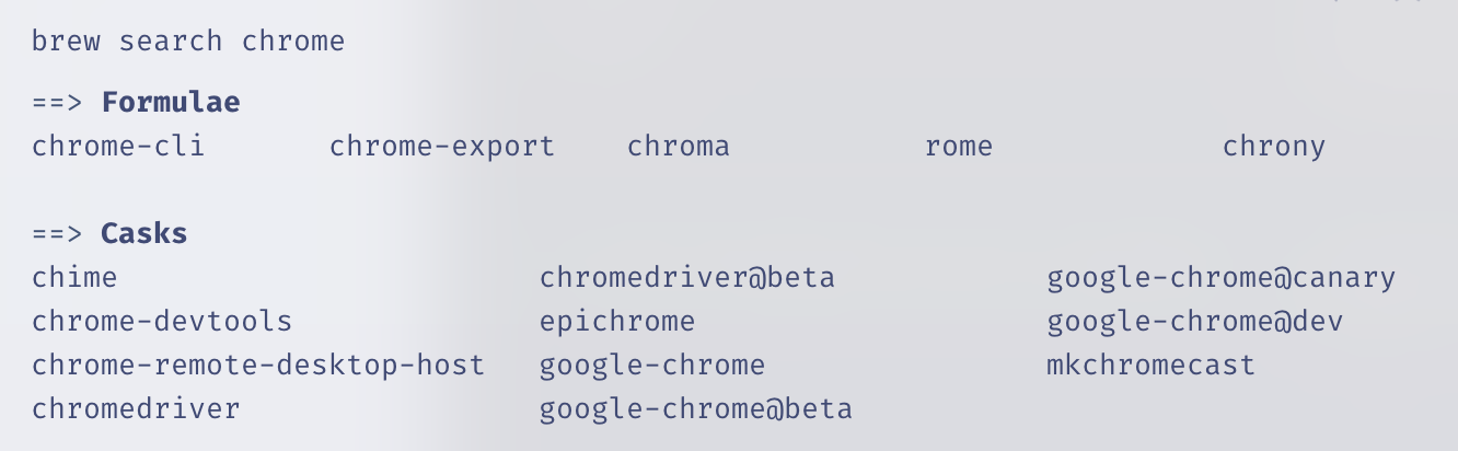
It’s a “package manager”
And this just means that you use it to install, uninstall, and update other apps. These can both be command-line software (called formulae in Homebrew parlance) or what most would recognise as regular apps (called casks).
And here’s how you use it:
Installing something is as easy as typing brew install firefox. That’s it! No going to a website, no downloading of installers, no dragging and dropping, no nothin'! And you uninstall by typing brew uninstall google-chrome. Even though you’d be surprised by how many apps support installation through Homebrew, not every app does. Furthermore, every “app name” has to be only one word – so brew search chrome will help you find out if the app you want is there, and how you should address it.
It's Not Too Late to Listen to the October Trilogy
Terrific Albums for the Autumn
For any Norwegians reading this, this recommendation will be categorised as very cliché. But clichés are just that for a reason – and if you haven’t listened to these albums, you’re in for a treat.

The albums I’m referring to, are the following, by the Norwegian artist Thomas Dybdahl:
They were all released in October, and are the perfect companions to wool jumpers, a fireplace, and warm soup. But I get that listening to three albums is a big ask. So as a taste, you can listen to his shortest song, which is also one of my favourites: Dice
A Shortcut for Automatic Mac Dock Changes
For When You Switch Between Screen Sizes
I switch a lot between using my MacBook as a laptop, and in clamshell mode in my office. And in general, I keep every setting the same between the setups. However, I have different dock preferences:
The great Rafael Conde has made a solution, with his app HiDock. But sadly, in my experience, it’s simply not stable enough (probably due to some esoteric macOS restrictions) – so I’ve made a crude shortcut to replace it. But before the guide to try it out for yourself, a little thing I recommend you paste into your terminal:
defaults write com.apple.dock autohide-delay -float 0;
defaults write com.apple.dock autohide-time-modifier -int 1 ;
killall Dock
First, create shortcuts for setting the different preferences
Waste Your Money on Things That Last
A Defence of Buying Things
A couple of years ago, I was working full time as a teacher. And even though the pay in that profession is far too low, I was still quite comfortable (economically). However, the last few years, I’ve had way less spending power. I wanted to take a master’s degree, which (sadly, and luckily) led to my mind sort of rupturing, and me getting diagnosed with ADHD.1 Now I’m learning how I really work, while trying to get a freelance lifestyle up and running. I’m lucky in that I know that I can get a teacher job if I like (and need) to.2 And even luckier: I’m in a position where I can survive on less income for a while. So, we’ll see what the future holds – but nonetheless: Currently, I don’t have a lot of money to waste.
Some notes on privilege:
I live in a wealthy country, with plenty of social security, and come from a middle-class background. And the reason I talk about 'not having money to waste' instead of 'being poor' (even though I don't have a lot of income), is that I still have everything I need (and more). After all, this post is about being in the position of having money to waste! So I do know that I'm very privileged. However, I hope the principles I'm trying to get across can be relevant for several levels of affluence.
I’m not saying it’s wrong to spend your money on things like holidays and experiences. And you can absolutely argue that these things last in their own way! But I just wanted to give a little shout-out to something I feel like gets recommended less than those.