English
- I purchased a (cheaper and slower) Satechi USB-C enclosure 🖇️, and a 4 TB SSD 🖇️.
- Then I moved the old 2 TB SSD over to the slower USB-C enclosure,
- and slipped the new 4 TB drive into the faster Thunderbolt enclosure.
- I wanted a Mac layout, while most keyboards are made for Windows,
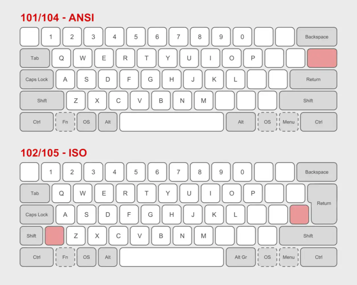
- I needed the ISO layout, while most keyboards has the ANSI layout,
- and the Norwegian layout is a subsection of ISO.
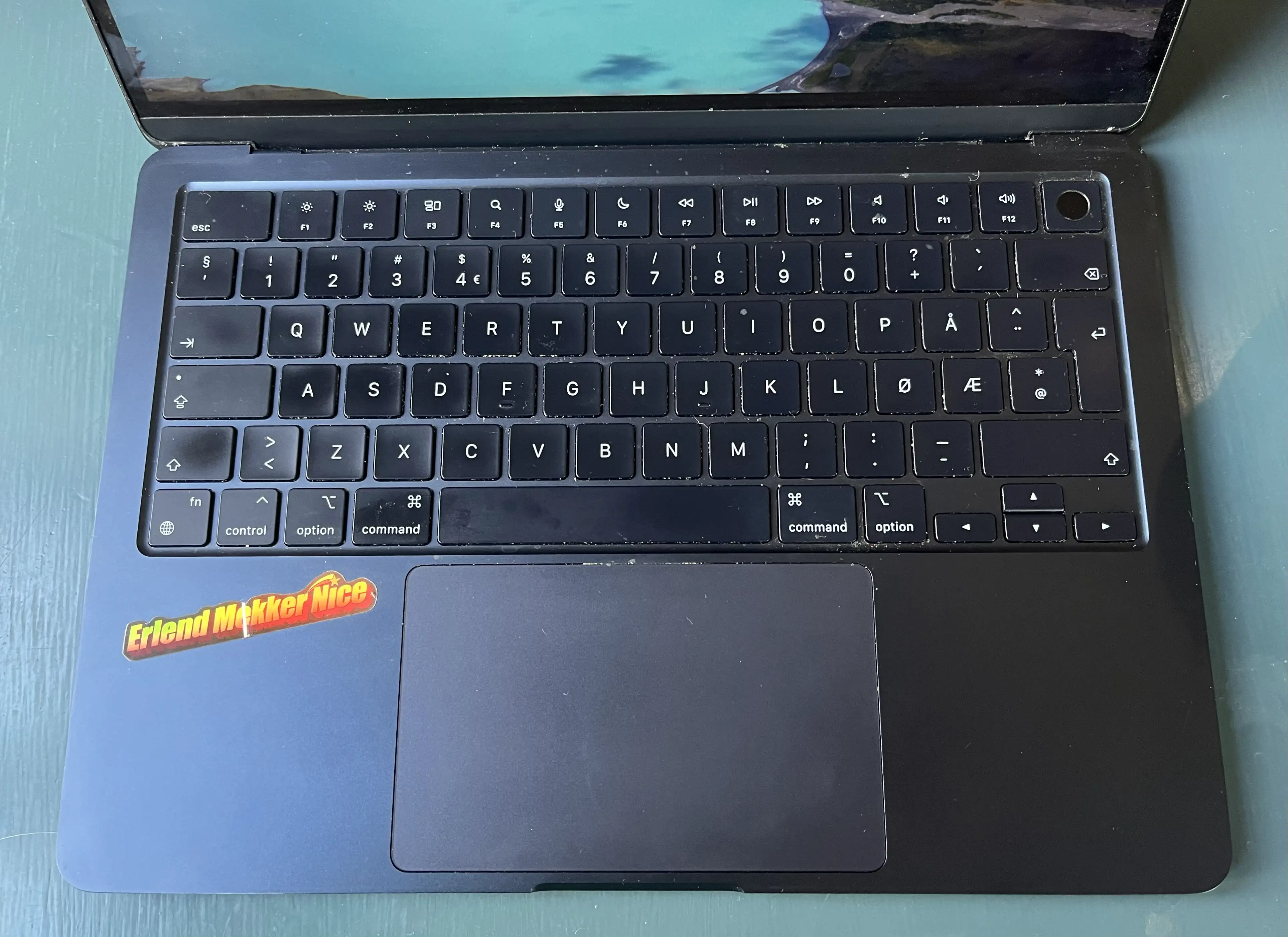
- Have all features (except Touch ID) that she uses on her MacBook Air. This includes:
- All letter, number and symbol buttons,
- arrow keys,
- escape,
- and brightness and sound/music controls.
- Be simple enough that she could just sit down and use it without any prior knowledge.
- I also want to try to not have a function row. So closer to a 65% than a 75%.
- It’s better for them if you stay in their app.
- The reason is that they can advertise new stuff (you’re not watching yet), to make sure you stay with the service. This is also why Continue Watching isn’t always at the top.
- If you’ve finished watching a show (perhaps through Apple TV (app)), you’ll might go on to something from another service next. And then you’ll might cancel your subscription after a while.
- They don’t have to.
- Even though they’re not as dominant as they used to, Netflix is really popular. So they feel like they can get away with not participating.
- One “full-sized” WebP version,1
- and a lazy placeholder PNG version (that has only 24 pixels as its max height/width).
- A best-in-class text engine, that can jump between Markdown (plain-text) and Preview (rich text) Modes.
- This is also already great on both Mac, iOS, and iPadOS. (No Apple Watch, though.)
- The UI is made to be minimalistic, mimicking just a piece of paper.
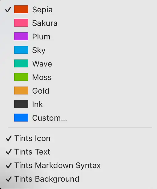
- Paper ships with several beautiful accent colours, and great support for them in the UI.
- It also provides good export features. (Including for copy/paste.)
Locked-In-O-Meter: iPhone Edition
I use several Apple devices. This is partly because I like them, and partly because I think they’re more worthy of my support than (for instance) Microsoft and Google.
However, Apple is doing their best to invalidate that second point. I’d also love to be able to support cool companies, like Framework and Fairphone.
So, I want to examine: How locked-in would I rate myself? Starting with the iPhone.
And I’m not just talking about being locked-in for nefarious reasons. I’m also talking about things I simply prefer about having an iPhone.
Hardware
I do like my current iPhone 13 Mini – and also my wife’s iPhone 15 Pro. However, from a hardware perspective, I would have zero issues moving to something else instead.
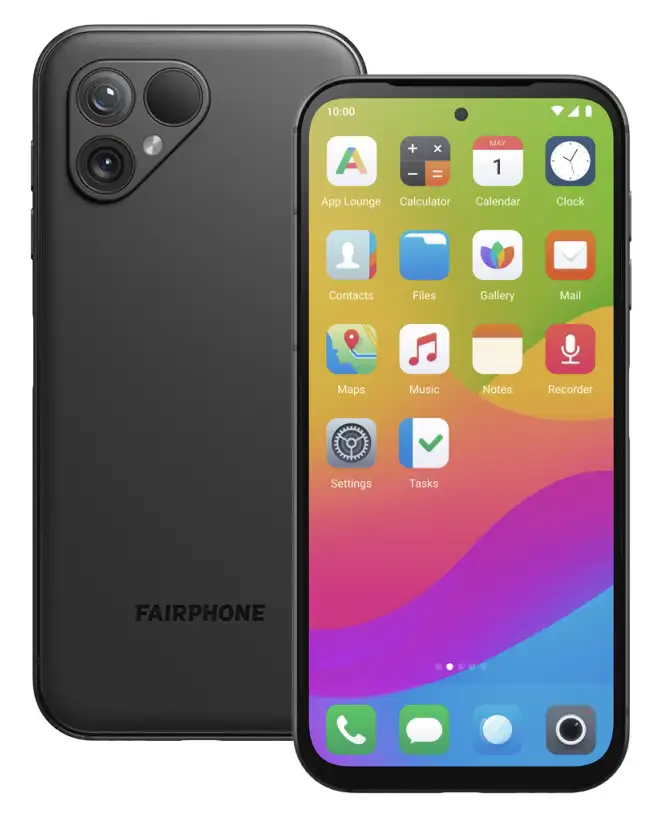
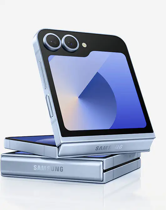
I’d either buy a Fairphone (the 5 has been out for a while, so interested in seeing what they do with the 6th version), or maybe a flip phone of some kind 🖇️. I think that’s the logical next step for a Mini Phone Person like myself.
Especially as long as my wife has access to a good camera, I’m not very picky about my phone hardware.
Accessories
Quick Recommendation #9: Niléane
Just a Really Cool Woman
In this instalment of Quick Remmondations, I’m going to recommend a person in general!
While listening to the last few episodes of one of my favourite tech podcasts, Comfort Zone, a thought has been growing in me: “I think Niléane might be one of my favourite people online!” (I do like both Matt and Chris as well, to be clear. 🫶🏻)
She’s French-Réunionnese – and in addition to the podcast, she, among other things, writes for MacStories, creates a great theme for Mastodon called TangerineUI, and is the president of Toutes des Femmes.
Recently, she wrote a great post, called Are Pride Wallpapers and a Watch Band Enough in 2025?, and that pushed me over the edge to write this recommendation. (I also really liked this follow-up post by Matt. 👌🏻)
Why I think she’s a treasure for the community:
Raycast for iOS Is Out
A Companion to My Favourite Mac Launcher
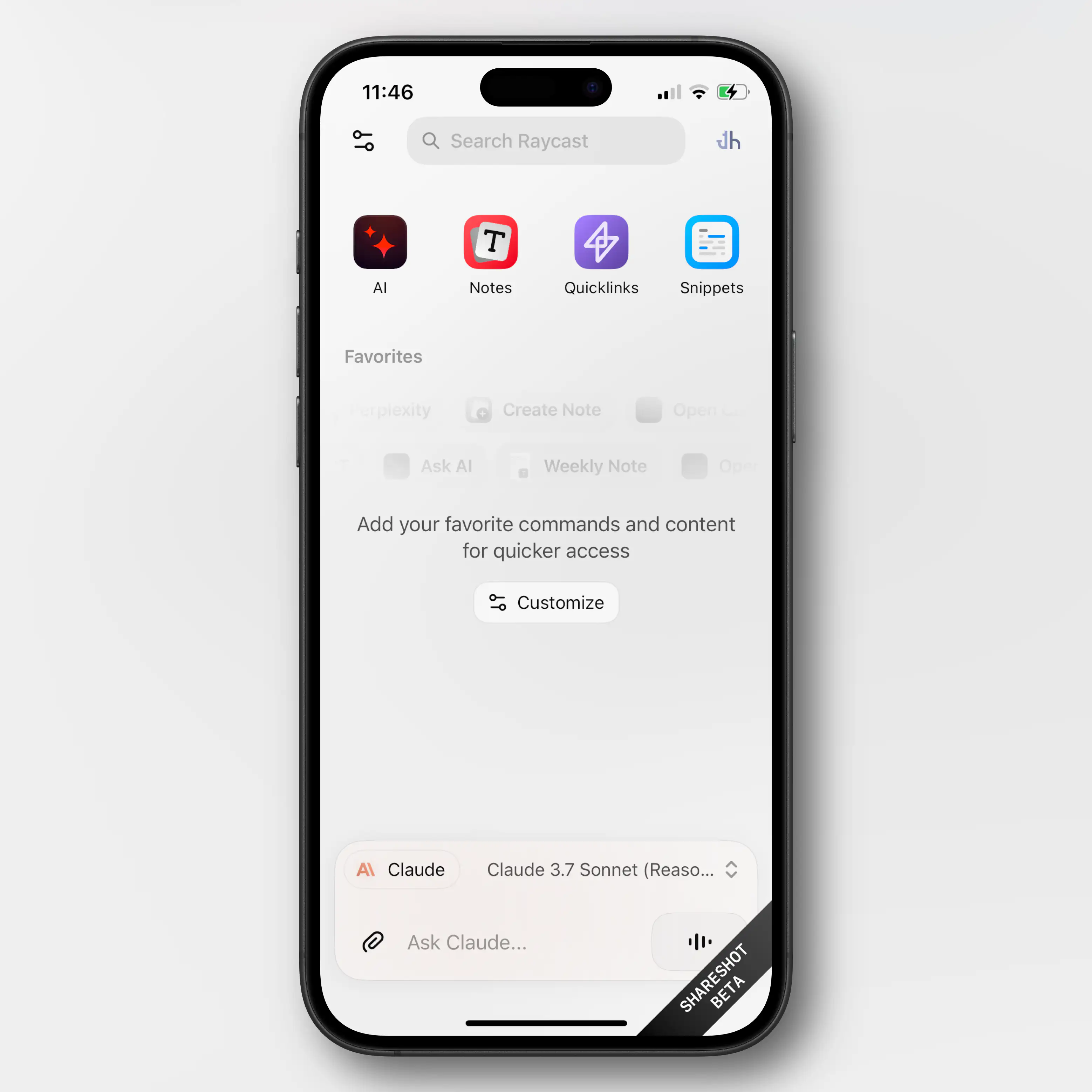
Raycast 🖇️ is one of my favourite parts about using a Mac. It’s a great launcher, that I also use for snippets, window management, searching, setting a bunch of hotkeys (like for shortcuts), and more. It’s also my main window to AI tools, and the only AI subscription I have.
I’m working on a full post on how I use Raycast – but now I just wanted to share that the iOS version is out.
Obviously, very limited (thanks Apple)
Most of what Raycast does on the Mac is, obviously, not even close to allowed on iOS. So this new app is mostly just a companion for the Mac app.
Raycast did a large overhaul of their notes feature in november – and if you’re a user of this (which I’m not) having access to them on mobile is nice.
You also get access to your snippets and “quick links” (which I don’t use either).
But the thing I’ll use the iOS app for, is access to my AI chats. Not only does it sync the conversations from the Mac, I’ll also be able to use all the premium models I’m paying for. This greatly increases the value of my Raycast subscription.
As I don’t pay directly to any AI vendor, I’ve been using only free options on mobile. I don’t use AI chat that much, and even less on mobile, so I’ve been content enough with Mistral’s Le Chat.1 But having access to all of Raycast is a large upgrade here.
An (Imperfect) Solution for USB-C Devices Without PD
You Know, Those Who Need USB-A on the Other End
I just listened to the latest episode of the Upgrade podcast. It was Myke Hurley’s first episode after his parental leave – and as someone who got my first child less than a week ago, the episode obviously resonated with me.
I intend to write a bit about some baby tech – but here I just wanted to throw out a quick recommendation for an annoyance Myke brought up.
(Click here to jump straight to the solution!)
USB-C is great – but also a lie
The good thing about “everything” being USB-C, is that every cable fits into every socket. However, the problem is that you suddenly don’t always know if things will work. For instance, what’s the maximum amount of charging a cable can give? And when do you need a Thunderbolt cable? And how can you tell what a cable is?
In the Upgrade episode, Myke mentioned another issue: If the USB-C device doesn’t include everything that’s needed for USB-C Power Delivery, the USB-C cable might need to be USB-A on the other end.
For instance, this is the case with the, otherwise great, Anbernic RG35XX_ 🖇️ retro hand-held. If I connect it to my 140W charger, with a powerful USB-C to USB-C cable, it gets “scared” (because it doesn’t have the smarts to ask for less power), and doesn’t want to charge. However, if it senses a USB-A on the other end, it knows that it can’t draw too much power, so it “dares” to charge.1
This is nothing but poor design from the device maker, as giving it the necessary smarts is both cheap and easy – but it’s still something one encounters from time to time.
The most obvious solution …
… is to simply buy a USB-A charger that you then use for those specific devices. And this is what Myke said he had done, for the multiple baby tech devices needing special treatment. But then you need to both have a custom cable for these devices and a custom charger. (By “charger” I mean the actual charging brick, not including the cable.)
There’s a (slightly) better way!
Making My Phone More Boring
Not More Dumb
There are numerous reviews of the new Light Phone III going around – and this has invigorated discussions about having a dumber phone. There are also Android e-ink devices going around, with 🖇️ or without 🖇️ a SIM slot, which are cool. A friend of mine is considering how far he can get with the combination of an Apple Watch with a SIM and a Boox Palma. 👌🏻
I’m 100% in the category of too dependent on my phone. However, I don’t think having a dumber phone is the solution for me. I want one that’s more boring.
The problem with out phones isn’t that they’re too useful. It’s that they’re “too fun”. And by that I mean “too fun” like how junk food is “too good” for our own good.
Because, things like being able to buy transit tickets, pre-heat my car, and control my lights are not issues for me. And neither is easy access to a camera, calculator, music, weather forecasts, etc.
I do have some issues with my phone, though…
I have ADHD – and also a history (and not only a history) of anxiety and depression. So I really struggle with being uncomfortable with my mind wandering and being left to its own devices. This has led to me “needing” to fill every void with … something.
I want to try to work on this – especially as we’re expecting a baby next month.
Before mentioning what I have done to my phone: One thing I’m choosing not to tackle at the moment, is my over-usage of podcasts. Not listening to anything makes me uneasy. And often music isn’t even enough, and I require something like a podcast. That’s because the latter demands more of my mind. To put it a bit exaggerated: I want to listen to a podcast while going out with the rubbish. I intend to think more about this – but at the moment, I haven’t deleted Overcast or anything.
I do want to try to have it be more quiet around me, though – or at least “only” have music. (However, I know that will make things less quiet on the inside…) So, I’ve deleted the YouTube app from my phone. I don’t want to never use my phone for video, though – but maybe more intentional TV shows, etc. instead.
I also have an issue where I want to fill every little sliver of free time (like waiting a minute for something to load) with reading something quick – often in Mona (Mastodon) or Narwhal (Reddit). So, I’ve deleted all social media apps like this. I’ve kept Lire, my RSS reader, for now. I’ve also loaded up my phone with some ebooks.
I Had to Expand the External Storage on My Secondary Mac Mini
I first wrote about this Mac and its setup here — and then I have an update here. However, quite quickly, I learned that the 2 TB of storage I had purchased wasn’t enough.
The main culprit is Time Machine — and while I could probably do something to minimise the usage, backing up my wife’s MacBook Air (512 GB) and my MacBook Pro (512 GB) currently takes up about 1.1 TB.
I was considering upgrading the internal storage on the Mac, as more and more options for this gets released. However, none of my use-cases for storage benefits from being internal — so I did something else.
New hardware
So, I previously only had a 2 TB SSD 🖇️ in a Satechi Thunderbolt enclosure 🖇️. And here’s what I did:
✉️ How, and Why, I Use Micro.blog
A friend of mine, Simen (who has a nice, Norwegian blog), asked me about Micro.blog. That’s where this blog is hosted, and is also a social medium of sorts.
His questions
First, I want to give quick answers to the questions he had – and then go into more detail on how I’ve set things up.
1) “Which tier do you use, and why?"
Micro.blog has several tiers:
When I signed up, they only had the $5/month and $10/month plans. And I don’t quite remember what made me require the Premium plan – but things has been restructured now, so I could probably make do with one plan lower. If my friend wants to move to Micro.blog, we could go for a Family plan. 🫶🏻
I don’t find any value in things like notes and bookmarking, as I’d much rather use dedicated tools for this. I also don’t really use the newsletter feature – so I can’t really comment on that.
2) “Which features do you appreciate the most?"
I like the cross-posting features and robust ActivityPub support. For instance, the comment feature here is neat:
I also like that there are great option for third-party apps for publishing, like Ulysses, Drafts, and MarsEdit.
And I find that the platform has a good balance between being easy enough to use, while also being powerful and flexible enough to form into what I need. An example of the contrary was how I couldn’t find a way to have WordPress have a front-page with the start of my blog posts like I have now. (I’ll go into how I’m doing that later.)
3) “How is it different from the alternatives?"
Before I tried WordPress, my blog was on Write.as. However, that was too simple, and not expandable enough. With Micro.blog I can freely add features via Javascript, for instance. (Examples below.) And it also has a plug-in system (even though it’s far from as powerful as WordPress in that regard).
I know that Simen uses Quartz, which I also use for my band’s website. This is a nice static site generator where you, for instance, can simply “push” an Obsidian vault. However, this doesn’t have integrated newsletter support, doesn’t support ActivityPub, and doesn’t have cross-posting (among other things).
4) What’s missing? Or is too clunky?
One thing Quartz is better suited for, though, is digital gardens. Micro.blog is absolutely built around traditional, chronological blogging.
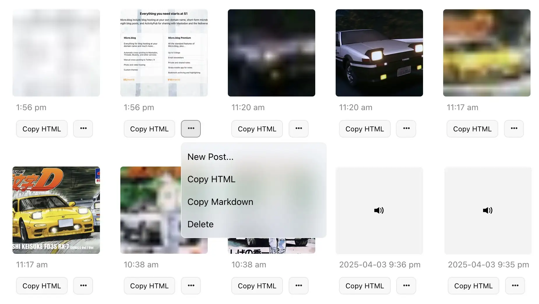
I also find uploads to be very clunky, when I don’t do it through Shortcuts. I can only upload one file at the time – and there’s no way, even in the … menu, to copy just the URL to the file. (I have to carve it out from the HTML or Markdown.) 👇🏻
The ActivityPub posts that Micro.blog push, for the long-form posts, are also very lacklustre, IMO. Just the title, and link to the post:
And I don’t like the social media part of the service – which I’ll get into next.
However, I’m generally delighted with the place I’ve gotten this blog!
My use, and how I got there
Quick Recommendation #8: Initial D
Drifting Anime, That Drips With Style
I’m not the biggest car-guy, even though I do enjoy a bit of car-YouTube from time to time.1 But I just love the anime Initial D.
The cars they drive remind me of my first real racing game: Gran Turismo on the first Playstation. And it has cemented owning a car with pop-up headlights on my bucket list.
The show has lots of intense racing scenes, backed up by an insane eurobeat soundtrack. Trust me – it works.
Here’s the basic setting:
Takumi Fujiwara is a teenager that works part-time for his father’s Tofu shop – making deliveries in the early morning. His father, Bunta, is an old street racer, and while Takumi hasn’t inherited his interest, he has inherited his talent. And being a lazy teenager, who wants to get done quickly with his work, he simply started driving faster and faster.
He drives an old, but well-tuned, Toyota Corolla – and him getting laughed at for driving a car like that, with the name of the tofu shop on the side, is part of the charm.
How to watch
Milestone Achieved: Linked to on a Podcast I Like
And a Guide to Pronunciation of My Name
One of my favourite tech podcasts, is Comfort Zone. It’s hosted by Christopher Lawley, Niléane Dorffer, and Matt Birchler, and is simply a pretty chill time with neat people.
Last week they asked for listener input, so I sent them a relevant blog post – and I got a little shoutout. ☺️
I’m thoroughly in the writing into the void phase of blogging. So every share, mention, and email really means a lot.1
My name(s)
Matt made a valiant effort to pronounce my weird Norwegian name – but obviously failed spectacularly. So I thought I’d use this occasion to provide a little guide!
My name is Erlend. The d is always silent – but for some Norwegian dialects, the r is silent as well. And for English speakers, this is my recommendation.
Then you pronounce it like the name “Allen”, but slower: Alen
However, if you have r’s like me, or the French, you can pronounce it like this: Erlend
Oh, and then there’s my blog. The name Havn is Norwegian for harbour. The a is like the a in “car”: Havn
Go and give the podcast a listen! The banter is good, and they have interesting challenges every week.
Furthermore: Share and/or email a small blogger this week. 🫶🏻 It’s lovely when the void answers – and many of us don’t get any help from algorithms.
Why I Don't Use LLMs for Facts
A Simple Story About iPhones and Perplexity
A couple of mates and I have a little (private) Telegram group called The Nerd Garden (in Norwegian). And, among other things, we talk about technical equipment there. Recently, a friend asked for advice on buying a used iPhone. He said he was considering the 15 Pro vs. regular 16, and shared a link to Perplexity.1
Part of the answer he got there, was this table:
| Feature | iPhone 15 Pro | iPhone 16 |
|---|---|---|
| Build material | Titanium frame, matte glass back | Aluminium frame, glossy glass back |
| Display | 6.1-inch OLED, ProMotion (120Hz) | 6.1-inch OLED, standard 60Hz refresh rate |
| Processor | A17 Pro chip | A18 |
| Camera System | Triple-camera system with telephoto (3x zoom) | Dual-camera system (no telephoto lens) |
| Main Camera | 48 MP quad-pixel sensor | 48 MP quad-pixel sensor |
| Zoom Capabilities | Up to 3x optical zoom + digital zoom | Up to 2x lossless zoom (cropped from main sensor) |
| Video Recording | ProRes video support | Standard video |
| Action Button | Customisable Action Button | Standard mute |
| Battery Life | ~23 hours video playback | ~22 hours video |
| Price | Higher price due to Pro features | More affordable |
If you don’t know all the facts in this situation, nothing jumps out as being off here. However, not only does the iPhone 16 have an Action Button – it also has Camera Control. And I think it has slightly better battery life than the 15 Pro.
Design Challenge: 65% ISO Mac Keyboard, Usable by Everyone
I Want Your Opinion!
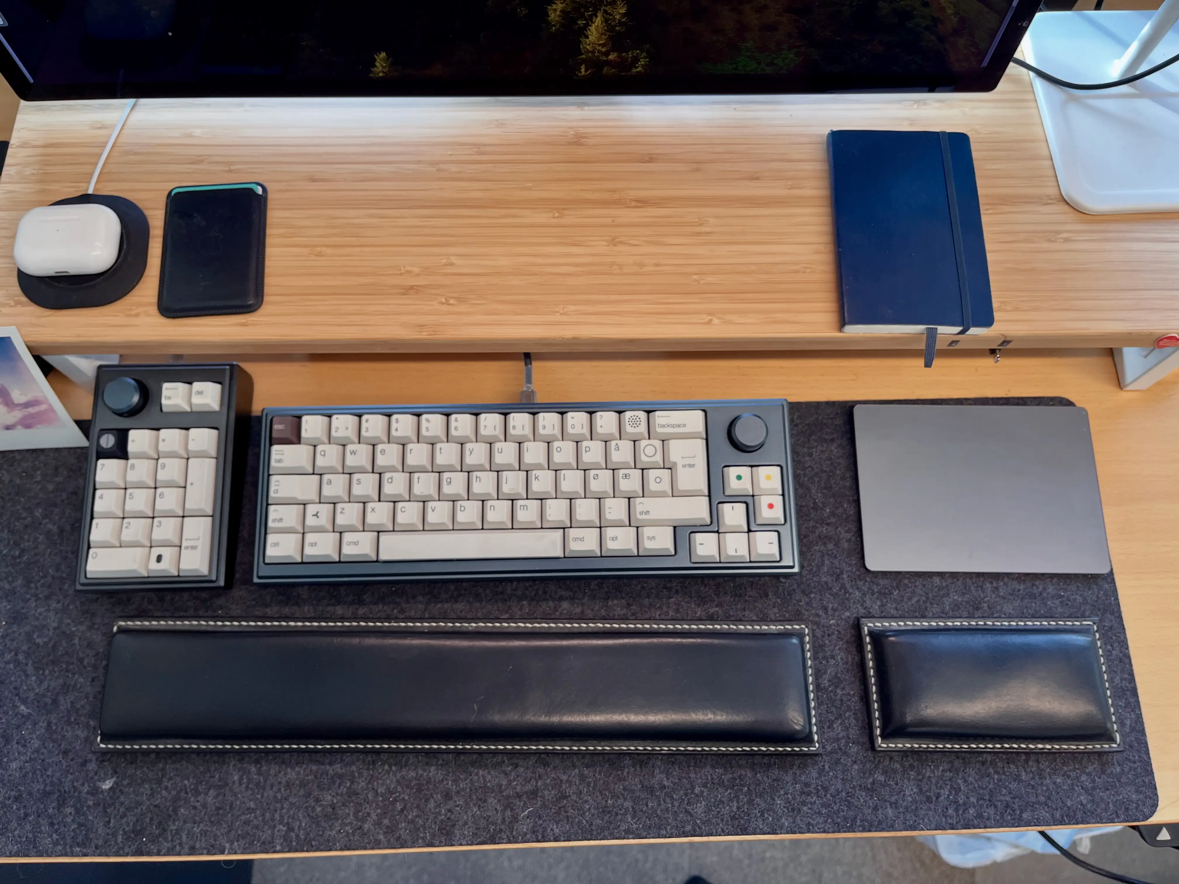
I like custom keyboards, and a couple of years ago, I made my own:
However, three things made this process harder/more expensive (at least at the time):
Enter: 3D printer
This spring, I’m moving from a tiny flat (in the city) into a large house (not in the city). And one of the things I’ll now get room for, is a 3D printer.1 And as someone who likes tinkering and soldering, I want to try to create a keyboard, perhaps hand-wired, in the style of the legendary Joe Scotto.
In time, I would like to make a split keyboard for myself. But before that, I wanted to try to create a more standard keyboard. And I thought a fun challenge would be to design:
A simple keyboard for my wife
This provides the following criteria:
The main issue with having no function row, is the escape key. It needs to be the top-left button, but then the button we use for apostrophes (next to 1) needs to be moved somewhere. I solved it by moving it to the ISO-key between Shift and Z, which usually is < and >. And then I access those with a special modifier. However, this wouldn’t work for a keyboard that’s supposed to be instantly usable by everyone.
3D print everything
A (New-ish) Game for Lovers of Heroes of Might and Magic 3
Do you, like me, get warm and fuzzy feelings from this sound?
My Heroes of Might and Magic journey started with HOMM 2 🖇️ – but I’ve probably spent the most time with HOMM 3 🖇️.
I still play it from time-to-time, but I’m also always interested in modern takes on the formula.
One I like, is Hero’s Hour 🖇️ (currently 55% off!). Here the world map portion is very similar to HOMM, while the combat is more of a free-flowing auto-battler.1
But my favourite is Songs of Conquest,
and it’s currently 72% off on GOG 🖇️!2 It’s also available for iOS (both iPhone and iPad!) — but I haven’t tried that version myself.
AITAH for Wanting 50% of Someone's Income, to Drive Them to the Hospital?
Last night I came across a guy, who had been mugged, stabbed, and was bleeding out. He desperately needed me to drive him to the hospital.
First I said: “Well, you shouldn’t have started it, when you allowed yourself to be attacked!”
Secondly, I said I could help him if he promised me 50% of his income, for the rest of his life. And then, for some reason, he got mad??
I said to him: “You don’t have any cards here.” And I told him that keeping 50% his income is better than the 0% he’ll get if he dies…
Am I the asshole, just because I wouldn’t help someone innocent in need, unless there’s something in it for me? Should I be punished, just because I had the means to help, with a car and all the time in the world?
(On a completely unrelated note: Slava Ukraini! ✊🏻🇺🇦)
On the Need for Friction
Imagine talking to a medieval farmer, about the concept of excercise. Giving yourself “useless” physical strain, to improve your health? Let’s call this idea artifical physical excercise. That wouldn’t make any sense to someone who would get more than enough strain through just living their life.
And while it will vary greatly, from person to person, how much artificial exercise is needed, everyone agrees that we need to look after our physical health in today’s society.
When discussing this, people will mention which of these they enjoy the most, which they find effective, how to fit it into their lives, etc. Some of it are games, competitions, sports, and more – and it can be your job, a favourite pastime, a hobby, or just something you tolerate.
It can also be adjustments you make to your life, like riding a bicycle to work, or changing your desk setup. Let’s call this incidental physical exercise, in opposition to deliberate physical exercise.
But, in this context, this is my main point about this: It’s very accepted to talk about doing things for your physical health, even though it might not be the most comfortable, fun, or easy.
And similar to how technological improvements increased the need to look after the health of our bodies, it has now made it important to look after the health of our minds as well.
Learning and AI
If you’re at the gym, there are many examples of how technology can enhance the effectiveness of our artificial physical exercise. However, using a forklift to lift weights might be more effective and comfortable, compared to doing it yourself – but it also makes the action completely useless! The point isn’t that the weights get lifted, but that you do it. This is in contrast with a warehouse, where the point is to get the stuff lifted.
In Defence of Netflix Not Being in the Apple TV App
I like the Apple TV (box). It’s the only way I watch TV! I like that it’s a competent and fast piece of hardware, without ads*, that gives me easy access to all the streaming I want.
That it’s an app platform, makes it easy for even my niche Norwegian services to be a part of the platform. It can also have things like the excellent Infuse media player (for local files and Jellyfin).1
Apps can also choose to serve their content to Apple’s frameworks: This makes the content searchable with the global search, and also adds the content to the Apple TV app. A section of the app is “Up Next”, where you can continue watching things from different services:
However, annoyingly, Netflix doesn’t participate.
And before I defend them, I want to highlight the cynical reasons they don’t:
The mistake
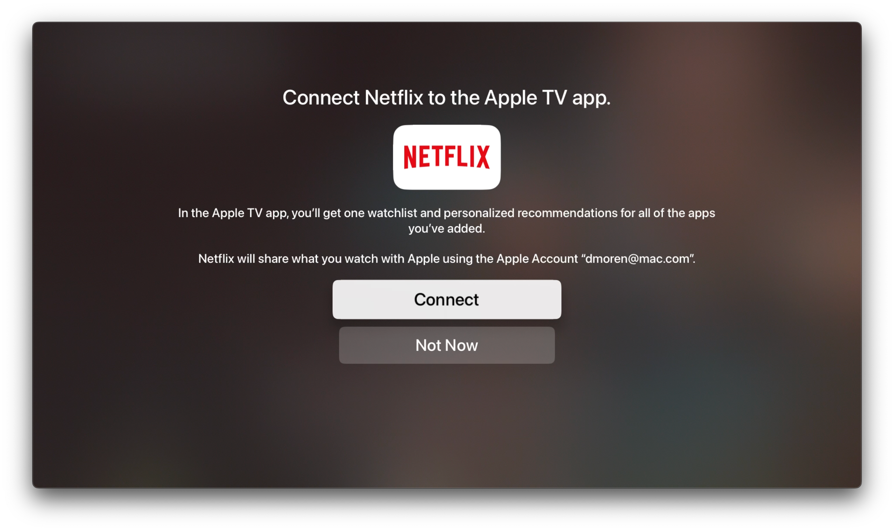
Last week, there was a bit of writing because someone accidentally flipped the switch, and made Netflix actually participate:
Netflix quickly turned it off again – and the take that was the most popular in this cycle, was perfectly summarised by this great quote:
Netflix deeply regrets accidentally making Netflix a better product for its customers.
As someone who uses both Netflix, the Apple TV (box), and Apple TV (app), Netflix participating would be better for me. But I think I have more understanding towards Netflix than most.
The defence
My first thought was that it was funny hearing someone like John Gruber criticising the move. When Apple themselves don’t play nice with others, to instead give users a unified experience (or whatever), he’s usually quick to defend them. And when they do this, it’s also because they’re dominant enough to not have to.
But I also think John Siracusa had plenty of good points on this, in the latest episode of Accidental Tech Podcast. And I’m stealing some of these here.
My Blog's Photo Workflow, Powered by Shortcuts
And Thoughts on Alt Text
I use many images on my blog. But that’s not because I’m a photo blogger, or use a lot of decorative illustration images – it’s usually because I want to show and/or explain something.
I’m pleased with where my flow for uploading these, and adding them to my blog posts. So I would like to show what it looks like, and give thanks to Jarrod Blundy over at Hey Dingus, as I’ve built it around a shortcut of his.
The shortcut starting point
Jarrod has shared plenty of cool shortcuts, over at his Shortcuts Library. And the one I started with, was the one called Bulk MB Image Uploader. The point of this was to be able to upload several images at once to Micro.blog – which is the hosting provider we both use. However, uploading in bulk like this isn’t necessary to me. I just used the framework surrounding access to the Micro.blog API/app token, so I don’t have to use the website, and can do it all from shortcut actions.
More features
After being yelled at, by various web efficiency tests because my website used too many resources, I wanted to optimise the way I use images. And this involves two steps: Compress the main images, and add lazy loading (with a temporary lazy image, that keeps the layout while the image loads).
So, my version of the shortcut (which only works with one image at the time), actually uploads two images to Micro.blog:
I’m using Jason’s GLightbox plugin for Micro.blog to get a lightbox for the images, and I combined that with this guide for lazy loading.2
So the code my image uploader shortcut spits out, looks like this:
✉️ Tapestry Feedback Feedback Feedback
Not too long ago, I wrote some feedback to Iconfactory’s latest app, Tapestry. I just got some great feedback on that, from them, so I wanted to provide a response.
Here’s what they wrote, on Mastodon:
There’s a lot in your post. Thx for such thoughtful feedback, it’s appreciated. Some things like the ability to turn off the service name is coming. The thing to keep in mind is this: just because a particular part of the design doesn’t work for you, doesn’t mean it wasn’t designed that way for a reason that you may have not considered.
The service name is a perfect example. Lots of people are colorblind or even unsighted. To them they cannot tell posts apart simply by color.
So while we are going to add the ability to turn off the service name, that’s why it’s there by default. Avatars are never going to move to the right side. Their placement was carefully considered as was how they appear with their transparency.
Everything you see is the result of over a full year of design, testing by over 1,500 TestFlight backers & then tweaking to adjust things that didn’t work as well as originally planned.
In the end Tapestry may not be for everyone & that’s fine
If Tapestry ends up looking & behaving like Reeder or Surf or… what’s the point? We designed the app the way we wanted it to look & behave using feedback from our testers as a guide. The design will continue to evolve based on feedback like yours (which is thoughtful) but it can never be all things to all people.
Many have told us they love Tapestry so it seems to be doing a lot of stuff right but it can always be better. We’re gratified but will continue to improve going forward. 👍
Here’s my response:
Thanks for reading my feedback, and getting back to me with such an interesting response! And looking back at my own feedback, I see that it was harsher than what was intended… Sorry!
✉️ Micro Social: A New Third-Party iOS App for Micro.blog
And Some Very Early Feedback
Greg Morris is someone whose blog I’ve followed for a while, but I didn’t know was a developer. But now he has released a third-party iOS client for Micro.blog!
As he’s mentioned, it happened “quite accidentally”, and it’s very early days. So this post is just me letting people know it exist, and providing some very early feedback.
To Greg:
Oooh, I love that you’re making this! I’m 100% in the target demographic for Micro Social. (Someone who uses, but doesn’t like, the default Micro.blog app — and is willing to pay for something better.)
I’ll try to provide some more useful feedback later, as I’ve used the app more, that you can use if you’d like. 🙂
Here are some first-impressions:
(In general I like it! So these “negative” comments are meant to be constructive. 🫶🏻)
I’m currently running an iPhone 13 Mini — so the phone is probably both older and smaller than what you use. ☺️
I had several crashes two updates ago, but it’s fine now. But I’ve noticed that avatars load slowly when I scroll (even if I scroll slowly). Maybe you can have the lazy loading start “earlier”?
I really like that you have avatars and names on a separate line, so you can use full-width content. (Instead of having weirdly large left-margins, that far too many apps has. I have strangely strong feelings about this…)
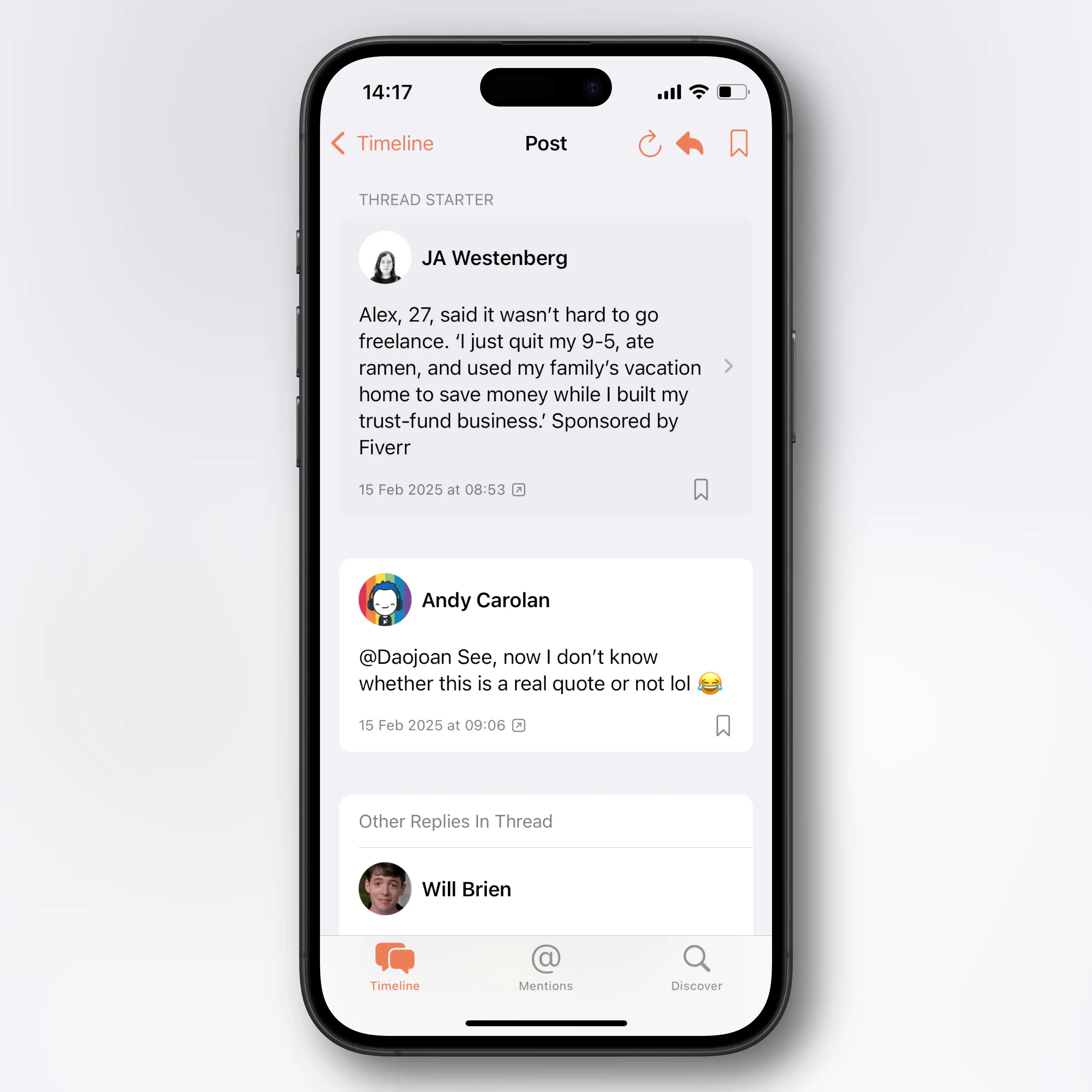
I also really like the “card look”:
However, on my Mini phone, I wish you were a bit more stingy with the padding, as the content gets too narrow. Especially on the timeline, due to the extra arrow on the right side. Is this needed?
The Paper Dev Should Give Their Take on a Tot-Like App
I recently wrote a review of Iconfactory’s great app, Tot.
I like it – but editing text in it does make me miss my favourite places to do this: Paper and Bike.
And this process made me realise that the Paper dev has all* the pieces in place to give their take on an app like this. And it makes sense from a business perspective!
The pieces
Here’s what I would do:
My suggestion for a name (also to make it easier to discuss here) is Slate.
A slate is a thin piece of hard flat material, historically slate stone, which is used as a medium for writing.
The next question is how much it’s OK to copy from others. Let’s pretend it’s fine to take all …
The best parts from Tot:
Fixed number of notes
I really like that Tot only supports 7 notes, that are all “internal” to the app.1 I also love how they’re distinguished from each other by colours.2
Having exactly 7 would a bit on-the-nose… But one of the reasons I liked the “Slate” name, is that you could one-up, rhyme, and go for 8!3
Perhaps the 8 notes could be regular, accessible Markdown files in the app’s iCloud folder, to simplify automation? But that you can’t create other notes with the app, and it can’t “find” other notes if you place them there.
The business model
Quick Recommendation #6: Arco (video game)
Original, Tactical, Recreational
Last year, Panic published a terrific indie game I’d like to recommend: Arco. I’ve only played the first two acts, but I like it a lot so far.
It has great pixel art, music, writing, and story.
It also has a genuinely innovative turn-based combat, and guilt system, which makes in-game choices interesting.
It’s available on PC, Mac, and Switch. I’m playing it on Mac, with a controller – and it works flawlessly. (If you want to get it for desktop, I recommend getting it through Epic, as the dev gets a larger piece of the pie.)
Click here to see all my quick recommendations!
