Guides
- Camera Control button added
- Support for Dolby Vision video
- Latest generation Photographic Styles
- Anti-reflective lens coating
- Improved glass
- Faster MagSafe charging
- Lower minimum brightness
- A bit longer battery life
- Larger screen size, from 6.1" to 6.3" / /6.7" to 6.9" (A negative in my book, but not in most’s, I assume.)
- Upgraded chip, from A17 Pro to 18 Pro (Doesn’t seem like the largest bump.)
- Improved thermals
- New ultra-wide camera (Seems substantial!)
- The non-Max also gets last year’s 5x tele lens
- Improved microphones
- Upgraded chip, from A16 to A18 (All-new architecture – more substantial upgrade.)
- More RAM, from 6 GB to 8 GB.
- Support for Apple Intelligence (Due to the last two things mentioned.)
- Added Action button
- New ultra-wide camera (With support for Macro photography – but not as large an upgrade as on the Pro.)
- Support for spatial video
- Thread radio
- 1 whole gram lower weight (🤓)
- In my apartment, I have some light switches that are in idiotically placed. I also have several lights I wish had more than one switch. So the fact that I can easily place switches wherever I want, by just sticking a little button to the wall (or whatever), is very nice. And so is the fact that it’s trivial to have one switch control several lights, or have several switches controlling one light.
- I want nothing to only be controllable by my phone. But I do think it’s nice that I can use it to control my lights — even when I’m not home. I also like that I can create automations, like turning off the lights when I leave.
- I really, really like to vary the colour temperature of my lights throughout the day. However, I don’t need colours like in the image above.
- quarters,
- halves,
- and wholes (not fullscreen mode).
- To protect the cards (kinda says so on the tin)
- To increase the sense of quality, much like component upgrades
Summarised – This Year's iPhone Changes
While working on a different blog post, I made a list of changes to the different iPhone models. Instead of just scrapping it, I thought I’d post it here.
Improvements across the line(s)
iPhone 15 Pro → 16 Pro
iPhone 15 → Iphone 16
Anything I missed? Feel free to let me know!
My recommendation is that it seems like the iPhone 16 (regular model) is the best buy at the moment. And that the €100 higher price compared to buying last year’s iPhone 15 is well worth it. (Where a used 15 Pro fits in the calculation, is a more complicated question!)
The Beauty of Third-Party Services
and Open Protocols and Standards
I’m very much what you’d might call a software snob. Not only do I care about unnecessary things like how an app looks – I also care about how it feels. I’d also say that apps are an interest/hobby of mine, and I love testing new things. So I love open and portable stuff, so that I’m always able to use the software I prefer. Allow me to explain, with four examples: RSS, Email, Browsers, and Markdown.
RSS
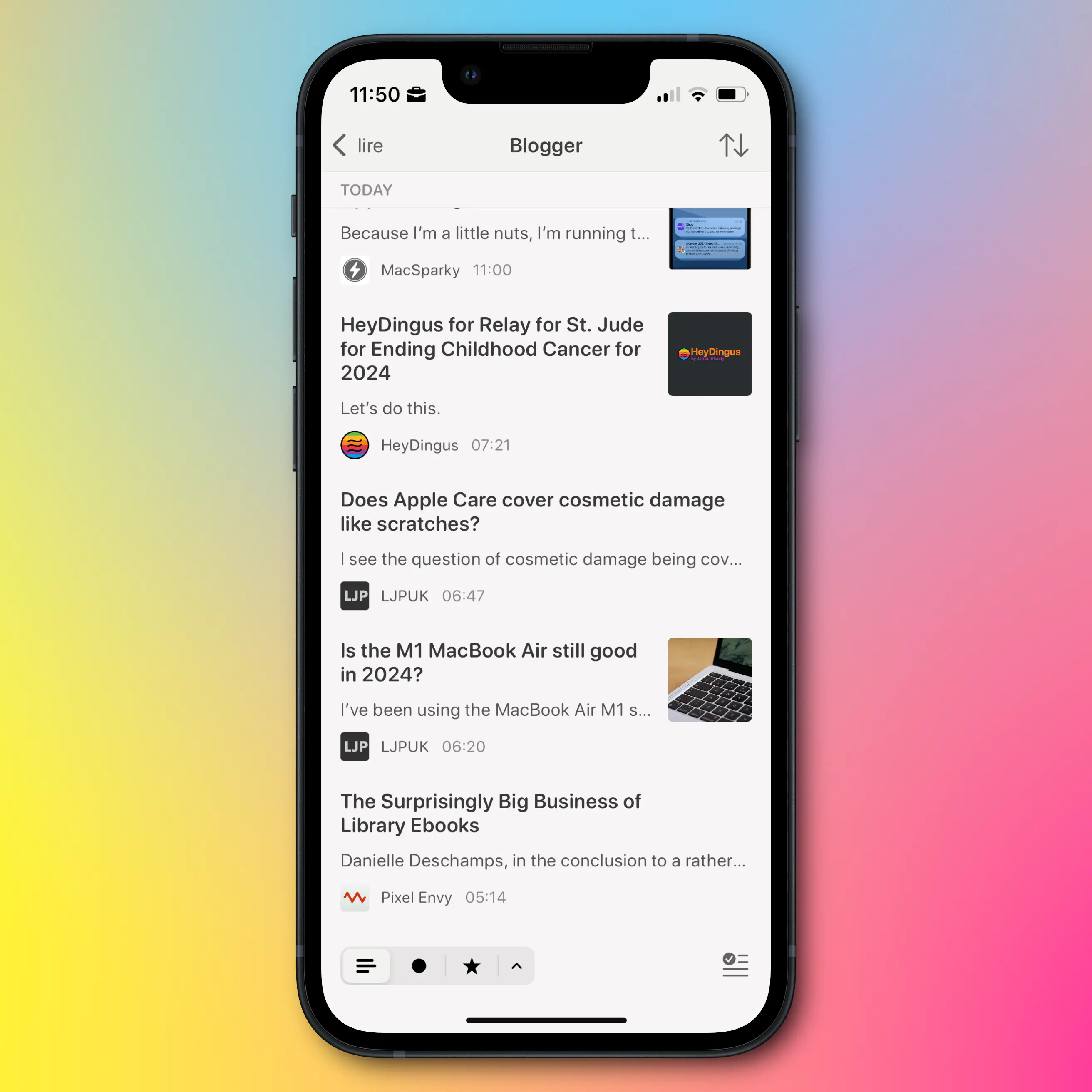
My current RSS reader of choice, is Lire. It doesn’t look and feel quite as nice as Reeder and Unread, but it is still good in this regard. However, I love that I can customise the look, that it caches truncated RSS feeds, and that I can (on a feed-by-feed basis) load an inline web browser. This makes it possible to read blogs with their original design, which I think is neat.
However, my feeds don’t live in one client. They’re synced with Feedbin. This makes it trivial to move between clients, and I can even use several in parallell, as things like sorting and read status instantly sync between them. Maybe I prefer Lire on mobile and Unread on Mac, for instance?
Portability is an important principle here. And if I want to move from Feedbin to Inoreader, for instance, I can easily export my feed subscriptions as an OPML file, which I can then import into Inoreader.
So I’m not locked in anywhere, and I can use the client I prefer everywhere. This reality is what I wish I could have for music streaming as well, as I’ve touched on here. It also shows why I want less bundling and integration.
Notes on cross-platform-ness
My best friend, and fellow nerd, has always been adamant in using cross-platform tools – the reason being that he can be flexible in terms of which hardware he uses. He can easily switch between Windows, Mac, iPhone, Android, etc. However, this doesn't gel well with my software snobbery, as most of the best apps (in my opinion) simply aren't cross-platform. I have the same issue with web apps – I love their flexibility and portability, but I don't love using them. So the approach laid out in this post, is my approach to the same idea. But yes, it would be even more robust if I only used web based and cross-platform tools.Now, as opposed to with RSS, there’s not many good email clients… But the same principles apply!
I host my email with Fastmail 🖇️, and I’m very pleased with it.1 But if I still want to switch later, I don’t use an @fastmail.com address. Instead, I use my own domain, hosted on Hover 🖇️ – so I don’t have to change address if I change hosting. I can also change where I have my domain without having to change anything regarding my email.
Now, I don’t like the default Fastmail client – but email being email, I can use a client I dislike less instead!
Browser
✉️ Learn from my mistakes: Buy Larger Shoes
I love getting email etc. from readers (hint, hint), and recently, I got an email regarding an older blog post about a great pair of sneakers from Crown Northampton.
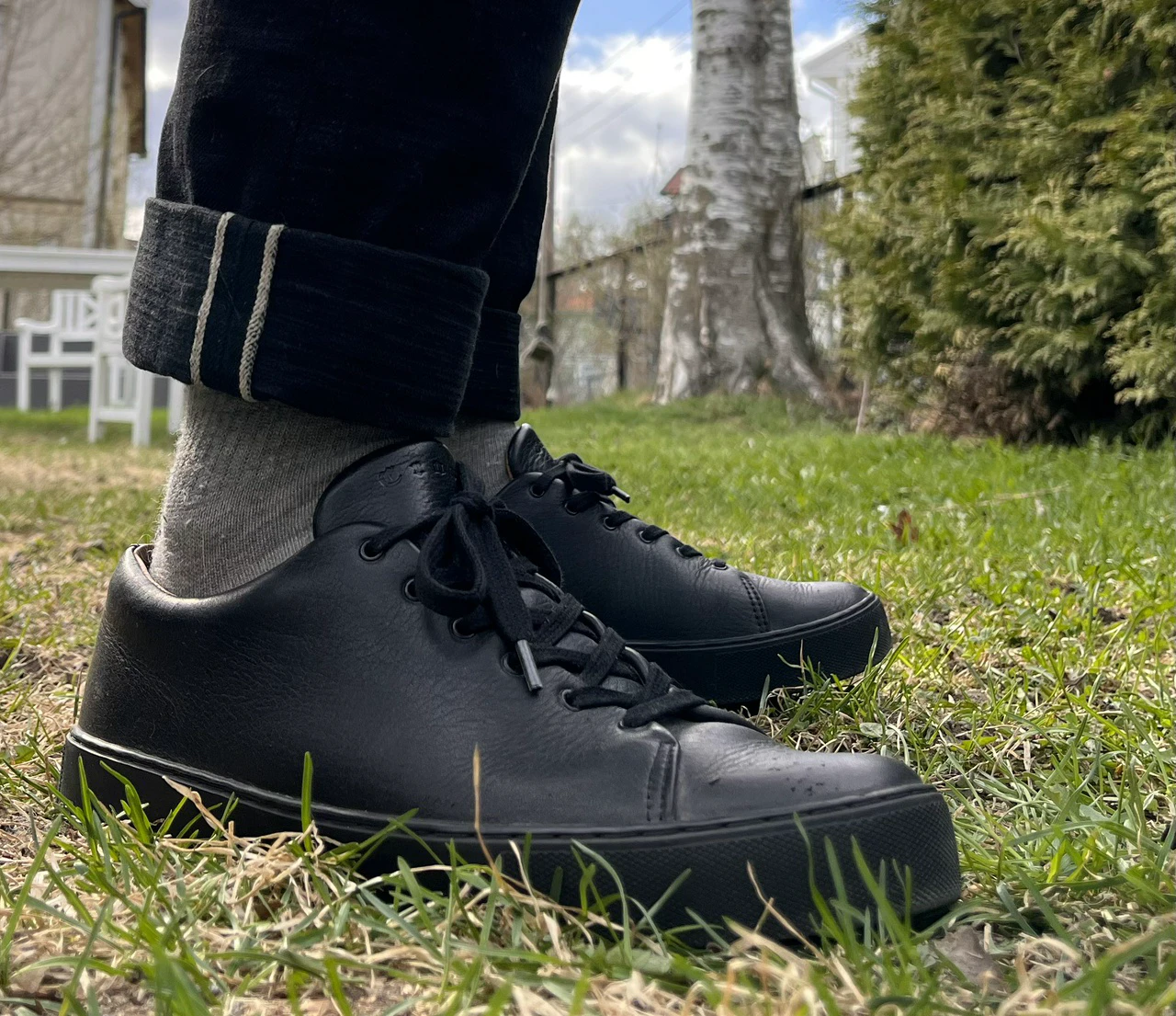
In the original blog post, I said I first bought them too small — but it took me a year to realise it. I bit the bullet, and bought another pair (of the quite expensive shoes), and I hope that’s a testament to how much I like them.
Here’s the email I got:
Hello there!
I just got these babies. I do have a question for you. I know you’ve said that it took you a year to admit they were too small. I think, I’m having the same problem. They’re a bit tight on the toe box.
I just tried to go for a walk (first wear since I received them), and I already have blisters on my ankles.
Should I re-send them to get the wider option? I just don’t feel like paying $160 to send them back and wait another 4 weeks.
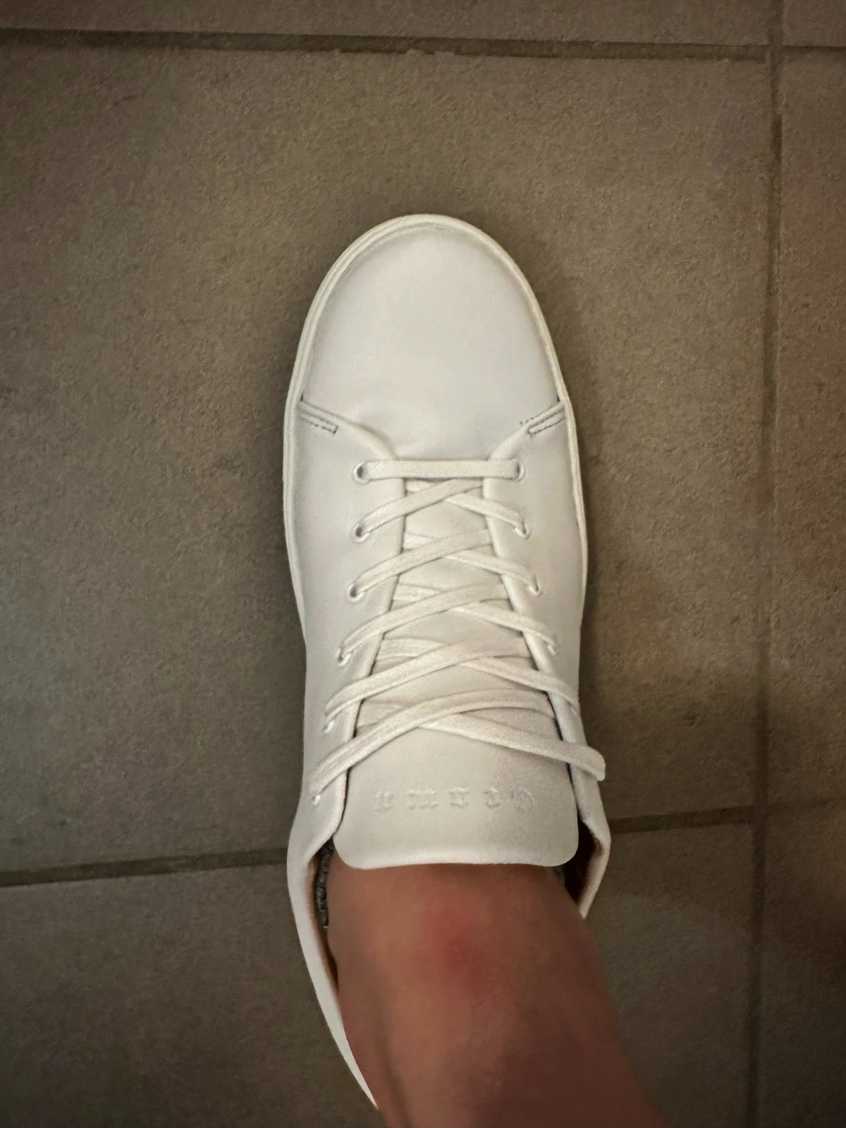
My dilemma is whether I should be patient and try breaking them in a little more instead of getting the wider option. What would be your advice? I’m disappointed that a shoe this expensive is not as comfortable out of the box.
I look forward to your reply!
Best,
Luis 1
And here’s my first reply:
🌱 Coffee: Max Good, Min Effort
My Coffee Setup
My wife and I love coffee — and we drink a lot of it. So we want it to be good, while still not being too much of a hassle to make every day. And this post is me highlighting the equipment we use, and the process.
If you only want one-ish cup (and why I don’t like capsule machines)
When I say that we drink a lot of coffee, I mean that we drink coffee made of 0.75-1 litres of water/45-60 grams of beans. So it’s pretty obvious why something like a Nespresso capsule machine isn’t a viable option.
But other reasons I don’t like it, is that the coffee tastes much, much worse than alternatives, it can get expensive, and how much waste it creates. (For some info on environmental impact, check this video and this video.) In my book, capsules are Min Good, Min Effort.
I think capsule machines can be a viable option if you personally don’t drink coffee, but you want to have something to serve guests now and then (and you have room in your kitchen). But if you only want about one or two great cups of coffee for yourself, I’d either go for the quite quick AeroPress, or a more ritualistic pour-over, like a V60.
We sometimes make a pour-over — but most of the time, we use a (pretty) regular coffee-maker. 1 But they’re not all created equal.
What you need to make great coffee
0) Good water
I almost forgot this because in Norway, we are very lucky to have great water on tap. But depending on where you live, this might be an issue.
1) Coffee (duh)
🌱 Some Scripts for Native Tagging of Markdown Files
One thing I like about Markdown is the way the files are just plain-text files, that can be opened and read in different programs and contexts. As much as I can, I try not to lock down my content, or workflows, into specific apps. But I still want to use nice apps! So sometimes I have to jump through a few hoops to make things interoperate. I’ll go into more detail on my workflows later — but I thought I’d share some scripts I use in one piece of the puzzle.
First, here’s what they do:
What I want is to be able to tag things in the different programs I use, and then automatically apply native Finder/Files tags to the files themselves. If I want to make three tags called “Bass guitar”, “Music” and “Effect pedals”, I would write #Bass guitar# #Music #Effect pedals#. (Notice how the multi-word ones also end with a #.)
The scripts come in three different flavours:
An Introduction to Mad Max
I recently saw a film poster to Furiosa: A Mad Max Saga - so I thought I’d might watch Mad Max: Fury Road again. I think I remembered it being pretty good - but after rewatching it, I thought: “Uhm, I think this is the best film I’ve ever seen??"
So I’ve spent some time the last two weeks getting into the Mad Max Franchise. I’ve always known about it, but never really had a relationship to it. But now I’m a fan!
I’m not going into why Fury Road is so amazing here. Instead I’m going to give some pointers on how to get into the series.
Worth your time
There are many famous franchises out there - but most of them take a little lifetime to get into. There’s so much Star Wars/Trek, Game of Thrones or Marvel stuff out there. But Mad Max is much more manageable, and the high notes are so great, that it’s absolutely worth your time.
You can absolutely just watch Fury Road, without doing anything else before it. If you’re going that route, you can read this little footnote for a tiny bit of background. 👉🏻 1
I watched Fury Road blind, and then went back to the three old ones - but it could also be fun to simply watch them in chronological order!

Mini reviews of the first three
Game Changing CSS Trick (for Noobs Like Me)
OK, I just learned a brilliant CSS technique I wish I knew about much sooner! This is probably old news for most of you wizards out there - but maybe this little post can be useful for some fellow newbies?
This is one of my "Noob teaching noobs" posts. Some experts are excellent teachers - but not all. Hopefully, these posts can be helpful due to their layman nature, but please contact me if I'm misinforming!
Here are some examples of selectors I could see myself using:
h1 {} -> Styling Header 1 (h1) elements.
h1:hover {} -> Style when hovering h1.
h1::after {} -> A pseudo-element (like a line) related to h1.
h1:hover::after {} -> The pseudo-element when I hover over h1.
h1 a {} -> A link (a) within an h1 element.
h1 a:hover {} -> When I hover over one of those links.
.page-content h1:hover {} -> When I hover an h1 that’s within .page-content.
Put into context, I could do:
🌱 Why Smart Bulbs > Smart Switches
I really like my smart light setup — and later I will write a guide on how I set it up. (I promise!) But in this post, I want to explain why I think smart light sources are a better option than smart switches (with regular light sources).
(Click here to go to the TL;DR!)
Some notes on costs
Smart lights ain’t cheap. And while I will argue that I don’t think going for smart switches is that much cheaper than smart light sources — my main focus is on what gives the best smart light experience. And then it’s up to each person to evaluate what feels “worth it”, or even possible, to them and their budgets.
I also think the experience is way better if you get the consistency of having (more or less) every light in your home be smart — so keep that in mind as well. I’m not arguing against those who say “Yeah, I only wanted these four lights to be smart, and then it was cheaper to go for a couple of smart switches”. What I am arguing against is those who say going for smart switches is better than smart light sources — and hopefully giving some valuable insights to those who haven’t decided yet.
Why smart lights at all, though?

To me, there are three main reasons (in no particular order):
The two approaches to smart lights
🌱 Some Quick Mastodon Client Reviews
One of my favourite things about Mastodon, is that, as opposed to most other social networks, the service is completely open for other developers to make their own clients. And this has lead to a remarkable ecosystem of third-party options.
Now the official ones, are pretty mediocre (especially the web app, IMO) — but I like this prioritisation. They could’ve sacrificed precious dev time to make their own clients great — but this would have to come at the expense of improving the core service. And the only thing we would gain, is “another great way to use Mastodon”.
“How good are the default apps?” is a far less important question than “How good are the best apps for Mastodon?”. Also, what’s a good app isn’t the same for everyone — so why on earth should there only be one client (like Instagram, Facebook and, now, X)?
If you’re new (or old) to Mastodon — don’t be afraid to test different clients! They can be used in complete parallel — so you could just download a bunch on your phone, and log into each of them with your username. And then you could just “main” one of them for a couple of days (turning on notifications on that one, for instance), and then move to another one.
But let’s get to the main point: Some quick reviews of some of my favourite clients!
A Very Good All-Round Game Controller, With One Major Flaw (for Me)
A quick review of the 8BitDo Ultimate Bluetooth Controller

I mostly play boring strategy 🖇️ games that are just as good to play with a trackpad as anything else.
But every so often, I’ll play something that’s best played with a controller. That’s usually on my Switch, where I’ve used the joy-cons with a charging grip — but that’s never been great. Also, my joy-cons have started to drift…
So I wanted to buy a single controller that could fit all my use-cases, and my choice fell on the 8BitDo Ultimate Bluetooth Controller 🖇️. And it’s a great controller, with many smart features. But did you know that a controller can support 2.4 GHz, Bluetooth, Switch, PC, Steam Deck, Android, iOS and iPadOS, but not support macOS?? Well, I didn’t.
A Way To Get a Fancy Link Hover Effect
Jarrod, of (the great blog) HeyDingus.net, wanted to do something about the way his links appear on his website. He asked:
Since the first design of my site, I’ve stuck with blue text for my hyperlinks because that always seemed canonical with the web. Links = blue text, blue underline. But I’ve grown less certain with its readability with all that blue text interspersed. I’m considering a change. What do y’all think?
One thing he didn’t mention there, is that he also has a nice hover effect, that changes the underline to a gradient (that matches his logo and more) on hover.

My first idea for how to solve it sacrificed the gradient — but that just wouldn’t do. But I think I found a pretty good solution in the end!
The solution and how to implement it

🌱 A Shortcut for lite-youtube-embed
YouTube embeds take up way too much on a site - so luckily someone has made lite-youtube-embed.
“Renders faster than a sneeze.”
Provide videos with a supercharged focus on visual performance. This custom element renders just like the real thing but approximately 224× faster.
First you have to include some CSS and JS on your site. 1 And then when you want to embed a video, you could just add this piece to your post/page:
<lite-youtube videoid="CItvhGl__Mk" playlabel="Play: Beatenberg - Wheelbarrow (Official Music Video)"></lite-youtube>
This will embed the video, but over 200x faster - nice!
However, you have to manually add the videoid and the video title.
And they’ve also made a variant named “Pro-usage: load w/ JS deferred (aka progressive enhancement)”, which I think is even more optimised. But then you have to add all of this:
<lite-youtube videoid="CItvhGl__Mk" params="controls=0&rel=0&enablejsapi=1" style="background-image: url('https://i.ytimg.com/vi/CItvhGl__Mk/sddefault.jpg');">
  <a href="https://www.youtube.com/watch?v=CItvhGl__Mk" class="lty-playbtn" title="Play Beatenberg - Wheelbarrow (Official Music Video)">
    <span class="lyt-visually-hidden">Play Video: Beatenberg - Wheelbarrow (Official Music Video)</span>
  </a>
</lite-youtube>
Chromium and Nested Backdrop-Filters
If you’re like me, you sometimes get these small (often technical) problems, that you work on for so long — and you refuse to surrender.
I had this with CSS a couple of months ago:
I had a menu, that had transparency and blur, and then I also had a submenu that I wanted to have the same. But the submenu just. wouldn’t. blur!
It works perfectly in Gecko and WebKit — but after countless hours, I found the problem: If an element has a backdrop-filter, Chromium won’t let its children have it as well. 1
I had to design around it, and moved on with my life.
A few moments later…
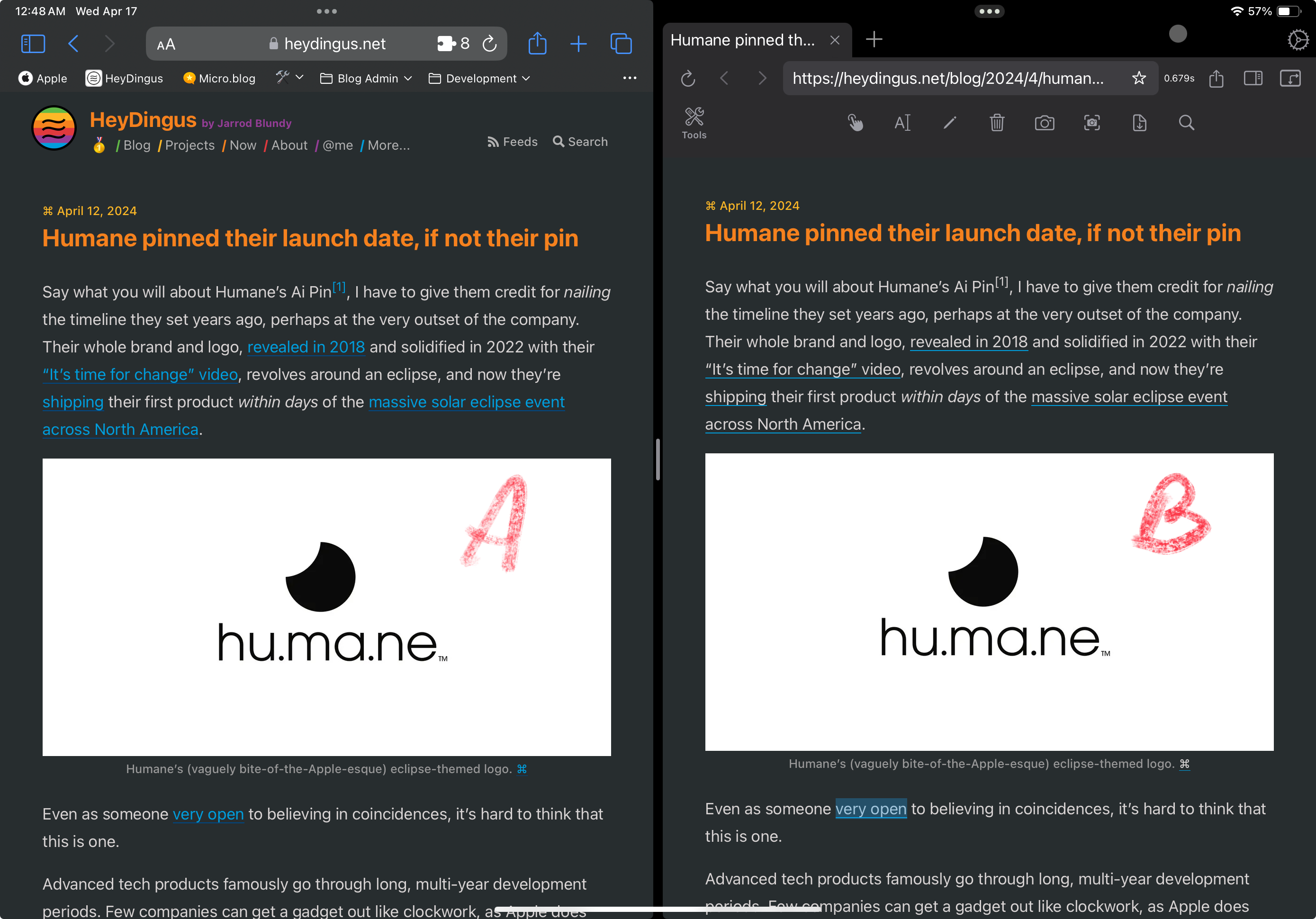
I recently moved to Micro.blog. And one day I was scrolling down my timeline…

Then I opened the submenu:

There it was — the same bug! I’m not alone!
The fix
🌱 A Good Way to Get Home Row Mods on a Mac
As part of my ergonomics voyage, I’ve been working on getting home row mods on my keyboard. This excellent guide provides tons of info on this, but the short version is this:
To contort your hands less when using modifiers (like shift and control), the letter keys on your home row serves double duty: They’re the letters if you tap them, but modifiers if you hold them.
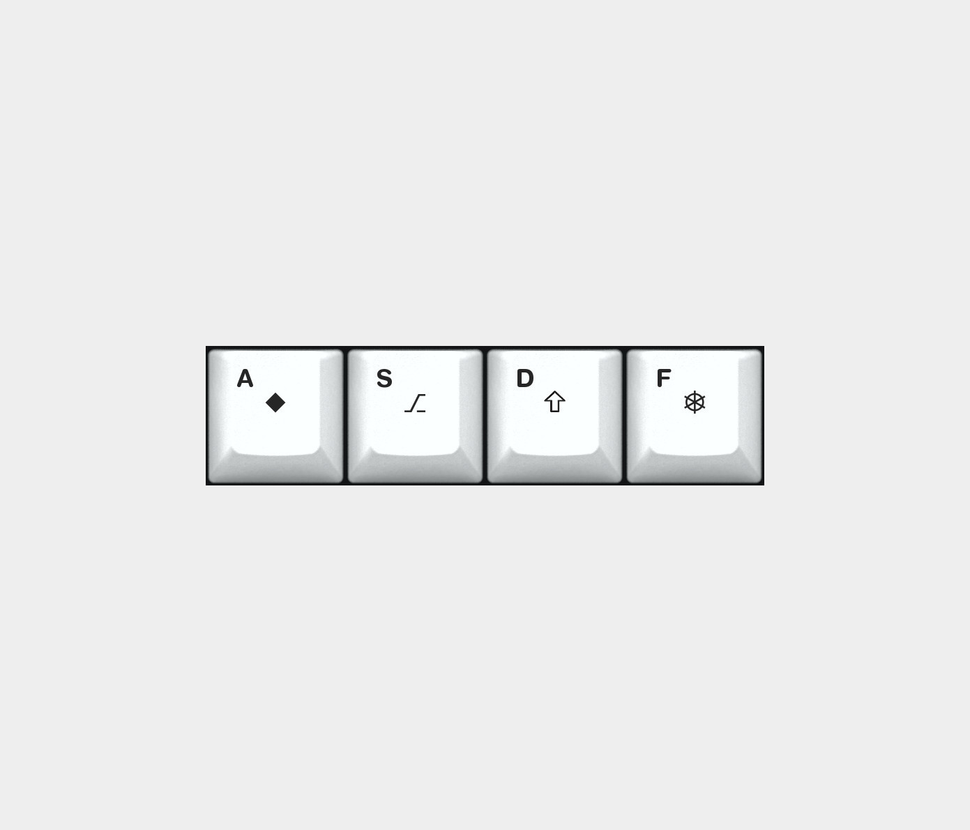

Tapping vs holding
But what’s constitutes a tap and what constitutes a hold? That’s the central question here…
🌱 How I Manage Windows
Rafael Conde, posted on Mastodon today:
We’re sharing how we use the Desktop and how we size/position windows on our Macs on our work Slack and it’s absolute madness.
And, then followed it up with a poll:
Time to fess up, how do you primarily use windows “on your” Mac? Bonus points if you reply with a screenshot 📸
⋅ Wherever the appear, I don’t know
⋅ Centered (think Apple marketing shot)
⋅ Fullscreen (as big as you can make them)
⋅ Tiled (in a grid, like taking up half the screen)
I, as many others, have strong feelings about this. And I’d love for this to become the next «Default apps»! So I’ll start.
I’m a big tiler.
I switch between my MacBooks 14 inch screen, and my Studio Display’s 27-inch screen. But no matter which I’m on, I move my apps around quite a lot, and almost always in
Here are some examples:
🌱 My Tech Setup
I’ll make separate posts for my software and bass guitar setups, but here’s my current tech hardware setup.

My Ergonomics Voyage: Part 1
Prologue, and the first steps
I’ve been a nerd my entire 34-year-long life. So naturally, much of it has been spent in front of computers using keyboards, and I’ve never experienced any discomfort related to this.1
I don’t know if it’s due to my age, or just the fact that I’ve worked even more than usual on keyboards, but lately, I’ve started to notice discomfort. Especially in my left hand, but a bit in my right as well. Luckily, there’s nothing anywhere else, and it’s not that bad. But I want to take action to try to stay ahead of it.
A bit about my current situation
The last couple of years, I’ve been working mostly in my small home office, which was OK, but not great. Just a couple of weeks ago, I finally got my own (external) office, so the situation has improved. However, I’ve been stupid, and also worked quite a bit on my laptop on our kitchen table lately.
Here’s my current office setup:

Good things about my setup
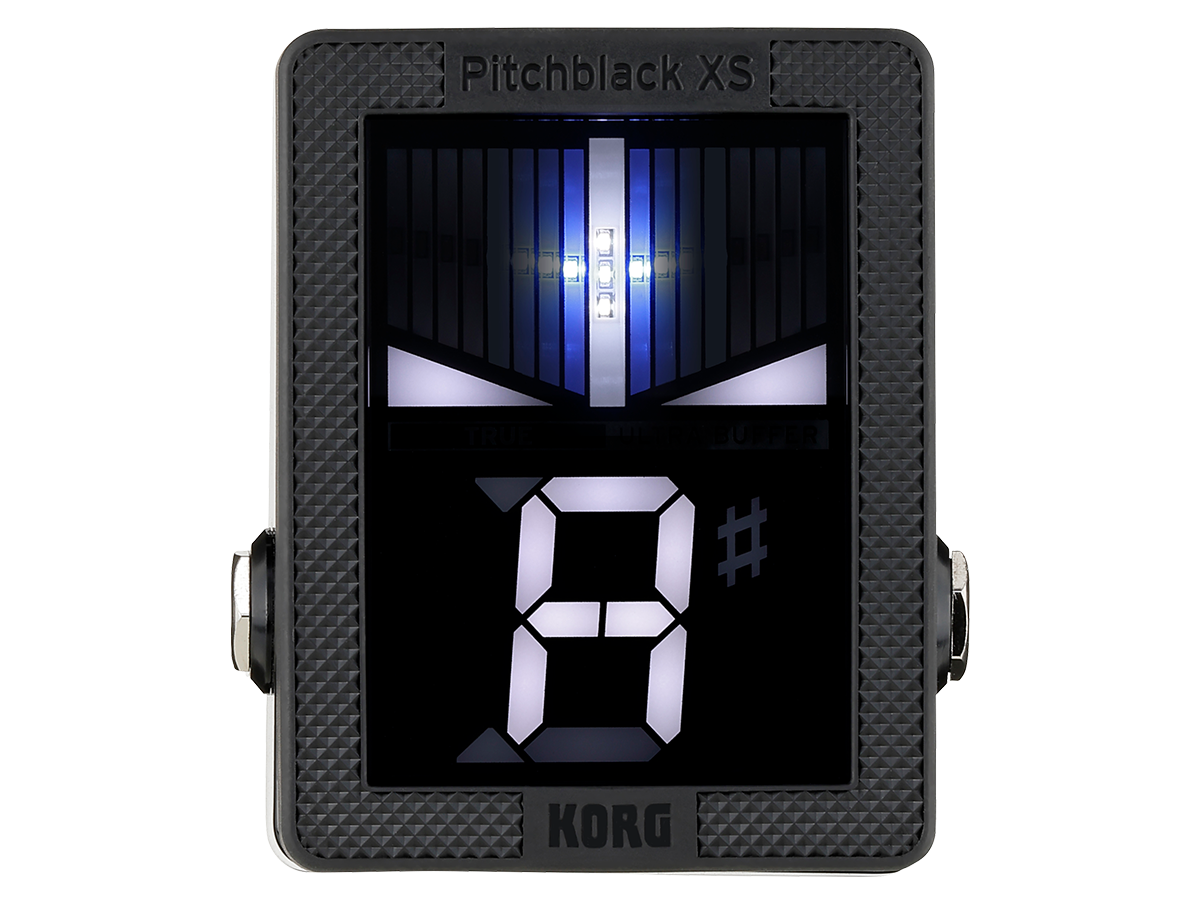
Pedal tuners and product design
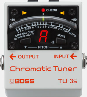
Firstly, sorry about caring a bit too much about guitar tuners. You see, as a side gig, I help people with their pedalboards (especially people using multiple guitars on stage), and I often recommend that they get a new tuner. But no tuners are exactly like I want!
While this post is mostly hard core nerd out on pedal tuners, there are also some comments on product design in general. Let’s go!
A new product series gives (false) hope
I prefer always-on tuners that you mute elsewhere (volume pedal or otherwise), and this makes foot-switches redundant. That’s why I like the idea behind Boss TU3-S.
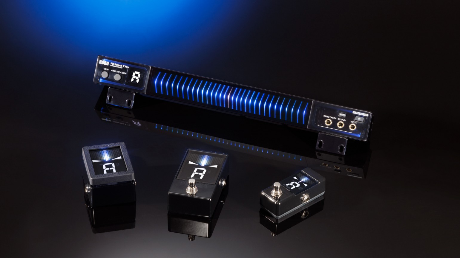
So, when I saw the new(ish) Korg X tuners, I was stoked – especially for the XS. The pedal to display size ratio is great, the switch design is cool, and I like that it’s more squared off than your typical mini pedal. This allows it to fit into odd slots on pedalboards.
🌱 Guide to card sleeves
«Why?»
Card protectors, or sleeves, are perhaps the most common accessory for games. There are two main reasons for sleeving your games:
The protection part is especially important if the cards are of high value and/or gets shuffled a lot. Both are true with most collectable card games (CCGs), like Magic The Gathering – and this is why the sizes used for these games has the best selection. Shuffling with sleeved cards feels a lot better than unsleeved, so that affects both point 1 and 2. You can also get them with matte finish, to reduce glare.
Here’s a guide to how you should proceed if you want to sleeve:
🌱 Wallpapers for Home.app

Here’s a remake of backgrounds from this thread that I made since the links were dead. These were inspired by u/rzalexander and made with free illustrations from illustrations.co. I’ve tried to adapt the illustrations to iOS 16’s new home app, so that the text and icons are visible.
I’ve also made companion backgrounds for use with iPad and Mac. Since those windows resize all the time, using two tone and illustrations was a no-go. So they are just one colour backgrounds (I have one using the dark colour and one using the light one. I’ve used the latter).

